Online journal devoted to type design, visual culture and typography
-
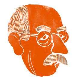
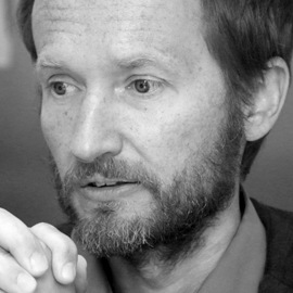
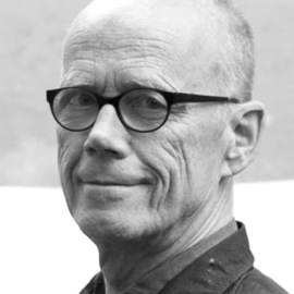
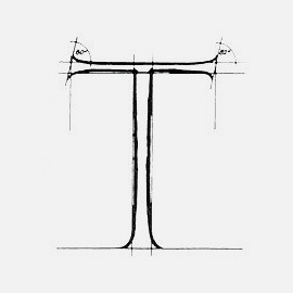
 Gerard Unger
Typography as Vehicle of Science
3.02.2022Address delivered at the acceptance ceremony of the professorship in Typographic Design, sponsored by the Dr. P.A.Tiele-stichting, at Leiden University on March 16, 2007 -
 History
Aaron Burns: Till we meet again
3.08.2021Aaron Burns (1922–1991), co-founder and president of ITC, was a typographer and typography enthusiast who made a massive impact on the development of typography and type design in post-Soviet Russia. Today, few people are aware of this side of his work, so we invite the reader to take a closer look. A short essay by Maxim Zhukov on meeting the master, organizing exhibitions together and partnering on ITC Cyrillics. -
 History
Script and its graphic language
30.10.2020“If one wanted to experiment freely with Cyrillic forms and rhythms, one would have to question commonly accepted practices and dare to think differently” — Irina Smirnova and Max Ilinov are mapping the intertwining roots of type design and calligraphy and discussing the unobvious. -
 Cyrillic
On the appearance and development of Cyrillic letterforms
21.09.2020The history has seen examples of inventions of writing for entire ethnic groups, however rare script has undergone as many transformations and reforms as the Cyrillic alphabet. -
 Rodchenko
An Interview with Aleksandr Lavrentiev and Yekaterina Lavrentieva
26.05.2020There names that are included in the history of art almost automatically. They belong. Rodchenko and Stepanova are artists of this kind. Indeed, there would now – thanks to the efforts of their heirs and interested scholars – hardly seem to be an unexplored corner of their existence after the outpouring of their letters and scholarly articles and memoirs about them that began to be published in the late 1980s with the renewal of interest in the Russian avant-garde. Yet this conversation with Aleksandr Lavrentiev, scholar and professor at the Stroganov Academy, offers a new angle on many questions: Rodchenko’s life before the era of Constructivism, his role at VKhUTEMAS, the Constructivist lettering almost obscured by the paintings, his acclaimed advertising projects undertaken in the 1920s. -
 Interview
Interview with Peter Bilak
26.03.2020‘A man of letters’ — used to call individuals in the Renaissance times who were engaged in critical thinking, reading, research, and human self-reflection about knowledge, life and society. That definition perfectly suits Peter Bilak: he writes, lectures, publishes, and more of that it reflects a literal one dimension of the term — he makes letters. -
-
 Interview
Interview with Brody Neuenschwander
14.06.2018I loved calligraphy but thought that if these people are in charge, it will die. I started to realize that I had to open up to other ideas and then the process started. I was 30 years old by that time — pretty late, I thought. Anyway, at least it happened. -
 Interview
Letters from Sweden
26.03.2018People are not perfect, why should typefaces be? -
 Interview
Interview with Sumner Stone
9.01.2018Due to the popularity of Sumner Stone’s typefaces, released at the dawn of the digital age, his name has almost become a common noun, but the world-renowned designer and founder of the Adobe Type Department is about much more than his early successes. Especially for Type Journal, Sumner Stone talked to Misha Beletsky about type techniques, life, work, teaching and his plans. -
 Interview
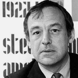
An interview with Erik Spiekermann at p98a
18.09.2017We just like to print — one can find the statement on the spreads of the journal PAPER, which Erik Spiekermann publishes with a small team of type-enthusiasts at the letterpress workshop p98a. At 70 years of age, having stepped down as chairman at Edenspiekermann and switched between FontShop to p98a—after the acquisition by Monotype in 2014—he doesn’t seem to be retired (although he mentions the word repeatedly). -
 Interview
An interview with studio NORM
24.07.2017Back in 2016, NORM Studio gave a lecture at the Serebro Nabora conference in Moscow. It was a case-study presentation with the main focus on type design. Looking closely at the works, one could find oneself in a world somewhere between their Swiss predecessors’ experience: such as Adrian Frutiger’s systematic attitude to type design and Max Bill’s mathematical way of visual thinking. -
 History
An interview with prof. Gerd Fleischmann about Bauhaus
7.02.2017Professor of typography, author and educator Gerd Fleischmann talks about the school Bauhaus phenomenon, its time, masters and typographical peculiarities of that period. “When I became aware of Bauhaus back in 1955, Bauhaus promised freedom. For me, it means mostly freedom.” -
 Cyrillic
A Look at the Letter б
8.06.2016This is the first in a series of columns on letters from the Cyrillic alphabet. What can we say about a letter when we look at it? Only that its form implies an infinite number of variants. But what happens when we compare a letter with similar characters in a type system? The letterform begins to make sense. Type designer Gayaneh Bagdasaryan shares her opinion on shaping one of the trickiest letters in our alphabet. We should add that every professional has gone through much suffering over many years of practice to come to these conclusions, which means that they are subjective and can be the subject of debate. -
 Books
BooksFive Books about a Restless Typographer
27.04.2016In March 2013, Unit Editions published a small book that shed light on the life and work of Dutchman Jurriaan Schrofer (1926–1990), a versatile designer little known outside his own country. His designs for photobooks and corporate identities were innovative, and he helped to organize the design community and elaborate state policy regarding the creative industries. At the peak of his career in the 70s, his bizarre experimental approach to the construction of typefaces and complex rhythmic compositions based on them set him apart. -
 History
The Trajan letter
in Russia and America5.02.2016Maxim Zhukov shares his views on the role of the classical capitalis monumentalis, as exemplified by the inscription at the base of the Trajan’s column in Rome (113 CE), in the history of Soviet print, graphic and type design, and architecture. Typefaces originally designed for setting languages using Latin alphabet often get adapted for Cyrillic and other scripts. What makes the task of their “cyrillization” easier is the presence of many letters in both alphabets that share similar forms, even if those glyphs relate to different characters. Zhukov also elucidates the process of developing a Cyrillic version of Adobe Trajan Pro 3 and Adobe Trajan Sans he was invited to assist in. -
 Interview
Now we are talking.
Interview with Typeradio2.12.2015Typeradio is the radio channel on type and design. Since 2004 the archive of the internet radio stream keeps growing and counts at the moment nearly three hundred records of interviews with design professionals. This time Typeradio (Liza Enebeis and Donald Beekman) answers to questions from Ilya Ruderman at the type conference Serebro Nabora, September 2015, Moscow. -
 Interview
Interview with Alexandra Korolkova
2.11.2015Since 1982, the Association Typographique Internationale (ATypI) has awarded the Prix Charles Peignot, named after the organisation’s first president, to a designer under the age of 35 “for an outstanding contribution to type design”. In 2013, Alexandra Korolkova won the prestigious award. -
 History
Solomon Telingater:
Standardisation
of Alphabetic Graphemes10.08.2015I am neither a scientist nor a semasiologist nor a philologist—my field is book design; I am also engaged as a type designer. Questions arise in my work which are not directly related to my profession. It may, therefore, be self-evident that my attempts to express an opinion about some of these problems may lead to certain mistakes since I am not sufficiently proficient in all of the complexities these problems involve. In spite of this, I should like to deal with one of these problems in a very general way—simply as an idea—in the hope that it will be taken up, corrected, and refined by the appropriate specialists. -
 Interview
Interview with Ilya Ruderman
19.06.2015I consider myself to be a practicing type designer who is less focused on the historical basis of his work and more interested in trying to create something relevant and new I take up projects on the condition that there is a possibility to come up with something unique that could contribute to a certain part of type heritage or world culture in general. Although it probably sounds too presumtuous… -
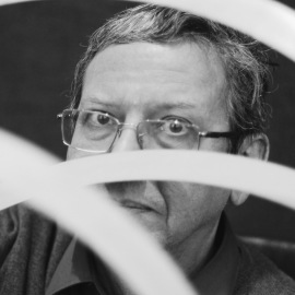
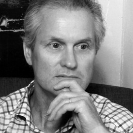
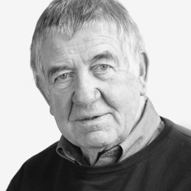
 Interview
Interview with Gerard Unger
13.05.2015I’ve always been very curious, and I think curiosity is a very fundamental Dutch quality. When you make a design, the first question you ask when you’ve made it is: What else can I get out of this? Is there anything more? Is there anything beyond what I have done so far? So that was another thing that I’ve learned in the 60s as a student: never be satisfied with what you can do, but always try to get a bit more out of yourself and to experiment. I think this is what I have in common with many of my Dutch colleagues. -
 Types
TypesType Journal’s Top
Cyrillic Fonts of 20148.04.2015Our Top-10 Cyrillic Typefaces of 2013 published last year sparked a huge interest and until now this publication is one of the most read. The past year showed that the number of great Cyrillic typefaces is growing constantly. More than 350 type projects with Cyrillic went in for the Modern Cyrillic 2014 competition. But only a tiny part of this impressive number was released on the market. Most of the projects, including those created by brilliant masters, unfortunately remain beyond designers’ reach. -
 Interview
Serebro Nabora: interview
with Gayaneh Bagdasaryan15.08.2014I was going to a Ukrainian type event, and I was suddenly struck by the thought that here, in Russia, there's nothing similar, while there are a number of such events in Ukraine. I found this so unfair and even hurtful that I thought, “I have to fix this—right now, today”. -
 Interview
Masha Doreuli: I learned
to make decisions quickly5.06.2014A successful text typeface to me is the one in which both the character set and the family structure are well organized. That’s what we started our project in the Netherlands with. Even using just a few letters, you can decide on which exact styles are necessary. After all, even a small detail affects everything else. You have to start with a broad overview: what’s going to be part of the family, and how the styles are going to work with each other. -
 Interview
Gerry Leonidas on teaching typeface design
27.03.2014Typefaces do not exist in a vacuum: they take form and meaning because they are responses to many other typefaces that exist already, and to changing conditions of use. Good research skills, and a sufficient understanding of typographic history and practice, are essential. -
 History
Towards an open layout:
A letter to Volodya Yefimov23.02.2014In Soviet times, with the “type assets” put on special register by the KGB, the development of typography had been cut short. Like sex, typography had no place in USSR. At the same time, with the spread of hand-lettering the book designers developed a unique, exquisite “feeling of command” of type, and drawing it became an intimate instrument of self-assertion. -
 Types
TypesType Journal’s Top
Cyrillic Fonts of 201311.02.2014Annual roundups are common in many fields, including typography. They allow us to observe trends, review what has been accomplished, and compare it to the expectations. To this end, the reviews ought to be conducted with regularity. This has not been the case with Cyrillic font design roundups so far. Results of a few occasional type design competitions have served as the closest substitute in Russia, falling short of creating the big picture one could only see on a yearly basis. Our first annual list below seeks to remedy the situation. -
 Solo
SoloKis Cyrillic. The second part
24.01.2014The typefaces of Hungarian genius Miklós Kis (1650–1702) are the most striking example of Dutch old-style Antiqua. In this second part of the essay, Vladimir Yefimov gives a detailed account of how was created Cyrillic script for the Bitsream's Kis—a contemporary version of Miklós Kis's typeface. One of the most beautiful Latin typefaces of the great Russian ruler's era, in the author’s opinion, gives the answer to a very reasonable question—Could a Petrine typeface take a different form? -
 History
Civil Type and Kis Cyrillic
3.09.2013Civil Type and Kis Cyrillic is Vladimir Yefimov’s essay on the history of Civil Script and the creation of modern Cyrillic type based on historical forms. Today, 10 years after its release, the article is not only still relevant, but more capable than ever of rousing both professionals and those readers who are interested in the history of Civil Type. -
 History
Between the Circle and the Square
July 2018A chapter from the book ‘The Two Faces of One Revolution’ Vladimir Krichevsky and Alexey Dombrovsky.
-