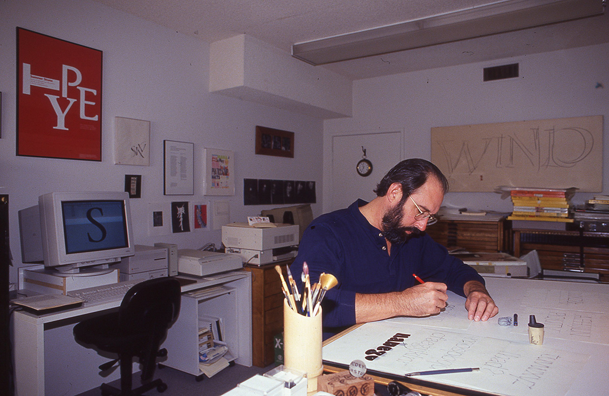
 he etymology of type is no less important, but much less studied than the etymology of language. Due to the popularity of Sumner Stone’s typefaces, released at the dawn of the digital age, his name has almost become a common noun, but the world-renowned designer and founder of the Adobe Type Department is about much more than his early successes. Before us is a subtle designer, serious researcher of type history, calligrapher, teacher and a fascinating conversation partner. Especially for Type Journal, Sumner Stone talked to Misha Beletsky about type techniques, life, work, teaching and his plans.
I would like to talk a little bit about how you got into this business of calligraphy and type design. I heard you studied with Lloyd Reynolds.
Lloyd Reynolds was certainly the person who captured me, when I first arrived on the campus at Reed College, which is a small liberal arts college in Portland, Oregon. One of the things that you couldn’t miss was the fact that when you went in to the cafeteria, it was covered with posters, which were obviously hand-made and hand-lettered. I had no experience of calligraphy before that. Zero. I didn’t even know what calligraphy was. This is in 1963. I soon learned that this was all the work of his students that were students. When you got to be one of the top two or three people, then you would make these banners. Most of them were on butcher paper, announcing events on campus and whatever was going on. I very quickly was introduced to the fact that this was an important part of student life and I had a couple of friends who got very into it as undergraduates. When I graduated, I took a summer class from Reynolds. It turned out to be the last class he taught at Reed College. He went on teaching at the Museum Art School in Portland and some other places, gave workshops and so on. This class was where he turned over the baton, so to speak, or the pen, to Robert Palladino, who has been in the news in the last year because of Steve Jobs. He was the one that Jobs studied with at Reed College. That was after my time, some years later.
It’s interesting that you both picked it up from there.
Indeed. I didn’t work closely with Steve Jobs, but I was involved in the process of choosing the typefaces that were going to be in the second batch of things that were on LaserWriter. The first was Times Roman, Helvetica, Symbol, Courier and so on. Then we had to choose the next ones. That turned out to be a kind of wrangle. People had all sorts of different opinions. We had the guys from ITC in there, we had Linotype, everybody had what they wanted to be in there. It was a big scramble, so I was involved in that. I sat in his office and participated in the debate about that. I do think that through that influence with both him and myself, that Reynolds had a definite impact on what we’re now seeing everyday on computers.
Another student of Reynolds is Chuck Bigelow: he and Kris Holmes, who was a student of Palladino’s, designed the typeface that is the resident typeface on the Mac. You see that everyday. So he’s there, Reynolds is there. There’s this renewed interest in typography and letterform, because of the personal computer, because of the fact that people have their hands on the letters now and have to make choices about them. The interest in type design has really mushroomed in the last, I would say, even five years. As part of this explosion of people making typefaces, because it’s so accessible now, I had no idea that would happen on the scale it has happened. I thought it would happen, but I did not predict the incredible volume of letterforms that are being made.
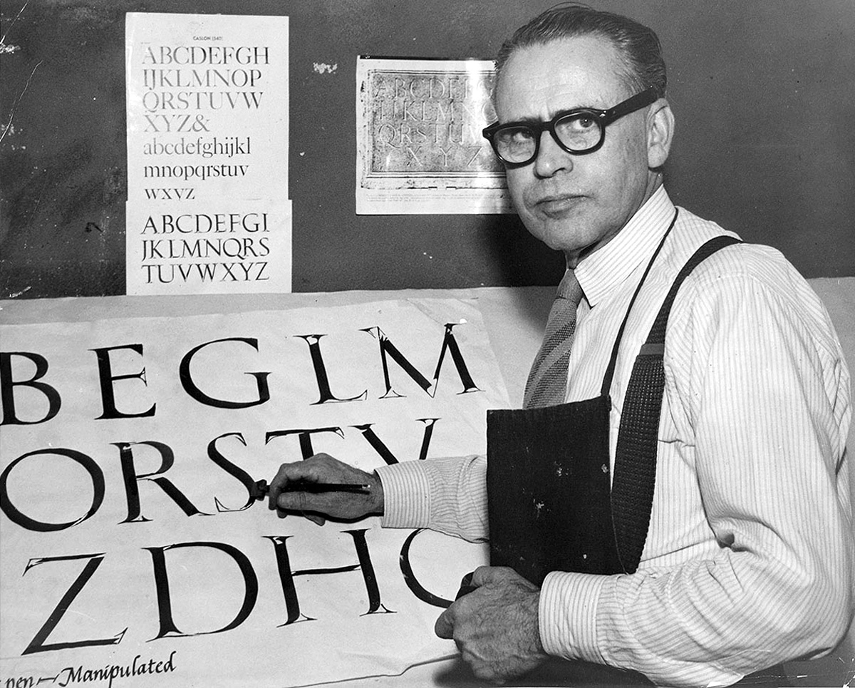
Artist and calligrapher Lloyd Reynolds (1902–1978) in 1961. For Reed College in Portland, Oregon, known for its academicism and emphasis on theoretical studies, Reynolds was a landmark figure. He influenced several generations of students, though most of them did not intend to dedicate their lives to type art and calligraphy. Sumner Stone was an exception – his lessons with Reynolds were a turning point for his career choice. According to Stone, Reynolds evaluated students’ work not only on the accuracy of their forms and details, but mainly from the perspective of an artist who is obliged to breathe life into the form. Life movement was Reynolds’ favourite expression, against which he verified both his own and students’ creative work•Photo: Reed Magazine.
The first explosion happened twenty years ago. Everybody ran to make fonts with Fontographer on the Mac and then that wave subsided a bit. Now, we’re on the peak of another wave. Why is that? What is happening now?
Well, I think that this happens in people’s personal experience with many things. With food, for example, if you start exploring things to eat, then inevitably as you put your attention on it you become more sophisticated about that, you make choices that are more refined, you eat things that taste better and so on. You acquire tastes, you may even wonder where your food comes from and you find out about that. This is a similar situation where, as people have become more interested and actually done work to make things themselves, they get hooked, and they want to know more about it, they want to know where the things come from, what the whole background is. So I think a lot of this current interest is people having gone through an initial stage of being caught by this whole world of making letterforms, in particular making type, making fonts, and now we find a large group of people, most of whom are already designers, the ones I get as students, who really want to know: Where does it come from? How do I make it?
On the surface, we’ve taken letters for granted for so long that we don’t really know – even people who are relative experts in making type don’t necessarily know a lot about the background of it – where it came from, why it looks the way it does. Really, the only period in our Western history where letterforms were kind of a focus was in the medieval period, and that was all centred on Christianity and making these incredibly elaborate books. Now, when we look at those books and when people write about them, they’re completely focused on the images. Read any book about illuminated manuscripts and most of what you see is just pages of the illuminations. But that’s beginning to change. I think people are realising that this is also an art form. This is something that is very sophisticated, is very deep, and there is a great deal of knowledge that we could have about it if we put some resources into that.
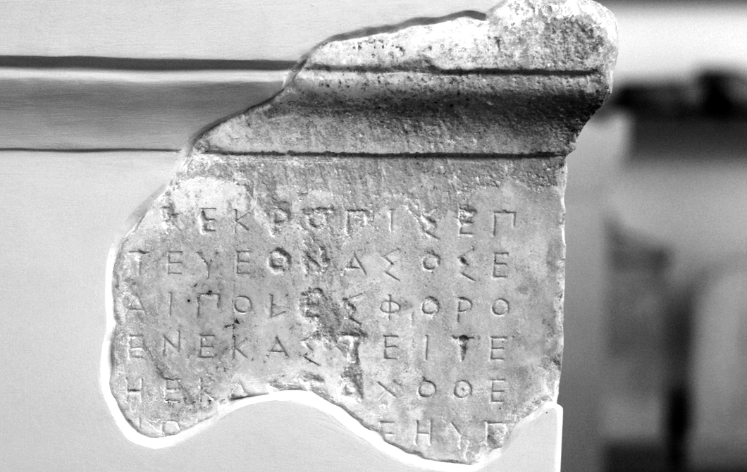
That’s really what we have, that’s what letters are made of – other letters. There are cross-cultural influences. For example, it appears as though the serif probably originated sometime in the late 4th century BC in Greek colonies near the Turkish coast, as an ornamental thing that was referring to Persian culture. Alexander was conquering Persia and he loved it, he wore their costume after a while. In Stanley Morrison’s book Politics and Script you see the first known inscription with serifs on it – Greek letters – in 334 BC. That was on a temple dedicated by Alexander. In order to understand what we’re looking at, we have to go back a long way. Letterforms are incredibly resilient, they last for long periods of time and they keep getting revived. The Trajan letter, which is now this typeface that is everywhere, has not been consistently a popular thing throughout history. It’s been noticed, but actually right now is its most extensive use since the original letter at the end of the 1st century BC to the beginning of the 3rd century AD. So it’s interesting to reflect on these things.
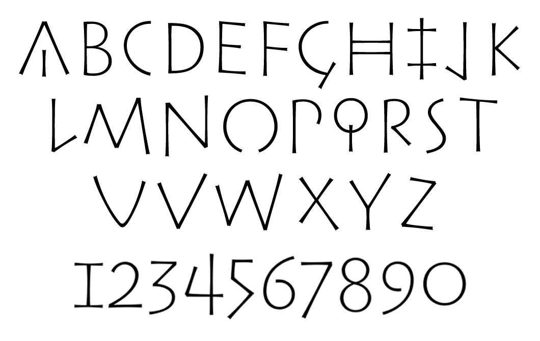
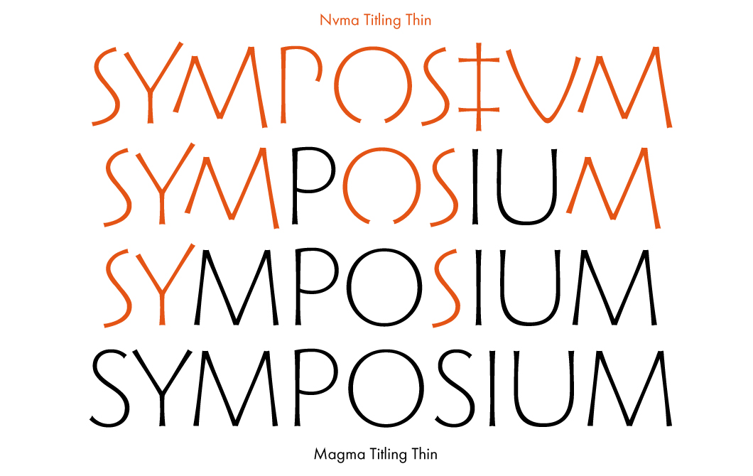
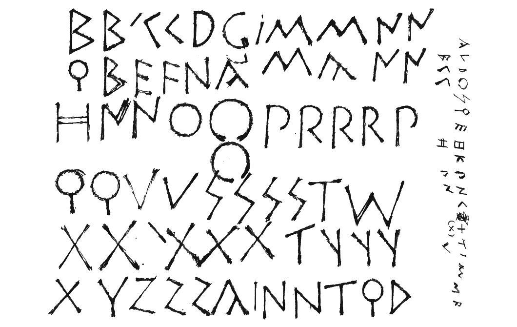
Nvma Titling (2014) is Sumner Stone’s attempt to rethink Roman inscriptions of the Early Republic era (509–287 BC). Most of the capital letters in ancient Rome were borrowed from the Etruscans, who in turn adopted the Greek alphabet (the letter G came into being later, in the 3rd century BC, while the letters J, U and W emerged in the Middle Ages). Early Roman writing was linear (in contrast to the well-known monumental letters of the Empire era). This type of writing is different from cuneiform and the Egyptian Hieratic and Demotic scripts in its forms: the letters, created with a sharp tool, had little contrast between thick and thin strokes. Modern sans-serif typefaces have preserved many features of this lettering. Nvma does not recreate the historical forms exactly (for example, the shape of the letter I was inspired by the character Zeta from the Etruscan alphabet), but this was never part of the designer’s plans – Sumner Stone found it more important to convey the original rhythm and historical spirit of ancient Roman inscriptions. As Stone says, when he first saw them in the City Museum of Gubbio, Umbria in the early 90s, he was struck by their modern appearance, as if they were written in the 21st century, not the 2nd century BC.
Nvma was created in parallel with the Magma II family – its general design, proportions and weight match those of Magma Thin. Here, Sumner Stone’s first sketches for Nvma, drawn in one night, are shown alongside digital samples of signs and fragments with Ancient Greek inscriptions on stone from the collection of the Epigraphical Museum in Athens. The typeface was named in honour of the legendary second king of Rome, Numa Pompilius, who was famous for his peacekeeping missions.
I’d like to know how your experience and background in sciences affects your being a designer – helps, or maybe hinders, your design approach.
Well, I did study mathematics. And I studied social science. The reason that I studied Sociology when I was an undergraduate was because my father was a sociologist. And Sociology is not a thing you learn about in school until you get to college. Maybe you do these days, I don’t know. But when I went to high school, there was no Sociology. The only reason I knew about Sociology was through my father. I think that really, I studied it because I wanted to understand him, more than I wanted to understand Sociology, as it turned out (laughs).
Was there any parental pressure to follow in the steps of your father?
I’m sure that there was that element there. I had it in my head that I would be a university professor, do something like what my father did. So that’s what I studied as an undergraduate. Maybe this is part of whatever my relationship to my father was – somehow liberation from that tie in a certain sense – and I think that the whole social science approach got put in place for me. I realised that it was an interesting part of our general knowledge, but not everything, by any means, and that these folks who did it were hung up on certain things and seemed to be stuck in a lot of ways. I have more respect now for the discipline than I did when I finished studying it as an undergraduate. I was somewhat disappointed. I became more interested in psychology, actually, in my later years at Reed College. After I graduated is when I started to become interested in calligraphy. So I took this class from Reynolds, I started taking some classes. I stayed in Portland – I actually was in San Francisco briefly – and I took classes at the Museum Art School, drawing and painting, and threw pots and stuff like that. I did calligraphy obsessively. I had this wonderful job which was a half-time job working for the post office. I sometimes wish I still had that (laughs).
That was a good career.
(Laughs) It was perfect, yeah. So, I got to do a lot of calligraphy. This was the end of the sixties,‘68, ‘69. I moved back to Portland after that, and that’s when I started taking classes at the Museum Art School in Portland. And then I got a job working for Hallmark Cards. I saw, during the class that I took from Reynolds, he showed a film of Hermann Zapf working, and this film had been made at Hallmark. You can see it online. It’s quite wonderful. It starts out with him doing these flourished letters on a chalkboard. Just spectacular, I’d never seen anything like that.
The Art of Hermann Zapf — a short film about calligraphy and writing.
Reynolds was a perfectly good calligrapher, and I had a short brush with Edward Catich then, too. Catich was the man who investigated and learned how to make these imperial Roman letters. Reynolds got him to come to the campus and carve the names of the buildings in stone. I witnessed some of that, even though I didn’t really know what I was watching at the time. So, yeah, I just became captured by calligraphy, by making letters, went to Hallmark.
At Hallmark is where I became aware of typeface design as a thing. They had purchased very recently a phototypesetting machine, not quite at the beginning of the phototypesetting era. They had this very clever fellow who had figured out how it all worked. They had photographic grids for the machine, so they could typeset the Hallmark proprietary alphabets, a lot of which were scripts of course. In my era, the way things worked was that the inside of the card, which was called the “sentiment”, was most often set in type. The outside of the card, which had some sort of “Happy Mother’s Day” or whatever, was called the caption. The caption was hand-lettered, so there was a small group of people who worked on converting these hand-lettered styles that people had established. These were people who had been at Hallmark a long time and had developed their own style. On the typesetting machine they made them into fonts and set them. One of the most awful jobs was that once a week, if you couldn’t avoid it, you got what’s called “retouch” for at least half a day. You sat there with a lettering brush – a little watercolour brush, very small – and white paint, and you went through and dotted all the little specks from the dirt in the typesetting machine. Then, if there were breaks in the letters or something, then you had to get out the black.
Zapf was very sympathetic with the lettering artists. He acted like, and I think he was very sincere, that he felt like one of us. He knew the low status we had as lettering artists, and he was very sympathetic. He was very much interested in teaching us technique: shortcuts, things that he did in his work, and it was wonderful to get that time with him.
Zapf came from an environment at Stempel where he had a lot of help. He had August Rosenberger, who was cutting punches for him and cutting punches for his letter designs. He also had people who were very, very skilful making the type. So if he had something that wasn’t quite working at 12 point, then he had people who could tell him or fix it themselves. This fellow, Myron McVay was his name, was playing that role at Hallmark and converting his drawings into fonts. Not a trivial task, I’m sure.
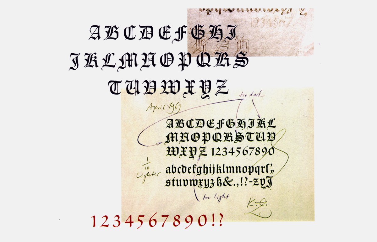
One of Hermann Zapf’s (1918–2015) works for Hallmark – sketches of the typeface Hallmark Textura with comments•Source: Hermann Zapf at Hallmark Cards by Steven Heller.
How much time did you really get to spend with Zapf?
He would come for like a week, ten days, and he would hang out in the lettering department all day. He would go around to each person and he wasn’t in a big hurry or anything. He would look at your work, he would make suggestions, he would draw stuff. When you’re with a master like that and you get to experience them working, you get something that I think you can’t really get in any other way. That was always my experience in taking workshops and so on – the most important thing to me was being right there when they made the letters and watching them do it.
Once he was in a booth next to me, working on a personal stationery design for the president of the company, Don Hall, the son of one of the two brothers who founded the company. All it had was his name in Optima, in all caps, and Zapf spent a whole morning doing this. He would put the thing on the floor and get up on the chair to look at it. I was really impressed by the care that he gave to this apparently very simple task. The design process was very thoughtful and deliberate. Not rushed. So that was another lesson.
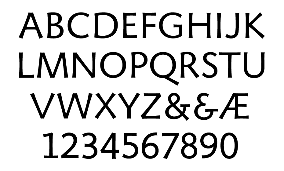
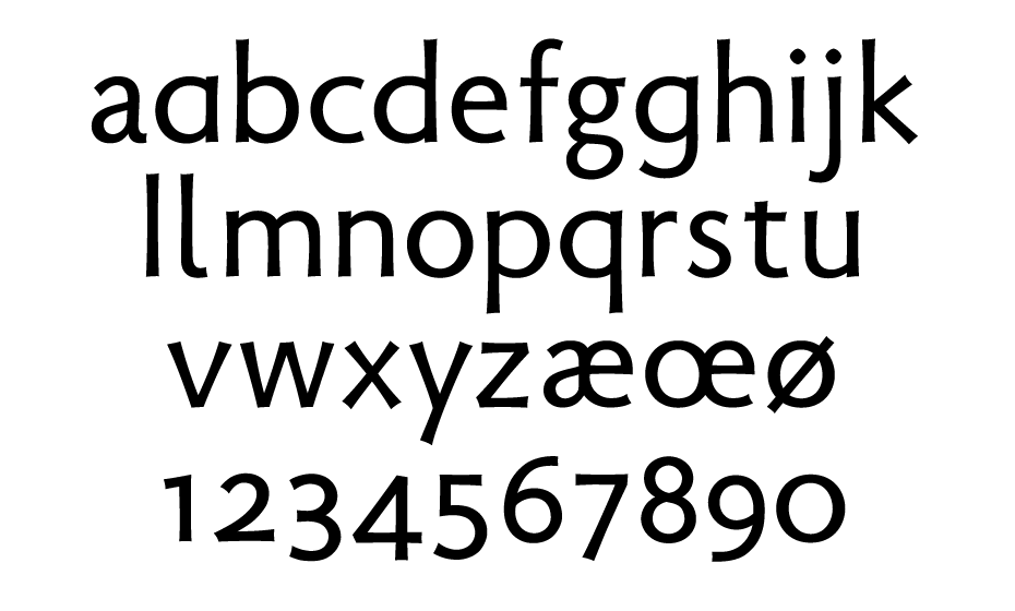
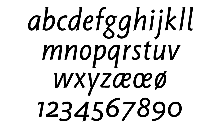
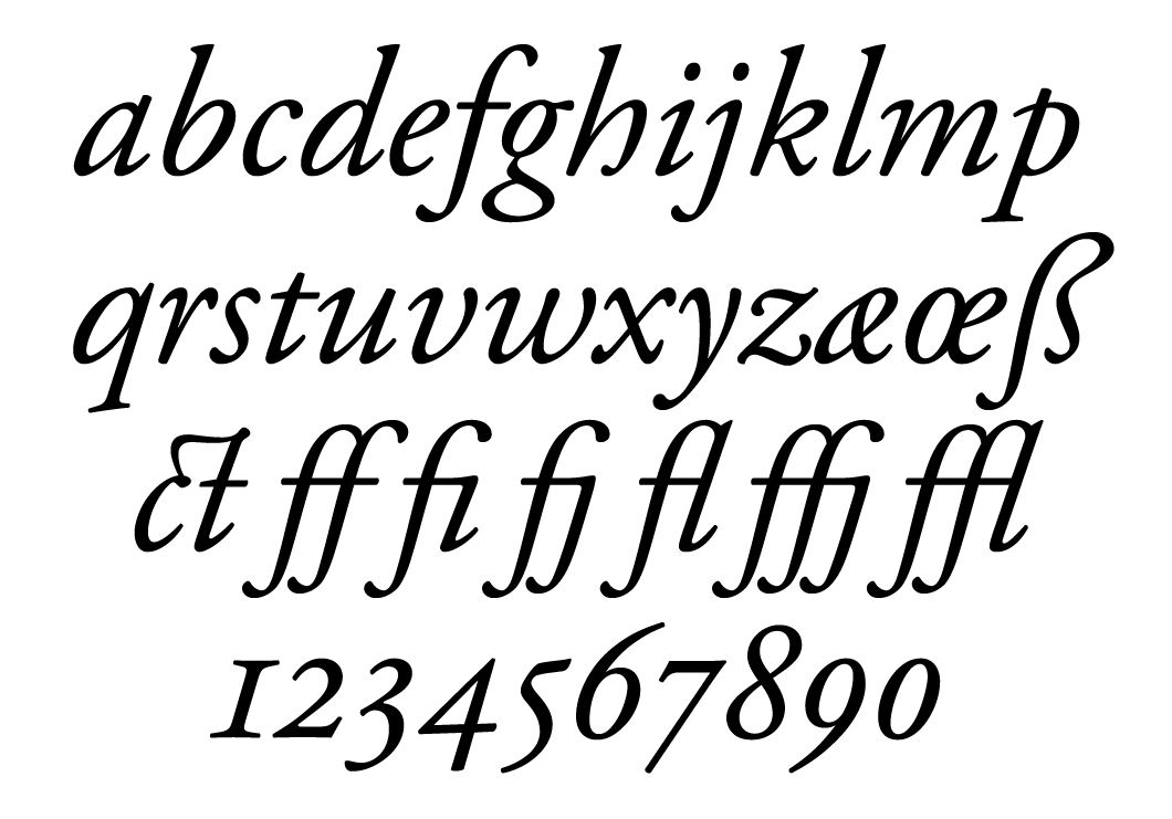
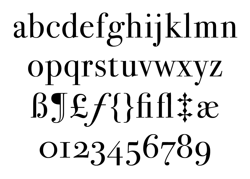
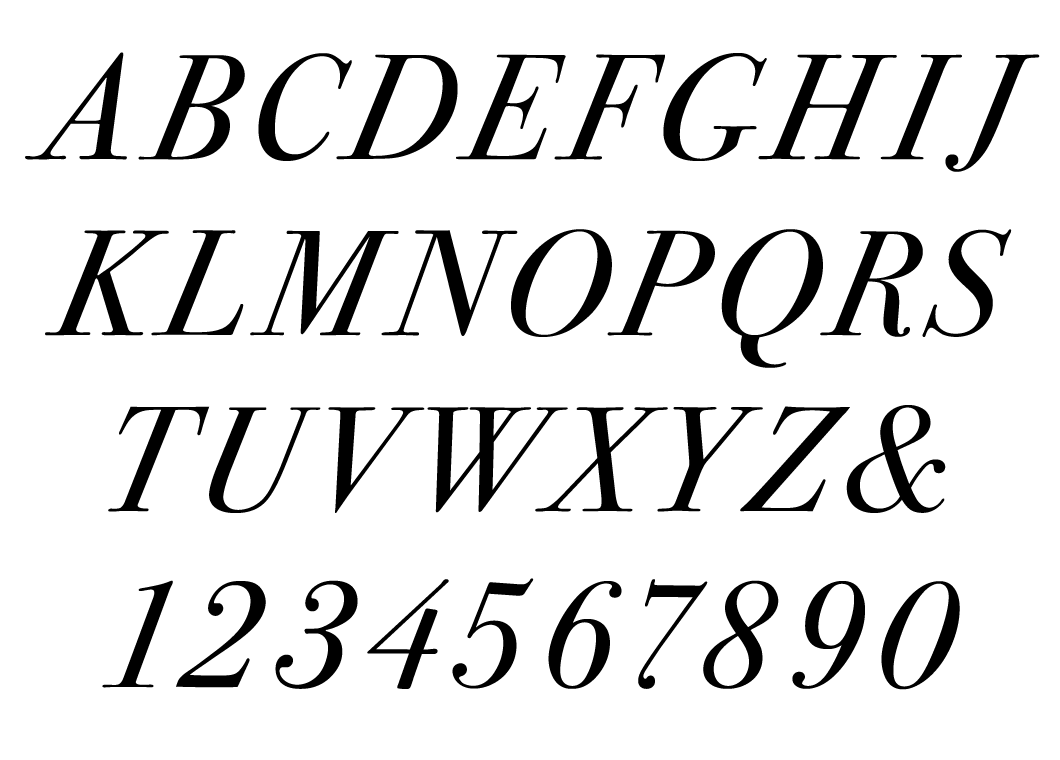
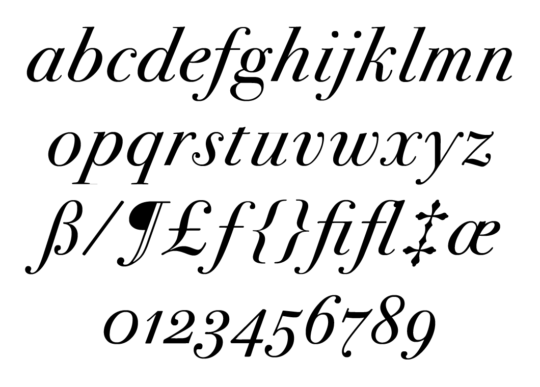
Magma II is a lineal humanist typeface that can be looked at through several different lenses. On closer examination of the characters, one has the impression that it is primarily a display typeface for headlines, but a solid text composition shows that Magma II forms a fluid and readable texture in small point sizes. Sumner Stone emphasises that typefaces such as Robert Hunter Middleton’s Stellar, Syntax by Hans Eduard Meier and Hermann Zapf’s Optima served as sources of inspiration for this project. There is nothing coincidental about the open, strongly modulated character forms in the type family, which are based on the proportions of Renaissance-era serifs. Vertical lines are drawn dynamically with reverse entasis and their ends bend slightly inwards (these details come to the fore when working in large point sizes). Some of the alternative characters are noteworthy: the closed form of the lowercase a, the single-storey g and the l with a rounded “foot”. Compared with the first version, Magma II has been expanded to five styles, from light to bold, and contains small caps and number sets for all occasions. These styles are equipped with four elegant italics of rather narrow proportions that are very dynamic and make direct reference to broad-nib handwriting practice: it is worth paying attention to the intersections of the bowls and stems in the lowercase a, d, q, b and p, as well as the finely balanced characters with diagonals and the Old-style figures.
Magma II is a lineal humanist typeface that can be looked at through several different lenses. On closer examination of the characters, one has the impression that it is primarily a display typeface for headlines, but a solid text composition shows that Magma II forms a fluid and readable texture in small point sizes. Sumner Stone emphasises that typefaces such as Robert Hunter Middleton’s Stellar, Syntax by Hans Eduard Meier and Hermann Zapf’s Optima served as sources of inspiration for this project. There is nothing coincidental about the open, strongly modulated character forms in the type family, which are based on the proportions of Renaissance-era serifs. Vertical lines are drawn dynamically with reverse entasis and their ends bend slightly inwards (these details come to the fore when working in large point sizes). Some of the alternative characters are noteworthy: the closed form of the lowercase a, the single-storey g and the l with a rounded “foot”. Compared with the first version, Magma II has been expanded to five styles, from light to bold, and contains small caps and number sets for all occasions. These styles are equipped with four elegant italics of rather narrow proportions that are very dynamic and make direct reference to broad-nib handwriting practice: it is worth paying attention to the intersections of the bowls and stems in the lowercase a, d, q, b and p, as well as the finely balanced characters with diagonals and the Old-style figures.
Magma II is a lineal humanist typeface that can be looked at through several different lenses. On closer examination of the characters, one has the impression that it is primarily a display typeface for headlines, but a solid text composition shows that Magma II forms a fluid and readable texture in small point sizes. Sumner Stone emphasises that typefaces such as Robert Hunter Middleton’s Stellar, Syntax by Hans Eduard Meier and Hermann Zapf’s Optima served as sources of inspiration for this project. There is nothing coincidental about the open, strongly modulated character forms in the type family, which are based on the proportions of Renaissance-era serifs. Vertical lines are drawn dynamically with reverse entasis and their ends bend slightly inwards (these details come to the fore when working in large point sizes). Some of the alternative characters are noteworthy: the closed form of the lowercase a, the single-storey g and the l with a rounded “foot”. Compared with the first version, Magma II has been expanded to five styles, from light to bold, and contains small caps and number sets for all occasions. These styles are equipped with four elegant italics of rather narrow proportions that are very dynamic and make direct reference to broad-nib handwriting practice: it is worth paying attention to the intersections of the bowls and stems in the lowercase a, d, q, b and p, as well as the finely balanced characters with diagonals and the Old-style figures.
Magma II is a lineal humanist typeface that can be looked at through several different lenses. On closer examination of the characters, one has the impression that it is primarily a display typeface for headlines, but a solid text composition shows that Magma II forms a fluid and readable texture in small point sizes. Sumner Stone emphasises that typefaces such as Robert Hunter Middleton’s Stellar, Syntax by Hans Eduard Meier and Hermann Zapf’s Optima served as sources of inspiration for this project. There is nothing coincidental about the open, strongly modulated character forms in the type family, which are based on the proportions of Renaissance-era serifs. Vertical lines are drawn dynamically with reverse entasis and their ends bend slightly inwards (these details come to the fore when working in large point sizes). Some of the alternative characters are noteworthy: the closed form of the lowercase a, the single-storey g and the l with a rounded “foot”. Compared with the first version, Magma II has been expanded to five styles, from light to bold, and contains small caps and number sets for all occasions. These styles are equipped with four elegant italics of rather narrow proportions that are very dynamic and make direct reference to broad-nib handwriting practice: it is worth paying attention to the intersections of the bowls and stems in the lowercase a, d, q, b and p, as well as the finely balanced characters with diagonals and the Old-style figures.
Magma II is a lineal humanist typeface that can be looked at through several different lenses. On closer examination of the characters, one has the impression that it is primarily a display typeface for headlines, but a solid text composition shows that Magma II forms a fluid and readable texture in small point sizes. Sumner Stone emphasises that typefaces such as Robert Hunter Middleton’s Stellar, Syntax by Hans Eduard Meier and Hermann Zapf’s Optima served as sources of inspiration for this project. There is nothing coincidental about the open, strongly modulated character forms in the type family, which are based on the proportions of Renaissance-era serifs. Vertical lines are drawn dynamically with reverse entasis and their ends bend slightly inwards (these details come to the fore when working in large point sizes). Some of the alternative characters are noteworthy: the closed form of the lowercase a, the single-storey g and the l with a rounded “foot”. Compared with the first version, Magma II has been expanded to five styles, from light to bold, and contains small caps and number sets for all occasions. These styles are equipped with four elegant italics of rather narrow proportions that are very dynamic and make direct reference to broad-nib handwriting practice: it is worth paying attention to the intersections of the bowls and stems in the lowercase a, d, q, b and p, as well as the finely balanced characters with diagonals and the Old-style figures.
How did you get from Hallmark to Adobe? What happened in between?
When I left Hallmark, I moved to Sonoma, California, north of San Francisco in a rural setting, and opened a design business. I mostly did work for the wine industry which was there. I taught calligraphy both at San Francisco State University and also at the University of California Extension in San Francisco. I did quite a lot of teaching and also taught workshops. I was one of the founders of the Friends of Calligraphy, which was one of the earliest calligraphy groups in the U.S. I really liked the teaching. I had a young child at that point, started looking around, but my wife did not want to leave California, which I sympathised with.
I thought maybe I should go back to school and I should study something that isn’t graphic design, but that I liked and that I could teach. One of the things I really liked as an undergraduate was mathematics, so I decided I was going to study it and teach it. I went back to graduate school – Sonoma State, which was the closest place to me. I had wonderful teachers there. That’s when I learned how to program computers, just as a kind of fallout from studying math. I got my master’s degree, wrote my thesis about a thing that was closely related to non-Euclidian geometry. Then I taught for a while in the community college that was close to me and also at Sonoma State: I taught business majors how to do this optimising math. That was extremely discouraging – at the community college I was teaching them algebra and geometry, but all these people hated math and had to pass in order to get their degree. It’s kind of the worst possible teaching situation you can have. I would say the absolute opposite of that is what I had in teaching type design at Cooper, where I’m getting students who are professional people, who are really interested and really want to know the subject.
I enrolled in a PhD programme for a year at UC Davis, which was also close to me, and I realised that there were no permanent jobs. So I started looking around at what kind of jobs there were. I knew that typesetting was becoming computerised. This is already in the late 70s, by the time I’m really getting into it. There was one company in California that did digital typesetting and that was a company called Autologic. They were really the first successful manufacturer of digital typesetting machines, which were very fast, very expensive and depended on a very high resolution cathode ray tube (the type was stored as bitmaps at 720 dpi). They were very successful and sold these machines to almost every daily newspaper in the U.S., then in Europe and to everybody else who needed to print things fast, such as cheque printers. Then they wanted to make a commercial typesetting machine to compete with Compugraphic and Linotype. They realised, after they had the machine all designed and everything, that they needed type (laughs). Because the type they had made for the newspapers wasn’t going to cut it.
Autologic hired me to be in charge of the department where they were making the type for the newspapers. The way they made the type was that every new, big newspaper or newspaper chain would photograph the type that was in the paper, scan it, and digitise it. I won’t even describe to you how silly that was. Anyway, I took the job, I moved my family down there and proceeded to make type. The company purchased an Ikarus system, which was this software designed by of a German nuclear physicist Peter Karow, who pioneered the idea that instead of bitmaps you could use outline representations – spline representations, which we now call vector representations – of the character and then you could bitmaps from that for a particular machine. That was very early digital typesetting.
Phototypesetting (1930–1970s) was a bridge between the era of hot-metal composition and digital technology. The images of letters that served as a basis for the production of matrices were cut onto masking film. This film (Rubylith) was a coloured, transparent two-layer material, the upper layer of which could be scored with a knife. When the outline is complete, unnecessary sections of the colour layer are removed (cut and peeled away). The positive or negative image of the original on the backing is then left as the final representation of a character•Photo: Misha Beletsky.

Cathode ray technology (CRT, 1960s) represents a letter in the form of points (pixels). In his book Font Technology, Peter Karow describes the process of displaying a character on screen as follows: “To prepare typefaces for CRT systems, it was necessary to digitize analog artwork with a scanner. A graphics screen (display terminal) was used for reproducing the bitmap information of the scanned character. Optimization of character shapes, deleting or adding single pixels, was performed with bitmap editing programs”.

A pencil outline of a lowercase g prepared for digitisation and conversion into the Ikarus format (mid-1970s). The IK-format involves the abstraction of the outline – the letter is made up only of coordinates that define the start, corner, tangent or curve points. Its advantage is that this information can be provided using any method: Bezier curves, g-conics, quadratic splines, spirals or arc segments obtained through interpolation. Peter Karow calls his method “extra abstraction”•Photo: Dutch Type Library Flickr.
In the early 80s, John Warnock and Chuck Geschke at Adobe Systems developed the PostScript page description language for work with vector graphics. The language made it possible to open and print files on different devices regardless of their platform (if an interpreter was installed on it). Many manufacturers of phototypesetting equipment began to support the PostScript interpreter, and over time the language became a standard in the pre-press field. In addition, Adobe developed a specification for the support of fonts in this format.
At this point, were you designing fonts?
I was. I designed a typeface which was probably completely inappropriate for that place and never got produced there. It was a kind of Uncial-based typeface, not exactly like Hammer Uncial, but somewhat in that world. So I was drawing and I was still giving calligraphy workshops. But then I went to work for what was essentially a start-up company in Boston. They were making the machines that Bitstream used initially to digitise the type. They had written the software and used the same hardware that Camex used. Camex had a product that was a vector machine that was used for laying out display ads in newspapers, and they had a whole little business going for just that. The big mistake was that they wanted to design their own hardware.
In the middle of that year I was walking to work and passed a store window and there’s this little box with a screen – it was the first Mac. I went in and the guy gives me a little demonstration on the Mac and a lightbulb went on: these guys are not going to make it. They should not try to make their own hardware – that’s their mistake. I got to know the people at Bitstream, including Matthew Carter and Mike Parker, pretty well during that year. Mike even tried to hire me. At about the time I decided I was going to leave, I got a call from John Warnock, one of the two founders of Adobe. He describes to me that they need somebody to be in charge of their type-making program and asked if I’d like to come for an interview. I said “Yes, of course!”.
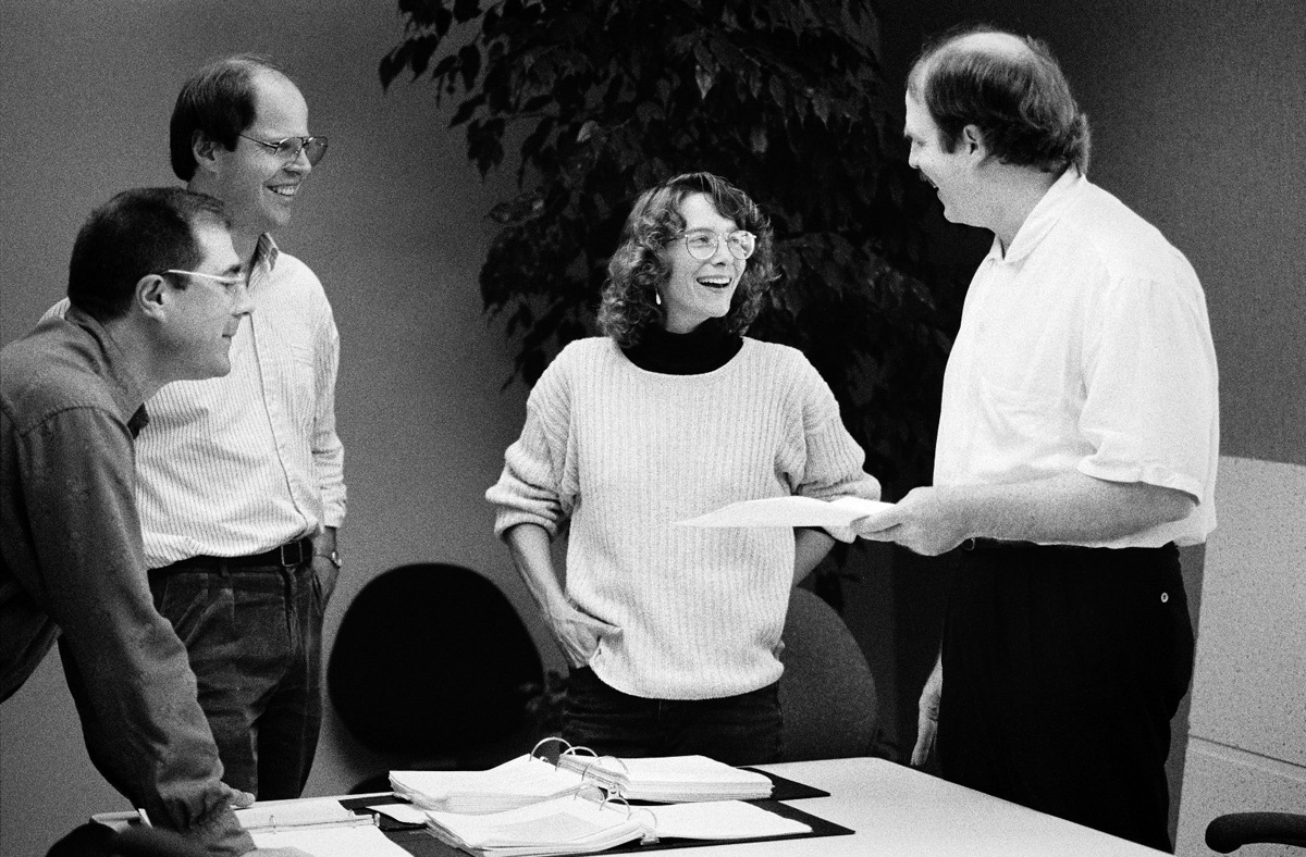
The Adobe design team, from left to right: Jim Wasco, Robert Slimbach, Carol Twombly and Fred Brady•Source: Stanford University.
Did they have PostScript at that point?
PostScript was the thing that they were selling. Their business plan at that point was to design an interpreter for the PostScript language for people who were manufacturing and/or distributing printers, laser printers in particular. So if you had a PostScript program, you send it to this board that was going to be built into their printer, it would then make a rasterized page for you with text and images. That was a very appealing thing for a lot of people and it captured the imagination of Steve Jobs, who made the deal to put this in the first LaserWriter printer. It’s interesting because they were so focused on the screen at Apple that the printing part really got left as kind of a poor cousin in the whole operation. It wasn’t until the Mac became successful that they realised that they really needed a high-end printer of some kind, because if you bought the Mac and then bought this really funky dot-matrix printer… (laughs). You could do New York and all of those typefaces that they had, but it was still a dot-matrix printer.
So Jobs got it immediately, he and Warnock hit it off, and that was the first big contract, which was a lot of money. That was right as I arrived there. They had made the deal with Apple before I arrived and when I got there, it was like “Okay, we’re going for it”. They had already put together the software for the very first version of the LaserWriter, but they were working on the next round. They had no fonts other than Times, Helvetica, Courier and Symbol, and they were pretty bad! What I told them when I went there was that I’d been involved in two companies where, basically, what people are doing is they’re just grinding up the old stuff and spitting it out in a new form. I was ready to do that if that’s what they needed, which they did, but I wanted to have resources to do new things as well. New things might turn out to be not completely original, but new versions of old things, certainly. My intention at that stage was to do original type designs, and I made that very clear to them. Unlike anybody else in the typesetting business that I had known up to that time, these guys were computer scientists. They had come from a research environment, they thought innovation was what everything was all about. They thought the fact I wanted to do this was great!
When I started out, I bought an oak drawing table and deliberately had it put in my office, to emphasise the fact that this was not going to all be done on a screen. That was taken note of, actually. I remember the guy who was the main hardware engineer coming in and saying “Hmm, tools of the trade!”. That was the beginning, and they were true to their word. They were very supportive of the whole effort. I think they did not really understand what they were in for: we got a lot of publicity, magazines and trade magazines published stuff about us. The last few years, going round and talking to various design departments around the country, I meet these people who were young designers at the time when all this was happening. They said “When you came out with the Garamond, that’s when we knew”. They knew that we were serious – Adobe Garamond was a very big deal. It was better than anybody’s Garamond that was around at the time. Then it was quite a ride at Adobe. It grew very quickly, the type was extremely successful. Part of that was because we were the only game in town for a couple of years.
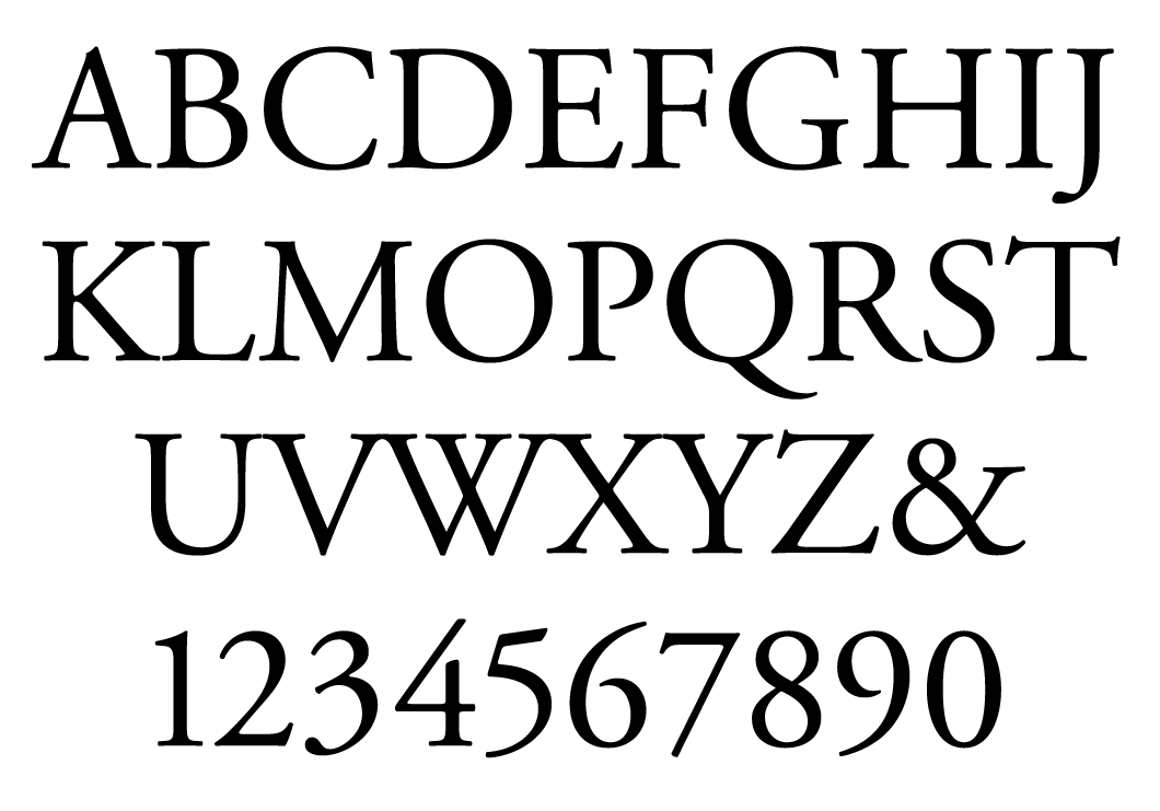
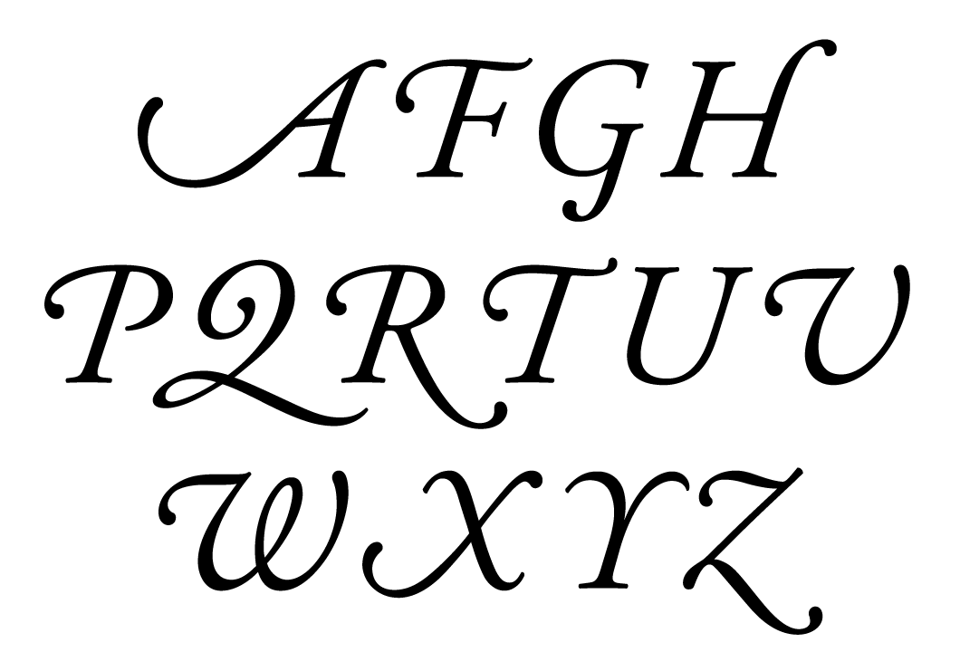
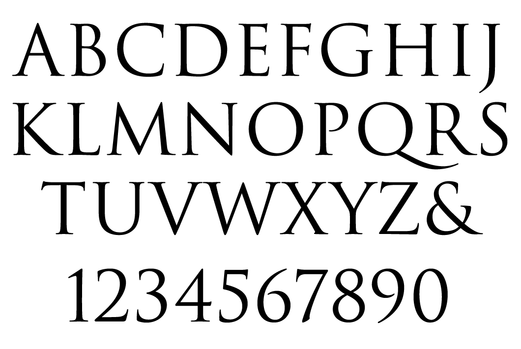
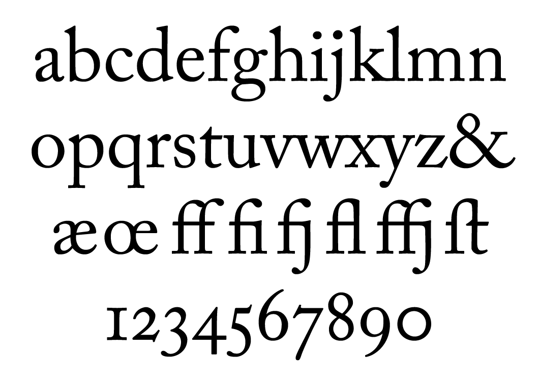
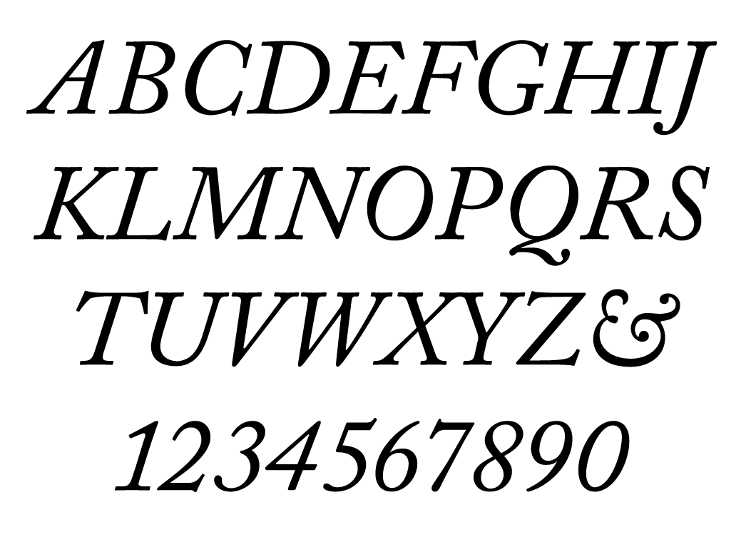
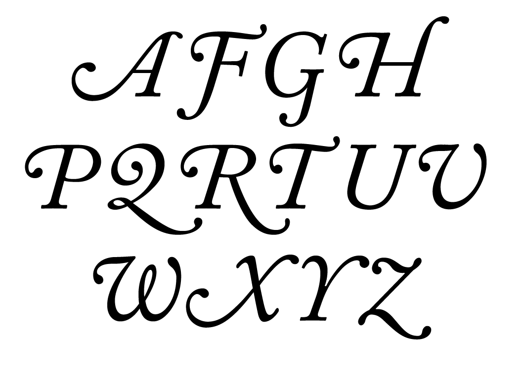
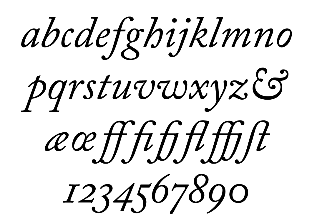
The main difference between Adobe Garamond, released in 1989, and its competitors with the same historical name is the diligent consideration of its forms, as close as possible to the original typeface designs of Claude Garamond and Robert Granjon. Sumner Stone, then head of the Adobe Type Department, always reminded his colleagues that “with historical revivals, you should go look at as much of the original material as you can and the place they were done to try to absorb as much as possible of the spirit of the letters”. Robert Slimbach was first given impetus to work on the typeface by a specimen of several styles completed by Garamond (Egenolff-Berner specimen, 1592). The typeface Vraye parangonne was chosen as an archetype for the Roman face, but there were still not enough materials, so Slimbach, Brady and historian John Lane went to the Plantin-Moretus Museum in Belgium, which to this day retains a huge collection of punches made by Granjon and Garamond. As a model for the Italic, Slimbach chose Granjon’s Saint Augustine, which was slightly smaller than Garamond’s Vraye parangonne. In addition, the museum’s collection inspired Slimbach to create additional alternative characters with swashes, ornaments, ligatures, small caps and Old-style figures. The modern version of Adobe Garamond Pro is shown here in its Regular and Italic faces.

The main difference between Adobe Garamond, released in 1989, and its competitors with the same historical name is the diligent consideration of its forms, as close as possible to the original typeface designs of Claude Garamond and Robert Granjon. Sumner Stone, then head of the Adobe Type Department, always reminded his colleagues that “with historical revivals, you should go look at as much of the original material as you can and the place they were done to try to absorb as much as possible of the spirit of the letters”. Robert Slimbach was first given impetus to work on the typeface by a specimen of several styles completed by Garamond (Egenolff-Berner specimen, 1592). The typeface Vraye parangonne was chosen as an archetype for the Roman face, but there were still not enough materials, so Slimbach, Brady and historian John Lane went to the Plantin-Moretus Museum in Belgium, which to this day retains a huge collection of punches made by Granjon and Garamond. As a model for the Italic, Slimbach chose Granjon’s Saint Augustine, which was slightly smaller than Garamond’s Vraye parangonne. In addition, the museum’s collection inspired Slimbach to create additional alternative characters with swashes, ornaments, ligatures, small caps and Old-style figures. The modern version of Adobe Garamond Pro is shown here in its Regular and Italic faces.

The main difference between Adobe Garamond, released in 1989, and its competitors with the same historical name is the diligent consideration of its forms, as close as possible to the original typeface designs of Claude Garamond and Robert Granjon. Sumner Stone, then head of the Adobe Type Department, always reminded his colleagues that “with historical revivals, you should go look at as much of the original material as you can and the place they were done to try to absorb as much as possible of the spirit of the letters”. Robert Slimbach was first given impetus to work on the typeface by a specimen of several styles completed by Garamond (Egenolff-Berner specimen, 1592). The typeface Vraye parangonne was chosen as an archetype for the Roman face, but there were still not enough materials, so Slimbach, Brady and historian John Lane went to the Plantin-Moretus Museum in Belgium, which to this day retains a huge collection of punches made by Granjon and Garamond. As a model for the Italic, Slimbach chose Granjon’s Saint Augustine, which was slightly smaller than Garamond’s Vraye parangonne. In addition, the museum’s collection inspired Slimbach to create additional alternative characters with swashes, ornaments, ligatures, small caps and Old-style figures. The modern version of Adobe Garamond Pro is shown here in its Regular and Italic faces.
The main difference between Adobe Garamond, released in 1989, and its competitors with the same historical name is the diligent consideration of its forms, as close as possible to the original typeface designs of Claude Garamond and Robert Granjon. Sumner Stone, then head of the Adobe Type Department, always reminded his colleagues that “with historical revivals, you should go look at as much of the original material as you can and the place they were done to try to absorb as much as possible of the spirit of the letters”. Robert Slimbach was first given impetus to work on the typeface by a specimen of several styles completed by Garamond (Egenolff-Berner specimen, 1592). The typeface Vraye parangonne was chosen as an archetype for the Roman face, but there were still not enough materials, so Slimbach, Brady and historian John Lane went to the Plantin-Moretus Museum in Belgium, which to this day retains a huge collection of punches made by Granjon and Garamond. As a model for the Italic, Slimbach chose Granjon’s Saint Augustine, which was slightly smaller than Garamond’s Vraye parangonne. In addition, the museum’s collection inspired Slimbach to create additional alternative characters with swashes, ornaments, ligatures, small caps and Old-style figures. The modern version of Adobe Garamond Pro is shown here in its Regular and Italic faces.
The main difference between Adobe Garamond, released in 1989, and its competitors with the same historical name is the diligent consideration of its forms, as close as possible to the original typeface designs of Claude Garamond and Robert Granjon. Sumner Stone, then head of the Adobe Type Department, always reminded his colleagues that “with historical revivals, you should go look at as much of the original material as you can and the place they were done to try to absorb as much as possible of the spirit of the letters”. Robert Slimbach was first given impetus to work on the typeface by a specimen of several styles completed by Garamond (Egenolff-Berner specimen, 1592). The typeface Vraye parangonne was chosen as an archetype for the Roman face, but there were still not enough materials, so Slimbach, Brady and historian John Lane went to the Plantin-Moretus Museum in Belgium, which to this day retains a huge collection of punches made by Granjon and Garamond. As a model for the Italic, Slimbach chose Granjon’s Saint Augustine, which was slightly smaller than Garamond’s Vraye parangonne. In addition, the museum’s collection inspired Slimbach to create additional alternative characters with swashes, ornaments, ligatures, small caps and Old-style figures. The modern version of Adobe Garamond Pro is shown here in its Regular and Italic faces.
How did you go about deciding what to do next after these Adobe Originals, which is what everything started from. Was there any sort of programme?
That’s a good question. As I said, the original business, when I joined the company, was what’s known as an OEM business – original equipment manufacturer. Which meant that Adobe was licensing software and the design of hardware to companies that manufactured equipment, in this case laser printers or laser imagesetters. There was no retail business, there was no Illustrator, there was no Photoshop, there was nothing like that. Illustrator was the first product, based on the software that we had written to edit the fonts, because you needed to be able to manipulate these Bézier splines – that was the whole deal, really. That was made into a more general-purpose product for drawing with splines called Illustrator, which was Adobe’s first retail product. I had already designed my first typeface there, which was the Stone typeface, now ITC Stone. The reason it became ITC Stone was because there was no retail business.
Once it was decided that Illustrator was going to be a retail product, there was then the opportunity to sell retail fonts, which made sense, because we were making new fonts. My original Stone typefaces were done before that decision was made, and John Warnock proposed licensing it to ITC, which we did. Once the decision about the retail business was made, I could come forward and say that we were going to make Adobe Originals typefaces and sell them at retail, and that was fine, because they had Illustrator and that was a retail product too. We got a name, we got an identity, we made a logo. The process of what we made turned out to be not so trivial: I decided to assemble a board of people in the industry who would come be advisers and consultants. We met twice a year – those people were very significant in the whole atmosphere and guidance of the programme. There were some unsung heroes, but we also had guests to the board every time, so it wasn’t just this group of 5 or 6 people.
There was Alvin Eisenman, who was the head of the Yale design department at that time. Stephen Harvard was the design director at the Stinehour Press. Lance Hidy, a multi-talented artist/typographer/type designer – as it turned out, I encouraged him to design a typeface, and he did a very interesting one, called Penumbra. Jack Stauffacher, a wonderful printer in San Francisco, and Roger Black, who became very well known as an art director and designer and entrepreneur. He started a font shop, is a newspaper and magazine designer, and is still going strong. That was the original group. About mid-way through we added a Swiss man, Max Caflisch, who was an educator, writer, type designer – a very influential figure in European typography. We had a lot of guests: Gerard Unger, Erik Spiekermann, Louise Fili, a lot of different people came and participated in one of these meetings.
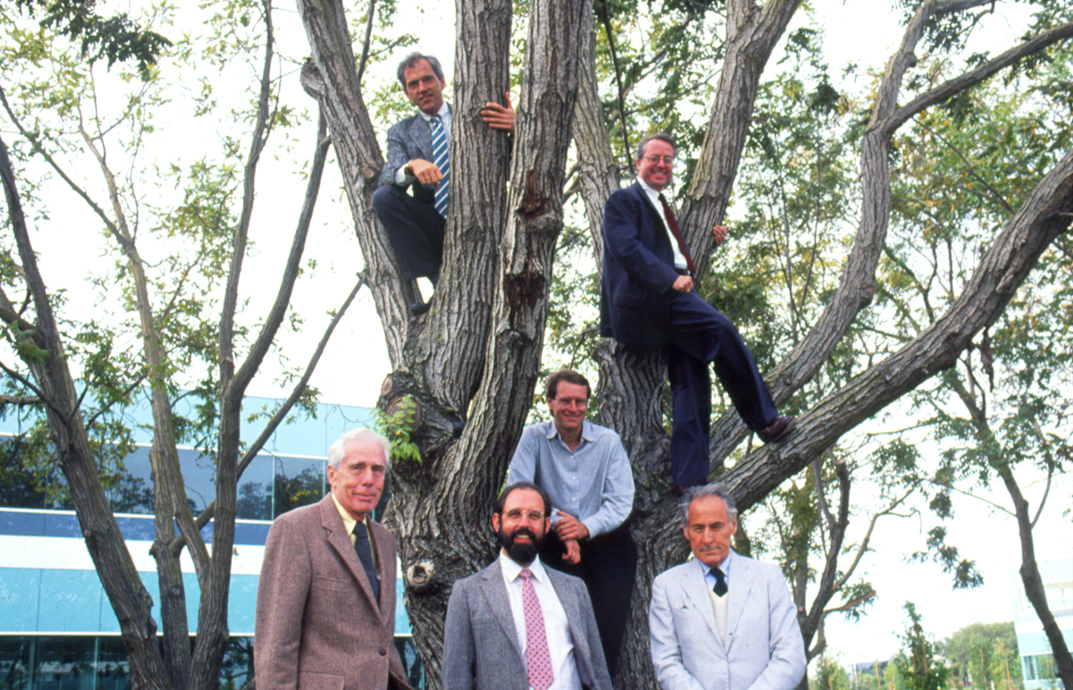
The Adobe Type Advisory Board, 1988. On the tree: Stephen Harvard, Roger Black, Lance Hidy. Standing, left to right: Alvin Eisenman, Sumner Stone and Jack Stauffacher•Photo courtesy of Sumner Stone.
The agenda was that we would look at the work that had been going on for the last six months and then discuss what to do next. After the board got the first look at the Trajan typeface, the idea came up to do more pre-typographic typefaces. Carol Twombly went off entirely on her own and did Lithos and Charlemagne, which turned out ultimately not to be nearly so popular as Trajan. Lithos, actually, was a big hit right out of the gate – it became really popular for a short period of time, then it kind of faded. I think part of that was Matthew Carter’s Greek-esque typeface that he did for Microsoft, which really put Lithos out of business.
A graduate of the Rhode Island School of Design (RISD), Carol Twombly joined the Adobe team in 1988 on the recommendations of Chuck Bigelow and Chris Holmes. Her first project in Sumner Stone’s team was the typeface Trajan (in collaboration with Robert Slimbach, 1989), which is now distributed under the name Trajan Pro 3. According to Carol, Sumner gave her a full-size copy of the inscriptions from Trajan’s Column, which they hung in the corridor. To draw the characters, Carol used Adobe Illustrator, which is “not set up at all as a font design program”. However, Robert and Carol always started with hand drawings, only later involving the computer. “The forms had to be modified and perfected in order to work as a digital font, while remaining true to the spirit of the historical source,” Carol recalls. Indeed, this was Sumner Stone’s doctrine, which was later applied to other Adobe Originals projects. The Cyrillic was created by Robert Slimbach and Carol Twombly in 2011 (consultant – Maxim Zhukov).

A graduate of the Rhode Island School of Design (RISD), Carol Twombly joined the Adobe team in 1988 on the recommendations of Chuck Bigelow and Chris Holmes. Her first project in Sumner Stone’s team was the typeface Trajan (in collaboration with Robert Slimbach, 1989), which is now distributed under the name Trajan Pro 3. According to Carol, Sumner gave her a full-size copy of the inscriptions from Trajan’s Column, which they hung in the corridor. To draw the characters, Carol used Adobe Illustrator, which is “not set up at all as a font design program”. However, Robert and Carol always started with hand drawings, only later involving the computer. “The forms had to be modified and perfected in order to work as a digital font, while remaining true to the spirit of the historical source,” Carol recalls. Indeed, this was Sumner Stone’s doctrine, which was later applied to other Adobe Originals projects. The Cyrillic was created by Robert Slimbach and Carol Twombly in 2011 (consultant – Maxim Zhukov).
I remember, back in the mid-90s, everything that Adobe put out became an immediate hit, as far as fonts went. There was a little catalogue, like a periodical – Adobe Magazine or something like that – which had the new fonts listed, and everyone ran to that to see what the next big thing was going to be.
That’s right, the magazine was called Font and Functionit and was a very successful business, the whole programme was very successful and we got a lot of press. The company grew very, very rapidly, and I wound up spending all my day in meetings, the last year I was there. I didn’t get to participate in the design process of these new things that people were working on. We had already done the Caslon, the Garamond, the Trajan, the Lithos and stuff. I realised that the guys who were the founders of the company, and many of the people in the company – all the technical guys, all the software guys – were fascinated by the computer. The thing that fascinated me was the letters, the fonts. I left and don’t ever regret that. I think it was a wise decision. I started my own foundry, which I still have to this day. It consisted of mostly just me the whole time, doing everything.
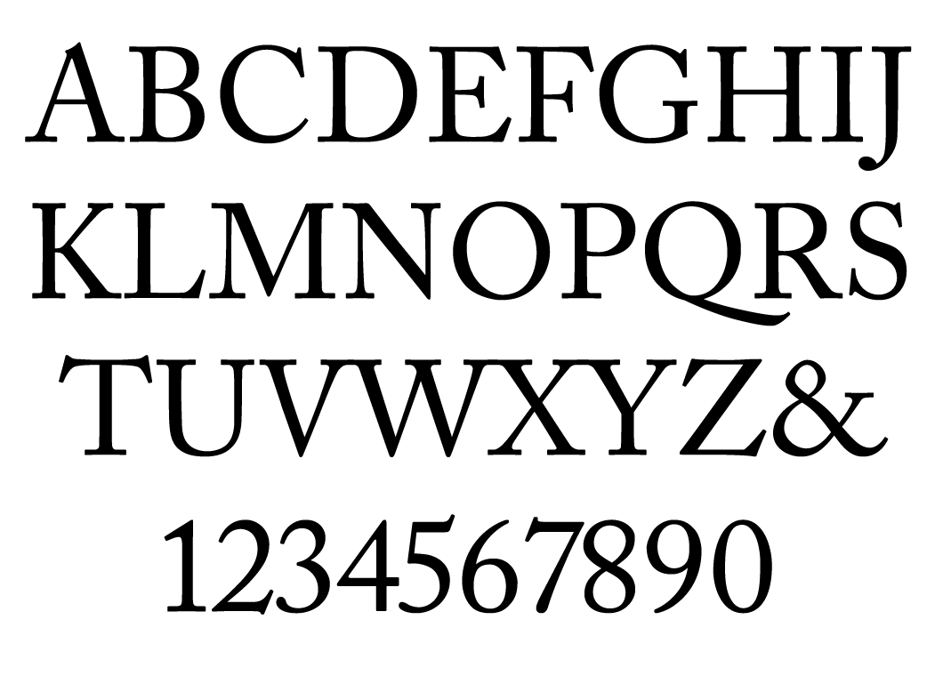
When designing Adobe Caslon, Carol Twombly drew on text typeface specimens produced by William Caslon between 1734 and 1770. The digital version of the type family preserved their main features: fairly wide proportions, contrast, weight and a variety of details. We can observe the designers’ desire to bring Caslon’s characters into a more rigid system: the capital S is narrower than the original, the lower serif of the C is cut off and the indentation at the top of the letter A is quite strongly pronounced. The extenders of lowercase characters are rather long, but the characters themselves are much smaller than the uppercase. The Italics in Adobe Caslon Pro are not as narrow and sloping as Caslon’s originals, but preserve all the specific details: the bright flourishes on some lowercase letters, the distinctive p with a curved stroke that crosses the stem at the top, a lot of teardrop terminals in the lowercase and the irregular, steep slope of some uppercase letters (A, V, W). Today, the OpenType version of Adobe Caslon contains five styles plus small caps, Old-style figures, ligatures, fractions, ornaments and finely crafted alternative Italic capitals with swashes.
When designing Adobe Caslon, Carol Twombly drew on text typeface specimens produced by William Caslon between 1734 and 1770. The digital version of the type family preserved their main features: fairly wide proportions, contrast, weight and a variety of details. We can observe the designers’ desire to bring Caslon’s characters into a more rigid system: the capital S is narrower than the original, the lower serif of the C is cut off and the indentation at the top of the letter A is quite strongly pronounced. The extenders of lowercase characters are rather long, but the characters themselves are much smaller than the uppercase. The Italics in Adobe Caslon Pro are not as narrow and sloping as Caslon’s originals, but preserve all the specific details: the bright flourishes on some lowercase letters, the distinctive p with a curved stroke that crosses the stem at the top, a lot of teardrop terminals in the lowercase and the irregular, steep slope of some uppercase letters (A, V, W). Today, the OpenType version of Adobe Caslon contains five styles plus small caps, Old-style figures, ligatures, fractions, ornaments and finely crafted alternative Italic capitals with swashes.
When designing Adobe Caslon, Carol Twombly drew on text typeface specimens produced by William Caslon between 1734 and 1770. The digital version of the type family preserved their main features: fairly wide proportions, contrast, weight and a variety of details. We can observe the designers’ desire to bring Caslon’s characters into a more rigid system: the capital S is narrower than the original, the lower serif of the C is cut off and the indentation at the top of the letter A is quite strongly pronounced. The extenders of lowercase characters are rather long, but the characters themselves are much smaller than the uppercase. The Italics in Adobe Caslon Pro are not as narrow and sloping as Caslon’s originals, but preserve all the specific details: the bright flourishes on some lowercase letters, the distinctive p with a curved stroke that crosses the stem at the top, a lot of teardrop terminals in the lowercase and the irregular, steep slope of some uppercase letters (A, V, W). Today, the OpenType version of Adobe Caslon contains five styles plus small caps, Old-style figures, ligatures, fractions, ornaments and finely crafted alternative Italic capitals with swashes.
When designing Adobe Caslon, Carol Twombly drew on text typeface specimens produced by William Caslon between 1734 and 1770. The digital version of the type family preserved their main features: fairly wide proportions, contrast, weight and a variety of details. We can observe the designers’ desire to bring Caslon’s characters into a more rigid system: the capital S is narrower than the original, the lower serif of the C is cut off and the indentation at the top of the letter A is quite strongly pronounced. The extenders of lowercase characters are rather long, but the characters themselves are much smaller than the uppercase. The Italics in Adobe Caslon Pro are not as narrow and sloping as Caslon’s originals, but preserve all the specific details: the bright flourishes on some lowercase letters, the distinctive p with a curved stroke that crosses the stem at the top, a lot of teardrop terminals in the lowercase and the irregular, steep slope of some uppercase letters (A, V, W). Today, the OpenType version of Adobe Caslon contains five styles plus small caps, Old-style figures, ligatures, fractions, ornaments and finely crafted alternative Italic capitals with swashes.
When designing Adobe Caslon, Carol Twombly drew on text typeface specimens produced by William Caslon between 1734 and 1770. The digital version of the type family preserved their main features: fairly wide proportions, contrast, weight and a variety of details. We can observe the designers’ desire to bring Caslon’s characters into a more rigid system: the capital S is narrower than the original, the lower serif of the C is cut off and the indentation at the top of the letter A is quite strongly pronounced. The extenders of lowercase characters are rather long, but the characters themselves are much smaller than the uppercase. The Italics in Adobe Caslon Pro are not as narrow and sloping as Caslon’s originals, but preserve all the specific details: the bright flourishes on some lowercase letters, the distinctive p with a curved stroke that crosses the stem at the top, a lot of teardrop terminals in the lowercase and the irregular, steep slope of some uppercase letters (A, V, W). Today, the OpenType version of Adobe Caslon contains five styles plus small caps, Old-style figures, ligatures, fractions, ornaments and finely crafted alternative Italic capitals with swashes.
While you were at Adobe, did you have anything to do with non-Latins?
It was just getting started as I exited. I had a lot to do with the Japanese. Warnock came into my office one day and said “Well, would you like to go to Japan”. What had happened was that Adobe really wanted to have Japanese typefaces that they could then license to laser printer manufacturers or whoever, many of whom were Japanese. But they wanted their own faces, digitised in PostScript. Luckily, I knew Japanese people in the type world through ATypI. I went around the typesetting manufacturers there and talked to them. Adobe wound up doing business with Morisawa, so in ‘87, ‘88 and ‘89 I was in Japan quite a lot, doing that deal and becoming completely captured by Japanese gardens (laughs). I was already captured by a lot of Japanese culture, particularly the writing and the poetry. Traditional Japanese culture is very attractive. Chinese is as well, although I didn’t really realise until I went to Japan that educated, sophisticated, intellectual Japanese people – the aesthetic leaders – regard themselves as being kind of in the shadow of China in all the traditional arts.
Did you have anything to do with the Greeks or Cyrillics?
No, although I did have some involvement in the Cyrillics right after I left Adobe, because ITC was making Cyrillic typefaces with this Russian company, Paratype, and they were doing the ITC Stone faces in Cyrillic, so I wound up in the role of a consultant to advise them on the expansion of my own faces into Cyrillic. That was a very interesting process, because I really knew nothing about the history of Cyrillic type, about its current uses. I knew a little bit, I had certain heroes: there are some calligraphers from that world that I had admired. But I really knew very little about it, so they would do things that I thought were questionable and we would have discussions about them. Ultimately, I came to understand that there was this tradition of how the forms were treated, which prompts a whole line of thinking about what you’re doing when you take a typeface that’s been designed for Latin characters and turn it into either a Greek or a Cyrillic. What really is going on there? There are a lot of puzzles, I think. There are lots of questions as to whether that is really such a great idea or not. A lot of it is really about politics, power and culture.

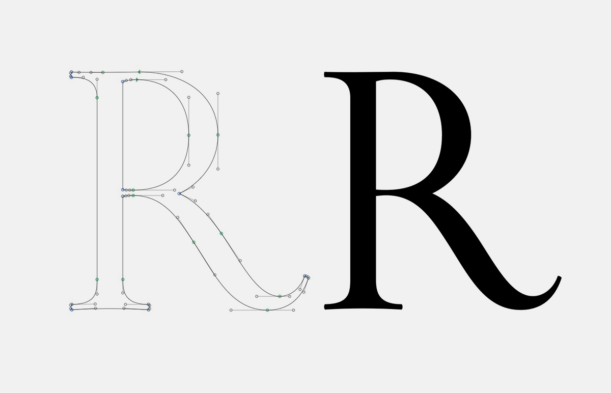
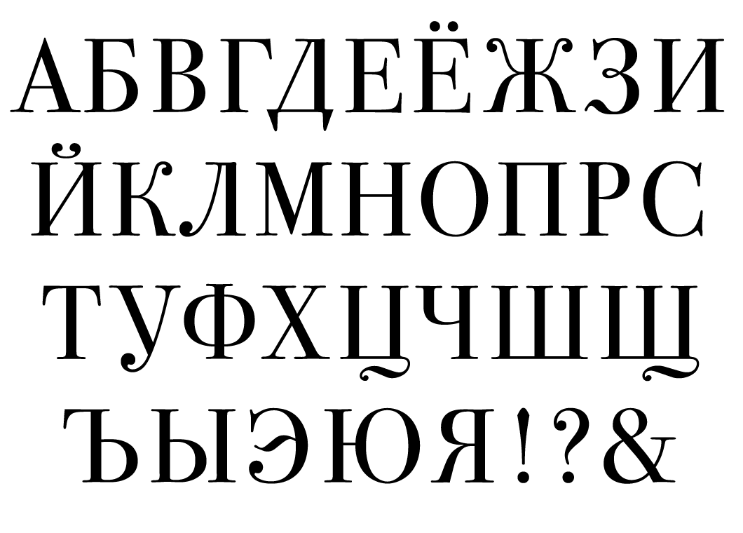
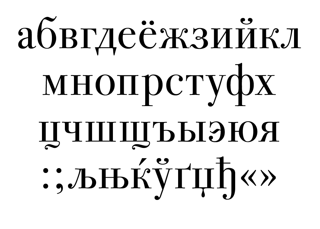
Like all of Stone’s projects, the development of the Stone type family started with pencil drawings. It should be kept in mind that by the end of the 80s Adobe already had the tools to work with Bezier curves on a computer, although there was no comprehensive package for developing a font from the first sketches to the final design. A digitised pencil drawing on tracing paper was divided into many small fragments that were converted into vectors. At Stone’s request, Bill Paxton at Adobe wrote a small script that transformed the vectors into Bezier curves – this was the starting point of the work. It was possible to edit the letters, change the contour, fill it and print on a laser printer. This work was carried out in March 1985. Sumner Stone compares the process of working with digital contours on a computer screen with work on a sculpture, not just with drawing: material from one character can serve as a basis for another. The Cyrillic version of the Stone Serif family was completed by Vladimir Yefimov in 2012.
The counterpart Stone Sans type family is distinguished by its low contrast. The x-height is rather large, while character proportions are slightly narrowed. Diagonals are cut off at a right angle to the stroke axis. Work on the Cyrillic version was started by Vladimir Yefimov at ParaGraph in 1994 and Maxim Zhukov advised on the project. Today, this wonderful humanistic sans-serif contains six styles with Cyrillic, while the Medium and Semibold have small caps. All styles are equipped with Old-style figures, fractions, subscript and superscript characters, and a number of Latin ligatures.
Are you using somebody to help you? Do you feel confident that you’re not going to make some terrible mistakes in the shapes of the letters?
I’m just doing it by myself. I have a very bad tendency to do that (laughs). I’ll have people look at it when it gets to a stage where I think that I can get advice about it. I’m not at that stage yet, but there are people who have spent time thinking about these things and will advise me. This is a real issue, not only for me, but for everybody who’s involved in this process. If you’re going to make a Cyrillic version of Times, Helvetica, or the brand-new typeface that you invented, then how do you go about that? If you do things that you think are graphically correct, but which are contradictory to the paths that have been followed in the past, then what are the consequences of that? An example is Hermann Zapf, who designed an Arabic typeface. I look at it and think that it’s an absolutely beautiful typeface. Apparently, in the Arab world it gets used almost exclusively for children’s books! It looks like it belongs in a children’s book, evidently. One of the students in the first condensed class at Cooper that I taught three years ago is a fellow named Tarek Atrissi, who has become quite successful as a graphic designer in the Arabic world. He tells me that if you do a typeface in Egypt, people will have certain reactions to it. If you take the same typeface over to Syria or Lebanon, they’re going to have different emotional and cultural reactions to those forms. Well, this makes things rather tricky, doesn’t it?
There’s also this ongoing conversation about how you have to be a native speaker of a language to really know all the intricacies of character design. Or do you?
It’s not even so much a native speaker, it’s a native user of typography, writing, calligraphy. That is what’s required. Somebody who is aware of the tradition of the forms. If you don’t have that, you’re going to make mistakes.
Sumner Stone in his studio after leaving Adobe•Photo courtesy of the designer.
Have you seen the Cyrillic version of the ITC Bodoni 72? Paratype never got around to working on the text weights, so they only did the display 72-point. What’s interesting is that, when Paratype digitised it, they went back to the period of Bodoni-like fonts in Russia and borrowed some of those forms. It’s like what Bodoni would have done, had he known the better versions of the Russian letters – he did his own Cyrillic, but unfortunately didn’t have good models for his letters, so the Cyrillic was flawed.
I’m not surprised! I think I actually have seen it, but I have not spent much time looking at it, put it that way. What do you think of it? Is it successful?
Actually, we’d like to ask what you think of it. Here are some of the characters that are based on forms that some type designers in Moscow now perceive as archaic or antiquated.
I think that the ITC Bodoni is archaic and antiquated. I think it was deliberately intended to be that way.

In August 1991, three years before the release of ITC Bodoni, a team made up of Holly Goldsmith and Janice Prescott Fishman from Xerox, Alan Haley and Ilene Strizver from ITC and Sumner Stone left the United States to visit the Bodoni Museum in Parma. Sumner planned to study punches and prints in order to create three master sizes: ITC Bodoni 72 (in four styles) for display work and large point-sizes, ITC Bodoni 12 (in four styles) for standard text composition and ITC Bodoni 6 (in four styles) for small point sizes. Later, ITC Bodoni Ornaments was released, and in early 1996, ITC Bodoni 72 was complemented by an Italic Swash display face.
In the article ITC Bodoni: Notes from Parma (U&lc Volume 22, Number 2, fall 1994), Stone wrote, “Selecting a prototype for the display version was simple: we immediately realized that it should be Papale, Bodoni’s largest typeface (by order of the Pope). It was harder to choose a model for small sizes – we compared the specimens from Manuale Tipografico, printed on vellum, with the metal letters. In the end, we settled on the typeface Filosofia Bassano as a reference for the text family”. After returning to the USA, Holly Goldsmith concentrated on developing the faces for small point sizes. Her main design task was to preserve the image and plasticity of the original letters carved into a metal bar without taking into account the defects that inevitably arise when strongly magnifying a printed sample. Janice Prescott began work on the large-size version of the typeface, based on Papale. Her task was somewhat different: Sumner Stone wanted to convey the elegance of the master’s engraved type. Moreover, in all the faces the designers wanted to move away from the over-simplification and geometrisation of contours that was seen in previous versions of typefaces based on Bodoni’s punches. Here and elsewhere, faces of the ITC Bodoni 72 family, based on the Papale typeface, are shown.
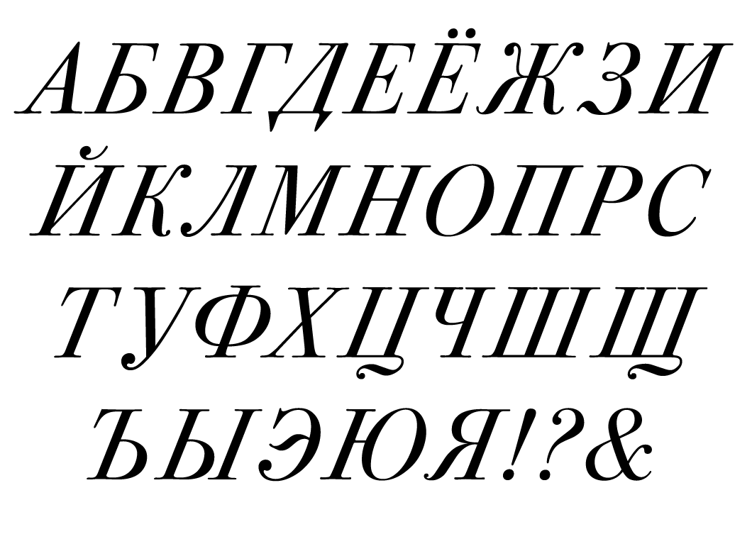
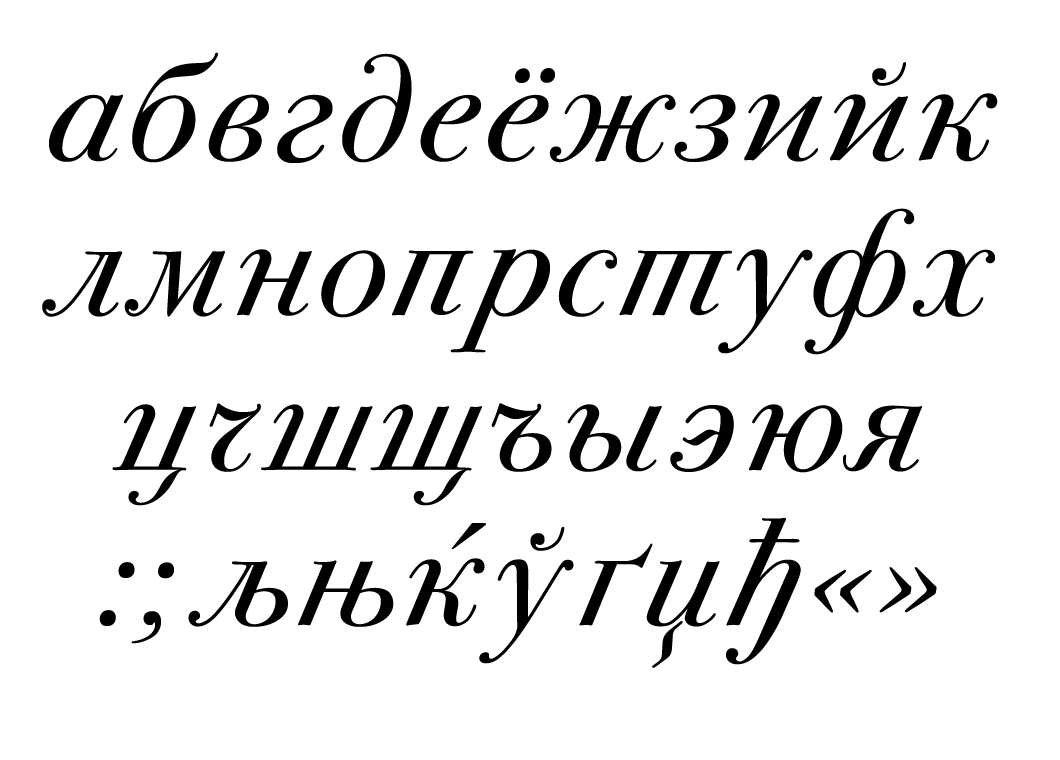
Do you think that if I were to use this font on a modern or contemporary project, that would make it look old-fashioned?
It depends entirely on how it’s used and what the context is. It’s not necessarily the case at all: you could use it on a candy wrapper and it would look completely contemporary.
You think that this is in-keeping with your original plan for ITC Bodoni?
It sounds like it. Looking at the character of what has been done, I would say it does have some of the same spirit as what we did. There’s this very deliberate attempt to capture something about Bodoni that was unquestionably lost in the ATF Bodoni revival – the handmade quality of it, as opposed to looking like a machine part, which was the way it was drawn and viewed. It was much more like the Didot faces, especially the later ones, which really did look like that.

Dmitry Kirsanov
type designer
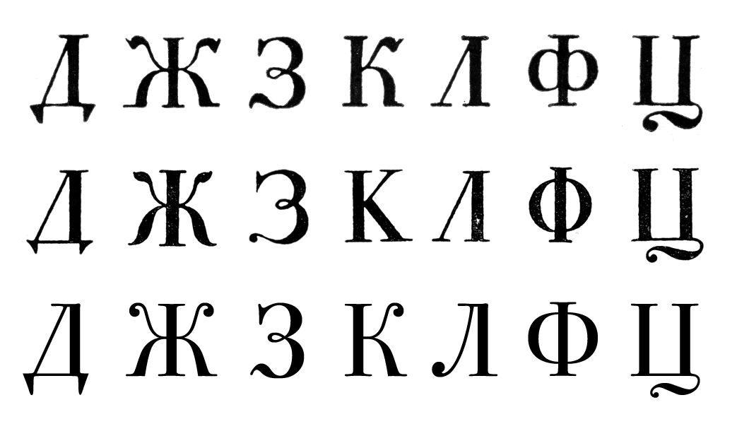
A comparison of some uppercase letters in Double Tertia size from Sample Book of All Alphabets, Characters and Printing Decorations Available at the Imperial Print House of the Academy of Sciences (St. Petersburg, 1748), the book of Giambattista Bodoni type specimens Manuale tipografico (Vol. II, Parma, 1818) and the digital typeface ITC Bodoni 72 (ParaType, 2000, Cyrillic designer – Dmitry Kirsanov).
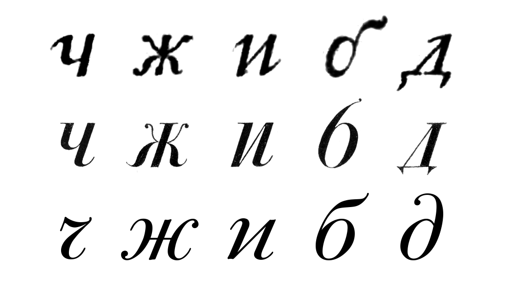
A comparison of some uppercase letters in Double Tertia size from Sample Book of All Alphabets, Characters and Printing Decorations Available at the Imperial Print House of the Academy of Sciences (St. Petersburg, 1748), the book of Giambattista Bodoni type specimens Manuale tipografico (Vol. II, Parma, 1818) and the digital typeface ITC Bodoni 72 (ParaType, 2000, Cyrillic designer – Dmitry Kirsanov).
They still had a little more refinement than the Benton version, where the machine comes through very strongly.
Indeed, absolutely. There are some beautiful Didot typefaces, no question about it, in spite of the rigour they were made with, and in some cases because of it. I’m actually in the process of agreeing to do a brief course about the modern letter next semester, so this is becoming interesting to me again. For the last couple of years I’ve also been privileged to participate in helping to advise Valerie Lester, the author of a biography of Bodoni. It’s being published by Godine and that’s in process. It’s a fascinating book, particularly with the illustrations. It will give people an insight into the world that Bodoni lived in, in a way that has not been available to English speakers.
The thing that made Bodoni famous in his time is simply not present in the ATF Bodoni. It’s an elegance, a refinement, a sensibility that even his rivals, the Didots, could not help but acknowledge. That’s what I was after in doing this project. To try and recapture that, which is not so easy. It seems like “Oh yeah, well, just copy it!”. What do you copy to start out with?!
That’s right. There are so many various cuts and he had lots of different alternates even in the same point size.
That’s pretty much always true in doing revivals. You have the very initial question of what to use as source material. Do you use punches or matrices? In the case of the Garamond, it turned out that there are still matrices around. You can cast Garamond’s original type, you can print with it and use that as a model. That question in itself, just that one thing, turns out to make a huge difference in what you wind up with at the end. There are many, many such decisions along the way that you have to cope with. The whole notion of making different designs for different sizes of the type is a thing that people really had a difficult time dealing with. Even though there was a very brief period of phototype, designers who grew up with it were used to having “one size fits all”. Those were the people who were around when the personal computer becomes the centre of typography, and Postscript and so on. The whole notion that you have different designs for different sizes was by then already kind of odd (laughs).
It’s like with everything else: the type manufacturers figured out that they could save by going this way…
Matthew Carter told me that, in the very early days, Linotype actually made a number of different masters. You could buy a 24-point Garamond No. 3, for example, and nobody bought them. They just bought the 12-point. It wasn’t a priority.
Cycles is an Old-style serif with high contrast and rather narrow character proportions, the forms of which are linked to Humanistic minuscule. The basis of this family is another Sumner Stone typeface called Stone Print, which he designed for the magazine of the same name. As he worked on it, Stone experimented a lot with character proportions, testing how narrow a typeface can be without losing legibility. This was done to solve a certain problem (there was a lot of text in the magazine and at the same time he wanted it to be known as an environmentally friendly and economical publication), and many of these experiments, as well as the measured contours of the letters, later made it into the designer’s new project Cycles. However, the main feature of this type family is the varying design of faces for different point sizes (Eleven, Nine, Seven, Five). As the size decreases, the contrast lowers, weight and side bearings increase, stroke terminals are simplified and the height ratio of uppercase to lowercase characters changes. That was the norm for metal type, but Stone was one of the first to return to this principle in digital typography.
“In typography,” he writes in his introduction to the samples of Cycles, “There is a fundamental relationship between the physical image of the text and the visual apparatus of the reader. For 2,600 years of making and re-making, the breeding of the Roman letter has been under way. Traditional type sizes are the product of a lengthy accumulation of human attention. Like a star crystallized out of the heavens, like a species of creature, each size of type is relatively absolute. It represents a reduction, a cooking down of the reading and writing experience of many generations. Cycles’ faces honour this tradition, which has at its base an unwavering devotion to the legibility of the text”.
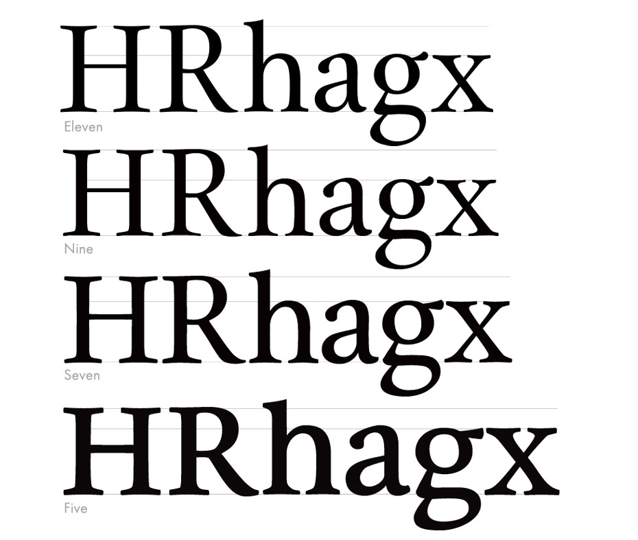

Max Caflisch
typographer, book designer, teacher
In his book First Principles of Typography, Stanley Morison wrote, “For a new font to be successful, it has to be so good that only very few recognize its novelty. A type which is to have anything like a present, let alone a future, will neither be very ‘different’ nor very ‘jolly’.” Sumner Stone’s Cycles is exactly one of these typefaces. Its form is very simple and natural, without any special features. The proportions are reminiscent of an Old-style serif, but the character drawings are more sophisticated and their strokes have more contrast than a canonical Renaissance Antiqua. Stone’s unmistakable hand can be seen in this typeface, although it does not take centre stage. The Roman and Italic of this unassuming, natural typeface are suited to books and magazines.
When designing Stone Print, Stone used the Adobe Multiple Master method. Alongside the main version of the typeface, two wider and two narrower versions were also created for a total of 5, with letter width differing by 3% between each one. Of these, only the middle one was used in the magazine. Even then, Stone decided to rework the widest face as book type. In this way, Stone Print, 6% wider than the original, became the basis for Cycles.
Cycles has calm, open forms in both the Roman and Italic faces. The elongated serifs, as in Stone Print, are marginally concave. The axes of the lowercase c, d and e are angled, which reminds us of the handwritten foundation of the forms, like in many Old-style serifs. At the same time, the axis inclination of the letters b, p and q is less pronounced. In the Italic, all the characters are a little narrower than in the Roman. In accordance with this, the serifs are shortened too. The Italic Q, as in the other faces, has a long tail slightly off to the side of the lower base of the circle. The Roman face has small caps that are slightly larger than the height of lowercase letters. Capital letters, alongside the ligatures ff, fi, fl, ffi and ffl, can be found in the extended set.
All faces are furnished with excellently designed Old-style figures. The three variants of the number 1 have been given small hairline strokes for clarity – their elongated serifs allow the figures to look more solid.
Max Caflisch, Schriftanalysen, Band I. Typothron St, Gallen 2003.
I want to talk a little about your teaching experience. When you look at students work which qualities do you find the most important?
It depends on the stage, you want to emphasise different things at different times. In the beginning I’m not so much concerned with the refinement of the forms although that’s one of the things that I do talk about and I do critic. But I’m more interested in them looking at the overall proportions of the letters, playing with the weights and seeing how those relationships come out, how that affects the structure of the letters. I do have them going back and forth particularly in the beginning between drawing with pencil and drawing on the computer to make letterforms. Teaching type design is like teaching juggling, you have to keep a lot of things in the air at the same time and the only way to do that is to get started and see what people are doing and then try to focus on the things that seems not working out.
What would be an ideal length of a type design course?
Well, I think if you’re going to do it thoroughly that it will take a couple of years. About two years for a graduate course and you can get people up to a level where you can feel confidence that they can go out and continue. Maybe even longer, it really depends on what your goals are. The actual drawing of letters in a sophisticated way is difficult and the understanding of the whole system and something about why we’re where we’re today, takes time and practice. You need somebody who is a master to help you and you need time to explore yourself, different pathways that are there.
I think that Gill and Koch models are good, they were in a workshop where things were actually happening. I show the students what I’m working on, get them to participate a little bit and at least see what a real project looks like, I’m showing them the things I’ve done and tell them my own practice because that’s what I know best.

The two Type@Cooper programmes of varying lengths (an extended twelve-month one and intensive summer courses) offer instruction in the basics of lettering, calligraphy, programming in Python and other must-have skills for a type designer. Writing with a broad-nibbed pen is how Stone starts work with students. He is true to his principles: type is born through understanding its form on paper and drawing historical designs with pencil and ink – only after sketching do students switch to working on the computer. At this stage, Stone pays great attention to the skills of structuring side bearings and kerning a typeface. In addition to this, an important part of the Type@Cooper course is the examination of historical type specimens, as well as the study of art history. An important role here is played by the university’s partners: the New York Public Library, Morgan Library & Museum, Butler Library at Columbia University and the Letterform Archive in San Francisco. Among Sumner Stone’s colleagues are Andy Clymer, Christian Schwartz, Berton Hasebe and Just van Rossum, as well as other designers and historians. Together, they form an important part of graphic arts education at Cooper Union, the oldest college in New York with its own traditions and unique history. In September 2009, the university opened new academic centre 41 Cooper Square, designed by architect Thom Mayne. In addition to a number of faculties and laboratories, this unusual building houses the Herb Lubalin Study Center, curated by Alexander Tochilovsky•Photo: Paul Eng, New York, 2014.
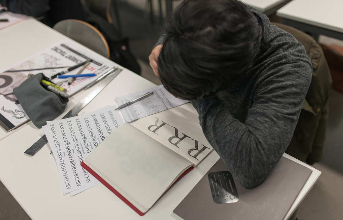
The two Type@Cooper programmes of varying lengths (an extended twelve-month one and intensive summer courses) offer instruction in the basics of lettering, calligraphy, programming in Python and other must-have skills for a type designer. Writing with a broad-nibbed pen is how Stone starts work with students. He is true to his principles: type is born through understanding its form on paper and drawing historical designs with pencil and ink – only after sketching do students switch to working on the computer. At this stage, Stone pays great attention to the skills of structuring side bearings and kerning a typeface. In addition to this, an important part of the Type@Cooper course is the examination of historical type specimens, as well as the study of art history. An important role here is played by the university’s partners: the New York Public Library, Morgan Library & Museum, Butler Library at Columbia University and the Letterform Archive in San Francisco. Among Sumner Stone’s colleagues are Andy Clymer, Christian Schwartz, Berton Hasebe and Just van Rossum, as well as other designers and historians. Together, they form an important part of graphic arts education at Cooper Union, the oldest college in New York with its own traditions and unique history. In September 2009, the university opened new academic centre 41 Cooper Square, designed by architect Thom Mayne. In addition to a number of faculties and laboratories, this unusual building houses the Herb Lubalin Study Center, curated by Alexander Tochilovsky•Photo: Paul Eng, New York, 2014.
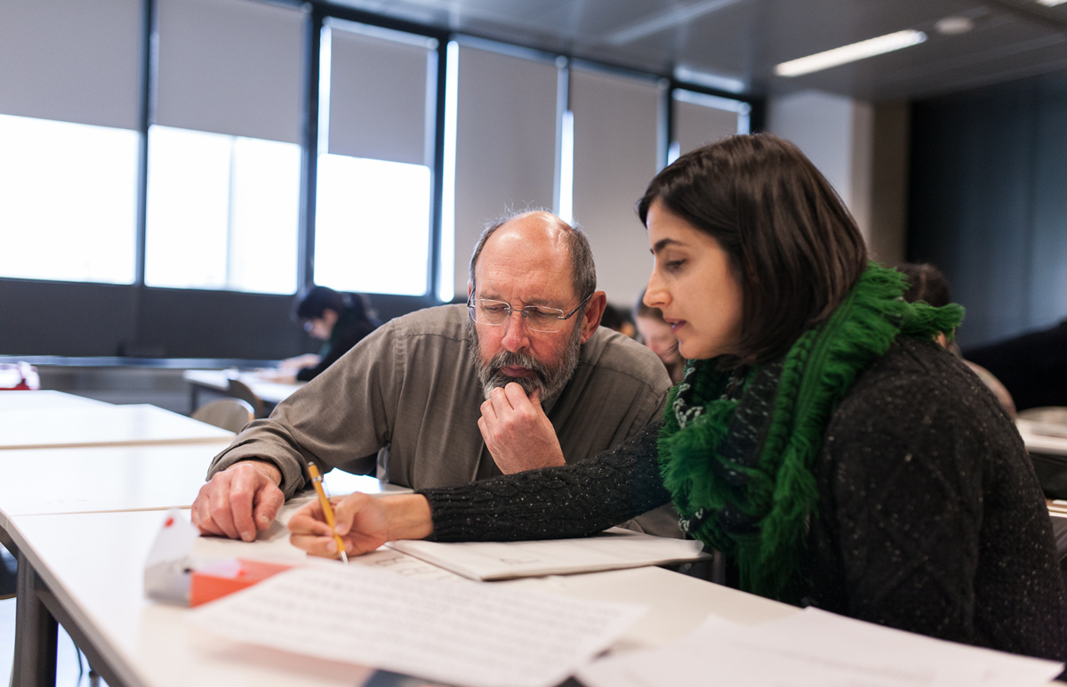
The two Type@Cooper programmes of varying lengths (an extended twelve-month one and intensive summer courses) offer instruction in the basics of lettering, calligraphy, programming in Python and other must-have skills for a type designer. Writing with a broad-nibbed pen is how Stone starts work with students. He is true to his principles: type is born through understanding its form on paper and drawing historical designs with pencil and ink – only after sketching do students switch to working on the computer. At this stage, Stone pays great attention to the skills of structuring side bearings and kerning a typeface. In addition to this, an important part of the Type@Cooper course is the examination of historical type specimens, as well as the study of art history. An important role here is played by the university’s partners: the New York Public Library, Morgan Library & Museum, Butler Library at Columbia University and the Letterform Archive in San Francisco. Among Sumner Stone’s colleagues are Andy Clymer, Christian Schwartz, Berton Hasebe and Just van Rossum, as well as other designers and historians. Together, they form an important part of graphic arts education at Cooper Union, the oldest college in New York with its own traditions and unique history. In September 2009, the university opened new academic centre 41 Cooper Square, designed by architect Thom Mayne. In addition to a number of faculties and laboratories, this unusual building houses the Herb Lubalin Study Center, curated by Alexander Tochilovsky•Photo: Paul Eng, New York, 2014.
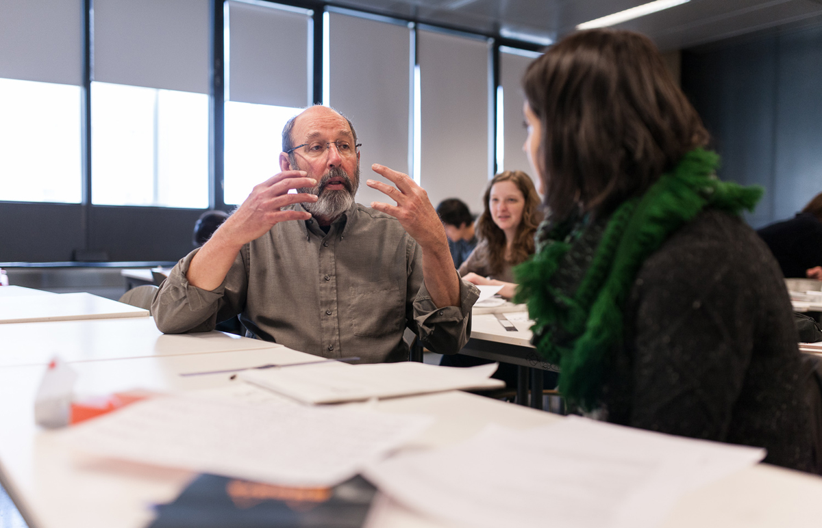
The two Type@Cooper programmes of varying lengths (an extended twelve-month one and intensive summer courses) offer instruction in the basics of lettering, calligraphy, programming in Python and other must-have skills for a type designer. Writing with a broad-nibbed pen is how Stone starts work with students. He is true to his principles: type is born through understanding its form on paper and drawing historical designs with pencil and ink – only after sketching do students switch to working on the computer. At this stage, Stone pays great attention to the skills of structuring side bearings and kerning a typeface. In addition to this, an important part of the Type@Cooper course is the examination of historical type specimens, as well as the study of art history. An important role here is played by the university’s partners: the New York Public Library, Morgan Library & Museum, Butler Library at Columbia University and the Letterform Archive in San Francisco. Among Sumner Stone’s colleagues are Andy Clymer, Christian Schwartz, Berton Hasebe and Just van Rossum, as well as other designers and historians. Together, they form an important part of graphic arts education at Cooper Union, the oldest college in New York with its own traditions and unique history. In September 2009, the university opened new academic centre 41 Cooper Square, designed by architect Thom Mayne. In addition to a number of faculties and laboratories, this unusual building houses the Herb Lubalin Study Center, curated by Alexander Tochilovsky•Photo: Paul Eng, New York, 2014.
The two Type@Cooper programmes of varying lengths (an extended twelve-month one and intensive summer courses) offer instruction in the basics of lettering, calligraphy, programming in Python and other must-have skills for a type designer. Writing with a broad-nibbed pen is how Stone starts work with students. He is true to his principles: type is born through understanding its form on paper and drawing historical designs with pencil and ink – only after sketching do students switch to working on the computer. At this stage, Stone pays great attention to the skills of structuring side bearings and kerning a typeface. In addition to this, an important part of the Type@Cooper course is the examination of historical type specimens, as well as the study of art history. An important role here is played by the university’s partners: the New York Public Library, Morgan Library & Museum, Butler Library at Columbia University and the Letterform Archive in San Francisco. Among Sumner Stone’s colleagues are Andy Clymer, Christian Schwartz, Berton Hasebe and Just van Rossum, as well as other designers and historians. Together, they form an important part of graphic arts education at Cooper Union, the oldest college in New York with its own traditions and unique history. In September 2009, the university opened new academic centre 41 Cooper Square, designed by architect Thom Mayne. In addition to a number of faculties and laboratories, this unusual building houses the Herb Lubalin Study Center, curated by Alexander Tochilovsky•Photo: Paul Eng, New York, 2014.

The two Type@Cooper programmes of varying lengths (an extended twelve-month one and intensive summer courses) offer instruction in the basics of lettering, calligraphy, programming in Python and other must-have skills for a type designer. Writing with a broad-nibbed pen is how Stone starts work with students. He is true to his principles: type is born through understanding its form on paper and drawing historical designs with pencil and ink – only after sketching do students switch to working on the computer. At this stage, Stone pays great attention to the skills of structuring side bearings and kerning a typeface. In addition to this, an important part of the Type@Cooper course is the examination of historical type specimens, as well as the study of art history. An important role here is played by the university’s partners: the New York Public Library, Morgan Library & Museum, Butler Library at Columbia University and the Letterform Archive in San Francisco. Among Sumner Stone’s colleagues are Andy Clymer, Christian Schwartz, Berton Hasebe and Just van Rossum, as well as other designers and historians. Together, they form an important part of graphic arts education at Cooper Union, the oldest college in New York with its own traditions and unique history. In September 2009, the university opened new academic centre 41 Cooper Square, designed by architect Thom Mayne. In addition to a number of faculties and laboratories, this unusual building houses the Herb Lubalin Study Center, curated by Alexander Tochilovsky•Photo: Paul Eng, New York, 2014.
So what can you accomplish in a semester or a year?
You can teach people something about the structure of the letters, using the design tools on the computer, a little bit about the software that supports the whole thing (and now gotten to be rather large) and send them off. Hopefully they can find a place where they can work and learn more about it or continue with the studies. It’s not a short thing, it’s several years worth of studying. Ideally we should have people who are experts in all three areas — in the history, in the practice and in the theory then you have well-educated people.
Where would you advise young people who are interested in type design to go?
If you happened to live in New York city, you can do the extended program at Type@Cooper Program if you’re from somewhere else you can come and do the summer course.
Then the program of the University of Reading which is the oldest one and the program of the Royal Academy of Hague, both programs have their strengths and weaknesses. If you’re interested in the technical part and all the software I would go to Hague and study Type & Media course, we’re very fortunate to have some graduates of that program teaching here in New York. And if you’re more interested in academic part, in history, research, theoretical aspect than there’s something to be said about going to Reading. At Reading they have a different approach to the higher education where you’re doing your thing and just have periodic reviews with your tutor. I’ve been there one time, I’ve criticised everybody’s work, gave a lecture, there was a very intense working atmosphere. If you look at the graduates of the program they’ve done a very fine work, a few people now have turned into a top-notch designers and the same with research, there’re people who are serious scholars now.
The real meaning of “vector” being a straight line — Sumner Stone’s note
ITC Bodoni 72 is a special typeface for me. It was my final project at the Polygraphic Institute (now the Moscow State University of Printing Arts) and my first typeface drawn on tracing paper and the computer as a complete set of Cyrillic characters.
But the project was also unusual for the Western type community when it was completed on 23 August 1994. There were several distinctive features. The first was that, unlike modern versions of Bodoni based on geometrical shapes, a historical typeface had been designed that more or less accurately conveyed the character drawings created 200 years ago by the master. The second feature was the presence of three master sizes. A set of ornaments, ITC Bodoni Ornaments, was also released.
The concept of the Cyrillic character set was as follows. We tried to imagine that Bodoni had understand the nature of the origin and development of Russian movable type, instead of merely interpreting (by all appearances) in his own way the character forms he had seen in the Academy of Sciences catalogues. In light of this idea, I did a thorough analysis of Bodoni’s typefaces in Manuale Tipografico (1818) and of 18th century Russian type catalogues in the Rare Book Department of the Russian State Library. I had to agree with the conjecture of a number of authors, particularly Abram Shitsgal, that the master’s main source was the 1748 type catalogue of the Academy of Sciences printing house.
Interaction with type designers at ParaGraph, mainly Vladimir Yefimov, who became the de facto curator of my work, was an invaluable experience. Maxim Zhukov’s detailed comments had a huge influence on me and the work – both the typeface as a whole and each character individually. As a result, a Cyrillic typeface was born that was a laureate at the 1996 Golden Bee Biennale, although the final character set, including small caps and italics with swashes, was completed in 2000. Unfortunately, the original contract with ITC was concluded only for ITC Bodoni 72. I started making sketches of Cyrillic alphabets for ITC Bodoni 12 and ITC Bodoni 6, but for now they will remain on paper…