They remain alone in the world,
Alone, like the planets’ march,
The gates and hoops of copper letters,
Polished by fire!
—Eduard Bagritsky, “Night”, 1926
 he current—multilingual—versions of its Trajan-inspired typefaces, Trajan® Pro 3 and Trajan® Sans Pro, were rolled out by the U.S. digital foundry Adobe in 2011. Trajan® Pro3 is the latest upgrade of the well-known Trajan (by Carol Twombly), initially issued in 1989 in two weights, regular and bold, comprised only of capital letters, figures and punctuation signs (such faces are often called “titling”). The typeface was conceived and designed as a repurposing for print of the monumental letter used in the inscription on the pedestal of the Trajan column in Rome. It was part of a set of display typefaces called Modern Ancients™. Lithos and Charlemagne, also designed by Carol Twombly, belonged to the same series. The first three typefaces offered as part of a similar but much more ambitious programme originating with Linotype, Type before Gutenberg, were issued one year later.
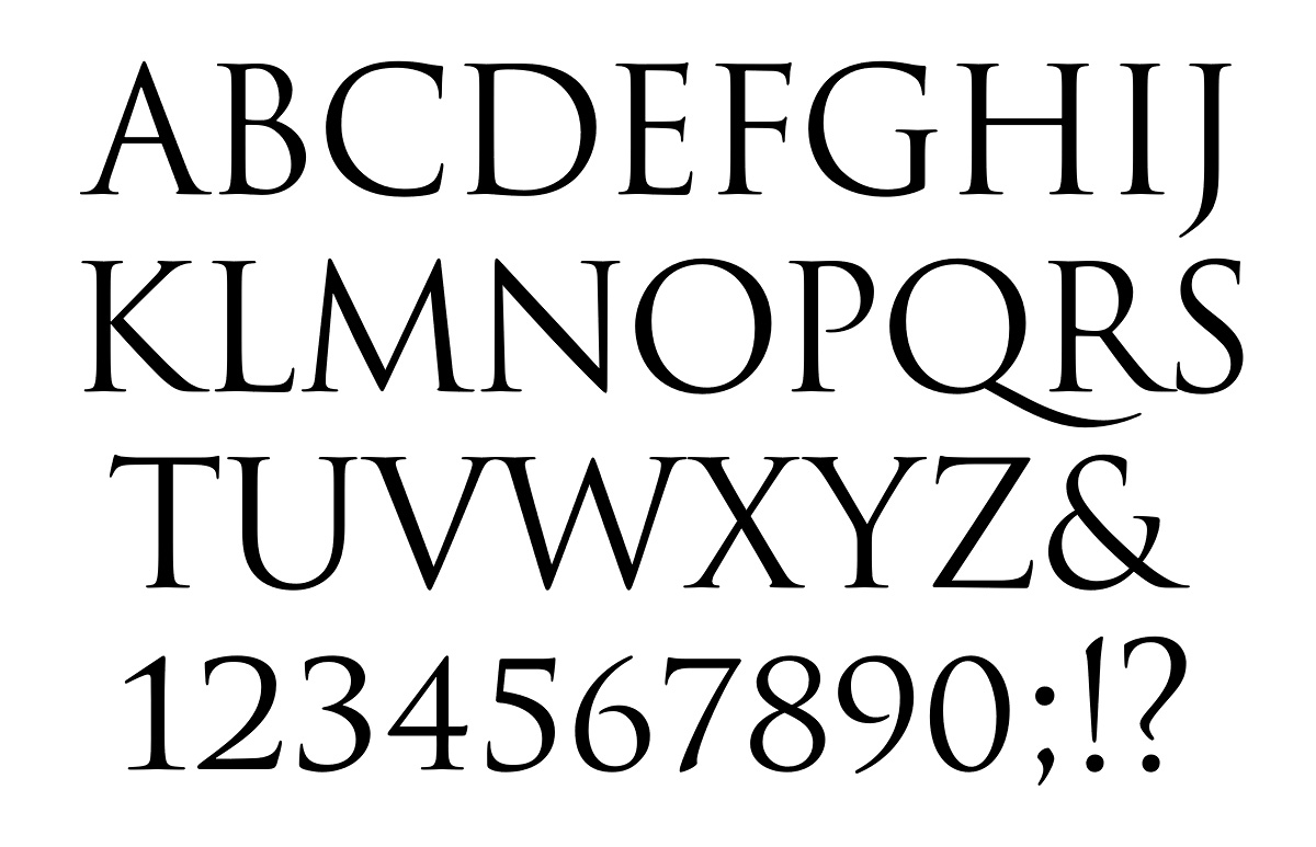
Trajan Pro 3, by Robert Slimbach and Carol Twombly. Adobe, 2011.
Trajan Sans Pro, by Robert Slimbach and Carol Twombly. Adobe, 2011.
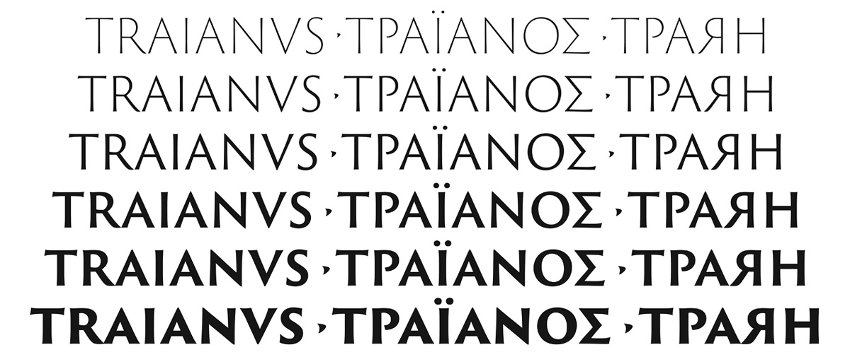
In 2001 an upgrade of that type family was issued, Trajan Pro. Its glyph set was expanded: large-size small capitals were added. The latest modification of Trajan, Trajan Pro 3, features a much wider weight range (six, from Extralight to Black); its script coverage was extended into Greek and Cyrillic. The development of Trajan Pro 3 was directed by Robert Slimbach, Adobe principal designer, in consultation with Twombly who quit her full-time job at the company in 1999.
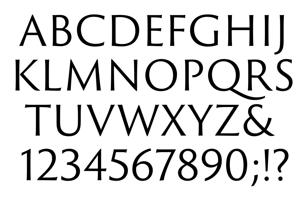
The second typeface, Trajan Sans Pro, is Slimbach’s new work. It has been developed as a companion design to Trajan Pro 3. Its structure, font complement and actual letterforms are similar to Trajan Pro 3’s, except, as the name implies, its glyphs have no serifs.
Trajan Sans Pro, by Robert Slimbach and Carol Twombly. Adobe, 2011.

Trajan Pro 3, by Robert Slimbach and Carol Twombly. Adobe, 2011.
A brief recount of the story of Trajan Pro 3 and Trajan Sans Pro, written by John D. Berry, a famed industry expert and author, was posted on Adobe’s Web site. Gerasimos “Gerry” Leonidas and I acted as non-Latin design consultants.
The launch of Trajan Pro 3 and Trajan Sans Pro happened to coincide with a significant book project devoted to ancient Roman inscriptional letter (capitalis monumentalis)—first and foremost to the style used for the lettering at the base of the Trajan column. Titled The Eternal Letter, the book was published by the MIT Press in early 2015. Its editor Paul Shaw, a well-known American type historian, included my two short essays in this monograph—on the role of the Trajan letter in the history of Soviet typographic design, and the development of Cyrillic versions of Adobe’s two typefaces, Trajan Pro 3 and Trajan Sans Pro.
So here goes…
The Trajan letter in the USSR
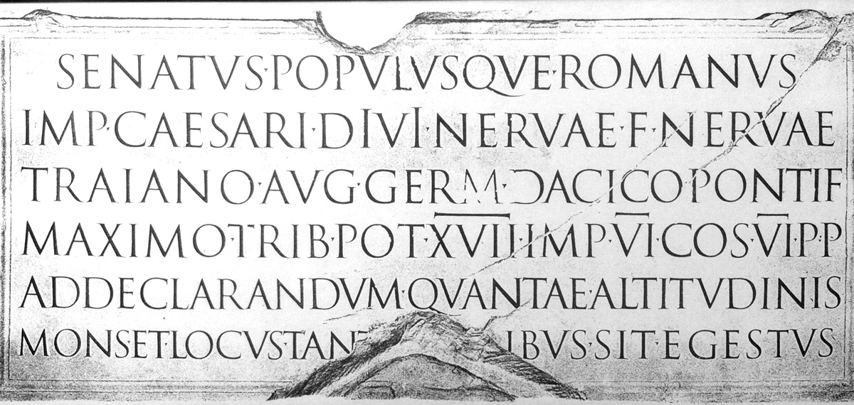
Lettering at the base of the Trajan column in Rome (113 CE; Apollodorus of Damascus, architect), erected near Via dei Fori Imperiali to commemorate the victory of Emperor Trajan (98–117 CE) in the Dacian Wars. Facsimile of a rubbing taken from the inscription.
I fell in love with the Trajan letter early in my life… I was fifteen or younger when I noticed how beautiful and elegant the title of an American art book looked.
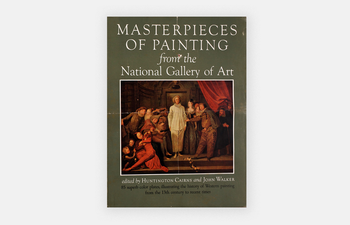
Huntington Cairns, John Walker, ed. Masterpieces of Painting from the National Gallery of Art. Washington: National Gallery of Art, 1944.
Later, I learned that the typeface that caught my eye was Goudy Old Style, created by an American designer Frederic W. Goudy, and much later that the book was among the winners of the prestigious Fifty Books of the Year competition held annually by the American Institute of Graphic Art. I tried to copy those letterforms, as closely as I was able to. I even ruined the jacket of that book by tracing the cap- and the baselines, and marking the horizontal boundaries of the letters.
In the USSR, the late 1950s was a time of big change in politics, culture, education, art—in virtually all walks of public life. That period is often referred to as “the Thaw,” as it followed the long decades of Stalin’s chilling rule.

“Khrushchev said, ‘I opened the windows [onto the world] but if I went on I would have knocked down the doors.’” Source: Artem Chashchikhin-Toïdze, director of the documentary Nikita Khrushchev: Golos iz proshlogo [“Nikita Khrushchev: A voice from the past”]. Studiia Artel’, Pervyi kanal, 2012.
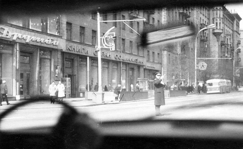
The bookstore Druzhba was located at 15 Gorky Street (corner of Stankevich Street). Moscow, 1974. Photograph © Polbar.
The opening of Druzhba [“Friendship”], a bookstore in downtown Moscow that offered books in foreign languages, was one of the notable events in the life of Moscow intelligentsia. Predictably, Druzhba carried books only in the languages of the socialist countries (German, Czech, Polish, Chinese, etc.), but even that felt exciting. It was, indeed, a breakthrough from cultural isolation.
Artists and designers used to stop by Druzhba quite often, because within a couple of days, many new arrivals would be all gone. The mid- and the late-1950s saw the appearance of some seminal books on type, typography, lettering, and calligraphy. Those were the subjects barely explored by the domestic experts, with one notable exception: the milestone monograph Russkii grazhdanskii shrift, 1703–1958 [“Russian Civil Type, 1703–1958”] by Abram Shitsgal, which was published in commemoration of the 250th anniversary of Peter the Great’s typographic reform. Two books of note briefly showed up at Druzhba in the late 1950s: Albert Kapr’s Deutsche Schriftkunst (1955) and František Muzika’s Krásné písmo (1958).
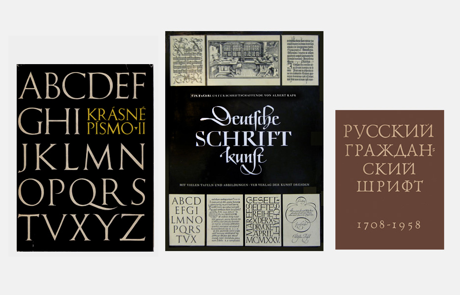
From left to right: František Muzika. Krásné písmo ve vývoji latinky. Praha: Státní nakladatelství krásné literatury, hudby a umění, 1958. Albert Kapr. Deutsche Schriftkunst. Ein Fachbuch für Schriftschaffende. Versuch einer neuen historischen Darstellung. Dresden: Verlag der Kunst, 1955. Abram Shitsgal. Russkii grazhdanski shrift, 1703–1958. Moscow: Iskusstvo, 1959.
One common—and distinctive—feature of those books was the showing of the Trajan letters, which made their way even to the dust jackets.
I think the last time Trajan letters were mentioned in a Russian-language book, before those German and Czech books reached Moscow, was in 1946, in Boris Kissin’s Graficheskoye oformlenie knigi [“Graphic design of the book”].
The respectful and careful showing in Muzika’s and Kapr’s books looked very convincing compared to Kissin’s casual and inaccurate rendition. Kapr’s featured a stunning 3-page fold-out picture of the inscription on the base of Trajan’s Column. Somehow, those showings seemed to possess an authenticity that was missing in Soviet architectural lettering of the 1950s… Which, by the way, looked and felt very similar to the American monumental inscriptions of the 1910s–1920s in the Beaux-Arts style.
Frank Chouteau Brown. Letters & Lettering. A Treatise with 200 Examples. Boston: Bates & Guild Cº, 1902; p. 5.

From Tikhon Kutsyn. Nachertanie Shriftov: Posobie dlia arkhitektorov i inzhenerov [“Lettering design: Handbook for architects and engineers“]. Moscow: Gosudarstvennoe izdatel’stvo Arkhitektury i Gradostroitel’stva, 1950, plate 10.
In fact, that lettering style had a lot more to do with the Renaissance treatises on letter construction—by Dürer, Tory, Pacioli, Arrighi, et al.—than with the classical Roman capitalis monumentalis.
The large-scale, credible showings of the Trajan letters in Muzika’s and Kapr’s books made a lasting impression on the development of type design in the USSR. In 1958, Vadim Lazurski became the first Russian designer to create a Cyrillic adaptation of the Trajan inscriptional letter. In 1964 another Cyrillic interpretation of the Trajan letterforms, by a Bulgarian designer Vasil Barakov, had been published.
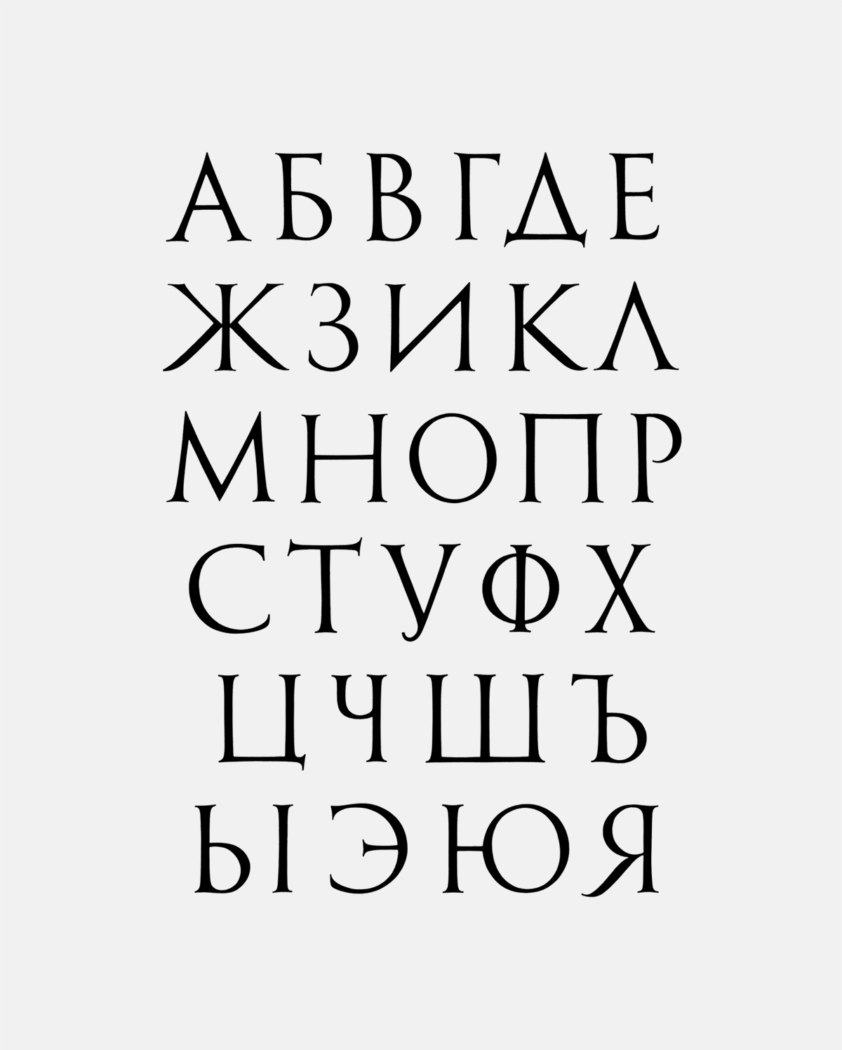
Vadim Lazurski. Cyrillic letters [Russian alphabet] styled after the Trajan inscription in Rome. Gouache and collage on paper, 1958.

Vasil Barakov. Capitalis monumentalis from the Trajan column, adapted for Bulgarian alphabet. From: Vasil Yonchev. Shriftŭt prez vekovete [“Type through the centuries”]. Sofiia: Bulgarski khudozhnik, 1964; p. 252.

Vadim Lazurski. The Birth of a Printing Type. Gouache and collage on paper, 1973.
Much later, in 1973, Lazurski acknowleged the influence of the Trajan letter on the development of his 1962 typeface when he referenced it in a wall chart titled The birth of a printing type. It was designed as a visual record of the process of development of the eponymous typeface which was issued by NIIPolygraphmash in 1962.
The same powerful influence is clearly visible in the letterforms of a typeface Solomon Telingater was working on at the time; it was rolled out in 1959 under the name of Telingater Display.
Telingater Display, Cyrillic capitals [Russian alphabet]; by Solomon Telingater; NIIPolygraphmash, 1959.
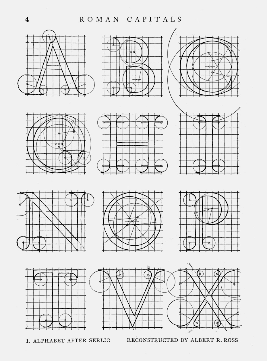
Around the same time—in 1958 or in 1959—I came across a genuine trove of books and periodicals on type and typography. At the instigation of Telingater, I applied for a library card to the Rare Book Department of the Lenin Library, the national library of the USSR. It had the richest collection of typographic literature in the nation. Three books in particular caught my attention: Roman Lettering by L.C. Evetts (1938); The Alphabet by Frederic W. Goudy (1922), especially its chapter 4, “The Development of the Roman Capital” with its magnificent plates; and last but not least, an intriguing monograph by Walter Kaech, Rhythm and Proportion in Lettering (1956).
Leonard C. Evetts. Roman lettering: A study of the letters of the inscription at the base of the Trajan column; With an outline of the history of lettering in Britain. London: Pitman, 1938; p. 136.
Frederick W. Goudy. The Alphabet. Fifteen Interpretative Designs Drawn and Arranged with Explanatory Text and Illustrations. New York: Mitchell Kennerley, 1922; p. 45, plate 18.
Walter Käch. Rhythm and Proportion in Lettering [Rhythmus und Proportion in der Schrift]. Olten und Freiburg im Breisgau: Walter-Verlag, 1956; p. 66.
I was so impressed by those resources that I actually translated most of Evetts’s text into Russian, and copied all drawings using my own tools—pencil, compass, and ruler. Using photocameras, and taking pictures at the Rare Book Department was strongly forbidden in 1950s; this restriction has survived to this day.
In 1960, I was admitted to the Moscow Printing Institute (MPI). During two semesters, lettering was taught to us by the very same Vadim Lazurski. Expectedly, exploring capitalis monumentalis was an important part of his course. I lent him my amateurish, handmade translation of Evetts’s Roman Lettering, and he happily used it in class. For almost the entire semester we assiduously worked on the Trajan letterforms, trying to build Cyrillic glyphs to match the Latin originals.
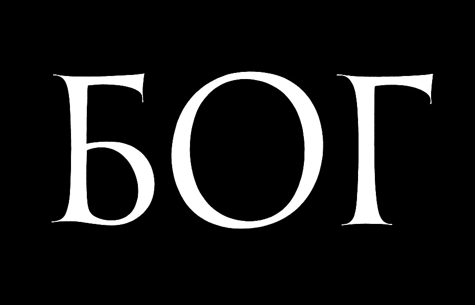
Maxim Zhukov. Bog [“God”]. China ink on paper, 1963.
When, twenty years later, I myself lectured at MPI, my students drew the letters from Trajan’s Column for about three weeks. They also designed matching Cyrillic letters, in the original cap size, approximately 4½-inch high. From the jointly developed A–Z (А–Я) alphabetical glyph set—each student drew several glyphs—a class list was composed in two versions, one Russian and one Latin (e.g., Данила/Danielis, Дмитрий/Demetrius, Мария/Maria, Елизавета/Elisabetha, etc.). Also, as a tribute to Lazurski, who was a guest speaker at my course, my students came up with an inscription on a scroll using the extra-large size of the same style (cap-height around 1 meter) saying, Ave Vadimo, paraphrasing the Ave, Caesar, morituri te salutant.
Our informational resources were still the same as in my own school years: Evetts’s and Goudy’s monographs, but they were complemented with a study that did not yet exist when I was Lazurski’s student: Father Edward M. Catich’s The Origin of the Serif (1968). That book not only shook up the world of lettering in the West, but it also had a lasting impact on my understanding of the Trajan letter.
Rev. Edward M. Catich. The Origin of the Serif: Brush Writing and Roman Letters. Davenport, Iowa: The Catfish Press, St. Ambrose College, 1968; p.
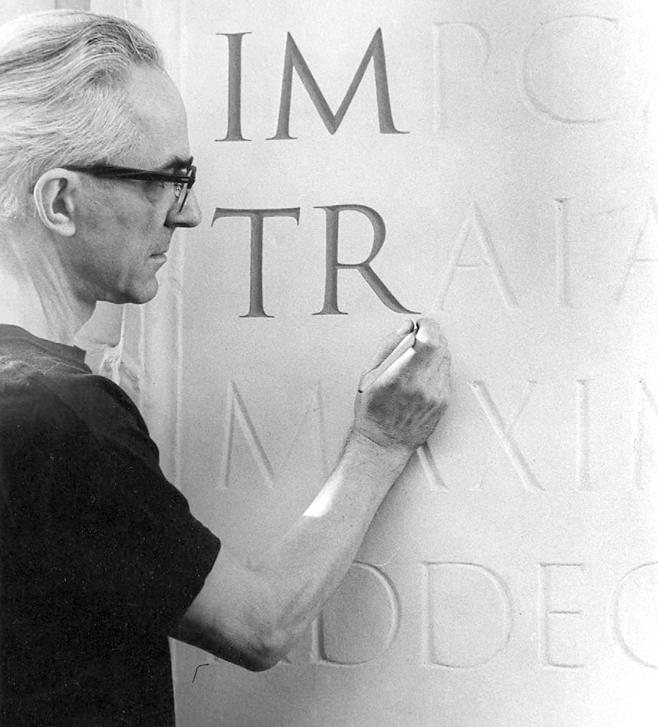
Rev. Edward M. Catich. St. Ambrose College, late 1960s–early 1970s.
Trajan® Pro 3 и Trajan® Sans Pro
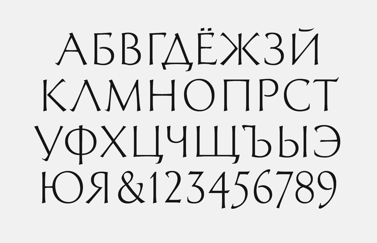
Many Cyrillic versions of typefaces based on historical models are not, strictly speaking, revivals. There is not much to revive: Cyrillic typefaces that could be classified as Old-Style (e.g., Venetian oldstyle or French Old-Style) did not exist in the 15th- and 16th-century Russia, or in any other lands where Cyrillic was used. However, credible and convincing Old-Style typefaces can be developed by extrapolating the visual features of the Latin originals and applying them to the letters of the Cyrillic alphabet.
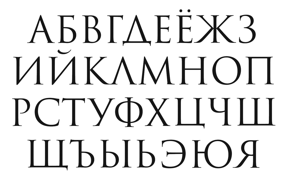
Trajan Pro 3 Cyrillic, by Robert Slimbach and Carol Twombly (Adobe, 2011).
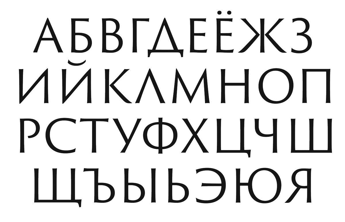
Trajan Sans Pro 3 Cyrillic, by Robert Slimbach and Carol Twombly (Adobe, 2011).
What makes the “cyrillization” of designs originally created for the Latin script easier is the presence of so many letters in both alphabets that share similar forms, even if those glyphs relate to different characters. For example, in English and Russian glyph sets, the uppercase A, B, C, E, H, K, M, O, P, T, and X are all letters derived from the Greek script, the common ancestor of both the Latin and the Cyrillic alphabets, and thus are virtually the same. The balance of the Russian capital glyph set—Б, Г, Д, Ё, Ж, И, Й, Л, П, У, Ф, Ц, Ч, Ш, Щ, Ъ, Ы, Ь, Э, Ю, and Я—remain to be designed to “match” the look and feel of the original (Latin) version. But that is where the difficulty lies.
Obviously, there is a lot more to a Cyrillic font complement than the Russian glyph set. Most digital Cyrillics support the processing of text in dozens of languages. The most common language set covered by Unicode code page Windows 1251 (“Standard Cyrillic”) covers six Slavic languages— Belarusian, Bulgarian, Macedonian, Russian (modern and pre-1918), Serbian, and Ukrainian—and twenty-one non-Slavic languages—Abaza, Adyghe, Aghul, Avar, Chechen, Dargwa, Ingush, Kabardian, Kabardino-Cirkassian, Karachay-Balkar, Karakalpak, Kumyk, Lak, Lezgian, Mordvin-Erzya, Mordvin-Moksha, Nogai, Rutul, Tabasaran, Tat, and Tsakhur. And then there is a Cyrillic Asian code page (ParaType 154) covering forty languages, both Slavic and non-Slavic.
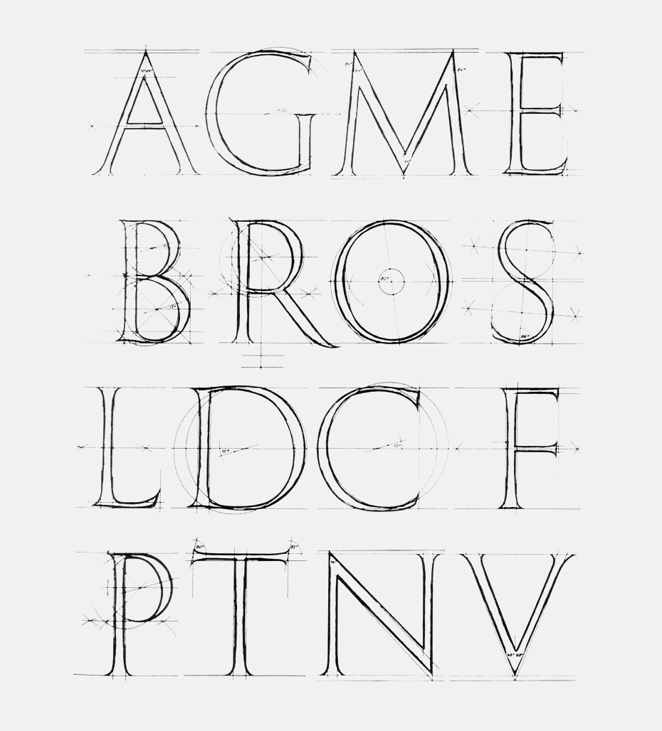
This is where the design job becomes really challenging, even if the typeface under construction, like Trajan Pro 3, is all majuscule, with no lowercase glyphs. Not only is the Cyrillic version expected to be consistent with the design of the Latin, but it also has to conform to the design conventions endemic to Cyrillic.
As with Latin-based typefaces, there are letterforms in Cyrillic that work better in the Modern (neoclassical) idiom than in the Old-Style one (for example, the wavy, tilde-like terminals in the З, Ц, Щ, and Э). To ensure the design integrity of a Cyrillic typeface, it is standard practice to coördinate the construction of certain glyphs that are visually related (for example, С, О, and Э; or Г, Е, Ё and Т; or Н, П, Ц, Ш, and Щ; or Б, В, Р, Ч, Ь, Ы, Ъ, and Я).
In a multilingual typeface, those design groups correlate logically, extending across the boundaries of either glyph set, so the treatment of the Cyrillic C is coordinated with the Latin D, G, and Q; the Г with the F and the L; the Б and the Я with the R; and so on.

Cyrillic and Latin letters grouped by their construction pattern: rectangular, triangular, circular, semicircular, and the like. Using certain letter-forms calls for a similar treatment of other glyphs, visually related to them.

Cyrillic and Latin letters grouped by their construction pattern: rectangular, triangular, circular, semicircular, and the like. Using certain letter-forms calls for a similar treatment of other glyphs, visually related to them.

Cyrillic and Latin letters grouped by their construction pattern: rectangular, triangular, circular, semicircular, and the like. Using certain letter-forms calls for a similar treatment of other glyphs, visually related to them.

Cyrillic and Latin letters grouped by their construction pattern: rectangular, triangular, circular, semicircular, and the like. Using certain letter-forms calls for a similar treatment of other glyphs, visually related to them.

Cyrillic and Latin letters grouped by their construction pattern: rectangular, triangular, circular, semicircular, and the like. Using certain letter-forms calls for a similar treatment of other glyphs, visually related to them.

Cyrillic and Latin letters grouped by their construction pattern: rectangular, triangular, circular, semicircular, and the like. Using certain letter-forms calls for a similar treatment of other glyphs, visually related to them.

Cyrillic and Latin letters grouped by their construction pattern: rectangular, triangular, circular, semicircular, and the like. Using certain letter-forms calls for a similar treatment of other glyphs, visually related to them.

Cyrillic and Latin letters grouped by their construction pattern: rectangular, triangular, circular, semicircular, and the like. Using certain letter-forms calls for a similar treatment of other glyphs, visually related to them.

Cyrillic and Latin letters grouped by their construction pattern: rectangular, triangular, circular, semicircular, and the like. Using certain letter-forms calls for a similar treatment of other glyphs, visually related to them.
One convincing manifestation of the interdependence of glyph shapes is the belonging of certain letters to more than one group of correlates. The Б, for one, is subject to coördination with В, Р, Ч, Ь, Ы, Ъ, Я, and R, but its construction is also related to Г, Е, Ё, Т, Ц, Щ, F, and L. The lineup of those rows of glyphs that share certain visual features is not rigid: it is design-dependent. For example, the Ж may be harmonized with К, Я, and R (as in most Cyrillic faces issued after 1750), or it may be treated as a singular form, visually unrelated to its sister glyphs (as it looked in the typefaces before Peter the Great’s typographic reform).
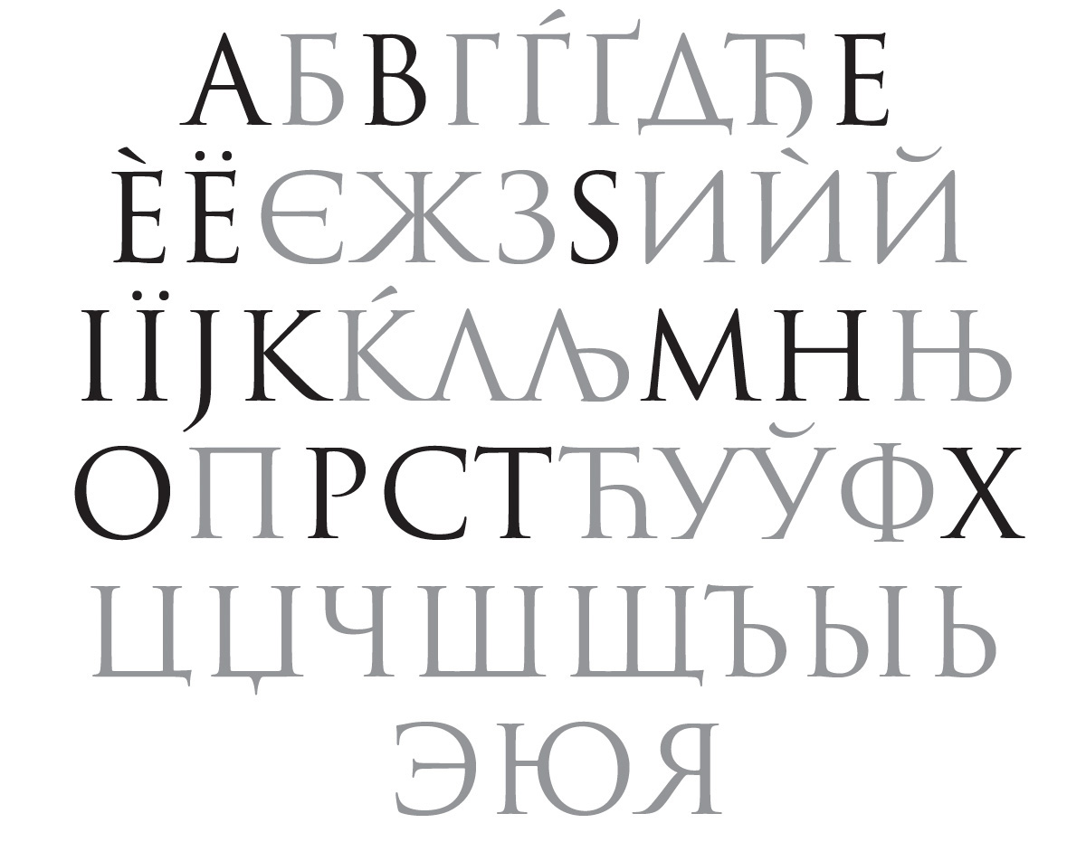
Cyrillic letters included in the most commonly used encoding Windows 1251 (“Standard Cyrillic”). Identical letter-forms shared in Latin and Cyrillic are shown in solid black. Source: www.paratype.ru/help/language
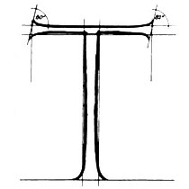
Some design features of Trajan Pro 3 called for a judicious revision of the common, habitual correlations in Cyrillic glyph construction. The pointed apices and vertices of the original A, M, N, V, W, and the spiky Z called for the use of the isosceles Д and Л (delta- and lambda-like), and the unusual, zigzag (“inverted-N”) form of the И. Preference was given, unhesitatingly, to the straight-limb, kappa-like construction of the К, the matching Ж and Я, and the stiff, v-like, not sagging, form of the У. Simple, austere, geometric forms, reminiscent of classical Greek inscriptions, were invariably preferred to a more elaborate, fanciful pattern of a latter-day printing type. No fancy finials, bulbous or lachrymal—usually found in Cyrillic type design—were allowed. The hanging terminals of the Д, Ц, and Щ were reduced almost to naught.
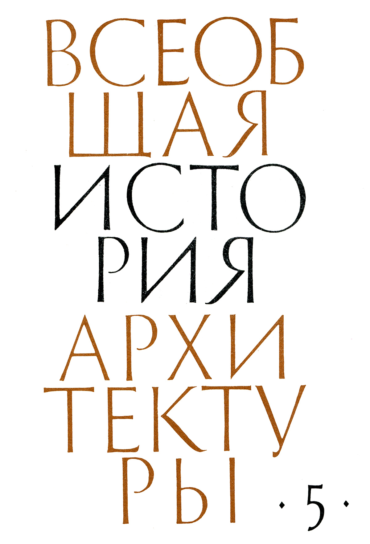
Vseobshchaia istoria arkhitektury [“General History of Architecture”]. Moscow: Stroyizdat, 1967–75. Jacket design by Vadim Lazurski. Paper, gouache, 1965.
In 1958, Vadim Lazurski became the first Russian designer to create a Cyrillic “adaptation” of the Trajan inscriptional letter. He subsequently created a sans serif interpretation of the Trajanic letter in 1965 and, in 1978, came up with a proposal of a multi-weight Cyrillic typeface in the vein of the Roman Imperial capital. In his hand-lettered interpretation of Gavrila Derzhavin’s poem Reka vremen (“The River of Time”) by Gavrila Derzhavin he used different stroke weight—for lack of the better terms, from Black to Ultra Light, although with very subtle, flowing gradation—in all letters of each of its eight lines. In all of this he anticipated both of the main innovations of Trajan Pro 3.
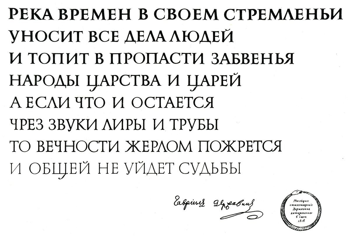
Gavrila Derzhavin. Reka vremen [“The River of Time”], July 6, 1816. Design by Vadim Lazurski. Paper, China ink, gouache, paste-up lettering, 1978.
Thus Vadim Lazursky managed to predate by many years—by fifty, and thirty-seven, respectively—the development of Adobe’s multi-language typeface superfamily inspired by the Roman inscriptional letter, comprising serif and san-serif styles and coming in a wide range of weights. Fred Goudy would have been 150 last year, but his maxim—Lazursky just loved repeating it to us—still holds true: “All the old fellows stole our best ideas”.
Such markedly sloppy, casual reference to the greatest landmark of European epigraphy might have been meant to shield the author from allegations of overestimating the role of the Western art of printing, to show that he had learnt good lessons from his past mistakes, and drawn all the right conclusions from the scorching criticism the pre-war edition of his book—Grafika v oformlenii knigi [“Graphics in book design”, Moscow/Leningrad: Gizlegprom, 1938], with multiple references to European and American typographic history and printing technology,—was subjected to. Alas, Kisin’s using that badly mutilated showing of Trajan letters (his figure 287 on page 234) did not spare him repeated accusations of being an antipatriotic, rootless cosmopolitan, and kotowing to the West. Soon he died. Rumour had it that he committed suicide. That tragic story came up in a long and informative thread on ru_typography forum in late March 2009.
Tikhon Kutsyn. Nachertanie Shriftov: Posobie dlia arkhitektorov i inzhenerov [“Lettering Design: Handbook for Architects and Engineers“]. Moscow: Gosudarstvennoe izdatel’stvo Arkhitektury i Gradostroitel’stva, 1950.
Frank Chouteau Brown. Letters & Lettering. A Treatise with 200 Examples. Boston: Bates & Guild Cº, 1902.
Leonard C. Evetts. Roman lettering: A study of the letters of the inscription at the base of the Trojan column; With an outline of the history of lettering in Britain. London: Pitman, 1938.
Frederick W. Goudy. The Alphabet. Fifteen Interpretative Designs Drawn and Arranged with Explanatory Text and Illustrations. New York: Mitchell Kennerley, 1922.
Walter Käch. Rhythm and Proportion in Lettering [Rhythmus und Proportion in der Schrift]. Olten und Freiburg im Breisgau: Walter-Verlag, 1956.
Fonts whose glyph sets are based on the codepage Windows 1251—designed to cover East- and South-Slavic languages that use Cyrillic script, e.g. Belarusian, Bulgarian, Russian, Serbian, Ukrainian, etc.—also comprise 26 letters of Latin, or more accurately, English alphabet. This makes it possible, if need be, to use them for setting texts in all those languages that use Latin letters without diacritics, such as Bemba, Bisaya, Cornish, English, Fijian, Igbo, Indonesian, Interlingua, Kikongo, Luganda, Madurese, Malagasy, Malay, Manx, Māori, Nyanja, Pidgin English, Rundi, Rwanda, Sesotho, Somali (Lat.), Sundanese, Swahili (Lat.), Swati, Tongan, Tswana, Xhosa, Zulu.
О различных аспектах вариации и корреляции в рисунке знаков русского типографского шрифта я писал — много лет назад — в кратком исследовании «О своеобразии печатной кириллицы» (“On the peculiarities of Cyrillic letterforms: Design variation and correlation in Russian printing type”. Typography Papers 1, Reading: Reading University Press, 1996, 5–26), а о некоторых общих вопросах кириллицы шрифтов, спроектированных на латинской алфавитной основе, в очерке «ITC Cyrillics, 1992—. A Case Study» (Language Culture Type: International type design in the age of Unicode. New York: ATypI/Graphis, 2002, pp. 45–61).