 erard Unger’s typeface Delftse Poort named after the twin towers that are the tallest buildings in Rotterdam and perhaps the entire Netherlands (151m)—story about Delftse Poort can serve as a succinct introduction to this interview. Unger designed the typeface for navigation at the request of the towers’ owners, a national insurance company, and it is not used anywhere else. Delftse Poort includes one style—a kind of stencil type, because, as Unger writes on his website, “the building has two striking towers, so wherever possible I split the letters in two”. The Dutch love stencil type and know how to cut it—so what’s the big deal? But in a strange way, Delftse Poort and Unger’s ingenuous explanation of his concept seem to conceal the whole essence of three magic words: Unger, Netherlands, typography. The towers could have got an “up-to-date” sans serif with fifteen styles or the insurance company could have chosen another typeface (a more “corporate” one) from their homeland’s rich typographic selection, but they just agreed to settle for this slightly weird, disarmingly simple stencil type from Unger. That’s the Dutch for you—residents of a country with an advanced visual culture.
Gerard Unger (born in 1942) belongs to a generation of designers who have gone through fire and water when it comes to technology. They started their work with metal type, later designed phototypesetting fonts, and saw the capabilities and limitations of each invention first hand. From the mid-70s onwards, technological change happened at tremendous speed, and designers had to respond: new type forms were born, and their approach to the design process adapted too. Unger is primarily a creator of excellent text typefaces that have had a strong influence (and still do) on the generation of designers who started work in the digital type era. It is no exaggeration to say that Unger controls our perception of text with his typefaces: nothing is there by chance. They are well thought out in relation to where and how they will be used; their form is precise in its proportions, saturation and outline as a whole. Unger has many years of experience in readability studies and is the author of many studies about the reading process, newspaper design and typefaces in general. You will be able to read about these and many more other aspects in the interview that he kindly agreed to give to our journal.
When you were young and starting your career, could you imagine the present day and the current state of technology?
Looking back, what you can say is that you have absolutely no idea at all of what the future had in store.
I’ve always been a bit of an optimist. No idea where that comes from. I was not a brilliant secondary school pupil, I actually don’t have a final diploma from secondary school. In 1963 I entered the Rietveld Academy, which was not the Rietveld Academy yet, back then it was Kunstrijverheidschool. Completely new world. And suddenly, instead of very low marks, I had very high marks on my report, even 10s. I thought I was in paradise and I’ve actually still got that feeling. Throughout my education as a designer, typesetting was still hot metal, which was used everywhere in the early and mid 60s. Just about that time phototypesetting was beginning and a while later digital typesetting—in 1965. So I already had some information about the changes that were about to happen, but I still think nobody knew where exactly it was going to end. With the optimism I already had and the enthusiasm that my education has given me, the whole period which was about to happen was an endless series of opportunities.
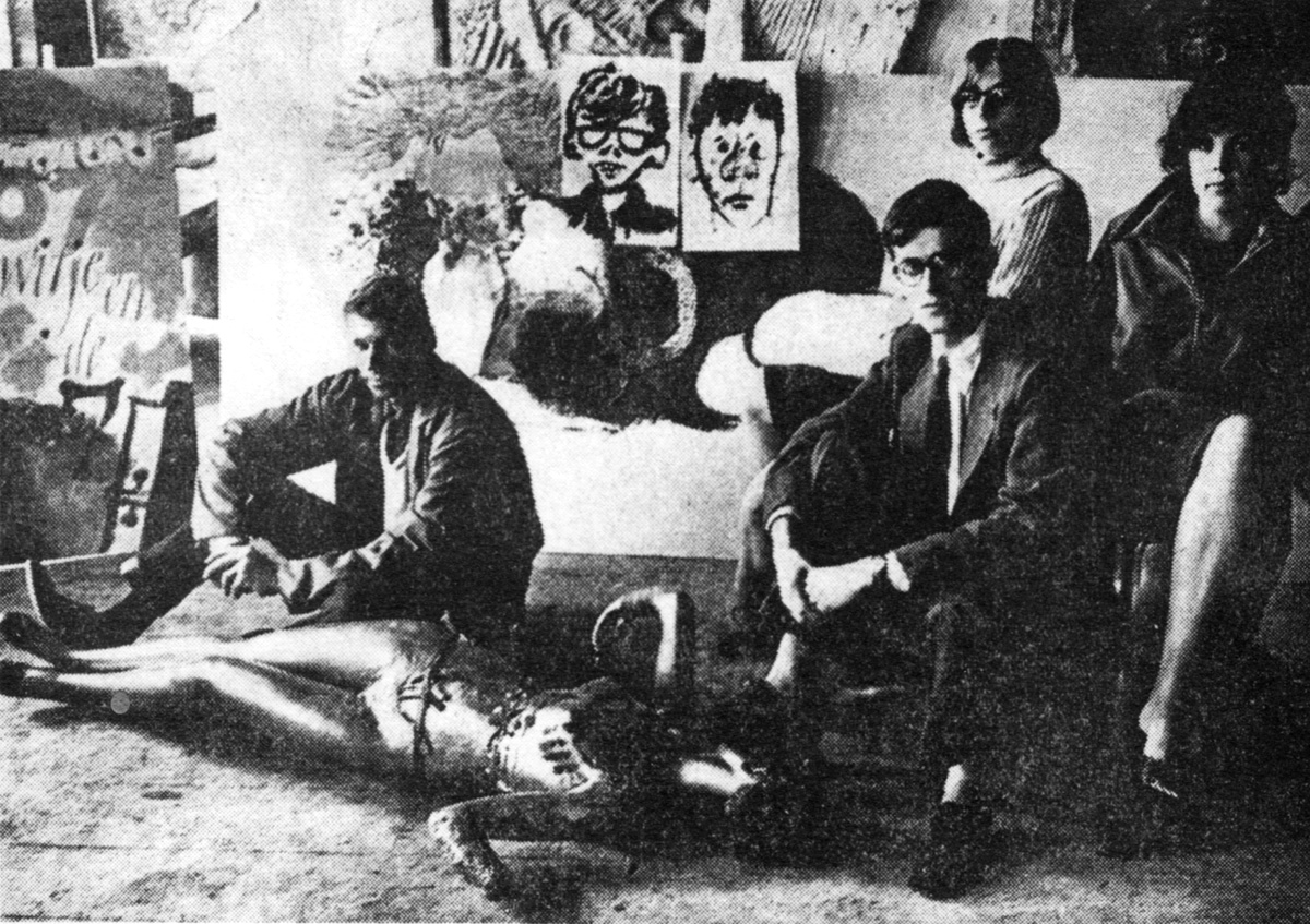
Gerard Unger in his student days, 1965. Scanned from a newspaper article. Every year, the Boekenbal is held in Amsterdam—a get-together of book publishers, booksellers, authors and everybody else in the book trade. The event takes place at a specially decorated City Theatre of Amsterdam. In 1965, Unger and his fellow students did a large part of that decorating. From left to right: Gerard Unger, Bertil Arends, Mariet Numan and Franka van der Loo. The portraits on the wall behind depict Aart Clerckx and Harry Vermeulen, who could not be there for the photograph.
The moment I was confronted with the new technology, I wondered what the essential characteristics of this technology were. I was always very good at finding out the essentials and then I would begin to invent. So in the early 70s I was one of the first designers who were involved in digital type design. At that time there were pixelated letters, so you were moving pixels around. The only literature in the world was on weaving. So it was an absolutely great period for a young designer interested in technology and equipped with a lot of curiosity.

From the working files of the serif Demos (1975, Dr.-Ing. Rudolf Hell/Linotype) and its sans-serif counterpart Praxis (1976, Dr.-Ing. Rudolf Hell/Linotype)—Unger’s first experience in developing a superfamily. Source: V. Efimov, A. Shmelyova. “Great Typefaces. Book Two. Serifs.” Moscow, ParaType, 2007.
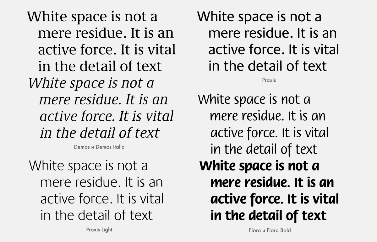
Samples of Demos (serif) and Praxis (sans serif). The proportions, size and weight of the two typefaces are harmonised. Italic sans serif Flora (1984) complements them. Source: V. Efimov, A. Shmelyov. “Great Typefaces. Book Two. Serifs.” Moscow, ParaType, 2007.
The only thing is that this has happened a few times since then, and I thought: “When is it ever going to end, all these changes?” Because as soon as digital typesetting was there and you thought, “Ah, now everything is settled, we can finally build up routines”, the Macintosh appeared—1986—and a short while later Postscript, Fontographer… and my whole life changed again. But the same enthusiasm, the same curiosity, the same optimism were still at hand. I decided to go with it and it has given me a lot of fun.
Actually, it still hasn’t stopped. The only thing is that it seems as if the pace of change has not decreased, but only increased. The way changes now come over in type design, graphic design, typography—not only do these waves of changes come in ever faster succession, but they also seem to be of much bigger influence.
For example, my whole life I’ve been engaged in working for paper-based media and only recently Newsweek, the American magazine, ceased to exist as a paper-based publication and went totally digital. And I think many other publications will follow. I am firmly rooted with both legs in paper-based typography. I have no difficulty whatsoever reading from the screen of an iPhone or reading from an e-book. And I think that by now we can come to the conclusion that the resolution of screens has grown so quickly that you don’t need to adapt type designs anymore, save for very specific information.
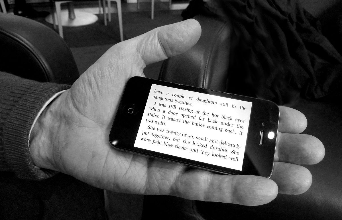
Unger’s favourite detective novel on the iPhone (The Big Sleep by Raymond Chandler).
Otherwise, you can bring any design on the iPhone, iPad and similar machines. I think there is no difference between paper and screen, the reading experience is the same. Actually, at the moment I am trying to read a very big and heavy book in bed, before I go to sleep. It is much more comfortable to read from an iPad, but this book is not available on the iPad.
So there have been all these technological changes, but the far bigger change, as far as I am concerned, is that throughout the 70s and in the early 80s I was working as a type designer—I could make a very good living as a type designer and I was one of the very few. There was Matthew Carter, Adrian Frutiger, Hermann Zapf; they were older than I was. I did not have many contemporaries. And suddenly in the mid 80s, early 90s, there was a wave of young designers from the Hague, Arnhem, and then Britain, Germany… and the picture changed completely. Since type design has gone digital, the number of type designers has multiplied unbelievably. But I don’t think about all my young colleagues in a negative way at all. It is great to have a large number of colleagues, to meet and discuss how different the products we make are or how similar they are when it comes to a neutral sans serif.

M.O.L. (1974)—this typeface for signage in the Amsterdam Metro was created in a working group led by Dutch designer Pieter Brattinga. This is one of Unger’s first experiments with readability. In the difficult conditions of the underground (Unger even has this draft on a black background), the forms of letters are lost and seem to drown in spots of light on bright lightboxes. From here follows Unger’s decision to “anticipate” this distortion: he made the counters of letters (the spaces within them) larger and rounded off stroke endings.

A draft of M.O.L. and its application in the real world. By the way, the typeface’s name refers to the Dutch word “mol” (meaning “mole”)—at first, the designers had the idea of making the animal the mascot of the Amsterdam Metro. There would be a giant molehill outside each station in the city, with a mole pointing the way to the entrance with his nose. This proposal was rejected by city authorities, but was allowed to live on in the name of the typeface.
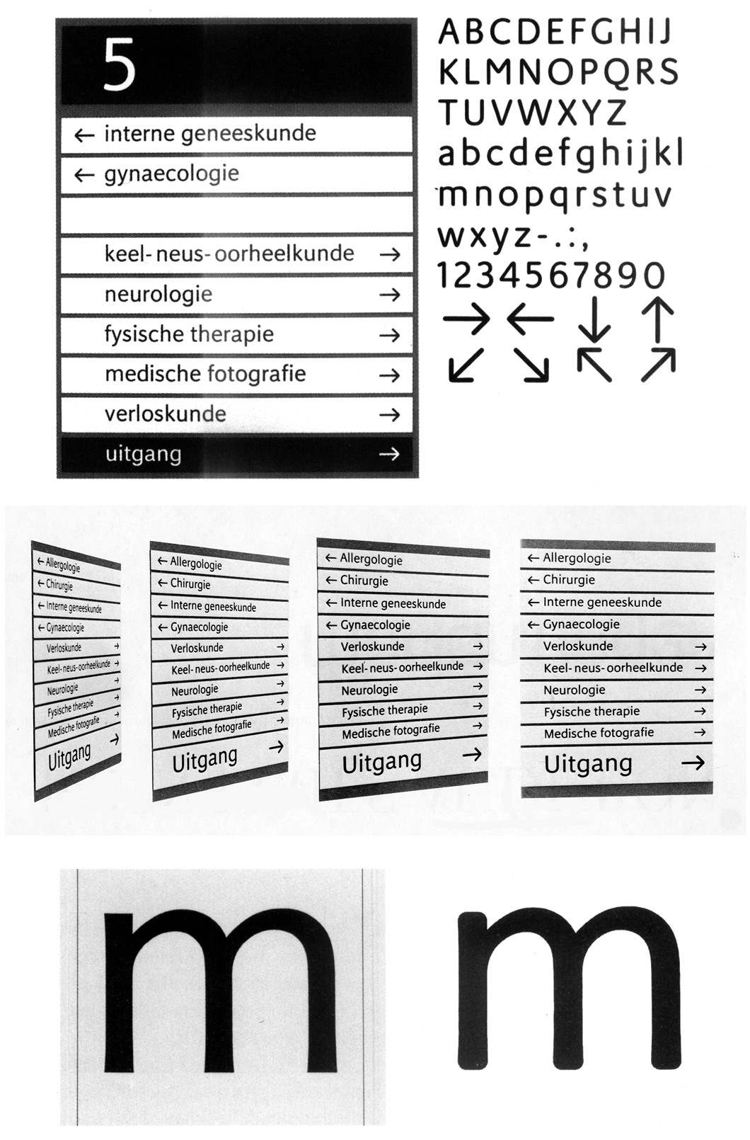
Unger’s first professional typeface—Markeur (1972). This sans serif for navigational purposes was directly linked to the then-existing technology of engraving letters on plastic: the engraving system Pantotype from company Enschedé was used to make signs based on Unger’s drawings. Below: Unger’s drawing and the letter engraved from it. Markeur largely formed the basis for M.O.L.
There is a lot to discuss. One of the big unresolved issues is type on the web copyright. When I was much younger, if I wanted to discuss something with my colleagues I had to wait until the annual ATypI conference, so once a year I could see some colleagues. In this way life has become more exciting and attractive. Huge, very very big changes.
What is your view of the Dutch type design?
I live here and work here, and I have travelled a lot, so I can compare. The Netherlands is still a kind of crossroads culturally. In many ways, the Netherlands is a very attractive place to work, because everything is very close together, everyone is close together, all the services you need are very nearby and there are no long waiting times. So if you have an idea and you want to develop something, and you need information on the subject, it is easily available, easy to find. Everything is here, we know about each other. There is a collective enthusiasm.
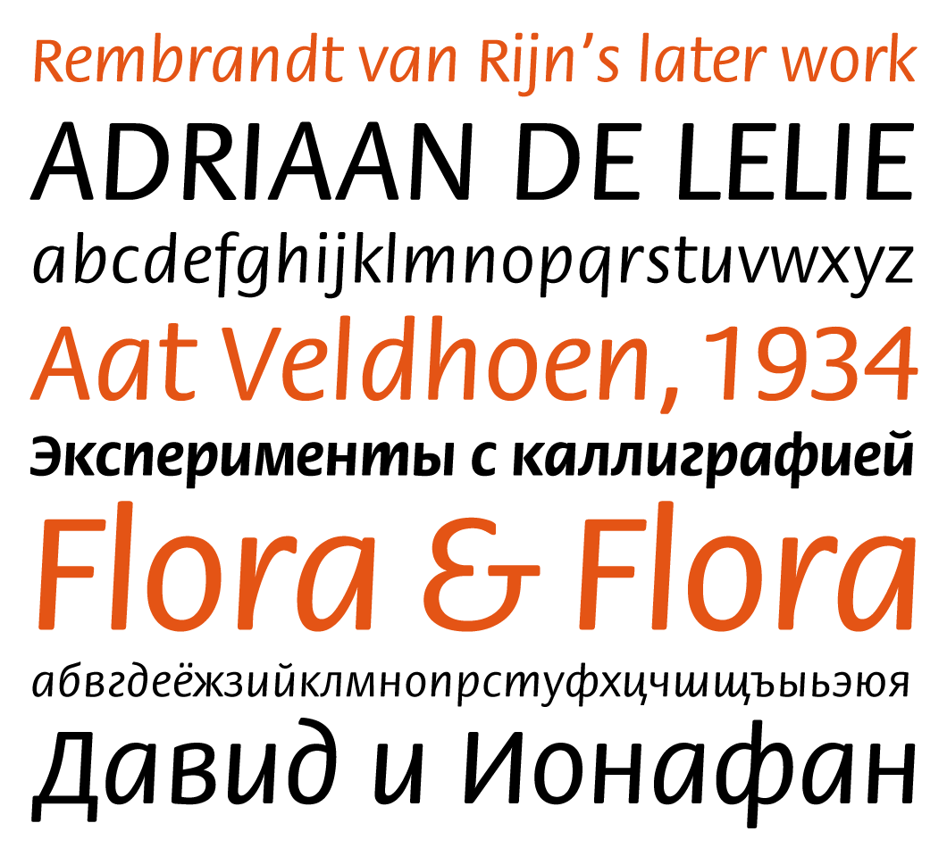
Sans serif Flora (1984) was originally released by Hell with the active participation of Swiss typographer Max Caflisch (then a consultant at the foundry), and later re-released in digital format by ITC—with a significantly changed design. Gerard considers the first version of the typeface for Hell to be the more successful one. Flora is charming and light, its letterforms influenced by the style of handwriting. Unger experimented with an ordinary ballpoint pen and eventually ended up with the regular handwriting that the type was based on. A Cyrillic version of Flora was released in 1995 by the Type Department at ParaGraph (designed by Emma Zakharova and Vladimir Efimov). The typeface has two styles—normal and bold.
But there is also a nice Dutch tradition which stems from industrial design and graphic design. Dutch type design and graphic design have always been pushed in the direction of fine arts. There is a thin line between design and fine arts. There are frequent crossovers. I have many colleagues, especially at the Rietveld Academy, who treated design as art, and sometimes took it too far, in my opinion. But sometimes they came up with surprising results you would not have got in any other way.
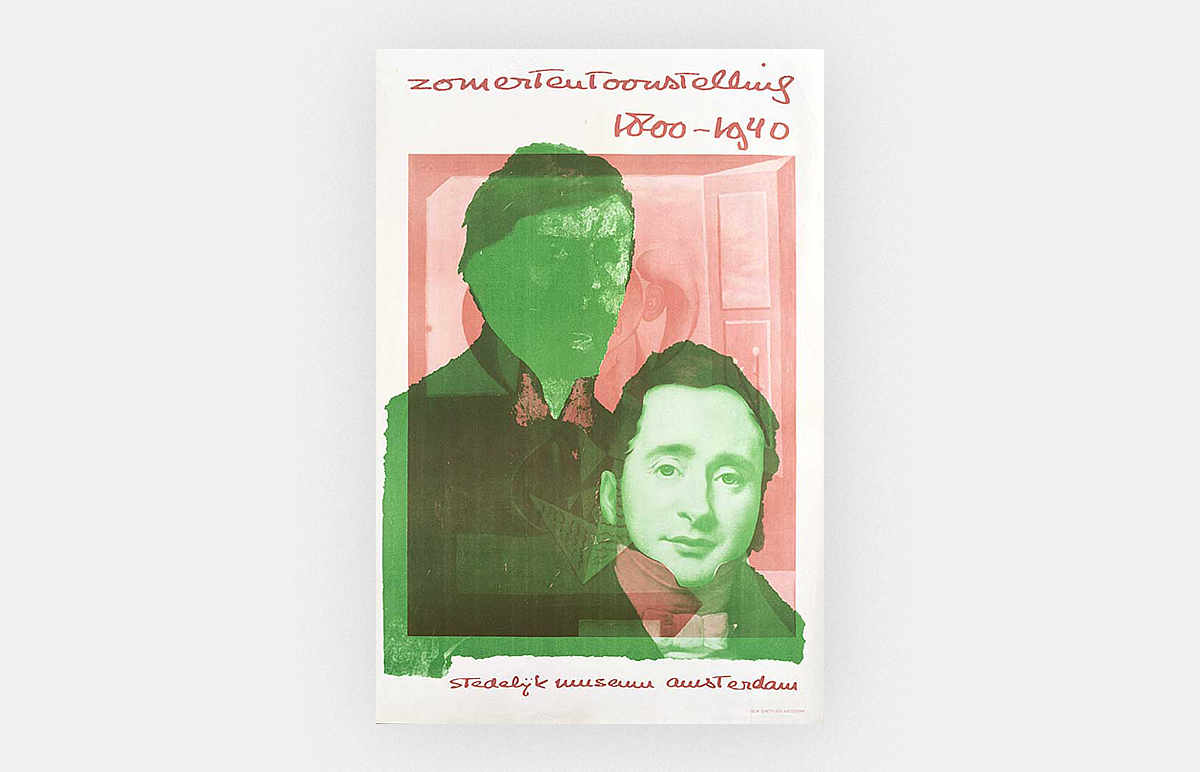
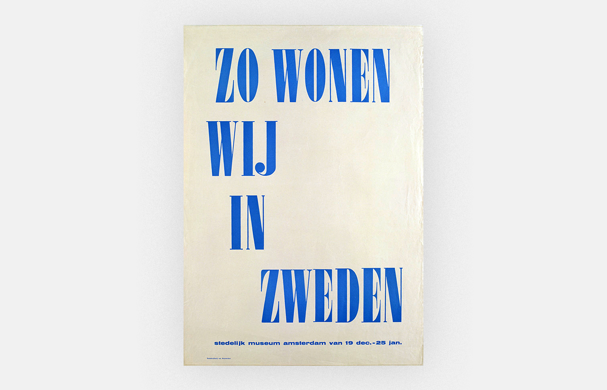
This attitude originated in the 20s, when people like Theo van Doesburg, Vilmos Huszar and Gerrit Rietveld straddled a very wide field of interest. When you open Jan Tschichold’s book on Modern Typography the first chapter is about recent development in the arts: abstraction, Malevich, Lissitzky, and how it influenced typography. So they took direct inspiration from the arts and that went on for quite a long time. After the Second World War one of the first who did it was Willem Sandberg, then the director of the Stedelijk Museum. He designed posters and catalogues himself.
Willem Sandberg (1897–1984). Poster for the Stedelijk Museum Amsterdam. 1946. Source: Bonifacio Pontonio
Willem Sandberg (1897–1984). Poster for the Stedelijk Museum Amsterdam. 1949. Source: pixelcreation.fr

Willem Sandberg (1897–1984). Poster for the Stedelijk Museum Amsterdam. 1949. Source: pixelcreation.fr
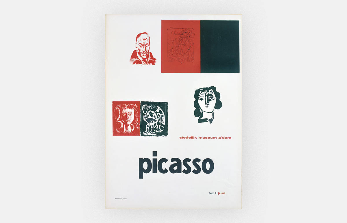
Willem Sandberg (1897–1984). Poster for the Stedelijk Museum Amsterdam. 1953. Source: pixelcreation.fr
I was educated by the whole generation of designers who combined a career in art with a career in design. For example, my teacher for lettering, type design and typography, Theo Kurpershoek, was a painter, a modern classicist in his paintings and a traditionalist in his typography, but he combined two careers. I think you see it much less nowadays. A lot of designers have gone very conservative, look for example at the Rijksmuseum and Stedelijk Museums’ identities. But there are still many people around who experiment and want to do things differently.
I’ve always been very curious, and I think curiosity is a very fundamental Dutch quality. When you make a design, the first question you ask when you’ve made it is: What else can I get out of this? Is there anything more? Is there anything beyond what I have done so far? So that was another thing that I’ve learned in the 60s as a student: never be satisfied with what you can do, but always try to get a bit more out of yourself and to experiment. I think this is what I have in common with many of my Dutch colleagues.
Actually, I find that now when you look around you find the same spirit in Germany, in Switzerland, in Britain and especially in the US. Think of how far people pushed things in the 90s in the US, pushed the boundaries of design, tried to reconcile it with all kinds of ideas from art. The period now seems to be a bit over, the situation is very different: it’s much more result-oriented and I regret that a bit. So I hope that this nice Dutch way of working, of combining experimentation with practical work, experimentation and pragmatics, of letting the ideas from the fine arts seep into design and vice versa, will go on.

A page from Gerard Unger’s research project, which he conducted during his studies at the Rietveld Academy in 1966. It was devoted to the history of numerals.
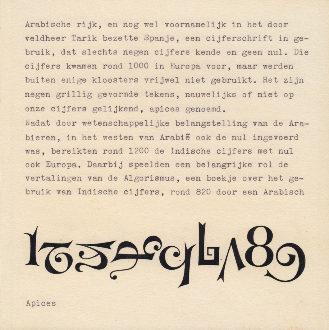
A page from Gerard Unger’s research project, which he conducted during his studies at the Rietveld Academy in 1966. It was devoted to the history of numerals.
I went to the Documenta in Kassel in 2012, and I found it extremely encouraging. It was mainly about how art is connected with how people think, how they form their opinion, how they work, how art can be connected to the society. Apart from that, there was concentration on form, on pure form. What they showed were a few of Morandi’s works. When I was a student, we had to do Morandi still lifes as well, it was one of the assignments. For me, it was very moving to see the Morandi objects. At the same time, the exhibition was about opinion making.
What is your “Ariadne’s thread” in type design?
First of all, I studied calligraphy as a student at the Rietveld Academy, which, of course, has an influence on my work. When I was confronted in the late 60s/early 70s with all these new technologies, I found that you have to approach type design from a really different side, to see it almost as a part of industrial design. What we were taught as designers is that when you are asked to design a product, you look around and ask a number of fundamental questions: What methods of production are available? Who is it for? How will it be used? Then you go out and research. And then with that information you go and start working. Then calligraphy disappears a bit in the background.
Calligraphy is still very much in the back of my mind. When I was a student, what impressed me was my teacher of type design—looking at an etching by Rembrandt, he put a magnifier on it so that you saw a fragment much enlarged. And you saw how Rembrandt with his hands, his brain, his eyes had made scratches. My teacher then said: this is calligraphy. The movement of the hand controlled by the brain and the eye. This is calligraphy. And I thought: How right you are! It’s not just how to make proper letters, calligraphy is a very living thing, and a very moving thing, it moves with the times.
And there was another thing—the abstract shapes of modernism. For example, I am still very fond of sculptors like Constantin Brâncuși (Константин Бранкузи) and Alexander Calder (Александр Колдер) with his mobiles, totally abstract shapes. The French designer Roger Excofon has been a huge influence on my work. When you look at letterforms as abstract shapes, you add a number of design possibilities to your repertoire.
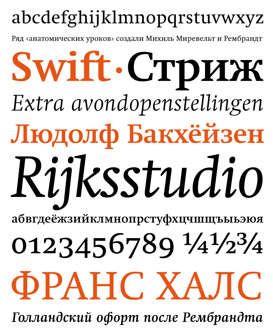
A digital version of Unger’s iconic typeface Swift, with the suffix “2.0”, came out in 1995. In 2003, ParaType released a Cyrillic version with eight styles (designed by Tagir Safaev) for public use. This is how Vladimir Efimov described Swift in his book “Great Typefaces. Book Two. Serifs“: “This typeface has strong and wide (like wings!) triangular or wedge-shaped serifs. In the header styles, they almost merge together sometimes, as if passing the baton from one letter to another. The flat arch of the lowercase h, m, n and the bowls of b, d, p, q are tapered when they join vertical strokes. The terminal of lowercase a in the Roman styles ends with prominent wedge shape. The open aperture and tension of the basic forms clearly brings out the spaces inside and between letters, which in turn seem to constitute their own independent forms. Just like a bird catches the wind with its wings, causing the air to yield and submit to its will, Unger’s typeface makes the space between letters and within them work.”
So if you talk about an Ariadne’s thread, it’s fundamentally to see type design as industrial design combined with ergonomics, in order to adapt the human product to the capacities of the human body, in this case to the capacity of the eyes and the brain and the hand. This is what supports my work.
I am very fond of curves. I’ve always liked curves. It’s never a simple curve, they are very complicated curves very often. It starts rather flat, it makes its turn, it stretches itself, makes its turn again and suddenly goes up… There is an outside curve and an inside curve doing something different, you create a silhouette this way, this is how shapes come about. That’s the trick. That’s all there is.

Outline drawing of characters for Swift with Gerard Unger’s revisions. 1987.

Sketches of italic characters for Swift. 1985.
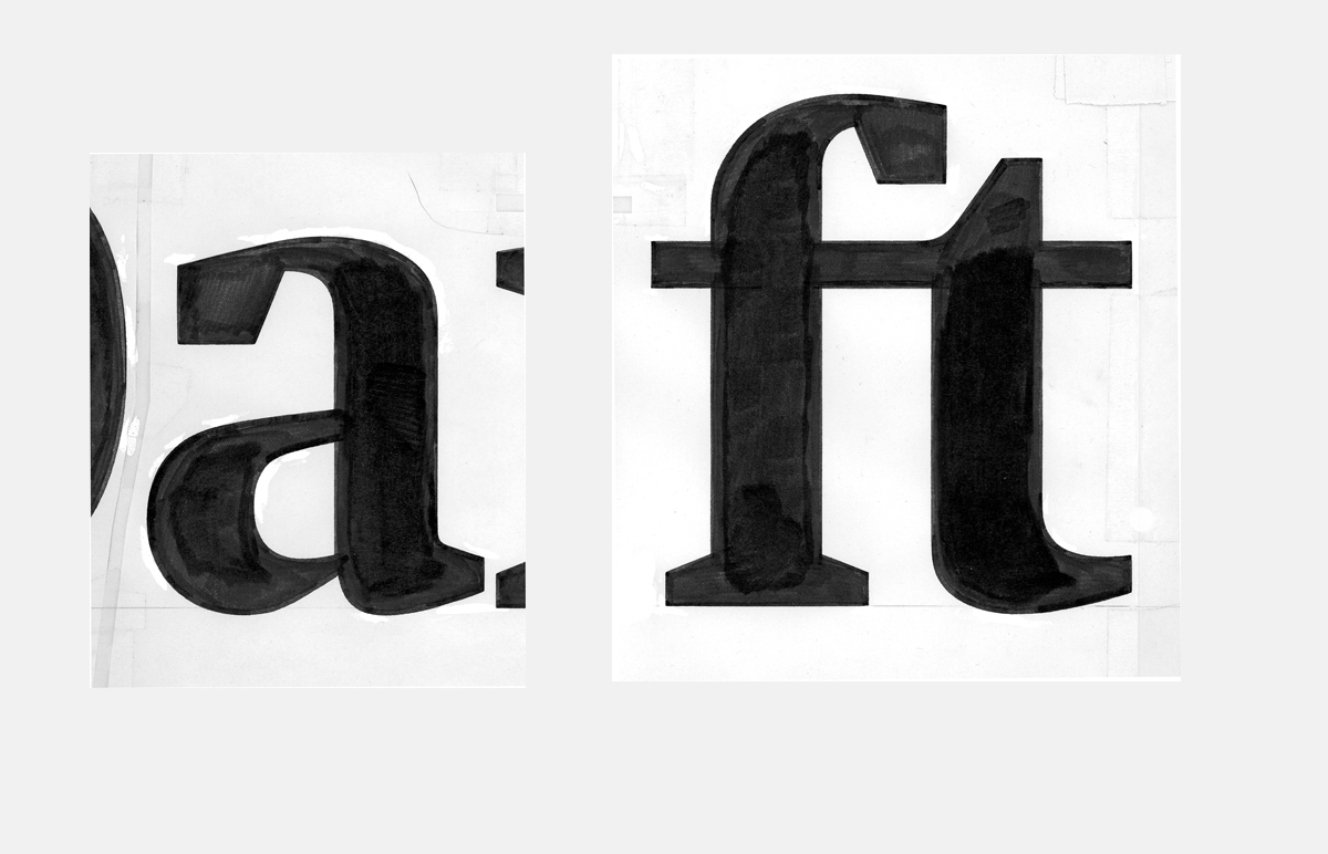
Sketches of italic characters for Swift. 1985.
How did you approach designing Cyrillic?
I’ve always been too careful, I think, with handling different scripts. For example, when I was a student, I designed some Greek, but I never took it any further. Gerry Leonidas in Reading has always been urging me to do a Greek typeface. I hesitated. I know the Latin script with all its subtleties and all its ins and outs. But I’ve always had a feeling that I did not know the Greek and the Cyrillic script with all this intimacy. With the Latin script, I know exactly how far I can go with experimentation, and when I am crossing the line where readers will become aware of my experimentation. And I go one step over that line on purpose. But I have no idea where this line is in relation to the Greek or Cyrillic script.
But then I was studying the Romanesque capitals, and there are three kinds of letters involved: the usual capitals which originally come from Rome, the second set of letters, which is called uncials (AEDHNQ), and there was a “wild” group of letterforms that are originally Insular, or Celtic, and come from Ireland and England. And there are angular versions of round letters, for example, the square “C” which looks like a capital “E” without a crossbar, and a square “S” that looks like a reversed “Z” and pointed “O”, and pointed “Q” and a square “G”.
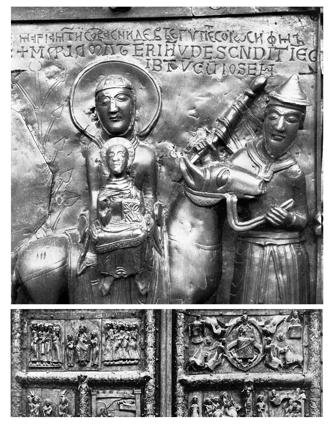
A typical example of Romanesque inscriptions can be seen in Veliky Novgorod. These unusual letters decorate the bronze Magdeburg Gates of St. Sophia Cathedral. The gates were made in the German city of Magdeburg in the middle of the 12th century and were intended for a church in the Polish city of Płock, but for some unknown reason were brought to Novgorod. The original inscriptions were translated into Russian and Cyrillic letters are engraved next to the Latin ones. Photograph from: Ursula Mende, Albert and Irmgard Hirmer, ‘Die Bronzetüren des Mittelalters’, Hirmer Verlag, München, 1983.

A typical example of Romanesque inscriptions can be seen in Veliky Novgorod. These unusual letters decorate the bronze Magdeburg Gates of St. Sophia Cathedral. The gates were made in the German city of Magdeburg in the middle of the 12th century and were intended for a church in the Polish city of Płock, but for some unknown reason were brought to Novgorod. The original inscriptions were translated into Russian and Cyrillic letters are engraved next to the Latin ones. Photograph from: Ursula Mende, Albert and Irmgard Hirmer, ‘Die Bronzetüren des Mittelalters’, Hirmer Verlag, München, 1983.
The moment I got control of the medieval forms and realised how they worked, I had a look at the Cyrillic and I thought: this is the same thing, just another composite alphabet like the Romanesque letterforms. Great fun! Some letters which are round in Latin are angular in Cyrillic, and you have a reversed “R” in Cyrillic—medieval stone carvers mirrored letterforms quite regularly. The moment I started looking at Cyrillic with medieval eyes, I could design it.
And then I thought: Now I could do the Greek as well, because in the Middle Ages, earlier than the period I have studied, Greek letterforms were used in combination with the later letterforms as well. {2} So when I had done my Greek design and I showed it to Gerry Leonidas, he looked up with a broad smile and said: How often have I told you that you could do it! Of course, Gerry made corrections and showed me certain things I could improve.
What are you working on now? What kind of questions do you research?
My PhD dissertation supports my project—21st century type design with medieval ingredients. The typeface is called Alverata, now available from TypeTogether. I’ve made a study of Romanesque letterforms from the period from 1000 to 1200. It’s a period when a single model for a set of letterforms was used for over 200 years throughout Europe, from the British Isles to Eastern Europe, and from Norway to Sicily. These letterforms were applied with amazing variation. I’ve never gone into history as deeply as I’ve done now. Extracting from that medieval period a number of ingredients: not just shapes, but also the mentality behind the shapes that I could apply now.
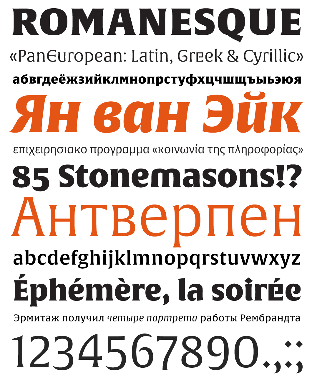
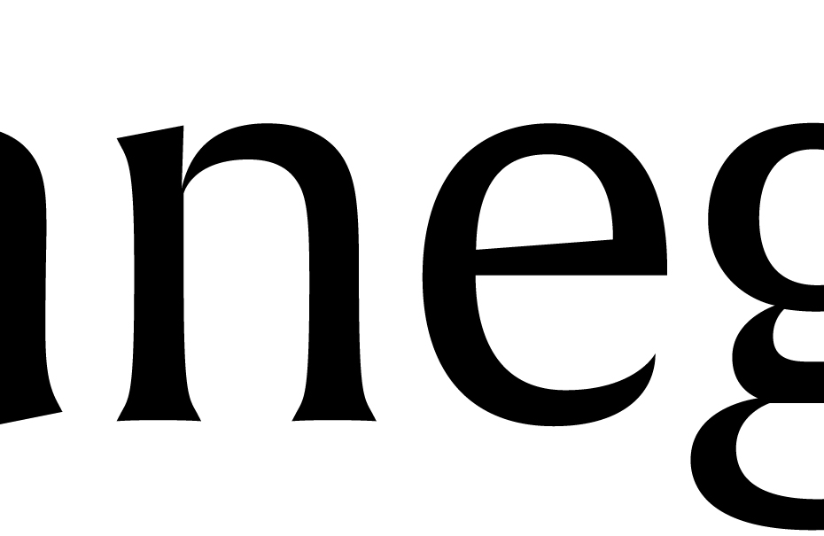
Alverata (2014) by Gerard Unger is a “21st century mediaeval typeface”. Unger explored a multitude of inscriptions from the Romanesque period (11th–beginning of the 13th century) and found an incredible variety of Romanesque majuscule letterforms. In books, stone inscriptions, metal engravings, wall paintings and various historical monuments of the time Unger noticed a mixture of three styles: medieval script (successor to the Roman square capitals of the 3rd–5th centuries), Uncial and Insular Letterforms. Romanesque majuscule was low-contrast and static; the straight strokes widened towards their ends and had small triangular serifs. The variation of letters in manuscripts of the time is very interesting: a square “alternative” of an originally round letter could suddenly appear in a line; letters were combined into ligatures and could change their proportions when the scribe had to fit the text into a certain area, or sometimes for no reason. In general, the spirit of playfulness and variability in this script is no coincidence—it could be a result of the monotonous lifestyle of monks for whom reading and writing books was an important pastime.
The Middle Ages were no stranger to linguistic games either, and it is possible that the appearance of strange letterforms in books had a functional purpose: it was a way for the scribes to draw the reader’s attention to certain parts of the text. All these details curiously resonate with the new typographic paradigms that were born thanks to the computerised technology of the 21st century. Unger is unusually subtle in noting type designers’ desire to work like Middle Age scribes: playing with letterforms, trying to control the reader’s attention, adapting to technology and making type a flexible and customisable tool. The Alverata family has three faces: Regular, Informal and Irregular. The Irregular style refers to medieval experiments with letterforms (with typically Ungeresque, of course, execution). Alverata is notable for its slightly narrower letter proportions, large x-height and the high modulation of its strokes (such as the exit strokes of bowls by stems). The variability that Unger studied has been brought into this family with great skill, and it really opens up a wide field for experimentation in typesetting for books, display type and screen typography.
Two of my PhD students, Ann Bessemans from Belgium and Nadine Shahine from Lebanon, have both gone into legibility research. And one of the supervisors for both is Kevin Larson from Microsoft. They are somewhat pioneering in the way that they are designers who have gone into legibility research. I closely followed their methods, and one of the ingredients in the research is that they have designed their own typefaces for it. In their type designs, they made a number of very subtle variations, which can be easily compared and give very valuable information that can be applied to type design.
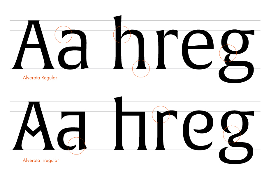
Specific details of Alverata‘s characters and some alternatives from the Irregular style.
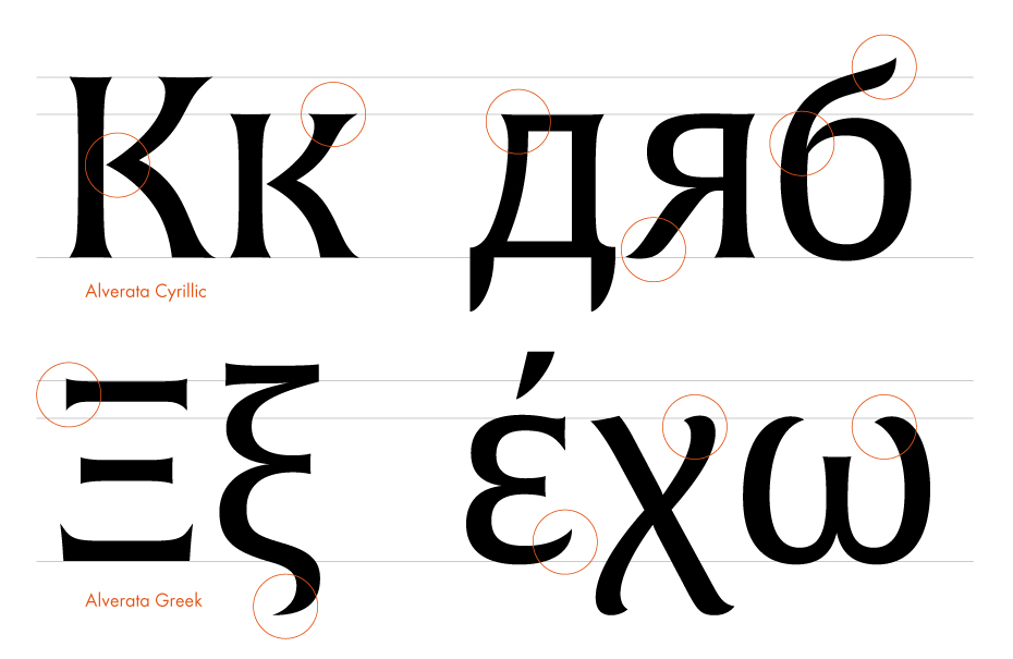
Specific details of Alverata‘s characters in Greek and Cyrillic.
Specific details of Alverata‘s characters in Latin.
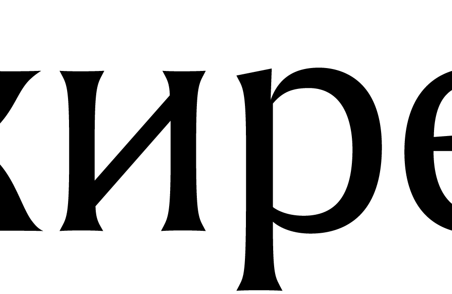
Specific details of Alverata‘s characters in Cyrillic.
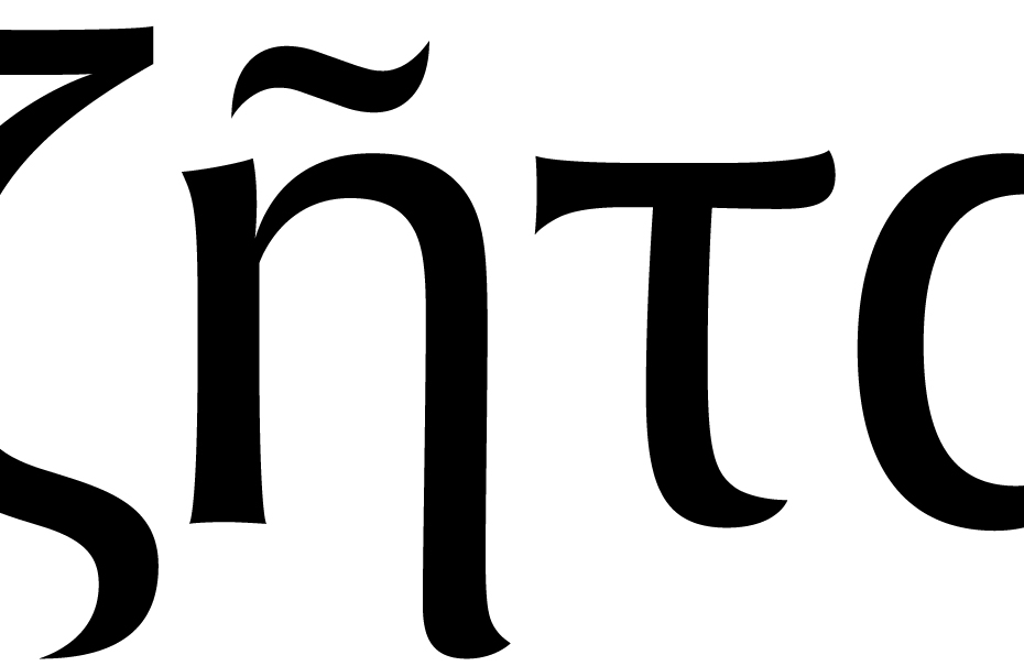
Specific details of Alverata‘s characters in Greek.
And my own 21st century medieval design offers me the same possibility, so I am already making a number of very subtle step-by-step variations. And I will go into legibility research myself. Working as a type designer for 40 years, I wondered about a number of things. For example, I pay a lot of attention to all kinds of details in a type design. What do the readers see from all these details? I think I can find out. Actually, the research methods to make such knowledge available have only recently been developed and improved. I am looking forward to a new career as a legibility researcher. I want to stop designing type, but I will definitely go into legibility research.
Ann Bessemans defended her PhD thesis “Type Design for Children with Low Vision” at Leiden University in 2012 (supervised by Gerard Unger and Bert Willems from Hasselt University). Nadine Chahine defended her thesis “Reading Arabic: Legibility Studies for the Arabic Script” in Leiden in 2012 (supervised by Gerard Unger and Kevin Larson).
documenta is a contemporary art exhibition that was founded in 1955 and takes place every five years in Kassel, Germany. Today, it is considered one of the most significant events in modern art alongside the Venice Biennale.
Unfortunately, there are not too many fonts with the Cyrillic alphabet among them. We have Swift (author of the Cyrillic alphabet—Tagir Safaev) and Flora (Cyrillic—Emma Zakharova, Vladimir Efimov), in addition to last year’s Alverata, for which the author designed the Cyrillic himself
In 1995, the first edition of his book about the relationship between type and its reader, Terwijl je leest (“While You Are Reading” in the English translation), was released. It was republished in 2006.