 ne of the most prestigious educational establishments in England—the University of Reading—was founded in 1892 and was part of the University of Oxford before receiving its Royal Charter in 1926. A recognised academic and research centre of world importance, the university has been conducting research into type and typography, among other things, since the early 1960s. A series of designers that currently set the bar in the type market and the profession as a whole can be found among the graduates of the MA Typeface Design course. Reading’s strengths, which both employers and prospective students are well aware of, are the in-depth study of the history of typography, development of analytical design skills, and instruction in constructing typefaces that support multiple languages. We interviewed University of Reading professor and MATD course director Gerry Leonidas to find out how they were able to reach such a high level and what is happening on the course today.
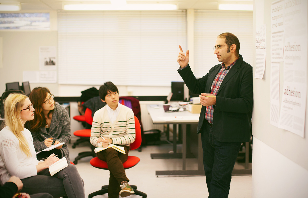
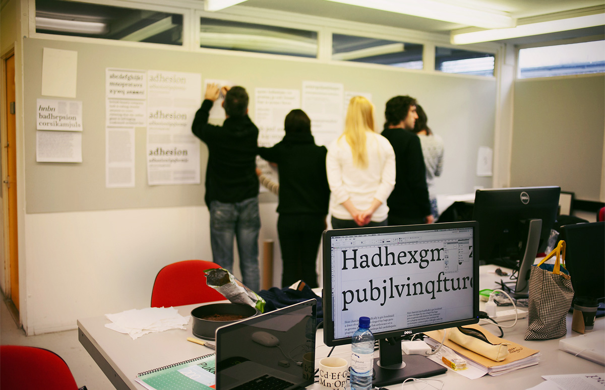
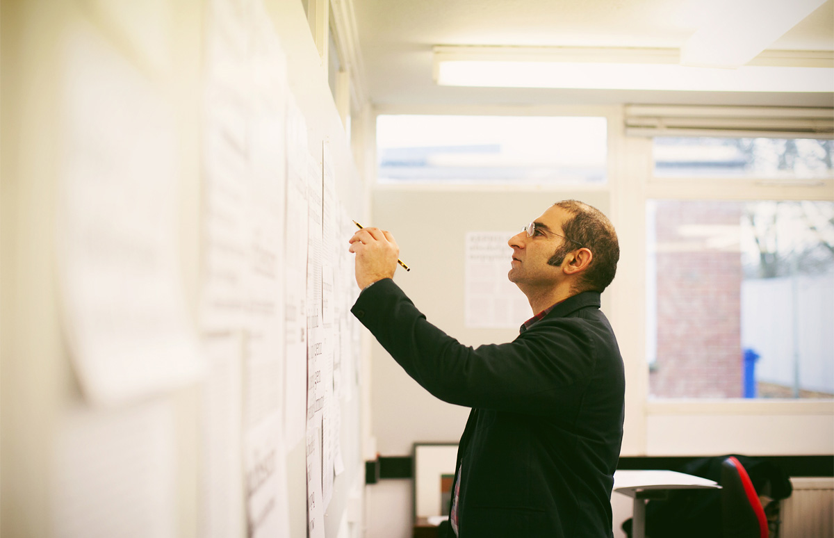
Gerry Leonidas in class with MATD students at the University of Reading.
What are the highlights of the MA Typeface Design programme? What is its main idea?
The MATD is founded on the idea that typeface design exists at the junction of design practice, a historical and technological environment, and a cultural context. So, alongside designing typeforms, and specifying typefaces, our students dive deeply into historical, cultural, and technical research.
Achieving a high level of practical skills comes with building a deeper understanding of how typefaces meet specific demands in a range of cultures. Above all, it is probably the change in the way of thinking about design and your own practice. Graduates learn to think more critically about their discipline and question the design decisions they make—not just for the typeface they work on while at Reading, but long after.
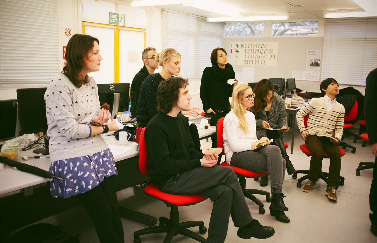
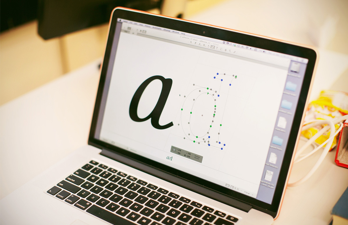
MATD students in class at Reading.
Highlights would include regular workshops on scripts, seminar series from Michael Twyman, lectures from James Mosley and the annual field trip, as well as deeply personal moments of discovery and insight.
Have there been any changes in the Typeface Design course over the last five years?
The programme changes every year. There are external factors (where we perceive the industry moving towards and the direction in which we want to grow) and internal (the interests and personalities of the students, and the mix of the visiting staff).
We have developed a methodology that shows how the technological, corporate and cultural environments in which typefaces are made have influenced the interpretation of the original, underlying scripts. Our method of typeface development takes into account the growth of non-Latin typeface design as an industrial enterprise in pre-digital and digital environments. It emphasises the impact of type-making and typesetting technologies on the form of individual characters and—in a broader sense—the specifics of various typographic eras. Finally, we analyse the tension between tradition and modernity in contemporaneous visual communication.
Once understood for the scripts each student is working on, this methodology can be applied to any script.
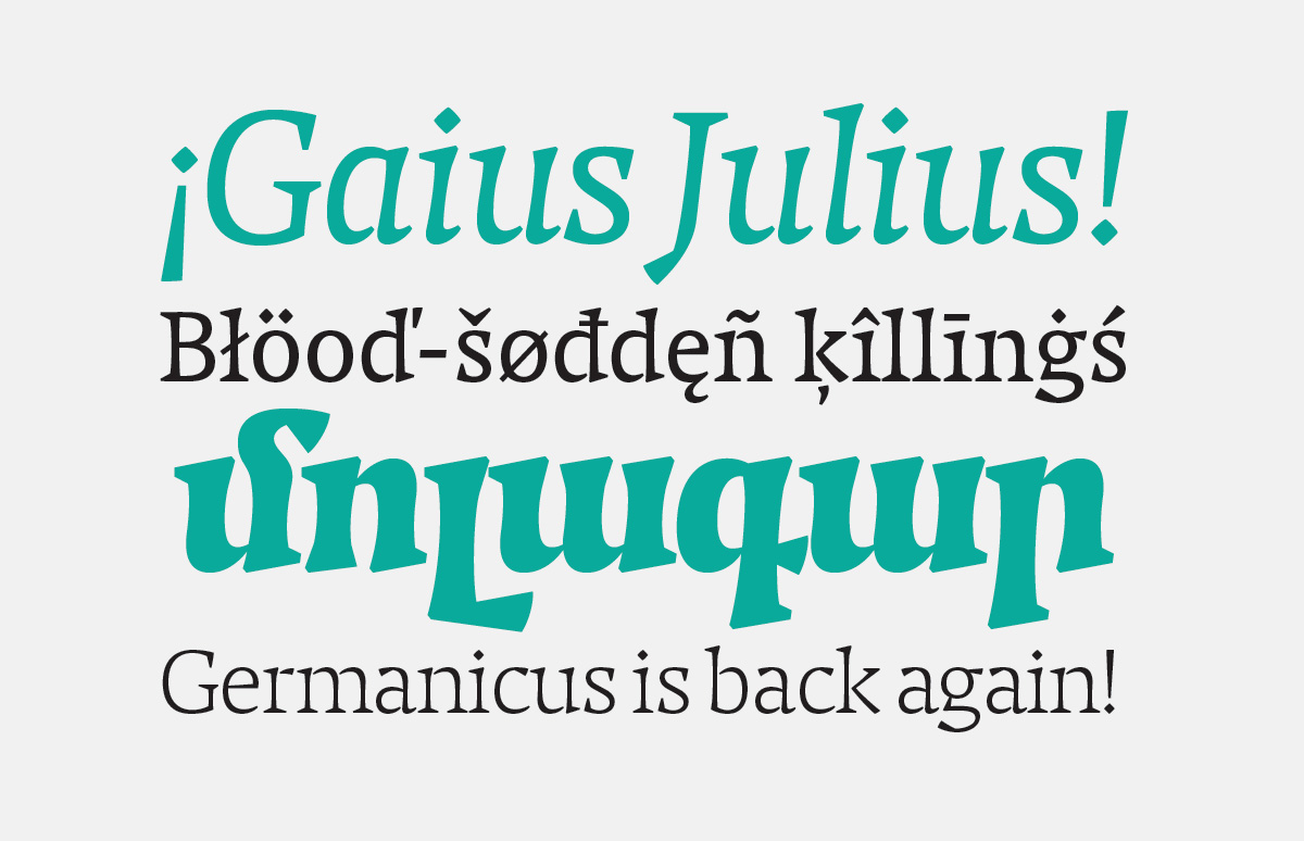
Caligula. Latin and Armenian characters. Jonas Niedermann (Switzerland, 2013). In this study, Jonas set himself the task of developing a dynamic typeface for magazines and newspapers that could be used with equal success on mobile devices and on paper.
Jonas did not want to limit himself to the technical capabilities of mobile devices and decided to focus on the new iPad 2 screens with Retina Display technology. The high-resolution screens allowed the author to focus on design, rather than character hinting.
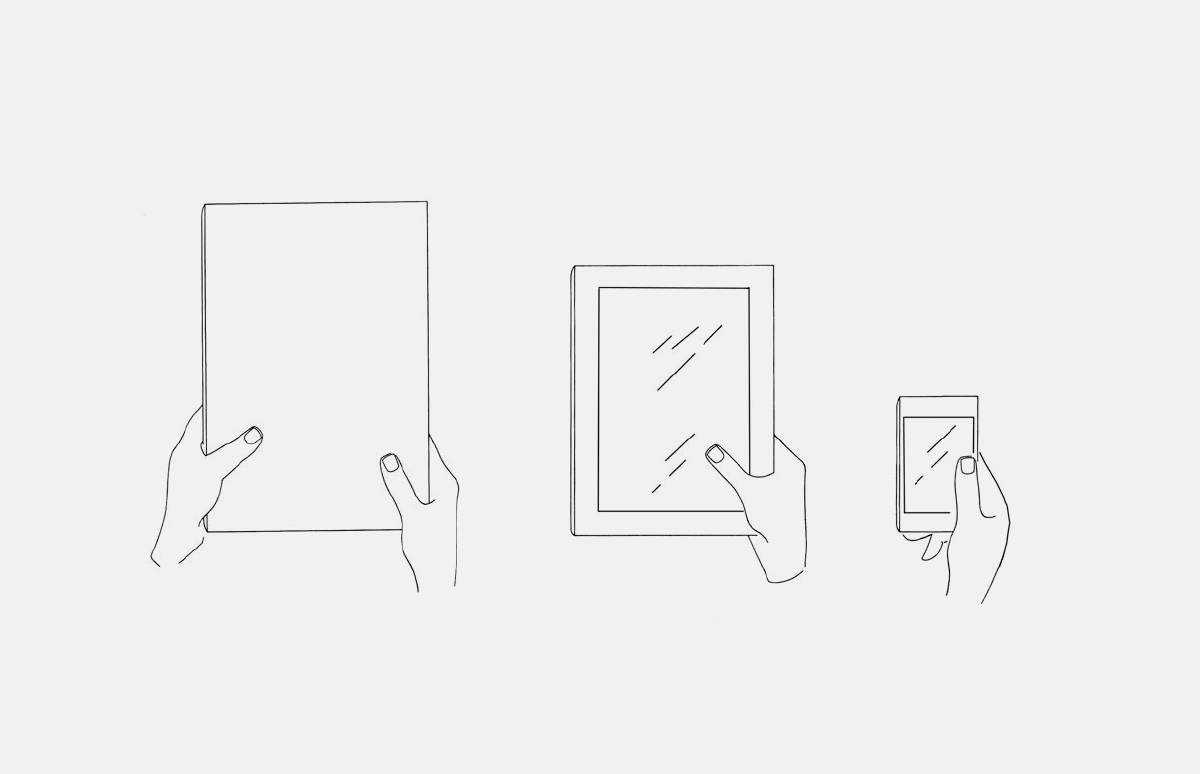
When setting himself this task, the author wondered just how modulated a typeface can be and which proportions would be more readable on an iPad with Retina Display. This illustration shows a comparison of the magazine, iPad and iPhone formats.
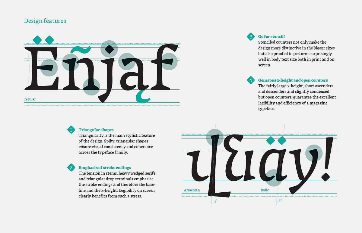
First of all, it was necessary to understand how the proportions of Latin characters should be related to those of their Armenian counterparts. Jonas was guided by Elena Papassissa’s thesis The Current State of Armenian Typefaces and consulted Armenian script specialists.
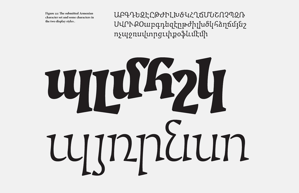
Should the Armenian characters be oblique or upright italics? Which design ideas associated with Latin letters can be transferred to the traditional Armenian script, in order to link the two writing systems?

Caligula also supports most languages based on the Latin alphabet, including French, German, Polish, Czech and Hungarian. Double-page spread from the author’s presentation.
A regular topic of contentious debate at type conferences is whether designers can make quality typefaces for scripts they don’t understand. You obviously think that they can?
This is, unsurprisingly, nothing new: this challenge is central to the history of typeface design, and grew rapidly in the second half of the 20th century. At Reading we have records of such discussions from the 1960s at least, as well as documents that show how people addressed the design problems of unfamiliar scripts. With Fiona Ross we have developed a methodology that builds on these earlier processes and is based on a combination of research and script-specific practice. We start with the manual foundations of a script, with sensitivity to tools and substrates and an analysis of writing practices.
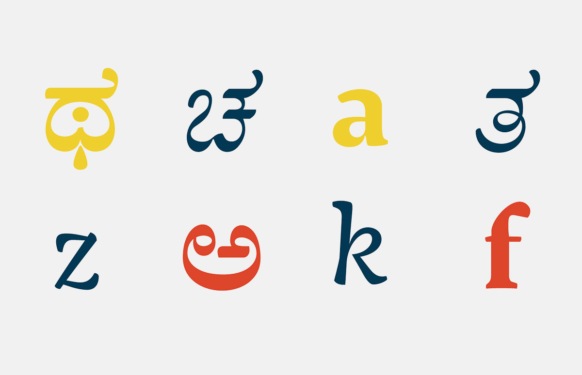
Aakriti. Katy Mawhood (UK, 2013). This project combines the Latin alphabet and a typeface based on the South Indian Kannada script, characterised by rounded shapes and multiple vowel and consonant ligatures (more than 450 combinations).
The unusual, rounded shape of the letters in Kannada is due to the fact that monk scribes wrote on thin palm leaves. They preferred ornate curves to straight and sharp lines, so as not to damage the surface of the leaf. Source: Cornwell University Library.
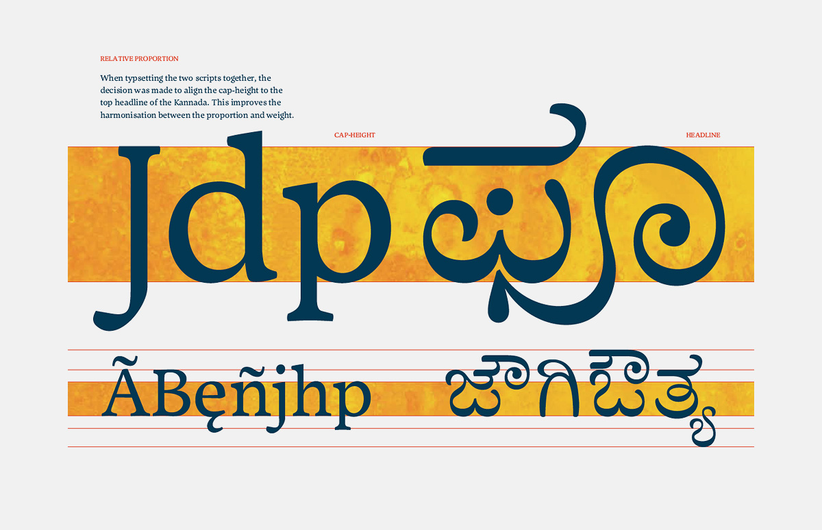
In order to combine the typefaces in bilingual books, the designer aligned the cap-height of the Latin letters to the top headline of the Kannada, consequently improving the harmonisation between the saturation of both styles.
We correlate this with research into the type-making and typesetting technologies that influenced the typographic implementation of the script. For example, hot-metal technology imposed limitations in the character sets, the forms of individual letters, and the way forms combine (in an automated typesetting machine—ed.). This does not apply to today—to reproduce these restrictions would be not only ignorant, but plain bad design. We then explore the way in which typeface design reflects the tension between tradition and modernity in visual communication, which is a key consideration in typeface design. For example, the associations with monoline strokes as “modern” or “traditional” are entirely relative to precedent and regional associations, not inherent in the shape itself.
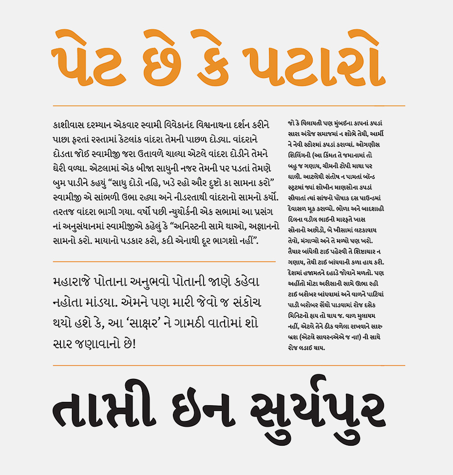
Final project typeface Prakashan (2013) by Italian designer Alessia Mazzarella which demonstrates an innovative approach to modulation for the traditionally monolinear writing system of Indo-Aryan language Oriya, thereby tying it rhythmically and dynamically to the Latin part of the project.
The Latin part of Prakashan has a wide range of styles, from a low-modulation light styles to a modulated display style.

As for the wide range of styles in Oria, the designer tried to strike a balance between the traditional monolinear script (in the light styles) and more modulated characters in the regular style.
The proportional relationship between the Latin and Oria.
Finally, we investigate typeface design for complex typography within each script/language combination, by analysing past and current publications from that community. These considerations allow for a more nuanced development and testing environment, that allows talented designers to cover scripts with which they are unfamiliar. While there is always a requirement for testing with native readers, this is much more towards the end of the development process than people tend to think.

Do students often express willingness to design Cyrillic? How do you find the overall level of Cyrillic in the MA projects?
I would say that there is only a moderate desire to cover Cyrillic. If I had to speculate why, I’d say that the relatively healthy production of typefaces from Russia and Serbia, and increasingly Bulgaria (possibly other places, too) makes Cyrillic less of a challenge in research terms.

Novinka (2006) by Sophia Safaeva (winner of Modern Cyrillic 2009).

Novinka (2006) by Sophia Safaeva (winner of Modern Cyrillic 2009).
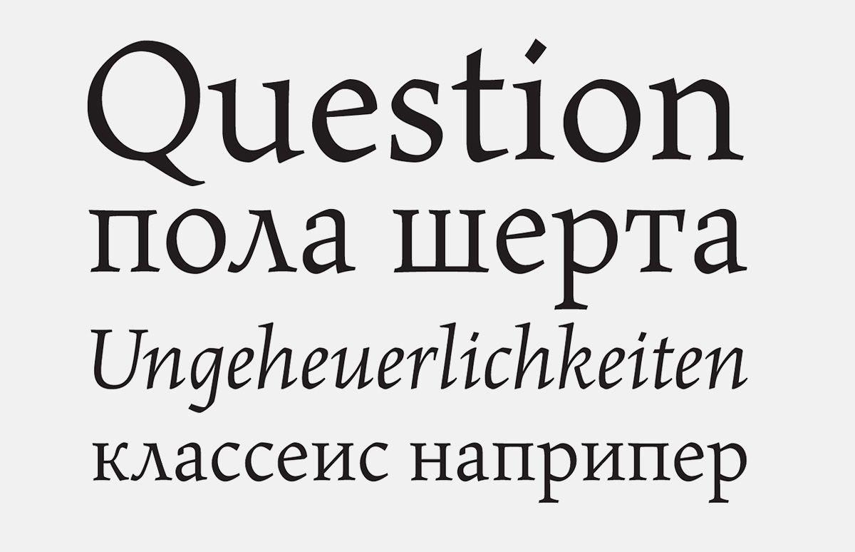
Maiola — a humanist Antiqua by Veronika Burian (Czech Republic/Germany, 2003).

Maiola — a humanist Antiqua by Veronika Burian (Czech Republic/Germany, 2003).
As for the work of MATD graduates in Cyrillic, I do not think I have the expertise to voice my opinion. When a student wants to cover Cyrillic, I am primarily interested in how they propose to build the right skills themselves: you want a student to have a solid research-based approach, and to build a methodology that will allow them to build skills for any script.
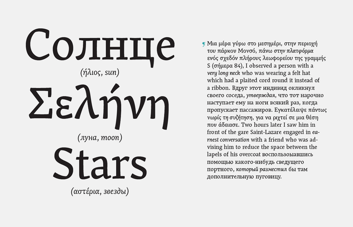
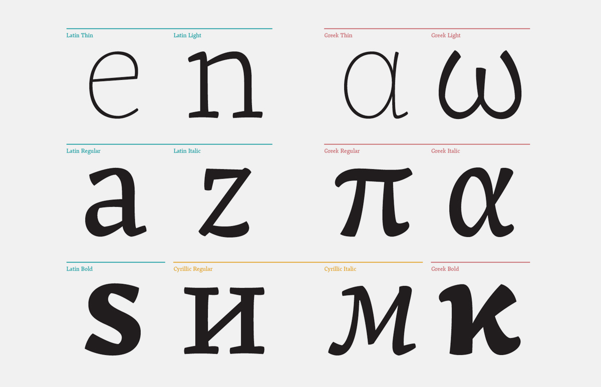
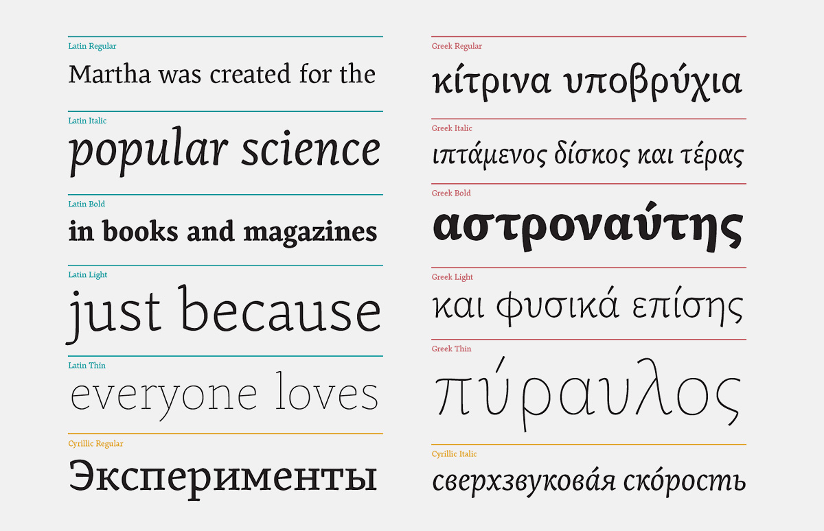
From a design point of view, I think that the three European scripts—Latin, Cyrillic and Greek—are a superb lesson in developing consistent typographic identities from very different fundamentals.
We try to support the scripts the students do with regular feedback by relevant experts. Cyrillic has been one of the most difficult to find good support for, partly because of the very small number of suitable experts who are resident in the UK or permitted to work here. The way we teach requires repeated contact, which is even more difficult. Unfortunately the cost and visa situation looks like it will get worse before it gets better.
What is your take on Cyrillic? Have you encountered the opinion that it is an alien script in comparison to Greek and Latin?
My own interest in Cyrillic is from the point of view of a script shared by different cultures that seek to express a typographic identity, of communities of designers with very different backgrounds, and as an example of a script with a constantly developing typographic repertoire.
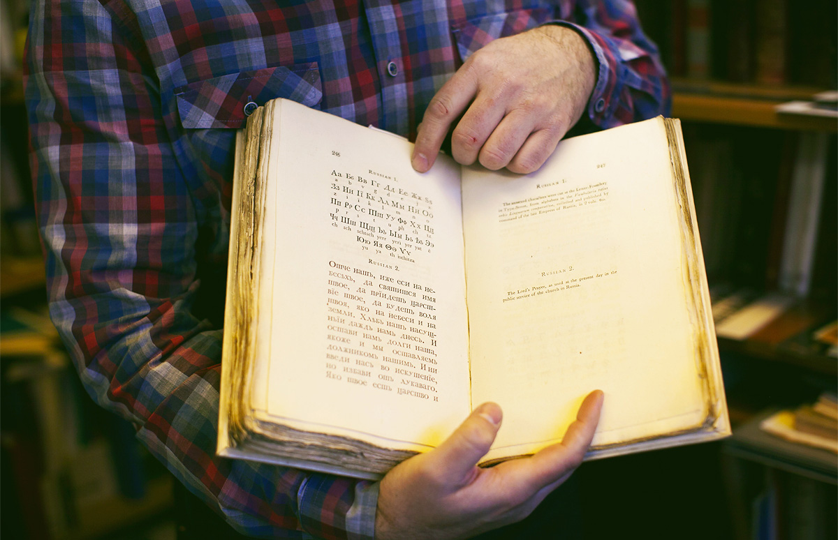
An excerpt from Edmund Fry’s book Pantographia (1799) with Cyrillic type. This is a striking example of a bygone typographic era with many characteristic features.
From a design point of view, I think that the three European scripts are a superb lesson in developing consistent typographic identities from very different fundamentals. In the Cyrillic, you have a degree of intentional form-making, and a combination of elements that require a deep understanding of the script structure, with a very specific history of adaptation to historical models.
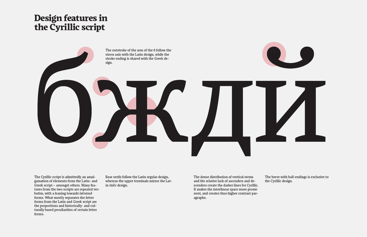
Design features of the Cyrillic script in the Markant typeface by Claus Eggers Sørensen (Denmark, 2009).
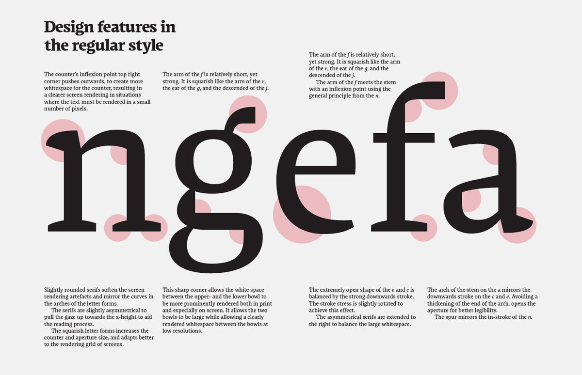
Characteristics of the regular Latin style.

Greek design features in Claus Eggers Sørensen’s Markant.
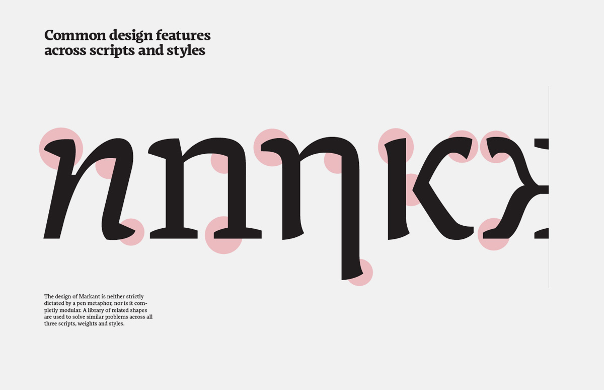
Stylistic unity across scripts and styles.
In the Latin you have a very high degree of formal uniformity and a grammar that has formed over centuries to allow the widest range of configurations, but a fairly narrow scope for innovation. This, in my view, makes it possible to achieve moderately successful (and slightly boring) designs easily, but makes innovation more difficult. Greek is at the other end of the scale, like an unconnected Arabic: it has eastern scribal roots, a single writing style at its roots, and is based around counters and loops, rather than strokes. Put all three together, and you’ve got a superb lesson in typeface design.
Liza Schultz’s typeface Martha (Austria, 2012) combines three scripts: Latin, Greek and Cyrillic.
Liza Schultz’s typeface Martha (Austria, 2012) combines three scripts: Latin, Greek and Cyrillic.

Liza Schultz’s typeface Martha (Austria, 2012) combines three scripts: Latin, Greek and Cyrillic.
Liza Schultz’s typeface Martha (Austria, 2012) combines three scripts: Latin, Greek and Cyrillic.
Your programme, as opposed to t]m, includes a large amount of analytical research: the students conduct field studies and write a comprehensive essay as part of their final project. What are the advantages of this approach?
In this, Reading is not only different to KABK, but to any course that is situated in an art school. All the courses in the Typography Department at Reading are informed by us being part of a research-intensive university (and, indeed, a very highly rated one). Typefaces do not exist in a vacuum: they take form and meaning because they are responses to many other typefaces that exist already, and to changing conditions of use. Good research skills, and a sufficient understanding of typographic history and practice, are essential.
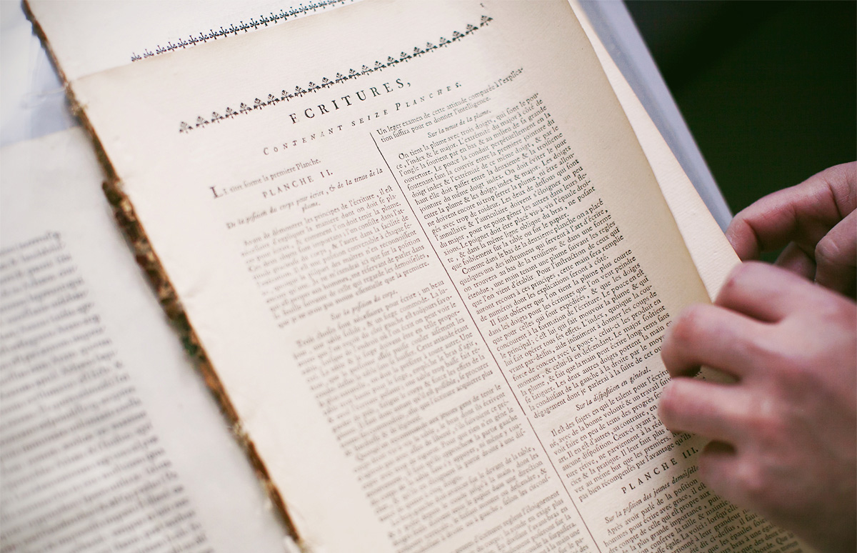
This part of Encyclopédie, co-edited by Denis Diderot and Jean le Rond d’Alembert (c. 1751), discusses various writing styles with handwriting samples. The text is accompanied by prints that show the correct posture for a scribe, as well as how to hold and prepare a quill.
For example, how can a Russian designer create a good typeface for the Latin script, or Greek, or indeed anything else—and vice versa? Surely just being able to read the language is not enough, otherwise any graphic designer who can move a Bezier curve would be a good typeface designer. Innovation requires a deeper understanding of what it is you are innovating against: what is the common position that you are re-thinking?
You are a frequent visitor to typographic conferences. Which professional events would you single out?
I have a soft spot for ATypI and hugely enjoy TypeCon. I also try to attend as many of the one-day and evening events at St Bride as I can (my favourite location for type gatherings in the UK). There is an increasing number of UK events that make it very difficult (and expensive) to keep up: TypoCircle, TypoLondon, Point, events in Birmingham, and many more.
I am also very happy when I can attend smaller events like TypeTalks, where there is an opportunity to meet many people. In recent years I have been talking at events that are not targeted at typographers and typeface designers (like the tightly focused Ampersand), which require me to think more deeply what is relevant from typeface design to other fields. My second-favourite events outside the UK are in Poland, which I find buzzing with activity. And my top-of-the-list is the triennial ICTVC, which brings together a very unique mix of specialists.
What are the key discussion topics in the typographic world today, in your opinion?
There are three areas we are discussing intensely. Firstly, the globalisation of typography and typeface design. This means not only wide script coverage, but also that designers think about wide type families and typefaces that allow typographic differentiation in scripts that have not had a developed tradition for this. For example, starting with a script that until recently only had a low-modulation stroke (e.g. Oriya or Kannada), to develop a modulated display style will require a decision about the angle of stress and how it changes along the strokes. There are many different possible implementations for this, and the structure of the letters does not give obvious answers. Conversely, removing the contrast from a heavily modulated style may distort the letterform in unacceptable ways. These are hugely exciting areas of intense innovation.

With Barbari, student Bon Min (South Korea, 2013) faced the problem of correlating Latin characters with the traditional South Korean script Hangul. Historically, Hangul characters were written slowly with a round brush, whereas livelier movement and style are typical of Latin script. This typeface is an attempt to find a way to bring the two writing systems to a unified style.
With Barbari, student Bon Min (South Korea, 2013) faced the problem of correlating Latin characters with the traditional South Korean script Hangul. Historically, Hangul characters were written slowly with a round brush, whereas livelier movement and style are typical of Latin script. This typeface is an attempt to find a way to bring the two writing systems to a unified style.
Secondly, some areas of typography are changing rapidly, mostly due to the rethinking of what the word “document” means in a world of smaller, user-responsive devices. In this environment, the typefaces and the typography at the paragraph level become a key identifier.
Thirdly, we are seeing typography and typeface design maturing into a recognised discipline, with its own established literature, numerous education pathways, and a growing understanding of its importance by the wider public. These three areas make working in typeface design and typography today more exciting than ever.
Gerry shows an original poster from the Olympic Games in Munich (1972), created by designer Otl Aicher.
How would you describe the role of Gerard Unger on the course? How many hours does he spend with students?
Gerard is as central to the MATD as Fiona and myself are. He visits six times a year, for four days each time. His classes cover a wide range of topics, which is instrumental in shaking things up. He does not let students be satisfied with something that is “just good enough”, and keeps pushing them. Gerard is also exceptionally patient and insightful when students are looking for inspiration. He also contributes many lectures and looks after half of our field trip. I think that we have a very good balance of influence and complement each other well. We are good friends too.
The student projects are primarily learning tools. If the typefaces get published and have a commercial life of their own, then that’s a bonus!
Which guest lecturers have visited the course lately? What sort of topics interest your students?
Many visitors contribute each year, in addition to Michael Twyman’s twenty seminars, James Mosley’s similar number of lectures, and Victor Gaultney’s six all-day visits. This year we’ve had people doing workshops, for example, Wayne Hart for two days on stonecutting and Martin Andrews on letterpress, visiting speakers like Richard Grasby, John Hudson, Paul Barnes and Myra Thiessen, as well as guests running multi-day sessions, like Tom Grace, David Březina and Miguel Sousa. We also have speakers for all our MA programmes in common, like David Pearson, Laurence Penney, and about a dozen PhD researchers presenting their work.
What makes a successful MATD student project?
The student projects are primarily learning tools. The best projects help the students become great typeface designers, able to do exceptional typefaces after they leave Reading, and be great collaborators. If the typefaces get published and have a commercial life of their own, then that’s a bonus.
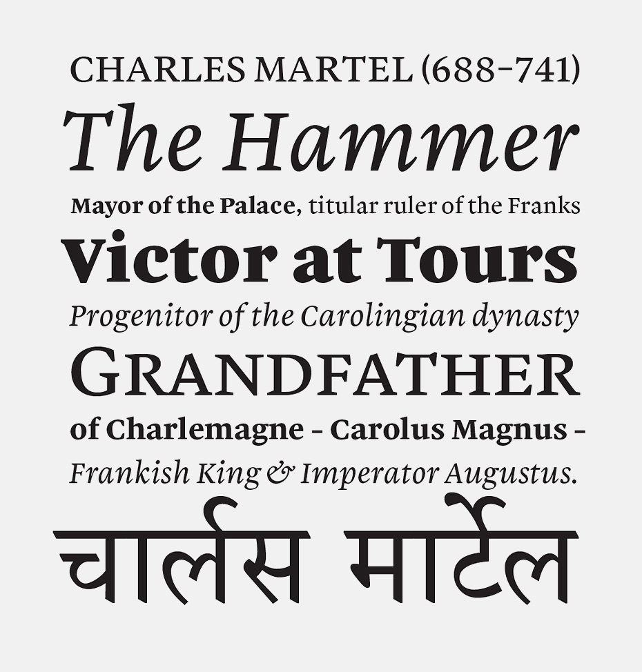
Martel, by Dan Reynolds (United States/Germany, 2008), is an old-style Antiqua with a large range of styles and support for Latin and Devanagari. It was released as “Malabar” and received a Certificate of Excellence at the TDC competition in 2009.
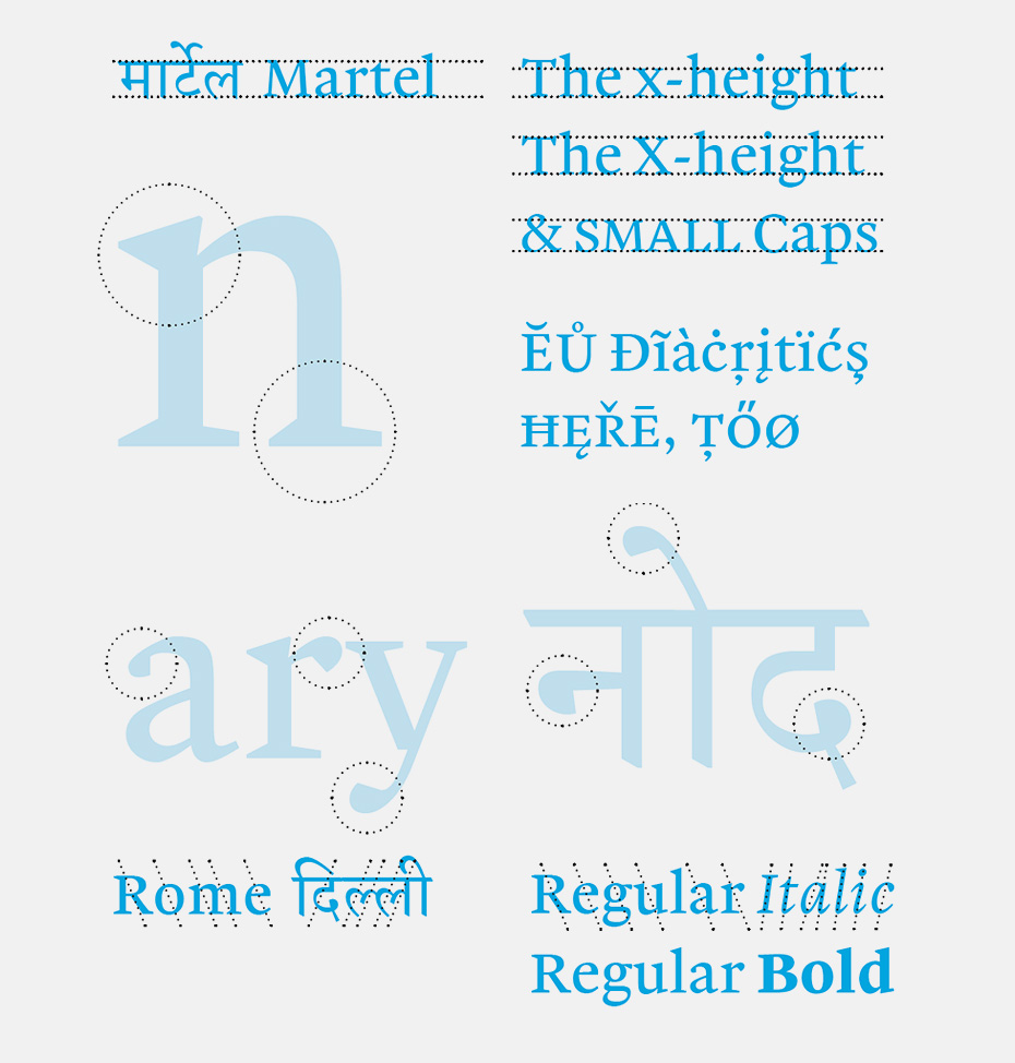
One of the designer’s stylistic goals was to harmonise the directly opposed writing principles and pen angle.
A key part of Dan’s study is dedicated to Devanagari as an “integrated” script with a multitude of consonant ligatures and diacritics, as well as solving the technical typesetting challenges of this language in different systems and programs.
There also students who do not go into type design: for them the projects are learning experiences of a different kind, and there you need to focus the project on what would benefit the student more. We’ve had people come to Reading with, say, ten years of software engineering experience, or twenty years of book design experience. In such cases the objectives are tailored to what would give those students a steep learning curve, a good challenge that is relevant for their career.
And, in all cases, you want the graduates to leave with a love for typography and typeface design, and with an open mind for themselves and their discipline.
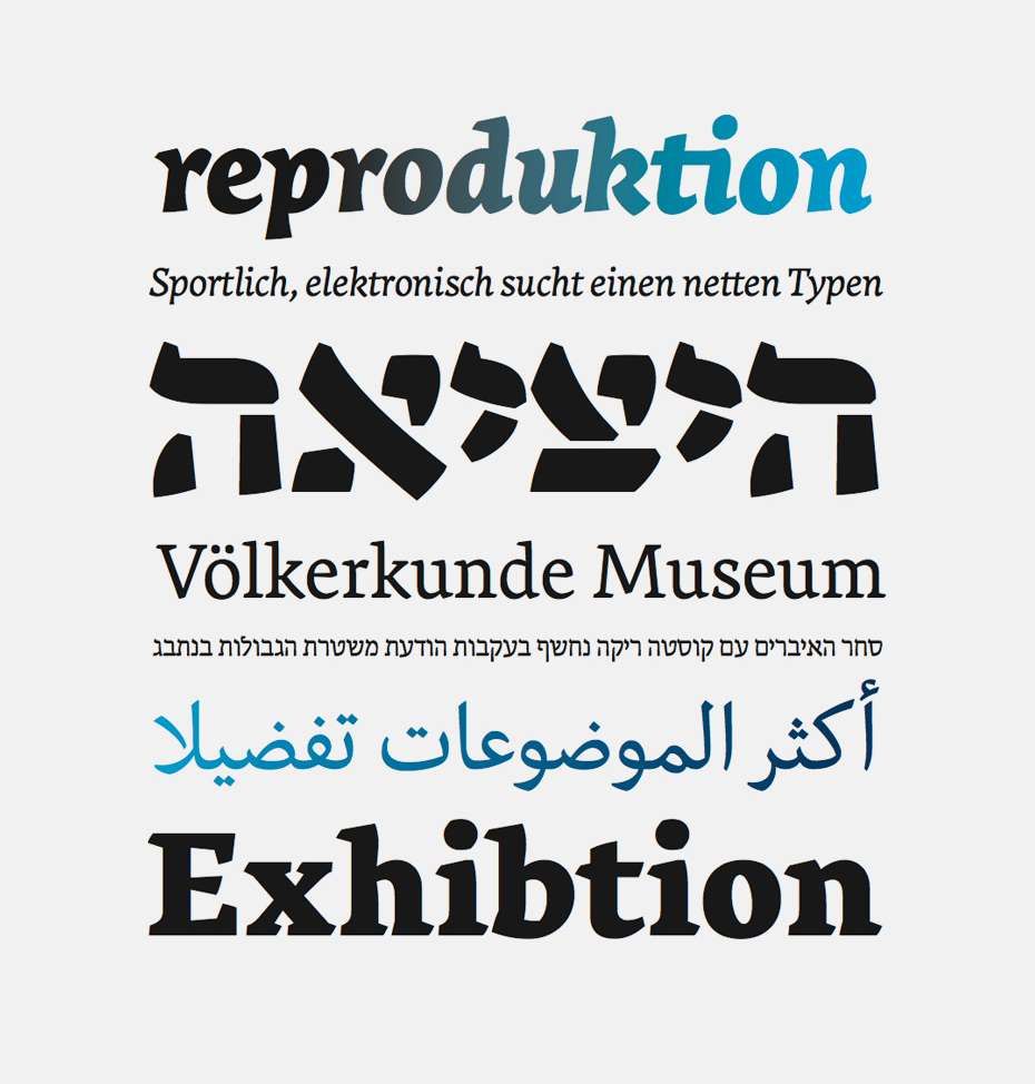
Excerpt from the presentation of the Salom font family by Igor Labudovic (Austria, 2013). Salom is an experiment in developing a modern Antiqua with support for Latin, Hebrew and Arabic.
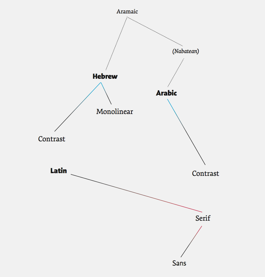
Diagram representing the amount of work required on each font style, inspired by Florian Coulmas’ book The Writing Systems of the World (1989). Dotted lines indicate the historical basis for the scripts.
In your recent TypoBerlin talk, you mentioned that there is an increasing number of Reading students from Germany. Is Germany, in your opinion, more typographically active than other countries? Or could you say that interest is declining in the UK?
We have always had strong interest in the course from Germany, and it does seem to have increased in recent years. Germany is a unique market in Europe: it is not only mature typographically, but also large enough to sustain its internal typographic education and publishing industry with no need to translate native texts, or seek to sell in other countries. At TypoBerlin I was teasing the audience a bit, so I will rephrase my question as, “In a saturated market, how can a young designer distinguish themselves?” This is, to a growing degree, a challenge for new designers in many other countries.
As for the UK, I do not think interest is decreasing at all—on the contrary, it is growing. We see this at Bachelors, Masters, and PhD level. But the UK market is different: it is very international in exporting skills and services, as well as in receiving talented professionals from other countries. In the creative industries, London is by far the most international city in Europe. Although cities like Berlin attract a lot of self-employed designers (mostly due to the lower cost of living), it is London that has the business turnover.
The technological aspect of type production has been developing rapidly over the last ten years. Nowadays, a good type designer is often also a good programmer. How did this affect your teaching approach and how has the practical methodology changed?
The expectations from type designers on the technical level have increased in recent years, but gradually, and not fundamentally. There’s more to learn, and some stuff may seem more complex, but nothing is prohibitive for entry in the profession—you don’t need a degree in computing. This means that a motivated graphic designer can easily pick up the training to shift to type design. This is similar to designers having to learn to work in proprietary markup languages, such as SGML, XML and so on—it’s nothing new. The intensity of the comments on this is more revealing of the commentators’ short memories, rather than any deeper shift. Type foundries are full of technically very competent people who learned through online resources, and short workshops. So, I think this is something of a non-issue: designers have always had to learn about the technology of their field, and it never was at university-level.
The real challenge, where there has been a fundamental change in type design, involve the expansion of skills into non-Latin scripts. The level of knowledge required there to produce competent designs is not within the realm of the self-educated. The research and interpretation skills that a new designer would need to tackle unfamiliar scripts are simply not possible to develop on your own. And, unfortunately, for many scripts we do not have yet widely available resources to support this. This area is leading the elevation of typeface design from a craft-based activity to a profession with a recognised body of knowledge and skills. We are still at the very beginning of this process, but in another ten years this will seem too obvious to mention.
Because there is no framework (in Russia) for student loans or suitable scholarships, students rely on personal or family finances. This is just crazy, and discriminates heavily against people with talent!
What are the career prospects of today’s Reading graduates?
Many are employed in type foundries, like Dalton Maag, Fontsmith or Hoefler & Co. A good number work for Monotype, Adobe and Microsoft. Quite a few work as individual freelancers, publishing through other foundries. It is important to mention Type-Together and Rosetta Type, two foundries founded by our graduates (Veronika Burian and José Scaglione, and David Březina respectively—ed.) with considerable growth. About a third have some engagement with teaching—either full-time or part-time, and this is growing as graduates want to add variety to their careers. As type design schools grow in number, this will continue to rise. And about a third return to graphic design work while doing a bit of type design.
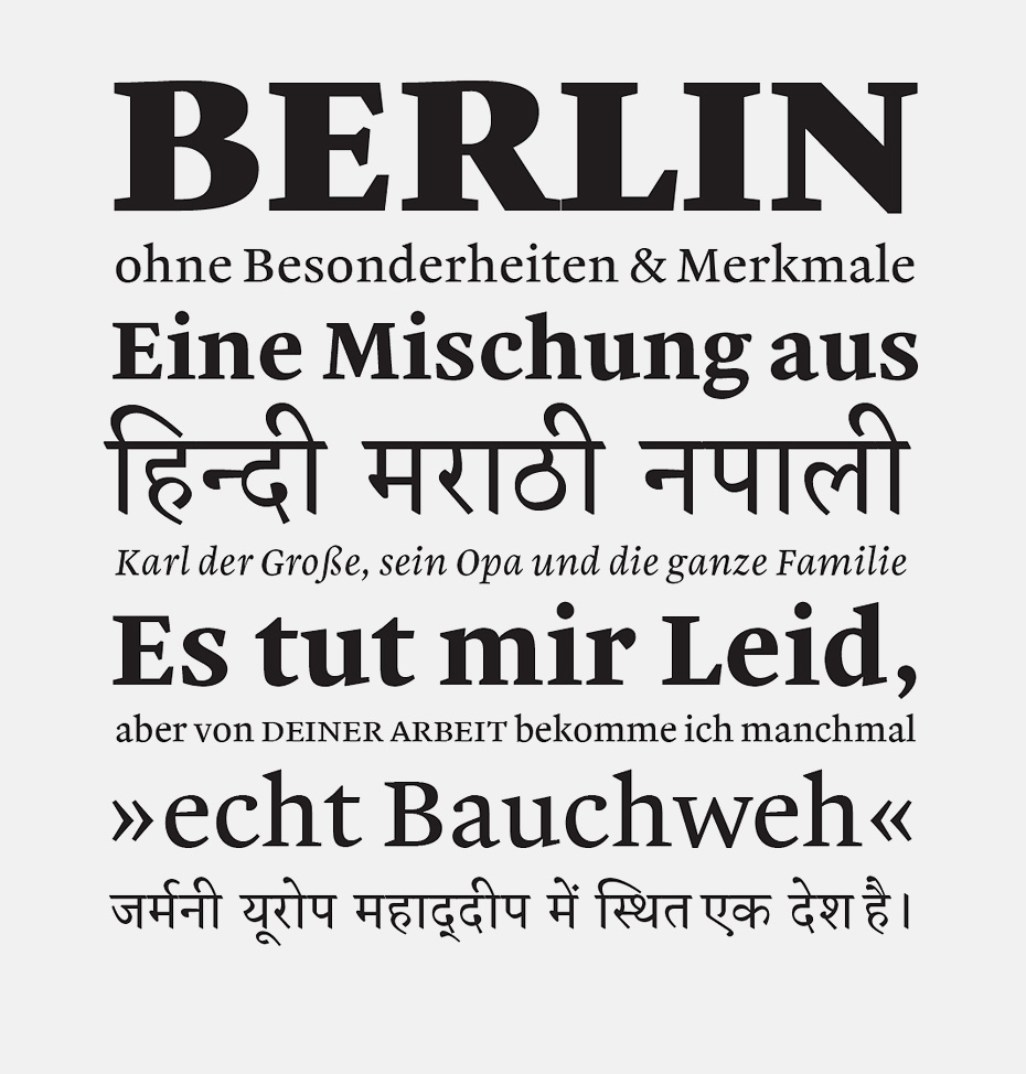
Skolar by David Březina combines Latin and the Gujarati language, one of the 23 official languages of India. Later, after becoming part of the Rosetta Type library, Skolar was supplemented with Cyrillic (with the participation of Aleksandra Korolkova), Greek and Devanagari characters.
Skolar by David Bržezina combines Latin and the Gujarati language, one of the 23 official languages of India. Later, after becoming part of the Rosetta Type library, Skolar was supplemented with Cyrillic (with the participation of Aleksandra Korolkova), Greek and Devanagari characters.
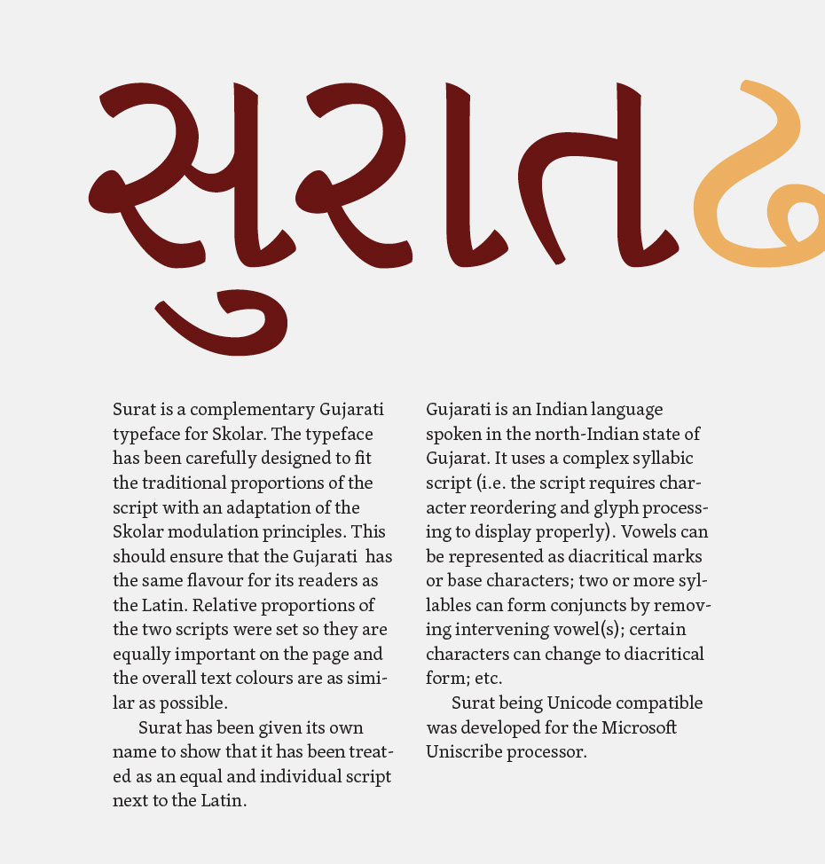
Skolar by David Bržezina combines Latin and the Gujarati language, one of the 23 official languages of India. Later, after becoming part of the Rosetta Type library, Skolar was supplemented with Cyrillic (with the participation of Aleksandra Korolkova), Greek and Devanagari characters.
Why do you think Russian type design students prefer Holland to England? Is it merely a question of finances?
You’d have to ask them, but my impression is that the financial difference is overwhelming for a Russian applicant. And because there is no framework for student loans or suitable scholarships, students rely on personal or family finances. This is just crazy, and discriminates heavily against people with talent.
How would you underline the main differences between the Reading and KABK MA programmes?
Why compare with the KABK, and not Porto or Eina, or FADU-UBA or Gestalt? In the recent exhibition of student work at the Ampersand conference there were well over thirty institutions represented. So your question is misleading, as if there are only two places to study type design.
Now, specifically about the difference between Reading and the KABK: we are not an art school, but a university programme, in a department with a range of related programmes, and forty years’ institutional experience of PhD and staff research in typography. Our students read and discuss at a high level, and conduct research in type design that is often ground-breaking.
Daniel Rhatigan devoted an essay (USA, 2007) at the University of Reading to his typeface for the composition of scientific literature with complex typography, primarily with mathematical formulas and large numbers of tables. Accordingly, he chose the Greek language as a counterpart to Latin script.
Daniel Rhatigan devoted an essay (USA, 2007) at the University of Reading to his typeface for the composition of scientific literature with complex typography, primarily with mathematical formulas and large numbers of tables. Accordingly, he chose the Greek language as a counterpart to Latin script.
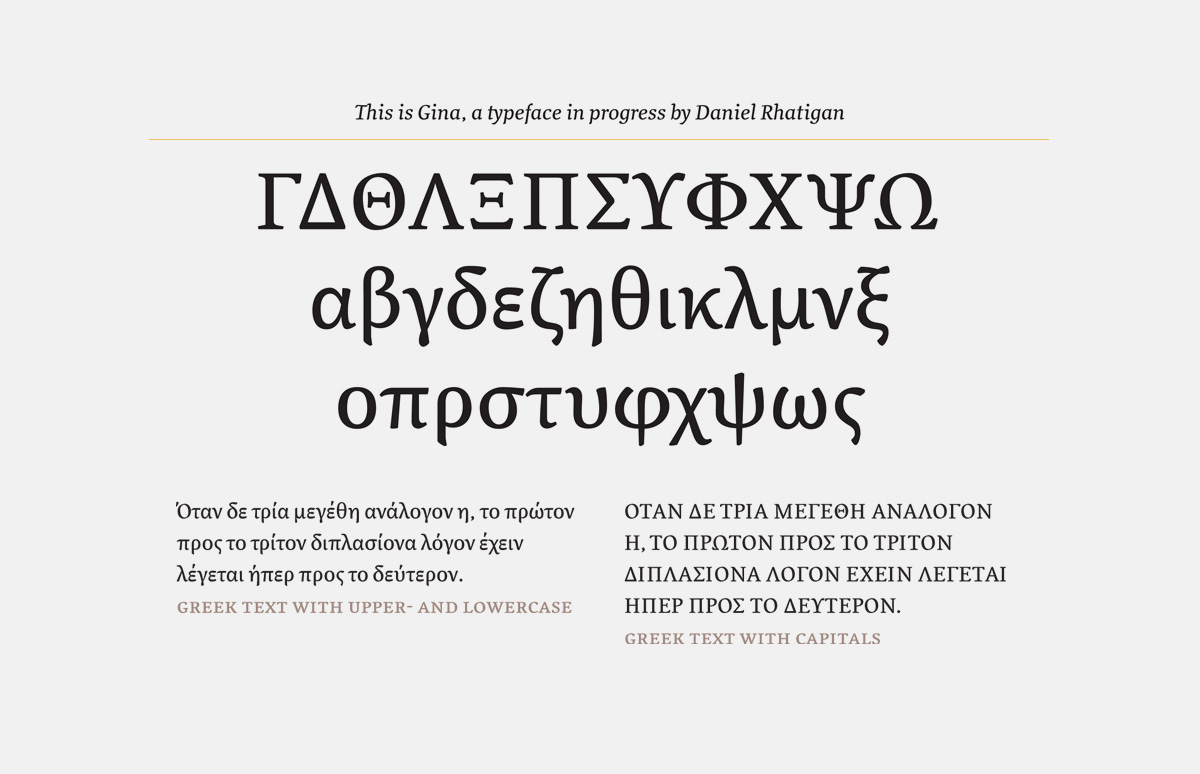
Daniel Rhatigan devoted an essay (USA, 2007) at the University of Reading to his typeface for the composition of scientific literature with complex typography, primarily with mathematical formulas and large numbers of tables. Accordingly, he chose the Greek language as a counterpart to Latin script.
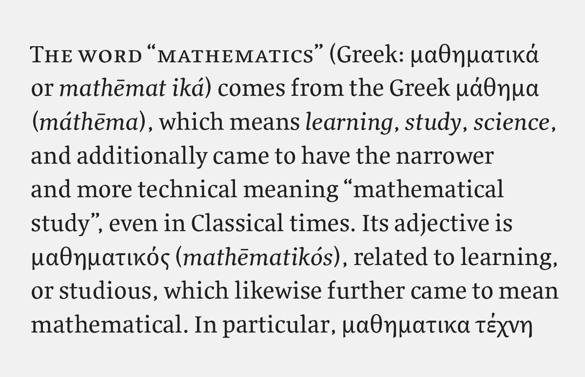
Daniel Rhatigan devoted an essay (USA, 2007) at the University of Reading to his typefacefor the composition of scientific literature with complex typography, primarily with mathematical formulas and large numbers of tables. Accordingly, he chose the Greek language as a counterpart to Latin script.

Daniel Rhatigan devoted an essay (USA, 2007) at the University of Reading to his typeface for the composition of scientific literature with complex typography, primarily with mathematical formulas and large numbers of tables. Accordingly, he chose the Greek language as a counterpart to Latin script.
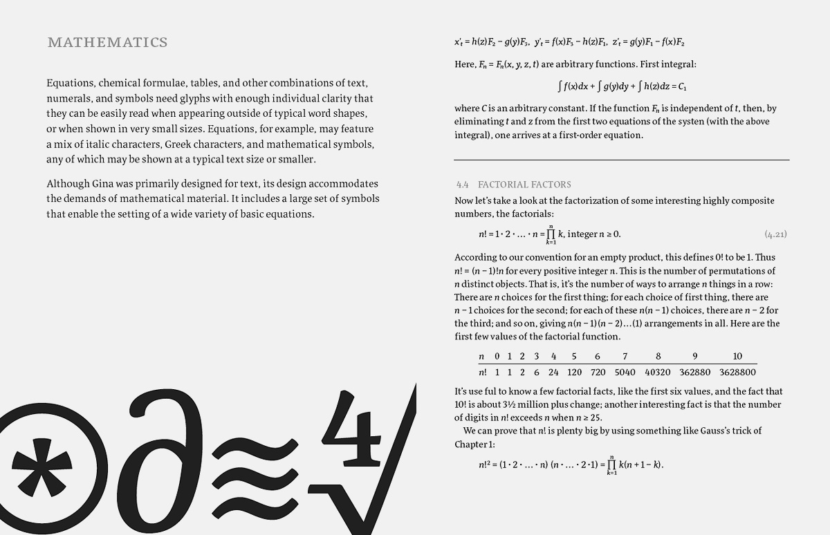
Daniel Rhatigan devoted an essay (USA, 2007) at the University of Reading to his typeface for the composition of scientific literature with complex typography, primarily with mathematical formulas and large numbers of tables. Accordingly, he chose the Greek language as a counterpart to Latin script.
They work on typefaces that get them design jobs, produce academic works that get them teaching jobs, and help other designers as well. When they graduate, they publish proper type specimens and dissertations that have weight and content, not ephemeral posters. These are our strengths. Worldwide, the trend in type design education is to emulate what we do.

Sophia Safaeva
Film director, studied on the MATD course in 2005-2006
Could you give us a list of “Gerry Leonidas recommends” books that no type designer/typographer should live without?
This is a difficult question to answer without some limits on time, or some idea of the experience of the reader. There are 14 key topics we discuss on the MATD, and I select texts for each depending on the ideas we want to discuss. In that sense, a book or article that is controversial might be more useful in the environment of a structured, guided discussion. But the same text might be misleading if someone reads it on their own without pointers. (I am slowly putting the lists for these seminars online.)
I also never include books like Robert Bringhurst’s Elements of Typographic Style or Philip Meggs’ History of Graphic Design—titles like these are on every designer’s bookshelves, and to include them would repeat the obvious. And I don’t include some targeted titles, like Cyrus Highsmith’s very good Inside Paragraphs, because I prefer to discuss spacing alongside Tracy and Dowding’s methods (referring to Walter Tracy’s Letters of Credit, and the essay Finer Points in the Spacing & Arrangement of Type—ed.), as well as objects: a page of Didot and a screen of Instapaper with Nicole Dotin’s Elena selected.
So, which texts? I’ve got a list for incoming MA students on the new Typeface Design site, which I think is a pretty good starting point. It also includes some comments on magazines and blogs that form an essential part of a typographic designer’s horizon. I occasionally update the listing, but prefer to have items that have proven their value, rather than the latest title.
List of educational institutions with type design courses (compiled by Gerry Leonidas):
- University of Aveiro, Aveiro, Portugal
- Eina, Barcelona, Spain
- FADU-UBA, Buenos Aires, Argentina
- KABK, The Hague, The Netherlands
- Gestalt, Veracruz, Mexico
- Atelier national de recherche typographique (ANRT), Nancy, France
- ESAD, Amiens, France
- Type@Cooper, New York, United States
- ZhdK, Zurich, Switzerland
- ECAL, Lausanne, Switzerland
Michael Twyman, (1934-) – Professor Emeritus of typography and visual communication at the University of Reading, author of several works on the history of typography and the art of lithography, graphic design researcher – Ed.
James Mosley – librarian at the St Bride Printing Library (London, 1958-2000), typography historian, author of numerous essays, reviews and monographs on the history of printing and typography. Lectures at the University of Reading, as well as for courses in Lyon and Charlottesville, among others. Writes typography blog Typefoundry. – Ed.
Gerard Unger (1942-) – Dutch graphic and type designer. Studied at the Rietveld Academie in Amsterdam 1963-1967. Professor of typography at Leiden University and a visiting professor at the University of Reading. Has worked as a freelance designer since 1972, designing a great number of postage stamps, logos, corporate identities, books, magazines and exhibition catalogues. Author of While You’re Reading, a book on the philosophy of reading which has been translated into several European languages. – Ed.
Victor Gaultney – medievalist, expert on mathematics and the music of the Middle Ages and Renaissance, graduated from the MATD course in 2002. Prize winner at bukva:raz! and TDC with with multilingual project SIL. – Ed.
I am sometimes asked if I regret the fact I studied at Reading, seeing that I’m in cinema now. I reply that I don’t. I have encountered some similarities between the professions. A director works on a film in its entirety, paying attention to every aspect of it. A type designer creates a unified typeface, paying attention to each letter.
Considering my studies ended 8 years ago, it’s hard to talk about them in detail, especially given my current non-type background. I remember the fantastic work ethic of the teachers on the course and their desire to help students with the intensive programme.
The student group was international, and my coursemates had various professional experience, although in one way or another they were all connected with the visual arts.