 or a long time, Ilya Ruderman was phenomenally persistent in not releasing his typefaces onto the market, accusing designers of piracy. His indignation is understandable if you look at our surroundings. Ruderman talks about the struggle to improve type culture in almost every one of his interviews, but not this time. We met after the ATypI‘14 conference in Barcelona to take a look at the typefaces he has created, as well as talk about the specifics of the profession, education and the changes occurring around us.
Ilya, many young type designers were introduced to the profession of type design from your personal experience: in 2004 your Dutch Heights columns, which chronicled the process of the Type and Media course in The Hague, made quite a stir. I, for one, read them like an epic saga. Ten years later, how do you see yourself in this profession today?
I consider myself a practicing type designer who is less focused on the historical basis of his work and more interested in trying to create something relevant and new. I take on projects on the condition that there is a possibility to come up with something unique that could contribute to a certain part of type heritage or world culture in general, although that probably sounds overly self-confident. If the task is set in an uninteresting way, I either turn it down or try to push the boundaries. I want to be allowed to find something new even where it seems that everything has already been done.
The typeface Vander could be seen as an example of a project with a unique story behind it. It was the first serious project I worked on with the idea of vertical italic, which is able to bring the image of Cyrillic text closer to Latin type due to its construction.
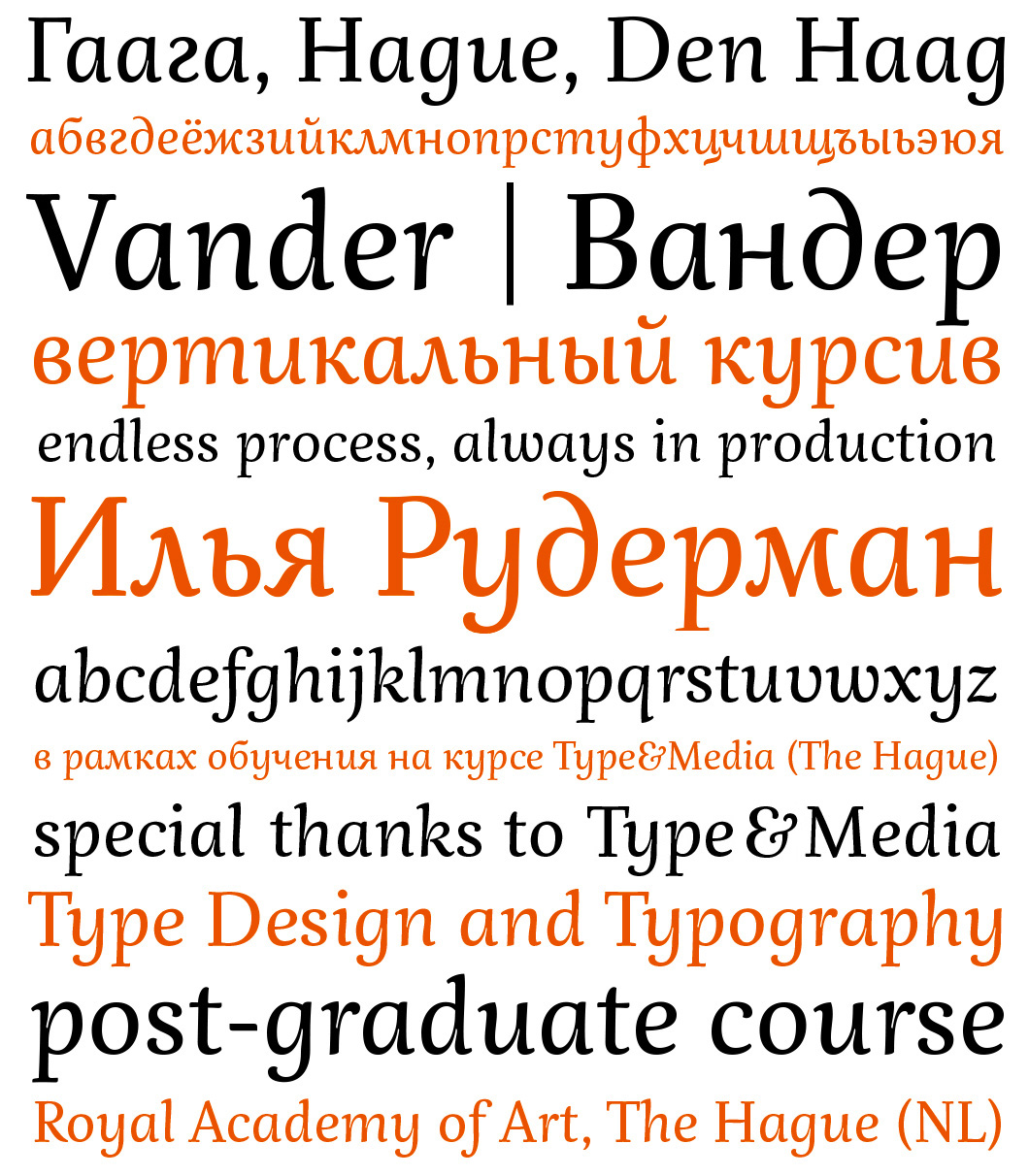
The idea behind the typeface Vander (Ilya Ruderman’s graduation project from theType and Media course at the Royal Academy of Art in The Hague) is to try to find common ground between the two (more, in fact, if we bear in mind the graphic variations of Cyrillic, for example, Bulgarian style) fundamental graphic “matrices”—Latin and Cyrillic. Technically, Vander is a vertical italic text typeface, and this is no coincidence. A detailed breakdown of Cyrillic characters (into vertical strokes, bowls, diagonals, horizontal crossbars, extenders, etc.) and comparison with a similarly “layered” analysis of Roman letters showed significant differences in the texture of type set in Cyrillic and Latin. The image of Cyrillic text is rhythmically less ordered, with fewer extenders and rounded elements. This put the author onto the idea of bringing Cyrillic and Latin closer together by using vertical italics, as the characteristics of Cyrillic italic are similar to those of the Latin alphabet: there are more ascenders and descenders, and many rectangular letters become rounded, which seriously changes the rhythm of text. Ten years after the graduation project was defended, it is being developed and rethought again, and there are grounds to hope that it will one day be published.
Vander is a typeface that was the result of your time on the KABK course in 2005. It was never released after your graduation. Why is it still sitting around in your desk, has it changed over this time, and what is behind the project?
For the last ten years, I just haven’t been able to finish Vander for various reasons. First of all, I got tired of it while I was working on my degree in the Netherlands. Then I tried to look into it again, but realised that I’d stopped feeling it—it wasn’t mine anymore. And now, after those ten years have passed, I took advantage of a recent lull in my work to have a fresh look at it—having taken a break from it, I’d started to miss it and wanted to redo everything, while keeping its essence. Perhaps I’ll be able to finish it in the near future—it’s not going to look like it used to, because over that time I’ve accumulated enough experience to purge the many questionable things that I allowed myself to do back then through naivety.
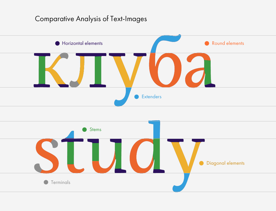
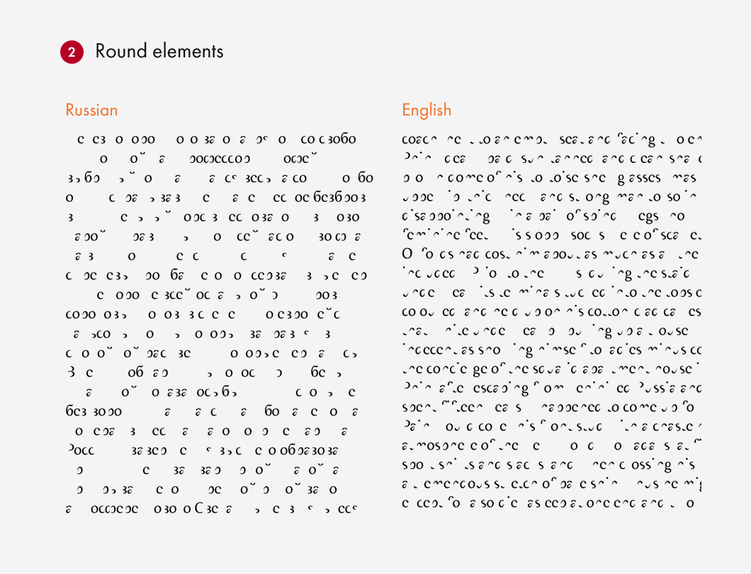
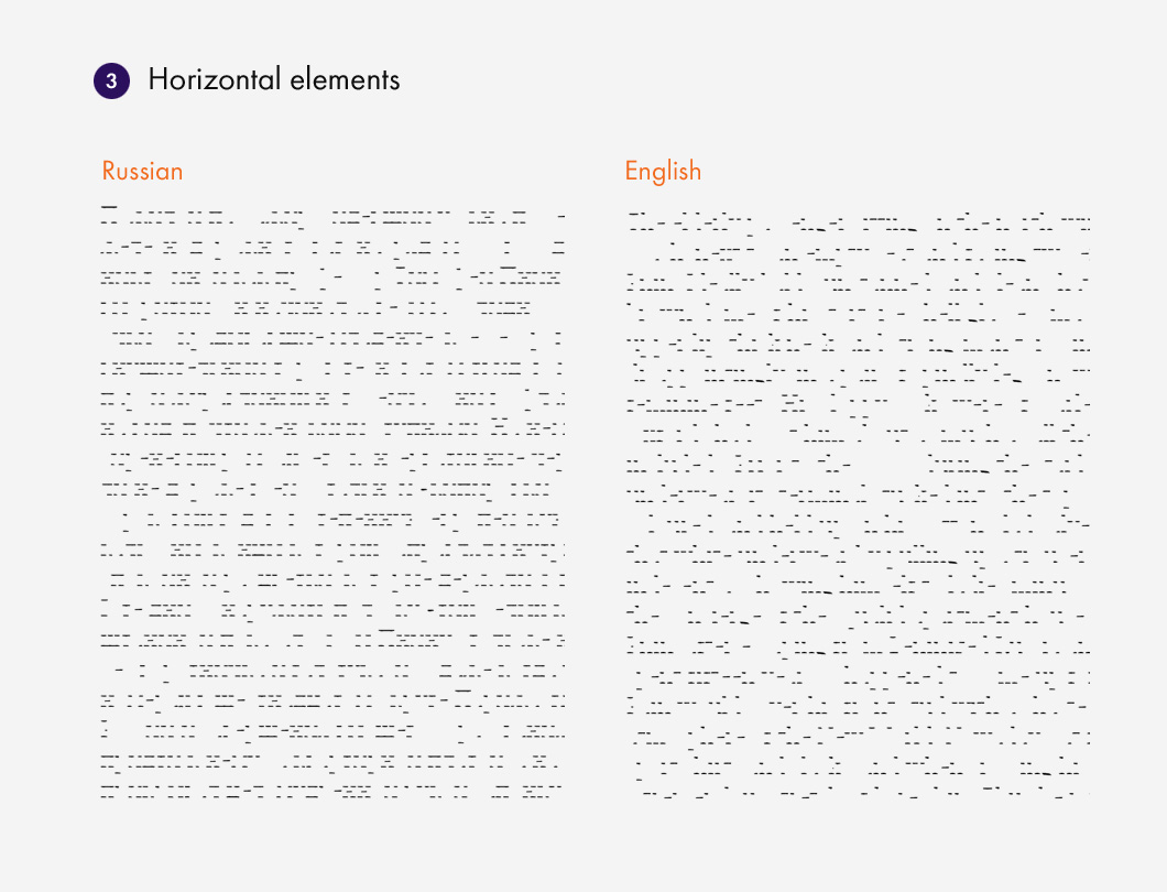
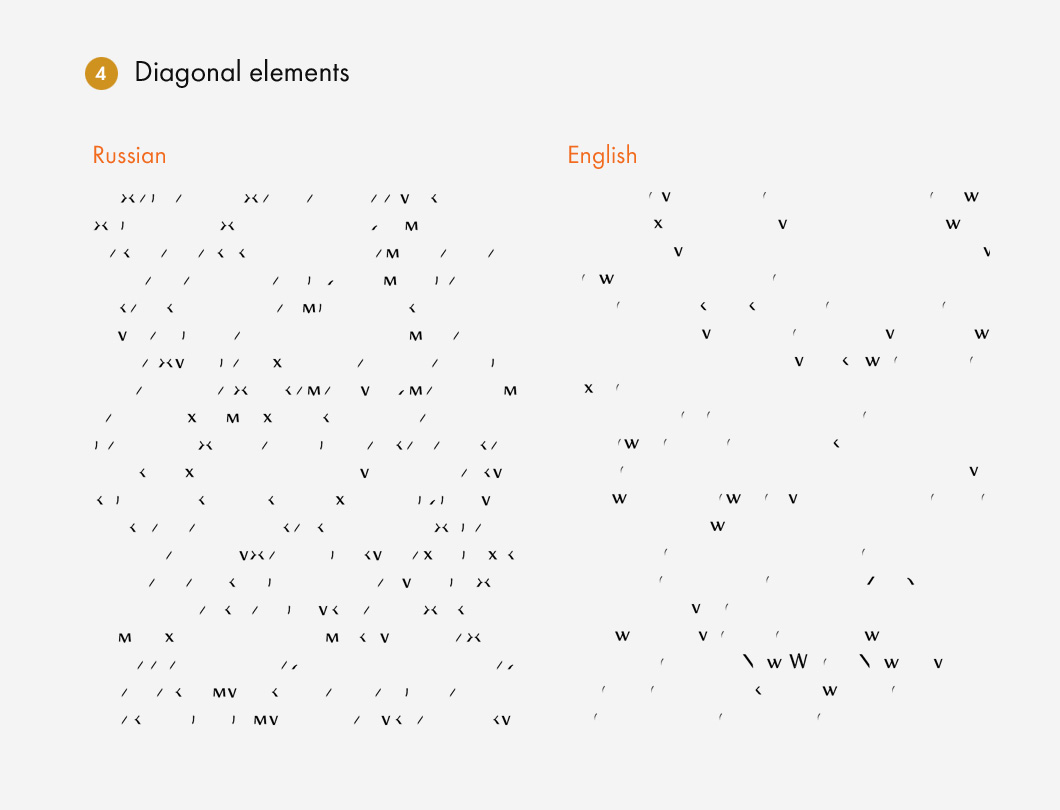
Method for studying two scripts from the point of view of rhythm (layering of type, as its author described it). The following parameters were selected to compile statistical tables: the frequency of occurrence in text of ascenders and descenders, diagonals, ovals and bowls, vertical lines and horizontal strokes. It is worth noting that the visual research was started by counting the most frequent letters and letter combinations in Latin and Cyrillic text, but the result was surprising: the number of occurrences of certain letters were about the same (“a”, “e”, “o” and others)—far more important was the quantity of the elements that the letters in the two alphabets are constructed out of. The analysis showed that the common stereotype of Cyrillic’s image as a “solid fence” is a fallacy. The most important aspect is the varying complexity of the systems: a single Cyrillic character contains much more information. This goes for both the quantity of strokes and their movement vector.
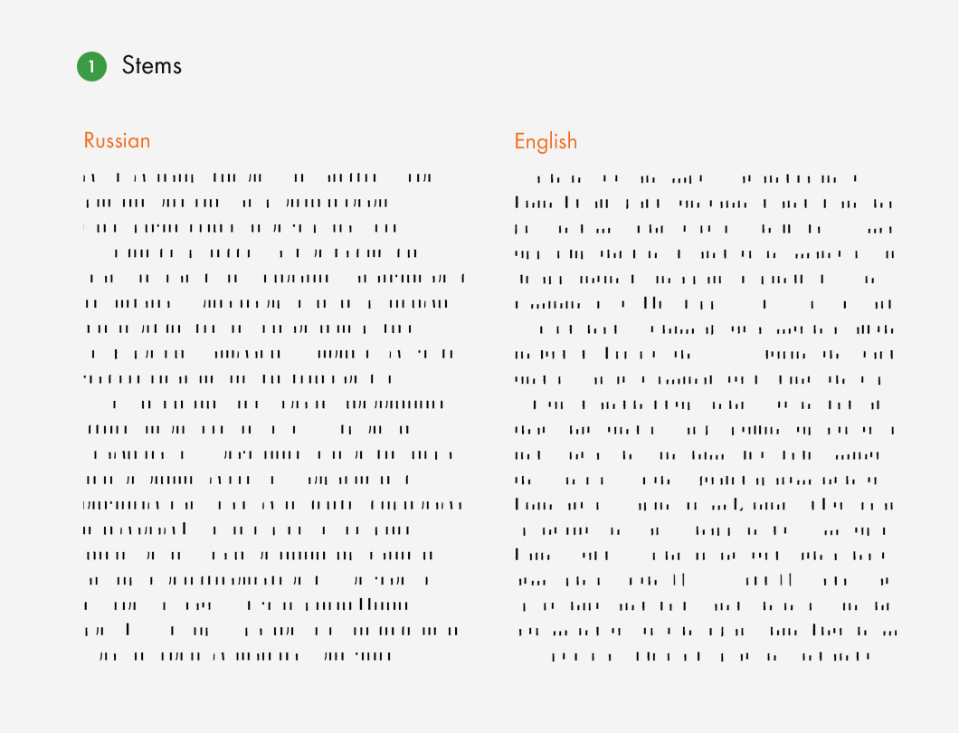
Method for studying two scripts from the point of view of rhythm (layering of type, as its author described it). The following parameters were selected to compile statistical tables: the frequency of occurrence in text of ascenders and descenders, diagonals, ovals and bowls, vertical lines and horizontal strokes. It is worth noting that the visual research was started by counting the most frequent letters and letter combinations in Latin and Cyrillic text, but the result was surprising: the number of occurrences of certain letters were about the same (“a”, “e”, “o” and others)—far more important was the quantity of the elements that the letters in the two alphabets are constructed out of. The analysis showed that the common stereotype of Cyrillic’s image as a “solid fence” is a fallacy. The most important aspect is the varying complexity of the systems: a single Cyrillic character contains much more information. This goes for both the quantity of strokes and their movement vector.
Method for studying two scripts from the point of view of rhythm (layering of type, as its author described it). The following parameters were selected to compile statistical tables: the frequency of occurrence in text of ascenders and descenders, diagonals, ovals and bowls, vertical lines and horizontal strokes. It is worth noting that the visual research was started by counting the most frequent letters and letter combinations in Latin and Cyrillic text, but the result was surprising: the number of occurrences of certain letters were about the same (“a”, “e”, “o” and others)—far more important was the quantity of the elements that the letters in the two alphabets are constructed out of. The analysis showed that the common stereotype of Cyrillic’s image as a “solid fence” is a fallacy. The most important aspect is the varying complexity of the systems: a single Cyrillic character contains much more information. This goes for both the quantity of strokes and their movement vector.
Method for studying two scripts from the point of view of rhythm (layering of type, as its author described it). The following parameters were selected to compile statistical tables: the frequency of occurrence in text of ascenders and descenders, diagonals, ovals and bowls, vertical lines and horizontal strokes. It is worth noting that the visual research was started by counting the most frequent letters and letter combinations in Latin and Cyrillic text, but the result was surprising: the number of occurrences of certain letters were about the same (“a”, “e”, “o” and others)—far more important was the quantity of the elements that the letters in the two alphabets are constructed out of. The analysis showed that the common stereotype of Cyrillic’s image as a “solid fence” is a fallacy. The most important aspect is the varying complexity of the systems: a single Cyrillic character contains much more information. This goes for both the quantity of strokes and their movement vector.
Method for studying two scripts from the point of view of rhythm (layering of type, as its author described it). The following parameters were selected to compile statistical tables: the frequency of occurrence in text of ascenders and descenders, diagonals, ovals and bowls, vertical lines and horizontal strokes. It is worth noting that the visual research was started by counting the most frequent letters and letter combinations in Latin and Cyrillic text, but the result was surprising: the number of occurrences of certain letters were about the same (“a”, “e”, “o” and others)—far more important was the quantity of the elements that the letters in the two alphabets are constructed out of. The analysis showed that the common stereotype of Cyrillic’s image as a “solid fence” is a fallacy. The most important aspect is the varying complexity of the systems: a single Cyrillic character contains much more information. This goes for both the quantity of strokes and their movement vector.

Method for studying two scripts from the point of view of rhythm (layering of type, as its author described it). The following parameters were selected to compile statistical tables: the frequency of occurrence in text of ascenders and descenders, diagonals, ovals and bowls, vertical lines and horizontal strokes. It is worth noting that the visual research was started by counting the most frequent letters and letter combinations in Latin and Cyrillic text, but the result was surprising: the number of occurrences of certain letters were about the same (“a”, “e”, “o” and others)—far more important was the quantity of the elements that the letters in the two alphabets are constructed out of. The analysis showed that the common stereotype of Cyrillic’s image as a “solid fence” is a fallacy. The most important aspect is the varying complexity of the systems: a single Cyrillic character contains much more information. This goes for both the quantity of strokes and their movement vector.
Your time in Holland was preceded by studies in Moscow—in Alexander Tarbeev’s workshop at the State University of Printing Arts. At that time, it was the only place where type design was taught. How were his classes organised?
Chronologically, that’s right, but I can’t call Alexander’s classes “studies”. In my lectures, when introducing myself to new groups of students, I always note that in my life Alexander worked more as a catalyst than a teacher who taught me something specific—unfortunately, there wasn’t enough time for that, as we were already in our final year when he came to the university.
When Tarbeev arrived, we were already working on our graduation projects. Yuri Ostromentsky and I went to him ourselves to ask him to supervise the second part of our work, which was dedicated to type. We already had an interest in typefaces and had even sent our first projects to Kirillitsa‘99. We had just mastered FontLab and Fontographer. We wanted to do something, but didn’t know how to. So when Tarbeev appeared, the type-oriented students were attracted to him like a magnet. He infected us with love for type and helped with the first steps, our graduation projects. I prepared half of my project at his house, because Fontographer didn’t work anywhere else for some reason, and we didn’t have our own computers back then—I visited him and designed my project with his help. So Tarbeev is much more than just a teacher for me—he’s a man who opened up a profession that became incredibly important in my life for a long time.
What other options of continuing your education did you consider?
Before leaving for Holland, I realised that I could get just about the same knowledge as from the Type and Media course by going around all our great type designers, but it would take a lot of time and be harder than spending one year on concentrated studies. In my opinion, Type and Media is one of the best places for this on the planet. This course fits with my way of thinking, as it’s focused on real practical production and less on the theoretical basis and research, which the Reading course, for example, is more geared towards. I’ve never regretted the fact that I studied in the Netherlands and not in England. The course itself, the teachers, the students and alumni make up a community that is really changing the type world, modern font design and technology. No one else has that sort of influence.
After studying in The Hague you started work as a type designer. At that time, the wave of the “Russian type boom”, which Krichevsky complains about, had not yet risen, and demand for type development was very selective. Who were your clients?
Returning to Russia, I was quite sought-after as a type designer—I’ve had no downtime since 2005 and was always busy with type work. Throughout my career of working as a freelancer or working as a salaried employee at an agency, I always found time, I always found time to do type work in the evening or at night—there were always orders. There are basically two fronts of work: in the first case, typefaces for the exclusive use of specific companies, when the client pays for a font to be produced for their own project. In this situation, there is no need to worry about the average user, the market or sales, which is an advantage, but not many people know about these jobs. Alternatively, in the second case, I worked for well-known magazines that were always more or less in the public eye.
For example, I did an important project for the magazine Bolshoi Gorod (Big City)—a large font family called Big City Sans, which then set a personal record for both the number of characters and number of styles. This design was well received by the professional community and it picked up a few prizes. That’s when this business with Cyrillic ligatures started—I see its continuation in the projects of students who don’t hesitate to draw Cyrillic ligatures any more. In my opinion, Big City Sans was the first time that ligatures appeared in such numbers. These days, of course, I have a lot of problems with it—I’d never let anyone use it in its current form. But the typeface was used quite actively in the magazine over five years, carrying out both text and display tasks. I think it strongly influenced the aesthetics and look of the magazine.
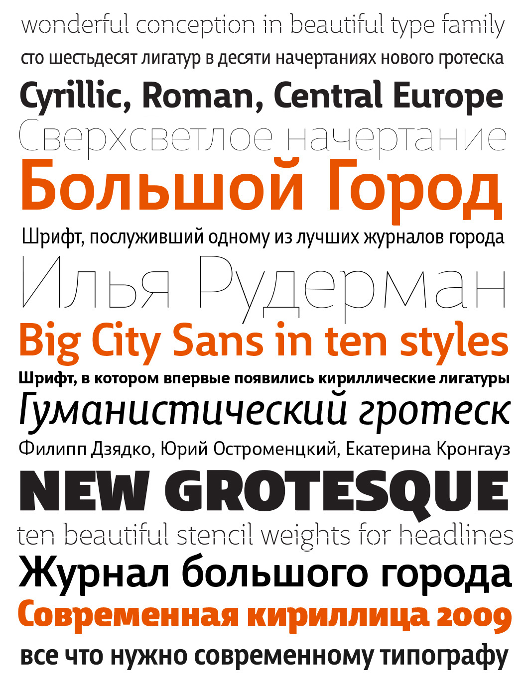
The typeface Big City Sans, designed specifically for the magazine “Big City” and used in that publication in recent years. The extended character set, which supports all European languages, a large number of ligatures, including Cyrillic, small caps, indices, fractions, ordinal numbers and five styles of numbers make the typeface a powerful tool in the design of periodicals.
Yuri Ostromentsky was the art director of the magazine. We maintained absolute independence between the processes. Yuri barely got involved in my decisions and didn’t try to influence my work. We agreed on the design, and I just expanded on some graphics we found that the customer was happy with, but that was the extent of the collaboration. Later, there were many projects where the design came together “between the fingers of two pairs of hands”, but that wasn’t the case for this particular project.
Big City, No. 10 (299), 30.05.2012— the last edition with Yuri Ostromentsky as art director after eight years of work on the magazine. The sans-serif Big City did a lot for the literary and public image of the magazine. In many ways, the up-to-date typography with its touch of self-deprecation contributed to this, which was generally consistent with the spirit of individualism and democracy that BC proclaimed. The magazine created a myth of Moscow, and it did not go to waste: the city imitated the myth, and a lot of things changed, despite the circumstances. A reasonable question: what is the role of type in these processes? But the answer is obvious: its role is just as great as the role of, say, NYT Cheltenham in The New York Times (along with its recognisable gothic logo), whose image has long been an integral part of life in the metropolis on the other side of the ocean.
Big City, No. 10 (299), 30.05.2012— the last edition with Yuri Ostromentsky as art director after eight years of work on the magazine. The sans-serif Big City did a lot for the literary and public image of the magazine. In many ways, the up-to-date typography with its touch of self-deprecation contributed to this, which was generally consistent with the spirit of individualism and democracy that BC proclaimed. The magazine created a myth of Moscow, and it did not go to waste: the city imitated the myth, and a lot of things changed, despite the circumstances. A reasonable question: what is the role of type in these processes? But the answer is obvious: its role is just as great as the role of, say, NYT Cheltenham in The New York Times (along with its recognisable gothic logo), whose image has long been an integral part of life in the metropolis on the other side of the ocean.

Big City, No. 10 (299), 30.05.2012— the last edition with Yuri Ostromentsky as art director after eight years of work on the magazine. The sans-serif Big City did a lot for the literary and public image of the magazine. In many ways, the up-to-date typography with its touch of self-deprecation contributed to this, which was generally consistent with the spirit of individualism and democracy that BC proclaimed. The magazine created a myth of Moscow, and it did not go to waste: the city imitated the myth, and a lot of things changed, despite the circumstances. A reasonable question: what is the role of type in these processes? But the answer is obvious: its role is just as great as the role of, say, NYT Cheltenham in The New York Times (along with its recognisable gothic logo), whose image has long been an integral part of life in the metropolis on the other side of the ocean.
From about 2008, Western designers started getting in touch with me all of a sudden—as a specialist in Cyrillic. That led to a tightly packed spread of cyrillisation collaborations. Over the years, I’ve created many Cyrillic alphabets for world-class projects, and am starting to become proud of this in some measure. Moreover, I realised that I can learn a lot by developing someone else’s graphic ideas in Cyrillic. These kinds of collaborations pair you with designers who have complimentary but different levels of experience, sometimes you learn a lot from them, other times you teach your colleague something. And that’s always interesting.
In 2011, a “universal typeface, created especially for the design of the city of Perm” was created, as stated on the “Art. Lebedev Studio” website. How was the task for the development of the Permian typeface formulated? Did it work out well?
That was an important milestone. Artemy Lebedev initially formulated the brief like this: we need one typeface (for the purposes of discussion, Johnston in the London transport system)—bright and multi-functional, which could be assigned to the typographical image of the city. But in the search for the perfect solution, we came to the conclusion that it would have to be three independent typefaces based on one graphical foundation. This was a rarity in the Cyrillic world, so the project was interesting to me. It’s one of the few projects that was brought to a conclusion, so that a sans serif, serif and square serif geared first and foremost to Cyrillic would come into being in Russia as one large superfamily. In the end, we went from one style to three typefaces with three styles each.
The Permian type system for the design of the city of Perm is made up of three typefaces united by a single graphical idea. Each face has italics and bold (9 styles in total). The serif, sans serif and slab serifs can be used for both text and display tasks. Since its creation, the family has been actively utilised by the Perm Centre for the Development of Design: Permian was used in the design of public transport stops, urban navigation and printed materials.
The widespread publicity and free distribution of the typeface worried me from the beginning. It was the first project where I had to upload a file that would be openly accessible and required to work for any user. Before, a product that I made went to one particular art director and had to work perfectly on his particular machine. But here, the typeface should fall into the hands of an audience unknown to me, a large number of users.
It is obvious that your evolution did not end with Permian, but there have not been any other projects on the scale of that one and Big City since then. What happened next? Which typefaces have emerged in the last few years?
That’s an interesting question. When I thought about what I should send to the recent Modern Cyrillic competitions, I realised that since the previous contest in 2009, I’ve created very few new typefaces. It’s just that in the last few years I’ve been more involved in cyrillisation. Which I enjoy, by the way.
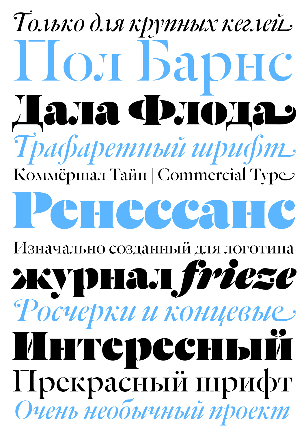
Dala Floda is a modern interpretation of Renaissance Antiqua with the addition of stencil slits. The project was inspired, according to its author Paul Barnes, by half-faded stone inscriptions and stencil type on shipping crates. Dala Floda is a clever combination of classical and modern forms. It also contains a set of alternative characters with swashes and discretionary ligatures.
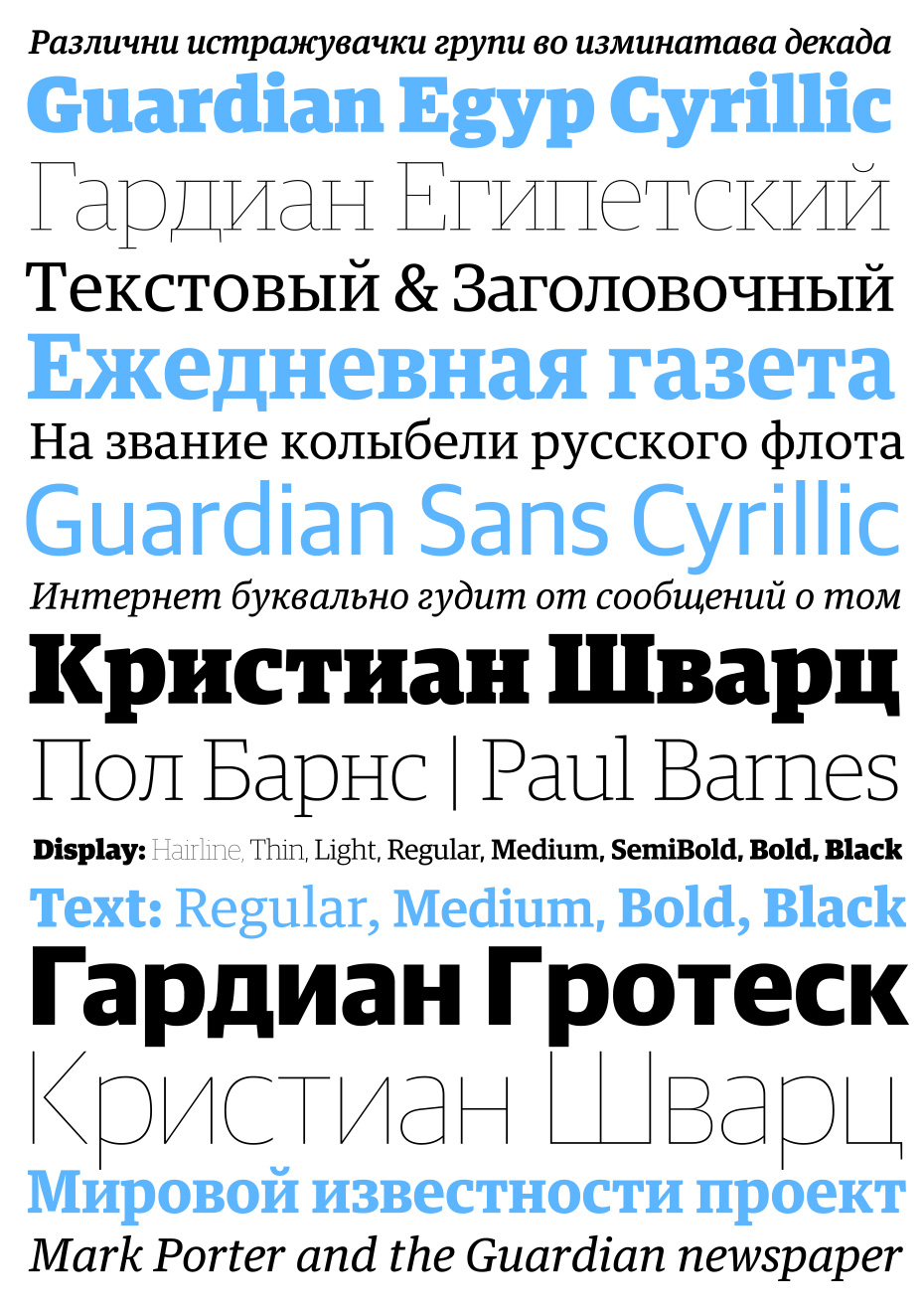
The legendary design of The Guardian (created in 1988 by David Hillman) was based on Helvetica and Garamond (later, Scottish serif Miller was used in the newspaper). In 2009, Christian Schwarz and Paul Barnes, in collaboration with art director Mark Porter, created a typeface pairing of slab serif and sans serif for the media brand, which will soon be released in Cyrillic. In total, The Guardian’s design incorporates 8 type families and 144 styles.
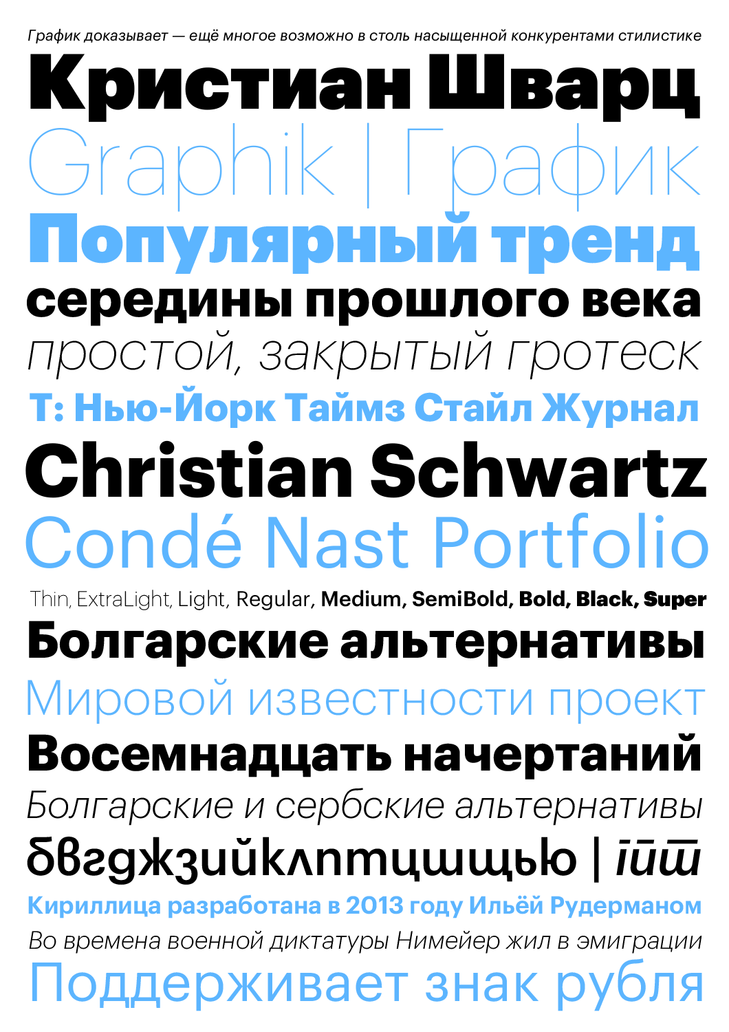
Notable sans-serif trends from the middle of the last century—simplicity and purity, neutrality and geometricity—are still relevant and in demand. Graphik by Berton Hasebe and Christian Schwartz proves that it’s still possible to find a way to say something new, even in such a saturated niche.

Austin was created at the request of publishing house Hearst Magazines UK as the signature typeface of fashion magazine Harper’s & Queen. It is an elegant retort to English punch-cutter Richard Austin’s typefaces (1765-1830). Later, the typeface went on public sale and has been in high demand.

Stag began as a small project for American magazine Esquire, but then evolved into a broad type family consisting of both a serif and sans serif. Stag combines modern design with solutions popular in the early 20th century. The relatively large lowercase characters and combination of soft details and sharp design make Stag extremely functional. Designed by Ross Milne, Christian Schwartz, Ilya Ruderman, Berton Hasebe and Panos Haratzopoulos, 2008, 2009, 2012, 2014.
For several years, we’ve been seeing increased demand of Cyrillic typefaces from international type foundries. For example, Commercial Type, Fontsmiths, Suisse Typefaces, Typotheque, Typonine, Type Together and others are actively developing their type families with Cyrillic. In your opinion, is this just market growth or is Cyrillic actually becoming more popular?
We’ve been living in a world with multilingual type systems for a long time. For example, yesterday you and I listened to a Paul Hunt talk on the evolution of non-Latin Adobe fonts and their releases. It’s obvious that the early Cyrillic releases are being replaced by quality projects with current and correct solutions—typefaces that it’s hard to find fault with: Adobe Text Pro, Garamond Premier Pro. Back in the day, Adobe made two disastrous mistakes providing us with Minion and Myriad—the number of drawing mistakes in the Cyrillic makes it impossible to recommend these beautiful typefaces for use. After 2000, releases with better Cyrillic started to appear. The trend is clear: more and more Western designers include both the Greek and Cyrillic alphabets in their basic packages by default. Western designers—including small studios—have accumulated enough experience to make fewer mistakes and are continuing to improve. What’s more, Cyrillic takes first place in the Adobe library among non-Latin scripts. This is not just a trend, it’s already a given. This is what the modern Cyrillic world looks like—most of the typefaces are designed in a country where Cyrillic isn’t the main script. The second phenomenon is the growth of a young generation of Cyrillic designers, and, in general, the Russian market is also developing successfully. We have more and more clients that understand the need for an original typeface, or at least a good typeface. More and more worry about the legality of typeface use.
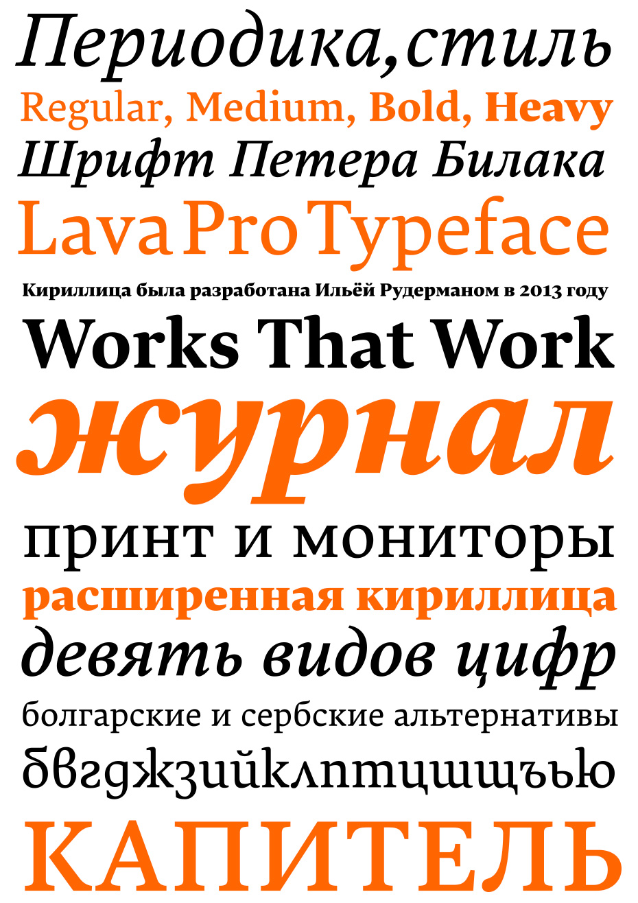
This workhorse typeface, started by Peter Biľak exclusively for use in print and on the website of his publication Works That Work, was later revised and published on the website of Peter’s foundry. In 2014, Lava was supplemented not only by Cyrillic, but also Arabic script.
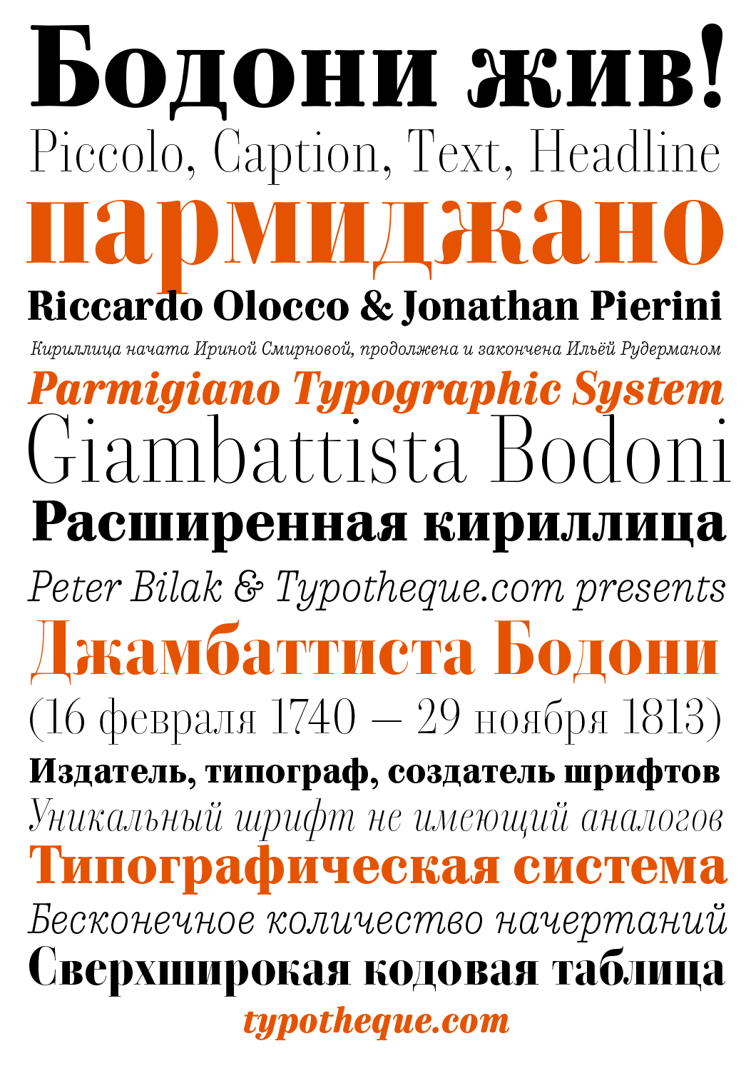
The project Parmigiano, which is hard to call just a typeface, was thought up by Italians Riccardo Olocco and Jonathan Pierini. It is a typographic system dedicated to the 200th anniversary of Giambattista Bodoni’s death. Designers from around the world contributed to modern interpretations (primarily innovative in their proportions and set of styles) of the famous Italian’s typefaces. The Cyrillic was created by Irina Smirnova and Ilya Ruderman.
I agree with Yuri Gordon that Cyrillic is worthy of its own evolutionary path. For this, the market needs a couple of dozen original type personalities who have done a lot of experimenting and are able to develop a type culture. It’s difficult to say that Russian type designers have some sort of recognisable style. You can kind of say that about the Dutch—they’re the successors of Dutch type traditions with their love of the broad-nib pen, followers of Gerrit Noordzij. Very often, I can recognise a Dutch designer by their “handwriting”. Can this be said about the Cyrillic world and Russian designers? I can’t be sure, but I wouldn’t want that to be the case. We’re multilingual designers anyway, and always design Latin by default. Sometimes we make more mistakes than in our beloved Cyrillic, and sometimes our Latin amuses Western experts, who have a better knowledge of the historical analogues and visual associations of the Latin alphabet. But the fact that we are part of this trilingual world, the world of three writing systems—Latin, Greek and Cyrillic alphabet—is the most important point and should not be forgotten.
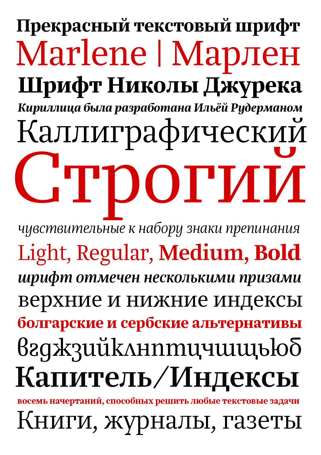
Nikola Djurek’s text slab-serif Marlene—a bright variation on the theme of Egyptian typefaces, elegant and high-contrast with a calligraphic hint of a broad-nib pen. The energetic and clean italics with unusual forms of certain characters deserve an extra close look. Cyrillic—Ilya Ruderman.
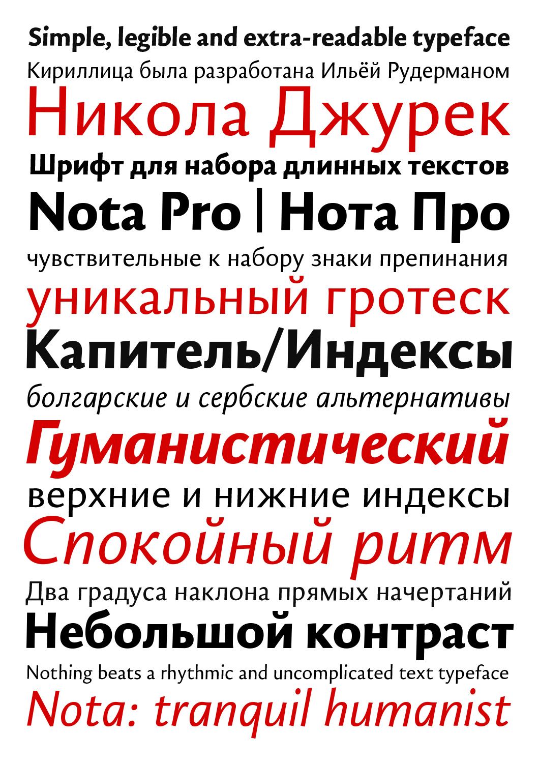
Nota is a humanist sans serif, whose skeleton is based on the proportions of Old Style faces. In spirit, this clear, rhythmic typeface with a slight slant (about 2 degrees) is reminiscent of the undeservedly forgotten Syntax by Stempel. Cyrillic—Ilya Ruderman.
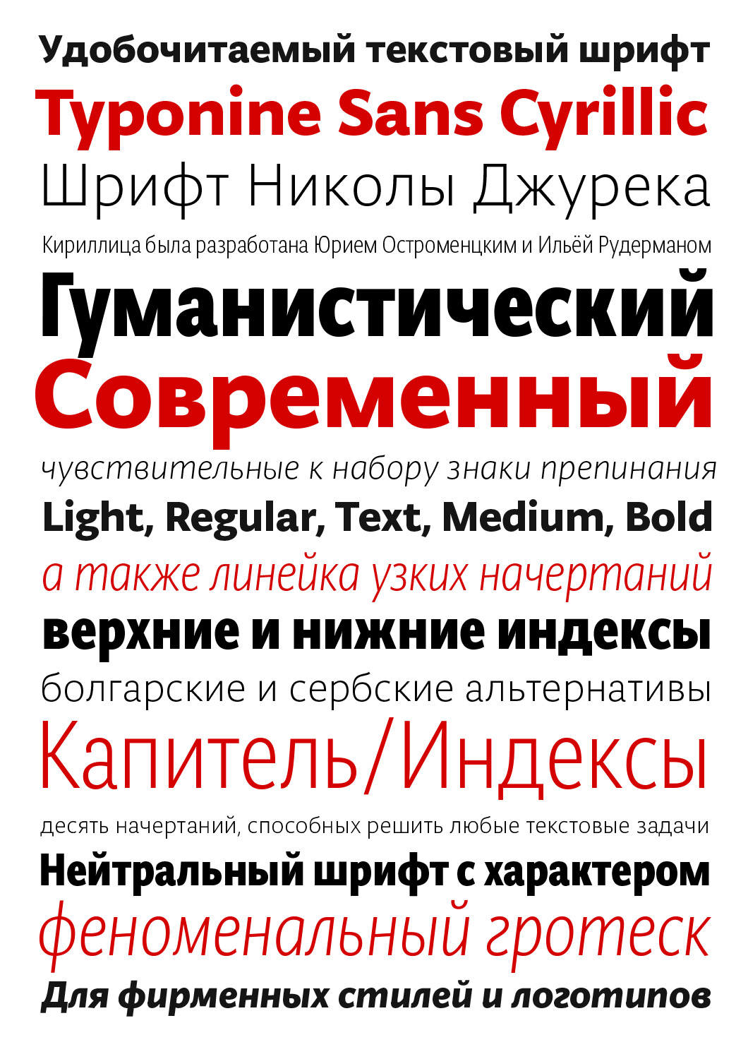
Modern high-readable humanist sans serif Typonine Sans. The typeface also has a set of narrow styles. Cyrillic developed by Ilya Ruderman and Yuri Ostromentsky.
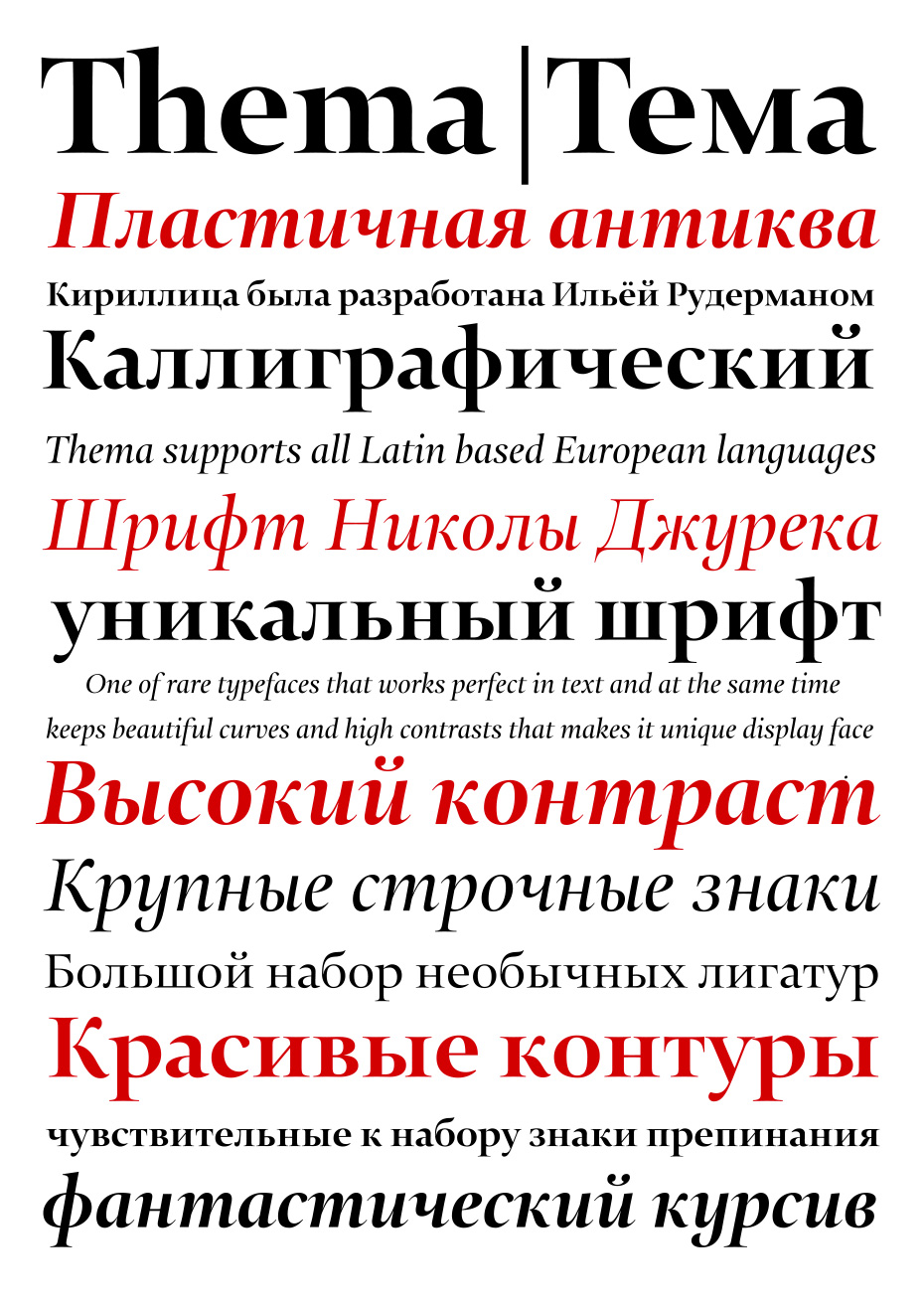
Nikola Djurek actively uses broad-nib pen model when designing typefaces. He applies this seemingly conservative approach masterfully: Thema is a statement and a study of the tool’s logic and its capabilities in the strict framework of movable type. A special mention should be made of the italics, distinguished by a steady rhythm and the striking plasticity of their contours.
Talking about your work with Yuri Ostromentsky, how does your type foundry CSTM Fonts position itself? Is it going to design typefaces for exclusive use, justifying its name, or do you plan to provide a type library for a wide range of users too?
In recent years, there have been many projects for which Yuri and myself created typefaces in tandem, effectively working as four hands together, which allows us to do things more quickly and produce a consistently high-quality product. Actually, it all started with a project on which we agreed the basic parameters, and then drew various faces independently. Yuri, for example, designed one style, and I did another one to go with it. Nevertheless, everything worked together, although the typefaces were fundamentally different. This led to us making our mutual dream come true—at the end of last year we created our own type workshop, which is called CSTM Fonts, and now we finally spend our time in the same space and work on the same projects.
Our first typeface Kazimir was inspired by P.N. Polevoy’s book “History of Russian Literature” and Russian typography of the late 19th–early 20th century in general, with all its various quirks from our modern point of view. It has two character sets—Regular and Irregular. The first behaves predictably in the eye of the current reader, while we put all those oddities, sometimes exaggerated, that we found in the typography of that era into the second.
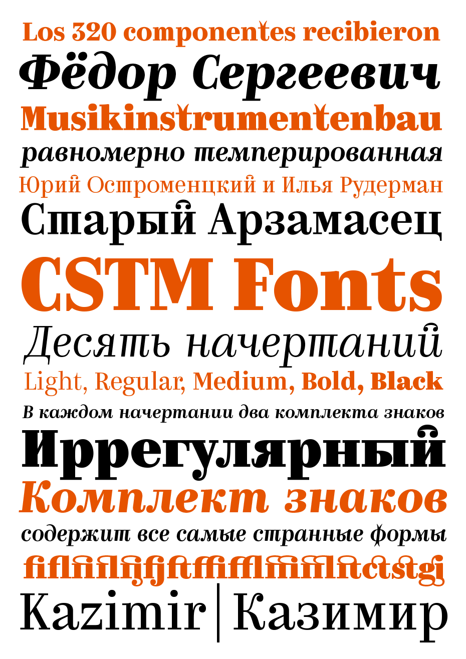
Kazimir is a new typeface from CSTM Fonts (Ilya Ruderman and Yuri Ostromentsky) and it is available for public use. It is a static contrast serif constructed on the basis of Russian book and magazine typography from the late 19th century. The typeface makes use of some of the characteristic details of Russian text faces that today seem extravagant. These parts have been reworked and accentuated. Kazimir has two sets of alphabetic characters—Regular and Irregular. The latter includes unusual alternates with details that it is hard to imagine in a text typeface today, but they are quite suitable for use at larger point sizes.
We haven’t decided what our library will look like yet. We’ve agreed to prepare a collection of unfinished works for release as part of this project. For example, I want to finalise and release Big City Sans. We’re going to offer some fresh things that are being actively developed right now, as well as some designs from the archives that couldn’t be distributed before for one reason or another.
Back to the topic of education. Was the Type and Typography course you organised after coming back from The Hague modeled on “Type and Media”?
I don’t know any other models. Type and Media has several important characteristics as an educational course. Firstly, the absolute independence of each teacher. There’s a constructed programme, and everyone knows what happens at which point and what is given to students. But each teacher is independent in their comments on students’ works. This professional independence is very important. The course is more a platform for communication than a purposefully crafted path to a successful outcome. It’s not very close to the modern Russian school as a higher education institution, where it seems like everyone should be part of a single process and continue certain traditions.
The “golden” teachers of the Type and Media course are experts respected by the professional community. The Type and Typography course at the British Higher School of Art and Design in Moscow is trying to bring together some of the best experts in the profession too, and in some ways may be similar to Type and Media. But we differ in one very important way: my course is a supplementary adult education programme, while the Dutch one is a Master’s degree with a daily timetable. Unfortunately, the British School couldn’t afford to launch such a course, but the compromise is only on the part-time status of the students: the classes are in the evening and can be combined with a full-time job.
From the beginning, the course was in a unique situation: students could have consecutive meetings with Vladimir Yefimov and Alexander Tarbeev, which in any other setting wouldn’t have been possible. How was the academic staff of the “Type and Typography” course formed, and who are its main teachers today?
The teaching staff of the course was never set in stone and, seemingly, never will be. There’s a natural process of turnover among the lecturers. There’s a framework, but some positions change every year—some subjects are introduced, others are removed. In the early years, we actively taught programs; there was an entire course devoted to the study of FontLab and so on. I got rid of it a few years later, because nothing teaches you a program as well as independent work with it. Running through the subtleties and buttons in a couple of hours is usually enough. Unfortunately, Vladimir Efimov, who lectured on the type history course, passed away in 2012. Others left for reasons that weren’t as sad, such as Katya Kochkina who went to study on the Type and Media course last year; prior to that she did a great job of teaching the sketching and calligraphy block. Each year the course changes while keeping its overall structure and general idea of what you need to get through and go through. Sometimes, teachers just get tired of teaching, then come back to us with new ideas, fresher and missing the work. Valery Golyzhenkov took a break of two or three years. If I had my way, I’d take five years off too. But there’s enough time for me to start to miss the basic course, because at the moment our intake is once every other year, so this two-year cycle allows me to take a break from the lectures in the initial period, which just have to be repeated.
In general, I don’t interfere in what teachers do with students within their own fragments. Before, I was a bit worried and tried to keep an eye on what’s going on, but now I leave it completely at the mercy of the teachers, and with absolute confidence in their knowledge and approach towards the topic. This freedom is also seen at the advanced stage, when students sometimes get completely contradictory comments about their graduation projects and end up at a loss as to what they should actually do. I think it’s a great achievement in the Russian educational system—that there’s a course on which the students themselves have to turn on their brains and make their own decisions, instead of marching in step with the trends of the school, the leader of the educational process or the leader of a creative workshop. I like that course is independent in itself. This even leads to me almost not feeling gratitude from the students in the end: they’re so confident that they’ve really earned everything they’ve picked up and acquired. And I like that.
Now a question about the Moscow Design Studio. What is it for you? A way to be independent? How do you have the energy to do so much: the design studio, type foundry, educational course, family…?
When the RIA Novosti news agency was shut down after I’d worked in a large design team for three years, I knew it was time to try my hand at something else. For some reason, I thought that one business wasn’t enough, and I got involved in opening another two—thank God that they weren’t competing amongst themselves! We have a beautiful cosy studio where both Moscow Design Studio and CSTM Fonts are based. We have some joint projects and play table football together. I can’t really talk about any sort of special independence—we are dependent on the market like everyone else: if the market experiences a crisis, we tighten our belts too, but things are still very positive so far. There are a lot of interesting projects, so we’re not losing heart.
How do I have the energy? Of course, there’s a lot of things I don’t have time for—the kids are growing in leaps and bounds, and I want to spend much more time with them to see all of their achievements. However, the amount of stress is much lower than in the news agency, so I have more energy left over.
What are you paying attention to in the type market at the moment, or rather in the art of type?
I follow a short list of interesting designers whose graphic ideas I really appreciate. I keep track of Underware out of habit, although for quite a while they haven’t had any works as striking as in 2001-2005, when they were just starting out and brought out fantastic projects each year. Now I keep an eye on them with the hope that they’ll surprise us again. I work closely with Christian Schwartz, who I’m a big fan of. Christian creates perhaps the most perfect contours that have ever come into my hands. Nikola Djurek is not only my friend, but also the star of the last decade—every one of his projects is interesting and unusual. I watch Peter Biľak, of course, who regularly produces original, commercially successful innovations. I’m partial to my teachers’ works when they indulge us with interesting designs every now and then. Erik van Blokland won over the professional community with his typeface Eames Century Modern. He worked on it for a long time, but it is, of course, a diamond. I’m looking forward to seeing what Hoefler and Frere-Jones do individually; they’re still major league professionals.
It seems that this list does not include any Russian designers. Why is that?
Of course, I’m aware of all the novelties in Cyrillic—there are so few of them that everything created by my colleagues immediately goes under the magnifying glass. However, if you don’t align yourself with the world’s best designers, there’s always a risk of losing relevance. And let’s not beat around the bush—it would be a gross exaggeration to call us leaders in the visual field, while global culture is regularly replenished with unique typefaces.
Editorial Note
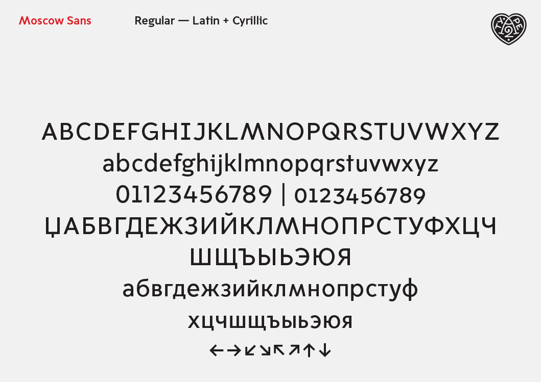
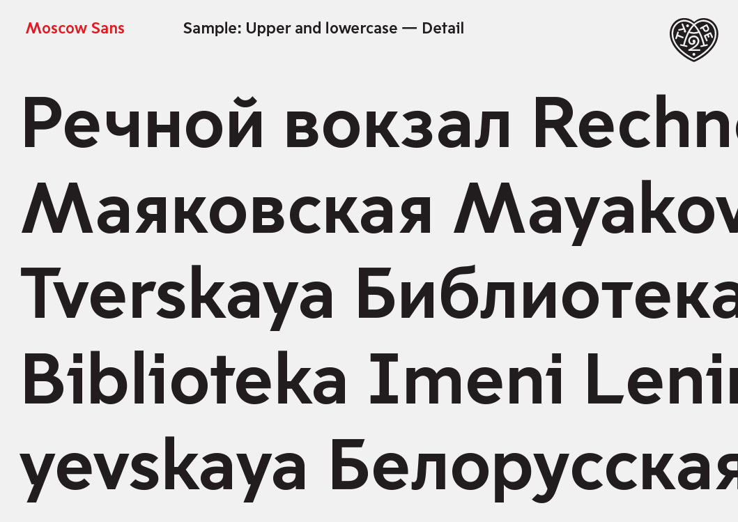
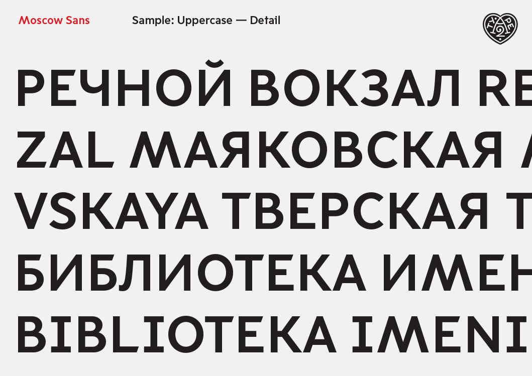
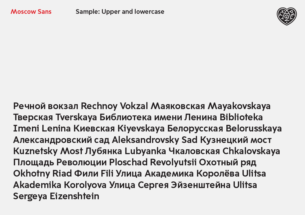
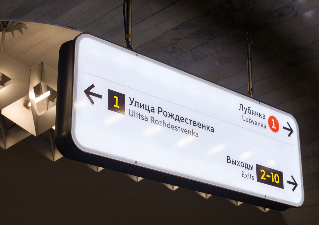
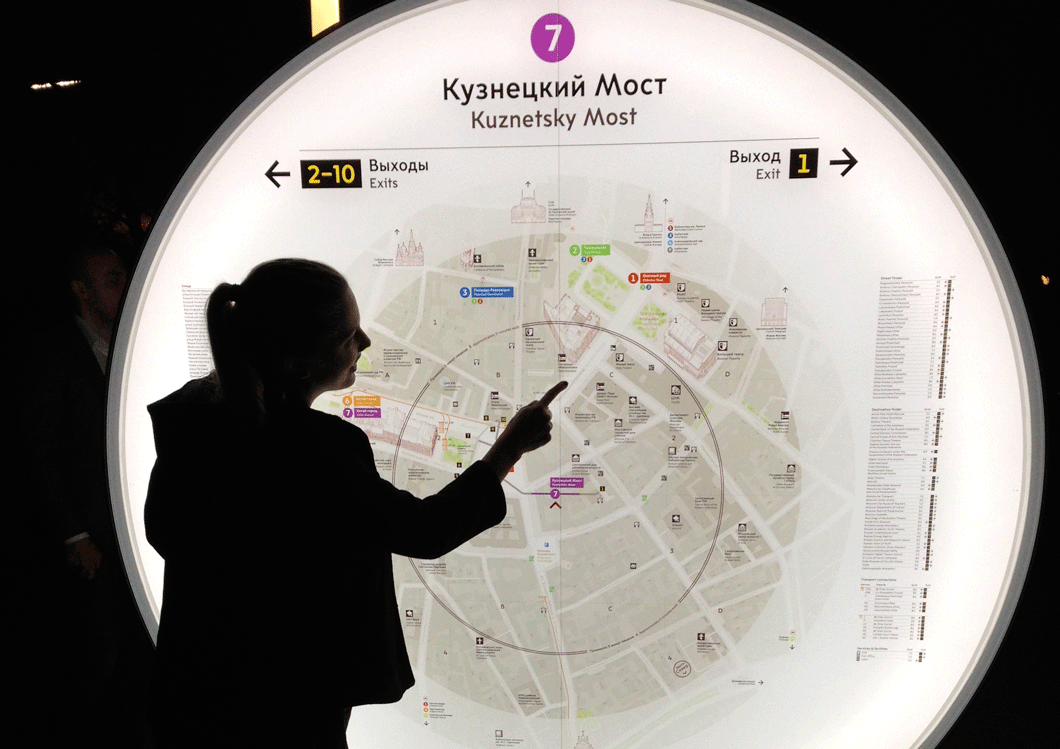
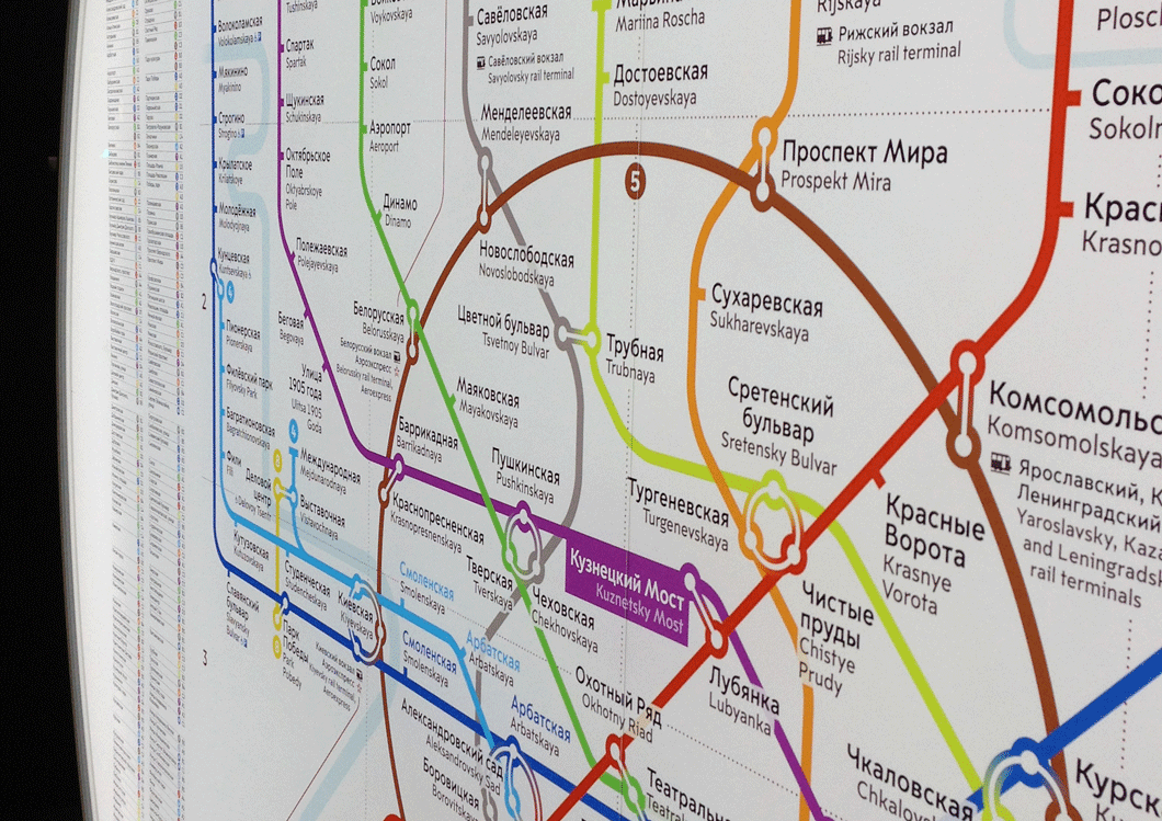
Before the publication of this interview, we managed to get hold of (thanks to Henrik Kubel) samples of Moscow Sans, created for the Moscow transport system by Scott Williams and Henrik Kubel of A2-TYPE. Margaret Calvert was a consultant on the type and pictograms, Ilya Ruderman advised on Cyrillic design. Late last year, design studio Billings Jackson Design published its project for company CityID, which was fulfilling an order for the Moscow Department of Transport. The experts at CityID had previously designed navigational systems for cities such as Bristol and New York. The updated navigational posts and signage have been visible at several Moscow metro stations since late last year. According to preliminary plans, the entire metro should be equipped with the new navigation system by the end of 2015, and it will then be extended to the above ground transport system. An overview of the project was posted on Arch Daily on 20 January 2015.

Moscow Sans is an exclusive typeface with four styles, which are complemented by forty unique pictograms. This multifunctional sans serif has bright features that serve as a kind of beacon, making the rhythm of type less smooth than it would be in text, but at the same time comfortable and distraction-free for quick reading in the difficult conditions of the metro’s underground passages. These “beacons” include serifs to facilitate the reading of problematic letters (eg, I, i, and J) and an unexpectedly wide letter M, which appears to structurally resonate with the logo of the Moscow underground. Materials supplied by Henrik Kubel, A2-TYPE.
Moscow Sans is an exclusive typeface with four styles, which are complemented by forty unique pictograms. This multifunctional sans serif has bright features that serve as a kind of beacon, making the rhythm of type less smooth than it would be in text, but at the same time comfortable and distraction-free for quick reading in the difficult conditions of the metro’s underground passages. These “beacons” include serifs to facilitate the reading of problematic letters (eg, I, i, and J) and an unexpectedly wide letter M, which appears to structurally resonate with the logo of the Moscow underground. Materials supplied by Henrik Kubel, A2-TYPE.
Moscow Sans is an exclusive typeface with four styles, which are complemented by forty unique pictograms. This multifunctional sans serif has bright features that serve as a kind of beacon, making the rhythm of type less smooth than it would be in text, but at the same time comfortable and distraction-free for quick reading in the difficult conditions of the metro’s underground passages. These “beacons” include serifs to facilitate the reading of problematic letters (eg, I, i, and J) and an unexpectedly wide letter M, which appears to structurally resonate with the logo of the Moscow underground. Materials supplied by Henrik Kubel, A2-TYPE.
Moscow Sans is an exclusive typeface with four styles, which are complemented by forty unique pictograms. This multifunctional sans serif has bright features that serve as a kind of beacon, making the rhythm of type less smooth than it would be in text, but at the same time comfortable and distraction-free for quick reading in the difficult conditions of the metro’s underground passages. These “beacons” include serifs to facilitate the reading of problematic letters (eg, I, i, and J) and an unexpectedly wide letter M, which appears to structurally resonate with the logo of the Moscow underground. Materials supplied by Henrik Kubel, A2-TYPE.
Moscow Sans is an exclusive typeface with four styles, which are complemented by forty unique pictograms. This multifunctional sans serif has bright features that serve as a kind of beacon, making the rhythm of type less smooth than it would be in text, but at the same time comfortable and distraction-free for quick reading in the difficult conditions of the metro’s underground passages. These “beacons” include serifs to facilitate the reading of problematic letters (eg, I, i, and J) and an unexpectedly wide letter M, which appears to structurally resonate with the logo of the Moscow underground. Materials supplied by Henrik Kubel, A2-TYPE.

Moscow Sans is an exclusive typeface with four styles, which are complemented by forty unique pictograms. This multifunctional sans serif has bright features that serve as a kind of beacon, making the rhythm of type less smooth than it would be in text, but at the same time comfortable and distraction-free for quick reading in the difficult conditions of the metro’s underground passages. These “beacons” include serifs to facilitate the reading of problematic letters (eg, I, i, and J) and an unexpectedly wide letter M, which appears to structurally resonate with the logo of the Moscow underground. Materials supplied by Henrik Kubel, A2-TYPE.

Moscow Sans is an exclusive typeface with four styles, which are complemented by forty unique pictograms. This multifunctional sans serif has bright features that serve as a kind of beacon, making the rhythm of type less smooth than it would be in text, but at the same time comfortable and distraction-free for quick reading in the difficult conditions of the metro’s underground passages. These “beacons” include serifs to facilitate the reading of problematic letters (eg, I, i, and J) and an unexpectedly wide letter M, which appears to structurally resonate with the logo of the Moscow underground. Materials supplied by Henrik Kubel, A2-TYPE.
Moscow Sans is an exclusive typeface with four styles, which are complemented by forty unique pictograms. This multifunctional sans serif has bright features that serve as a kind of beacon, making the rhythm of type less smooth than it would be in text, but at the same time comfortable and distraction-free for quick reading in the difficult conditions of the metro’s underground passages. These “beacons” include serifs to facilitate the reading of problematic letters (eg, I, i, and J) and an unexpectedly wide letter M, which appears to structurally resonate with the logo of the Moscow underground. Materials supplied by Henrik Kubel, A2-TYPE.
Moscow Sans is an exclusive typeface with four styles, which are complemented by forty unique pictograms. This multifunctional sans serif has bright features that serve as a kind of beacon, making the rhythm of type less smooth than it would be in text, but at the same time comfortable and distraction-free for quick reading in the difficult conditions of the metro’s underground passages. These “beacons” include serifs to facilitate the reading of problematic letters (eg, I, i, and J) and an unexpectedly wide letter M, which appears to structurally resonate with the logo of the Moscow underground. Materials supplied by Henrik Kubel, A2-TYPE.
Moscow Sans is an exclusive typeface with four styles, which are complemented by forty unique pictograms. This multifunctional sans serif has bright features that serve as a kind of beacon, making the rhythm of type less smooth than it would be in text, but at the same time comfortable and distraction-free for quick reading in the difficult conditions of the metro’s underground passages. These “beacons” include serifs to facilitate the reading of problematic letters (eg, I, i, and J) and an unexpectedly wide letter M, which appears to structurally resonate with the logo of the Moscow underground. Materials supplied by Henrik Kubel, A2-TYPE.