My first question is about Moscow. You’ve been here for a week. How do you like it? Is it what you expected to see?
I’d forgotten how big the city was — it must be by far the largest city in Europe and so much historical architecture survived. It’s interesting to see that the Bolshoi alone is twice the size of similar theatres in other European cities. It’s quite an easy city to walk around. I feel like I’m in another European city — it has obviously transformed itself into a friendly, typically Western European luxury consumer city. Back in the 70s, there was nothing here: no shops and in the restaurants there was only one thing to eat, so the transformation is really stunning. I don’t know if that is reflected in other parts of the country, but certainly the capital city seems to be doing very well.
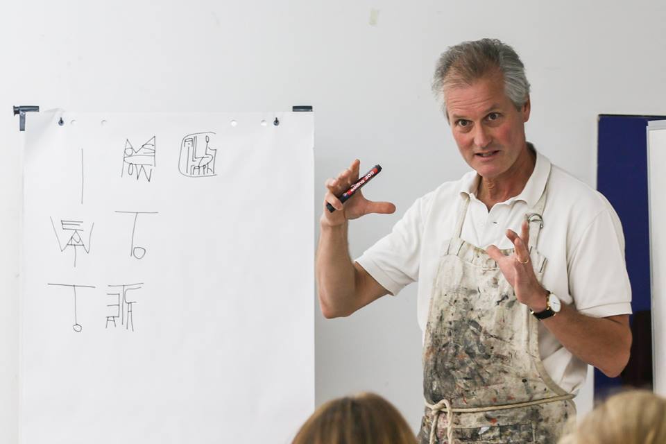
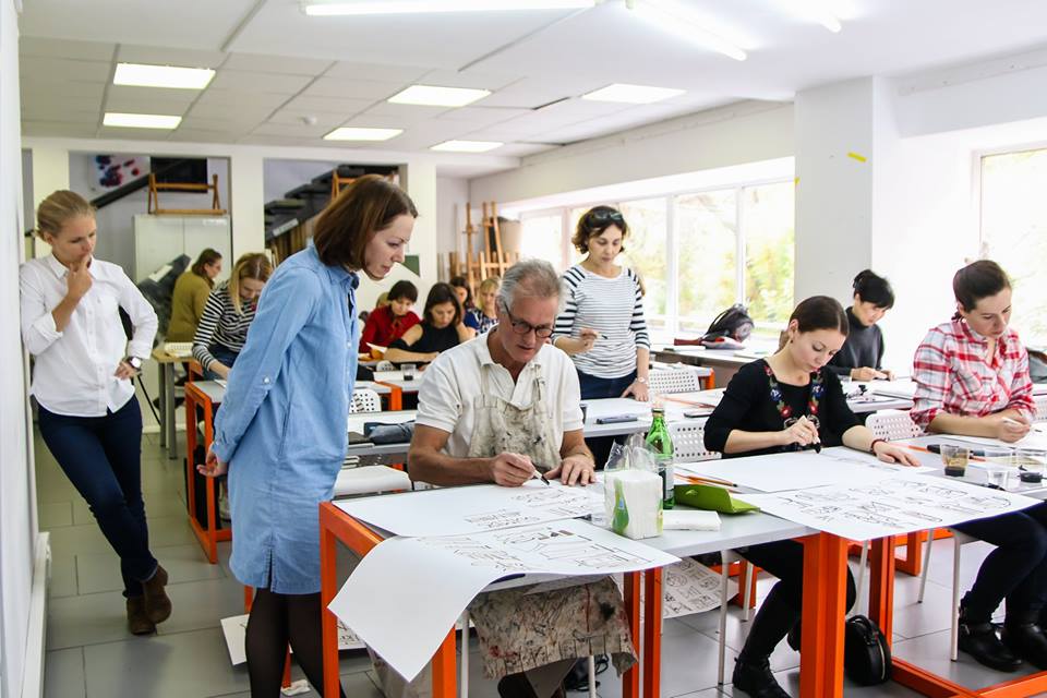
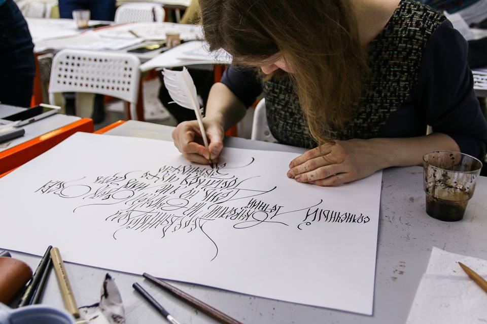
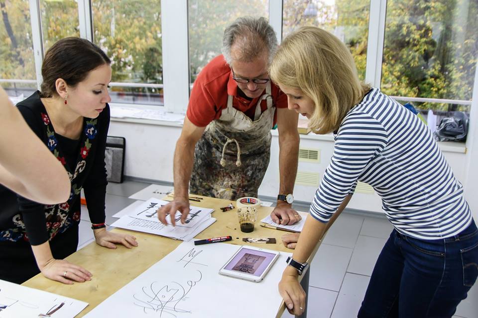
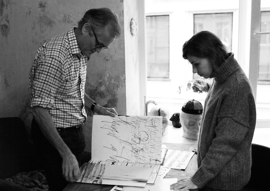
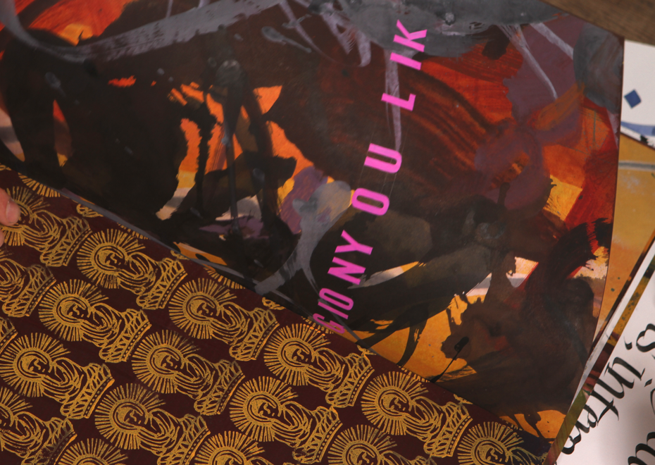
It’s also the 4th day of the Calligraphic Line workshop held at the Serebro Nabora conference. How is it going? What can you say about your students?
The students are really quite surprising because they taught me a lot about the situation in Russian calligraphy. I had no idea that it is such a cultural movement, that there are so many calligraphers, both professional and hobbyist, and that there are different schools and everything. That there are hundreds and it seems even thousands of people across the country doing calligraphy. I thought we have a lot of calligraphers in Belgium, but it seems there are even more here. And the level is high. I had expected that, because my experiences in other Eastern European countries are that the people have a very strong graphic sense. If you think about the poster tradition in Poland or the wonderful tradition here — futurism and constructivism and all. So, it’s not a surprise that a graphic understanding is here, but I didn’t know that there were that many people involved in calligraphy.

Workshop during the conference “Serebro nabora”, 2016•Photos — Lubov Eremina
Workshop during the conference “Serebro nabora”, 2016•Photos — Lubov Eremina

Workshop during the conference “Serebro nabora”, 2016•Photos — Lubov Eremina
Workshop during the conference “Serebro nabora”, 2016•Photos — Lubov Eremina
Workshop during the conference “Serebro nabora”, 2016•Photos — Lubov Eremina
Workshop during the conference “Serebro nabora”, 2016•Photos — Lubov Eremina
Workshop during the conference “Serebro nabora”, 2016•Photos — Lubov Eremina

Workshop during the conference “Serebro nabora”, 2016•Photos — Lubov Eremina
So are they good more in traditional technique or in the way of thinking?
I get the sense that they are very good in the traditional aspect of it and seems — that was a surprise to me to learn that the basis is the copperplate pen or the flexible nib, the pointed nib, because as they explain at the time that the script forms were carried through by Peter in 1720, something like that, that was the tool that was being used and so Russian calligraphy was strongly influenced by that. They also talk about that being a short tradition, because they say that it basically was a new start in 1720, and that means that a lot of the traditions from before that were lost, replaced by new ideas.
They seem to be able to express themselves on paper very well, if I give them emotional exercises in order to express emotions with writing or certain graphic concepts with writing, they seem to be able to do that quite easily, certainly putting emotions on paper came very easy. So there was a real sense of the poetry of the process. And I’m still rather curious and puzzled a little bit, why they think they need me to teach them something about modern calligraphy. There’s a sense that I can teach them more expressive ways of using the pen, but I think of course that main thing is to teach them ways of looking at the whole process of writing as text art. So the step away from calligraphy as a craft process based in history to something based in a thought process like what modern artists engage in — conceptually based, research based, a form of personal expression or analysis in the art of the conditions of life in our times.
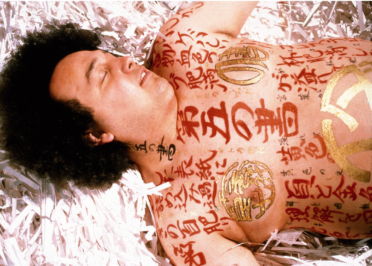
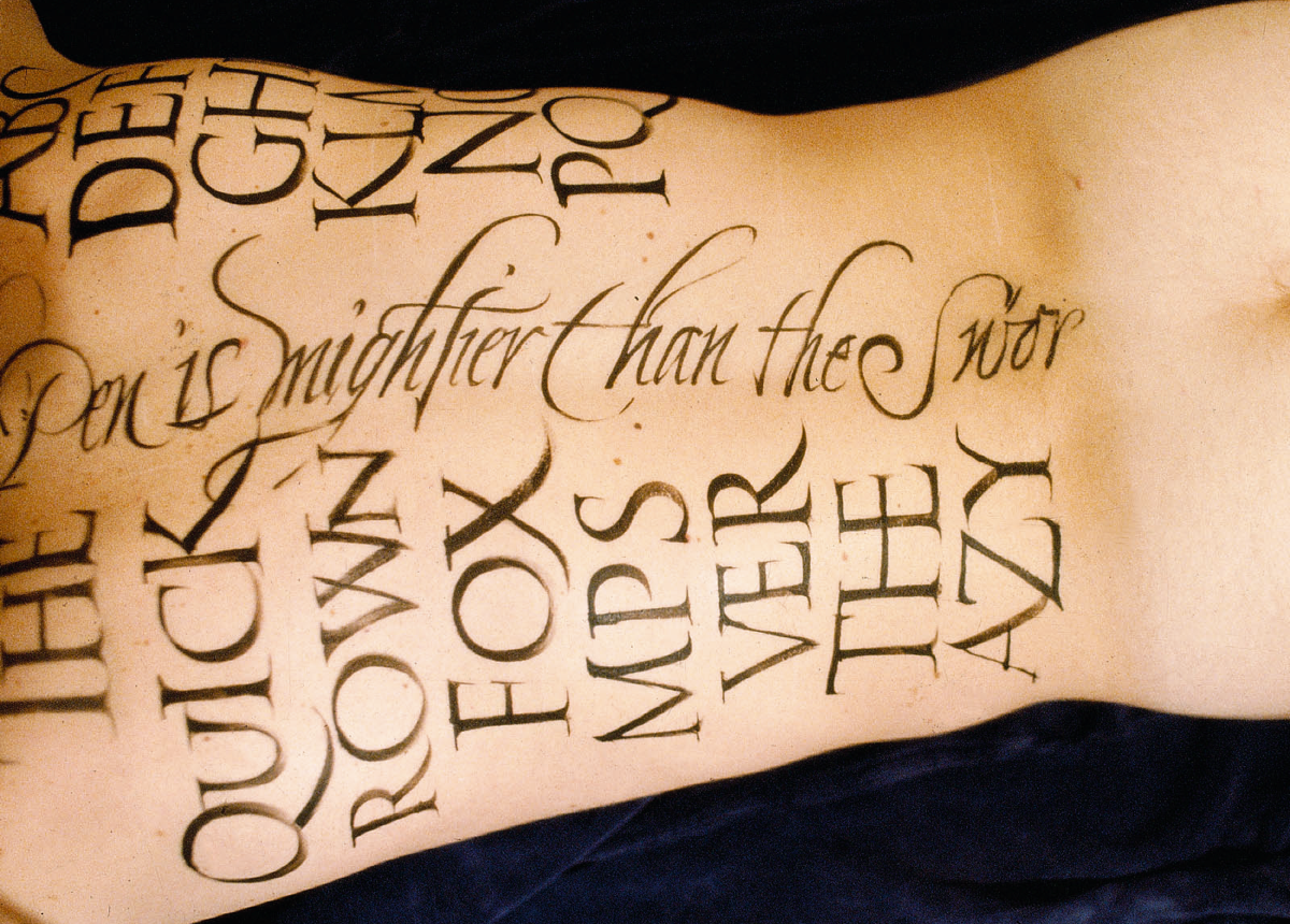
The Pillow Book — is it the project that gets all the attention, and nobody cares about
anything else?
Yes, I’m the guy that did The Pillow Book. Within the calligraphy world, that interest is understandable, because it’s unusual to write on a body and they want to know what it is like to make a good composition, how it feels and what is it like to write on Vivian Wu. But it’s really annoying for me that my efforts to enter the art world were always been — well, not blocked — but I’m just categorised as That person and so they don’t look so much at the other work that I’ve done, and actually the other work is better. The Pillow Book calligraphically and graphically speaking has its problems, you know I had a body that I had to do in about hour or two with no preparation, and then when it was finished I thought “Aah, I could have done it better this way, I could have done it better that way”.
“The Pillow Book”, a film by Peter Greenaway with calligraphy on the actors and actresses by Brody Neuenschwander, 1996.
Plenty of times in the film that was the case, but there was never a chance to do anything again — you couldn’t have a second take or anything. The body was painted and they go off to the set, so the learning curve was very steep and my ability to do my best work was very limited by the conditions. The whole body needed to be covered in just three hours when in fact if I wanted to do it really well, it would take me eight hours or something like that. So I look back at it and I think, “Well, it was an interesting process and I learned a lot, but it’s not my best work in many cases”. I learned a lot in the film that I used in later works of art, certainly, and those are more interesting. If I could just get the art people to look at them instead of only The Pillow Book.
Working on a movie project — what is the difference? What is interesting or complicated?
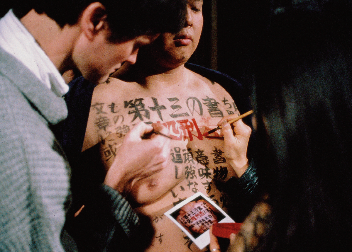
It’s all of those things. It’s interesting because on the set there are lots of really fantastic people. Greenaway’s people are the best people: they know everything about lighting, everything about makeup and everything about set design. Since they’re Dutch, they know how to do it with a very low budget — they work miracles on the small budgets they have. You simply learn a lot about that. The second thing about The Pillow Book was that when everything was ready, the set was done, the lighting was ready, the camera was in position and it was time to bring on the actors, if you just looked at what was in front of you, it was so beautiful. I said to Greenaway sometimes, “You know, we don’t need to film this, let’s just stand here and look at it”. So it was not just virtual beauty for the sake of the camera, there was real beauty. You could consider them artistic installations.
I liked talking to Peter about what he intended to do because that opened up so many possibilities for me in calligraphy that I would explore in the years after that. There was also actually excitement from the same thing that’s a disadvantage — that you have no time. You literally run from one idea to the next idea and the next one. You have to solve the problem immediately, so it becomes a kind of ongoing process on high speed. I went to the hotel room at the end of the day exhausted, but no matter what, I had to think and sit down to sketch the body for the next morning.
A prop for “The Pillow book” film•Photos — Sergei Tabunov, Otokomae
A prop for “The Pillow book” film•Photos — Sergei Tabunov, Otokomae
A prop for “The Pillow book” film•Photos — Sergei Tabunov, Otokomae
A prop for “The Pillow book” film•Photos — Sergei Tabunov, Otokomae
A prop for “The Pillow book” film•Photos — Sergei Tabunov, Otokomae
A prop for “The Pillow book” film•Photos — Sergei Tabunov, Otokomae
A prop for “The Pillow book” film•Photos — Sergei Tabunov, Otokomae
A prop for “The Pillow book” film•Photos — Sergei Tabunov, Otokomae
A prop for “The Pillow book” film•Photos — Sergei Tabunov, Otokomae
What was the process of preparation?
Well, I had a kind of a form, a basic body front and back, and I had texts that Greenaway himself had written that were translated into Japanese by somebody, and there was a woman who did all the Japanese work. So I looked at the text and would say “Left arm this, right arm this, back this, lower back this, legs this”, and I had a translation so I knew what it meant. Then I had my Japanese calligrapher, Yuki, that I art-directed. I had to sit down with her and say “Ok, where is the logical break in the text,” she’d say, “Here” and I’d say, “Oh, so that’s twelve characters”. We drew a grid of twelve on the arm, put six and six or something like that. So I knew exactly where that text was going to go, and the next day when we got there and the actor came, I would take a white pencil, draw the twelve squares and then Yuki would come to put the calligraphy there. I would grid the whole body and I would think in my planning about graphic contrast, so I would want some large and small elements, some fine calligraphy and some very bold — typographic contrast: bold, semibold and light.
That’s very Western, actually.
Yeah, I took an entirely Western typographic approach to the graphics of the bodies and then I used the grid for Japanese calligraphy to place a block here and a block there, always leaving place for the red seals which Greenaway really liked, and then the gold title. The titles were real gold on the body.
Calligraphy on actors for the film “The Pillow book”•Photo courtesy of Brody Neuenschwander
Calligraphy on actors for the film “The Pillow book”•Photo courtesy of Brody Neuenschwander
Calligraphy on actors for the film “The Pillow book”•Photo courtesy of Brody Neuenschwander

Calligraphy on actors for the film “The Pillow book”•Photo courtesy of Brody Neuenschwander
Most of the areas you work in, the way I see it, are connected to motion — video performances, installations, movies — and you have to think about things like dynamics and the speed you write with. When you are filming the writing process, it’s not only about the end result. So did you think about, for example, how fast should you move the pen because of certain dynamics in the movie?
There are two sides to that question for me. One is the pen for the camera and its motion — in other words, the pen as an actor. That was easy for me to understand. On earlier Greenaway projects, we discovered that the best thing was to have a monitor in front of me. Then I watched the monitor and not my actual pen. So that I could see the image the pen is making, because we had very tight focus, and if I moved even three millimeters too far, the pen would go off the edge, which is terrible. So there was a monitor in front of me and I learned very quickly to look at that image and see it as a graphic whole. In other words, it was quite natural for me to look at that and react to the developing image in motion.
I don’t think I have the mind of a filmmaker, but when I look at the text in motion — that I do understand. So that’s sort of half the process, and the other half — considering the entire film — I don’t think I really have that kind of mind. I mean, Greenaway thinks in film, he can do that. Well… actually he doesn’t. He thinks in series of tableau, you know, one set image after another. That’s painting after painting actually. Tarkovsky thinks in terms of the whole thing and the whole movement of the thing. Calligraphy is much more limited process of kinetic part. But within the bounce of calligraphy that kind of kinetic art I understand and I think I can work with. I would say it’s almost better calligraphy for a film camera than just on paper.
So when you write to get something on paper as a result you don’t have to be faster or slower in process, but for the camera you do?
Yeah, for the camera you do, you absolutely do. Because it’s the speed and actually the sound. If you make sound recording you can use that like a voice of an actor. And then you can use the quantity of ink, lots of ink to make a huge puddle which catches the light or when the pen is drying out and the trace is beginning to die, it gives the sense of desperation, you know. So you can use absolutely everything that a pen can do for the camera as an actor can do for the camera.
Video is part of a collaboration between European and Middle Eastern artists. Based on the poem Hegire by Goethe, read by an Iranian refugee in Germany. Calligraphy by Brody Neuenschwander. Edited by Igor De Baecke, 2011.
I wanted to talk about the relationship between design and calligraphy. Calligraphy usually belongs to art, not design (if we mean design as a “form follows function” thing). Where does your work lie between these two worlds?
Well, if that’s design, I’m not a designer at all. One of the problems in my life was that I was always in some strange middle zone, but the projects I did that usually interested me were ones where I could really use my fascination for art history and my, let’s say, understanding of the longer line of European cultural history to develop things in the project. I don’t know if that makes them art. I’m thinking of something like what I did for a cathedral in Belgium, a permanent video installation at the top of the tower. You climb 500 steps to get to the top of this tower and there’s a video installation with music. The whole context of being at the top of the tower, the top of the church, the bell tower, the bells, the way that time was kept in the Middle Ages — the way they divided up time reflected the movement of the spheres, the universal harmony, there was God. You know, I can go on and on and on about the historical and artistic and religious associations that inspire me to create an installation. To be honest, I don’t think about the public very much.
Sometimes it seems like in the art of calligraphy creating something that is just beautiful, not thinking much about a concept or idea, is a very normal thing. But that’s definitely not what you’re about.
Most calligraphers make the mistake of assuming that technically well-made letters are therefore beautiful. And that that’s enough. If the O has perfect curves, it’s beautiful. But, you know, calligraphy is a medium, it’s not an end in itself — it has to serve a purpose. You use it like a painter uses color or a filmmaker uses an actor or anything else to achieve some kind of expression of something. There’s no one kind of shape that’s better than another kind of shape. They’re all possible. Calligraphers tend to shy away from things that at first glance are not well-made because they think, “Well, it’s not beautiful”, whereas precisely that could be the most beautiful, because it carries all sorts of human levels of meaning. That’s a really general problem that calligraphers have. I think they’re mostly rather uptight control-freakish types of people who often want to work more freely. Then when you try to figure out what that means to them, it doesn’t include the freedom to express the full range of human emotions in their work, including the negative emotions — the emotions of confusion, of fear or doubt or insecurity or any of the grey or dark sides that make up a full life. So yeah, the letterforms are just something that you develop to express whatever it is that comes out of the process of research and artistic development.
Do you remember if this always your thing or was there a moment when you changed?
Oh yeah, I’ve changed completely. You know, denial is an important psychological process and when I was growing up I remember saying so many times that an artist like Jackson Pollock was just horrific (and even Cy Twombly). I have changed, it was a process covering two or three years of my life. I can remember starting to see what it was about Cy Twombly that first fascinated me in a negative way and then started to fascinate me in a positive way. Certainly Greenaway helped to push that along, absolutely, and also I have to say that just getting to know the calligraphy world and — I’m sorry to say this, it sounds arrogant — looking at what they were doing, they were never going to take this anywhere. I loved calligraphy and I thought it was a terrible thing that if these people are in charge, it will die. By looking at the problem, I started to realize that I had to open up to other ideas and then the process started. I was 30 years old by that time — pretty late, I thought. Anyway, at least it happened.
Sound and light installation by Peter Greenaway, calligraphy by Brody Neuenschwander. Piazza Maggiore, Bologna, 2000.
How do you start working on a project? When you choose a style, do you think about what you want to say or what kind of emotion you want to get as a result before choosing specific shapes?
Well, there are different approaches. If it’s a work on paper, I’ve developed a kind of process by which I delay the start of the project and slide into it gradually. I stretch a large piece of paper and collage rice paper on top of it, so that takes a little time — I don’t have to do any writing or drawing yet. Then the whitewash goes on and it has to dry, then it has to be sanded, so, you know, it’s three days before I’m ready to actually make the first mark. Next, I go to another form of denial by using these metal stamps, which I use to fill the background by actually hammering the letters into the whitewash. I’ve learned to stamp the first word that comes into my mind and I don’t worry about where I’m going, because by the time the first word is there, the second word arrives, and then a sentence, and I can keep going — stamping the letters allows an enormous freedom of composition.
I can do much more experimentation that way than with a pen. It’s just in the nature of the process — the language comes naturally. I know that this is going to be background text, so it’s not a problem if there are spelling errors or a bad word — I just scratch it out or whatever. It gives a process by which certain concepts, ideas and a kind of poetry — concrete poetry — start to happen on the surface. I really enjoy that, and then I have to react to this background text with the rest of the composition and more words, however they’re written or drawn. I find that the most difficult part. Partly as a matter of visual balance, partly because I really do want there to be a tension in the reading so that you don’t read too much or too little.
When you work on projects where historical calligraphy is needed, do you do any research or is everything in your head?
Oh yeah, it’s in my head.
Do you change things or keep their traditional forms?
Well, it depends on the project. If it’s like the things I did for the Paderborn Museum in Germany, then yes — they asked for a very correct script from about the year 1000 and that’s what they got. Just watching the pen do that with a microlens is really wonderful to see. You see every fibre of the parchment, you see every movement of the quill — it’s gorgeous, so that speaks for itself. Using a purely historical script is fine. If I’m doing, let’s see, the things I did for… something like a documentary series on Henry VIII, most of that is really historically very correct, but some are more dramatic. To get the camera interested in what I’m doing. We took it much further than pure history.
Brody Neuenschwander’s calligraphy for the BBC television series “Henry VIII: Mind of a Tyrant”, directed by David Sington, Dox Productions, 2009.
There are two types of graphics in your work — text as text and text as an image. Do you feel that “switch” in the process: when you think text and when you think images?
There was all that talk for all these years with Greenaway: text as text and text as an image — are they separate, can they be the same, can you look and read at the same time. I personally concluded that they cannot be — at least in the Latin alphabet we read or we look, and certainly with different parts of the brain.
But when creating calligraphy can you think in both ways?
I always write text and I always write letters. I’m aware of the words I’m writing and I’m always very conscious of the legibility level, how much I want. There is a certain sense of the reception of the word — what will another person perceive here. But it’s also about what I will perceive. If I’m working on something and I feel I’m reading too much, then I’ll get rid of some level of legibility. If I feel the balance is wrong between reading and seeing, then I will alter it — I will add legible or remove legible elements.
So it’s about controlling legibility and illegibility to make it “more image, less text” or “more text, less image”?
Yeah, until I’m happy with the balance. It’s about how much you let a person into your soul. A work of calligraphy for me, to speak very honestly, is my process of deciding how much of me I’d like the world to see. Sometimes it’s in the text but it’s also always in the image because that never lies. Image is the truth. You could see how much has been hidden, how much is honest, how much is alive, how much is a mask, how much is genuine — the image will tell you that. And the words would only sometimes tell you that, I think words are trickier and less trustworthy than the images. If you know how to look.
Is the process more intuitive or rational?
Well, I always thought I was a very rational person, but in recent years I learned that I’m just totally emotional. I have great rational capacities and I always thought that was what was leading the process, but it wasn’t. The point is that yes, of course, you use your powers of reason, and that’s very important for digesting, processing, and ordering information, but the real thing that makes the decisions is your intuition and your emotion. In an artistic project, that’s the only thing that counts. But if you don’t have the reasoning powers to bring the information together, that’s no good. You need to be able to do that. If you try to do that emotionally, it would be sloppy.
There’s a thing which I call professional intuition — when you have many years of experience and you don’t know why you make certain decisions, because all that knowledge you have is in your subconscious, you just can’t keep it on the surface.
Yeah, you don’t know rationally, but you know. In biology, they talk about “real” and “notional” consents. “Notional” means you understand the idea and say “Yes, I agree with that” but “real” means that it goes right down. That doesn’t happen early, you have to learn it over the years.
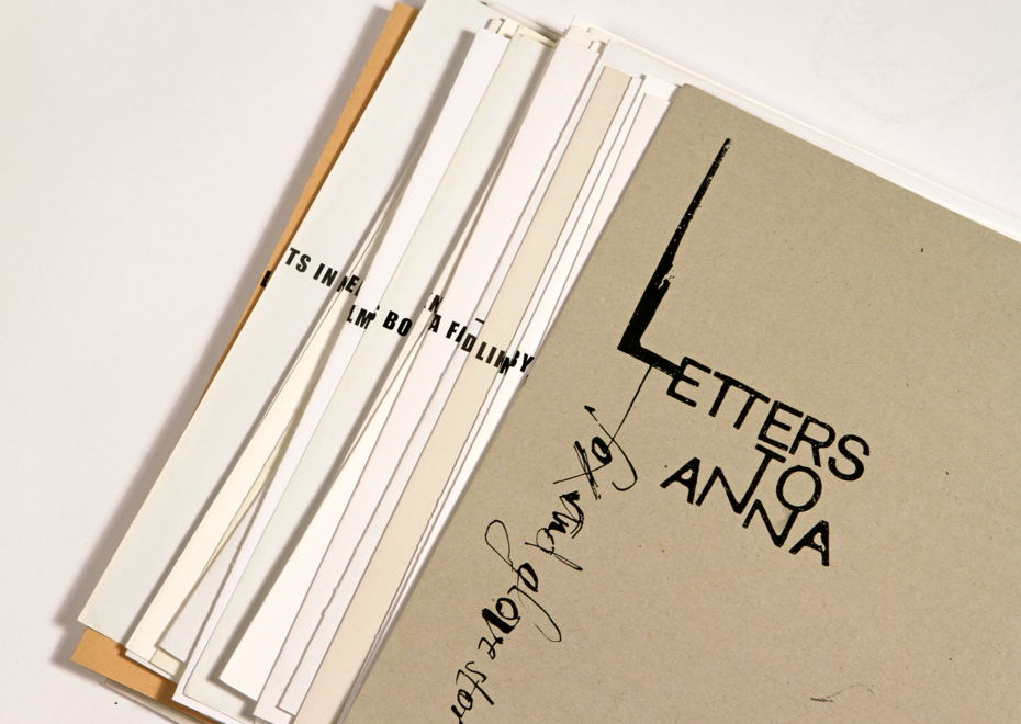
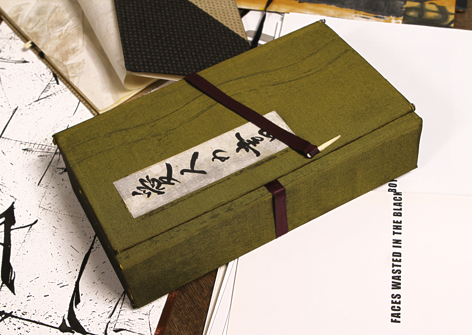
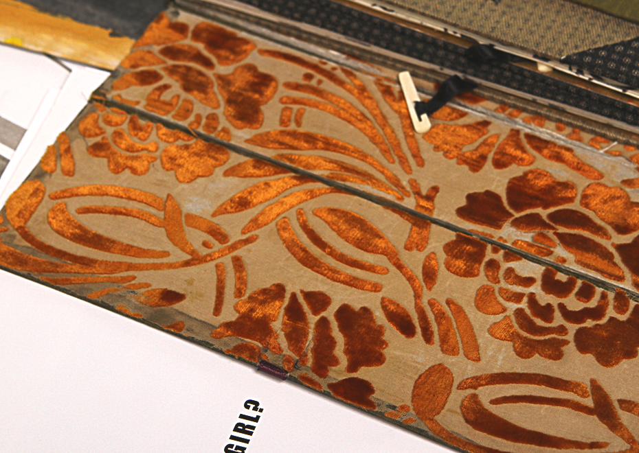
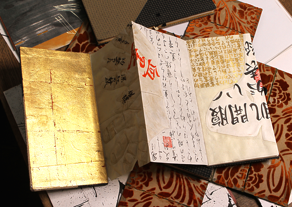
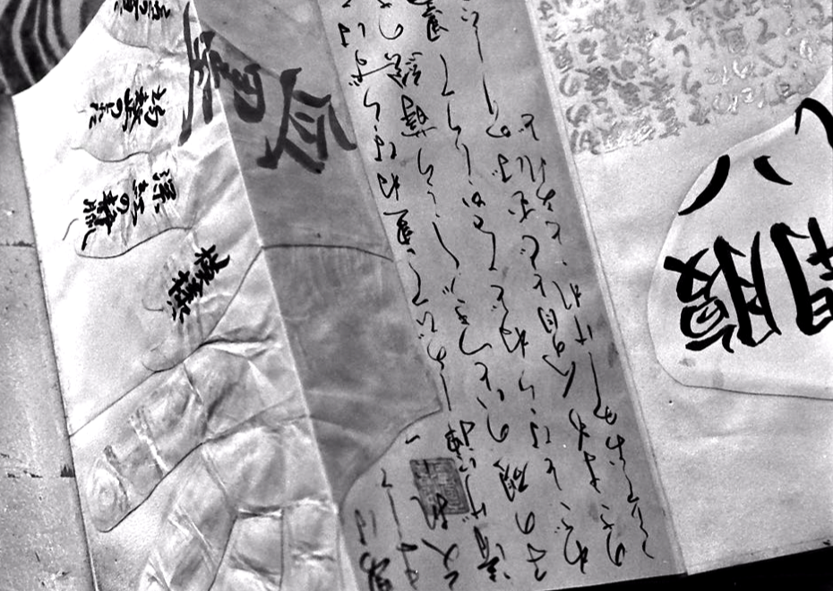
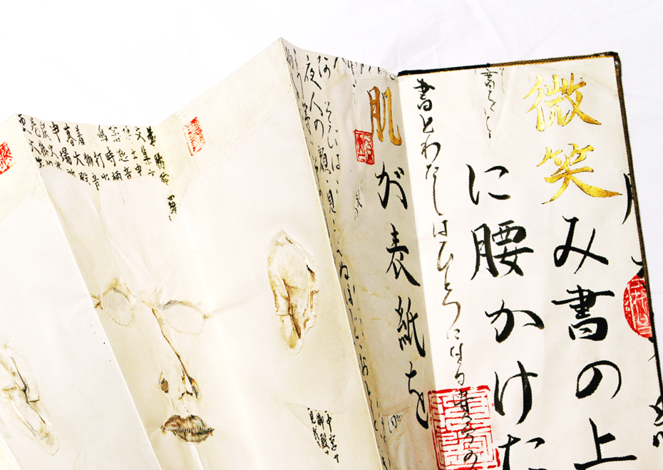
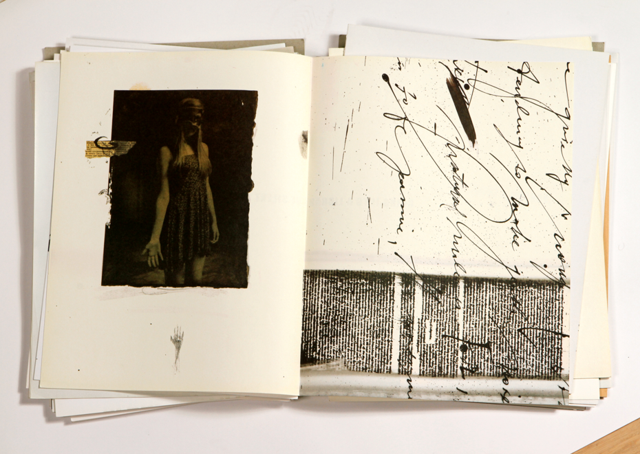
Letters to Anna, a project by Brody Neuenschwander and White Rabbit (an artist collective from Belgium), 2014.
Brody comments: “It was a request from a school, to design a project for the young printing students. We decided to make a book that will have all sorts of different techniques, so that students would have to do various things using different machines and learn about them.”•Photos — Sergei Tabunov, Otokomae
You’ve told me about Professor Hans-Joachim Burgert whose writings were very important for you… Can you tell more about that?
Hans-Joachim Burgert was a professor of Gestaltung — formal analysis — at some university in Berlin and at some point he got very interested in writing, calligraphy, the forms of letters, and he applied Gestalten to the analysis of shapes. I had real problems as a calligraphy student because I started getting interested in Arabic calligraphy, Chinese calligraphy and I just thought it was fabulous. My teacher would say, “Why do you think it’s fabulous?” and I couldn’t explain, I just knew I liked it. Then all of a sudden this German man appeared and gave a workshop, which I took and so did a lot of a professional calligraphers. I was still a young, beginning calligrapher, and all the big names I was supposed to respect, but didn’t, took the workshop, and he was teaching people to look at and make letters as forms, not as the known shapes of a received alphabet. All this professional group was completely upset by what he was saying. They just couldn’t deal with it. The few people in the class who were inexperienced had a great time. So this was interesting. Then he asked me to translate, because I was the only one who spoke German in the class, so I translated for him during the week and then at the end of the week he asked me to translate his book as well.
So that gave me the chance to really look at the ideas up close. I suddenly realised that here was an analytical language that could be used for Arabic or Chinese or Hindi or Latin or Greek or Cyrillic. And that was simply fantastic. He was the one who…. basically, he gives scores to different kinds of writing, saying this would get 10 out of 10, that would get 7 out of 10, meaning that the Trajan inscription fails. It gets no marks at all. It’s so bad in gestalt — because there’s no formal contrast, it’s all silver text. He looks at some things by primitive people and they get very high scores, because you have thick elements and small elements, tense passages and open passages, horizontals and verticals — real graphic language. If you can get into that, you get into the idea of letterforms, texts and groups of letterforms being graphic compositions.
He was not interested in emotional expression at all. He was entirely interested in whether the forms together represented a graphically interesting, tense graphic language. Imagine a musical composition with certain themes that develop and repeat in variation, and then turns things down for the conclusion. Within the composition there are certain particular things that come back in variation. Well, writing for him has to do that. There has to be enough variation to have graphic tension between one element and another. He says that the Western typographic tradition has nothing, which gives it high functionality and low graphic value. Because in a page of silver text not one letter sticks out — it’s all an even, silver glow, which he thinks gives, again, high functionality, but it’s nothing to look at. Just read it. If you think of, let’s say, an Arabic text, the functionality could be quite high, but if there’s really a lot of calligraphy going on, the functionality is lower and the image value, the graphic value is higher. So he analyses these things, which was incredible and eye-opening for me.
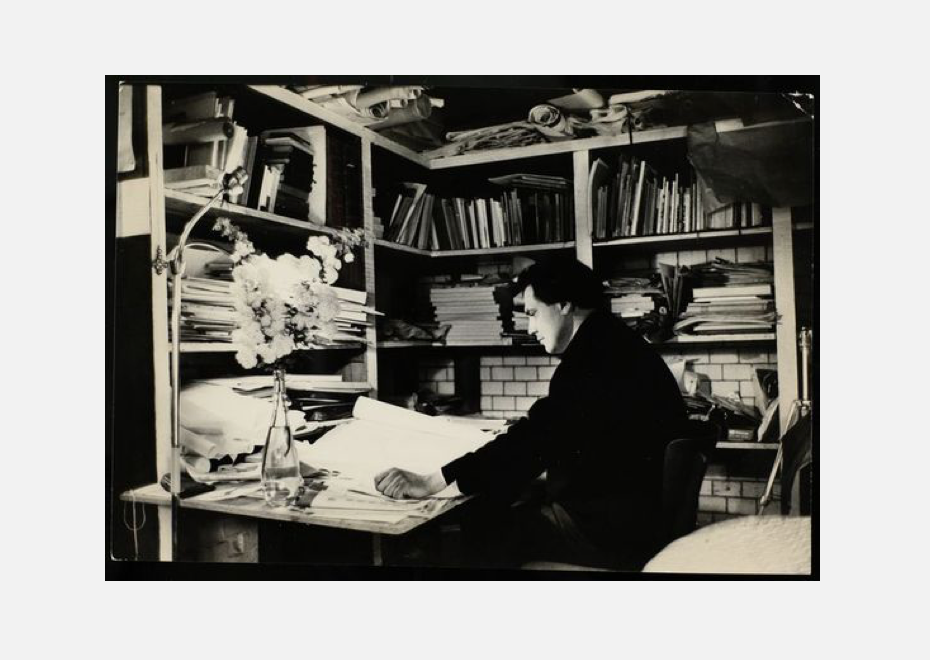
Hans-Joachim Burgert, Berlin 1996•Photo by Enger, source — Germanisches National Museum
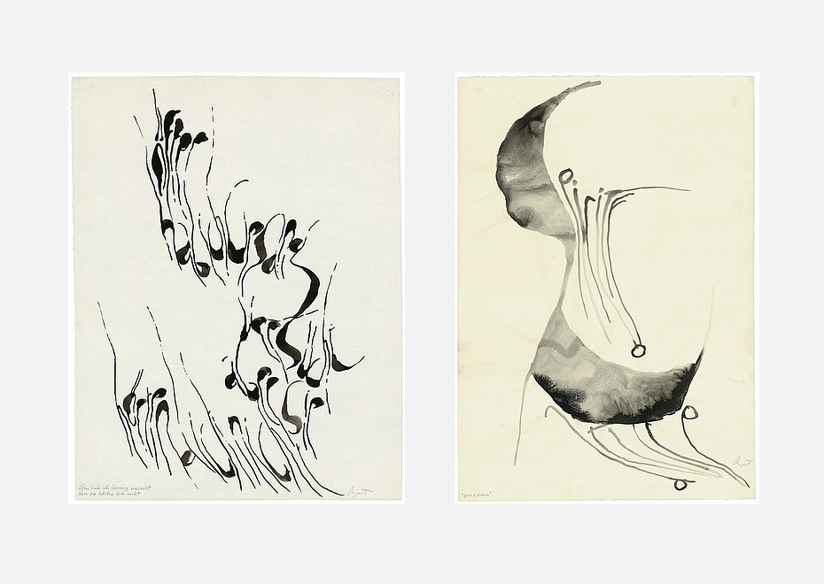
Works by Hans-Joachim Burgert•Image courtesy — Akademie der künste archive
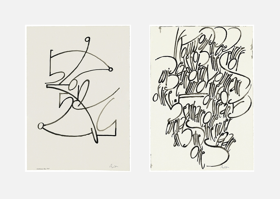
Works by Hans-Joachim Burgert•Image courtesy — Akademie der künste archive

Work by Hans-Joachim Burgert•Image courtesy — Akademie der künste archive
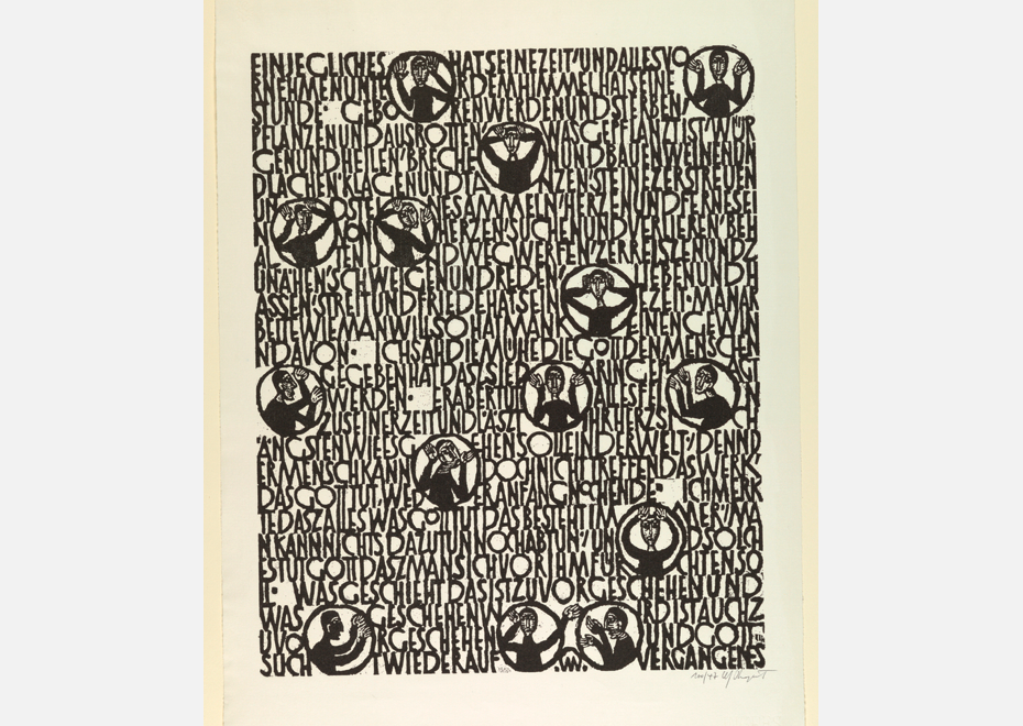
Work by Hans-Joachim Burgert•Image courtesy — Cooper Hewitt collection
Work by Hans-Joachim Burgert•Image courtesy — Akademie der künste archive
Works by Hans-Joachim Burgert•Image courtesy — Akademie der künste archive
It changed everything. I started doing calligraphic exercises, every kind of experiment with letters I could think of, which I put in the post and sent to him in Berlin. All he actually did was send it right back with no comments at all except “Keep going”, and that was enough. That brought me the idea that if the graphic values in Arabic or Chinese are stronger than in the Latin alphabet, maybe I can learn something from that, maybe I can import that. Not in the sense that I’d make fake Islamic Latin calligraphy or anything kitsch like that, but certain graphic strategies could be useful — in Arabic, obviously horizontal extension would be the main one.
Or, for example, if you can find anything like an x-height in Arabic typography
— let’s say you take the basic circle that makes the n or the f, which is usually three to five pen-width height, and let’s say you put that next to the tallest letter, which could be twelve or fifteen height. So you have five to twelve or five to fifteen — that’s a ratio of one to three or even more. If you look at the same ratio in Latin script, x-height to ascender height is basically one to one. That’s not very dramatic. So I learned that when ascending the height of the h or the l, let’s go to one to one, two to one, three to one, five to one — let’s have a bigger difference between the tall things and the small things.
Then you have the other issues of spacing. If he says that silver spacing is graphically uninteresting, that’s because it means all the spaces were even. Well let’s make them uneven, to an extreme, and put a lot of things really close together and some things further apart. This is just a disaster to a typographer, but to a calligrapher it’s music. It’s what works. So I came to the conclusion that, basically, users of the Latin alphabet have been typographers since Roman times, not calligraphers. So we don’t really have Western calligraphy. We have to invent it.
Even before we had typography, we were typographers, because we had regular spacing and regular shapes. That’s why Gutenberg could do it — because it was already typography, and that’s why the Arabs couldn’t do it. I mean, that’s the reason that modern printing started in Germany, because the letters were so regularised in Gothic script that he could put them on metal.
So, in Arabic there is the idea of many more extremes in the difference between x-height and ascenders, the horizontal elongation of forms and irregular density — more letters here, fewer letters there. As for Chinese calligraphy, the main thing that we can learn from is the density issue. Some characters have three strokes, some characters have twenty strokes, some characters have forty strokes. All in the same space. That means that in Chinese calligraphy it’s unavoidable that some areas are light and other areas are dark. You can not have “silver text” in Chinese, it’s impossible because of the number of strokes occupying the space. I treat it as a virtue. Plus the fact that in Chinese calligraphic tradition, the brush was considered a very sensitive instrument that records emotion. That’s never been the case for Latin calligraphy, or Arabic, actually. It’s not an emotional process. The hard pen was never seen as an emotional instrument, the brush was.
And it’s all about Qi.
Exactly, it’s all about a Qi… So yeah, they had a brush, they had paper. And they also had this sense, because of the brush. When they were examining the officials — you know that in Emperor China you had to go and take the examination to become an administrator — the main subject was calligraphy because first of all he has to be able to write a report in good writing. The second is — we can read his character from his writing, we’ll know if he’s good official or not if he is honest, for example. Graphology in other words. Chinese invented graphology more than 1000 years ago.
But still, not being native makes it hard to feel that text-culture bridge.
Yeah, there’s no question about that… What I feel and what I know from having studied the Arabic and Persian scripts is that they are certainly highly developed for writing poetry. There’s no question that the Persians are obsessed with poetry — they’re the most poetic people — and they have this wonderful descending diagonal script nasta’liq that they use for poetry all the time. This script doesn’t sit like soldiers on the line, it really does float like leaves in the wind or something. The calligraphy of Chinese poetry, and Japanese poetry even more so, has been developed for the lightness of their poetry — you can easily see that.
In Europe, calligraphers were never the educated classes. They were laboring classes — they wrote what the boss told them to write. Art calligraphy was never developed by the “literati” — the poets, the imperial administrators — it was developed by the workers who recorded information for books. Japanese calligraphy was developed because of the poetry by the people who were writing the poems. We can’t imagine such a thing. I don’t know who developed the nasta’liq script, whether it was the poets themselves, but the response to the poetry is certainly easy to see. I need to look into that, I don’t know. But in the East it’s clear — it was the upper classes with an artistic language. The upper classes in Europe never created art.
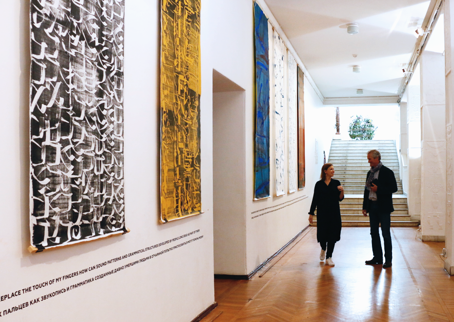
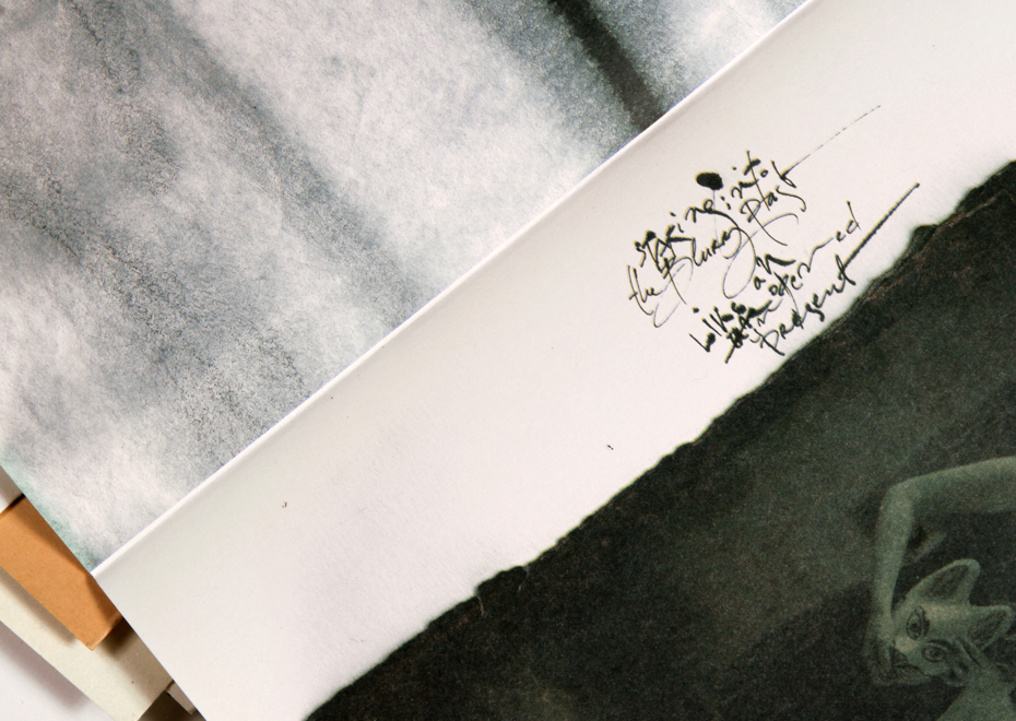
Brody Neuenschwander’s exhibition in Moscow, 2016•Photo — Maria Krasyukova
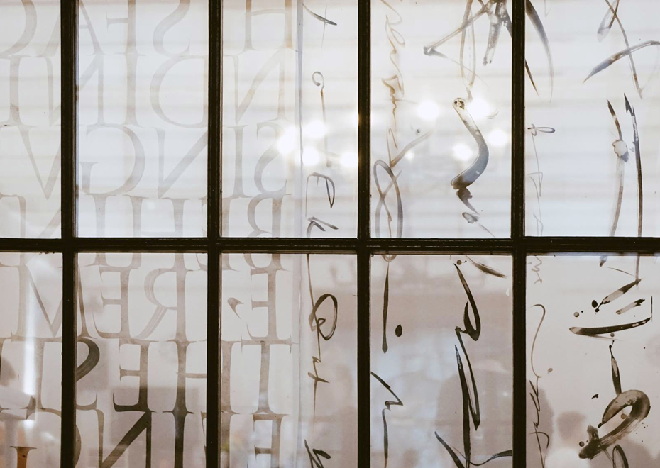
Brody Neuenschwander’s exhibition in Moscow, 2016•Photo — Diana Yurtaeva
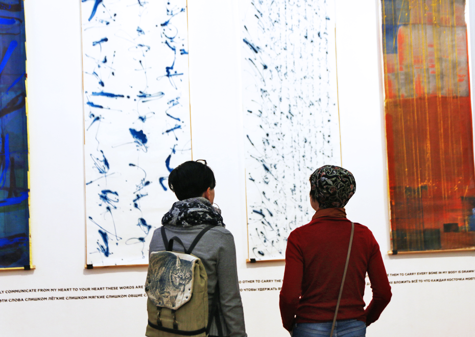
Brody Neuenschwander’s exhibition in Moscow, 2016•Photo — Maria Krasyukova
Brody Neuenschwander’s exhibition in Moscow, 2016•Photo — Diana Yurtaeva
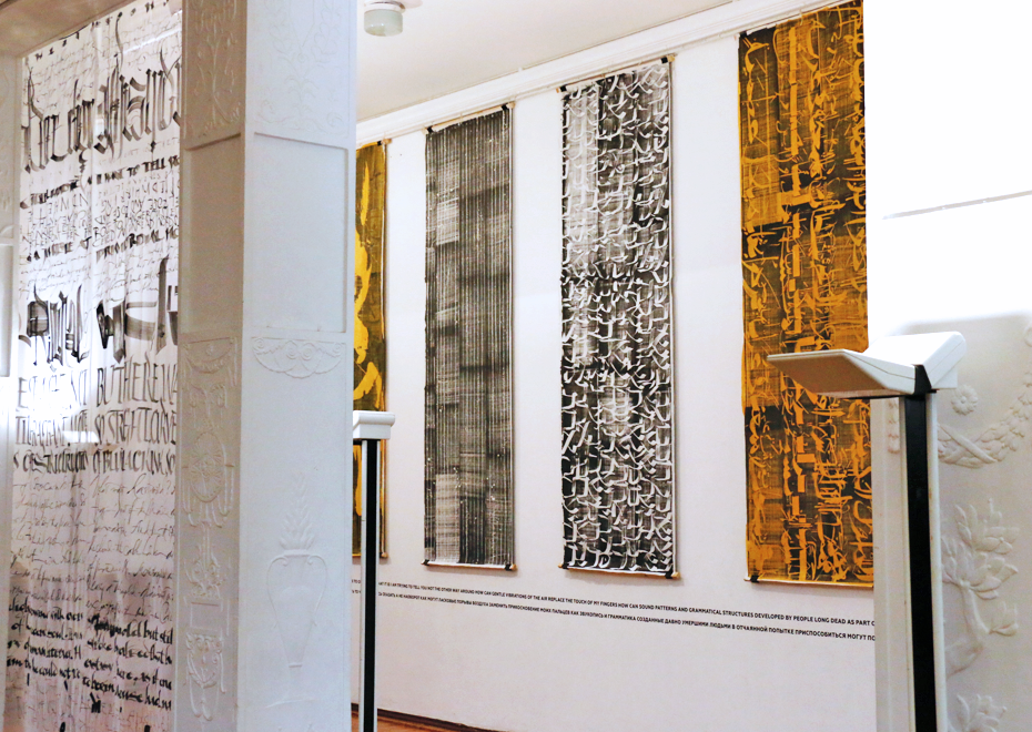
Brody Neuenschwander’s exhibition in Moscow, 2016•Photo — Maria Krasyukova
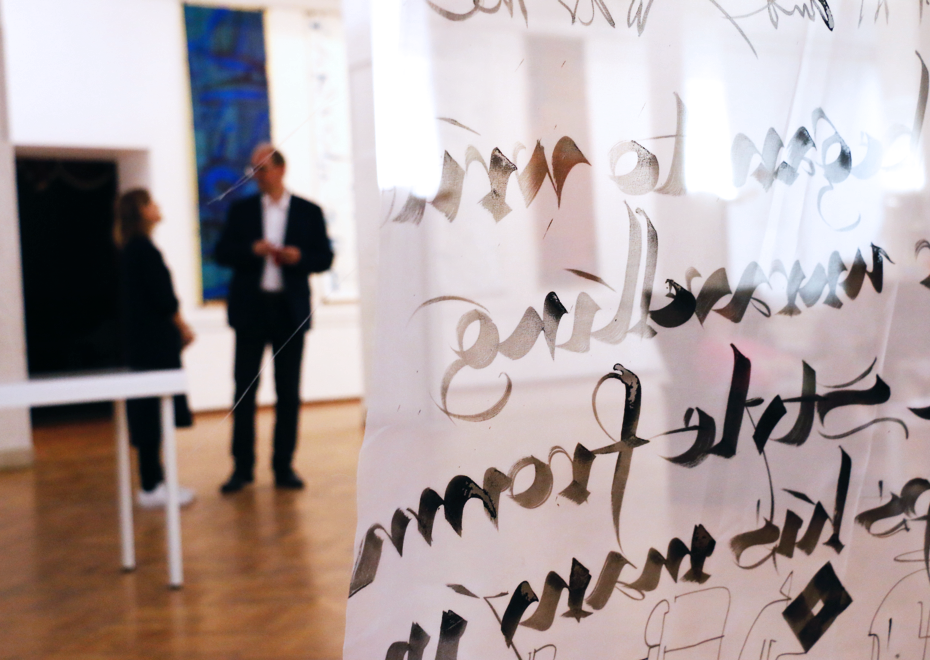
Brody Neuenschwander’s exhibition in Moscow, 2016•Photo — Maria Krasyukova
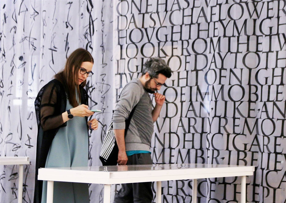
Brody Neuenschwander’s exhibition in Moscow, 2016•Photo — Diana Yurtaeva
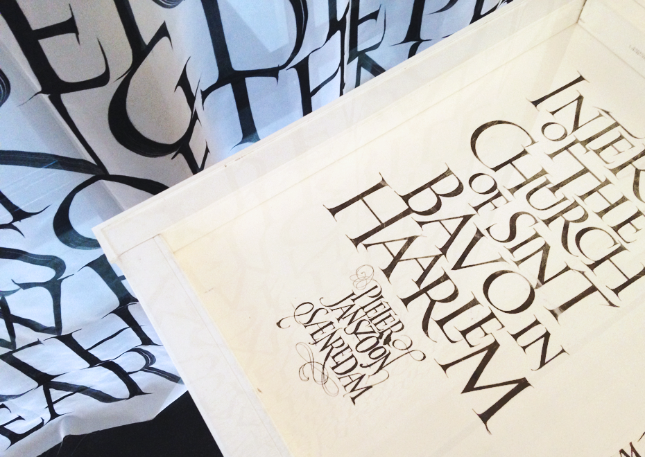
Brody Neuenschwander’s exhibition in Moscow, 2016•Photo — Natasha Mozz
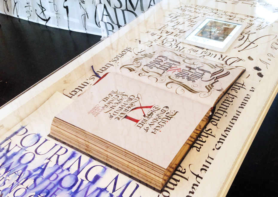
Brody Neuenschwander’s exhibition in Moscow, 2016•Photo — Natasha Mozz
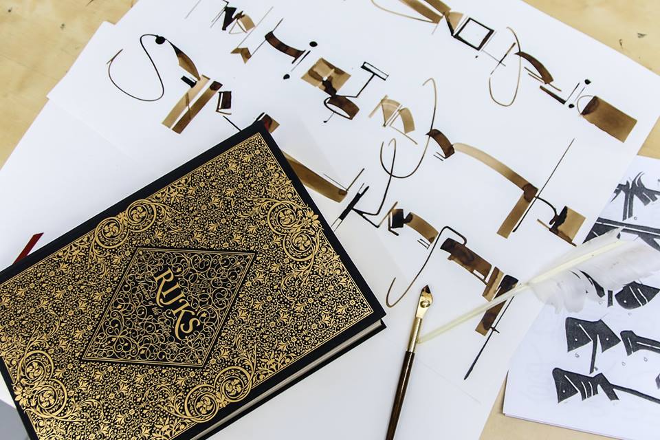
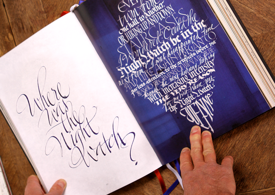
Can you tell us about the process of creating the Rijksbook? Did you have any sketches from Marcel Wanders or did you have absolute freedom to do whatever you wanted?
Marcel Wanders did not participate in the project at all. He brought in people who were book designers to do the project for him. They would send me and Massimo (Massimo Pollelo) the digital layout sketches they wanted, which were simply incompetent, just awful. It was some typography that they would draw some curls on or paste some curls on from something else. The sketches did not correspond to anything that you really do, they were ugly, or very often the sketch didn’t take into account how long the text actually was. They would go online and find a piece of calligraphy, but maybe that piece had four words and they would give you twenty words. It doesn’t work. You have to understand the quantity of text you have — this is what determines the layout — and they just threw it on there. At the beginning, we tried to follow this, but we realized pretty quickly that it wasn’t going to work, and Massimo and I just did what we thought was right. We didn’t follow the sketches at all and then they were happy anyway… They knew nothing about calligraphy. I cannot believe that so much money was spent on a project by people who did not know what they were doing. If designers are commissioned for calligraphy, they should know something about it, or the other thing you do is hire a consultant. You know, they didn’t come to me and say, “Brody, would you like to manage the calligraphy on the project?” That would have been a good thing.
After all the handwritten work was done, what else did you do to get the final version? How much retouching did you do?
Lots. For anything for print, I made a decision when I bought my wacom tablet where I draw on the screen (it’s not a little wacom that people know where you look on the other screen). I realized that for print there’s no point in playing around the idea of honesty in the sense that there would be no retouching. It’s printing, so it’s already not the original. So I decided to not to limit my digital manipulations in any way. It’s more efficient, I can do it better and faster that way, and with much better results. So for the Rijksbook, for example, I would take the text…
… It was black and white, right?
… Well, grey and white. I always use greyish ink that is easier to color in Photoshop than black and white — you’d just get a solid color. I would go to my desk, play around with different tools until I found which tool gave the right kind of lettering feel, and then I would write the text, mistakes and all. If there was a spelling mistake or ugly letter, I would just continue on and maybe in the margin write another o or another h that was better or a completely different word. All the flourishes and everything was usually separate, and then I would go back to the computer, scanning it all in high resolution, and start to piece it together in Photoshop. So I would say it was usually a question of one hour by hand, four hours in Photoshop.
It sounds almost revolutionary for traditional calligraphy.
Let’s say the general public will look at the calligraphy in the book and they will simply find it to be wonderful calligraphy, very beautiful letters. The calligraphers will look and they will also say that, but then they will think, “Wow, he’s really good if he can do this”, you know, and then you tell them that it was all retouched, and they say, “Oh no”. Well, okay, I’m not interested in those issues. It’s not a work of art to me, it’s a work of craft and I can craft it best with two processes together, analog, and digital. Besides, to tell the truth, the budget was not that great, so I needed to do it in the fastest way possible. I had to do a page per day. There was a production schedule.
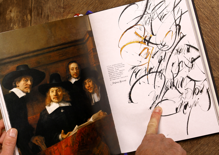
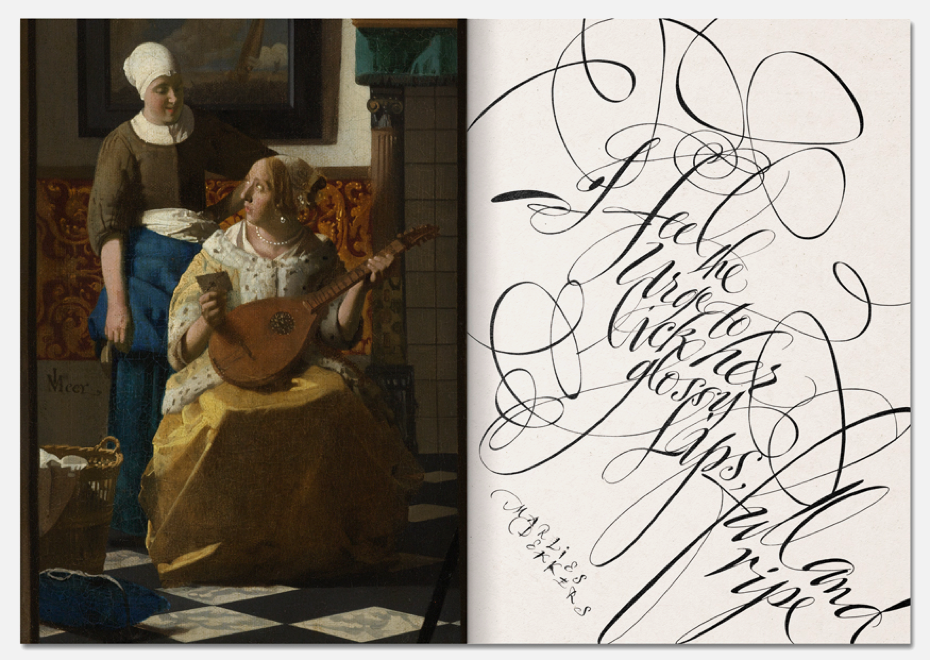
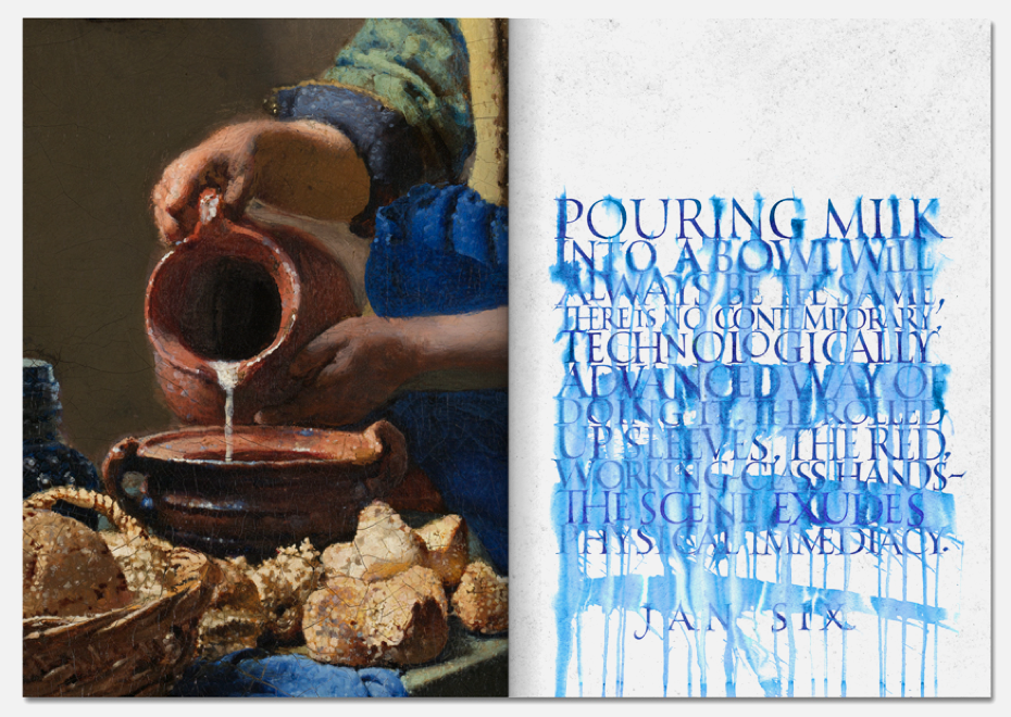
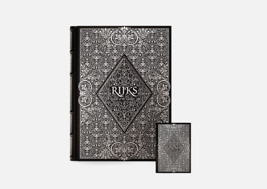
Rijks, Masters of the Golden Age. The project by Marcel Wanders, 2016. Calligraphy by Brody Neuenschwander and Massimo Polello•Photo — Sergei Tabunov, Otokomae
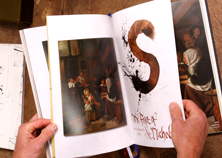
Rijks, Masters of the Golden Age. The project by Marcel Wanders, 2016. Calligraphy by Brody Neuenschwander and Massimo Polello•Photo — Sergei Tabunov, Otokomae
Rijks, Masters of the Golden Age. The project by Marcel Wanders, 2016. Calligraphy by Brody Neuenschwander and Massimo Polello.
Rijks, Masters of the Golden Age. The project by Marcel Wanders, 2016. Calligraphy by Brody Neuenschwander and Massimo Polello.
Rijks, Masters of the Golden Age. The project by Marcel Wanders, 2016. Calligraphy by Brody Neuenschwander and Massimo Polello•Photo — Sergei Tabunov, Otokomae
Rijks, Masters of the Golden Age. The project by Marcel Wanders, 2016. Calligraphy by Brody Neuenschwander and Massimo Polello•Photo — Sergei Tabunov, Otokomae
Rijks, Masters of the Golden Age. The project by Marcel Wanders, 2016. Calligraphy by Brody Neuenschwander and Massimo Polello.
Rijks, Masters of the Golden Age. The project by Marcel Wanders, 2016. Calligraphy by Brody Neuenschwander and Massimo Polello.
You’re an American living in Europe. Do you feel difference between Europe and the States in the calligraphy world?
Lots of differences. America is just the land of kitsch. When I do the workshop Developing Meaning, in which we do journaling with text art including calligraphy, we can avoid the kitsch. I can teach them to work from the concept and not just do cute things. It’s a demographic issue — these are women over 40 and over 50, so kitsch is their, you know, natural biosphere. Europeans are more strict about these things and have a better taste. The better calligraphers in Europe have created a modern language of calligraphy. Not the British, by the way. I mean continental Europe — that’s where the better calligraphers are.
Do you have to practice a lot or is it like a bicycle?
Like a bicycle, yeah… Well, I should practice, but I wouldn’t know what to practice because I do so many different things. When the Rijksbook came, I was pleasantly surprised that I could still do formal writing. I made, for example, two books that could be one book or could be four — there’s just a lot of pages with a lot of very strong color and very strong marks. I don’t know what the theme would be if it’s going to be books, but I keep trying to find a style of letter that aesthetically fits in the book and that is correct for now. I’m really not getting there yet — I mean, I’ve tried everything, so I do sit down and practice, I write, I try different styles and more styles, I put them in the book and it still doesn’t work. I think at this point I’m going to have to stop and change the rules of the game. If it’s not working, something else has to happen — maybe there’s no text at all, maybe there’s something else, I don’t know what. So that’s not practice, that’s sort of a long period of trying to figure something out.
Tell me about artist’s books.
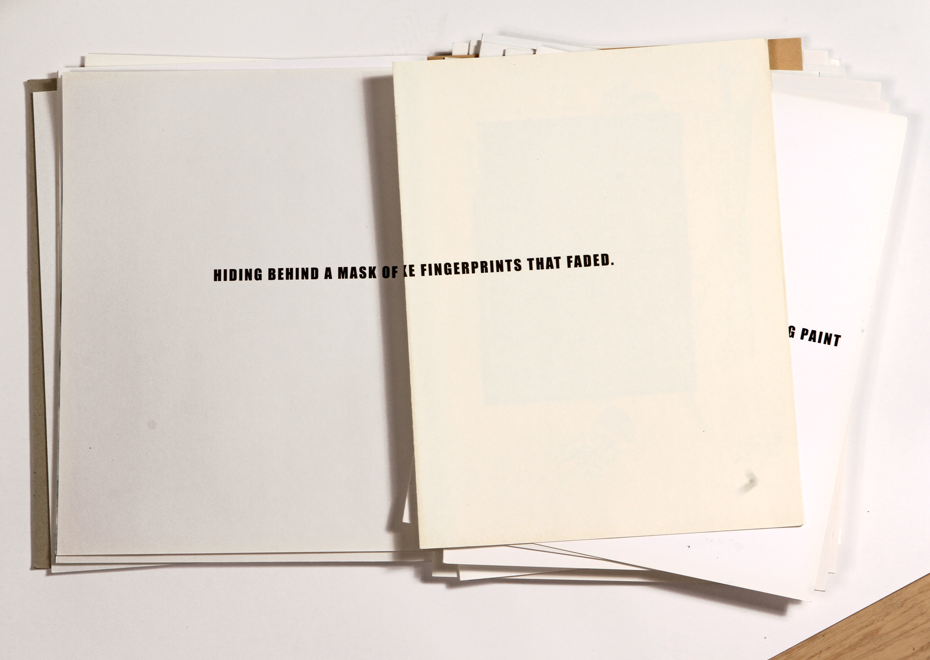
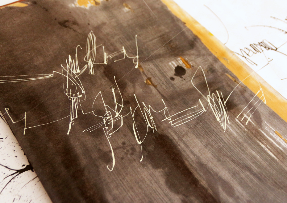
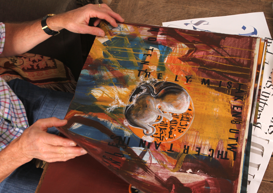
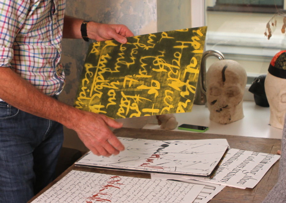
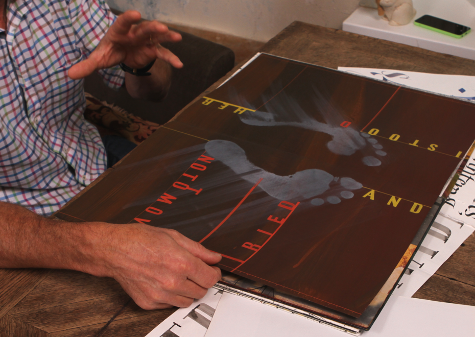
I didn’t do books over the years, and then I did this Book of Errors, which was a very intense experience. And then I thought, maybe I’ll do some more books, but you know when you look at artist’s books often they kind of disappoint me. Well, I think I need some time to figure out the parameters of an artists book.
It’s kinetic, it relates to your body in a different way than a painting or a sculpture, and it brings certain expectations such as reading or whatever, and it brings certain ideas of text/image relationship too. So to move into that medium, it’s a complex medium, and I have to be satisfied with whatever I could do to rejuvenate the text/image relationship in the kinetics of the book. I don’t particularly feel the need to rethink how this page turns and all these experiments with forms people do, I’m not interested in it. Turn the pages. Cause there’s enough to worry about. So I think I would be much more interested in… as you turn the page what happens. How do you use that process? And incorporating photography, that’s the main thing I’m thinking about right now. If you hold the book, on the one hand, you’re holding a flat object, it’s open, you know it’s only so thick and underneath there is your hand or your lap, so you know it’s not a window. Like a painting might be a window. But we still have books with photography in them, the page which is clearly thin is still a window. So there’s terrible contradiction — fascinating contradiction — of flat and depth. And if you have, if you were to combine a photography and painted marks which are clearly flat, then you can have intense contradiction. It seems to me that that would be the most interesting area to go.
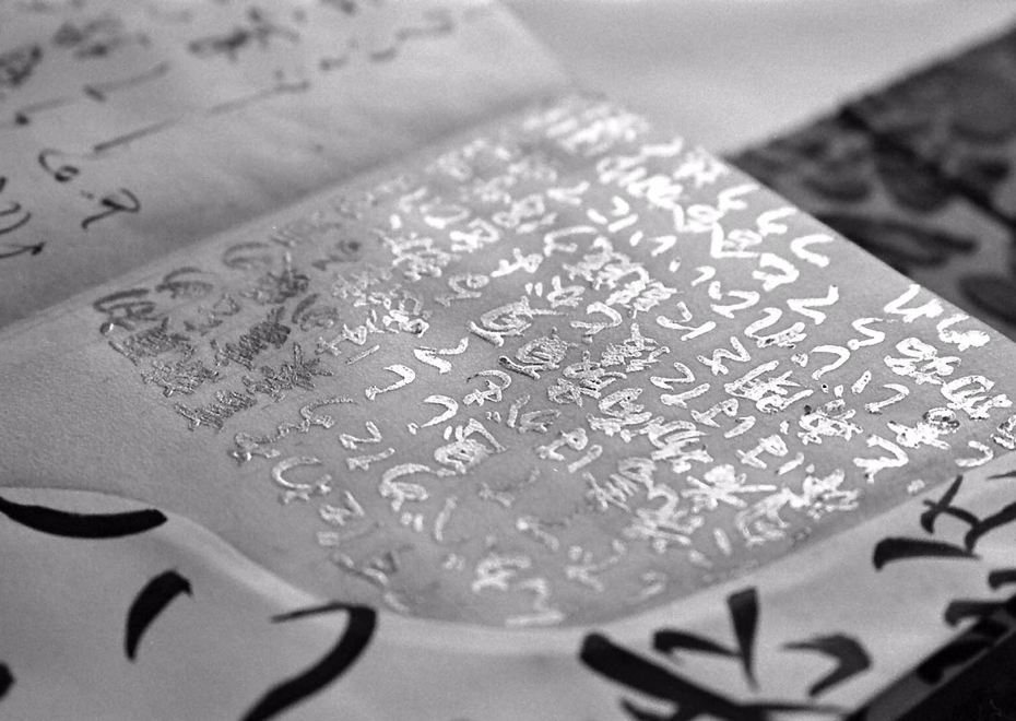
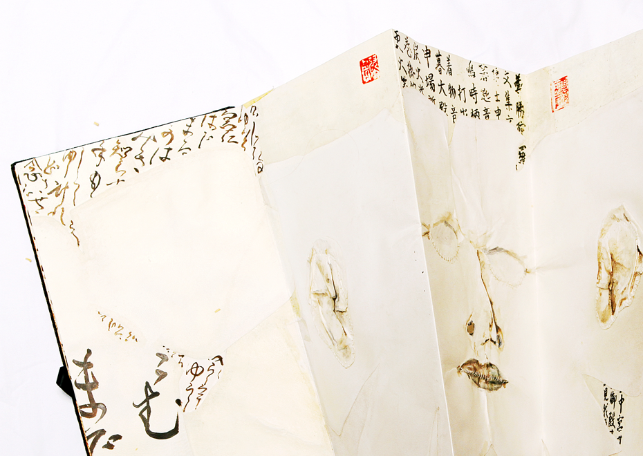
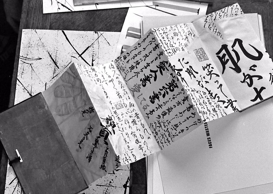
The Book of Errors, art project by Brody Neuenschwander, 2014•Photos — Sergei Tabunov, Otokomae
The Book of Errors, art project by Brody Neuenschwander, 2014•Photos — Sergei Tabunov, Otokomae

The Book of Errors, art project by Brody Neuenschwander, 2014•Photos — Sergei Tabunov, Otokomae
The Book of Errors, art project by Brody Neuenschwander, 2014•Photos — Sergei Tabunov, Otokomae
The Book of Errors, art project by Brody Neuenschwander, 2014•Photos — Sergei Tabunov, Otokomae
The Book of Errors, art project by Brody Neuenschwander, 2014•Photos — Tabunov, Otokomae
What is your favorite instrument?
My favorite instrument is my brain [laughing]. But I’ll tell you that recently, I wanted to make some pages for the Book of Errors. I have a table in my studio, so I unrolled paper over the whole seven meters. If you want to paint 7 meters with white gesso, it dries, so you have to put a lot of moisture on. I was all white and the white was all in different textures, because I’m spreading it out in different ways. I started to write on it with a brush and ink in black and white and then I thought, “Throw this brush away”. I started with my hands and before long I was on top of the table swimming in it. I don’t know what came over me, but when it was all over, I was totally covered with ink and ready to cry, like something overwhelmed me. That was actually a really beautiful page.
How do you think, is it possible to make something beautiful without being involved emotionally?
If you’re not involved emotionally, nobody else will be either, I think. It would be like a crystal. I think I was interested in that earlier in my life, but not anymore. Life’s too short. You know, like Raphael — it’s just beautiful, way too beautiful. Michelangelo hated him too, by the way. They met each other many times in the Vatican. He was a pretty boy, popular with everybody, but of course, Michelangelo is million times better than Raphael.