January 22, 2022 would have marked the 80th birthday of graphic and type designer Gerard Unger. Of all the older generation typographers who had successfully transitioned into the 21st century, Unger was perhaps the most open to experiments and the most genuinely accepting of alternative viewpoints both in type design and in science. In a conservative professional environment prone to overestimating tradition, it is a vital quality for the development of type design and the transfer of knowledge to new, younger generations.Gerard Unger’s inaugural address at Leiden University (where on March 16, 2007 he was appointed professor of typographic design) came out in Amsterdam as a booklet in English and Dutch. To honor the memory of a dearly loved designer, we are publishing his address with kind permission of his heirs. — Editorial board
Address delivered at the acceptance ceremony of the professorship in Typographic Design, sponsored by the Dr. P.A.Tiele-stichting, at Leiden University on March 16, 2007
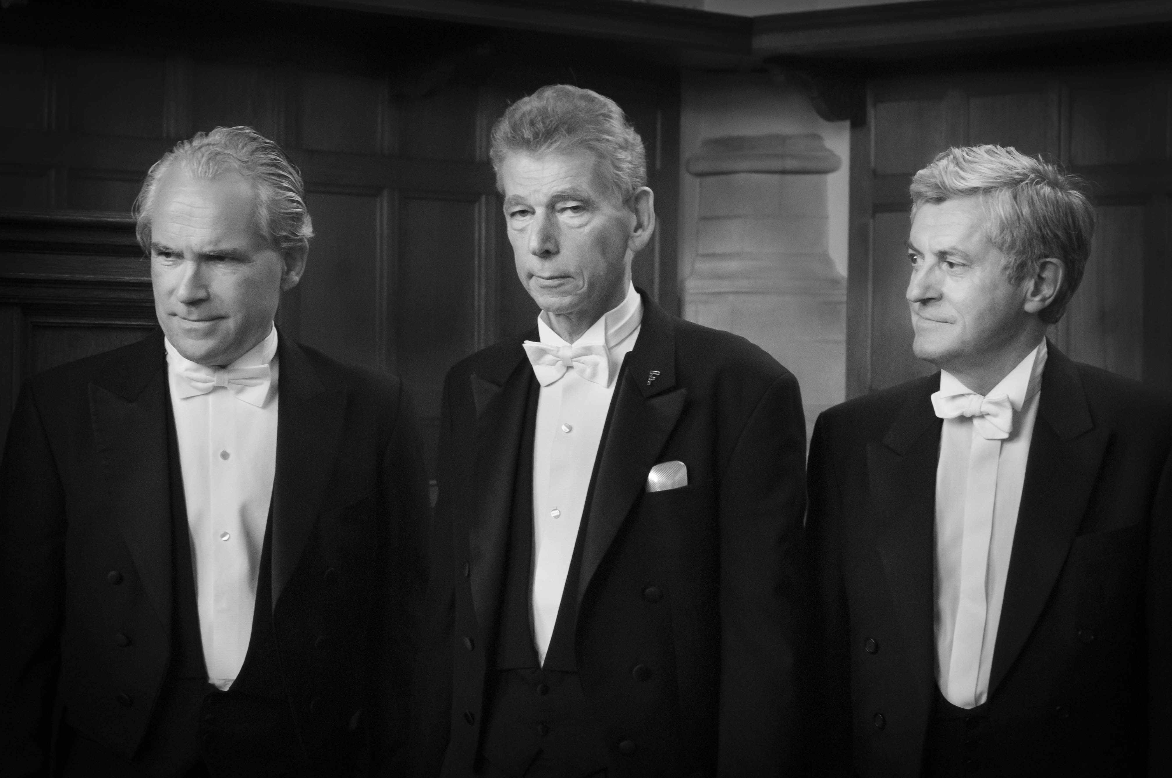
Chris Vermaas, Gerard Unger and Bertil Arends attend Unger’s PhD graduation ceremony at Leiden University. September 2013•MacSiers Imaging
Of all the evil on the earth
this is the greatest pain:
Who once has learned to read,
can never give up again. Koos J. Versteeg
Typography is a wonderful and tested vehicle for recording views and ideas and sending them out into the world. As a science, however, typography is much more than just a vehicle, and as a profession typography is more than a purely instrumental affair, to me at least. As a typographer and a type designer I am constantly thinking of the readers. Of course, authors are important and as a designer you represent their interests, but you equally represent the interests of readers. Typography is also a social tool. I consider it a challenge to get people to read who currently do not read, and to help readers gain access to various sorts of knowledge and opinions, so they can make their own decisions and develop their own views.
Freedom of speech is not possible without the freedom of readers to have access to knowledge and opinions. In this country everyone is basically free to express, publish, and disseminate any view or opinion (some minimal restrictions apply; it is illegal, for instance, to offend the queen). Moreover, readers can freely choose the texts they want to read. In many parts of the world, however, having such choice is not a given.
Reading is a fundamental skill and this is unlikely to change in the foreseeable future. This awareness must have prompted Unicef in 2005 to distribute an advertisement with a photo of ten-year-old Shamila from Afghanistan. The Unicef ad has her say: ‘Nobody will fool me anymore, for I can read now. Fortunately I go to school, but many other girls don’t as of yet.’ Reading has equipped her with the power to judge for herself, and many more girls should go to school in order to accomplish the same. Reading is beneficial.

The concept behind this campaign appears to hook up with an earlier notion of reading, which in the second half of the nineteenth and the first half of the twentieth century was diligently promoted by, among others, the socialists: reading contributes to elevating the working classes. Reading helps workers to move up in society, bring them prosperity, make them more critical, bring culture within their reach, and so on. To this end, publishing houses were set up that focused on quality and affordable books. The Wereldbibliotheek (World Library), set up in 1905, served as the Dutch counterpart of England’s Everyman’s Library, committed not only to issuing first-rate texts, but also to quality book design.1 Such initiatives went hand in hand with the ongoing mechanization of the graphic industry, which facilitated the production of print in ever larger editions against declining rates.
The Dutch newspaper Het Volk started out in 1900, to continue as Het Vrije Volk in 1945. This is the newspaper we read at home. Of course, during the Second World War socialist newspapers (and other ones) were gagged, which suggests a different take on reading: it is bad for you, if not dangerous. Starting your own newspaper or publishing house allows you to expose readers to information you deem suitable for them, as a counterbalance to publications that offer undesirable reading matter. The Roman Catholic Church understood this principle long ago already, which is why it established its Index Librorum Prohibitorum, a list of prohibited books. It did so in 1529 and first in the Netherlands because of the Reformation. Until as recently as 1966 this Index has been in use, and today readers are still controlled to some extent in many countries throughout the world.
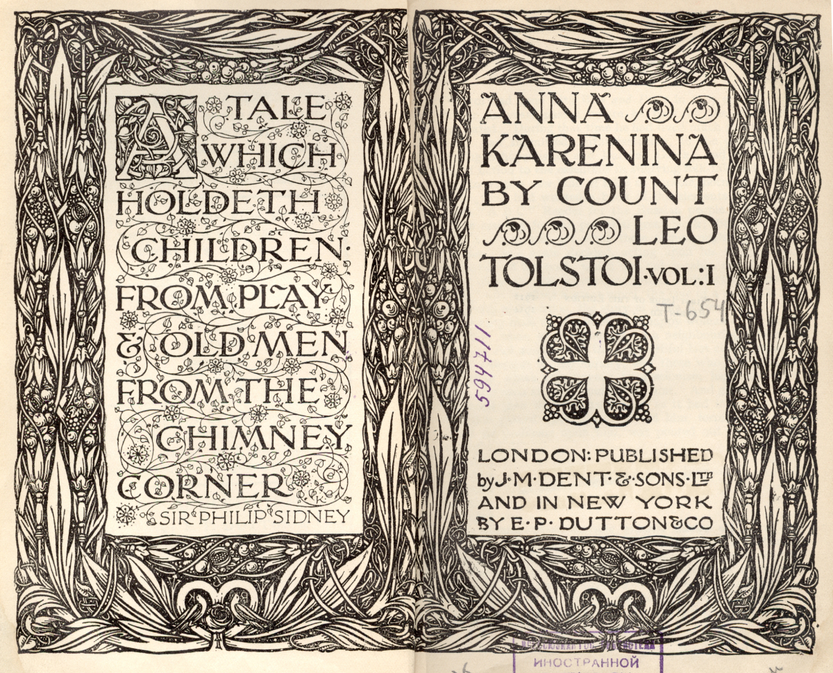
The Everyman’s Library series was the initiative of L. Simons (1862–1932) launched with the support of the Society for the Diffusion of Quality and Affordable Readings. The publisher, Joseph Dent (1849–1926), did not have a political agenda, he simply wanted to make reading affordable for everyone. In his autobiography, he wrote, ‘my fixed determination was to make it a democratic library at the democratic price of one shilling’ (Dent, J. M., The Memoirs of J. M. Dent, London, 1928, p. 126)•Library for foreign literature
The effort to promote reading and public education has definitely raised the level of knowledge among the population, which in turn serves as basis for developing autonomous views and making individual choices. For many, obviously, this has contributed to an improved life, with more education, better employment, and a higher standard of living. But many organizations active in the advancement of reading have simultaneously tried to push their political or religious convictions. Even though it may not have always been their aim to have individuals develop their own views and opinions, once they can read and choose and compare what they read it is inevitable they start thinking for themselves. Sooner or later this is bound to result in the formulation of fresh views and new opinions, as well as perhaps the abandoning of the particular bias of the organizations that promoted reading in the first place.
After 1945 much effort was put into building a new society, including a decent education for all citizens and a free, honest press. The result is a very high level of prosperity in many Western countries – in material terms at least. However, from a spiritual angle there may be less wellbeing, while in recent years social cohesion has come increasingly under pressure. Moreover, certain social groups appear ever harder to reach, and more people seem to have no interest in reading and have trouble articulating coherent opinions.
How do texts end up with the people who need them and who can really use them? How do we get those individuals to read who did not grow up in a family where reading was common and who did not get much from school either? It seems as if authors and typographers are altogether powerless in such case. There is but one solution: exposing these non-readers somehow to a diversity of views and opinions. Does the internet offer a solution here? Those who cannot or do not read paper documents are likely to avoid reading from a screen as well. And those who use the internet a lot generally do so to find likeminded people. If it will not work to expose people to a range of views through reading or showing, with images and sounds, perhaps it will work on the basis of face-to-face interaction. Although employment and improved material and social circumstances are certainly crucial, the same applies to a wide availability and diversity of opinions in society.
More than once I have run up against the criticism that when it comes to the basic necessities of life, design is not one of them. The underlying suggestion is that only content matters, not how this content reaches readers. I strongly disagree of course: good, balanced, and committed typography is more important than ever. You cannot conquer indifference by means of indifference.
We would hope Shamila, the girl in the advertisement, will achieve her goals indeed. Hopefully many more girls from her country will attend school, to learn to read well and make genuine choices on their own.
One of my instructors at the Kunstnijverheidsschool (School of Applied Arts) in Amsterdam, Theo Kurpershoek, had me as first-year student enroll in a course on operating the Monotype machine. Monotype machines were much used for typesetting books and you could get special type designs for them. This gave me a solid entry into typographic practice. Theo Kurpershoek also introduced me to the Typographic Library of Lettergieterij Amsterdam. This marked my entry into theory, and, surely, it proved a revelation: typography as science virtually complete, books as vehicles of their own science. At the time when I regularly visited this library, mostly afternoons, the doorkeeper, mister Moen, would call the librarian upon my arrival, after which I was allowed to go in. At my third visit or so I overheard the librarian saying on the phone: ‘He is here again.’ A few minutes afterward Prof. Dr. G.W. Ovink (1912–1984), who was in charge of the collection, came in. He opened cabinets and books for me and showed me around.
This wonderful experience of getting broad access to typography, techniques, designs, and their various scholarly facets I have always been happy to share with students, and I will continue to share it with them.
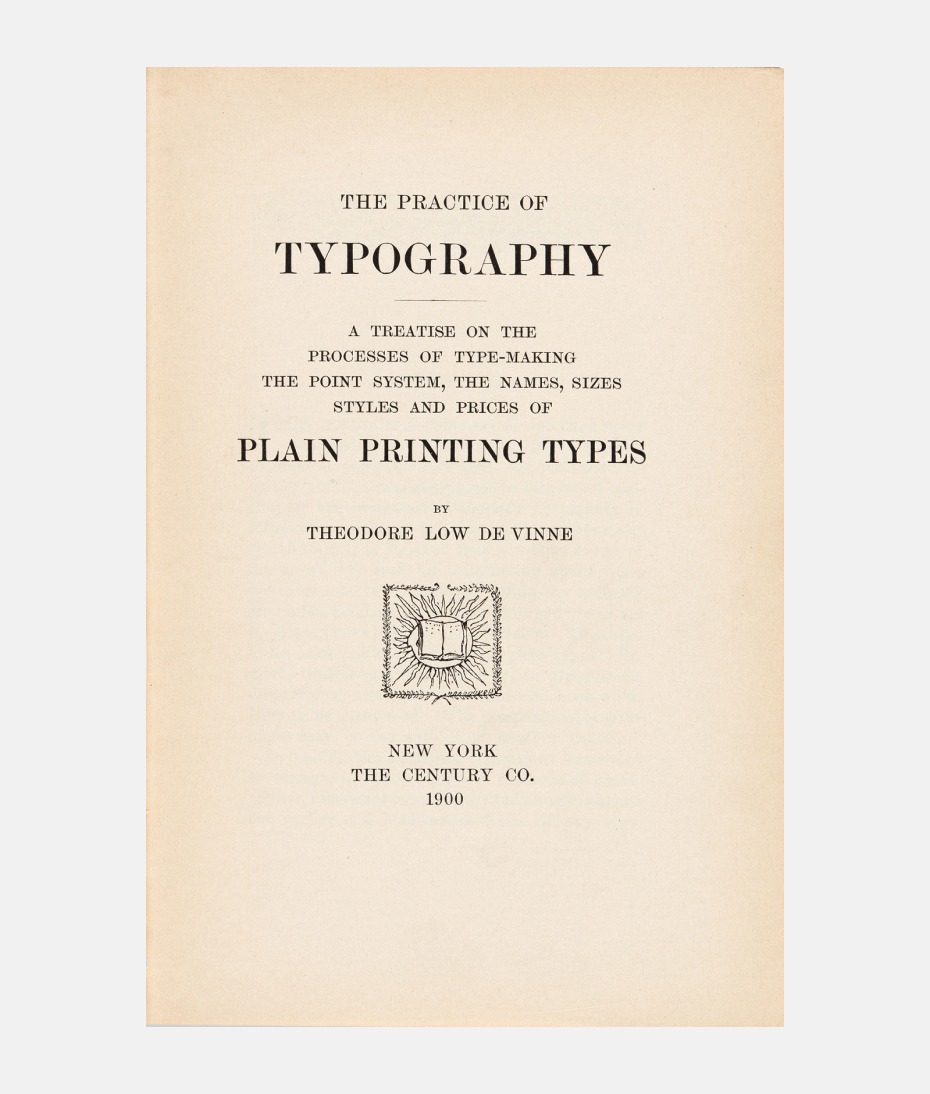
One of the first books put into my hands in the Typographic Library was Plain Printing Types (1900) by Theodore Low De Vinne (1828–1914), a printer-scholar who ran a large print and composing shop in New York and who has contributed much to the historiography of typography. The book’s title immediately appealed to me: Plain Printing Types – this was exactly what I aspired to design! Later on, this book taught me how much ingenuity and attention for detail are involved in achieving plainness in type design. It is a perspective on typography to which I still feel close, even though in the course of my career I encountered and embraced many more constructive professional views and insights.
There were more books in the library that instantly caught my attention, such as The Letter as a Work of Art and Printing and the Mind of Man. The first work, a 1951 jubilee volume of Lettergieterij Amsterdam edited by the art historian Dr. G. Knuttel Wzn. (1889–1968) with help from Prof. Ovink, shows inscriptions, manuscripts, and printed books alongside artistic works such as murals, buildings, furniture, stained windows and sculptures. This book applies art history and art criticism to typography and letter designs, for instance, by addressing when, where, and by whom they were made. In most cases, it is possible to trace issues related to a particular design’s period, place, origin, and designer. There is, for example, baroque and neoclassicist typography. The type designs by the French Roger Excoffon (1911–1983) are quite recognizable. They reveal his character and handwriting, while as products they clearly reflect the 1950s and in their expressive gestures they are also very French.
Printing and the Mind of Man was an exhibition in London in 1963, which displayed books of social and cultural importance. The accompanying catalog perfectly illustrates the role of typography as vehicle of science and as means for spreading ideas and ideologies geared toward social change. It contains a host of divergent works such as Canon Medicinae (Strasbourg, before 1473) by Avicenna (980–1037) on Arabic medicine, De Thiende (Leiden, 1585) by Simon Stevin (1548–1620) which contributed to the introduction of fractions based on the decimal system, A Vindication of the Rights of Woman (London, 1792) by Mary Wollstonecraft (1759–97) on equal rights to education and knowledge for women and men, and Die Traumdeutung (Leipzig and Vienna, 1900) by Sigmund Freud (1856–1939) with the basic tenets of psychoanalysis. Printing and the Mind of Man offers a vivid example of what has been accomplished by allowing knowledge and opinions to spread freely, thus ensuring their ready availability to readers. In this respect it should be added that the recent Unicef campaign involving Shamila underscores that after over two centuries Mary Wollstonecraft’s call for equal rights for women still has a lot of urgency.

De Thiende (title page) by Flemish mathematician, engineer and mechanic Simon Stevin (1548/49–1620)•Plantin-Moretus Museum
The Letter as a Work of Art and Printing and the Mind of Man both show the scope of typography as a science: from appreciation of actual letter forms to reflection on content and typography’s effects on society and intellectual history.
There is also a key text I first encountered in the Typographic Library: The First Principles of Typography (London, 1930) by Stanley Morison (1889–1967), a much translated and very influential study. Morison is, among other things, the spiritual father of what is most likely the most used Latin type design: Times New Roman (1932). In First Principles he defines typography as ‘the efficient means to an essentially utilitarian and only accidentally aesthetic end’ (p. 61). With this last part, the ‘only accidentally aesthetic end’ I strongly disagree, and Morison himself has demonstrated the incorrectness of his claim. After all, with his Times he has done a great service to readers everywhere, and this specific design did not grow popular by accident: he contributed much to this attractive type design. Designers of course have a penchant for putting more into a product than what is strictly necessary. Whenever possible, you add a little extra to a typographic product that will enrich the experience of reading, give it more depth, or make it more enjoyable. In other words, you consciously try to create an aesthetically pleasing product.
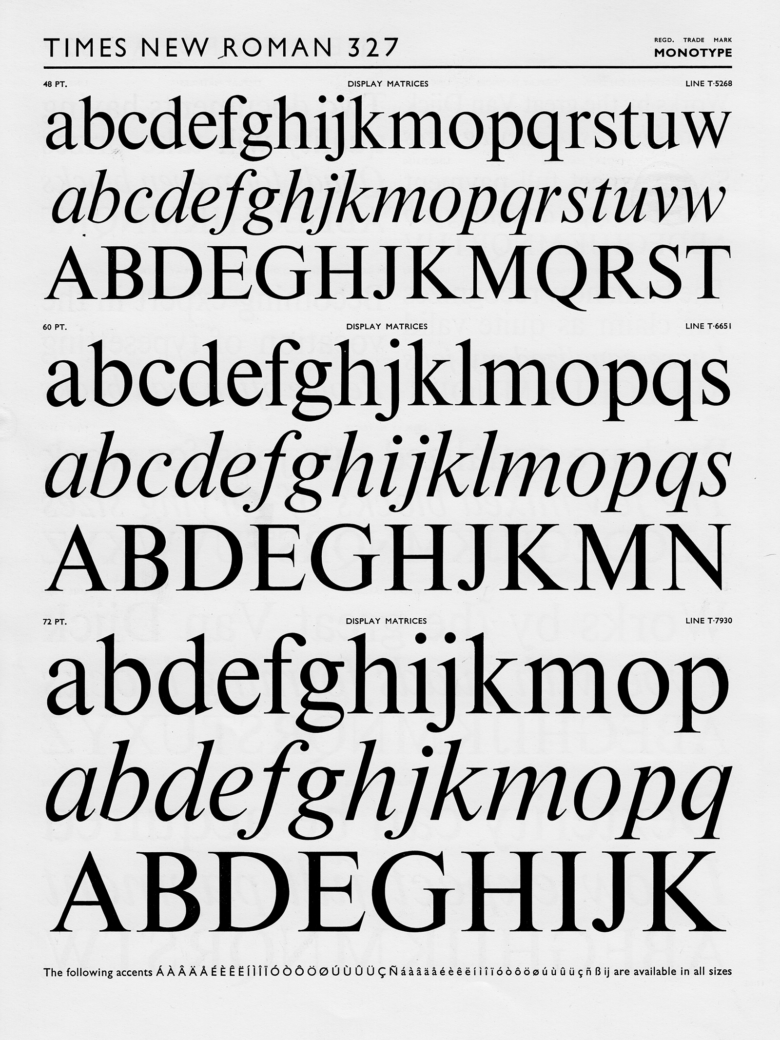
Times New Roman specimen (series 327) published by Monotype (1960s)•Tholenaar Collection at Letterform Archive, flickr.com
It is an issue what, exactly, ‘efficiency’ or ‘utility’ entails in relation to design. Although these qualities may also imply that users are moved by a product, that they feel it to be exciting or that it triggers some other emotional response, most of all a design should not leave users indifferent. From this angle I have always practiced my profession, and this is also how they taught me to do it at the academy.
This emotional dimension is part and parcel of design, as a mere cursory glance at twentieth-century contributions will reveal: all the various -isms, trends, and movements, such as Futurism, Constructivism and Dadaism, the pragmatism of the late 1950s and the 1960s and the reactions to it in the following decades, up to the more selfish experiments of the 1990s – all these shifting movements and aesthetics suggest that typography, too, is fully part of a cultural dynamics, rather than merely being its vehicle. Typographic products, just like other design products, are reflective of an era’s cultural climate and of how people live and think. Typography mirrors the ongoing changes in society and how these influence the minds of designers and users alike.
Meanwhile typography has become part of a broad-ranging media and communications landscape. Typography has also grown more interlaced with graphic design; it is increasingly driven by image and color, as well as annexed by artists. This has certainly enriched typography, and visually, apart from the pleasure of reading, it has more to offer than ever.
At this point it is relevant to refer to a striking paradox involved in the act of reading: a reading individual is not ‘seeing’. Of all products of art and design, letters and typography are unique in that they, when consumed and enjoyed, remain in a way ‘unseen’; they are not consciously enjoyed. If we are standing in front of a painting and fail to see it we are absentminded, if not worse. If we attend a concert without hearing the music we may be distracted or focused on something else. Yet in the case of letters and typography, it is quite common that we are looking at them without really seeing them. Observing and seeing are conscious acts, but reading is an automatic and unconscious act. Readers immersed in their text do not notice letters and typography anymore, as is partially true for the object that mediates the text – the book, newspaper, magazine, or screen – and even the surroundings will frequently escape the perception of readers to some degree. Possibly they ‘see’ before starting to read, or during interruptions; this is when they may perceive typography.
This paradoxical phenomenon may complicate discussion of the external qualities of typography. There are typographers who advocate minimalism, and some even argue that typographic externalities are completely superfluous – one type face is enough. This particular paradox has led to the theory of invisible typography (Warde 1956, p. 11–17) and Morison’s idea about ‘an essentially utilitarian and only accidentally aesthetic end’ is probably linked to this thinking as well.
Letters and the ways in which they work together as words and texts have taken on their shapes in the hands and minds of sculptors, writers, and typographers essentially on the basis of ergonomic concerns. Prior to the development of typography, the shapes of letters and the basics of typography were largely fixed already in manuscripts. This pertains to type areas, type sizes, interlinear spaces, and many other conventions. During the subsequent period covering over five centuries the typographic system has been further refined and enriched.
Still, a contemporary literary work, consisting of text exclusively, is surprisingly close to early printed works, such as books published in Venice between 1470 and 1480 by Nicolas Jenson (1420–±1481). This suggests the extent to which typography had already crystallized as a system. At first sight an industrially made paperback novel — digitally typeset, printed on inexpensive paper with a large high-speed rotation press, machine-cut on four sides and its glued back put into a board cover by machine as well — appears to be quite different from a book which in Jenson’s workshop was typeset by hand, printed on handmade paper with a hand press, and bound in leather by hand. Yet the production-based differences between this early book and recent paperback quickly evaporate once we read the two works. Although there have been many detailed modifications regarding type area and type designs, essentially very little has changed — because hardly anything has changed in how we read, notably the physical and neural processes involved.
The marginal change in typography during more than five centuries partly accounts for the view that there are strict typographic rules, or even laws. These rules exist indeed, but they largely pertain to language use and determine, for instance, where a word can or cannot be split up, or how punctuation marks ought to be applied. As far as typography is concerned it is mostly a matter of conventions, which, in contrast to rules, are often subject to interpretation. Type sizes, word spaces, interlinear spaces, and white around text are among the elements that offer room for variation.
The physical and neural processes involved in reading are studied by several scientific disciplines. Most of our knowledge about reading is generated by psychological research. From the angle of linguistics, reading has been studied in terms of how language is processed by the brain. Educational experts have studied reading to learn more about how reading didactics can be improved. And in the past fifteen years neurology has contributed major new insights as to how the brain processes text that is being read. Thus conceived, typography is a junction or meeting place of several academic disciplines.
Although the reading process as such has seen little change over the centuries, the reader’s outlook changes permanently. It is influenced by the era and environment in which readers grow up and live, while major events and social developments – climate change, wars, epidemics, religions, globalization, and growing conservatism – determine the mindset of readers. Are they eager to learn more or do they rather hide from unwelcome realities? Do they look for explanations, understanding, and consolation, or do they rather want to escape and be entertained?
Change does not just affect readers, of course, but also writers, while designers are subjected to it as well. As a typographer I wish to know what is going on in order to avoid merely being swept along; I want to anticipate, make reading easier for readers, if possible. And I would like to be able to explain to students what is taking place right now and what is to be expected in the nearby future.
Aside from such changes, technology has been in a state of permanent flux for some time now. In the fall of 2006 the Massachusetts Institute of Technology, in the United States, and the University of Southampton, in England, announced a program for ‘web-science’. On the WSRI-website one can read: ‘The Web Science Research Initiative will allow researchers to take the Web seriously as an object of scientific inquiry, with the goal of helping to foster the Web’s growth and fulfill its great potential as a powerful tool for humanity.’
Assuming that public access to the World Wide Web, made possible by the Mosaic browser, goes back to 1993, it has taken thirteen years to set up this academic program. If in 1450 scholars had responded in a similar fashion to Gutenberg’s invention, typography would have been a science in 1463; ‘…with the goal of helping to foster typography’s growth and fulfill its great potential as a powerful tool for humanity.’
Back in the fifteenth century, the French King Charles VII (1403–1461) was quick to realize the potential of printing. He did so after eight years already, in 1458. He probably had smart advisers who encouraged him to find a knowledgeable individual who in Mainz could investigate how the new mode of text reproduction worked. It is questionable, though, whether the knowledge thus gained would have become the object of science at that time. The project evolved differently anyhow. The individual sent to Mainz, Nicolas Jenson who was master of the mint at Tours, returned to France with his newly gained knowledge of printing. However, the king’s death in 1461 and his son’s distrust of the officials hired by his father caused Jenson to leave France and move to Venice, where around 1470 he started his own print shop and publishing business, in the service of science (Lowry 1991, p. 49).
Not until more than three centuries later, in the course of the nineteenth century, a process of drastic technological changes in the various graphic disciplines took off – a process that is still ongoing.
Composing shops and print shops were mechanized and industrialized. The first half of the twentieth century was fairly quiet, but around 1960 a technological revolution erupted. Metal type and letter press printing were replaced with phototypesetting and offset printing, followed directly by digital typesetting machines, while also the automation of the various graphic disciplines started off on a grand scale. Initially these changes led to an enormous decline of the quality of print, and precisely when it began to improve the personal computer appeared on the scene – heralding yet another revolution. Today, much print has very high quality again, even though on screens it is still a matter of getting by.
Apart from print, other media have gained much ground in recent years. Television has turned living rooms into movie theaters. Mobile telephones have fully become part of our daily life, as is true of the web and the internet. And where the application of text on paper is losing terrain, it is gaining terrain on screens. Much of the information on the web consists of text, so we have ample reason to view typography as part of web science. Once inexpensive high-resolution screens will be available, the complete typographic richness of paper will also become visible on screens, adding even more and altogether new possibilities to typography.
The various technological developments have had major social ramifications as well. The graphic industry was shaken up, it strongly declined in terms of its size, and it had to give up many certainties. Producing print has come within reach of many, not just with the personal computer – which merely intensified an existing trend – but already much earlier, in the 1960s, with the introduction of electric typewriters and desktop printing presses. ‘Freedom of the press applies to those who have a printing press,’ the Dutch Provo activist Rob Stolk supposedly said around 1966. Like many others at that time, he used these small devices to make magazines, pamphlets, and posters (an activity that later on evolved into a full-blown print shop). In the mean time, many now have their own print shop at home in the shape of a printer linked up to their pc, while the web has turned ‘freedom of the press’ into a greater liberty still. Today we truly live in a country of free speech and opinion.
In 1972 Prof. Ovink argued that typographers and graphic designers should refuse assignments that involve dubious content or that send a ‘wrong’ message. Ovink’s call was based on the view that our senses suffered from overexposure and ‘mental pollution’ because there was so much to see and read, in print and on TV, that no one really needed or was waiting for. Whenever necessary typographers should rewrite texts and readers should collectively make clear which printed matter or broadcasting they no longer wanted to receive (Ovink 1972, p. 341–354).
It is not uncommon for designers to refuse an assignment when their own views happen to be at odds with its content. Although occasionally a typographer will propose a client to revise a text, it is unusual to do so for ideological reasons.
Since the early 1970s, various initiatives have shown that readers or viewers are all but uncritical consumers. One example involves the introduction of official mailbox stickers that indicate you do not want to receive unsolicited printed matter. And of course, viewers may zap and readers may throw away unread print. Largely, however, these things have been left up to the market because it is impossible to define or have everyone agree on which texts are useful to humanity.
As a self-employed typographer I am in a position to refuse assignments, but I have never had to do so. I was refused a project by the Dutch Communist Party, though, which approached me for work on the title of its newspaper, De Waarheid (The Truth). My not being a communist eventually caused the assignment to be cancelled. As a type designer I can refuse to sell my digital letters to a client I dislike. But once they are out there and being used to spread views I happen to disapprove of, the only thing I can do is grab a pencil or go sit behind my keyboard and write a text in response.
Although like Morison I designed letters that serve as suitable vehicles for opinions, I cannot prevent other people from using my letters for presenting texts I disagree with. Nor do graphic designers, typographers, and type designers have any control over the views derived from these texts. Essentially, then, my type designs, as well as the typographic system, are in the same position as the printing press: they are at the service of freedom of speech and public opinion.
Benno Wissing (1923-2008), a designer who worked for Total Design, the design bureau where I had my first job, once felt that the stationery he had designed for a client turned out so beautiful that they should use it for nice letters only. In the early 1980s typewriters were replaced by laser printers, which made it possible to typeset letters with very refined typefaces, which beforehand only appeared in quality printing such as books. On one occasion it took some time before a colleague – who it was I don’t know anymore – realized that he was holding an angry letter in his hands. Upon reading it he only had eyes for Palatino, a type design from 1950 by Hermann Zapf (1918). This typeface merely triggered pleasant thoughts in my colleague’s mind, and this unfortunately did not exactly match the letter’s content. Of course I would be happy to join such cheerful optimism, but typography has limits.
Personally I can practice typography as a science only by periodically returning to the roots of my fascination for letters and typography, to the origin of my love of letters. Why did I become interested in typography and letters in the first place? I have been unable to track down when, exactly, it started. Yet the excitement I must have felt at one point for the first time when consciously looking at letters is still there: how beautiful letters are! What wonderful, exciting shapes they have. Let’s briefly consider four different R’s: Lutetia (1925) designed by Jan van Krimpen (1892–1958), Vendôme (1952), after an idea by François Ganeau (1912–1983) and made by Roger Excoffon (1911–1983) (cf. Blanchard, Mendoza 1983, p. 21, 22), Century Schoolbook (1919–1924) by Morris Fuller Benton (1872–1948), and my own Swift (1985). And by way of comparison let’s look at two pieces of text, typeset in Swift and Capitolium News (2006), which I also designed.

Lutetia (1925, designed by Jan van Krimpen), Vendôme (1952, designed by Roger Excoffon after an idea by François Ganeau), Century Schoolbook (1919–1924, designed by Morris Fuller Benton), Swift (1986, designed by Gerard Unger)
The Lutetia R is one of the first letter forms I not only perceived consciously, but also copied. It is a very classic R with a rather large upper counter. Lutetia well illustrates the extent to which Van Krimpen followed classic examples while simultaneously leaving his personal mark on it. The Vendôme R is much sharper and idiosyncratic, and less formal than Lutetia. This R too struck me quite early on and must have shown me how much space type designers have to make a particular letter their own. This typeface, then, is very French: it is a gesture, slightly nervous. Morris Fuller Benton’s R is in fact not pretty, with its slightly slack twist as a tail. But the Century Schoolbook I always considered very fine as a whole indeed. It taught me that type designs and typography are not just about aesthetics and details, but that there are also many other qualities, such as warmth and solidity, and that you may adapt letter forms to influences from technology or to special demands from readers. I added the Swift R because it is easy to see that Vendôme served as one of its sources of inspiration. The sharpness and the speed of Roger Excoffon are traceable in Swift.
These four R’s already show how rich and versatile typography can be as a source of conscious visual pleasure, aside from its unknowingly enjoyed function as a vehicle of science, knowledge, opinions, news, and literature. One of the artistic styles of the 1950s and 1960s is called Hard Edge painting. Of the artists working in this style Ellsworth Kelly (1923) is my favorite, with his sharp-edged surfaces in smooth colors and with exciting contrasts between curved and straight edges. In my opinion, there is no harder-edged art to be found than pitch black letter shapes on a light surface. Similarly, it is precisely these very shapes, I believe, that allow for the most intimate collaboration between science and art.
After 1985 Swift has been widely applied, for instance, in many Dutch newspapers (including Trouw and Metro), and also in other print, but only sporadically in books. Apparently, book typographers are more conservative than other typographers in applying type with unusual details. Swift is unconventional in its very spacious counters and its angularity and large serifs. Only recently the Swift was described as ‘unorthodox but not intrusive’ (Rade 2005, p. 9). Still, it took some time for both typographers and readers to get used to it. Occasionally, in the late 1980s, I was called upon to account for the alleged aggressive character of Swift, but later on this never happened anymore. Compared to Swift, Capitolium News (used in the Netherlands by de Volkskrant) is more serene and conventional.

Evidently, much has changed over the past two decades or so, but the first signs of a more conservative turn in fact became visible in the late 1970s already. The sixties’ sense of liberty and the late sixties’ commotion and student revolts gradually gave way to a new sense of prudence and traditionalism, partly as a consequence of the mounting and accumulating problems in the world, which television in particular has managed to bring right into our living room. Some of these problems I mentioned already, such as war, climate change, and large-scale migration. However, it is mainly the issue of the growing intolerance that has a more direct influence on typography, causing people to remain silent about things they actually want to talk about. Many criticized the Danish cartoon case as tactless and silly, yet it has demonstrated people’s increased self-censorship regarding the issues involved.
In the final decade of the twentieth century typography was subjected to wild and daring experiments. Unusual and radically modified letter forms and wild or disorderly typography, made subservient to images and colors, eclipsed the concern for readability. After 2000 such design is still done, but much less so, while traditionalism and conventionalism increasingly prevail in typography.
Should you go along in this trend? Wouldn’t it be a matter of giving in to the urge for moderation and more cautious formulation? I personally side with leaving no means untested when it comes to keeping readers reading and turning non-readers into readers, as well as to guaranteeing maximal freedom of speech. Compared to Swift, Capitolium News is more serene. Although the experiment with large spaces in the letters is less visible than in Swift, it is still part of it, albeit slightly more hidden. Capitolium News, too, is a personal and clear type design. My answer to the increasing prudence is to opt not for conservative designs, but for classic ones. A conservative approach suggests you’re afraid to lose what you have, but a classic approach allows you to breathe new life into an old idea or concept – it allows you to modernize. Capitolium News is based on my earlier Capitolium, designed for Rome and the year 2000, and inspired on early baroque, Italian interpretations of Roman models (cf. Unger 1998, p. 61–73).
Linguists such as F. de Saussure (1857–1913) felt that written language is merely a conversion of spoken language (Olson 1994, p. 65, 66). A related view, expressed by D.R. Olson (1935), is that with typography one has tried to compensate for the losses caused by writing in respect to oral language, as in speaking softly and loudly, facial expressions and gestures, the probing intonation or an ironic voice, and so on (Olson 1994, p. 92, 93). Olson is somewhat right of course, but writers have many options for indicating how speakers say something; consider, for example, the phrase ‘He turned red and roared…’
Typography is the toolkit – and the system – for writing and reading. This toolkit contains, among other things, capitals and lower case, larger and smaller type sizes, types with or without serifs, italics and bold, small capitals, ranging and non-ranging numerals, and various kinds of white. At a higher order level, this toolkit provides structure to the title page, bibliographic data, the table of contents, the footnote and more.
As such these means hardly relate to speaking and listening (Gumbert 1993, p. 5, 6). In typography bold and italics are used for emphasis, among other things, and a speaker may stress something by raising his voice. But italics is also applied to indicate that a portion of a text differs from the main text, as in a comment or a quote. In such situations speakers have to make do with ‘and I quote’, ‘end of quote’, and other similar phrases. Typographic possibilities have influenced speech; consider, for instance, an expression such as ‘mind the fine print’.
Many readers deal with typography unconsciously, while many authors are insufficiently familiar with its possibilities. The reason for this goes back to our early education, when we are trained to reproduce written letters as personal and informal writing, while at the same time we are taught to use typography and ‘formal’ letters (with screens it is odd to speak of ‘printed’ letters) without thinking and also without reproducing them – which, understandably, very few readers are able to do. Teachers who train children how to read and write usually have no knowledge of the tools with which they learn to read. In the light of the widely disseminated and intensive use of this particular means of communication this is surprising indeed.
Those who have knowledge of the various possibilities of the typographic toolkit can make texts more effective and insightful, and they can express themselves more cogently (Gumbert 1993, p.7, Janssen 2004, p. 33). Having basic knowledge of the typographic system and its application should belong to the intellectual baggage of each university student. My colleague Frans Janssen and others have argued that authors do not write books, but texts (Janssen 2004, p. 13). Today’s programs for text processing on computers, however, offer such refined typographic possibilities that this claim has lost some of its validity.
Rhetoric is part of academic curriculums in Dutch and Classical Languages. The typographic toolkit, I would argue, offers tools for graphic rhetoric, to be deployed in articulating, structuring, emphasizing, making distinctions, marking directions, inserting pauses, and so on. These various options may be viewed as belonging to the system of rhetoric as well. Their reflective qualities turn typography into a fine academic instrument. Students are expected to have adequate knowledge of language, be it Dutch or English, and to express themselves well in writing. These skills ought to be based not only in fundamental knowledge of typography as the vehicle of science, but also in sustained exposure to typography as a science.
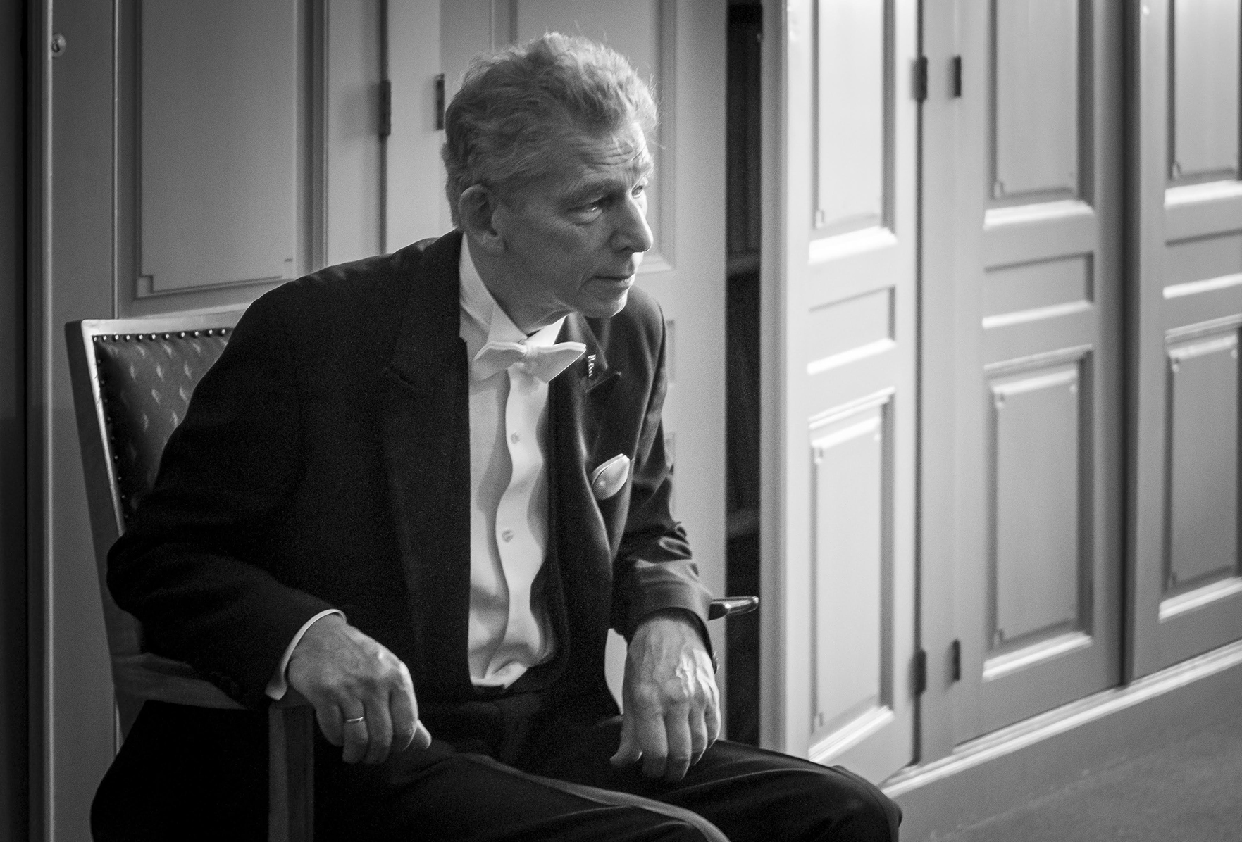
Gerard Unger at the PhD graduation ceremony at Leiden University. September 2013•MacSiers Imaging
I would like to express my gratefulness to the Board of Governors and the Executive Board of Leiden University, the board of the Faculty of Arts, the management of the Royal Academy of The Hague, the executive boards of the Royal Library of the Netherlands and Museum Meermanno, the board of the Dr. P.A. Tiele Foundation, and to all others who have contributed to realizing my appointment. I will demonstrate that your confidence in me is justified.
Many whom I would like to thank for their inspiration are no longer with us: my teachers who supported me from the outset, and my parents and parents-in-law. My father, with his interest in art and design, was the one to put me on the track of typography and letters, and my father-in-law, who came from an environment that looked upon artists with a sense of wonder, soon put his trust in me.
I express thanks to my family: my sisters, my brothers, and my daughter Flora. In particular I thank my wife Marjan for our good discussions, our collaboration, and her frank criticism, as well as for enjoying together with me our countless trips and visits to exhibitions over the years. In no small measure she has contributed to the fact that my interests have moved way beyond my own discipline.
Thank you for listening.
Bibliography
- Aitchison, J., Words in the mind, Oxford, 1999.
- Blackwell, L., The End of Print, London, 1995.
- Blanchard, G., J. Mendoza, Excoffon, in: Communication et langages, Nr. 57, Parijs, 1983, pp. 21, 22.
- Brown, C. M, P. Hagoort (eds.), The neurocognition of language, Oxford, 1999.
- Carter, J., P. H. Muir, Printing and the Mind of Man, München, 1983.
- Davies, F., Introducing Reading, London, 1995.
- Dent, J. M., The Memoirs of J. M. Dent, London, 1928, p.126.
- De Vinne, T. L., Plain Printing Types, in: The Practice of Typography, New York, 1900.
- Gumbert, J. P., ‘Typography’ in the Manuscript Book, in Journal of the Printing Historical Society, Nr. 22, Londen, 1993, p. 7.
- Hoftijzer, P. G., O. S. Lankhorst, Drukkers, boekverkopers en lezers in de Republiek, Den Haag, 2000, p. 31.
- Janssen, F. A., Author and printer in the history of typographical design, in: Technique & design in the history of printing, ‘t Goy-Houten, 2004, p. 13, 33.
- Knulst, W., G. Kraaykamp, Leesgewoonten, Rijswijk, 1996.
- Knuttel Wzn., dr. G., De letter als Kunstwerk, Amsterdam, 1951.
- Lowry, M., Nicholas Jenson, Oxford, 1991, p. 49
- Morison, S., First Principles of Typography, in The Fleron VII, Cambridge, 1930, p. 61.
- Olson, D. R., The world on paper, Cambridge, 1994, p. 65, 66, 92, 93.
- Ovink, G. W., The Changing Resposibilities of the Typographic Designer, in Visible Language, Vol. VI, Nr. 4, Cleveland, 1972, p. 341–354
- Rade, M., Consideration for the design of dictionary typefaces, Reading, 2007, p. 9. Ongepubliceerd essay.
- Rayner, K., A. Pollatsek, The Psychology of Reading, Hillsdale, 1989.
- Unger, G. A., A type design for Rome and the year 2000, in: Typography Papers, Nr. 3, Reading, 1998.
- Unger, G. A., Terwijl je leest, Amsterdam, 2006.
- VanderLans, R., Z. Licko en M. E. Gray, Emigre (The Book), London, 1993.
- Warde, B., The Crystal Goblet or Printing Should Be Invisible (1932), in: The Crystal Goblet, Cleveland, 1956, p. 11–17.
In 1966 the Kunstnijverheidsschool (School of Applied Arts) was renamed Gerrit Rietveld Academy. Theo Kurpershoek was my instructor for letter writing and letter drawing. I studied there in the years 1963–1967.
In 1971 the Typographic Library became part of the University Library in Amsterdam; it is now part of the Library Special Collections.
In the period 1955–1982, Prof. Dr. G.W. Ovink, aside from his work as aesthetic adviser of Lettergieterij Amsterdam, served as adjunct professor at the University of Amsterdam in the field of the ‘history and aesthetic of printing and related graphic techniques’ (Hoftijzer/ Lankhorst 2000, p. 31). I am more or less his successor.
A parallel exhibition showed the technical means for making the books, such as molds for casting letters, printing presses, and illustration techniques.
Warde, B., The Crystal Goblet or Printing Should Be Invisible (1932), in: The Crystal Goblet, Cleveland, 1956, p. 11–17
Warde, B., The Crystal Goblet or Printing Should Be Invisible (1932), in: The Crystal Goblet, Cleveland, 1956, p. 11–17
See the complete article: J.P. Gumbert, “Typography” in the Manuscript Book, Journal of the Printing Historical Society, Nr. 22, London, 1993. Also: F.A. Janssen, Author and printer in the history of typographical design, in: Technique & design in the history of printing, ’t Goy-Houten, 2004. In the footnotes, Janssen refers to more literature about this topic.
An example from psychology is: K. Rayner and A. Pollatsek, The Psychology of Reading, Hillsdale, 1989. For a contribution from linguistics, see J. Aitchison, Words in the mind, Oxford, 1999. For a contribution from an educational perspective, see F. Davies, Introducing Reading, London, 1995. A volume with contributions from neurology is: C.M. Brown and P. Hagoort (eds.), The neurocognition of language, Oxford, 1999. And my own volume, Terwijl je Leest, Amsterdam, 2006, discusses views on legibility and readability of graphic designers, typographers, and type designers.
Lowry, M., Nicholas Jenson, Oxford, 1991, p. 49
Ovink, G. W., The Changing Resposibilities of the Typographic Designer, in Visible Language, Vol. VI, Nr. 4, Cleveland, 1972, p. 341–354.
Blanchard, G., J. Mendoza, Excoffon, in: Communication et langages, Nr. 57, Parijs, 1983, pp. 21, 22
Rade, M., Considerations for the design of dictionary typefaces, Reading, 2007, p. 9. Ongepubliceerd essay.
The shift during the last decade of the twentieth century, as clearly reflected in magazines such as Emigre (VanderLans Licko Gray 1993) and Ray Gun (Blackwell 1995), is partly an effect of the introduction of the Macintosh computer, in 1984, as a tool for designers.
Unger, G. A., A type design for Rome and the year 2000, in: Typography Papers, Nr. 3, Reading, 1998, pp. 61–73
Olson, D. R., The world on paper, Cambridge, 1994, p. 65, 66
Gumbert, J. P., „Typography“ in the Manuscript Book, in Journal of the Printing Historical Society, Nr. 22, Londen, 1993, p. 5, 6
Gumbert 1993, p. 7; Janssen, F. A., Author and printer in the history of typographical design, in: Technique & design in the history of printing, ‘t Goy-Houten, 2004, p. 33.