Aaron Burns:
Till we meet again
When I first came to New York, in the fall of 1977, ITC already had seven years of successful operation in its unique capacity of a type design studio. None of the world-famous New York studios—Chermayeff & Geismar, Milton Glaser, Pentagram, Push Pin, Vignelli, and many, many others—offered, let alone specialized in, type design. ITC did. Predictably, one of my first pilgrimages was to the studio of Herb Lubalin, one of the three founding fathers, and the leading designer at ITC. At the time his shop was located in a converted firehouse on East 28th Street. If memory serves, the visitors were greeted by a very impressive young woman. Her name was Eloise Coleman.
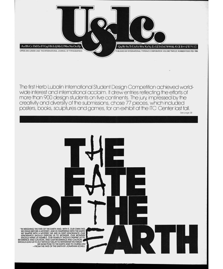
I felt like I was presenting credentials to a Master whose work was well known and admired in my home country. There was only one person in Moscow lucky enough to receive at his home address the quarterly issues of the company’s newsletter, Upper and Lower Case (U&lc). His name was Misha, and he was a good friend of mine. From time to time I used to come by his place to check out the new arrivals, to see what typefaces had been released, and to savour the delightful and sophisticated typographic pieces for which U&lc was famous. Most of those masterworks were signed ‘Herb Lubalin’.
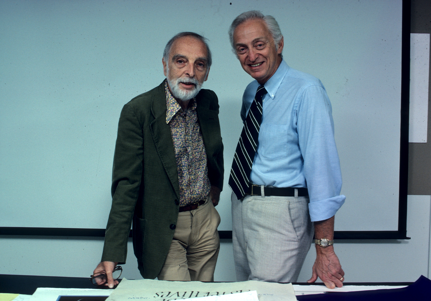
Herb Lubalin with Aaron Burns. 1970s•lubalin100.com
One of the first things I did after I settled down in Riverdale was to apply for a subscription. I was in for another pleasant surprise. The cheque I sent to U&lc (in the US single copies were $1.50 each) was returned to me because subscriptions were free of charge for the design professionals. Wow.
At that time, to my embarrasment, I did not know Aaron Burns. Our paths had not crossed, and if he attended the same events as I, I was not sure if that elegant silver-haired gentleman was Aaron Burns. However, what I knew well was the building in which he and his associates were located. I walked past it almost every day. That was 2 Hammarsköld Plaza, two blocks away from the United Nations compound.
ITC’s address was printed in U&lc, but I did not need to know it: the building sign on the façade said ‘2 Hammarskjöld Plaza’, in, yes, Avant Garde Gothic, the flagship typeface of the ITC. No graphic designer had to ask the passersby for directions. When I first saw the sign, I just smiled, and muttered to myself, ‘Privet ITC’. On April 20 the ITC Center opened its doors at the same address.
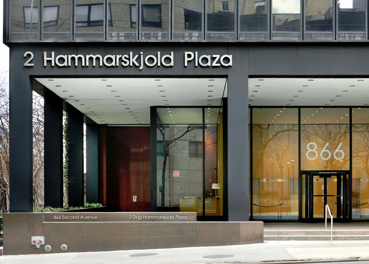
Photo: Macklowe Properties
That was where I finally made Aaron Burns’s acquaintance. The Center functioned as a gallery, a seminar facility, a library, and a minitheater. In order to build public awareness of typography, classes and seminars, as well as educational programmes for schools, students, and professionals were offered. They worked in conjunction with U&lc.
There were more than a few educational or professional centres of this kind In New York City. What made the ITC Center different was that it was established, and run, not by a non-profit, pro bono professional society, or a club—like the Grolier Club, or the Society of Illustrators, or AIGA, etc.—but by a high-powered commercial enterprise. Sure enough, that helped—indirectly—grow and expand ITC’s main line of business—type design, licensing, and marketing. That was very clever.
The Center’s programmes were so diverse and informative, so educational and entertaining. To give you an idea, just off the top of my head: Lubalin in Paris, International Calligraphy Today, Vision ’80s, Polish circus posters, Franco Maria Ricci. I doubt that I missed any of those events when I worked in New York.
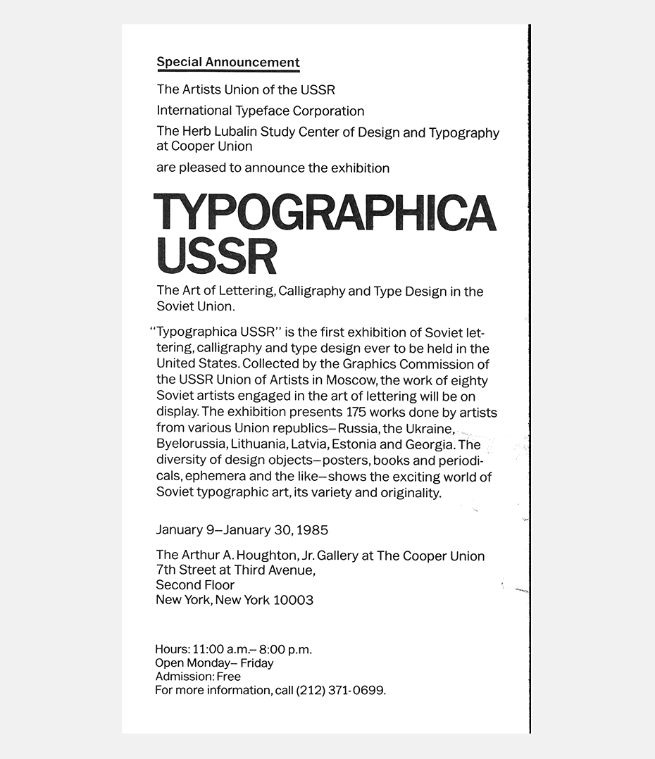
In the late fall of 1981, after almost five years of working for the United Nations, I returned to the USSR. A few months prior to my departure I came to see Aaron. We had a long meeting. We agreed to stay in touch, and he offered to keep me on the list of overseas subscribers to U&lc, and to add to it more names of Russian designers. We asked each other what else we could do to secure and expand professional coöperation and exchange between American and Russian designers. In the course of that discussion the idea of Typographica USSR was born.
Aaron said he would gladly help in facilitating arrangements for an exhibition of typographic design by Soviet artists. Inspired by Aaron’s support, I prepared a formal proposal for the Artists Union of the USSR, and first ran it past H.E. Oleg Troyanovsky, Permanent Representative to the United Nations, and the top Soviet official in New York. Without his endorsement no initiative in either bi-, or unilateral activities—cultural, academic, educational, etc.—would have been possible. Luckily, I managed to secure his endorsement.
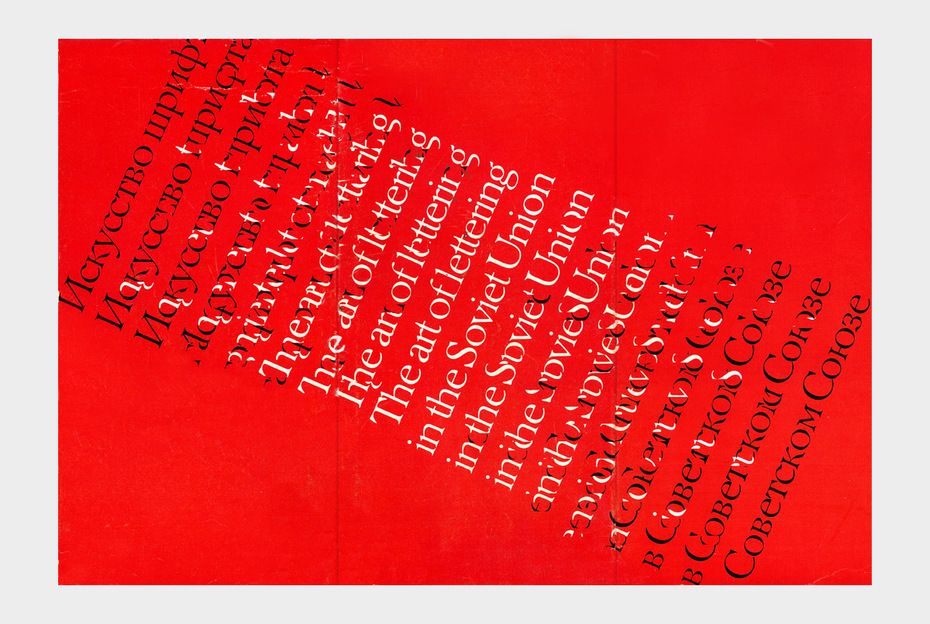
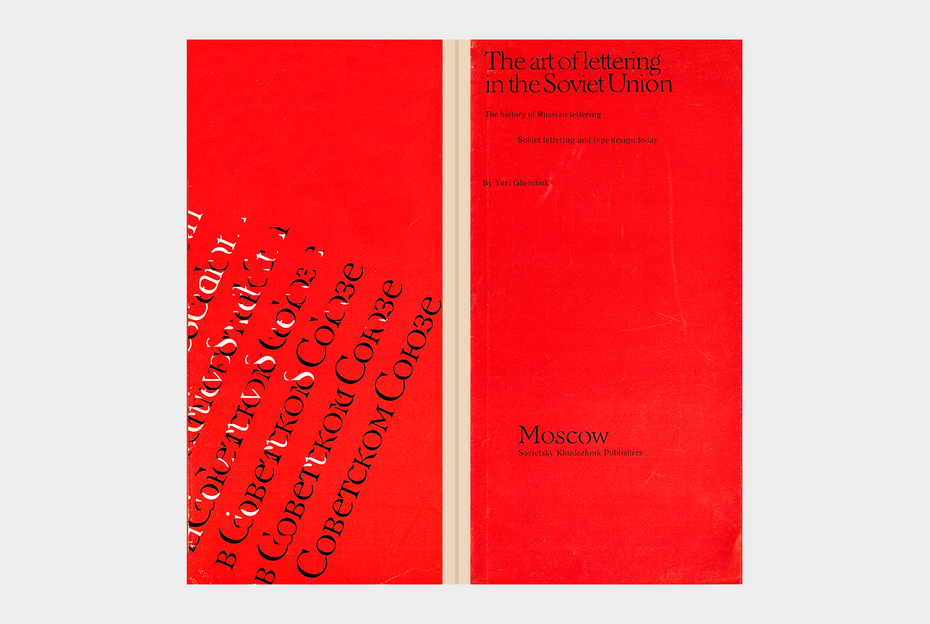
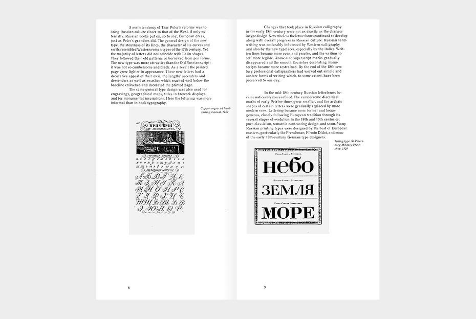
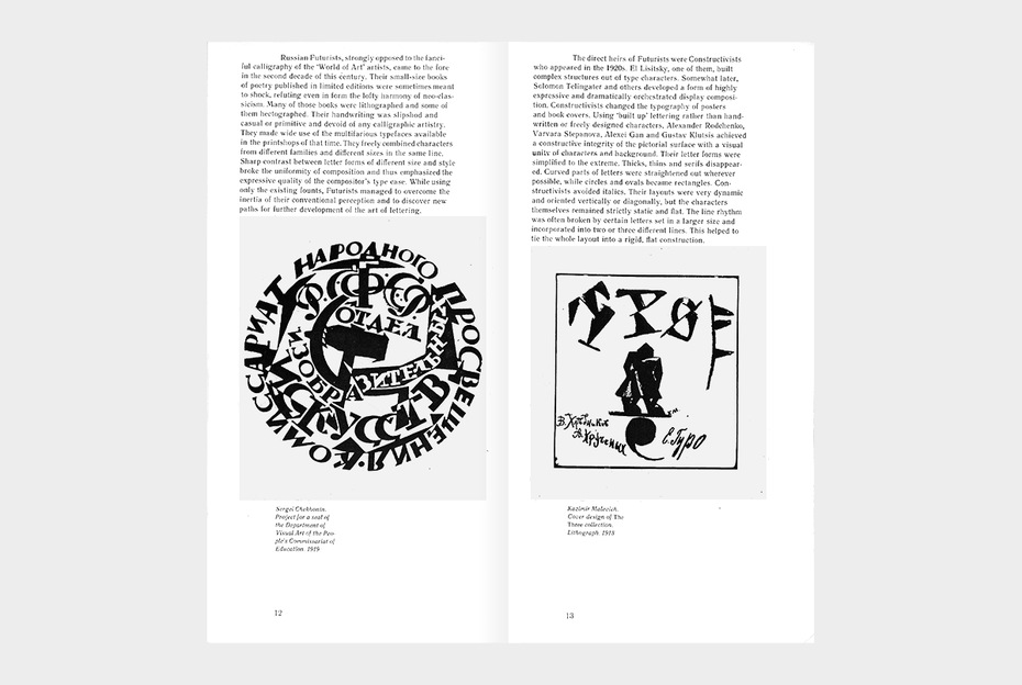
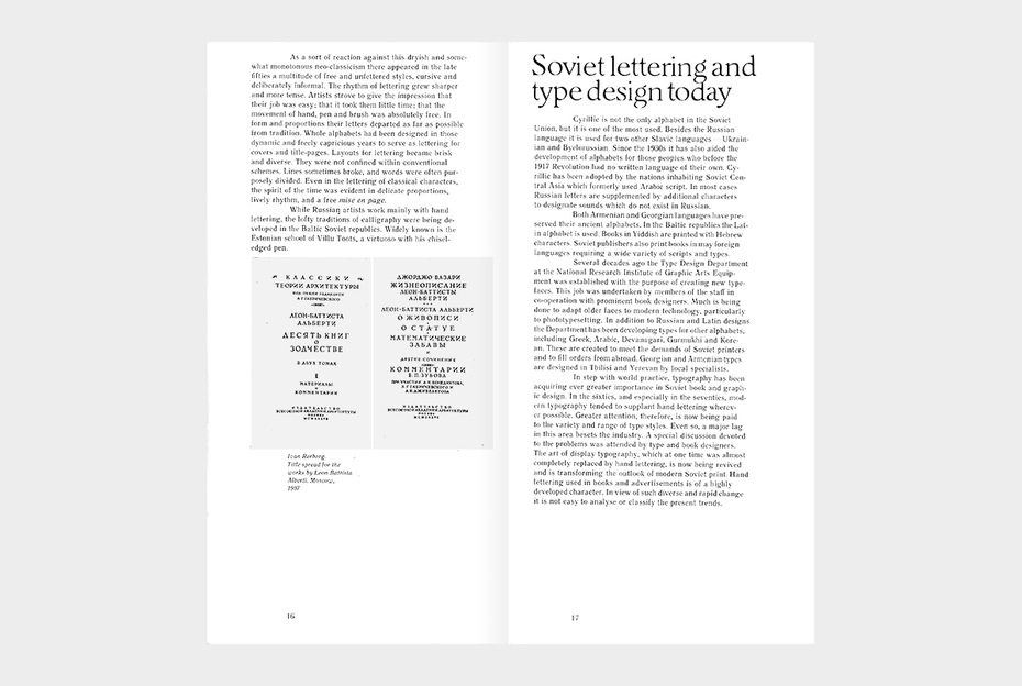
On my return to Moscow I worked for Mir, a publisher of science books in 20 languages. I also taught typographic design at my alma mater, Moscow Printing Institute. In my spare time I worked on the exhibition. I collected exhibits, supervised their framing, edited and designed a booklet that was packaged with the exhibition (The art of lettering in the Soviet Union, by Yuri Gherchuk. Moscow: Sovietsky Khudozhnik, 1983).
After a while the mounted exhibits and the printed booklets were shipped to New York City, care of Mr. Aaron Burns. The opening of Typographica USSR was first announced in 1983. The show was supposed to be on display at the ITC Center. An announcement to that effect was placed in the June issue of U&lc (vol. 10 no. 2; p. 76).
The exhibit finally opened fifteen months later, on January 8, 1985, at Cooper Union. Cutting the ribbon alongside Mr. Oleg Savostyuk, Secretary of the Board of the Artists Union of the USSR, was Mr. Valentin Manturov, first secretary to the Permanent Mission of the USSR to the UN.
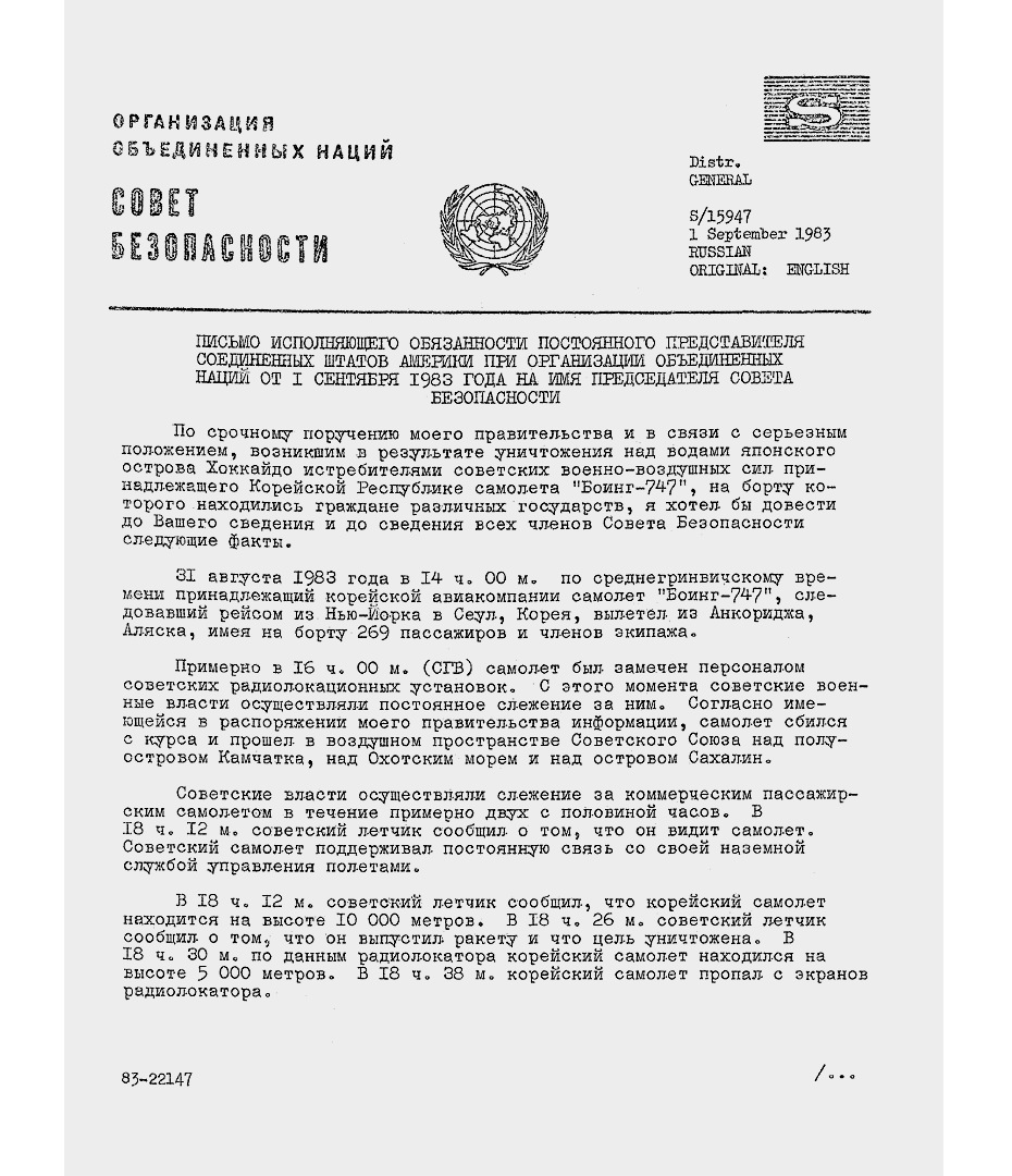
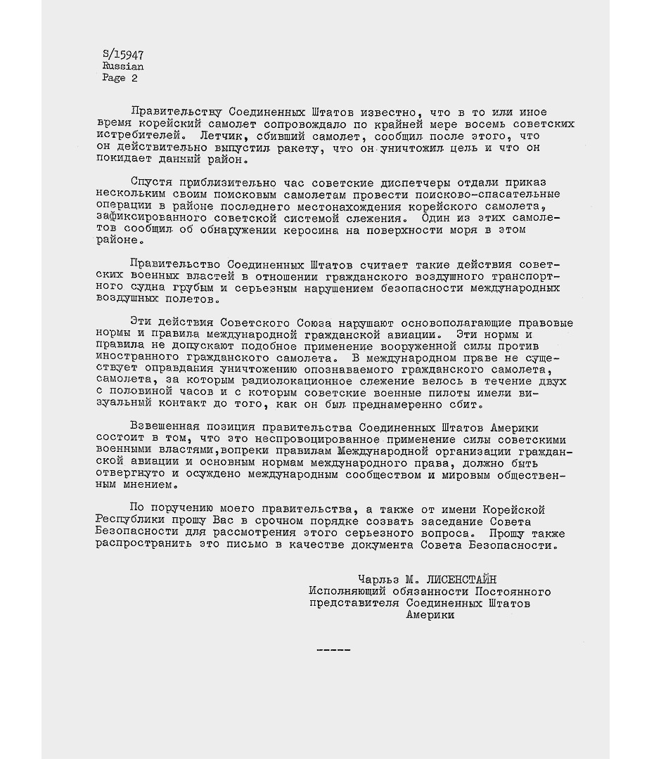
The reason for the show’s rescheduling was the tragic incident with Korean Air Lines flight KAL007, from New York to Seoul. On Thursday, September 1, 1983 it was shot down over the Sea of Japan by the Soviet military. Overnight the Dag Hammarskjöld Plaza became a rallying place for outraged and indignant protestors, who demanded that the USSR be taken to task for this shocking and senseless act. There was a big thunder in the air over Dag Hammarskjöld Plaza. All public events at the ITC Center were always coördinated with, and cleared by, the building management. As the site of the Soviet exhibition, the building came under a real risk of being vandalized by angry protesters. The building administration suggested that ITC cover the entire building with additional ‘emergency’ insurance. So Aaron reasonably decided to take a time-out until the dust settled, and the bullhorns became less deafening.
Aaron convinced George Sadek, then the dean of the Cooper Union and founder of its Center for Design and Typography, to arrange for its showing at Cooper. He also offered to underwrite the transportation, the unpacking, and the hanging of the exhibits. To his credit, George did a terrific job, as independent observers acknowledged.
Negotiations between George Shultz and Andrei Gromyko have marked an auspicious start for relations between the U.S. and the U.S.S.R. in 1985. Something of secular breakthrough is in evidence In New York this week: The first American show of Soviet lettering, calligraphy and type design is being exhibited until January 30. “Typographica U.S.S.R.” begins with the spelling out of the Cyrillic alphabet. But the exhibit is not just for academics. The display shows how Soviet artists can make letters into works of art. [The Courier-News, Bridgewater, NJ. Friday, January 25, 1985, p. 30.]
The writing we read has its own beauty apart from the messages it bears. While exhibitions demonstrating the manner in which artists have handled the writing of the Chinese, Japanese and Arabs are not hard to find in New York, there has been somewhat less of a stir about the writing of the Russians, the alphabet called Cyrillic.
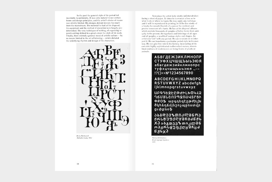
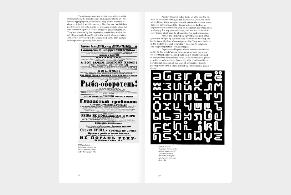
This state of affairs is rectified dramatically with “Typographica U.S.S.R.: The Art of Lettering, Calligraphy and Type Design in the Soviet Union,” which opens today in the Arthur A. Houghton Gallery of the Cooper Union, Seventh Street and Third Avenue (254-6300). This cultural import, coming during relatively lean years of such exchanges between the two countries, has a novelty about it and is the first show of Soviet lettering, calligraphy and type design ever held here. Even the eye that cannot decipher the letters will find pleasure, right from the corridor where the alphabet is graphically spelled out, in seeing the way Soviet artists make letters dance free from (or catch the spirit of) the work to which they are usually assigned. [Richard F. Shepard. ‘Designing Letters’. The New York Times, New York, NY. Wednesday, January 9, 1985, p. C15.]
Now that was success. Aaron in New York and I in Moscow were so happy that a solution had been found to put the show on display. I briefed Savostyuk, the official at the Artists Union, before he hit the road to New York, and urged him to take more pictures at the opening of the show. After he was back I organised a special, ‘remote vernissage’ for the Moscow-based participants of that exhibition. We celebrated, drank and cheered, and Savostyuk commented on his slides showing the ceremony at Cooper and the display of the exhibits.
It was during that time of uncertainty of 1983–1985 that I received a message from Aaron asking me to give a hand to Ed Gottschall, the vice-chairman of the company, and editor of U&lc, who was collecting information for a monograph on typographic communications at the time. That book was published jointly by ITC and MIT Press in 1989.
Ed travelled to Moscow and Leningrad in late July–early August 1984. The early 1980s were lean times in Soviet Union’s cultural exchange with the West. Using the words of the 19th-century dramatist Eugène Labiche, tout était rompu—no tours, no trips, no shows, no nothing. Even though neither the Artists Union, nor the Ministry of Culture nor the rank-and-file designers and artists, were responsible for the invasion of Afghanistan, one way or another, we all had to pay its high price. The thirst for renewed cultural exchanges was clear in the hospitality of Ed’s Soviet hosts. He was quickly granted the status of VIP, with all perks, freebees, and priviliges—from a personal full-time interpreter to skipping the queue to get into the Hermitage Museum. On my part, I worked hard to connect Ed with the Russian design professionals who could fill him in on the current state and trends of Soviet typography, and help him collect illustrations for his book.
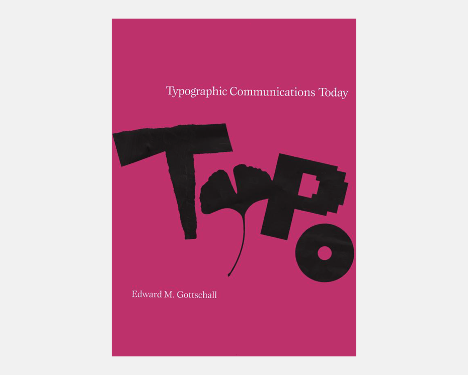
Gottschall E. Typographic Communications Today, Cambridge: The MIT Press, 1991.
Aaron was a visionary. He felt, and knew, that change was in the air. In everything he did he tried to keep up with the change, and, if at all possible, to get ahead of it, at least by one step. One of the reasons he started his newsletter, and opened the Center was to get more feedback from the ever-evolving industry and design community, to better understand where it was all going . One of the developing directions of the evolution of typography was globalisation. To some extent Typographica USSR could have been an eye-opener: the exhibition showed 175 layouts and designs by eighty artists from the constituent republics of Russia, Ukraine, Belorussia, Lithuania, Estonia, and Georgia, using various alphabets.
Against all headwinds, and there were quite a few, he seemed genuinely interested in developing more productive relationship with designers from all nations and regions, no matter where they lived and worked. He saw a huge, untapped potential in expanding that coöperation.
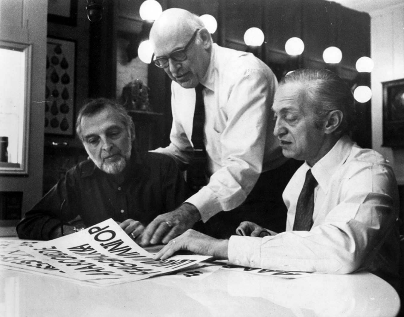
Herb Lubalin, Edward Rondthaler, Aaron Burns. 1970s. Unknown author•Photo: The Herb Lubalin Study Center
To get a taste of a culture that it is not Western he undertook his own journey to the Soviet Union. Aaron and Florence came to Moscow on Saturday, September 28, and took a flight back from Leningrad on Sunday, October 6, 1985. During their sojourn, they were offered the full red-carpet treatment. Their itinerary and schedule of stay, both entertaining and informative, had been carefully planned and put together for them—with my participation, and their own approval—by the foreign relations office of the Artists Union. Guests were offered a full-time escort/interpreter, and free ground transportation. Their programme was packed and intense. It included not only sight-seeing, museums, libraries, and meetings with selected publishers and designers, but also a ballet (at Bolshoi, of course), an opera, and a circus performance. It was a lucky coincidence that on the night of Friday, October 4 at the opera house they performed Gounod’s Faust, Aaron’s favourite.
Come to think of it, that kind of ‘all-inclusive’ programme was part of a standard package designed for, and offered to, VIPs hosted by the Artists Union. The year before and the year after Aaron and Florence came over, I’d managed to secure similar status for Ed Gottschall in 1984, and for Lou Dorfsman in 1987.
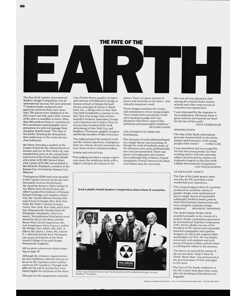
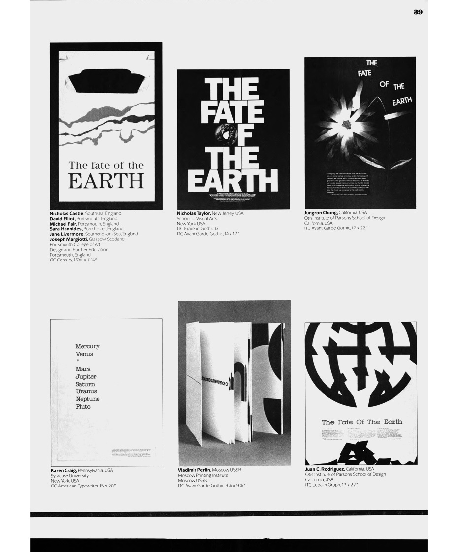
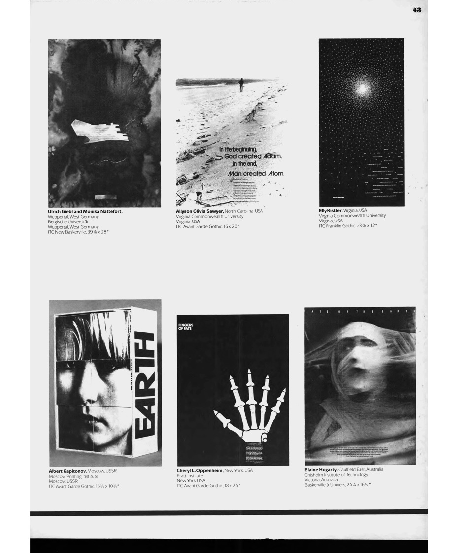
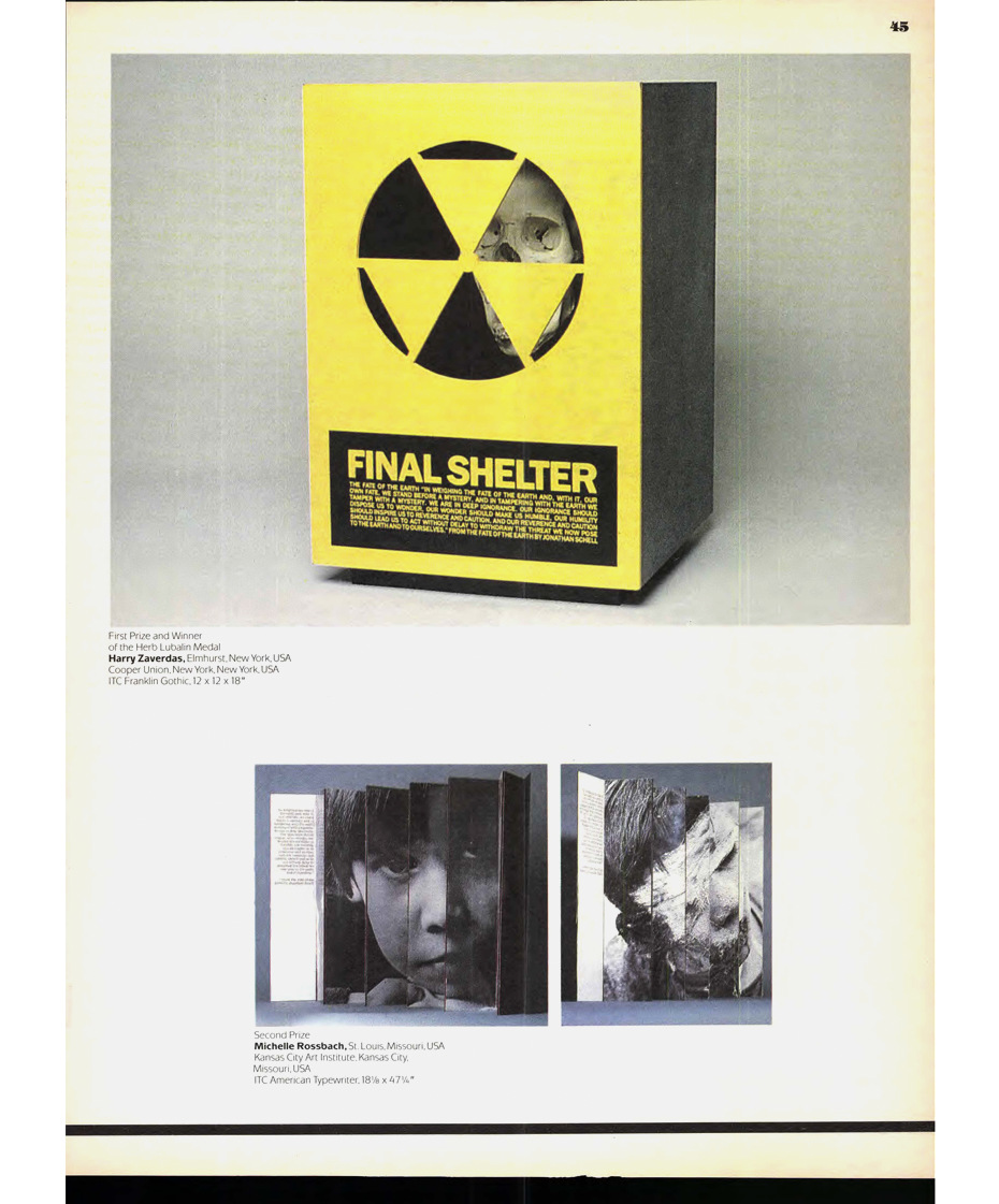
Aaron’s meetings with fellow colleagues and various officials were always held in an exceptionally cordial atmosphere. His interlocutors knew well who he was, and appreciated his interest in Russian design. One important factor behind that affection and popularity with people in Moscow and Leningrad, and the success of the talks Aaron gave, was that those meetings took place only few months after the showing of Typographica USSR in New York City. One very emotional meeting that Aaron had with my students was the presentation of certificates to the winners in The Fate of the Earth, the first Herb Lubalin international design competition organised by ITC in 1985. Later same year the 77 winning entries from 21 countries (including four winners from the USSR— Olga Bogomolova, Albert Kapitonov, Sergey Nikolayev, Vladimir Perlin) were shown in an exhibition at the ITC Center.
Two of the most memorable incidents took place on Tuesday, October 1, in the studio of Valery Akopov, where Aaron and Florence were treated to a hearty home-cooked dinner. Shortly before the Burnses arrived to Moscow I received a private note from Ed Gottschall. Among other things Ed expressed concern about Aaron’s declining health, and his getting tired and exhausted fairly quickly. Ed specifically asked me to make that Russian journey—packed with sight-seeing, museums, meetings and appointments—a little less difficult for Aaron.
Valery and friends worked in a small studio in the attic of a six-story building. There was no elevator. To get there, one had to climb many, many steep steps. That felt like a challenge. A solution, and a brilliant one, was found by Vladimir Chaika. He first washed and scrubbed clean all the steps of that filthy back staircase, from ground floor to attic. Then he counted all steps, and divided their number by 26. And last, using his best wide flat paintbrush, and a jar of the first-class Dutch gouache he painted beautiful letters of the alphabet, back to front, on every flight—starting with the Z and ending, predictably, with the A. The trick worked wonderfully. Aaron was so taken by the beauty of Vladimir’s calligraphy. He often stopped, examined the letters, commented on their shapes… He effortlessly climbed that staircase. The end of the painted message was ‘…Burns → Aaron → Welcome!’.
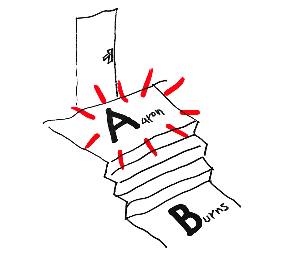
A sketch by Vladimir Chayka: the design of Aaron Burns’ “route” to Valery Akopov’s studio. Drawn from memory at the request of the author of the article.
That evening was marked by yet another thrilling situation. One of the designers present at Akopov’s, Vladimir Semenikhin, asked Aaron for an autograph. When Aaron wondered what was that large fuzzy image he was about to sign, Vladimir said that was a facsimile of a page from U&lc, same size as the original, of course. It turned out that he and his friends used to take pictures (on 35 mm film!) of the only copy of the newly-obtained issue they were able to find (Misha’s?), and privately shared those blurred, washy repros. At Akopov’s dinner party I sat far away from Aaron but I can bet my bottom dollar he almost broke out in tears. It was just too much for him. Much later Valery told me that when the Burnses returned to New York Aaron had copies of all issues of the newsletter, starting from volume 1, Number 1, mailed to Moscow, to several postal addresses he wrote down at Valery’s studio.
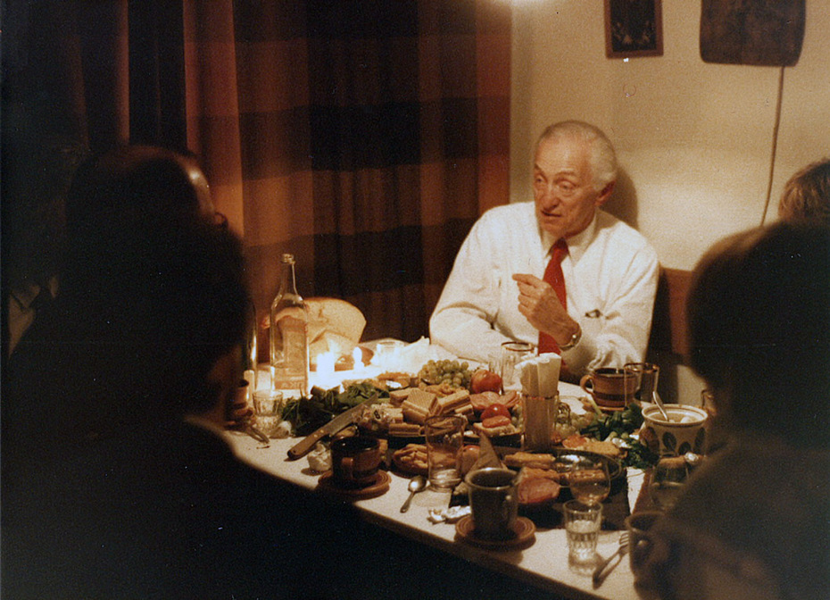
Aaron Burns in the workshop of Valery Akopov. Moscow, 1985.
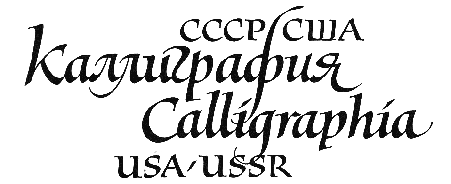
In 1986 I signed a new contract with the United Nations, and resumed my work in New York. I was very happy to renew the contacts and relationships interrupted by my absence. Very soon I was back to my earlier, unfinished endeavours, putting together a joint Soviet-American exhibition of calligraphy. That idea, deemed bold and daring at the time, was proposed as if on cue, by Lili Wronker, my old friend and active member of the New York-based Society of Scribes. I ran it past Aaron, and he assured me of his full support. Thus the ITC became a sponsor of another project aimed at deepening and expanding the coöperation of designers from both nations.
A 1994 CNN report from the opening of Calligraphia USA / USSR Lili Wronker curated with Maxim Zhukov.
That exhibition lived a very long life. Before coming to the United States in 1992, it was first shown in Moscow (from October 23 to November 4, 1990) and next in Kiev, Minsk and other former republics of the USSR. It was shipped to America where it travelled to seven locations in the US, starting with the UN World Headquarters in New York City, and later in Michigan, Oklahoma, and California; it quietly expired at a private SOMArts gallery in San Francisco where it was on display from September 8 to 13, 1994. The exhibition survived not only Aaron (he died on July 16, 1991) but the Soviet Union itself (it was disbanded on December 8, 1991). Conceived as a bilateral affair it transformed, rather logically, into a multilateral undertaking: it showed works by artists from Belarus, Georgia, Lithuania, Moldova, Russia, Ukraine, and the United States.
Our rapport with Aaron kept getting stronger, and our friendship even more confident. He recommended me for membership in ITC’s newly-created Type Review Board, that was announced in the May issue of U&lc (vol. 15, no. 2; pp. 14–17). In my new capacity I kept asking him, ‘Why is it that you call your company ‘International’? It is exclusively Eurocentric, developing and marketing only typefaces for Latin-based typography’. Aaron’s answer, predictably, was, ‘Well, we market world-wide, and the best designers from all over the world—e.g. Carter, Novarese, Spiekermann, Veljović, Zapf—work for us. Isn’t that international enough for you?’. Obviously, we spoke different languages (pun unintended). But as I mentioned above, the change was coming right up. Finally, the roll-out of ITC Arabic, a series of six typefaces all designed by a team led by Mourad Boutros, was announced in the August issue of U&lc (vol. 15, no. 3; pp. 8–11).
I felt I had to increase my efforts to have the ITC type library extended to cover at least the most essential non-Latin scripts. In May 1988, I made a presentation to the Type Review Board on the possible extension of the ITC type library to cover not only Arabic but Cyrillic, Devanagari, Greek, and Hebrew. After a lively discussion a decision was made to have the Cyrillic versions of the most popular ITC typefaces developed by a contractor in Moscow, ParaType.
Aaron Burns, everything he and his associates did, contributed quite significantly to the post-Soviet typographical revival in Russia and other parts of the USSR where Cyrillic script is used. ITC ended up signing an agreement with ParaType, which authorized its expanding the synopses of ITC typefaces beyond the limits of Latin script.
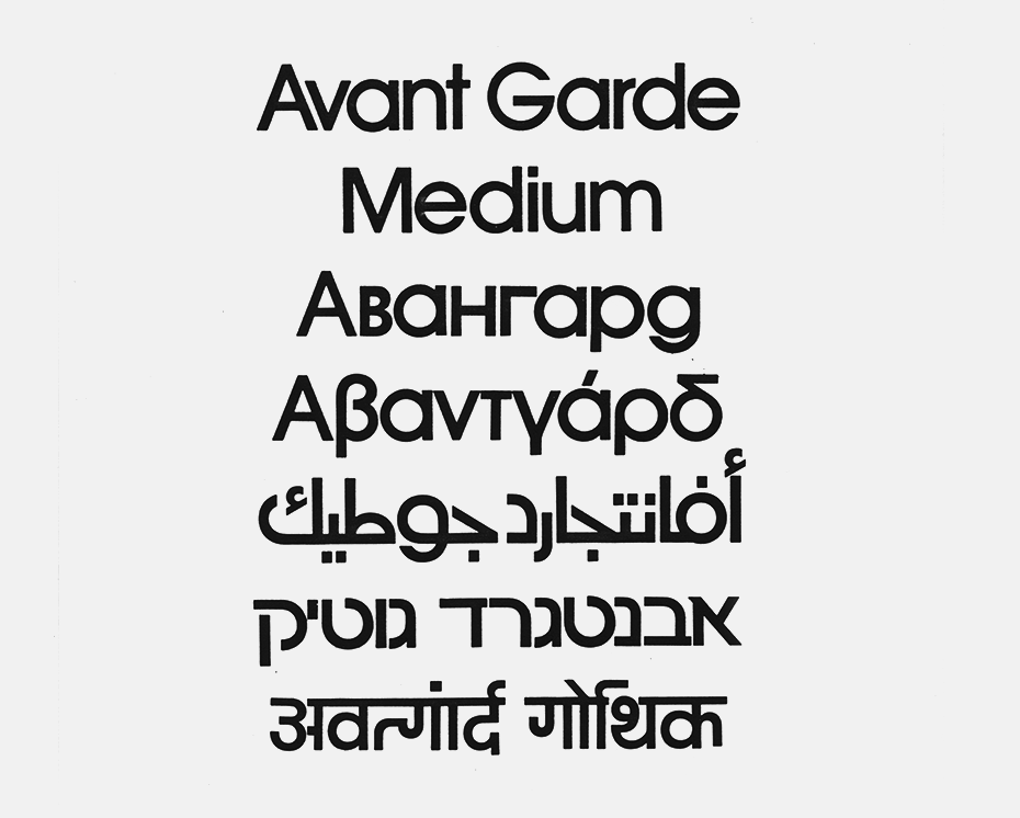
Multilanguage ITC AvantGarde: Latin, Cyrillic, Greek, Arabic, Hebrew and Bengali. Vladimir Efimov’s archive.
With the ‘ITC Cyrillics’ project revving up into high gear, the future should have seemed bright and promising. What I did not know was that time was running out for Aaron. In 1990 he lost his wife Florence. Soon after her return from Moscow she fell gravely ill. She lost a lot of weight, grew weaker and weaker. I once ran into her at ITC; she was a shadow of her former self. She never recovered.
My last time seeing Aaron was in early September 1990, at a conference organised by ATypI (Association Typographique Internationale) in Oxford. In celebration of the twentieth anniversary of the company, ITC threw an impressive reception for the attendees of the conference. It took place at the local museum of modern art. I saw my friend sitting in a wheelchair in the centre of a spacious hall, greeting his guests. Big African masks hung from the walls, looking like dark spirits hovering over their prey. Aaron looked frail and exhausted but he soldiered on.
He died at his home in Boynton Beach, Fla. on Tuesday, July 16, 1991, of AIDS contracted through a blood transfusion ages ago, during coronary bypass surgery in 1982.
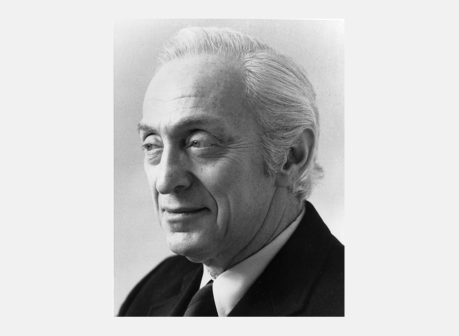
Aaron Burns (1922–1991)•Photo: Greig Cranna.
Contacts between ITC and Russian designers, mostly informal, started even before the advent of perestroika, glasnost, and the attendant freedom of press. They resulted in the development of about two hundred quality Cyrillic fonts, both text and display—using mostly codepage 1251 for Windows or Cyrillic 10007 for Mac OS—covering the needs of typesetting for most Slavic languages. The release of those fonts provided a solid foundation for significant improvement of Cyrillic-based typography. ITC became the first type foundry in the US to start an ambitious new venture with ParaType (then ParaGraph), the newborn Russian company that quickly emerged as an industry leader in developing Cyrillic digital fonts. The Russian legacy of Aaron Burns lives on, even if he did not live to see the results of our hard work.
The design and production of the ITC Cyrillics had to be divided into stages, in which packages of assorted typefaces, often batched as standard ‘four-packs’ of related fonts. This thinking resulted in the composition of the first four sets:
First set (Spring 1994): Avant Garde Gothic (4 fonts); Bookman (4 fonts); Fat Face (1 font); Garamond (4 fonts); Kabel (5 fonts); New Baskerville (4 fonts); Studio Script (1 font); Zapf Chancery (1 font).
Second set (Spring 1995): Anna (3 fonts); Bauhaus (5 fonts); Beesknees (1 fonts); Benguiat Gothic (4 fonts); Garamond Narrow (4 fonts); Machine (2 fonts); Officina Sans (4 fonts); Officina Serif (4 fonts).
Third set (Winter 1995): Franklin Gothic (8 fonts); Korinna (4 fonts); Flora (2 fonts); Garamond (4 additional fonts); Garamond Narrow (2 additional fonts).
Fourth set (Summer 1997): Benguiat Gothic (4 additional fonts); Korinna (4 additional fonts); Friz Quadrata (4 fonts); True Grit (1 font).
ITC Stenberg, ITC Banco, ITC Charter, ITC Bodoni 72, and ITC Franklin Gothic (Condensed, Compressed and X-Compressed) were added to the Cyrillic collection later: in 1997, 2000, 2001, and 2002, respectively.
A number of highly experienced professionals worked on ITC Cyrillics with much fervor and enthusiasm— both the stalwarts of Soviet type design (Baryshnikov, Yermolaeva, Zakharova, Kuznetsova, Slutsker, Slysh), and the designers of the post-Soviet nouvelle vague (Kirsanov, Lyskova, Safayev, Shmavonyan, Tarbeev). The project was coördinated by Ilene Strizver and me in New York, and by Vladimir Yefimov in Moscow.
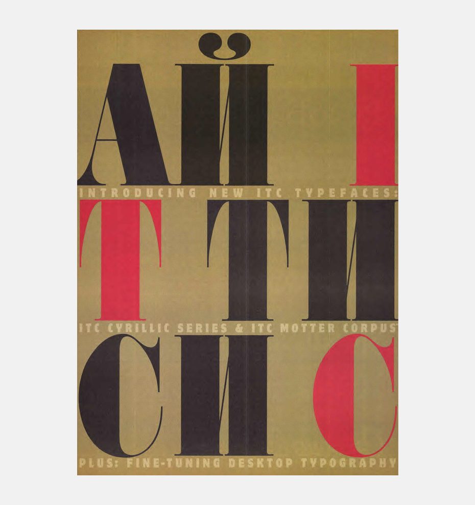
A page from the U&lc magazine (Spring 1994: vol. 20, no. 4) announcing the release of the first set of ITC Cyrillics typefaces. All announcements are available in the archive on our Pinterest page.
There are things in life you never forget. They stay with you to the rest of your days. I remember my coming to see Aaron in June 1986, after my return to New York. He stood up from his desk, walked over to me, gave me a bearhug, and said, Welcome home.
In this photo, a smiling Eloise is standing right behind the maitre.
Aaron Burns (1922–1991), co-founder and president of ITC, was a typographer and typography enthusiast who made a massive impact on the development of typography and type design in post-Soviet Russia. Today, few people are aware of this side of his work, so we invite the reader to take a closer look. A short essay by Maxim Zhukov on meeting the master, organizing exhibitions together and partnering on ITC Cyrillics.
