On the appearance and development of Cyrillic letterforms
Cyrillic is a phonetic writing system largely worked out in a relatively short time (9th – 10th centuries) in the First Bulgarian Empire. Eastern Greek uncial script underlies the general look of the script and that of many of its characters, while the phonetic structure derives from earlier Glagolitic. Cyrillic script and subsequent Cyrillic typographic forms developed gradually up to the early 18th century, approximately up to the creation of the Russian Empire and the accession to the throne of Peter the Great. Peter was deeply involved in the design and production of the new Russian type, known as Civil Type. However, the standard letterforms of Printed Cyrillic (as they appear today) were reached only in the 19th century — 400 years after the development of Western romans.
The development of the Cyrillic alphabet was thus marked by three important turning points: ➊ The invention of the Glagolitic alphabet in Great Moravia as part of the work of the Byzantine Christian missionaries Saints Cyril and Methodius (863 CE); ➋ Development of the Cyrillic alphabet by pupils of Cyril and Methodius in the First Bulgarian Empire on the basis of Greek letterforms and ₜhe phonetic system of Glagolitic 4 (893 CE) ➌ The “Romanization” of Cyrillic by the first Russian emperor Peter the Great in 1708–1710.
History and Background
In 831, Louis the German, of Bavaria, ordered the conversion to Christianity of the lands of Great Moravia, a Slavic kingdom, under his control. Prince Rastislav, whom Louis installed as king in 846, soon broke from his protector and created a Bavarian clergy. Hoping to bolster the independence of Moravia, Rastislav sought the assistance of the papacy in Rome in developing liturgy and translation of biblical scholarship in the language of the Slavs. When the request was denied by Pope Nicholas I , Rastislav turned to Byzantium and Emperor Michael III, who quickly dispatched the brothers Konstantin Filosof (given the name Cyril only at his last rites in 869) and Methodius as the requested missionaries.
Brothers Konstantin and Methodius arrived in Great Moravia in 863. Born in Thessalonika, they knew the Slavic language of their neighbors, and it is possible that Konstantin had translated liturgical texts into Old Slavonic and was using some version of the new Glagolitic alphabet before the brothers’ arrival in Moravia. In Moravia, for three years, the brothers translated Greek liturgical books, using Glagolitic, and instructed the Moravian Slavs in the liturgy and bookcraft.

A fragment of the Kiev Missal. This is a seven-folio Glagolitic Old Church Slavonic manuscript containing parts of the Roman-rite liturgy. It is held to be the most archaic Old Church Slavonic manuscript (ca. second half of the 10th century).
The missionary brothers’ work ran counter to the policy of the Western church, which recognized no languages but Latin, Greek, and Hebrew as appropriate for the Holy Scriptures, and accused the brothers of blasphemy. They were called to Rome by Pope Adrian II in 867 and, in the end, received his blessing.
However, this did not save Great Moravia. Rastislav died in 870, and the policy of the Roman church was invoked. After the death of Methodius in 885, his pupils were expelled from Moravia, settling among others in Pannonia and the First Bulgarian Empire, and took with them the Glagolitic alphabet and the books they had already translated. In 907, after an invasion from Hungary, Great Moravia ceased to exist.
The Birth of the Cyrillic Script
When and how Early Cyrillic was developed and introduced are a matter of controversy. It is generally believed that Cyrillic was invented by disciples of St. Methodius who were teaching in Preslav after the conversion to Christianity of Bulgarian lands in the 880’s.
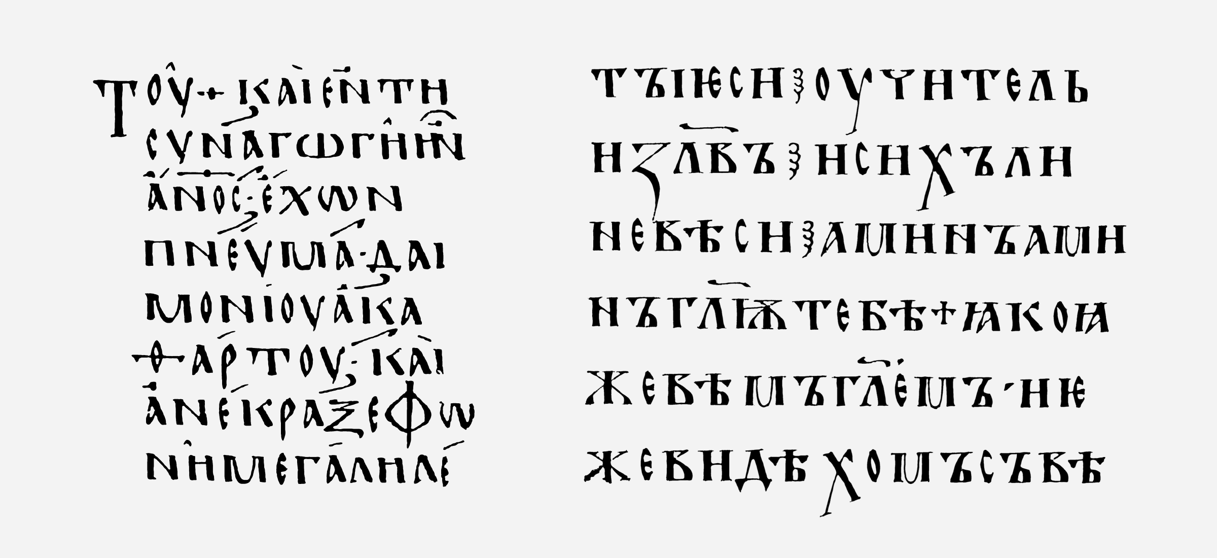
Left — a fragment of the Lectionarium 183, by num. Gregory-Alanda, 10 cent. written in Greek uncial; right — a fragment of the Ostromir Gospel (1056-57) written in Ustav (Cyrillic uncial).
The reigns of Boris I (852–889) and his son, Simeon I (893–927), stand as the high point of the First Bulgarian Empire, and questions of ethnic unity, religion, and relations with Europe’s Christian states were uppermost for the rulers. Toward the end of his reign, Constantinople granted Boris I the right to a locally headed branch of the church, and the exiles from Great Moravia found themselves in demand. In 886 Boris I established schools for them in Preslav and Okhrid, the empire’s literary and educational centers, and it was in them that the Holy Scriptures were translated and wide-ranging scholarly and educational work was carried out.
The result was that Old Slavonic ousted Greek as the language of divine services, and in 893, under Simeon, a church council declared it the language of church and government. The Cyrillic alphabet then became the basis for various alphabets across Eurasia. In considering the development of Cyrillic in the broader context of Russian culture, it is important to note the closeness in time of the conversions to Christianity of Great Moravia (831), the First Bulgarian Empire (865), and of the penetration of Christianity into the Kievan lands (the conversion of Askold, 867). From the attack on Constantinople by the Rus in 860, right up to the official date of the conversion of Kievan Rus by Prince Vladimir (988), missionaries from Byzantium sought to establish relations with Kiev.
➁ Early Cyrillic broadly followed ➀ Glagolitic in the number, alphabetical sequence, and sound values of the letters. But, as to the forms of the letters, Cyrillic borrowed directly from Greek, specifically from ➂ Greek uncial forms .
The earliest form of Cyrillic script, called ➁ ustav in the genealogy of Latin, is comparable to uncial. Derived from Greek uncial, it was intended for use in clerical books. During the 9th–14th centuries, the Cyrillic script was based on a single mode of the ustav form: no minuscule or majuscule, no italic. As the Cyrillic alphabet came together hand in hand with Orthodoxy and clerical books were sacred objects, the look of the letters was assiduously protected. The further evolution of Cyrillic script was unhurried and measured.
Civil Type
The next crucial step in the development of Cyrillic script was the Petrine typographic reform (1708–10). It was based on Peter’s directives, rather than on mature societal necessity. The reform was an integral part of a much wider program for remodeling Russian culture on the pattern of European Baroque/Classicism. Peter insisted on the adoption of European clothes and wigs, made facial shaving obligatory for the ruling class, and changed the calendar. He also promoted European forms of architecture and painting and introduced secular holidays, etc. Peter took particular inspiration from Louis XIV of France, who in the latter part of his reign also concerned himself with type design.
By the Petrine reform, Cyrillic writing had already developed to a stage comparable with semi-uncial (poluustav), which had been known since the 15th century. Poluustav could be written faster than ustav—both were book styles—and, in time, took its place.
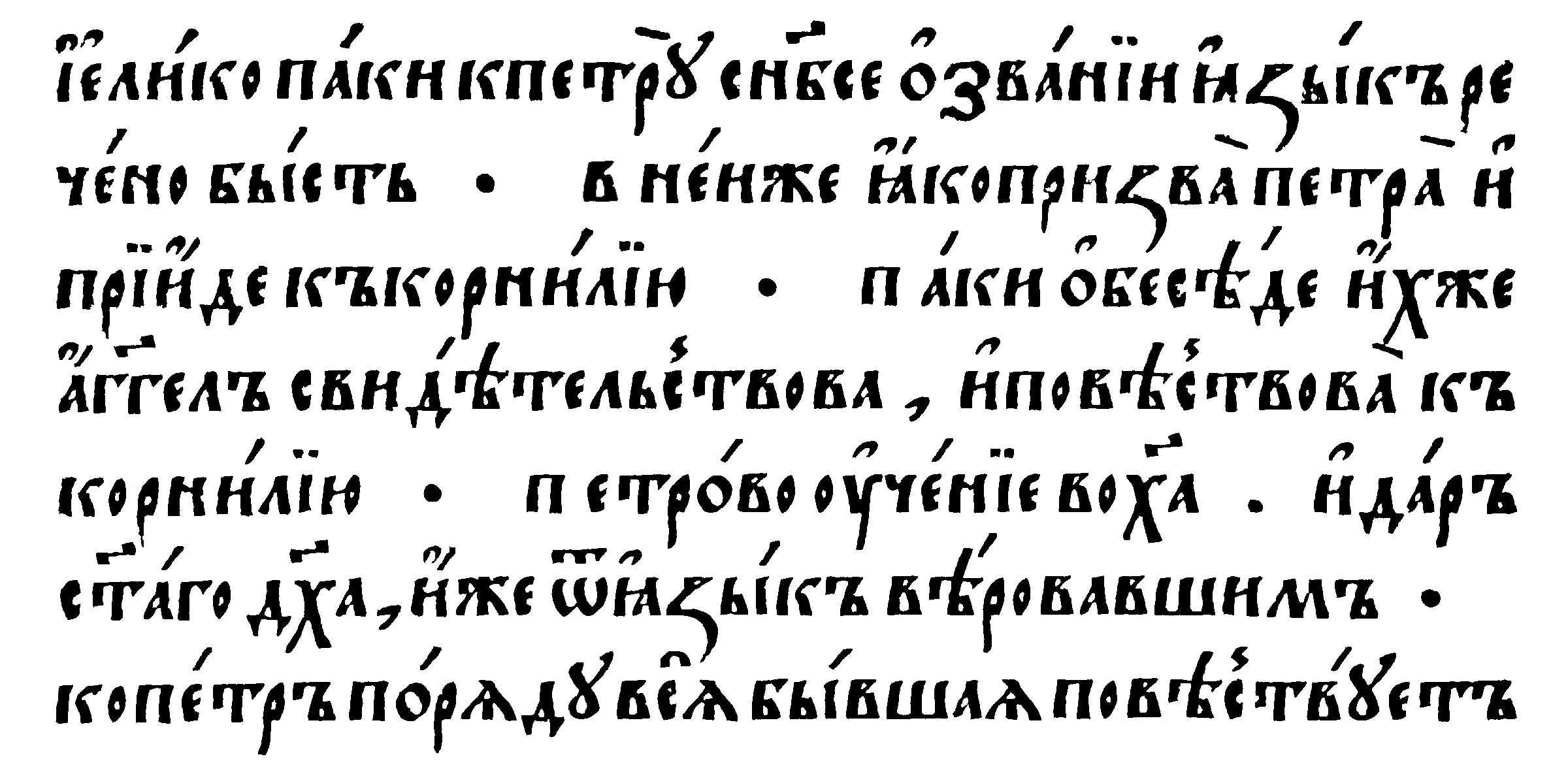
Cyrillic semi-uncial (poluustav). Apostle.•Printed by Ivan Fyodorov and Pyotr Mstislavets. Moscow, 1564.
It also featured ligatures and diacritics and had more varieties of letterforms. From the middle of the 16th century—that is, from the time of the Russian printing pioneer Ivan Fedorov—until the Petrine reform Cyrillic script changed little. In the absence of other type, poluustav was used in the printing of both religious and secular literature.
The only branch of early Cyrillic which was developed in the same natural way as Latin hands was quick hand (skoropis), which appeared in the 15th century and was used for everyday needs. Compared to ustav and poluustav, it was written much faster, with a great variety of letterforms. Some correlations with quick hand can also be found in modern italic letterforms.
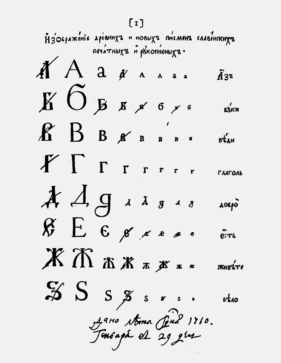
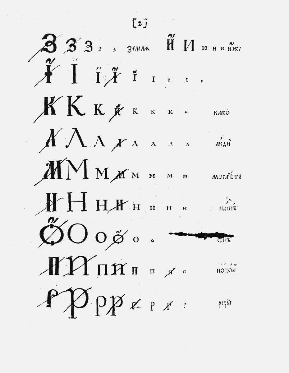
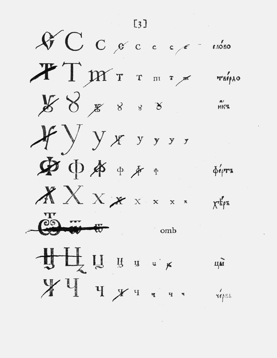
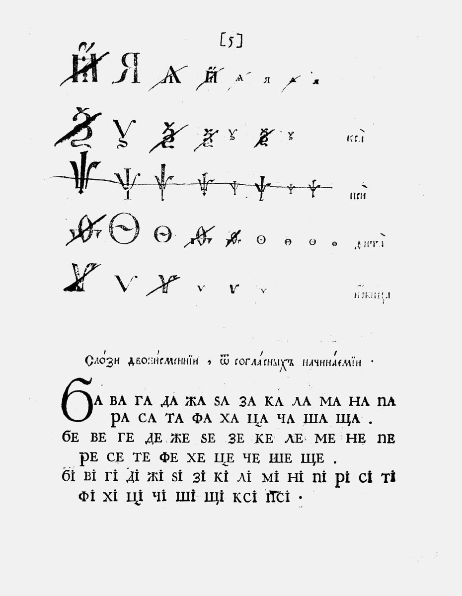
Eventually, the old poluustav type was reserved by Peter the Great for religious literature, which also helped to separate clerical and secular authorities and avoid a dispute over the typographic reform. For all other publications, he introduced a new style, which imitated the forms of contemporary Western type. This was what became known as Civil Type (grazhdanskiy shrift).
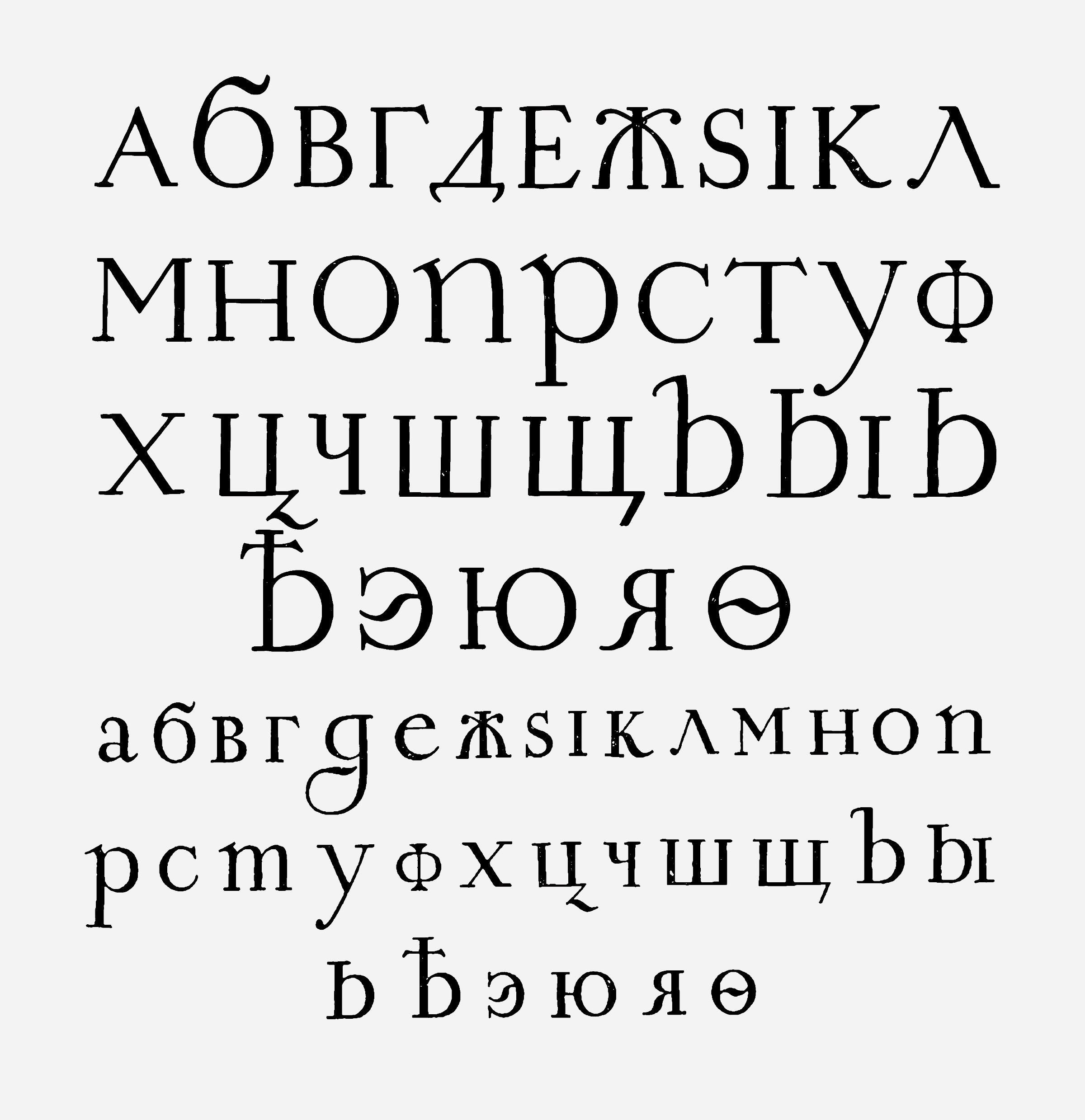
Civil Type,large size, 1707.
As a consequence of the reforms initiated by Peter and developed by the Imperial Academy of Sciences during the period 1708–1758, the Russian alphabet itself changed. The number of characters was reduced from 45 to 36. Several characters inherited from the Greek alphabet, including ω (omega), ѱ (psi) and ѯ (ksi), as well as the ligatures Ѿ (ot) and Ȣ (ou), were dropped. Also abandoned were ѥ (est’ iotated), Ꙗ (az iotated), Ѫ (yus large), Ѭ (yus large iotated), Ѩ (yus small iotated), and the letter s (zelo). The character Ѧ (yus small) was replaced by the letter я, and the letters э (e reversed) and й (short i) were introduced. In addition, in the course of the reforms punctuation marks and Arabic numerals were introduced, the use of capital letters was systematised, and diacritical marks and abbreviations were abandoned.
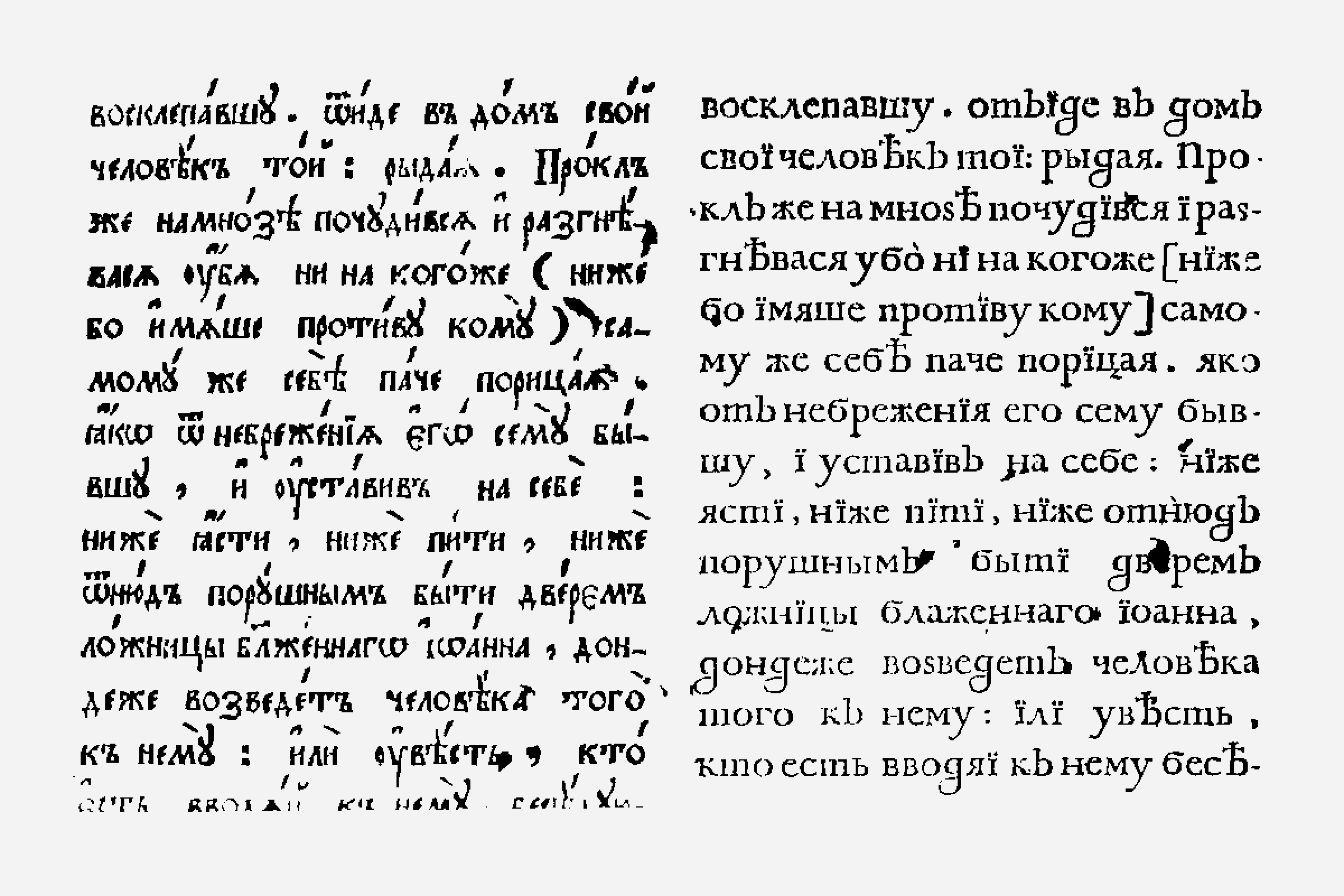
Left: Cyrillic semi-uncial (poluustav); right: Civil Type.•Com- parison of the printed types published in The Civil Alphabet with Arguments (Azbuka grazhdanskaja s nravouchenijami), 1710.
The new typographic style was settled by 1710. The proportions of Cyrillic type, the relationship of cap-height and x-height, the character of round forms, the shape of serifs, and other details were now all clearly influenced by old-style Dutch (Baroque) roman, especially as compared to poluustav. Most of the glyphs specific to the Cyrillic alphabet are also styled after Western models. Thus, Cyrillic took on the form of roman serif type in much the same way that Muscovy then dressed in European clothes.
Admittedly, Peter the Great was a multitalented person, but he definitely knew little of type design. The results of his lack of knowledge include the uneasy combination of certain Latin capitals and specific Cyrillic glyphs that were taken from the poluustav of the 17th century, even though the new letterforms were introduced to letterpress immediately upon invention. The letterforms of the new type followed the instructions (some believe even sketches) of Peter the Great and his assistant — a military engineer and draftsman Kulenbach — in Amsterdam. At the end of 1707, three specially invited Dutch printers, equipped with type and printing presses, reached Moscow. All of this suggests why modern Cyrillic did not have the natural development of Latin, though it looks quite similar.
Since the Petrine typographic reform nearly 300 years ago, the latinized form of Cyrillic has been traditional in Russia, and Cyrillic type has developed in parallel to Latin, repeating virtually all the stages of its development and changes of style: Classical, Romantic, Art Nouveau, Constructivist, Post-Modernist, etc.

Identical glyph shapes. Left: Greek, Latin, Cyrillic (Russian). Right: Macintosh, codepages 201 and 251. Typeface: PT Pragmatica.•The illustration by Maxim Zhukov for his essay “ITC Cyrillics: 1992–. A case study” in Language Culture Type. John D. Berry (ed.), 2002.
Reform of Russian Spelling 1917–18
The most recent major reform of Russian spelling was carried out shortly after the Russian Revolution of 1917. The proposed reform had been developed in 1912 by a number of eminent Russian philologists, including the prolific Aleksey Shakhmatov. It simplified Russian orthography by dropping four letters of the alphabet in favor of already existing letters whose pronunciation was exactly the same. Specifically, the letters ѣ (yat), ѳ (fita), і (i desjaterichnoe) and ѵ (izhitsa) were replaced by the already existing e, a, и, и (resp.). Additionally, the sign ъ (yer) changed its name to that of the hard sign, and the use of the ъ (hard sign) in final position following consonants was dropped.

The look of Cyrillic reflects the peculiarities of the Petrine Civil Type. The modern (black) and pre-reform letters of the Cyrillic alphabet are shown. Letters abandoned after the decree of 1918 are marked (–); letters officially recognized in the latter half of the 20th century are marked (+); archaic letterform constructions are marked (•). A digital revival by Dmitry Khoroshkin (2017) of the Academy typeface by the H. Berthold type foundry (Saint Petersburg, 1912), itself based on the Sorbonne typeface (H. Berthold, Berlin, 1905).
The Soviet government rapidly imposed a monopoly on printing and kept a very close eye on the industry. Many display typefaces were eliminated for ideological reasons, and the production of new ones slowed dramatically.
Before and After Perestroyka
Type design in the USSR developed very slowly. There was only one government-owned enterprise responsible for the design of typefaces — the Type Design Department of the Research Institute of Printing Machinery. Its typefaces of the 1960s became the new standard look of Cyrillic. The lack of display faces was compensated for by much reliance on hand-lettering. The digital revolution which took place in Russia in 1990s — almost simultaneously with the ending of the iron curtain — posed many challenges for Cyrillic type design. The pioneering enthusiasm of a tiny group of professionals led to the creation of the ParaGraph International company (later ParaType), whose team included such designers as Lyubov’ Kuznetsova, Isay Slutsker, Tagir Safayev, Alexander Tarbeev, and Vladimir Yefimov, with Maxim Zhukov as a non-staff typographical consultant. Their work resulted in a wide range of type classics.
Extended Cyrillic
Cyrillic script is used for more than one hundred languages, living and/or extinct (particularly in Eastern Europe, the Caucasus, Central Asia, and North Asia). As of 2011, more than 252 million people around the globe considered Cyrillic their native script. It is spread over territories of many countries such as: Abkhazia, Belarus, Bosnia and Herzegovina (along with Latin), Bulgaria, Kazakhstan (supposed to switch to the Latin alphabet by 2025), Kyrgyzstan, North Macedonia, Moldova (along with Latin), Mongolia, Montenegro (along with Latin), Russian Federation, Serbia (along with Latin), South Ossetia, Tajikistan, and Ukraine.

The codepage Windows 1251 Standard Cyrillic (52 letters, including pre-1918 letters, highlighted) covers 6 Slavic languages and 21 non-Slavic.

Characters of the Extended Cyrillic are used for specific sounds of mostly non-Slavic languages (93+ letters, not including Old Slavonic letters and emphasized vowels). As each letter has lower- and uppercase forms, the total number of Cyrillic characters is 290 and keeps changing.•Based on a study of Cyrillic alphabets by Vladimir Yefimov, 2009. Typeface used: Gauge Text Pro, designed by Alexander Tarbeev (2019). A note: the letterforms with unicode numbers 0401, 0451, 0472, 0473 and all the letterforms with N/A are not included in Gauge font’s character map, but designed additionally for this table of examples.
Just as Latin-based writings actively use diacritics for specific regional sounds, Cyrillic-based writings have frequently used modifications of the basic forms of its characters for the same purpose. For example, there is the letter Ӄ (Ka with hook), which is formed from the Cyrillic letter К by the addition of a hook. The letter is used in, among other minority languages, Itelmen (the original language of Russia’s Kamchatka Peninsula), which has fewer than 100 native speakers. It is hardly surprising that, among the world’s perhaps 100,000 commercial fonts, fewer than a dozen include the letter Ӄ.
Cyrillic and Latin
Since the 18th century, as a consequence of the Petrine reform Cyrillic typography and type design follow Latin in most visual aspects: it has identical relations between roman and italic faces, as well as between capitals and small capitals (with rare exceptions, which depend on the peculiarities of the typeface design). Modern fonts that support Standard Cyrillic codepage (Windows СР 1251, Macintosh Cyrillic) include Latin sharing identical letterforms: 16 in uppercase and 12 letters in lowercase (16 in uppercase and 15 in lowercase in italic forms), though the same shapes often represent different sounds.
The construction of glyphs in Latin, Cyrillic, and (uppercase) Greek follows the same pattern, and the glyphs share many visual features (e.g., height, weight, contrast, stress) and even design elements (serifs, stems, bars, bowls, terminals, etc.). As a result, creating non-Latin extensions, or expanding an original font complement, is very often a sophisticated exercise in glyph combinatorics.
In typeface classification, modern Cyrillic follows the pattern of the aesthetic evolution of European typography: Empire–Romantic–Victorian–Art Nouveau, etc., but the earlier style periods (prior to the Petrine reform) have left no trace on the forms of Cyrillic type. Nevertheless, with extrapolation of modern Cyrillic design conventions and their applications to pre-Petrine times, credible results in creating Cyrillic typefaces in the styles of, say, early Humanist faces, French Old Styles, Dutch oldstyles, or even Blackletter and Capitalis monumentalis style can be achieved.

Trajan Pro 3 Cyrillic, by Robert Slimbach and Carol Twombly (Adobe, 2011). Cyrillic letters included in the most commonly used encoding Windows 1251 (“Standard Cyrillic”). Identical letterforms shared by Latin and Cyrillic are shown in solid black.
Although Cyrillic glyphs share much with Latin, they present a number of unique features. Type set in Cyrillic is always different in texture from type set in a Latin face, even when the faces are the same. But this is the result not only of the presence of very distinctive non-Latin letters, such as н, п, ш, б, ж, ч, я, but also of differences in morphology. Languages that share the use of Latin script also differ dramatically from each other in texture, color, and rhythm when set.
The following three factors should be taken into account in any consideration of Latin–Cyrillic biscriptal typesetting: ➊ Overall, Cyrillic characters are much wider than Latin characters. Texts of similar numbers of characters take, for example, 15–20 % more space in Russian and 10–15 % more space in Ukrainian than in English. ➋ Because of the rarity of extenders among Cyrillic characters, the leading of a Russian copy text looks much looser in comparison with English. ➌ Cyrillic contains many fewer rounded elements than Latin, which strongly affects the rhythm and texture of text pages.
Bibliography
-
Бернштейн С. В. Константин-философ и Мефодий: Начальная глава из истории славянской письменности. М.: Издательство Московского Университета 1984.
- Верещагин Е. История возникновения древнего общеславянского литературного языка. Переводческая деятельность Кирилла и Мефодия и их учеников. М., 1997.
- Гордон Ю. Книга про буквы от Аа до Яя. М.: Издал, 2013.
- Григорьева Т. М. Три века русской орфографии (XVIII—XX вв.) М., 2004.
- Ефимов В. Гражданский шрифт и кириллический Киш. М.: Шрифт, 2013.
- Ефимов В., Шмелёва А. Великие шрифты. М.: ПараТайп. Том I и II. 2006, 2007.
- Йончев В., Йончева О. Древен и съвременен български шрифт. София: Български художник, 1982.
- Карский Е. Ф. Славянская кирилловская палеография. М., 1979. Королькова А.
- Живая типографика. М.: ИндексМаркет, 2011.
- Матвеева-Исаева Л. Лекции по старославянскому языку. М.: Учпедгиз, 1958.
- Папина А. Происхождение славянской письменности. Екатеринбург, 2004.
- Путеводитель по кириллице. М.: Шрифт, 2019
- Реформатский А. Введение в языкознание. М.: Аспект пресс, 1996.
- Репертуар русского типографского гражданского шрифта XVIII века. М.: Книга, 1981.
- Флоря Б., Турилов А., Иванов С. Судьбы кирилло-мефодиевской традиции после Кирилла и Мефодия. СПб., 2000.
-
Флоря Б. Н. Сказания о начале славянской письменности. СПб.: Алетейя, 2000.
- Хабургаев Г. А. Первые столетия славянской письменной культуры. М., 1994.
- Шицгал А. Русский типографский шрифт. М.: Книга, 1985.
- «Civil Type and Kis Cyrillic.» Yefimov, V., Language Culture Type: International type design in the age of Unicode. New York: ATypI/Graphis, 2002.Identitet, Djurek N., Split Academy of Arts, 2016.
- «On the peculiarities of Cyrillic letterforms: Design variation and correlation in Russian printing type.» Zhukov, M., Typography Papers 1: Reading University Press, 1996.
- «The Trajan letters in Russia and America». Zhukov, M., The Eternal Letter: Two Millennia of the Classical Roman Capital (Paul Shaw, ed., Cambridge: The MIT Press).
- «The Slavic Alphabets». Cubberley P., The World’s Writing Systems. Daniels P. and Bright W. (eds.). Oxford University Press, 1996.
- «ITC Cyrillics», 1992 — A Case Study. Zhukov, M., Language Culture Type: International type design in the age of Uni-code. New York: ATypI/Graphis, 2002.
Early specimens of Glagolitic (in the form of inscriptions and manuscripts) are exceedingly rare, and none bears a date. Cyrillic was long thought to have been the oldest Slavic alphabet. The hypothesis of the primacy of Glagolitic script was bolstered by the discovery in the 1845 on the Balkan Peninsula of the 13th-century Boyanski palimpsest by V. I. Grigorovich. It includes several pages of Cyrillic text written over partially obscured Glagolitic. The primacy of Glagolitic
is now accepted by most Slavists.
“Our nation is baptized and yet we have no teacher. We understand neither Greek nor Latin. We do not understand written characters nor their meaning; therefore send us teachers who can make known the words of the Scriptures and their sense.”— Rastislav, prince of Moravia, 862 CE.
Today the Greek city of Salonica. In the 9th century, Salonica was the second (after Constantinople) most important center of Christianity in the Byzantine Empire, a powerful, multinational metropolis situated at the junction of the empire’s most significant economic and cultural pathways.


