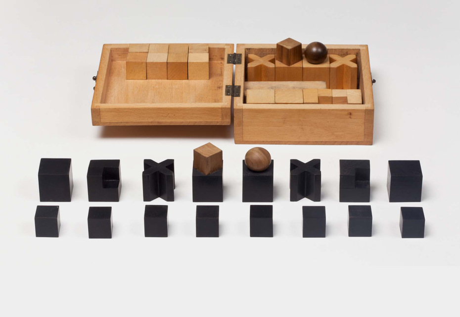
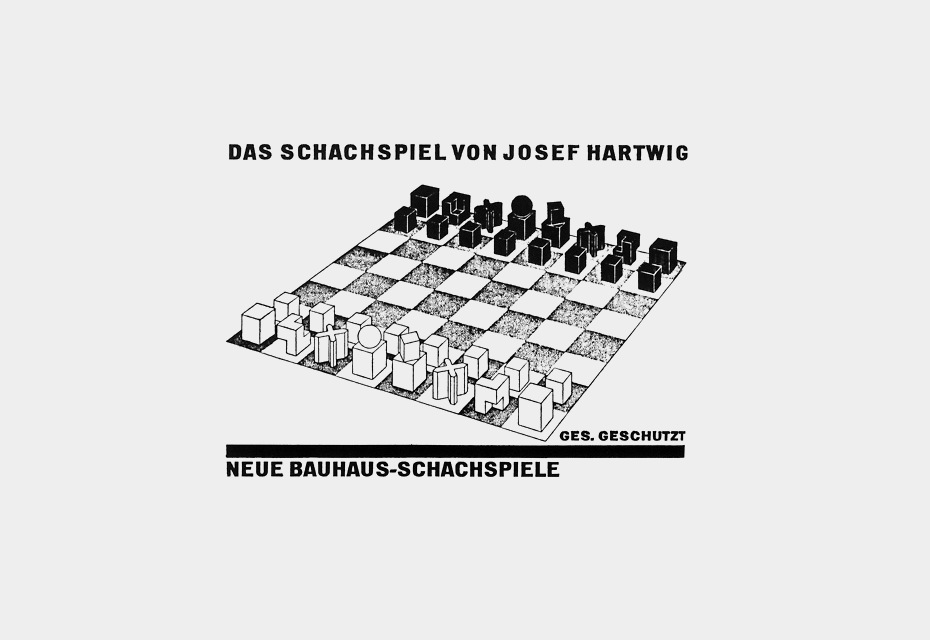
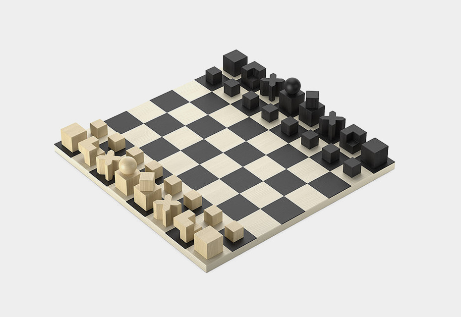
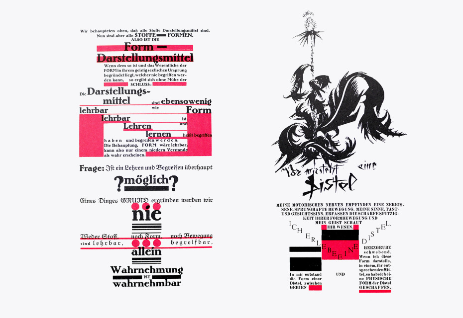
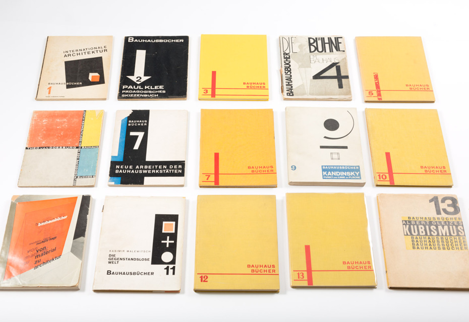
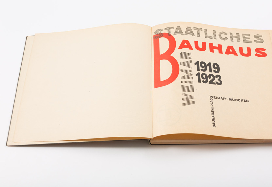
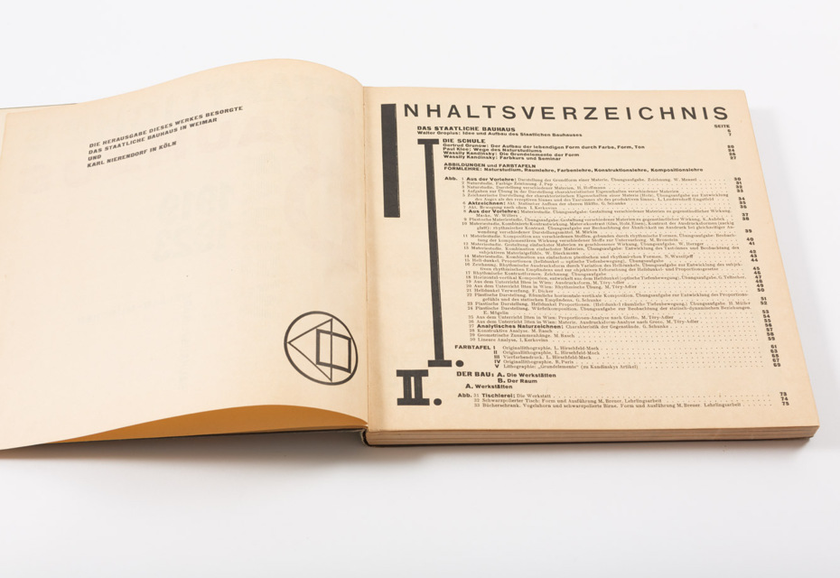
 here were a few reasons to reach out to the German professor of typography, author and educator Gerd Fleischmann. It all started back in 2015 in one of Berlin’s biggest bookshops, Buchhandlung Walther König, in the city centre. Its bookshelves were—and still are—packed with an enormous amount of literature on art and design. One can find brand-new editions from the best publishers from around the world, as well as some examples of rare antique books. This is exactly where I was lucky enough to pull the book bauhaus. drucksachen, typografie, reklame edited by Gerd Fleischmann (Edition Marzona, Düsseldorf, 1984) out from one of the shelves in the typography section. This is a unique and carefully compiled research work on heritage of Bauhaus and a printed ephemera that reflects the evolution of its typography, as well as the mindset of both the school and the period that started in the Roaring Twenties. Professor Fleischmann has kindly agreed to work with us on a Russian edition of his book, which will hopefully lead us into long-term collaboration. — E.Y.
I. Discovering Bauhaus
Everyone—not only in design, architecture, photography, but also in many other fields—feels familiar with Bauhaus. However, it seems like today “Bauhaus” is rather a synonym for an international design style and a brand with strong features than a source of knowledge and experience. What is Bauhaus for you, for your generation?
Freedom! For me, it means mostly freedom. When I became aware of Bauhaus back in 1955, it promised freedom. In many families at that time, the mindset of the Nazi regime was still alive. When I listened to the American Forces Network—I mostly turned it on for jazz—my mother called it “nigger music” and didn’t like that her boys were listening to it. The same moralists, the same people who were in these positions before worked in most of the authorities, courts and general administration. The so-called “denazification” was taken rather easy, so even the big banks like Deutsche Bank were still in some way governed by the same people who supported Hitler. Hermann Josef Abs was one of them.
When I saw Bauhaus photographs, the feeling was “freedom”. It was even sexual freedom, because boys and girls were together there in mixed classes and I went to a boy’s school. There were no girls in our school, and it was the policy of the school to separate the sexes. It was very interesting for us (boys) to look out of the window,
The photographs were so lively and so nice—besides freedom, the main message was that work and life is a unit. I don’t know whether this was the feeling of my generation,—but it’s true for me.
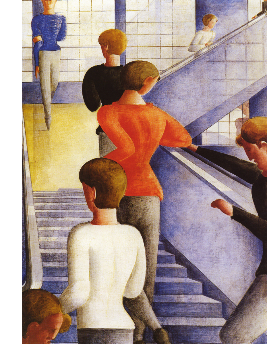
The Bauhaus Stairway (1932), Oskar Schlemmer (1888–1943). This painting is a farewell. All but one of the students on an ordinary day at the Bauhaus are walking away from us, up the stairs, towards the huge windows—the Bauhaus belongs in a higher realm than this one. Only one figure comes towards us, not so much walking as dancing on tiptoes. Perhaps there is still hope. Schlemmer painted this in the year that the Bauhaus was forced to abandon its beautiful modern building in Dessau. The Guardian. The painting is located in The Museum of Modern Art, New York•© Topham Picturepoint, 1999. TopFoto.co.uk
Today people see Bauhaus as a style only. This was never its intention. Gropius wanted to run a process and did not want to create the style, that was later called Bauhaus Stil, an international style of progressive architects. Gropius said in the foreword of the first Bauhaus monograph that was published in Germany in May 1955: »Das Wesen des Bauhauses bestand in einem sich ständig weiterentwickelnden Prozess, nicht in der Schaffung eines neuen ‘Stils’«. (The essence of the Bauhaus was an ongoing process, not the creation of a new style.) You can see in the short history of the Bauhaus that in the fourteen years from 1919 to 1933 the paradigm changed dramatically from Kunst und Handwerk (Fine Art and Crafts, 1919) to Kunst und Technik—Eine neue Einheit (Art and Industry—a New Unit, 1923) to co-op (Hannes Meyer, 1928–1930).
It is rarely realised that the Bauhaus was a process. Even if you look at the directors, the change from Walter Gropius to Hannes Meyer was a process itself, because Hannes Meyer definitely had different ideas on how creativity should be organised. Gropius was still (which is a fact of his generation) thinking of the genius, of the individual, whereas Hannes Meyer was propagating the collective as the place where creativity comes from. This is realised today—that teamwork may be more productive than individual work, but there should be strong individuals in the team who lead it in some way.
A team gives more input and it is possible to change the leading person within it, but I think that a mix of both paradigms is important. There are individuals, which a team needs. You won’t have a productive team if you have only weak individuals, and you won’t have any serious discussions if the members of a team don’t have strong opinions. Gropius said that the Bauhaus should be a process, like the process that always takes place in a team (even within the group). This one of Gropius’s beliefs is something people don’t realise, when they advertise, for example, architecture or houses to rent or to buy im Bauhaus Stil (in Bauhaus style). This is a contradiction in itself. Bauhaus is not a style, though some pieces may have a relationship with Bauhaus.
The educational process of the Bauhaus was based in many ways on pedagogical experiments. What was the key point in changing the mindsets of the Bauhauslers?
Well, this is the Bauhaus Vorkurs (Preliminary course). In the Vorkurs, the students had to unlearn what they knew from their existing society, existing beliefs and existing values. They had to research all things and phenomena in the world: material, spiritual, social. They had to develop a new approach towards the world. The unlearning of habits that the Bauhaus students came with was the key. You cannot build a new world if you keep all of the old world.
The Vorkurs tried to get the students in touch with the potential of materials, because that time was still the time of materials: iron, wood, stone and the others. It really was different from our world, which is becoming more and more immaterial. But we must confess that it is still material: we will die and this is the biggest proof of the material world. I cannot survive digitally myself, only what I do may be spread digitally. But, in fact, when I’m dead, it’s finished.
The Vorkurs was given initially by Johannes Itten. But I think the idea of the Vorkurs was a general idea that all the masters discussed and decided to implement. When Moholy-Nagy jouned in 1923, constructivism came into the Bauhaus. Before that, they were strongly influenced by expressionism and some mysticism—Mazdaznan, for example.
Itten with his unique ideas of art, rhythm and colours (he covered all the material and immaterial aspects of art) wanted the students to get rid of all religions, formal habits and what they previously learned about art. In the same way as he discussed studies in materials, he studied historical art with students, just to find out how paintings from the 15th or 16th century are composed, what colours are manly used, which colours represent the saints, Mary or Jesus, how they are used, what the colours mean. All these theories were made in order to free the students to think for themselves.
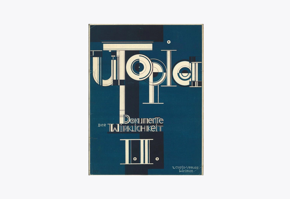
Itten tried to explain this. In Utopia, he says that one can’t teach art. It is only possible to understand, to develop your creativity, but nobody can teach other people art or how to be an artist. This is what was different in other schools at that time. The students had to draw replicas of Greek and Roman sculptures, do composition studies, believe in certain colour schemes, learn painting techniques and so on. In the Bauhaus, the main aspect even for Itten, who had a strong belief on how things should work was to open the mind and attain freedom.
Walter Gropius called the Bauhaus a “Cathedral of Socialism” in his 1919 Manifesto. As a school of its time, the Bauhaus was intended to develop socialistic ideas. How does that sound to you? Could one say that the Bauhaus materialised socialism through the power of standardisation?
I think the socialism that was laid out in the Arbeitsrat für Kunst (Working Committee for the Arts, 1918–1921) papers was quickly abandoned by Gropius, because there were no opportunities to discuss socialism. The Bauhaus, as a state institution, had to be funded by Thuringia. If they proclaimed socialism, the bourgeois society that government of Thuringia in some way was would have stopped the funding. Therefore, socialist ideas receded into the background, while fine art and crafts dominated, as well as education in new thinking, e.g. Theo van Doesburg brought the ideas of De Stijl (The Style) to Weimar and El Lissitzky brought Russian constructivism.
There were many influences that reduced the programme to the arts, creativity and the means of building a new world through art and the thinking of artists. But socialism very quickly disappeared from the discussions. It came back when Hannes Meyer, who declared himself a communist, became director in 1928 when Gropius left. He saw socialism as a programme for the future, but it cannot be said that the Bauhaus as a whole propagated socialism. The time was full of strife. In a small town like Weimar, there was always strong opposition towards the Bauhaus, which finally had to leave Weimar in 1925. Dessau, where the new paradigm Kunst und Technik—Eine neue Einheit became visible in the new building, was an open-minded industrial city. It was governed by a social democrat. Many members of the society supported the Bauhaus. For example, Hugo Junkers, a successful industrialist, one of the key persons of the German aircraft industry, also was one of the main sponsors of the school.
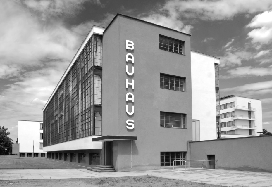
Photo by Sebastian Guettler, 2009
The pivotal point in the evolution of the Bauhaus was the replacement of Johaness Itten by László Moholy-Nagy in 1923 under the pressure of the postwar crisis and the insistence of the authorities, alongside other reasons. With the appearance of Moholy-Nagy at the school, the educational programme was adjusted in a more practical direction. What changes can we observe before and after Moholy-Nagy in the school in general and Bauhaus typography in particular?
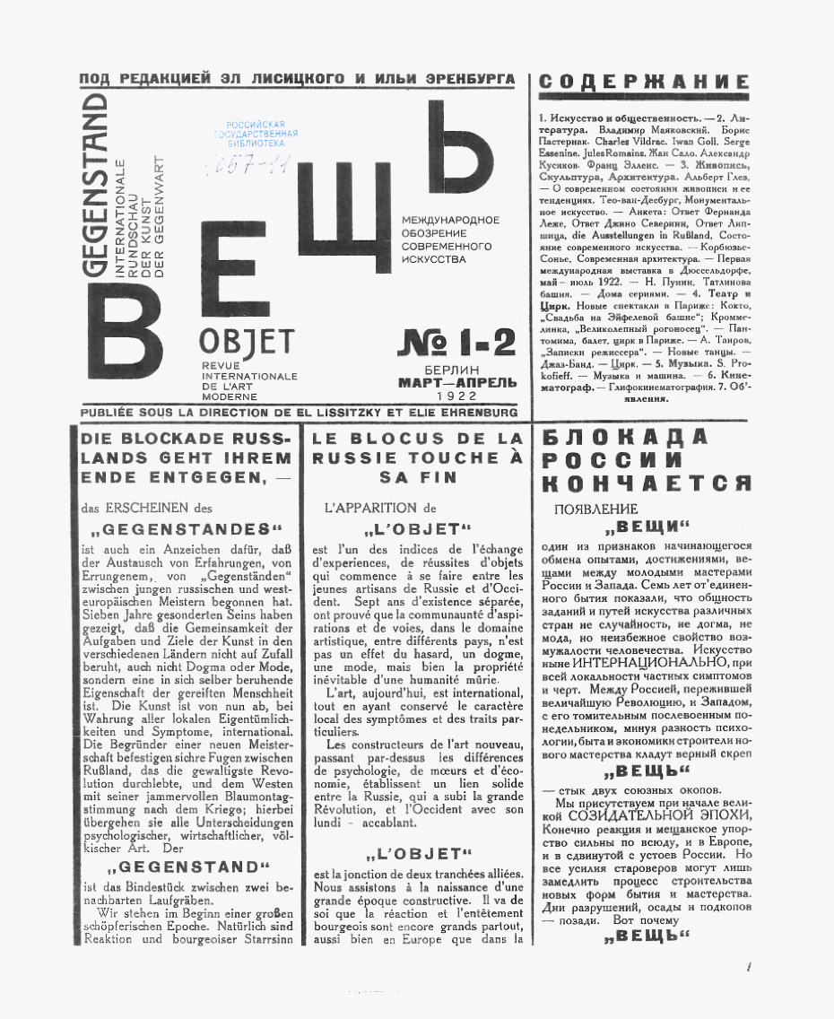
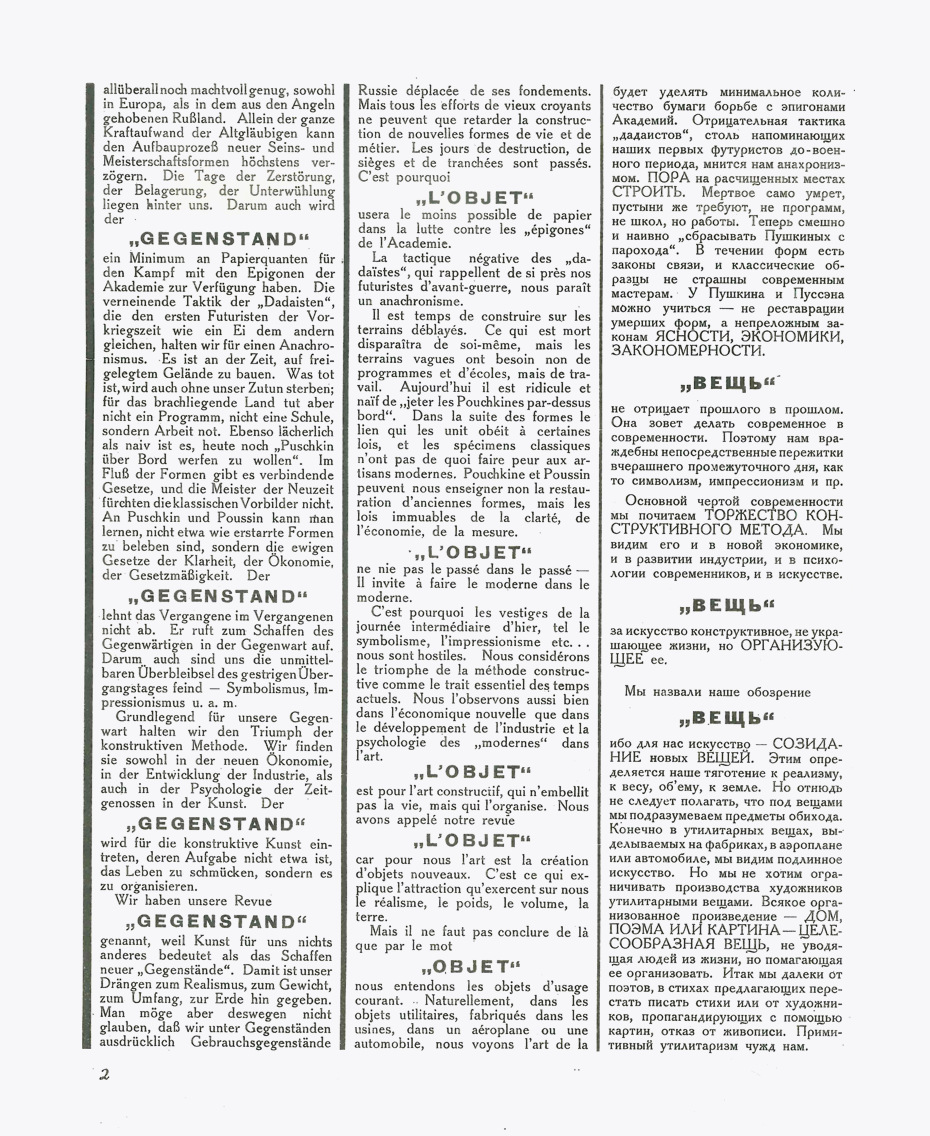
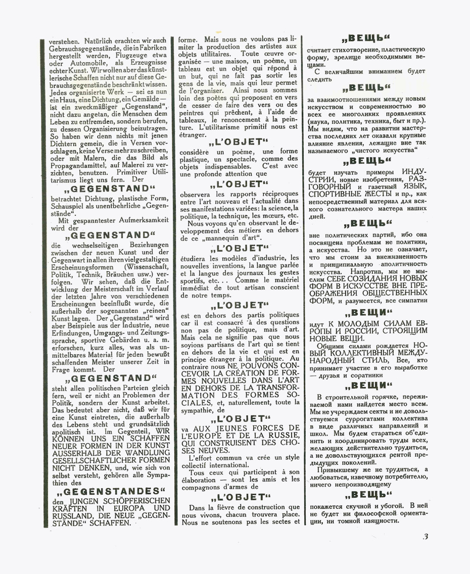
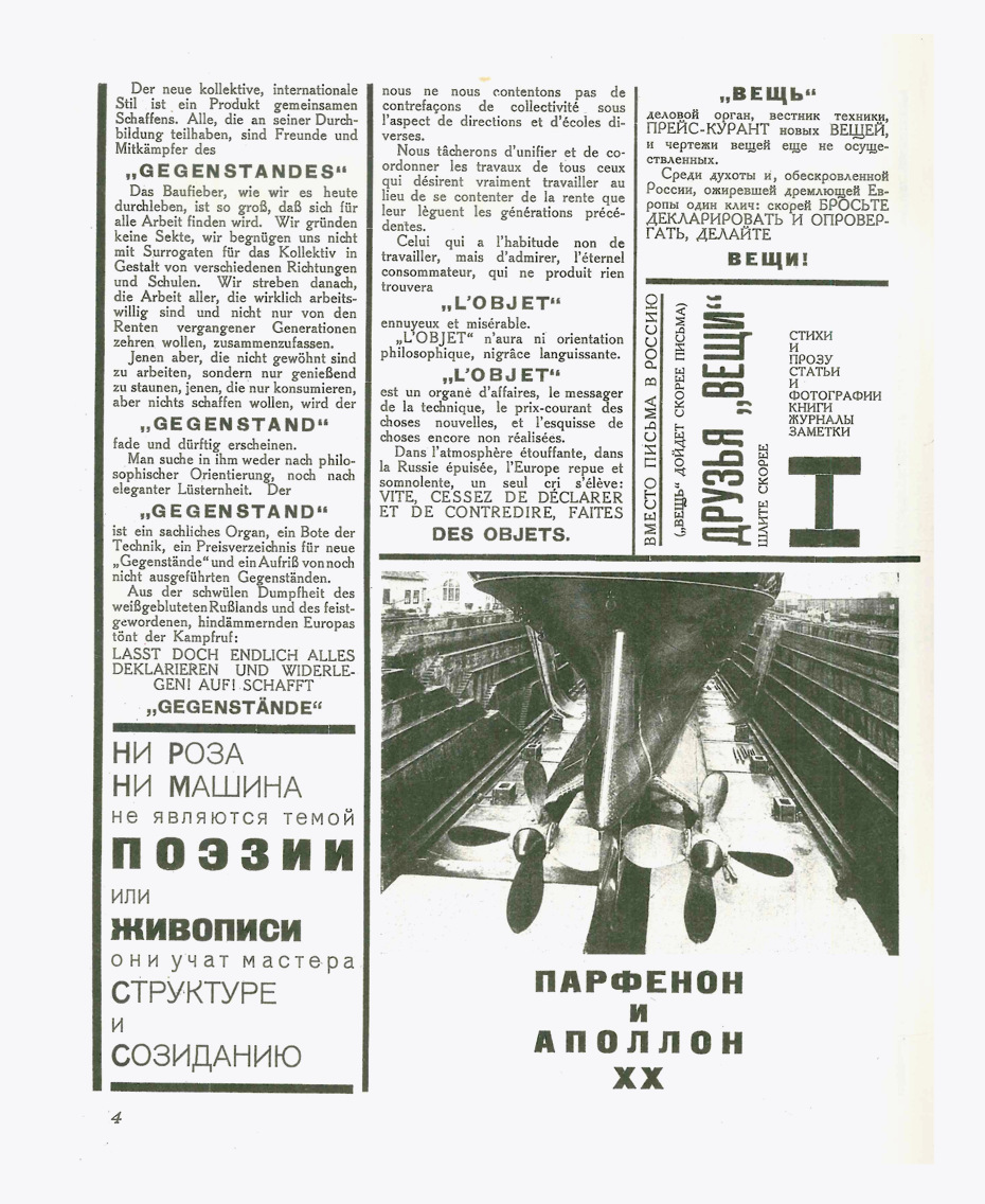
Moholy-Nagy was solely constructivist, and he came from the Hungarian group of artists and writers called MA (Today). He brought all the constructivist ideas and the ideas of El Lissitzky and Ilya Ehrenburg expressed in the magazine Вещь/Gegenstand/Objet. They maintained that they didn’t want to create art, but aspired to create “objects”. Art was no longer determined by creativity, rather all creative output would be judged on the basis of whether the result could qualify as an object. Even a painting or a sculpture would be called an object. If you look at the illustrations in Вещь, the prominent driving force is not the painting. The idea of constructivism was not to create singular works of art, but to bring the whole world into a certain visual rhythm and direct creativity towards the creation of objects. Everything is an object—nothing should be pure art.
In his first works at the Bauhaus, Moholy-Nagy was very rectangular, very strong, like in architectural construction where you have the vertical elements and the horizontal elements. His wife, Lucia Moholy, was a gifted photographer, documentarist and editor as well. Lucia Moholy, who came from Prague, had a decent level of language command and must have proofread all that László published. The main images of the Bauhaus building are photographs by Lucia Moholy, selected and authorised by Walter Gropius.
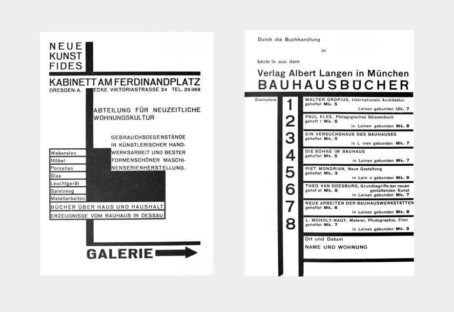
Print materials by László Moholy-Nagy (1895–1946). Left — An invitation from the gallery Fides, Dresden; red and black, DIN A6. Right — an order card; black on post cardboard, DIN A6•From the book bauhaus. drucksachen, typograpfie, reklame, Gerd Fleischmann; Edition Marzona, Düsseldorf, 1984
I think that both László and Lucia influenced each other and László in some way learned photography from Lucia. There was no photography department in the Bauhaus until 1929. But photography was an integral part of Moholy-Nagy’s work, and a new means of communication.
Moholy-Nagy’s activity influenced several aspects of the Bauhaus. The first is formal development—constructivist forms. The second is that he and Gropius published books and magazines, and started to spread their ideas to the world by means of printed materials. If you look at design schools today, not many have a publishing programme like the Bauhaus. They are limited to education. The staff may publish something from time to time, but there isn’t a programme.
II. Bauhaus Typography
Until the mid-1920s, the typography of the Bauhaus was extremely wild and had nothing in common with how we perceive it today. What can we consider to be the starting point of its typography?
At that time, advertisements, books and posters were either drawn by artists or simply set in the composing room. Jan Tschichold in some way invented the profession of the typographic designer in the early ’20s. For the first publication of the Büchergilde Gutenberg (the book club of the printers’ union for which Tschichold designed books), he was responsible for the Typographische Anordnung, which means how the type was to be set. This was the first step toward establishing the profession of the typographic designer that we know today.
Back then, the publishing houses were producing only standard publications in a kind of house style and everything else was designed externally, mostly by artists. The profession didn’t exist and the need for typographic design wasn’t realised—there was no idea that students could be trained in this field. The Bauhaus in Weimar didn’t have any facilities to set type, compose or print. There was no typography and no graphic design, as it was called later.
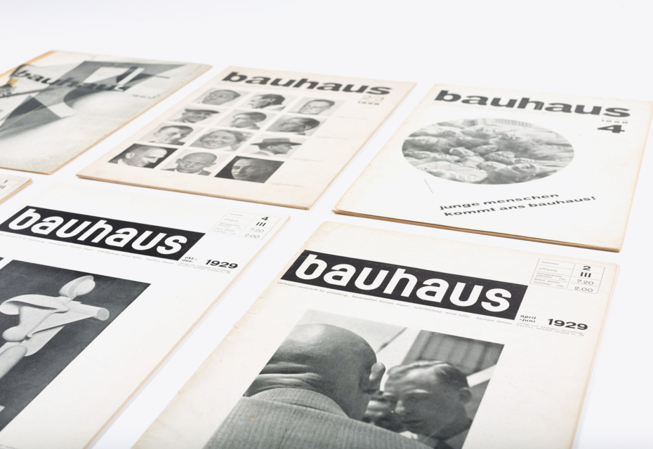
In Dessau, a printshop was installed in the basement of the new building (where the café is found today) headed by Herbert Bayer. The studio for graphic design was called Reklamewerkstatt and was also headed by Herbert Bayer. The printshop in Dessau even worked for people from outside the school. It could take in orders and deliver printed work and generateing income for the school. But the typographic style was not unique to the Bauhaus. In the booklet, junge menschen kommt ans bauhaus! (young men and women attend the bauhaus!) by Hannes Meyer, you can read about the typographic course, the course in the Reklamewerkstatt and even about the photography course. When Gropius, Bayer and Moholy-Nagy left, the idea of typographic design, photography, advertising and publishing was well established. Therefore, nobody discussed whether these were the subjects that students should learn about any more. Former student Joost Schmidt continued to teach Schrift (lettering), typography, Reklame (advertising or graphic design, as we call it today) and exhibition design.
Seeing as you mentioned Jan Tschichold… Nowadays it is somewhat overshadowed, but his »Elementare Typographie« (Elementary Typography) was mainly based on the ideas of the Bauhaus in general and on Lázsló Moholy-Nagy’s essay »Die Neue Typographie« in particular, isn’t it?
Before publishing his famous special issue, Elementare Typographie, of the printers’ union magazine, Typographische Mitteilungen, Tschichold thought that the Bauhaus was the precursor of all of these ideas. But when he was collecting material for this publication, he realised that the Bauhaus was not the only place where this kind of typography was cultivated and that Bauhaus had taken the ideas from the outside, for example from the Russians, the Dutch, the Polish, and the Futurists. The Bauhaus can be seen as a kind of melting pot for all these new ideas. There were many people who worked on this new approach towards typography. Therefore, Tschichold abandoned the title Bauhaus Typographie, which was his initial idea, and changed it to Elementare Typographie.
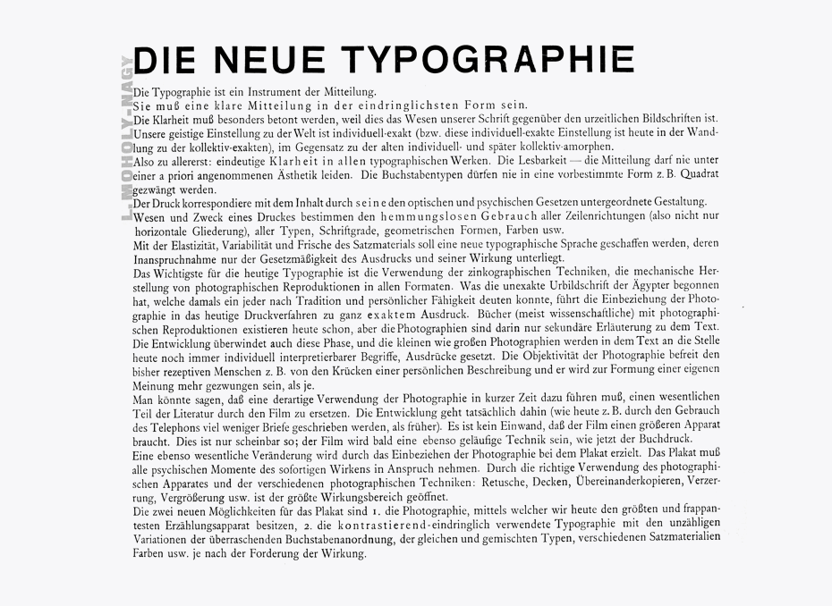
László Maholy-Nagy: The New Typography (Die Neue Typographie). A programmatic essay from the book Staatliches Bauhaus Weimar, 1919–1923 (1923), designed by László Maholy-Nagy. It is remarkable that only two of the four letters E’s in the title (see the word “NEUE”) come from one typeface. Moreover, the last “E” is compiled of four different parts, which is not surprising for hand-set compositions of that period•From the book bauhaus. drucksachen, typograpfie, reklame, Gerd Fleischmann, Edition Marzona, Düsseldorf, 1984
Elementary art was based on the usage of geometric elements and shapes. With them, you can build art, decorations or any type of illustration. These ideas spread all over Europe, and Tschichold was perfectly aware of everything that was happening. He corresponded with the leading lights in this field and collected whatever he could get. The term “Bauhaus typography” is inadequate in two ways: the Bauhaus never intended to create a style, and the Bauhaus was influenced from outside. Herbert Bayer, however, quickly understood that he should systematise and reduce the forms, developing a kind of style. He was, I think, for decades the most influential person for the new graphic design. Herbert Bayer was eager to do graphic design, even for the Nazis.
Could Tschichold have also taken his initial ideas from the manifesto of the journal Вещь/Gegenstand/Objet without mentioning the source?
I think this was a habit of the time, different from ours, when we’re always expected to reveal our sources. Artists and designers are especially afraid of having predecessors. They all want to be the first one. When Tschichold published Die neue Typographie 1928, he did not mention that Moholy-Nagy had coined this title in 1923.
It was still the time of individuals, of the genius; everyone wanted to be unique. Joost Schmidt probably never made the claim of being unique. There was no partner to cooperate with him. The same was true of Herbert Bayer and László Moholy-Nagy, to mention only three “typographers” at the Bauhaus. Gropius took credit for his architecture, though his office did a large part of the work. Even the design of the Bauhaus building in Dessau is not entirely his own work. Adolf Meyer was part of the Gropius office at that time and made important contributions to the architecture of the building.
The public wants the individual to be celebrated; the public doesn’t want to have a team. Even today if you look at the big shots in any business, especially in the entertainment industry, it’s always one person, never a team. I think it is basically human that we focus on the individual. Bauhaus consisted of individuals, even the students were individuals. Although some of them tried to set up teams, you mostly see individuals. I never heard of or read anything about team-based teaching in the Bauhaus. Every teacher taught on his own.
How did you come up with the idea for your book »bauhaus. drucksachen, typografie, reklame«? When did you start researching Bauhaus typography?
When I made the book, I had been working for years on typographic projects, but I had no real idea what Bauhaus typography was. When I got a box full of material, I realised there were so many different things that I had to create the threefold title bauhaus: printed matter, typography, advertising. I could clearly see that all the printed work in Weimar did not have a consistent style of typography. It was produced externally and only in details influenced by the Bauhaus.
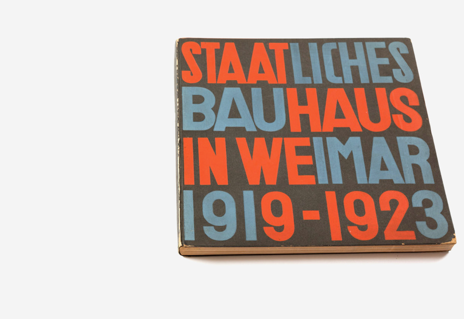
The titile page of the book that accompanied the Bauhaus exhibition in 1923 was designed by Herbert Bayer. It is very strange and in some ways does not make sense: nobody can really understand how the colour was assigned to the letters. The colouring does not assist reading. It’s a playful decoration which people liked—and still like. In the book designed by Moholy-Nagy, he could only control the title pages, the running heads and the folios (page numbers), but the typesetting and page layout were produced elsewhere in a printshop according to own rules.
The ephemera that was printed to accompany the exhibition was traditional, some was partly modernist when Oskar Schlemmer designed it, or constructivist if Moholy-Nagy stood behind it. The poster for the exhibition by Joost Schmidt (a student at that time) had a totally different look from everything that I have mentioned. It was done in freehand lithography, without any typographic style.
Typography as a subject for study, as well the awareness of type and printed matter, became relevant when Moholy-Nagy joined the Bauhaus in 1923. It became more and more visible under Herbert Bayer. When Herbert Bayer was appointed master and ran the printshop, his typographic style dominated. He designed the quarterly the journal bauhaus, invitation cards for Bauhaus parties, ads, etc., i.e. the general look of the Bauhaus.
Futura was marketed as the “Type of our time”. There is no doubt that it represented the zeitgeist, but it had nothing to do with the Bauhaus. If we were trying to replicate that period, we would probably choose other relevant typeface, e.g. Venus, Breite-Grotesk or Ideal-Grotesk, but they all look so old-fashioned and fail to represent the bold spirit of the school. Is that why you chose Futura to set your book?
If you publish historical texts, should you use a typeface of the time or can you use a typeface of our time? Given a book on baroque paintings, must it be in Bodoni or Garamond? Or can you use Futura, Meta or Helvetica? I think it depends on what you want to say. The use of Futura in the book had two reasons: the printer, Klaus Richter from Druckerei Heinrich Winterscheidt, Düsseldorf, likes Futura, and Futura, as you have said, is part of the zeitgeist. Paul Renner’s typeface fulfils that Bauhaus teachers and students wanted from type.
If you make a book on the Bauhaus today, it is your right to decide what to say through your choice of typeface. Look on the website of the Bauhaus 100 or Bauhaus Archive—they use typefaces that look quite modern and progressiv to us. If you are publishing something on baroque paintings and want to show not only your admiration for them, but also the awful smell in the streets that were home to the people of the time, you can make a kind of contrast and set it in DIN, for example. Why not?
III. Bauhaus Heritage Today
You have mentioned the Centenary of the Bauhaus that will be celebrated in 2019 and which the world is preparing for. There seems to be something of a Bauhaus triumphal march throughout the planet. What do you expect from this event?
Well, as an example: when people come to the Bauhaus Dessau today, they don’t experience the Bauhaus as they should. They don’t experience the approach or the philosophy. They go in, see an exhibition, then—after a relatively short visit—go to the shop, get souvenirs, go to the cafe, make their selfies with the signage and that’s it. There is nobody working in design in this place, and I think that’s the work that people should experience when celebrating the centenary.
I suppose that the brand Bauhaus will be more effective and they will sell more Bauhaus replicas. If you look at the Bauhaus Dessau or at the Bauhaus Archive Berlin, their souvenir shops are full. When I watched the Dessau shop for a while, I saw tremendous sales: people buy, buy and buy, not thinking about what they are doing—they are buying style.
I would suggest that if there is to be any commemoration for 100 years of Bauhaus, it should be a series of workshops where people try to solve certain problems in the spirit of the Bauhaus, as they understand it. Therefore, in my proposals for the centenary, workshops are the main aspect. The public wants to admire historical things, but a walk through IKEA would be just as revealing as looking at the old Bauhaus business, because you can see the Frosta stool there, for instance, which is a wonderful example of the Bauhaus idea. You can see a lot of bowls and glasses in the kitchen department of the shop that look like constructivist objects, according to the idea of elemental design.
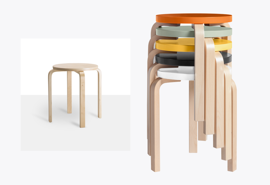
Frosta Stool. The stool can be stacked, so you can keep several on hand and store them in the same space that one occupies. © IKEA •Designer: Gillis Lundgren
If I were to hold a workshop on designing a chair, I would take the group through an IKEA showroom and discuss what’s Bauhaus or what could be Bauhaus there. Even the carpets in IKEA are wonderful pieces that could have come from the Bauhaus textile workshop. I wonder whether this link has crossed the mind of the customers and IKEA designers. There was some criticism—some leftist criticism—in Bauhaus times, saying that what the Bauhaus designed and produced was for the bourgeoisie who have money, and there was nothing for the working class.
When Hannes Meyer was the director of the Bauhaus, he wanted to change this, but he did not succeed within his two years. This is probably an idea the official committee wouldn’t enjoy, though IKEA sometimes sponsors Stiftung Bauhaus events. If something for this 100th birthday or centenary is ever organised, the local IKEA should be involved; there are so many things there that shout “Bauhaus”.
If you were asked about the most influential successors of Bauhaus ideas today, whom would you name?
Apple could be one, but this would already be a change from materiality to immateriality. For me, Apple is famous for their computers at the beginning of the change in the graphic industry, which occurred due to the user-friendly Macintosh.
I wonder what the Bauhaus people would say if you mention Greenpeace or Amnesty International. I wonder if these are concepts that are compatible with Bauhaus ideas. The problems that are related to Greenpeace or Amnesty International didn’t exist at that time. Well, environmental problems did exist, but people were not as aware of them as we are today. It would be a nice idea to think about Greenpeace and Bauhaus because Bauhaus wanted a new world and Greenpeace wants to change the world too, or the attitudes towards how we deal with the world.
Meanwhile, Bauhaus ideas have spread worldwide and are in some way common to our understanding of education. I learned this from an ex-student, whose daughter goes to school in Hamburg, where they have a curriculum with a minimum of “musts” and folders with a lot of new things that they are recommended to learn and study. The students organise their learning themselves. If their own learning seems more important to them tnah the official lessons that are offered, they are allowed not to attend class and continue their own learning. This reminds me a bit of the Bauhaus learning with many additional activities: Bauhausfeste, sports, theatre, music, photography, etc.
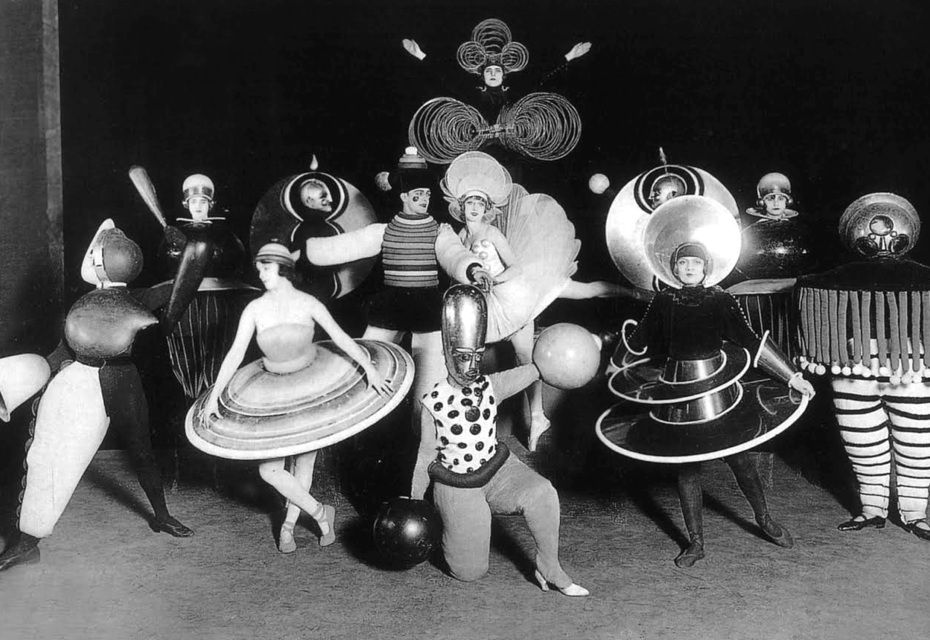
Costumes by Oskar Schlemmer for Ballet Tradique at the Metropol Theatre in Berlin. Photo by Ernst Schneider, 1926•Photo © PVDE / Bridgeman Images
In total there were only 150 students every semester at the Bauhaus. Each student knew everyone else. I think they felt like a family on an island within society, and they aimed to establish a new world.
Hermann Josef Abs (1901–1994) was a German banker. He was a member of the board of directors of Deutsche Bank from 1938 to 1945. After World War II he was chairman of Deutsche Bank, and contributed to the reconstruction of the German economy. Wikipedia
Mazdaznan is a neo-Zoroastrian religion which held that the Earth should be restored to a garden where humanity can cooperate and converse with God. Founded at the end of the 19th century by Otoman Zar-Adusht Ha’nish, the religion was a revival of 6th century Mazdakism. Adherents maintained vegetarian diets and practiced breathing exercises. — Wikipedia
