Script
and its graphic language
 he title of this essay was suggested by Oleg Matsuev’s thoughts about the far from simple situation in which Cyrillic finds itself today. Does Cyrillic have its own unique graphic language? What is it? Where is it to be found? And why is there so much doubt that it even exists?
Starting point
To begin to untangle this knot, however, we must start with another question: to what script do we look in our search for a graphic idea of a typeface? A glance at the selection of typefaces in Cyrillic Type Travel Book Commented shows that, while only 23 of the 50 Cyrillics here were worked out as supplements to a Latin face, the forms and rhythms of at least two-thirds are conditioned by Latin script.
Do we really know what Cyrillic is and how to work with it? If we were to ask people about Cyrillic, someone not involved in graphic design might remember it as lettering seen in church. And what about those letters we use for text messages? Civil Type, someone with some knowledge of the history of type might answer, but that is just one of the many forms of Cyrillic. What kind of letters did we use in school? That was cursive, and that is also Cyrillic. The diversity of Cyrillic is impressive, considering the number of languages it works for and the variety of styles and forms developed with it over the centuries. To name just a few : fluid and expressive Skoropis, solemn, liturgical book styles, woven ornamental headlines, intricate Art Nouveau letterforms, the brutal geometric letters of the revolution, the skillful titling by Soviet book artists, and the great diversity of today’s calligraphic experiments.
Despite the variety of options, the look of Cyrillic today is being formed neither by experiment nor by critical rethinking of the past, but rather by a supposedly “ universal recipe ” : find a Latin typeface, then copy and paste the key letters that define the rhythm and identity of the typeface from Latin to Cyrillic (А, В, Е, К, М, Н, О, Р, С, Т, Х ; а, е, о, р, с, у, х). The other letters are then designed according to generally accepted rules, considering what is appropriate to a given style and after testing different constructions when options are possible. This is not to deny the complexity of this work or the skill needed for it.
But however masterfully localization is done, we cannot get rid of the feeling of imitation, the sense that creative energy has been trapped in the arms of the Cyrillic К. With optical compensations and wide experience, we can make European clothes fit Cyrillic letters quite well. But we seem almost to have forgotten that there is a different way of working : with Cyrillic forms and the rhythms native to them. And yet, among the many projects in the world of Cyrillic, someone sometimes does dare to follow an untrodden path. These cases are worth looking at attentively.
Basileus
Working on her Type & Media graduation project in 2005, Vera Evstafieva decided to take as her starting point not one script but three. The common practice is to take a historical style belonging to one script and to invent the forms for other scripts as if they existed. Vera combined three different sources — pre-Petrine Cyrillic, Latin, and Greek — in an unexpected way : similar rhythms were her foundation, despite their origin in different ages and cultures. This project is meaningful because the three scripts contributed equally to the identity of the typeface, and a new path emerged far from the main road.
Gamos
Yulia Baranova began work on Gamos in 2015 and started with calligraphic experiments. She carried over to Cyrillic the forms of Greek inscriptions. Triangular letters and the characteristic joints of the horizontal and vertical strokes are essential to the rhythm of the typeface. These forms are abundant in Cyrillic but rare in Latin. An attempt to build Latin from elements found in Cyrillic and Greek failed : Beauty and Beast here suddenly exchanged roles. Latin looked strange and was difficult to work with. The solution was obvious — return to writing and the search for the rhythms natural to Latin instead of looking at Cyrillic.

Sample setting in three scripts. Typeface: Gamos by Yulia Baranova (2019).
Soyuz Grotesk and Tekhnicheskaya Estetika
In 1962 the first issue of Tekhnicheskaya Estetika was published. The logo and typography were inspired by constructed sans serifs popular in the West. Italic forms looked quite natural in “the first Cyrillic version of Helvetica,” as we can call this logo. Cyrillic here is not a million miles away from Latin — it is built of the same arches, which are easy to write and create a strong rhythmic bond.
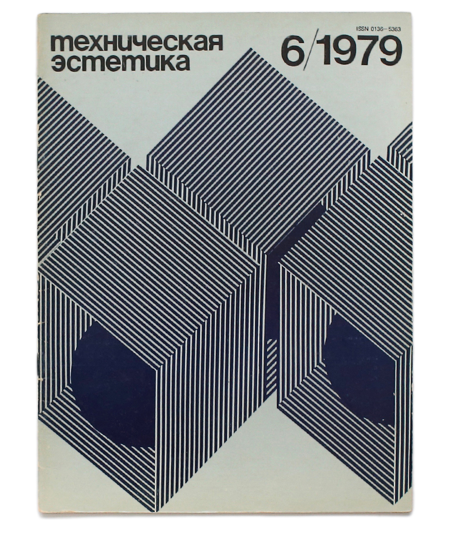
Cover of the Technicheskaya Estetika magazine, 1979•Designer Valery Chernievsky•Photo by Sergey Petrov.
In 2017 Roman Gornitsky used the same principle in his typeface, Soyuz Grotesk, and went even further : rhythmic unity allowed him to push Latin toward Cyrillic, making its rhythm more complex by adding unusual forms, removing some ascenders, and transforming everything into unicase.

This clearly unconventional design, interestingly, has found a firm place in contemporary typography and has slightly shifted our notion of what is possible in Cyrillic, not as to what is allowed or forbidden but of the available arsenal of graphic ideas.
Alverata
A definite rhythmic system developed in Latin over the centuries — a precise balance of circle, triangle, and square. Everything is related. Cyrillic, on the contrary, consists of many complex and sometimes contradictory forms, and the rhythm they make is difficult to control.
Gerard Unger in his forays into the history of Romanesque inscriptions found Latin to be no less complex. Having come to this understanding, he formulated a conceptual foundation for creating nonviolent unity among different scripts.

Romanesque inscriptions are the subject of Gerard Unger’s doctoral dissertation. He found that similar letterforms were used throughout Europe from West to East, even in Cyrillic. Maybe this is why the Romanesque style became a good foundation for a multiscript typeface.•Photo by Gerard Unger

The selection of letterform variations: a comment in Unger’s dissertation explains that it was not possible to collect all the variations and that it is unlikely that even those who were making the inscriptions in the 11th or 12th centuries ever had a complete set in their hands. Letters influenced by insular forms, rounded and squarish, curly and uncial-style forms, unexpected ligatures and classical roman capitals — this unique medley constantly varied —from one assignment to another, when skills were passed from master to student, or simply according to the personal preferences of craftsman or client. Nevertheless, every form was assimilated according to the balance of proportions, size and scale of the details, how they fit in the overall rhythm and added to the lively diversity peculiar to the complex organism that is Romanesque style.•Italic forms in Cyrillic are consistent enough to imagine (if one would want to) a system similar to the European modernist vision of an alphabet. But the regular alphabet in Cyrillic is not that simple — there are forms of different origin wound into it: letters coming from Greek and borrowed from Latin, a not quite deliberate mixture of upper- and lowercase, rare influences of pre-Petrine writing styles, not as a consolidating principle but as another element that adds even more complexity to the whole system. This might be the key to understanding Unger’s idea of Cyrillic as a composite alphabet.•The illustration from doctoral dissertation Alverata: contemporary European letters with medieval roots by Gerard Unger, Leiden University, 2013.
This idea of a “composite alphabet” is a unique gift for us, full of possibilities that we are yet to discover. Indeed, Cyrillic letters can be easily divided into several groups, each with its own logic. There is no need to hide this difference. It can be used openly as a design principle.
“ The moment I got control of the medieval forms and realised how they worked, I had a look at the Cyrillic and I thought : this is the same thing, just another composite alphabet like the Romanesque letterforms. Great fun! Some letters which are round in Latin are angular in Cyrillic, and you have a reversed ‘ R ’ in Cyrillic — medieval stone carvers mirrored letterforms quite regularly. The moment I started looking at Cyrillic with medieval eyes, I could design it.”

The idea of pure form and typographical pragmatism were Gerard Unger’s guiding principles in designing Alverata. He divided the variations found in Romanesque style into clear categories but then allowed them to mix freely.
Greta Sans Cyrillic and Greta Arabic
Greta Sans is a system with a wide range of widths and weights. Work on it was going on in the international community of the Hague, where Kristyan Sarkis was working on Greta Arabic.

Sample set of Greta Sans and Greta Arabic families.
Frequent discussions of the challenges and discoveries gave an opportunity to see Cyrillic through the eyes of a person from a different culture in the framework of one typeface. The graphics found in Latin were translated into two different languages. And through this work the difference became obvious : Kristyan could freely consult and interpret historical manuscripts, using them as his foundation. In Cyrillic, on the contrary, the only available foundation was the constraining rules developed in the difficult 1990s, though the Cyrillic tradition of handwriting is no less interesting and rich than Arabic. Why was the same step to the manuscripts not possible?
Dominanta
The question is not as simple as it might seem, but the answer can help us understand what is happening with Cyrillic today. Looking at the present situation without bias, one can notice a slip of attention, some familiar mechanism at work. In order to become unbiased enough, let’s take the idea of the Russian physiologist Alexey Ukhtomsky :
Dominanta, or the main center of nervous system excitation, uses other weaker processes to intensify itself. The closer to the dominanta, the more difficult it gets not to play by its rules. This principle is foundational for any human activity.
Where are the frontiers of dominanta in Cyrillic type design? Let’s have a look at the relations of Arabic and Cyrillic scripts in the fields of culture and typography. Where do we have similar hot spots and where do our roads diverge?
If one wanted to experiment freely with Cyrillic forms and rhythms, one would have to question commonly accepted practices and dare to think differently. Kristyan Sarkis faced a similar challenge when he designed Greta Arabic. His choice was to use late, “fluid,” book styles as his foundation — and this made all the difference.
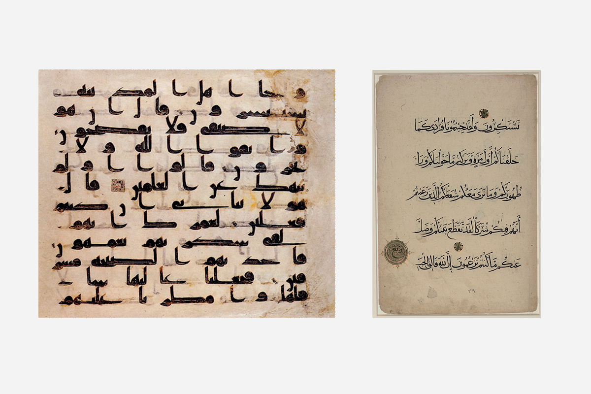
In essence, there are two different groups of writing styles in Arabic. The “solid” group emerged first and was used for sacred texts as well as in temple architecture. These styles are recognizable by straight horizontal parts and solid baselines. Modular geometric Kufic used for mosaics belongs to this group.•The second group is “fluid.” These styles emerged later and were used exclusively for text. The horizontal parts have rounded, flowing forms, and instead of sitting on a solid horizontal baseline, the words flow down the slopes formed by the letter combinations.•On the left Samarkand Kufic Quran, 8th century. On the right Qur’anic manuscript written in Muhaqqaq script in 14–15th century.
The most common and popular solution at the time was to go “the easy way” and use one of the early, “solid” styes, and even further — to dress this simplified construction with the native-to-Latin kind of contrast. In this case, the identity of the script was lost completely — Cyrillic is not the only script being dressed in Western clothes.
Nevertheless, Kristyan designed the typeface with the native-to-Arabic contrast distribution, extending it further in the narrow, wide and black styles.
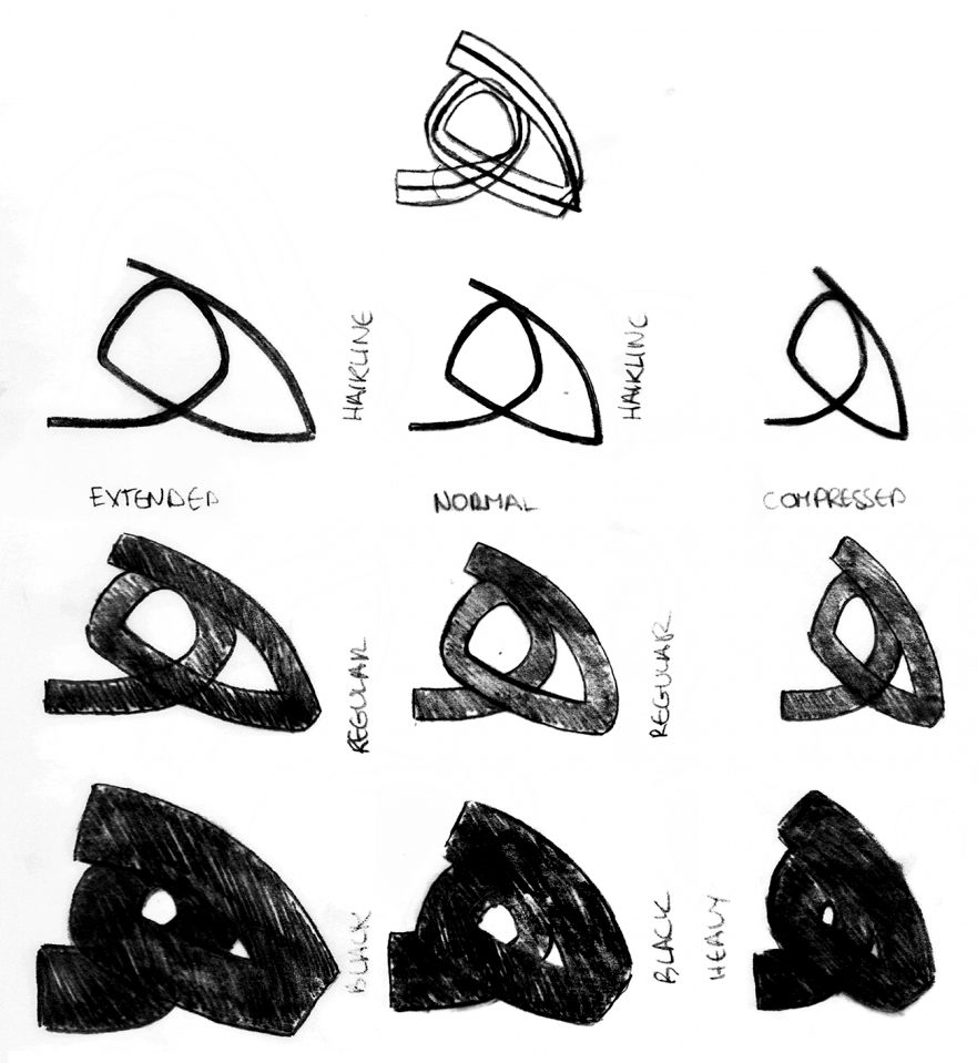
Plan of the type family Greta Arabic
Before, such transformations had been applied only to the typefaces based on geometric styles used in architecture. Working on Greta Arabic, Kristyan did not slip into the old groove, despite the discomfort and doubts that accompany any step into unknown.
A few years later, Kristyan Sarkis and Lara Kaptan formulated their stand in this manifesto :
What we ask for may sound obvious and it is. Understanding the script then moving to type is nowhere near innovative. In Arabic however — contrary to popular belief — this bridge has not yet been made. Throughout the 500 years of existence of Arabic type, we have seen a gradual regression of aesthetics, heavy westernisation of our characters, Latin-based mechanisation and a great loss of the formal and technical competence that was present in the script.
We can replace the word “Arabic” with “Cyrillic” and come to similar conclusions.
Arabic has one strong advantage over Cyrillic : independence from Latin. Not a single element can be copied.
“ The characters of the Arabic and Latin scripts are difficult to compare because they differ in almost every aspect : pen angles, stroke directions, line thicknesses, speed contrasts and variations.”

With increasing of weight Arabic grows in height.
Perhaps it was exactly this topological difference that allowed Kristyan to freely compose his own melody in type design instead of dancing to sb’s tune. Perhaps closeness to the dominanta is exactly what stops us from reaching the treasures that our culture has in store.
But we cannot simply discard well-established practices — they exist in the body of Cyrillic and act regardless of our will. But, keeping them in sight, we can try to walk softly sideways and break new ground for an alternative dominanta. In the end, every existing situation changes, and it is possible consciously to ascend to a new plateau, not fighting the old but walking closer to the margins. And in order not to slip to the center or fall from the edge, we need a strong guiding thread — the thread that connects writing and typography since the olden days. Let us have a look at how William Morris found this thread in late 19th century England, when this connection was concealed in darkness and how Dutch type designers took it over at the end of the 20th century.
Relations of Calligraphy and Typography
In 1888, the first exhibition of the Arts and Crafts movement opened in London. New technologies — electricity and photography — created new possibilities, and Emery Walker was giving a lecture with a magic lantern, showing enlarged fragments from incunabula and Italian manuscripts of the 15th century. People had never seen type and calligraphy in such close detail before. When Arrighi’s writing appeared on the screen, the audience burst into applause. Besides the evident formal connection between type and calligraphy (such as the contrast distribution influenced by the broad-nib pen), his point was that a common creative energy gives birth to both calligraphic and typographic forms.
The same evening, on their way home, William Morris and Emery Walker decided to start Kemelscott Press. But the English school of calligraphy, so well known today, did not exist yet. Edward Johnston was 16, and it would be 10 years before he arrived at the Central School of Arts and Crafts with his amateurish manuscripts. There William Lethaby, one of William Morris’s associates, welcomed the young man and envisioned him as the one who would revive calligraphy. After a whole year of studying and copying manuscripts at the British Museum, in the autumn 1899, Johnston started to teach and, together with his students, recreated the nearly lost craft of writing with a broad-nib pen. In 1899 he described his method in the book, Writing & Illuminating, & Lettering. This book became the lodestar for Gerrit Noordzij and greatly influenced his practice, his theory of writing and the type design program at the Royal Academy of Arts in the Hague. The broad-nib minuscule that students from all over the world practice nowadays at Type & Media originates in Johnston’s foundational hand. Through Johnston, it goes back to a 10th century psalter, which he reworked, rethought, and placed in a contemporary context.
Here we need to pay attention to the fact that in Latin there is no fundamental difference in letter construction between 10th and 14th century manuscripts and contemporary typefaces. A text written with a broad-nib pen can be quite straightforwardly transformed into a typeface, and looking at some serif types we can see their derivation in handwriting. A broad-nib pen (quill) was used for writing in Europe as well as in Russia for a long time, so the forms of both scripts — Latin and Cyrillic — were developed by hand movements, influenced by human anatomy and guided by visual perception.
In Cyrillic, on the contrary, between contemporary forms and the ages of handwriting stands Peter the Great’s reform. Attempts to write the letters used today for reading (forms that derive from Civil Type) with a broad-nib pen hurt both eyes and hands, while going back to pre-Petrine letterforms makes writing flow easily and fluently, like a clear stream in a forest. Nevertheless, those native forms look a lot stranger and more archaic to us than roman capitals or Renaissance manuscripts.
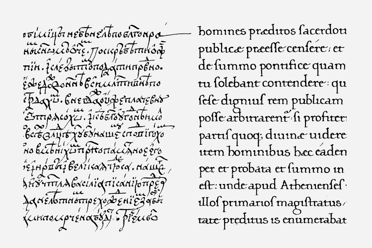
At left is an example of Russian cursive (Slovo Vasiliia Velikogo, 1556), and at right a Humanist minuscule (De incomprehensibili Dei Natura Beati Johannis Chrysostomi, 1458). Almost all the constructions of the minuscule are used in typography to this day. The cursive is very distinctive and has a rhythm rich in the variety of interconnections, but the idea of setting a modern book with these forms still seems remote.
Cyrillic and writing today
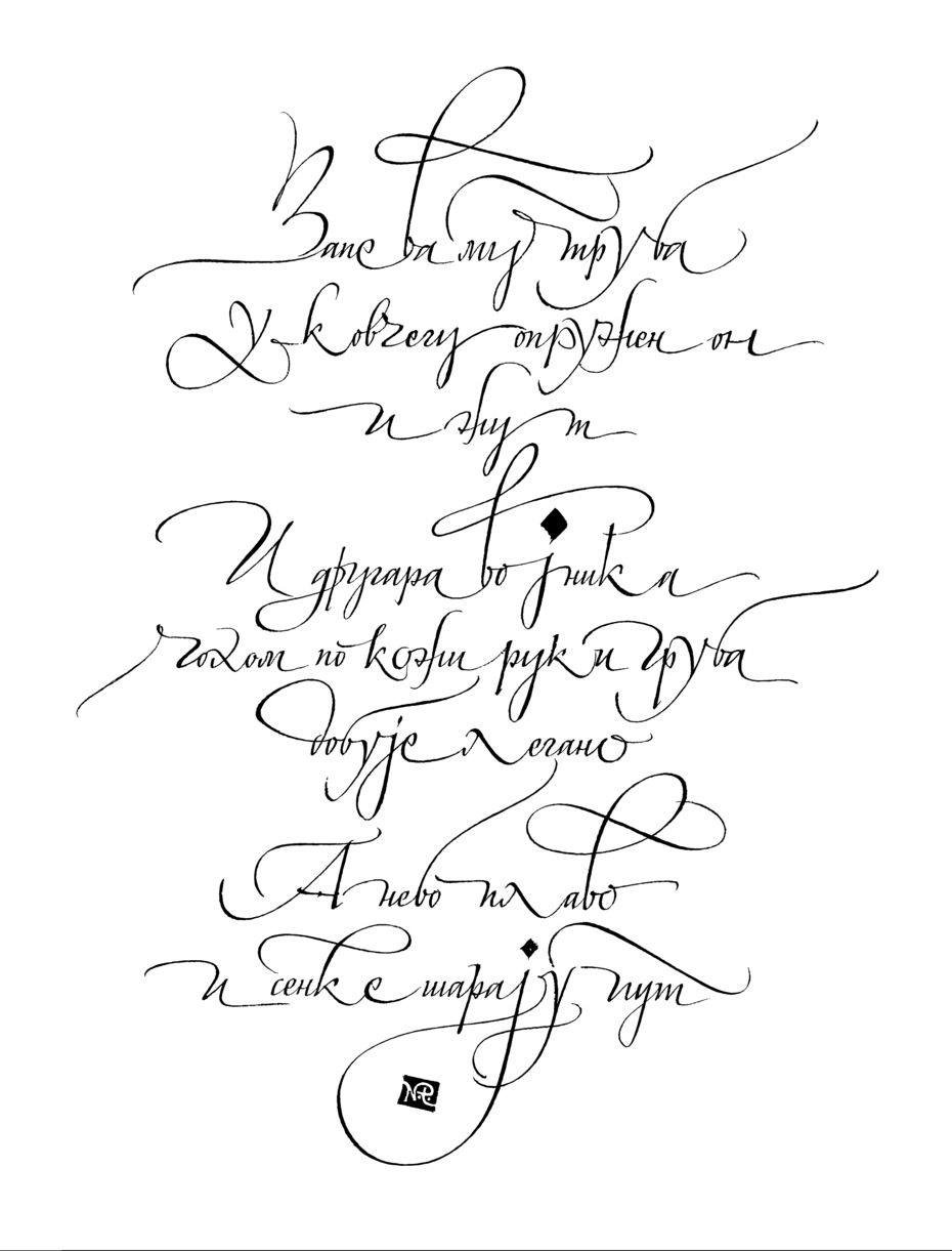
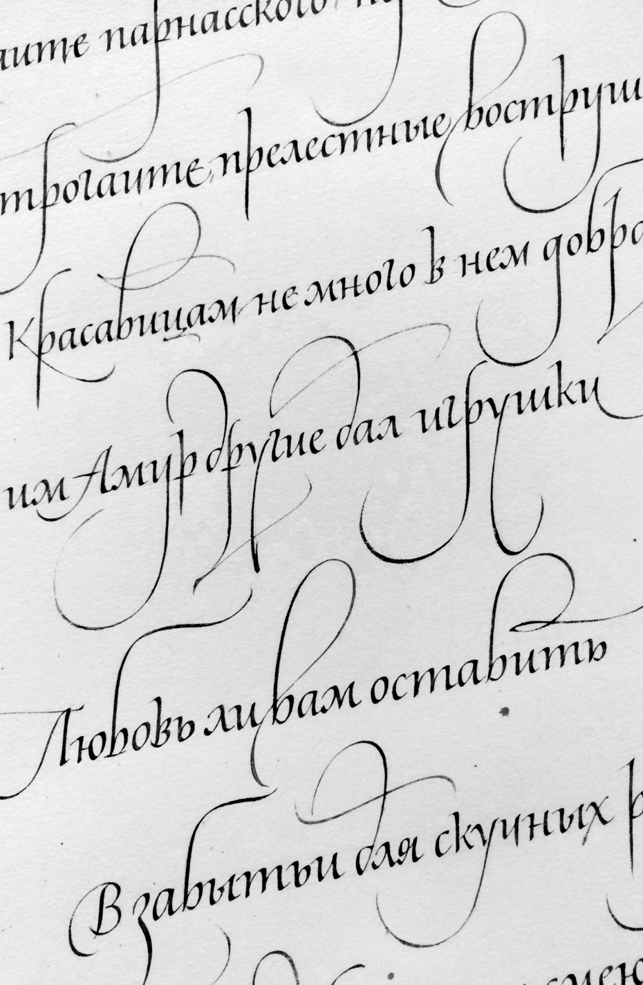
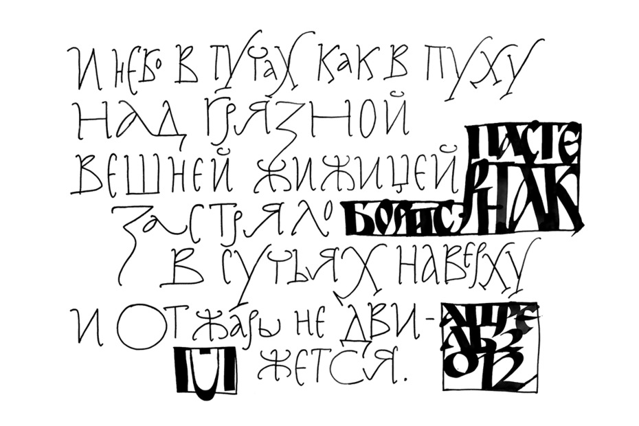
Nowadays, there is no need to wait for a messiah who would revive calligraphy in Russia. Over the last 10–12 years a bright and lively school of calligraphy has grown and flourished, indeed there are an infinite variety of schools, groups, courses, and enthusiasts of different levels and practicing with different aspirations. There are three islands in this primeval ocean that are important for type design : italic at Eugeny Dobrovinskiy’s school, studies and revivals of pre-Petrine writing styles by the calligraphers from Saint Petersburg, Moscow, and Nizhniy Novgorod, and the connection between writing and type design being explored at Aleksandr Tarbeev’s workshop.
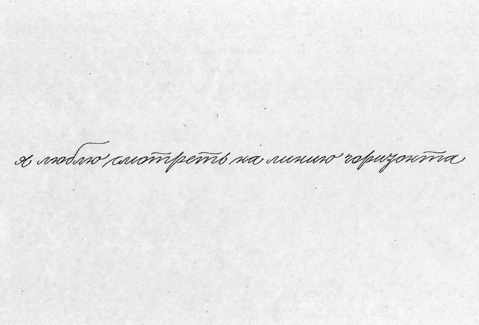
Anastasia Levina, pointed nib, Cyrillic Spenserian, 2013.
Italic at Eugeny Dobrovinskiy’s school
In Cyrillic, italic forms have always stood in the shadows and been considered inferior to the regular forms. Nevertheless, they have one strong advantage — they are easy to write and they create a natural rhythm. Those forms were studied, interpreted, and polished in writing over 12 years — just think of that number! The question of whether italic forms can be used instead of regular has been explored by many type designers. In fact, they are used for secondary roles in Russia, but Bulgarian experience proves that they can play the main role as well.
Russian writing
The exhibition “Russian Writing” and all that led up to it constitute another interesting event, on a par with, although much quieter than, Johnston’s rediscovery of the medieval traditions.
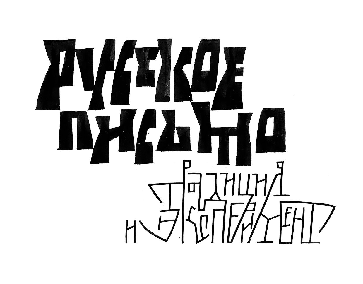
Egor Golovyrin, exhibition logo, 2017.
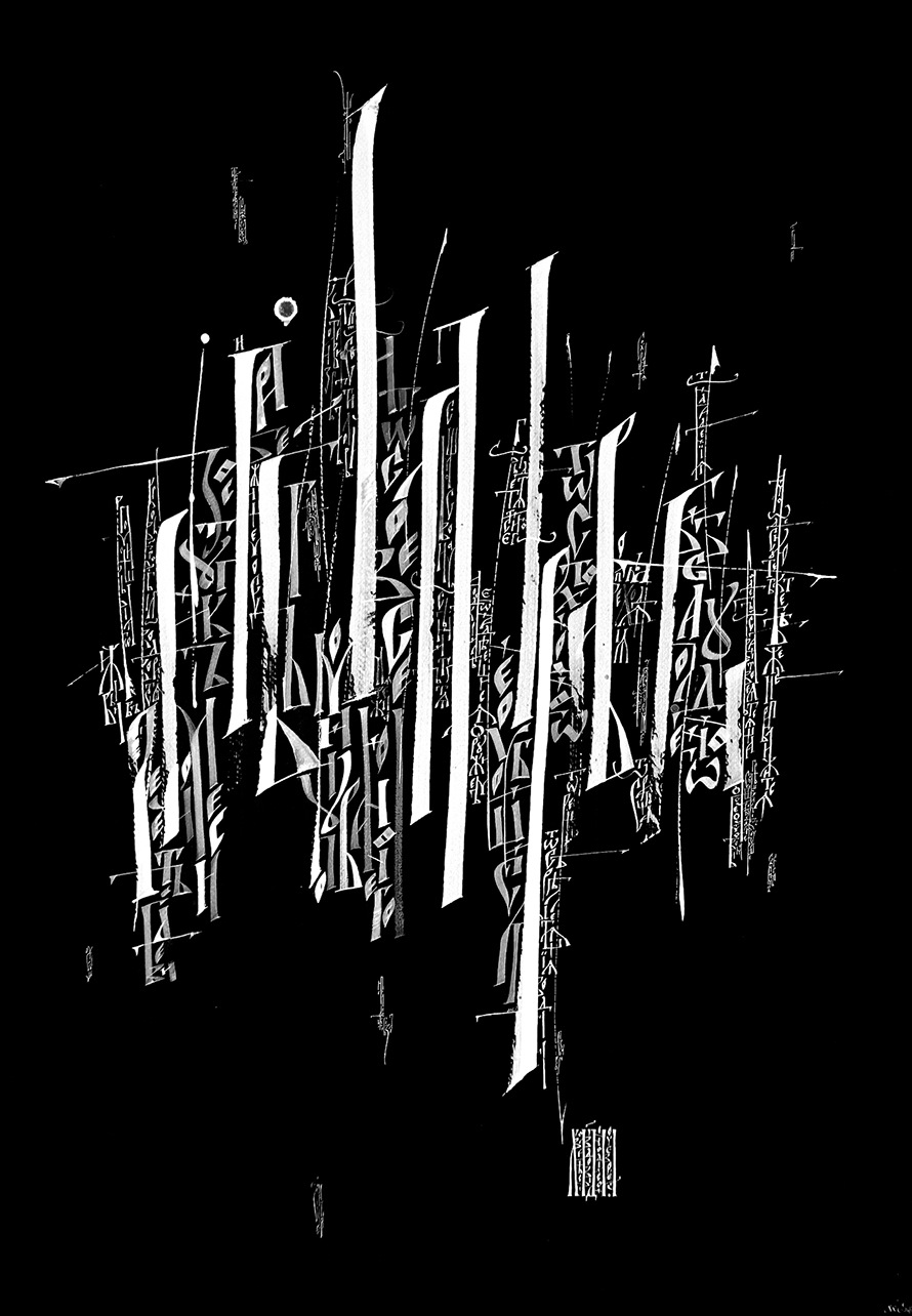
A small group of calligrapher-enthusiasts succeeded in reviving pre-Petrine writing styles, with all their native forms and rhythms, for use in contemporary contexts. It is often true that such forms carry with them trains of sometimes inappropriate associations. So it is wise to heed the advice of Brody Neuenschwander and entirely rethink how things have been done historically — altering contrast, using different tools and materials, changing scale, subject matter, intended audience, and every conceivable parameter. The poster for the exhibition and Egor Golovyrin’s page are fine examples of pre-Petrine forms liberated and made contemporary, no longer clerical and archaic.
Pre-Petrine forms and typography
Despite the multitude of interesting calligraphic experiments, logotypes, typefaces, and compositions using pre-Petrine Cyrillic, in which traditional Russian writing has been rethought both precisely and sensitively, almost nothing that is daring and contemporary has been produced. The first swallow of this sort, however, was Oleg Matsuev’s typeface, Epiphany, published in 2005, with cursive forms of low contrast.
In 2018 Marina Marjina created her Novgorod typeface. The letters, inspired by the small windows of the vast white-stone cathedrals of Novgorod, look, on close appraisal, like avant-garde compositions. But the spirit of the original image is maintained. For all their freedom, Marina’s graphics are very true to their source.
In terms of methodology, the typeface is based on the compound writing whose formal principle was discovered and described a year ago by Oleg Matsuev and Maria Skopina. Their discovery gives us a new instrument for using a calligraphic stroke for the design of new shapes. Such a bridge between handwriting and typeface design opens up an as yet unexplored space for experiments. And this means more than freedom with respect to form creation. It is also a way of working, of writing, that is organic to our own traditions of writing. The fact that such discoveries are possible shows how little we as yet know of Cyrillic overall.
If we are to forgo ready-to-use recipes and start experimenting, what can we rely on or be guided by? “The word formation is dominated by rhythm,”•Gerrit Noordzij wrote on the metal tablets for his students in the mid-1960s. These were recently found and published in the book, Gerrit’s Early Models (The Hague, 2013).
The first swallow from Alexander Tarbeev’s workshop traveled all the way to the Royal Academy of Arts in the Hague. It triggered the birth of a movement among Russian type designers, who now regularly travel to study in Holland. This, of course, has strongly affected what we may now call the Cyrillic space in type design.
Literally, the name of the magazine translates as “Technical aesthetic,” with the term standing for design as an industry.
From Arabic script to Type: A Manifesto by Lara Captan, and Kristyan Sarkis
The Influences of Greta Text Arabic, Kristyan Sarkis.
The first exhibition took place in 2017, but the processes that led to it go back more than a decade. Historical scripts were carefully studied, analyzed, and taught. Whole new generations of calligraphers came into being.
From Arabic script to Type: A Manifesto by Lara Captan, and Kristyan Sarkis
The Influences of Greta Text Arabic by Kristyan Sarkis.
The first exhibition took place in 2017, but the processes that led to it go back more than a decade. Historical scripts were carefully studied, analyzed, and taught. Whole new generations of calligraphers came into being.
https://typejournal.ru/articles/on-two-calligraphy-styles
Literally, the name of the magazine translates as “Technical aesthetic,” with the term standing for design as an industry.


