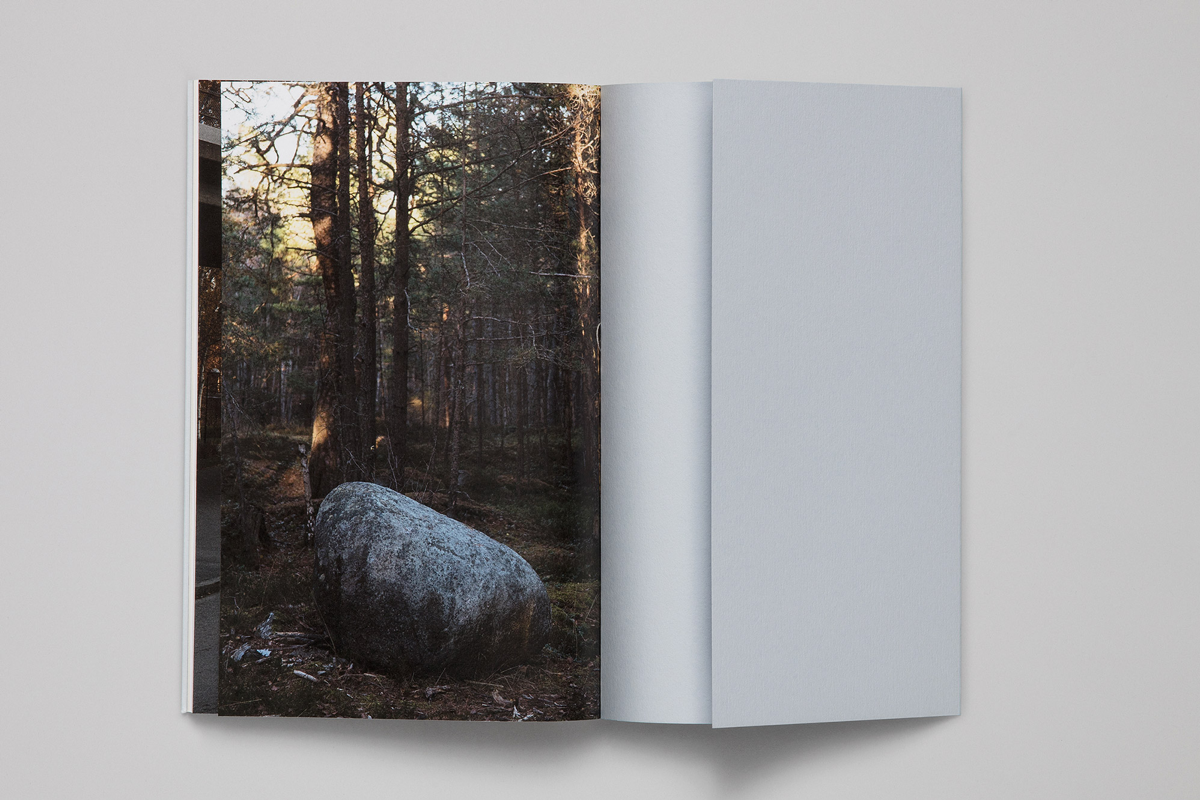
 eople are not perfect, why should typefaces be? — wonders Göran Söderström, a founder of the type foundry with the name that speaks for itself — Letters from Sweden. Göran has no professional education in type design but worked in various design and advertising agencies since he was 18 years old. He also considered a career as a musical producer and one can easily see how this side of life is influencing and enriching his experience in type design. Letters from Sweden primarily focuses on creating something new (and not just in the shapes of letters, they were one of the first foundries whose website was powered by live web fonts) and as a result their letters are loved all over the world from Berlin to Hawaii.
How did it all start? How did you decide to open your own foundry?
The first typeface I published was at a type foundry in San Francisco, Psy/Ops, about ten years ago. Then I also published some typefaces through Veer in the United States and shortly after started working with Fountain, the only Swedish type foundry at that time. Unfortunately, its founder Peter Bruhn has passed away, but I worked with him for a couple of years and published five typefaces there. After this, I thought about starting my own shop, just to see how that would go.
When you start a new foundry, it’s very hard to get customers to find you, so I also distributed my typefaces through MyFonts and FontFont in the beginning. Most of the income came from MyFonts at that time. As time passed, I designed more typefaces and after a couple of years I noticed that there were more purchases made from the Letters from Sweden shop than from MyFonts. And when someone bought a typeface from my own shop, I would get 100% of the income. I think it’s fair that a distributor takes a percentage of the income, but when your own business starts to grow, it’s better to focus solely on that. Eventually I stopped selling typefaces through external distributors.
Before starting up Letters from Sweden, I worked at a Swedish design agency that made custom typefaces now and then. One of the projects I worked on there was a typeface for postage stamps, one of the commissions I brought to that company. After a couple of years working there, I decided that it would be smarter for me to start my own company, since most of the time clients contacted me personally anyway. Today there are two sides to my career in type — retail and custom typefaces.
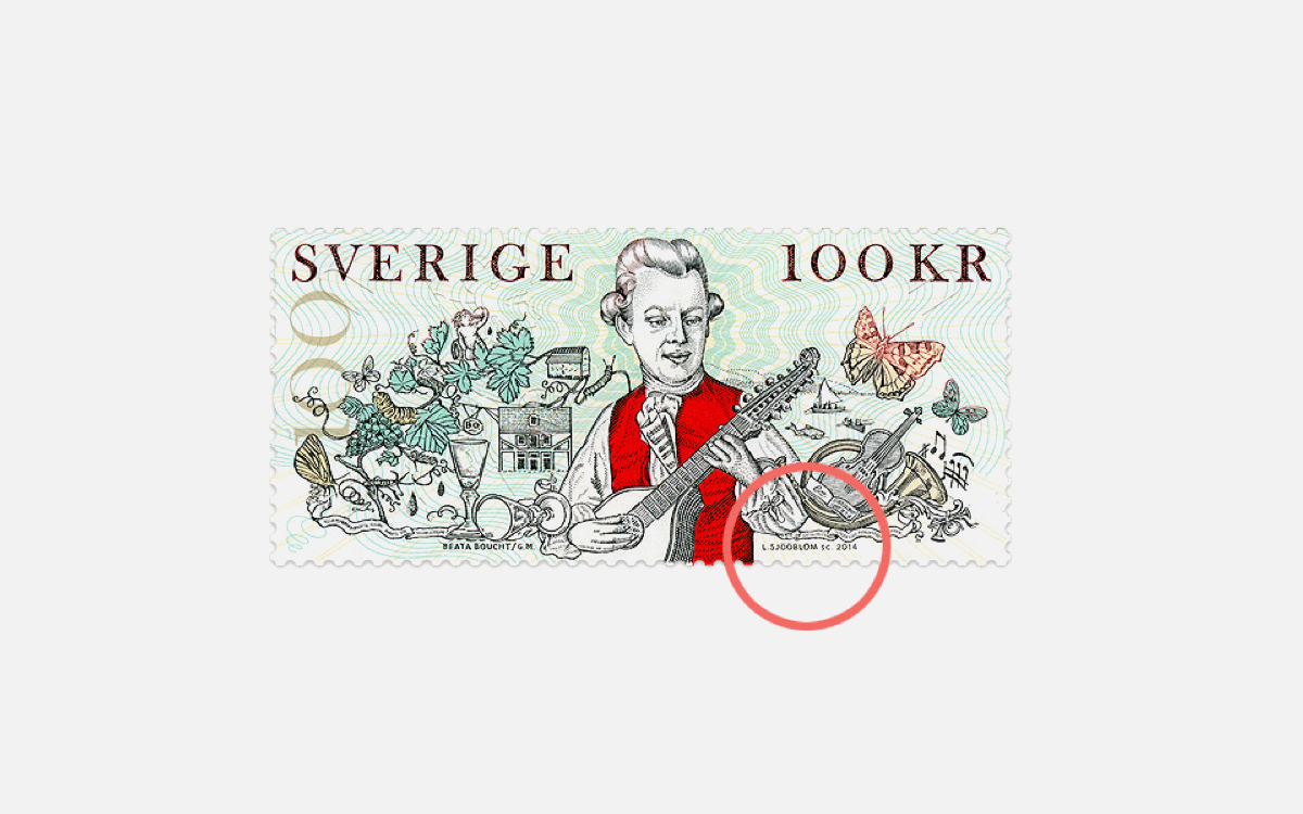
Typeface for Posten Frimärken, Swedish Postal Service’s stamp bureau. Göran was asked by Gustav Mårtensson to create a typeface that would work at a point size barely readable to a human eye. Göran Söderström writes: “It visually simulates how it could look if it was engraved by hand — all stroke terminals have the pointed shape of an engraver’s tool, or burin. This has very little effect on the final result due to the extremely small point size, it’s more of a tribute to the art of engraving. During the development it was tested in offset printing and engravings that were done by none other than esteemed Lars Sjööblom.”•Images courtesy Göran Söderström and Gustav Mårtensson
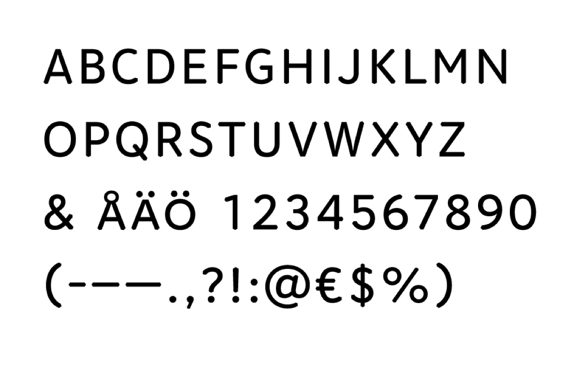
Typeface for Posten Frimärken, Swedish Postal Service’s stamp bureau. Göran was asked by Gustav Mårtensson to create a typeface that would work at a point size barely readable to a human eye. Göran Söderström writes: “It visually simulates how it could look if it was engraved by hand — all stroke terminals have the pointed shape of an engraver’s tool, or burin. This has very little effect on the final result due to the extremely small point size, it’s more of a tribute to the art of engraving. During the development it was tested in offset printing and engravings that were done by none other than esteemed Lars Sjööblom.”•Images courtesy Göran Söderström and Gustav Mårtensson
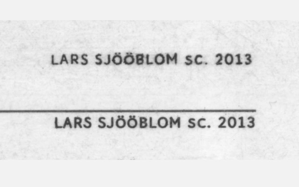
Typeface for Posten Frimärken, Swedish Postal Service’s stamp bureau. Göran was asked by Gustav Mårtensson to create a typeface that would work at a point size barely readable to a human eye. Göran Söderström writes: “It visually simulates how it could look if it was engraved by hand — all stroke terminals have the pointed shape of an engraver’s tool, or burin. This has very little effect on the final result due to the extremely small point size, it’s more of a tribute to the art of engraving. During the development it was tested in offset printing and engravings that were done by none other than esteemed Lars Sjööblom.”•Images courtesy Göran Söderström and Gustav Mårtensson
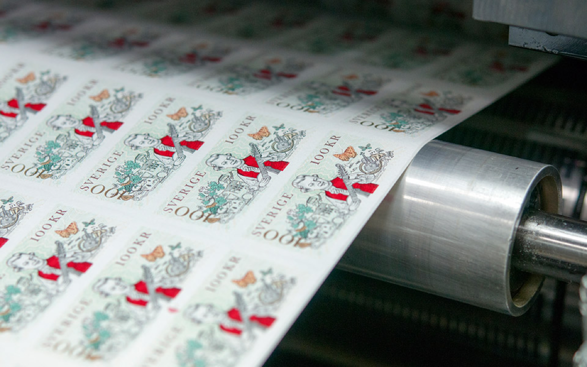
Typeface for Posten Frimärken, Swedish Postal Service’s stamp bureau. Göran was asked by Gustav Mårtensson to create a typeface that would work at a point size barely readable to a human eye. Göran Söderström writes: “It visually simulates how it could look if it was engraved by hand — all stroke terminals have the pointed shape of an engraver’s tool, or burin. This has very little effect on the final result due to the extremely small point size, it’s more of a tribute to the art of engraving. During the development it was tested in offset printing and engravings that were done by none other than esteemed Lars Sjööblom.”•Images courtesy Göran Söderström and Gustav Mårtensson
Do you still work on a lot of custom projects?
Yes, quite a lot actually. Maybe even more than on retail fonts. There has really been a boom in the last couple of years — I think more and more companies have started to realise the value of owning their own fonts. If you are a really large company it can even be cheaper to hire a small foundry like ours to create a great custom typeface. There are still large companies that pay huge amounts of money every year just for using classic standard typefaces. For me, that is a strange investment when you can have something unique for cheaper. When we do custom work, we often collaborate with design agencies, as the majority of commissions come to us through them. The goal is to create something unique that they and their client will use for branding. Sometimes we also get requests to create something very similar to a popular font, but we always turn those enquiries down. Unless we can change the client’s idea into something else, as we don’t want to do that kind of work.
I’ve seen only one custom slab serif that you did — all of the others are sans serifs. Why do you think this is the case?
We’ve done quite a lot of typefaces in other genres that we do not show on the website for various reasons. Sometimes the typeface has not been launched yet and sometimes we have signed an NDA. But in general, I think that sans serifs are very Scandinavian — it seems to be the most popular type of fonts around. Sans serifs are very functional and a lot of clients like to have something geometric and clean. Scandinavians quite often like simplicity, so sans serifs go very well with the design language we have here. I think at least that most of the commissions we get from Sweden are sans serifs. But I did a slab serif for Tele2 and I am currently designing a custom serif typeface, so maybe things are changing.
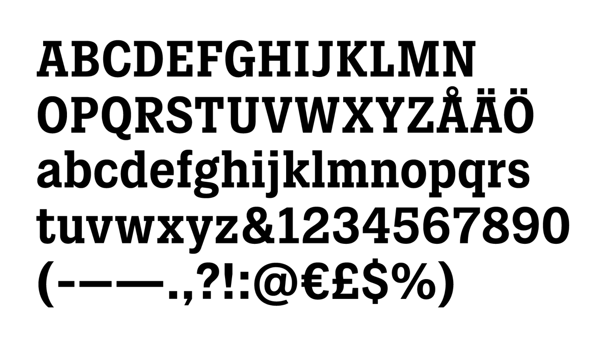
Slab Serif for Tele2 was designed by Göran Söderström in collaboration with Kurppa Hosk. There’re three styles in the typeface — Heavy weight with lowered diacritics for tight headlines, Bold style for sub-headings and short preambles and Regular style that is optimized for body copy, both in print and on screens.•Images courtesy Göran Söderström and Kurppa Hosk

Slab Serif for Tele2 was designed by Göran Söderström in collaboration with Kurppa Hosk. There’re three styles in the typeface — Heavy weight with lowered diacritics for tight headlines, Bold style for sub-headings and short preambles and Regular style that is optimized for body copy, both in print and on screens.•Images courtesy Göran Söderström and Kurppa Hosk
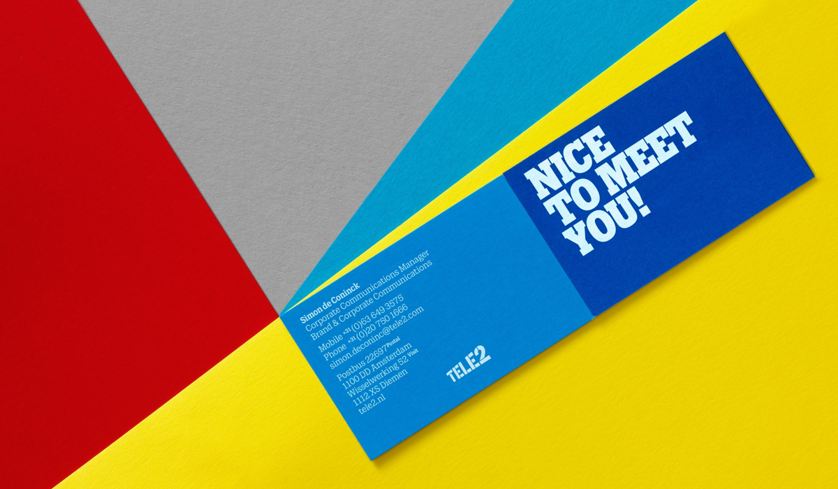
Slab Serif for Tele2 was designed by Göran Söderström in collaboration with Kurppa Hosk. There’re three styles in the typeface — Heavy weight with lowered diacritics for tight headlines, Bold style for sub-headings and short preambles and Regular style that is optimized for body copy, both in print and on screens.•Images courtesy Göran Söderström and Kurppa Hosk
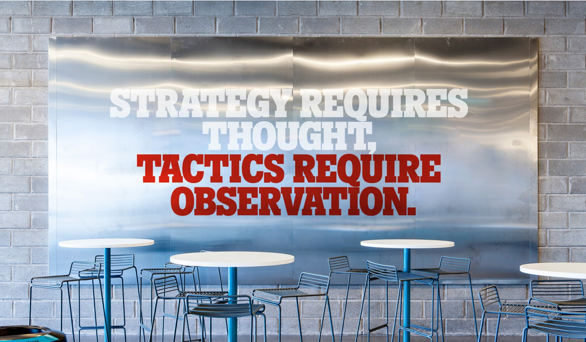
Slab Serif for Tele2 was designed by Göran Söderström in collaboration with Kurppa Hosk. There’re three styles in the typeface — Heavy weight with lowered diacritics for tight headlines, Bold style for sub-headings and short preambles and Regular style that is optimized for body copy, both in print and on screens.•Images courtesy Göran Söderström and Kurppa Hosk
However, I think it’s quite challenging to create something interesting within the sans serif genre. You can still make it different from all the others if you try hard — it’s like a three chord song, the possibilities are endless. Typefaces are very sensitive to small changes and subtle things can create completely different vibes.
Do you think that the companies that ask you for the typefaces can actually notice those nuances?
Yes, I do. We work very closely with our clients. My experience with custom projects is that once you start talking to people about letters and start showing them different ways of designing them, everybody gets really interested in learning more about the details. Everybody has a relationship with letters from when we learn to write in childhood. And when the head of a company starts to realise that she or he can actually influence the letters, it awakens the child in them. It’s often quite fun to do custom projects and most of the time I think people really like to participate and appreciate the small differences.
Small differences can make a large impact. If you want the seriousness and functionality that comes with a classic sans serif, either grotesk or geometric, you cannot draw it too differently. If you make it too playful, it’s harder to use, but if you have a sans serif as a base, you automatically get some seriousness. Companies that commission typefaces often want something very functional with a unique voice. If you try to solve that problem, you need to stay on the serious side of the spectrum.
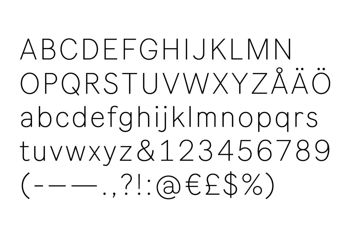
VSCO Gothic for VSCO, an art and technology company. Inspiration for VSCO Gothic was found in American type from the turn of the 20th century, including the less commonly seen eccentricities of ATF Franklin Gothic (1903), Inland Gothic No. 8 (1898) and Gothic No. 545 (1887)•Images courtesy VSCO
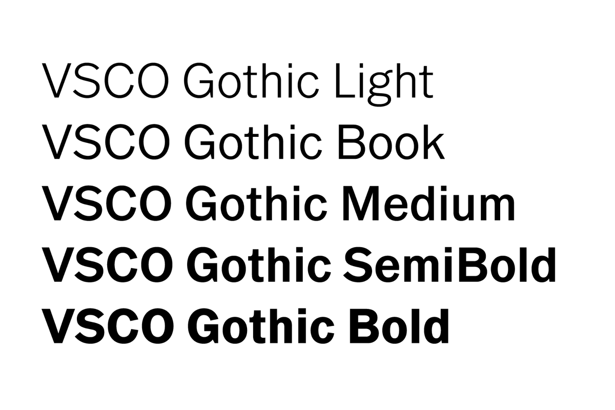
VSCO Gothic for VSCO, an art and technology company. Inspiration for VSCO Gothic was found in American type from the turn of the 20th century, including the less commonly seen eccentricities of ATF Franklin Gothic (1903), Inland Gothic No. 8 (1898) and Gothic No. 545 (1887)•Images courtesy VSCO
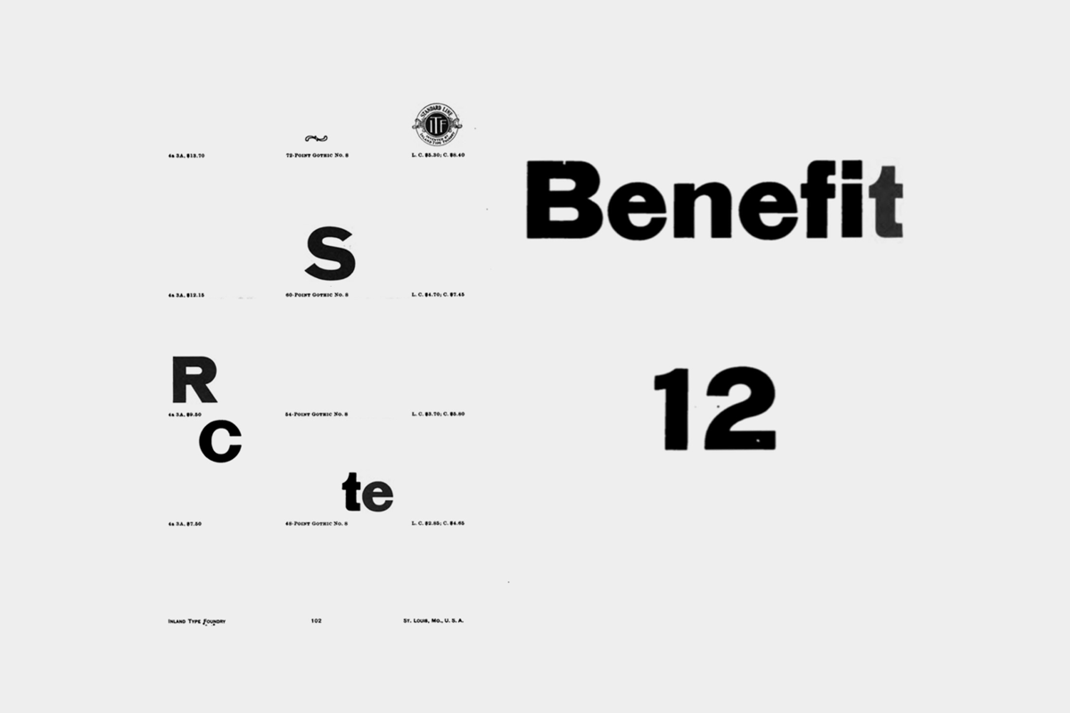
VSCO Gothic for VSCO, an art and technology company. Inspiration for VSCO Gothic was found in American type from the turn of the 20th century, including the less commonly seen eccentricities of ATF Franklin Gothic (1903), Inland Gothic No. 8 (1898) and Gothic No. 545 (1887)•Images courtesy VSCO
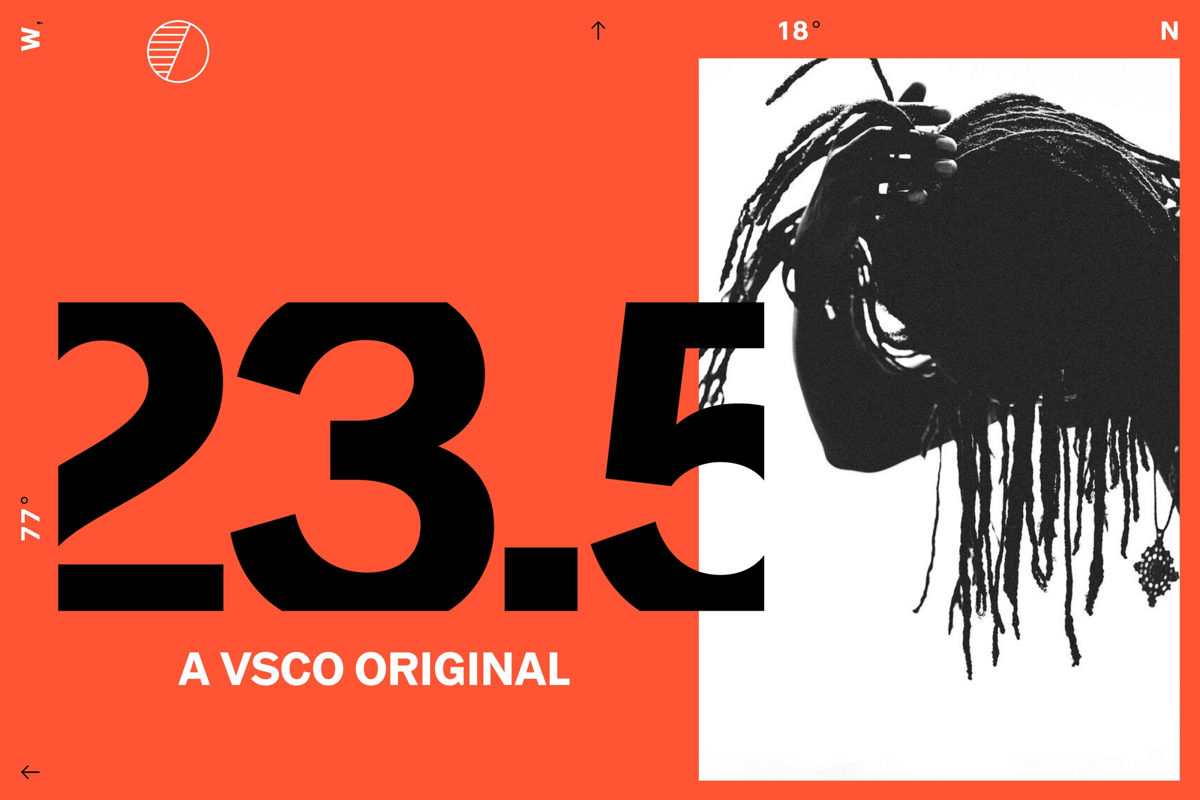
VSCO Gothic for VSCO, an art and technology company. Inspiration for VSCO Gothic was found in American type from the turn of the 20th century, including the less commonly seen eccentricities of ATF Franklin Gothic (1903), Inland Gothic No. 8 (1898) and Gothic No. 545 (1887)•Images courtesy VSCO
Ableton Sans was developed for use in Ableton’s physical and digital interfaces. Ableton Sans embodies the movement of “turning the knob” by spiraling round strokes outwards. Art direction by A Color Bright.•Images courtesy Göran Söderström and Ableton

Ableton Sans was developed for use in Ableton’s physical and digital interfaces. Ableton Sans embodies the movement of “turning the knob” by spiraling round strokes outwards. Art direction by A Color Bright.•Images courtesy Göran Söderström and Ableton
Ableton Sans was developed for use in Ableton’s physical and digital interfaces. Ableton Sans embodies the movement of “turning the knob” by spiraling round strokes outwards. Art direction by A Color Bright.•Images courtesy Göran Söderström and Ableton

Ableton Sans was developed for use in Ableton’s physical and digital interfaces. Ableton Sans embodies the movement of “turning the knob” by spiraling round strokes outwards. Art direction by A Color Bright.•Images courtesy Göran Söderström and Ableton
Do you think that serif typefaces are more playful or they have a tendency to be that way?
I wasn’t comparing serif typefaces with sans serif typefaces. For example, let’s compare Kabel with Futura — they are the same kind of geometric sans serifs, but they are on opposite sides of the spectrum. And I think that aesthetically Scandinavians are closer to Futura than Kabel, which might be a little bit too cheesy for us. Futura is more neutral while Kabel wants to play. It communicates the message but it also says, “Hey, look at my e, I’m a little bit funny.” When I try to do something quirky, I want to do it in a different, more subtle way. For instance, the Tele2 slab is actually a bit quirky, a bit weird, but still on the serious side. It’s always hard to describe type, but for me it’s all about how the typeface feels, how it presents the message. You can also describe it as personality — Kabel and Futura just have different personalities.
For the record, I must also say that I have at least twenty typefaces that I needed to take off the market, because when I just started designing type, I did a lot of experiments. But I think through the years I started to create more and more neutral works. The last typeface I make will probably be super classic. I haven’t touched that area yet — you know, doing my own take on Helvetica. Maybe I will do that someday, just to have done it, even though I think that there are far too many of those already available on the market.
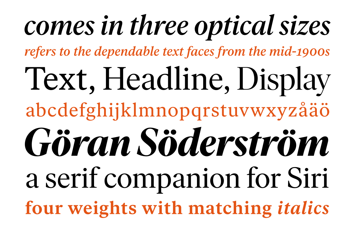
Ivar is strongly influenced by the grace and sturdy construction of Times. It’s not a revival but the typeface stands on the shoulders of giants: the design refers to the dependable text faces from the mid-1900s, which in turn were rooted in classic designs from the 16th and 17th century. Ivar comes in three optical sizes. Each sub-family consists of four weights with matching italics, for a total of 24 fonts.
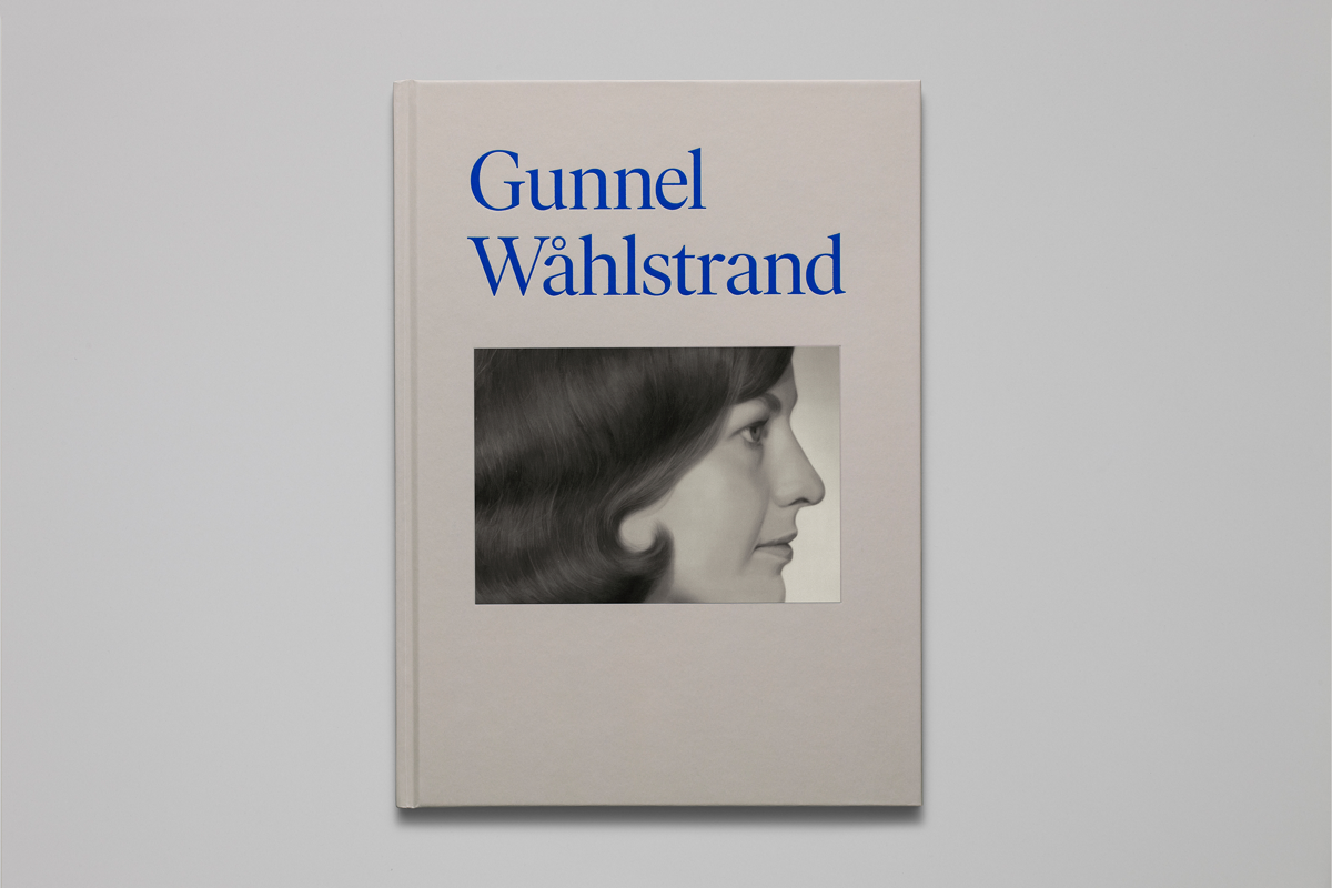
In the spring of 2017, Magasin III Museum for Contemporary Art presented an extensive exhibition by Swedish artist Gunnel Wåhlstrand. Malmsten Hellberg has designed a book for the exhibition that was set in Ivar.•Images courtesy Malmsten Hellberg
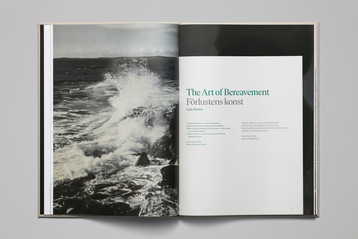
In the spring of 2017, Magasin III Museum for Contemporary Art presented an extensive exhibition by Swedish artist Gunnel Wåhlstrand. Malmsten Hellberg has designed a book for the exhibition that was set in Ivar.•Images courtesy Malmsten Hellberg

In the spring of 2017, Magasin III Museum for Contemporary Art presented an extensive exhibition by Swedish artist Gunnel Wåhlstrand. Malmsten Hellberg has designed a book for the exhibition that was set in Ivar.•Images courtesy Malmsten Hellberg
Ivar, the last typeface you released, is actually a serif one, the first in your collection. How did that project go?
It was fun! It differed from creating a sans serif, but it’s still the same way of thinking. If this letter looks like this, then that letter should look like that — the same kind of consistent thinking applies. Maybe it was even a little bit easier than I thought it would be. I had so much respect for people who designed great serif typefaces, most likely because I haven’t done so many myself and was thinking that it may be harder. But it turned out to be just different. I mean, a typeface is a typeface in the end.
I think there is more work with the details and maybe more production work, because if you change a serif there, you have to change it everywhere. In a clean sans serif you can not get away with any sloppiness in the curves and details, but it’s easier to do that with a serif typeface because there are already so many things going on anyway. If you want a sans serif to look perfect, everything should be pretty much perfect. But in a serif you can actually have more variations. I think there even should be more variations — the length of the serifs can be different to balance things up, the contrast can change direction a little bit. Since serif typefaces naturally have these movements in contrast and more complex details, it’s also easier to get away with small flaws or errors. Maybe you don’t even see them as errors, they simply become features instead. That is harder in a sans serif, as every small detail stands out more. That’s my experience at least.
Since I finished Ivar, I became more interested in doing serif faces, so I have a few more coming up. The next one is from a completely different world than Ivar, which was based on Times and its predecessors. The one I’m currently working on fetches inspiration from the turn of the 20th century.
Capitaine is a chunky slab serif based on the Adtype Series, as found on pages 572 to 575 in the American Specimen Book of Type Styles (American Type Founders, 1912)•Images courtesy Göran Söderström
Capitaine is a chunky slab serif based on the Adtype Series, as found on pages 572 to 575 in the American Specimen Book of Type Styles (American Type Founders, 1912)•Images courtesy Göran Söderström
Capitaine is a chunky slab serif based on the Adtype Series, as found on pages 572 to 575 in the American Specimen Book of Type Styles (American Type Founders, 1912)•Images courtesy Göran Söderström
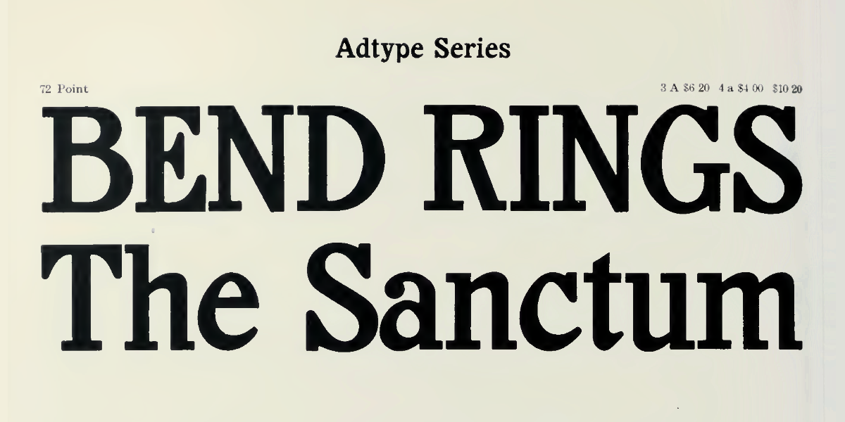
Adtype Series•From American specimen book of type styles : complete catalogue of printing machinery and printing supplies, 1912
Adtype Series•From American specimen book of type styles : complete catalogue of printing machinery and printing supplies, 1912
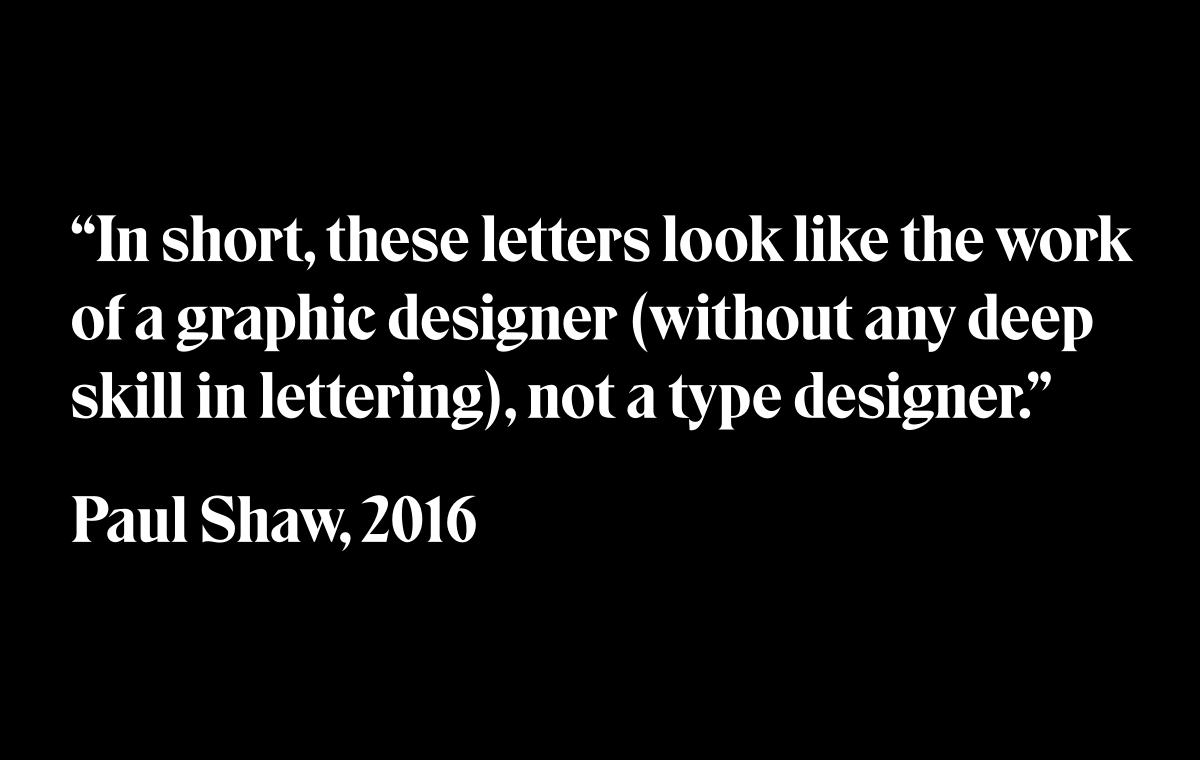
Talking about your collection, have you seen the review of Eksell Display by Paul Shaw? What do you think about it?
I think it’s quite entertaining because he completely misunderstood the whole project. It seems Paul Shaw was under the belief that I did a “revival” of the Olle Eksell typeface, as if we had picked up some old typeface and tried to do a modern version of it. But that was not the case. We loved the typeface exactly as Olle did it and simply wanted to make a digital version of it, perhaps a slightly better version, but with 100% of the characteristics intact. Eksell Display is one of our bestsellers, so it’s obvious that people appreciate it.
I can understand his [Paul Shaw’s] concerns from a traditional perspective, because if you look at Olle Eksell’s typeface, there are a lot of weird things going on. But these weird things are actually the features, not the flaws. Paul Shaw didn’t understand that — he wanted to lobotomise the typeface so it would fit his own way of thinking. The result would be just another typeface instead of something highly unique based on Olle’s fantastic imagination and playfulness. I think we simply come from different worlds. Paul is from the academic world and his references probably lie mostly within traditional typefaces, while our references are nothing — only Olle Eksell’s impressive way of drawing and a general curiousness for different aesthetics. When I read the review today, I think something similar could happen if a classical music theorist tried to review the latest album by Kendrick Lamar.
But you didn’t do it exactly like Olle Eksell’s drawings — you made four styles out of one.
Yes, first I just digitised the letters, but then I changed some proportions as I thought that the uppercase letters were a bit too wide and the lowercase too narrow, so I harmonised them a bit. And Olle’s version had less contrast than I was feeling the typeface could have so I added more contrast, and after that I think something great happened. It was like “Wow!” The Large and Medium styles, which have more contrast than Olle’s original letters, are the ones that actually show the typeface’s best side in my opinion. Because in those ones you actually see Olle’s pen movements even better. The stencil version is just an exploration of what happens if the contrast is so high that it opens up the letters.
I have started sketching the Cyrillic version of Eksell Display and it’s absolutely crazy. I’m really looking forward to the Russian review on that, if it ever gets published.
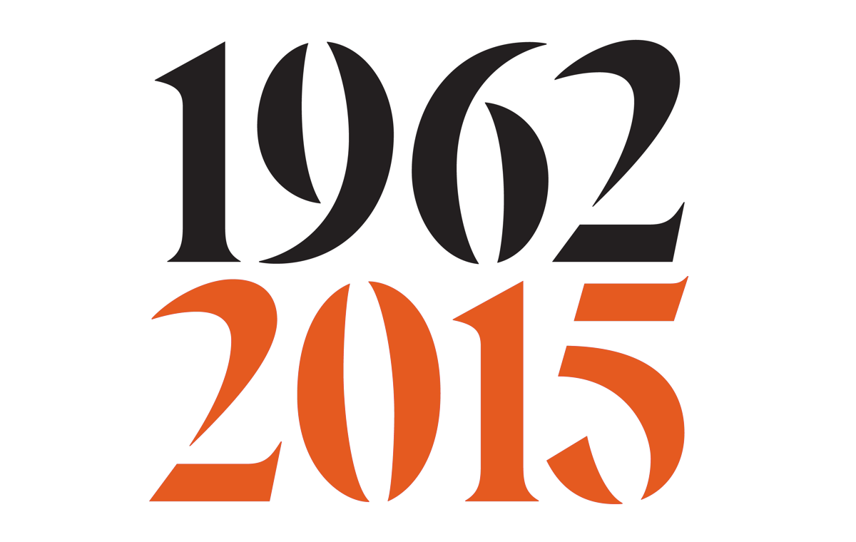
Eksell Display is a unique typeface from 1962, designed by the legendary swedish designer Olle Eksell (1918–2007), in 2015 Göran Söderström created a digital version of the typeface•Images courtesy Göran Söderström

Eksell Display is a unique typeface from 1962, designed by the legendary swedish designer Olle Eksell (1918–2007), in 2015 Göran Söderström created a digital version of the typeface•Images courtesy Göran Söderström
Eksell Display is a unique typeface from 1962, designed by the legendary swedish designer Olle Eksell (1918–2007), in 2015 Göran Söderström created a digital version of the typeface•Images courtesy Göran Söderström
Eksell Display is a unique typeface from 1962, designed by the legendary swedish designer Olle Eksell (1918–2007), in 2015 Göran Söderström created a digital version of the typeface•Images courtesy Göran Söderström

First drafts of Cyrillic letters for Eksell Display by Göran Söderström. There was no Cyrillic in Olle Eksell’s original drawings•Images courtesy Göran Söderström
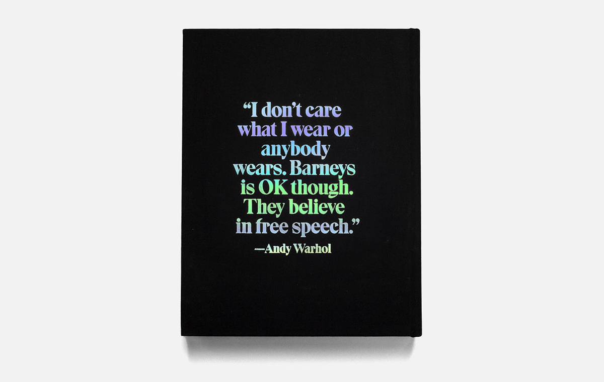
Barneys Book, designed by Sagmeister & Walsh, Area of Practice, Kevin Brainaird and Cybele Grandjean •Images courtesy Sagmeister & Walsh

Barneys Book, designed by Sagmeister & Walsh, Area of Practice, Kevin Brainaird and Cybele Grandjean •Images courtesy Sagmeister & Walsh
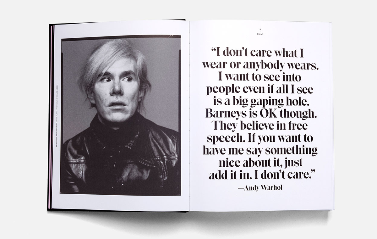
Barneys Book, designed by Sagmeister & Walsh, Area of Practice, Kevin Brainaird and Cybele Grandjean •Images courtesy Sagmeister & Walsh
How did you decide to start adding Cyrillic to the typefaces in your collection?
I’ve always been fascinated with Cyrillic letters. When I didn’t know much about them, they looked like flipped Latin, which is quite fascinating just from a design perspective. I slowly learned more and understood that it’s not actually like that — it was just my first impression of it. When I started to realise that, I became very interested in learning how to draw Cyrillic in a proper way.
The first time I added Cyrillic to a retail font was when a client purchased a big license and wanted to expand the typeface with Greek, Arabic and Cyrillic. That’s when I decided that I would actually give it a try. I started drawing, but I didn’t really know what I was doing — I was looking at tons of other typefaces and tried to find the logic behind them, but I didn’t manage to do it on my own. Eventually I consulted Maria (Maria Doreuli) so she could help out. I sent her the typeface, asking if it looks okay or if she would like to change something. And she returned a PDF document with a lot of corrections and suggestions — that was really amazing! I learned so much from that. We did a couple of rounds back and forth: I was looking at her feedback and tried to improve the letters until she was happy with them, at the same time trying to learn more myself.
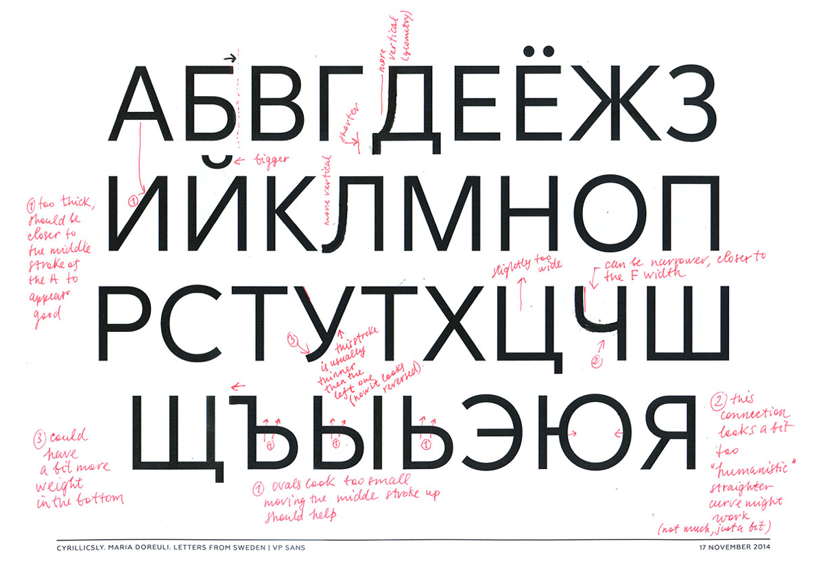
Maria Doreuli’s review on MTG Sans•Image courtesy Göran Söderström
Actually, I don’t think she was ever completely satisfied with my Cyrillics, but at least she was happier about them than in the beginning. At some point, when Maria’s reviews calmed down, I thought “Okay, now it’s usable” and that version was sent to the client. After this project, I hired Maria for each Cyrillic expansion we did, except for the most recent one. But I worked on that one at Maria’s and Krista’s (Krista Radoeva) workshop in Switzerland, so she helped out with that one as well in the end.
The best features in Trim’s cyrillics were all Maria’s ideas, to be honest. She made some hand drawn sketches suggesting ways to draw the most difficult letters like Д, Л, б, д and л. And those sketches solved a lot of problems. Almost everything I’ve learned about Cyrillic I know thanks to Maria.
How did you decide to consult her in the first place and not someone else?
I don’t really remember why it was specifically her. Maybe it was because she had this blog with Krista — Cyrillicsly. Maybe I saw that and felt that they were two young positive type designers who were open to help other people with this (and we really do need help with Cyrillics). I never experienced that from somewhere else before — some people you talk to give the impression that they want to keep Cyrillic to themselves and don’t want to give away the knowledge. I think knowledge is meant to be shared.

Trim is a typeface inspired by Knud V. Engelhardt, danish architect. As it’s stated in its name, everything in this typeface is trimmed: diagonals, round shapes, terminals. Trim comes in a large family including all kind of weights, stencil and poster versions. It’s ideal for setting headlines and in short paragraphs can knit the line tightly together.
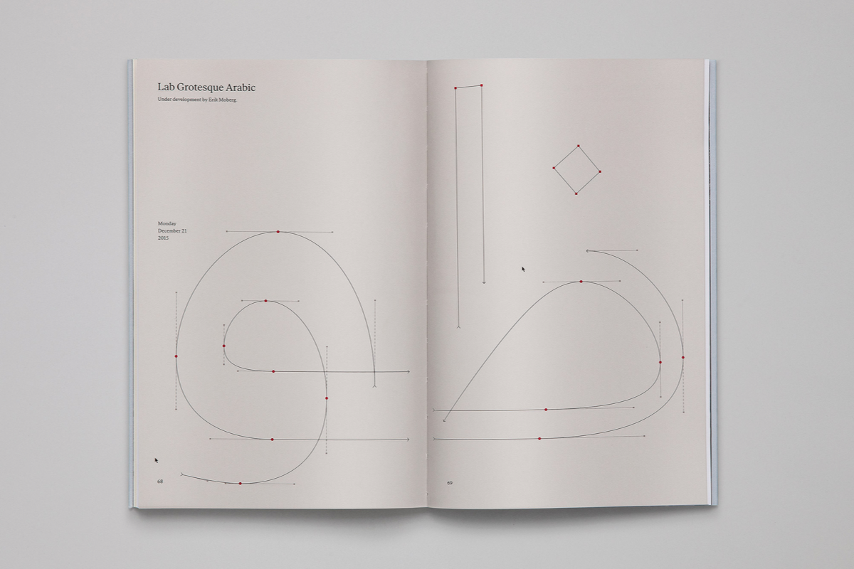
Apart from the Cyrillic, you also add Greek and Arabic to your typefaces.
Yes, but I don’t draw them myself. My talented colleague Erik (Erik Moberg) draws Arabic and now he draws the Greek too, which is really great. At the beginning, Panos Haratzopoulos drew the Greek for us and did some fantastic work as well.
You add Cyrillic, Arabic and Greek to your typefaces, which takes both time and money (especially when consultations are required), but you keep the same price regardless of which languages the typefaces support. Looks like a statement, doesn’t it?
It is a statement. Coming from Sweden, which is a tiny country, I can relate more easily to smaller businesses. Let’s say that you’re a Russian student, you like Trim and the Latin version costs €40, but the one that includes Cyrillic costs €80. I would question that. Why does the Cyrillic language cost more than the Latin? Why is Latin the norm and the Cyrillic is just added on top of that? I can relate to this problem. From a customer point of view, I think they should cost the same. So it’s a statement, but also a democratic way of thinking about the customer’s experience. The typeface market should be easily accessible in parts of the world other than just Europe or America.

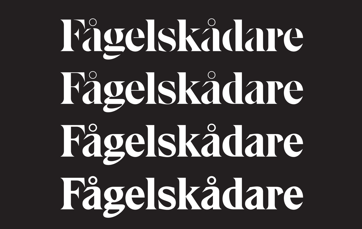
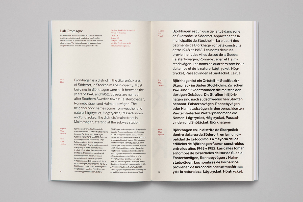
Lab Grotesque was designed in collaboration with Stockholm Design Lab and released as a retail font in 2015. Inspiration for the typeface was found in the idiosyncrasies of earlier grotesks and gothics from the turn of the century. In 2017 Cyrillic was added to Lab Grotesque and so far it’s the best approach of the studio to Cyrillic letters. Cyrillic Design Consulting — Maria Doreuli
It looks like a modern and very Swedish style of thinking, trying to make it equal for everyone. At some other foundries you sometimes can’t buy Cyrillic without even Greek, for example.
Yes, and then you have to pay for Latin, Cyrillic and Greek at the same time. I think a lot of these “norms” — how the typefaces market has been — are about to totally change since small players like me and hundreds of other small foundries are actually gaining a bigger significance in the market. We’re taking a bigger share every day and I believe that if we start to change things, the big players will have to do the same.
What do you think about other models of distributing typefaces? Renting them out, for example.
Our full library is available from Fontstand and that’s a brilliant application. But I think the best part about Fontstand is that people can test a typeface for a shorter period. I’m not sure if the renting model is as brilliant once you have decided you actually want to license the full version. From my experience, some people go there, try out the typeface or even rent it for a month but then they come to us and buy it. Because when you rent it, you are locked into a contract and quite a lot of people don’t like that — they want to pay once, get the fonts and move on.
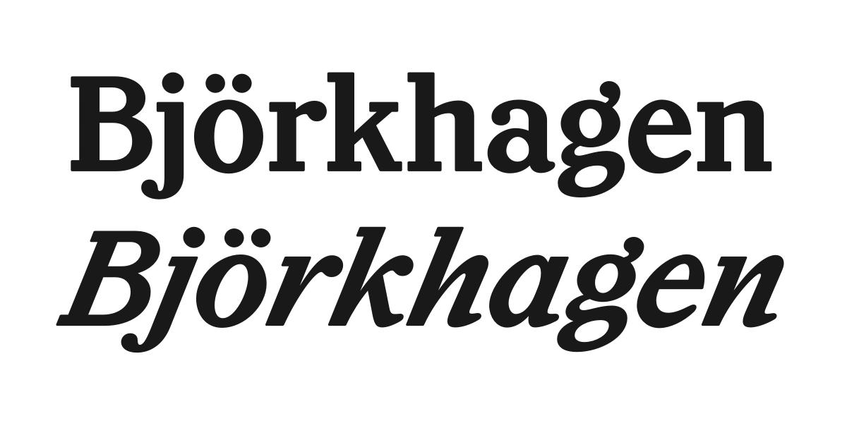
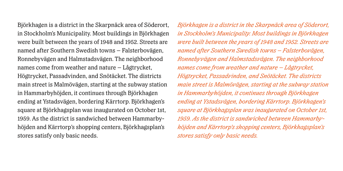
Specimen Letters from Sweden, designed by Malmsten Hellberg. The book is divided into three chapters: Retail Fonts, Custom Fonts, and Fonts in Progress, differentiated by respective types of paper. It doesn’t only present letters on paper but tells about the company and the area of Björkhagen outside Stockholm.•Images courtesy Malmsten Hellberg and Göran Söderström
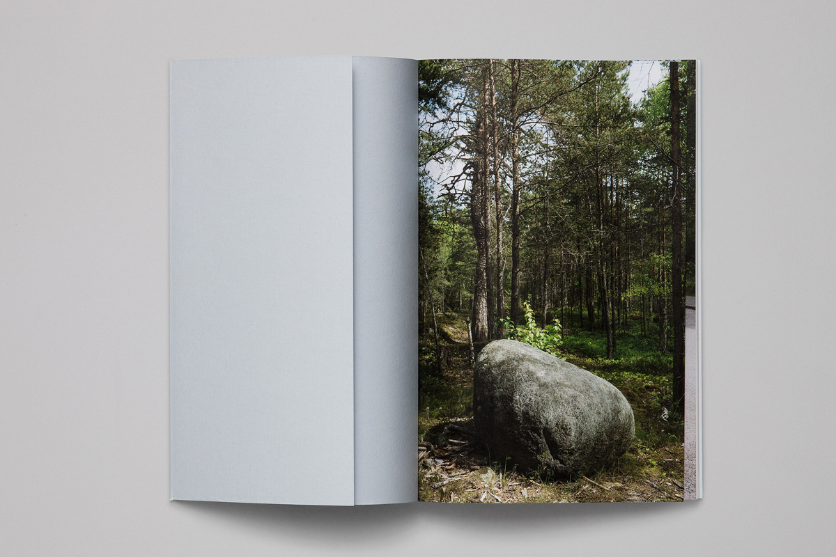
Specimen Letters from Sweden, designed by Malmsten Hellberg. The book is divided into three chapters: Retail Fonts, Custom Fonts, and Fonts in Progress, differentiated by respective types of paper. It doesn’t only present letters on paper but tells about the company and the area of Björkhagen outside Stockholm.•Images courtesy Malmsten Hellberg and Göran Söderström
Specimen Letters from Sweden, designed by Malmsten Hellberg. The book is divided into three chapters: Retail Fonts, Custom Fonts, and Fonts in Progress, differentiated by respective types of paper. It doesn’t only present letters on paper but tells about the company and the area of Björkhagen outside Stockholm.•Images courtesy Malmsten Hellberg and Göran Söderström
Specimen Letters from Sweden, designed by Malmsten Hellberg. The book is divided into three chapters: Retail Fonts, Custom Fonts, and Fonts in Progress, differentiated by respective types of paper. It doesn’t only present letters on paper but tells about the company and the area of Björkhagen outside Stockholm.•Images courtesy Malmsten Hellberg and Göran Söderström

Specimen Letters from Sweden, designed by Malmsten Hellberg. The book is divided into three chapters: Retail Fonts, Custom Fonts, and Fonts in Progress, differentiated by respective types of paper. It doesn’t only present letters on paper but tells about the company and the area of Björkhagen outside Stockholm.•Images courtesy Malmsten Hellberg and Göran Söderström
Specimen Letters from Sweden, designed by Malmsten Hellberg. The book is divided into three chapters: Retail Fonts, Custom Fonts, and Fonts in Progress, differentiated by respective types of paper. It doesn’t only present letters on paper but tells about the company and the area of Björkhagen outside Stockholm.•Images courtesy Malmsten Hellberg and Göran Söderström
Specimen Letters from Sweden, designed by Malmsten Hellberg. The book is divided into three chapters: Retail Fonts, Custom Fonts, and Fonts in Progress, differentiated by respective types of paper. It doesn’t only present letters on paper but tells about the company and the area of Björkhagen outside Stockholm.•Images courtesy Malmsten Hellberg and Göran Söderström
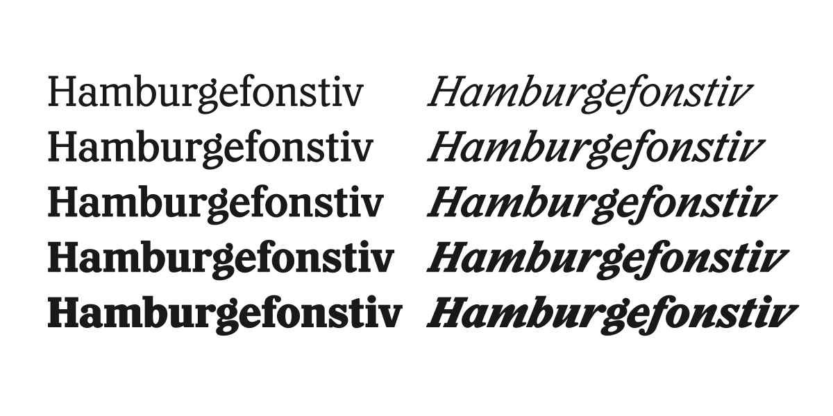
Your typefaces quite often don’t have so many styles — a couple of different weights, italics for them and that’s it. Why is that?
From my point of view, the most usable styles are the ones between Light and Bold, which is also where you see the typeface at its best. I think weights that are too bold change the characteristics of the typeface completely and sometimes it becomes almost comic. I prefer to stay within this modest range of weights, which might be some sort of Scandinavian approach. My favourite weight in any typeface is often the Medium. It has a really nice blackness. Just because we can interpolate, why should we do twenty weights? Do customers really need that? I doubt it. The most popular and well-used weights are between Bold and Regular, so why should I do those extreme weights if I don’t like them so much myself?
What do you think about modern technologies like variable fonts, for example? Do you explore these new possibilities?
I think what has been explored so far is mostly experiments. The variable demo fonts seem to take it a step too far, so it becomes more like a gimmick than something usable. Something that can benefit a lot from the variable font tech is optical sizes. When it is fully supported by applications and browsers and people start using it, I will definitely release a variable version of Ivar that could include its three optical sizes in one font and that’s great. But for me it’s nothing big, really, it’s simply a technical solution.
I think it will take a very long time until people in general start to use variable fonts. People still don’t know what OpenType features are. Honestly, how many people use various OpenType features and alternate letters in typefaces? When the OpenType format came, everyone was designing fancy ligatures for their fonts because they could, but then people didn’t start to use them and it could very well be the same with variable fonts. Maybe people just want to type text, choose a font and then it should look good — that’s it. Maybe it’s going to change, I don’t know. Tech is good but the design and functionality of a typeface will always be the main attraction.
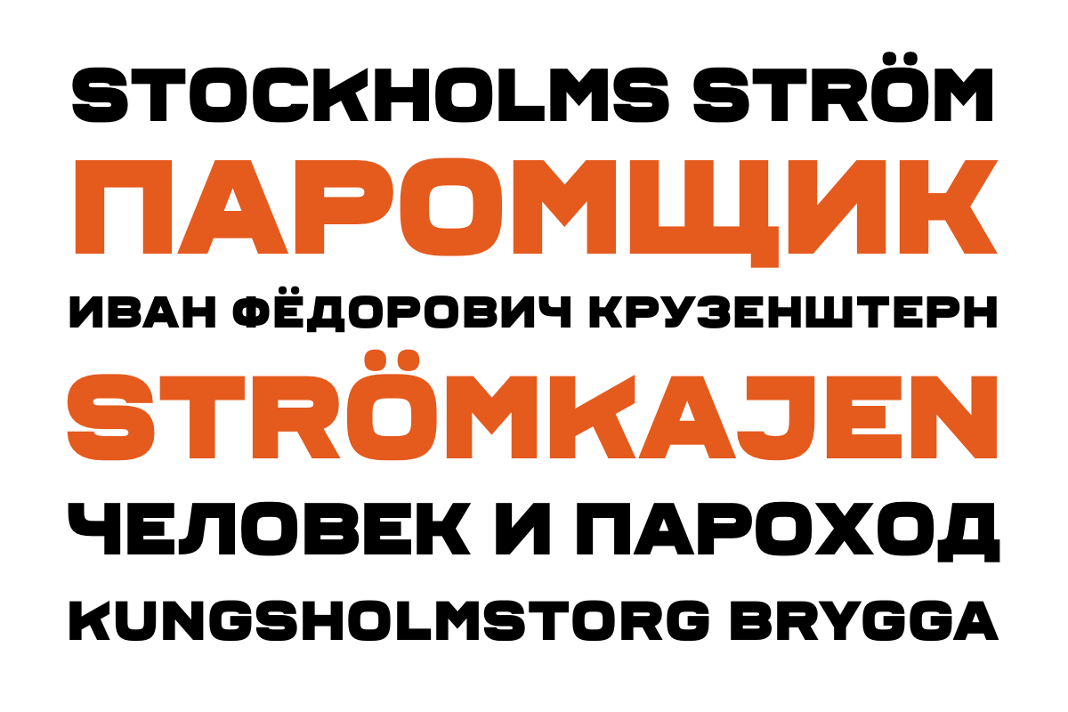
Ferry was designed by Erik Moberg and is the second contribution to Letters from Sweden’s “Fabrik Suite” — a project inspired by Swedish industry, factories and harbours. Ferry draws inspiration from three “Stockholms Ström” ferries were originally built as steam ones (1894–1907), but today are motorized and function as charter boats taking groups out to the Stockholm archipelago.
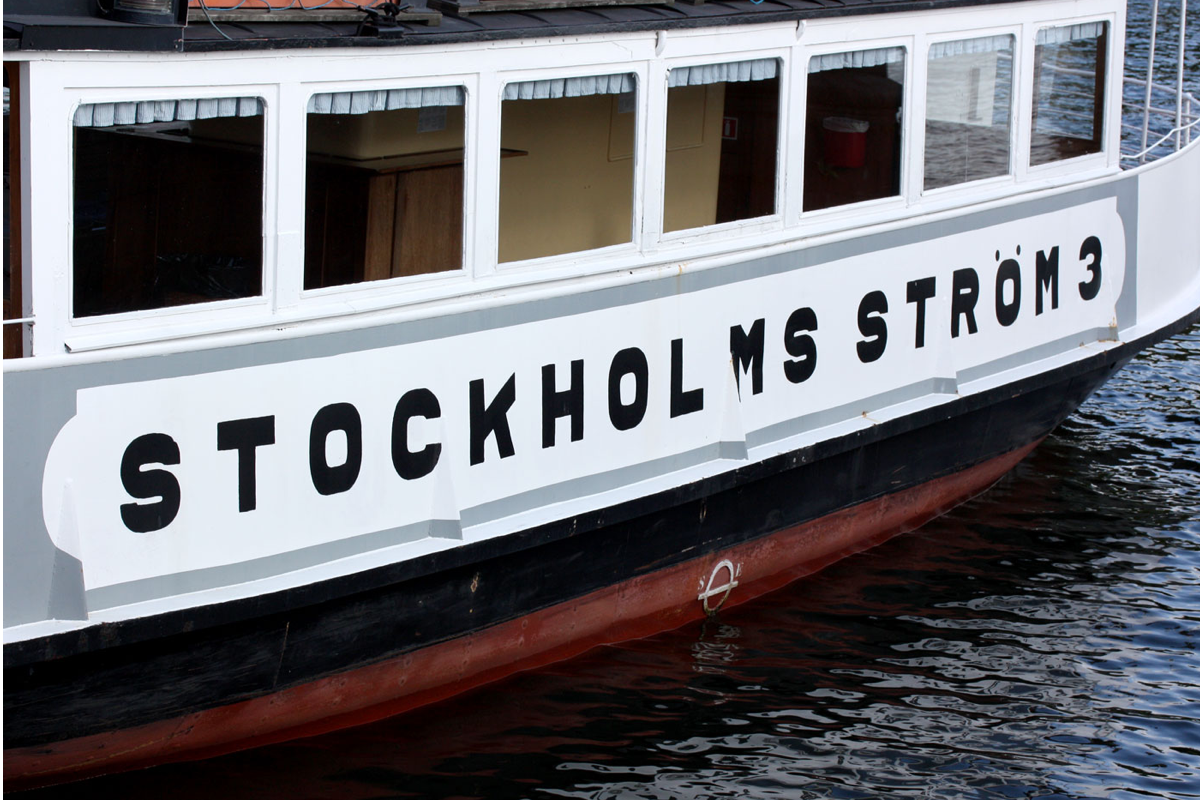
Ferry was designed by Erik Moberg and is the second contribution to Letters from Sweden’s “Fabrik Suite” — a project inspired by Swedish industry, factories and harbours. Ferry draws inspiration from three “Stockholms Ström” ferries were originally built as steam ones (1894–1907), but today are motorized and function as charter boats taking groups out to the Stockholm archipelago.•Image courtesy Göran Söderström
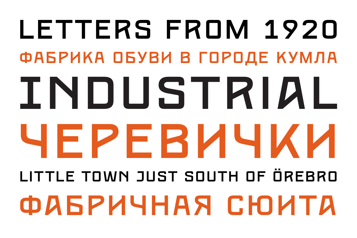
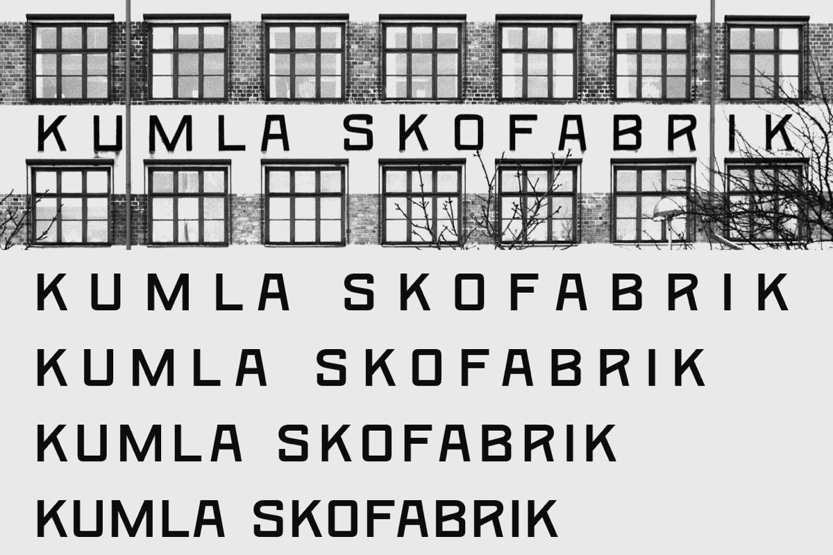
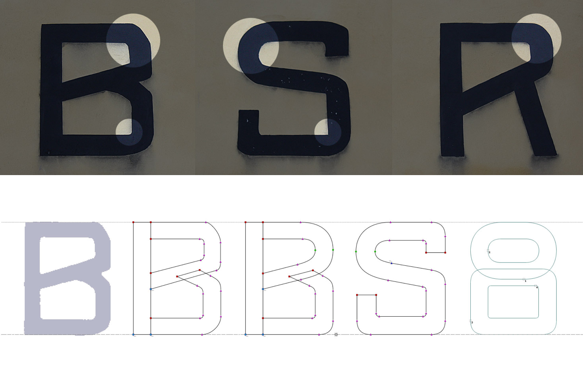
Kumla is the first release in “Fabrik Suite” that was inspired by the lettering on Kumla Skofabrik. The shoe factory that was built in 1912 and the letters were first seen in photos from 1920, unfortunately nobody knows who drew the original letters. They combine Art Nouveau flavour with the strong, industrial feeling and the typeface, a bit more consistent in comparison to the drawn letters looks modern and fresh.
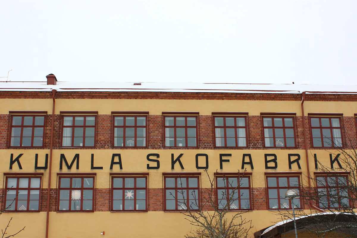
Kumla is the first release in “Fabrik Suite” that was inspired by the lettering on Kumla Skofabrik. The shoe factory that was built in 1912 and the letters were first seen in photos from 1920, unfortunately nobody knows who drew the original letters. They combine Art Nouveau flavour with the strong, industrial feeling and the typeface, a bit more consistent in comparison to the drawn letters looks modern and fresh.•Image courtesy Göran Söderström
Kumla is the first release in “Fabrik Suite” that was inspired by the lettering on Kumla Skofabrik. The shoe factory that was built in 1912 and the letters were first seen in photos from 1920, unfortunately nobody knows who drew the original letters. They combine Art Nouveau flavour with the strong, industrial feeling and the typeface, a bit more consistent in comparison to the drawn letters looks modern and fresh.•Image courtesy Göran Söderström
Kumla is the first release in “Fabrik Suite” that was inspired by the lettering on Kumla Skofabrik. The shoe factory that was built in 1912 and the letters were first seen in photos from 1920, unfortunately nobody knows who drew the original letters. They combine Art Nouveau flavour with the strong, industrial feeling and the typeface, a bit more consistent in comparison to the drawn letters looks modern and fresh.•Image courtesy Göran Söderström
You quite often collaborate with other designers. How does the design process look then?
Most of the time the collaborators provide me with inspiration and references, then I draw the typeface. During the process, they test the typeface and continually give me feedback — it’s like a match of table tennis. Collaboration is a very useful way of learning more, especially collaboration with graphic designers rather than type designers. Custom faces are always collaborations with talented people who have great ideas to kick things off. Quite a lot of projects at Letters from Sweden started with an idea from a graphic designer or art director.
I hardly use typefaces myself anymore, so I really appreciate feedback from a user perspective. How does this typeface feel, look and behave when you use it? It’s also valuable to see how other people use your typefaces. I can test it with my own test documents but they are limited. When someone else tests it, it’s easier to notice other things to improve. Early in the process of creating a new typeface, my collaborators get beta versions, sometimes with just a few key letters, and then I keep sending them updates. This process of bouncing ideas back and forth can even change the initial idea of the typeface and I’m very open to that.
Do you often draw by hand or just digitally?
Never by hand. I think it’s an unnecessary step. A typeface is digital so I draw it digitally. I sometimes use a pen to not forget an idea and just quickly draw something out, but that’s about it. Everybody has their own process, it’s very personal. It’s just that for me sketching doesn’t really have value.
Have you ever done calligraphy?
I’ve tried calligraphy a couple of times. Recently, I attended a workshop with Marianne Petterson-Soold, a Swedish calligrapher, and it was awesome, but it really didn’t stick. I am fascinated for a couple of hours but then I just get restless. I feel like I have no control over the calligraphy pen. I don’t think it’s for me — I like to build my letters and have endless possibilities to edit the shapes.
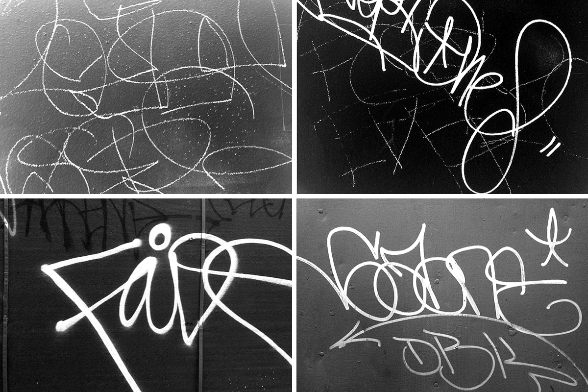
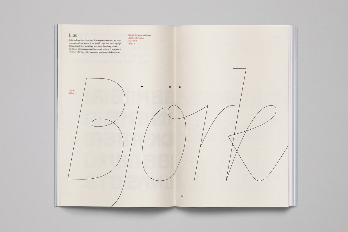
Line was originally designed for Swedish fashion and culture magazine Rodeo by Göran Söderström in collaboration with Stefania Malmsten. Monoline letters, arabic shapes, scribble, grafitti & tags, lettering, swashes, and different types of handwriting — all of this became inspiration for the typeface. Line comes in 5 super thin styles. With the formula 100, 65, 40, 25, 20 it’s easy to create compositions with same stroke weight across different point sizes. •Images courtesy Stefania Malmsten and Göran Söderström

Line was originally designed for Swedish fashion and culture magazine Rodeo by Göran Söderström in collaboration with Stefania Malmsten. It comes in 5 super thin styles. With the formula 100, 65, 40, 25, 20 it’s easy to create compositions with same stroke weight across different point sizes. The typeface consists of a basic character set with some alternate letters, plus a large number of modular embellishments which attach to letters in different ways. Rather than hundreds of alternate letters, these are simply kerning pairs.

Line was originally designed for Swedish fashion and culture magazine Rodeo by Göran Söderström in collaboration with Stefania Malmsten. It comes in 5 super thin styles. With the formula 100, 65, 40, 25, 20 it’s easy to create compositions with same stroke weight across different point sizes. The typeface consists of a basic character set with some alternate letters, plus a large number of modular embellishments which attach to letters in different ways. Rather than hundreds of alternate letters, these are simply kerning pairs.
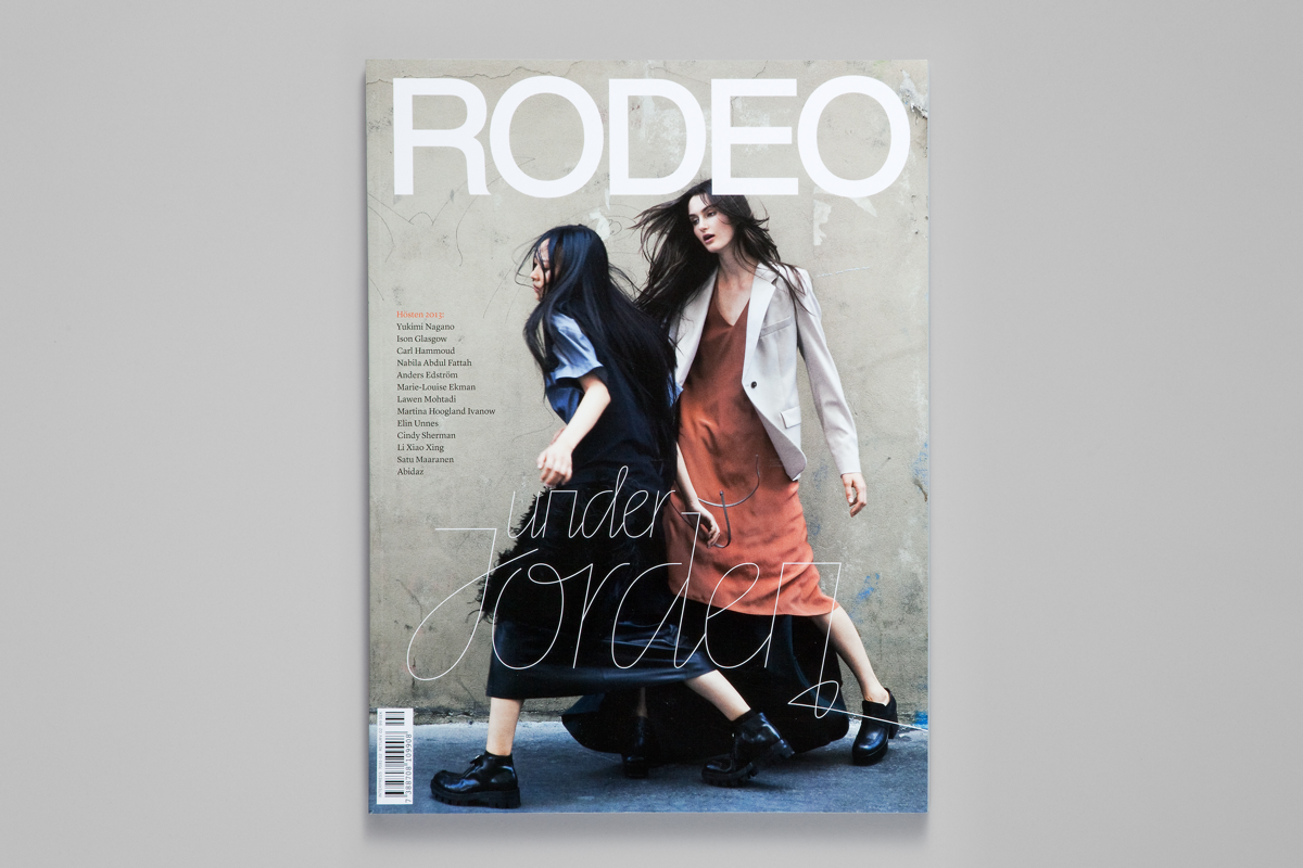
Line was originally designed for Swedish fashion and culture magazine Rodeo by Göran Söderström in collaboration with Stefania Malmsten. Monoline letters, arabic shapes, scribble, grafitti & tags, lettering, swashes, and different types of handwriting — all of this became inspiration for the typeface. Line comes in 5 super thin styles. With the formula 100, 65, 40, 25, 20 it’s easy to create compositions with same stroke weight across different point sizes. •Images courtesy Stefania Malmsten and Göran Söderström
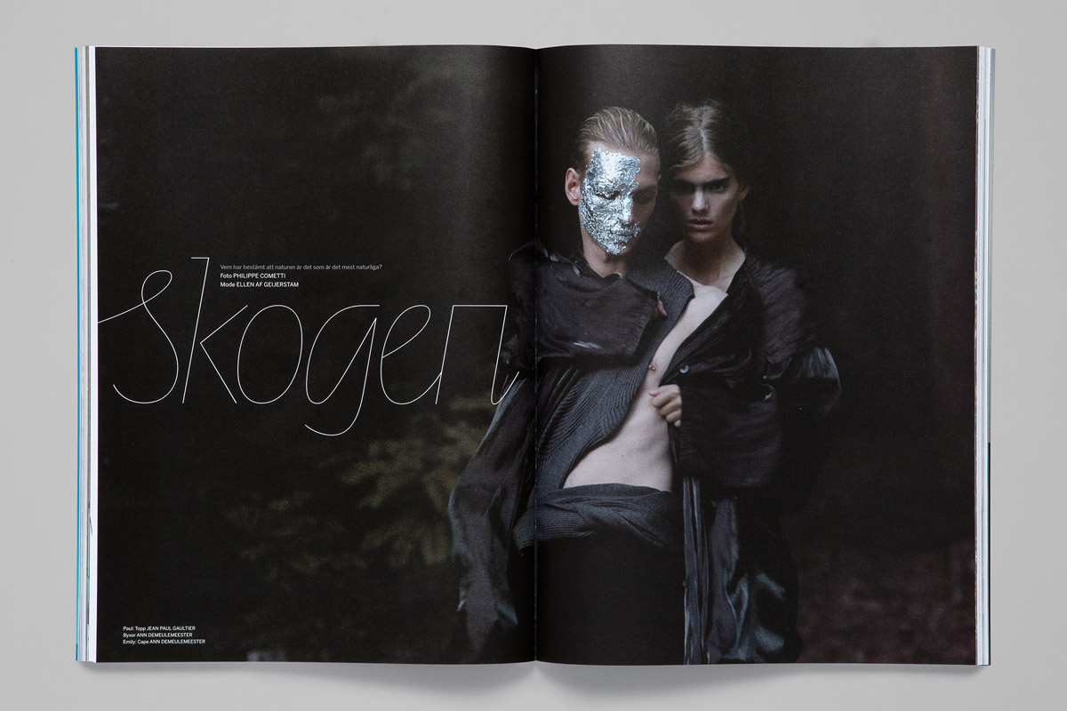
Line was originally designed for Swedish fashion and culture magazine Rodeo by Göran Söderström in collaboration with Stefania Malmsten. Monoline letters, arabic shapes, scribble, grafitti & tags, lettering, swashes, and different types of handwriting — all of this became inspiration for the typeface. Line comes in 5 super thin styles. With the formula 100, 65, 40, 25, 20 it’s easy to create compositions with same stroke weight across different point sizes. •Images courtesy Stefania Malmsten and Göran Söderström
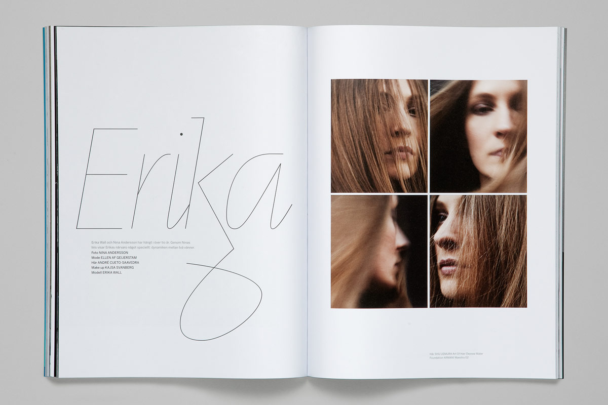
Line was originally designed for Swedish fashion and culture magazine Rodeo by Göran Söderström in collaboration with Stefania Malmsten. Monoline letters, arabic shapes, scribble, grafitti & tags, lettering, swashes, and different types of handwriting — all of this became inspiration for the typeface. Line comes in 5 super thin styles. With the formula 100, 65, 40, 25, 20 it’s easy to create compositions with same stroke weight across different point sizes. •Images courtesy Stefania Malmsten and Göran Söderström
Do you teach type design?
I have been teaching type design at Södertörn University. That’s where I met Erik Moberg, who is today my colleague at Letters from Sweden. I’ve also been visiting schools, talking about my work. But I don’t teach the history of type or applied typography. I’ve been conducting some workshops where we created a quick typeface together during class hours. Obviously, these workshops are more about opening up the idea of creating typefaces than a proper type design education.
Do you feel that interest in type design is growing in Sweden?
I’m not sure, maybe. There seems to be more young people today who are interested in designing typefaces, but it could also be that since I have a foundry, they get in touch with me nowadays, so I notice them more. At my studio we currently have an intern from Forsbergs School of Design who comes once a week. We sit and discuss his typeface, give feedback and the rest of the week he works independently from home. We have had two interns so far and soon we will also publish a new typeface by My Longley, a young Swedish designer who recently graduated from Konstfack.
Could you tell me about your project with Östbergaskolan?
The Museum of Stockholm was planning to do an exhibition about a suburb in Stockholm called Östberga. Daniela Kisch Juvall, who was responsible for designing the exhibition, wanted to work with people who had a connection to Östberga. I grew up there, so she found me and we talked about creating a typeface for the exhibition. The exhibition was supposed to take place in the local “fritidsgård”, which is something like daycare for kids where they go after school and play.
We discussed what to do and came up with the idea that we should let the kids make their own typeface. Everybody got really excited about the idea so we went there and had a workshop with the kids. We had a lot of paper on the floor and big graffiti pens. We asked the kids to write the alphabet and numerals in whatever style they wanted. We ran out of paper really fast and had a lot of fun. Then we scanned the letters and quickly built the font in Glyphs. Daniela and I selected the letters that were most usable for the typeface, but apart from that we didn’t interfere so much. We tried to use as much as possible from the kids’ letters, so there are also alternates in the font. Östberga Type is free to download for anyone. It was used for the exhibition but it became more than just that. The project turned out to be quite successful and had a lot of publicity. It was a very positive thing for Östberga and now those kids have even been nominated for a design award.
I hope that they win the prize.
Me too.
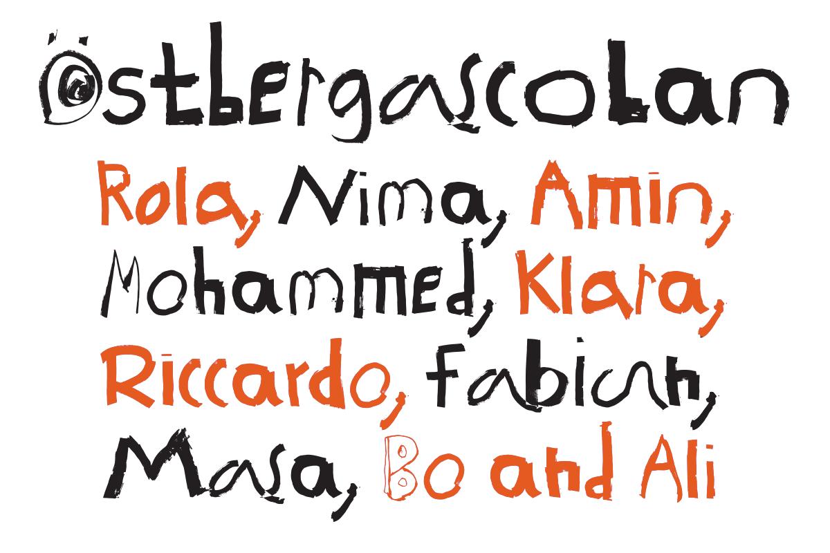
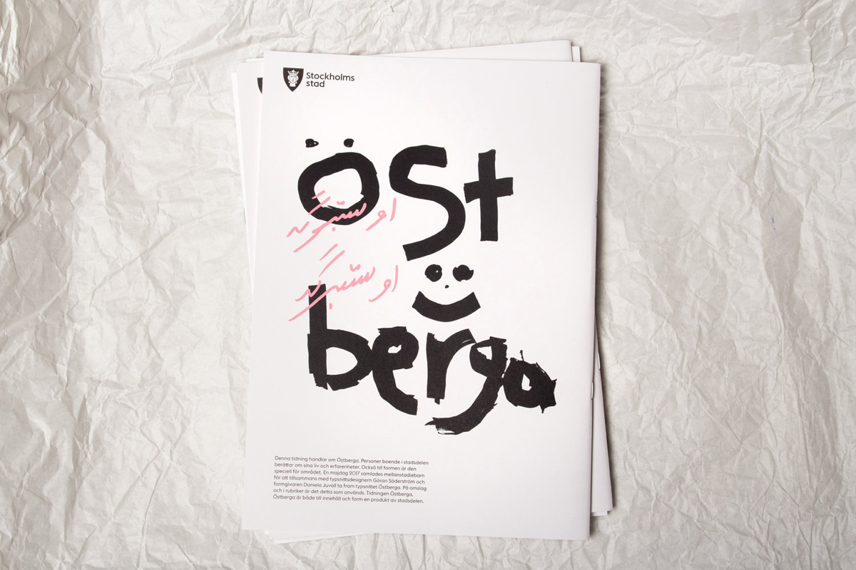
Östberga typeface was created by the kids from Östberga Fritidsgård, together with Studio Daniela Juvall and Göran Söderström. The font was used in Stadsmuseet’s exhibition Östberga, Östberga.
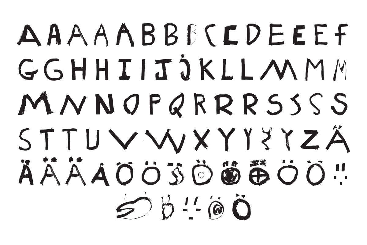
Östberga typeface was created by the kids from Östberga Fritidsgård, together with Studio Daniela Juvall and Göran Söderström. The font was used in Stadsmuseet’s exhibition Östberga, Östberga.

Exhibition design for Stadsmuseets exhibition ”Östberga, Östberga”, shown in Östberga fritidsgård, fall 2017.
•Images courtesy Daniela Juvall

The process of creating Östberga typeface. Rola, Nima, Mohammed, Riccardo, Klara, Fabian, Masa, Bo, Amin and Ali are working.•Images courtesy Daniela Juvall
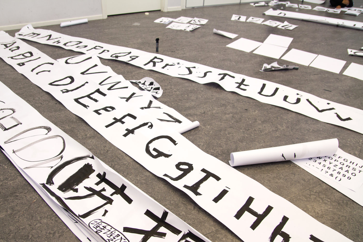
The process of creating Östberga typeface. Rola, Nima, Mohammed, Riccardo, Klara, Fabian, Masa, Bo, Amin and Ali are working.•Images courtesy Daniela Juvall

Catalogue for Stadsmuseet Exhibition “Östberga, Östberga”, designed by Daniela Juvall.
•Images courtesy Daniela Juvall
Catalogue for Stadsmuseet Exhibition “Östberga, Östberga”, designed by Daniela Juvall.
•Images courtesy Daniela Juvall

Catalogue for Stadsmuseet Exhibition “Östberga, Östberga”, designed by Daniela Juvall.
•Images courtesy Daniela Juvall
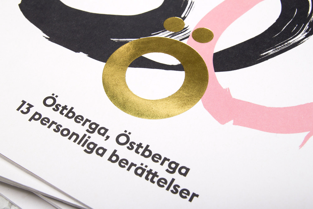
Catalogue for Stadsmuseet Exhibition “Östberga, Östberga”, designed by Daniela Juvall.
•Images courtesy Daniela Juvall
In interviews, you often say that you want to make your typefaces “not so bloody perfect”. Is this one of the ways to achieve authenticity or a way of thinking?
It’s a way of achieving personality. Let’s compare this with people — people are not perfect: someone has a nose that is too large, someone has a gap between the front teeth. I love this in people and I want to give that type of visual personality and character to my typefaces as well. Many typefaces out there are so similar, it’s like they have all gone through plastic surgery. If it gets too perfect it will be quite boring.