 t is evident that the design of the new Cyrillic type was done at the amateur level, although this was probably the first attempt in Russia to use a modern approach to type design, including sketching, the creation of original drawings, the manufacturing of type punches and matrices, then the printing of tests, with successive proofreading and improvements to the type. We don’t know which of the roman faces was used as the starting point for the design of the new letters. It is most likely that there was no single prototype and that the structure of the Civil Type was not based on one particular roman font. The sketches were a kind of eclectic mixture of the different roman faces available in Peter’s time (from late Dutch old-style roman to Romain du Roi). As a result, the Civil Type became very distinctive, but in fact its distinction was just the stylised trappings of the roman style, an imitation of it.
There were a number of reasons for this result (haste in general, the war, lack of skilled people), but the main one was the absence of a unified handwriting script that could have served as the basis for the development of a new type. Another was the amateur approach to the design. Of course, Peter the Great was a specialist in a lot of areas; as Pushkin described him, he was an “…academician and hero, navigator and carpenter…” But he was not a type designer, even if he made the sketches of the new letters himself. Other specialists (draftsmen, punchcutters, printers) were subordinate in their status to the august designer. And he had a very difficult task, trying to combine elements that were so different in style (the old poluustav letters and roman characters); in the absence of any stable handwritten form for these letters, the result of such a combination could be only a hodgepodge. Later modification of the Civil Type was rather haphazard, done by trial and error: different forms of letters were tried out, and new character forms were substituted for the old ones; uppercase letters repeated the form of the lowercase ones, and vice versa; and stresses were introduced and then rejected again. It took over a hundred years more after that type reform to stabilise Cyrillic letterforms.
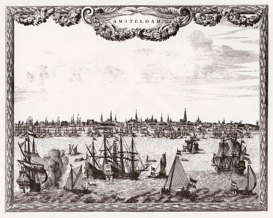
View of Amsterdam. Engraving. 1700.
On the other hand, some radicals (especially some Russian graphic designers) continue to believe that Peter should have given an order to all Russians to switch to the Latin alphabet, as he did with beards and smoking tobacco. If this had happened, from the cultural point of view this country would have ended up not so different from the West, and we would not have met so many difficulties with international communications and the internet; we would have been able to use all the treasures of the Latin types accumulated by Western civilisation. So we should immediately correct the emperor’s mistake!
I do not support this viewpoint, though it is quite evident that the Latin alphabet has had a longer evolution than the Cyrillic, and its artistic virtues are in no doubt. But Russia follows its own historical way, especially in type development. Still, the results of the Petrine type reform could have been different; and being a type designer, I often try to imagine what might have been done if they had better material to work with.
The Way It Goes in Russia
Of course everything should have begun with choosing the best Latin prototype for the new Cyrillic alphabet. Having arrived in Holland in 1697 as a member of the Great Embassy, Peter could still see the best samples of the Dutch old-style roman in use. At the beginning of the 18th century it was possible to encounter Elsevir type traditions in many countries, including Holland, Germany, and England, which had a lot of printing houses stocked with the types of such masters as Cristoffel van Dijck, Bartholomeus Voskens, and Nicholas Kis (Miklós Tótfalusi Kis).
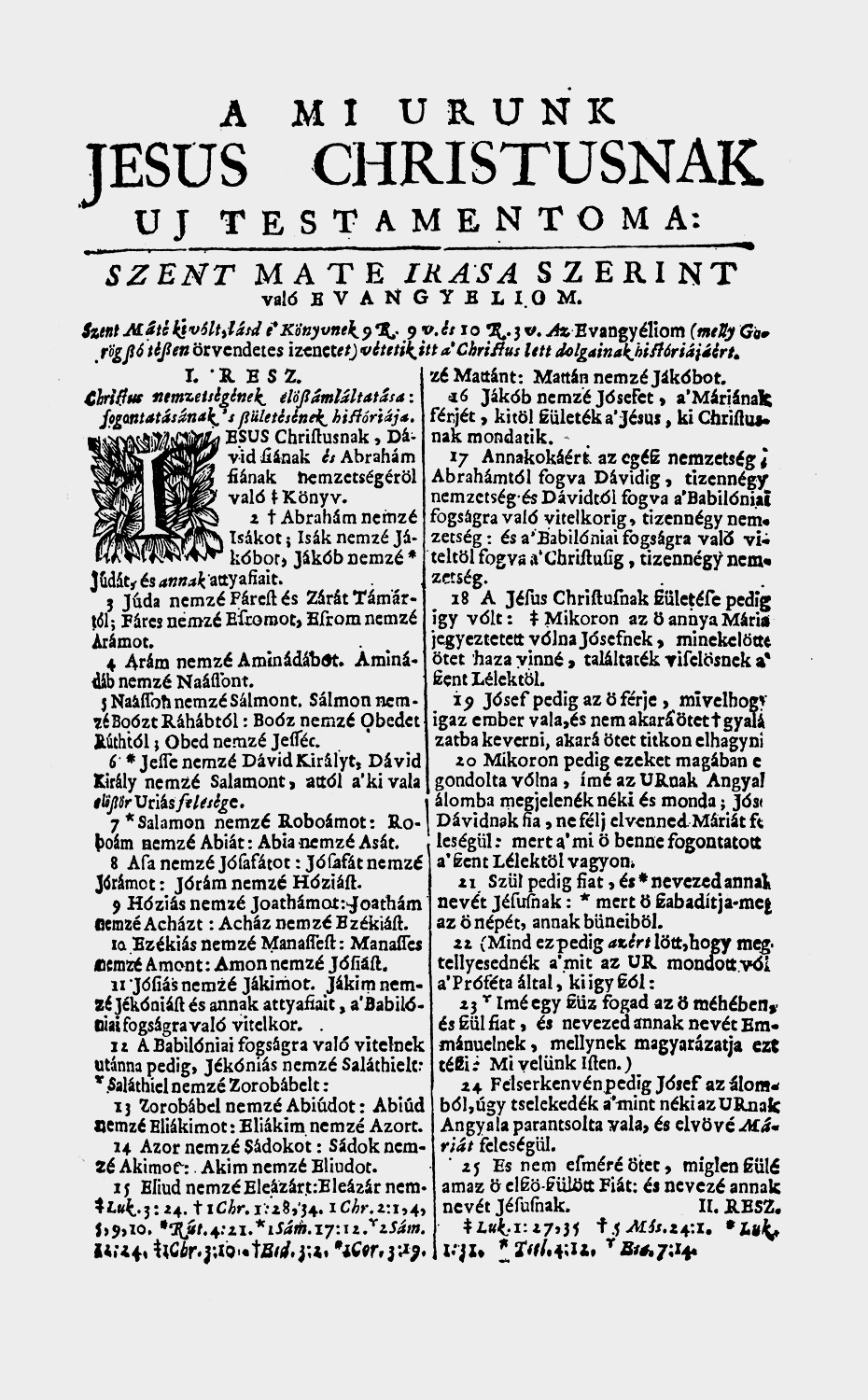
Amsterdam edition of the Bible. Opening page of the New Testament. Nicholas Kis. Amsterdam, 1685.
Nicholas Kis (1650–1702) was the oldest contemporary of the Russian type reformer. Of Hungarian origin, he worked in Amsterdam learning punchcutting and typographic skills from 1680 to 1689, in order to create his own type for publishing the Hungarian Bible. He had to cut a lot of typefaces for other type foundries to finance the Bible printing. After finishing his mission he went back to Transylvania, established a printshop in the town of Koloszvár (now Cluj in Romania), and util the end of his life published different kinds of literature in Latin and Hungarian, trying to educate his people. While he was still in Amsterdam, Kis became so famous and in so much demand for his punchcutting skills that he got orders not only from Dutch type founders but from typographers in other countries. Kis’s types were found in Germany, Poland, Sweden, England, and Italy.
I believe that his types are the most beautiful of all romans, and at the same time they are not that distant from Peter the Great’s epoch. It would have been quite natural to select these types as a prototype for the Civil Type.
It is noteworthy that Peter knew someone who was acquainted with Kis. This was Nicolaas Cornelius Witsen, the Mayor of Amsterdam, a traveller and geographer, and the publisher of books on shipbuilding and Siberian geography, who received the Russian Great Embassy during their stay in Amsterdam in 1697. Only a few years before this, Witsen had recommended Kis to the Georgian Tsar Archil (who was staying in Moscow at the time) as an excellent punchcutter. In 1687, at the request of the Georgian Governor, Kis manufactured several Georgian types, samples of which were discovered in the University Library in Uppsala, Sweden. (In addition to Georgian, Kis made some Hebrew, Greek, and Armenian types, and also Syrian, Samaritan, and Coptic types, though the fact that these last three were manufactured is known only from one of Kis’s letters).
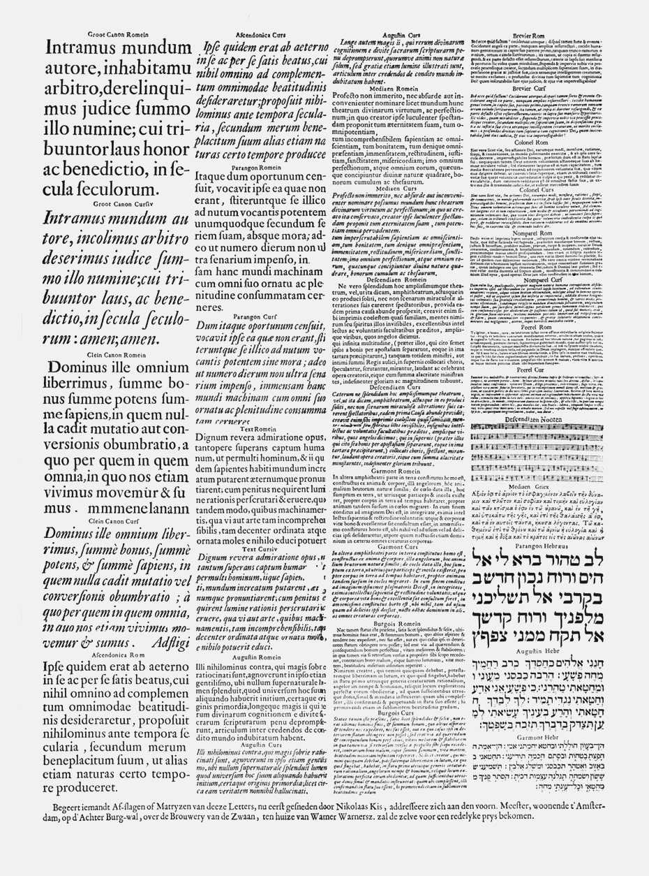
Nicholas Kis type samples. Amsterdam, ca. 1686.
About fifteen years ago I made my first attempt at following in Peter’s footsteps when I made some sketches based on the letterforms of the typeface known as Janson. The prototype of this typeface was found in the Haas-Drugulin printing house in Leipzig at the beginning of the twentieth century, and at first it was mistakenly attributed to Anton Janson (1620–1687), a Dutch craftsman who worked in Leipzig. In 1954, however, after comparing type specimens, the English typographic historian Harry Carter and the Hungarian wood engraver György Buday came to the conclusion that the so-called Janson types were in fact the work of Nicholas Kis.
In 1996, after the ParaType company in Moscow signed an agreement with Bitstream to license their typefaces and develop Cyrillic versions of them, I was very glad to come back to this work; I based my renewed efforts on Bitstream Kis, which is very close to Janson. On the one hand, this gave me an opportunity to make a modern text type of the late Baroque Dutch roman style, which at that time had no analogues in Cyrillic typography. On the other hand, I wanted to make its letterforms a bit archaic, resembling the Petrine Civil Type, and thus in some way correct it in the modern age, by making the shape of the letters less contradictory.
From the very beginning it was clear that the Cyrillic letters that corresponded to Latin ones should remain the same as in the Latin alphabet. I was not going to repeat Peter’s mistake and invent a new form of А and other Latin letters just because I liked the shape created by Nicholas Kis. The form of the Cyrillic characters that are structurally close to Latin should also be defined by the Latin alphabet, so as to stay in the framework of modern traditions of Cyrillic type design. The problem was not only in defining the forms of the Cyrillic letters that have no analogues in the Latin alphabet, which can have variant forms, but also in deciding whether to keep Cyrillic К, к similar to Latin K, k or to find another form for the diagonals, more specific to Cyrillic. The same problem arises for Я, я relative to the Latin R.
It was also necessary to design an italic, and that was essentially a completely different problem. Cyrillic italics appeared only in the post-Petrine period, in the 1730s; and unlike European italics, the form of the first Russian italic letters was based not on handwriting but on engraved inscriptions in book titles, geographical maps, and other printed matter. Only at the end of the 18th and beginning of the 19th centuries did the form of Cyrillic lowercase italics begin to resemble the Latin. Probably this is due to the mass import of Didot types from France, and to the activities of the Russian type manufacturers August Semen, Alexander Pluchard, and George Revillon in particular. That is why the structure and appearance of modern Cyrillic italics are much closer to the corresponding Latin than are the forms of Cyrillic roman, most of which just repeat the forms of the uppercase letters. Considering the fact that one of the common forms of handwriting in Russian of the 19th and early 20th centuries was a kind of connected script written with a pointed pen (so-called ‘English’ calligraphy), one can conclude that the structure of Cyrillic italics—no matter how paradoxical this may sound—is more settled than the roman because it developed later.
As a rule, in the lowercase Cyrillic italics some letters are the same as Latin ones; the structure of many others is related to Latin italic or Cyrillic upright letters, and all that needs defining is a few details, especially the ascenders and descenders. Only a few italic characters require special attention, but their analogues can be found in the handwritten scripts of the 19th century. Uppercase italic letters are usually made by inclining the upright letters and making any necessary subsequent adjustments.
Kis Cyrillic
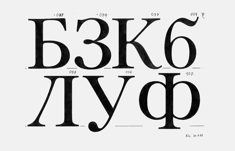
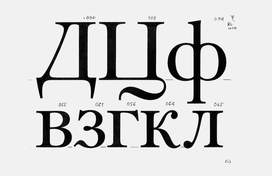
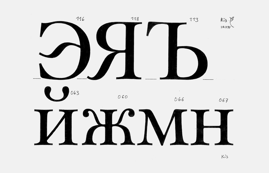
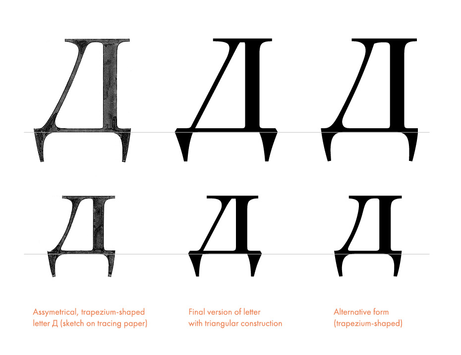
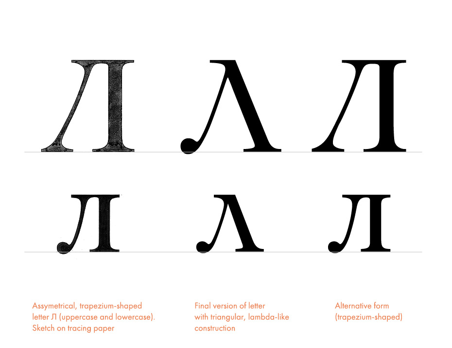
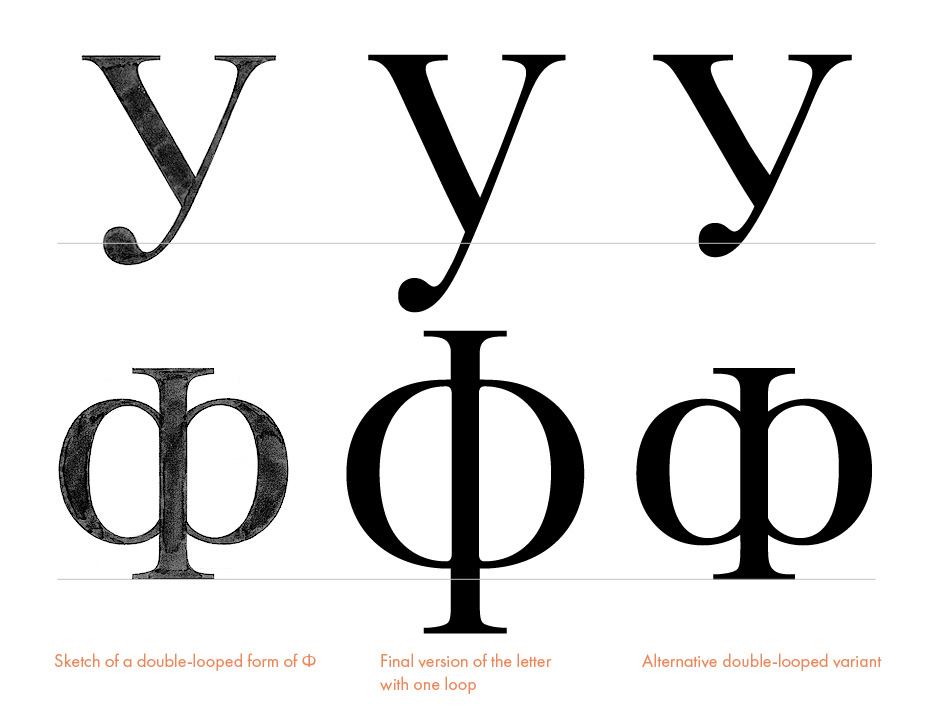
In the summer of 1997, when I drew the sketches of the roman and italic Cyrillic Kis on tracing paper, it was still not clear to me what changes ought to be made to the shapes of the Civil Type. In the roman, the outlines of most of the letters that were specific to Cyrillic were based on the types of the middle and late 18th century, and also on modern Cyrillic typefaces that interpret the forms of 18th century types (Academy, Bannikova, Elizabeth). So in the beginning I was going to make letters Ж, ж, and К, к different in nature, as they were in the Civil Type (Ж, ж, к with drop-shaped upper terminals, and with wave-shaped legs in К, к). The double-bowled Ф, ф, the wave-shaped bottom terminals in з, э, and the wave-shaped descending elements in Ц, ц, Щ, щ in general repeated the structure of similar letters from the Academy and Elizabeth faces. The trapezoidal Д, д, Л, л on the other hand resembled modern types (in Peter’s time the Д had the form of a right-angled triangle and the Л that of an isosceles triangle with inclined side strokes). З, with a drop-shaped bottom terminal, resembled forms of the Petrine engravings.
Further, in 1997–98 (on the computer), I changed the structure of some characters quite a bit from what I had done in the sketches. I redefined the structure of Ж, ж and к taking К as a sample (with the straight double-serifed diagonal at the top and the wave-shaped bottom one). I replaced the drop-shaped bottom terminal of З with a slightly inclined beak like the one in С and Э. I then replaced the trapezoidal form of Л, л with the historical triangle form. All these corrections made the roman shapes stylistically more orderly, but the Cyrillic counterpart still did not match the Latin model exactly.
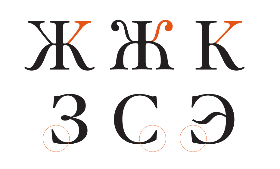
In the final version of the typeface, the letters К and Ж have the same straight upper diagonals and undulating bottom strokes as in the sketches. The shape of the lower serifs on the З, С and Э has been unified (cf. teardrop terminal on the З in the above sketches).
Everything was a bit simpler with the italic. Unlike the roman outlines, practically all the italic characters were a success from the very beginning, and in later refinement all they needed was some changes in proportion, colour, and a few details. For the low case ж I chose a zigzag structure, and for ч a handwritten form from the late 18th—early 19th century. The structure of some of the italic capitals, however, had to be changed to match related roman ones.
Being busy with other projects, I had to interrupt the work on the Cyrillic version of Kis for a while. A discussion in 1999 with Maxim Zhukov, our consultant on Cyrillic, helped me realise how to approach the rest of the work. The essence of his comments was that I should stick to the historical roman forms that corresponded to the general style of the type I was creating. I replaced the trapezoidal form of Д, д with a right-triangle structure with triangle descenders, which is closer to the form of the 18th century. I replaced the double-bowled structure of the lowercase ф with a form close to the corresponding letter in the Civil Type, with one oval crossed by the vertical stroke, as in the Greek letter phi. In order to stick to the chosen style, the capital Ф also got the same shape as in the Petrine type, with an ascender and a descender. To support a projecting Ф I had to draw a capital У with the tail descending down the way it does in the Petrine type. And finally, I replaced the double-sided serifs at the ends of the top diagonals of lowercase ж, к with drop-shaped terminals like those in the Petrine engravings and in the small sizes of the Civil Type.
And so, having retained characters that corresponded to the Latin old style, I gave the roman caps some features of Cyrillic types of the beginning of the 18th century. Similar changes were introduced into the italic capitals Д, Л, У, Ф. In order to preserve the stylistic unity of uppercase Ц and Щ, I replaced the wave-shaped descenders with small triangular elements similar to those in Д. At the beginning of 2000, the work on the basic Cyrillic alphabet was generally finished. Only the development of additional national characters required by standard encodings (Cyrillic, Eastern European, Turkish, Baltic) and the introduction of kerning for compliant character pairs were still to be finished. After the necessary technical processing, ParaType released Kis Cyrillic in PostScript Type 1 and TrueType formats for both Mac and Windows platforms at the end of September, 2001.
- Original-Janson-Antiqua (1919), Stempel
- Original-Janson-Kursiv (1919), Stempel
- Janson (1932–1937), Mergenthaler Linotype, Chauncey H. Griffith
- Janson (1936), Lanston Monotype, Sol Hess, Bruce Rogers
- Ehrhardt (1938), Monotype
- Janson (1954), Linotype, Hermann Zapf
- Janson Text (1985), Linotype, Adrian Frutiger
- Kis-Antiqua (1980), Typoart, Hildegard Korger
- Janson-Antiqua, Berthold
- Janson SB, Scangraphic
- Janson Antiqua, Scangraphic
- Bitstream Kis (1990–1993), Bitstream
- URW Janson (1995), URW
- T-26 Turnavia (2000), T-26, Gábor Kóthay
- Bitstream Kis Cyrillic (2001), ParaType, Vladimir Yefimov
- Berthold Kis BQ (2006), Berthold
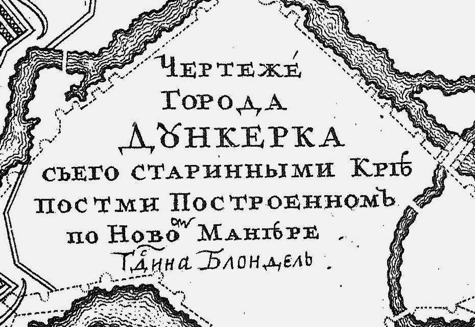
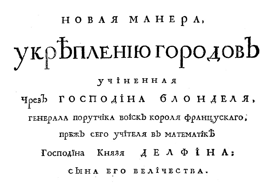
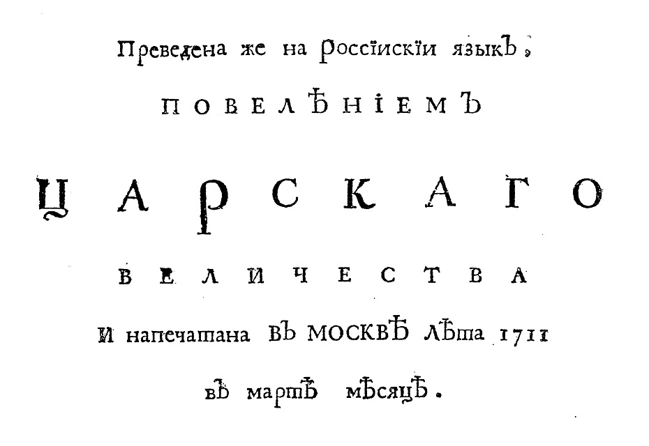
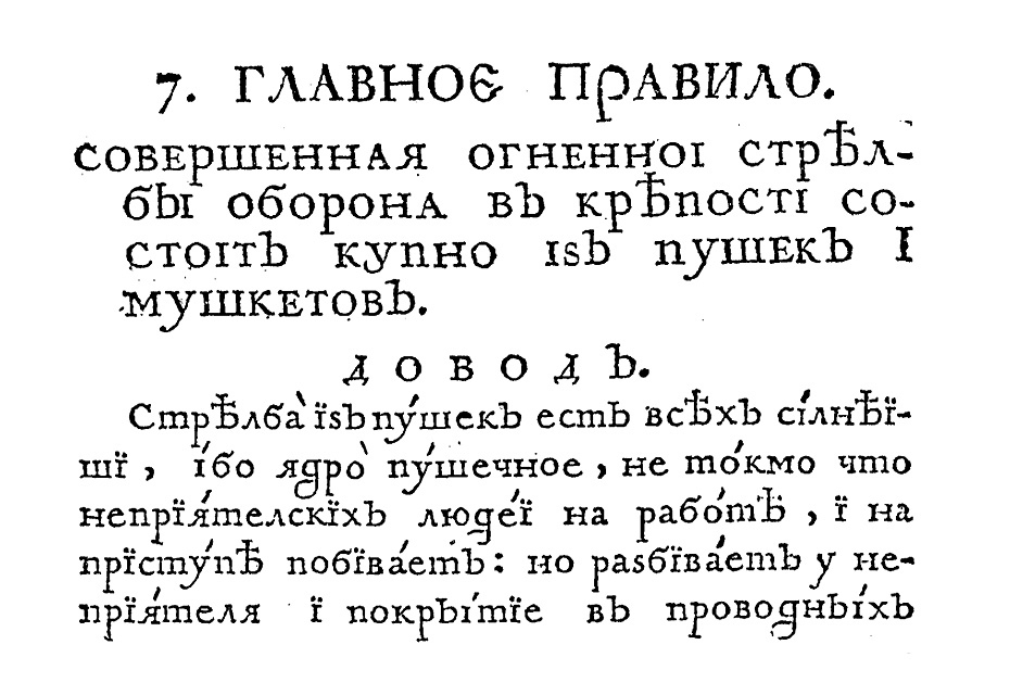
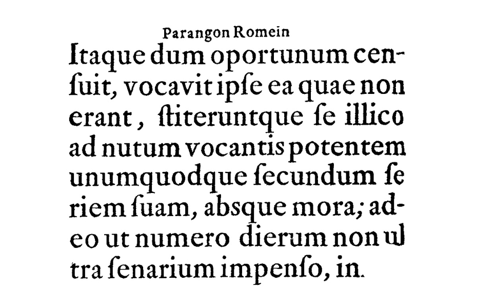
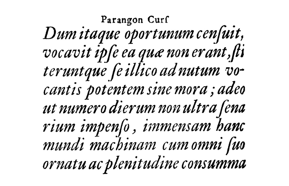
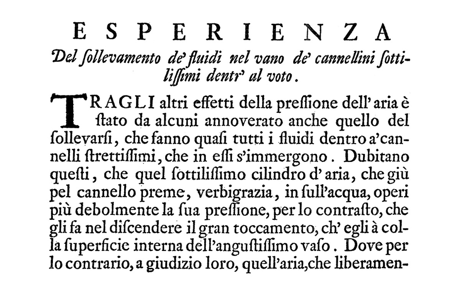
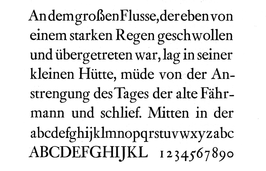
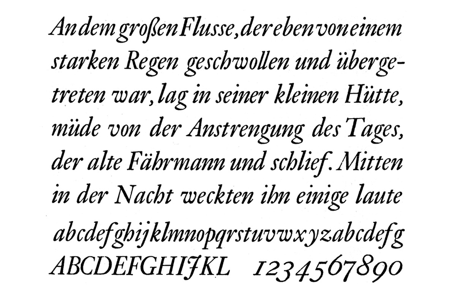
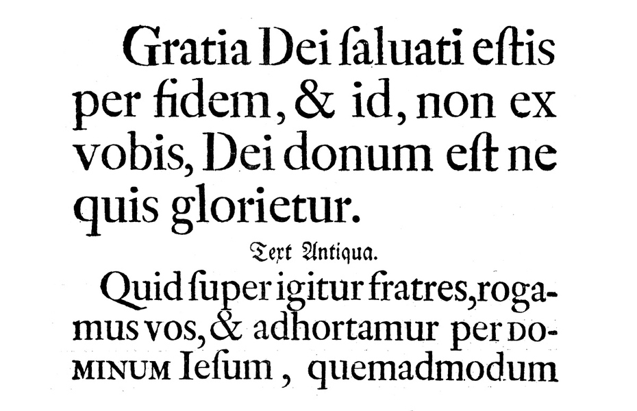
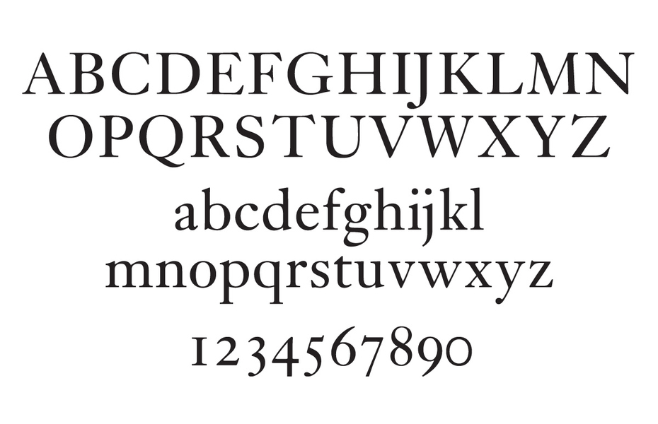
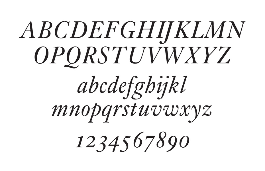
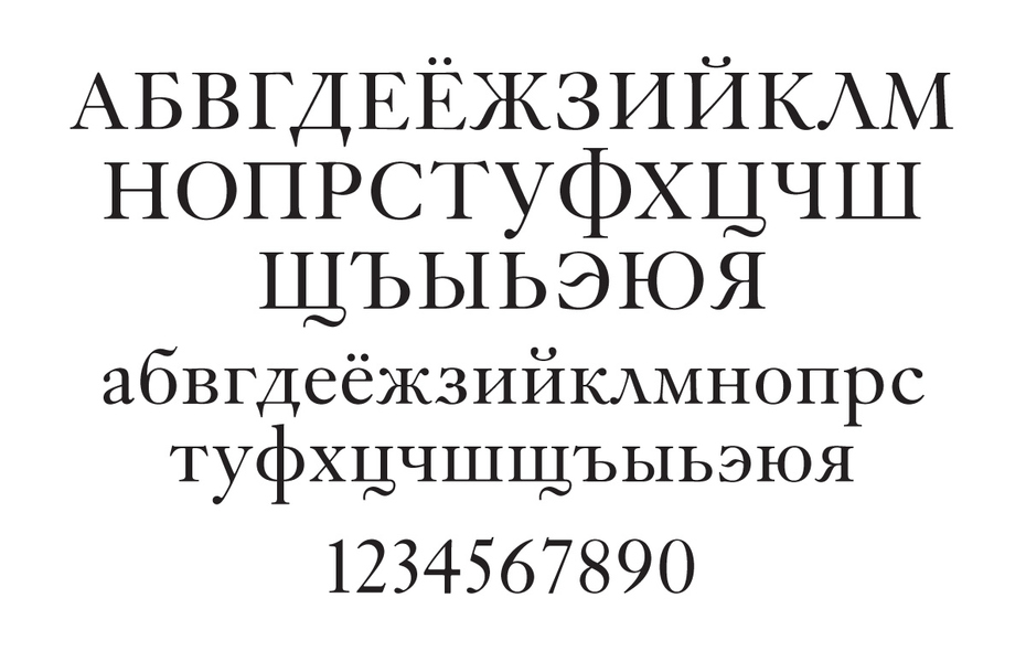
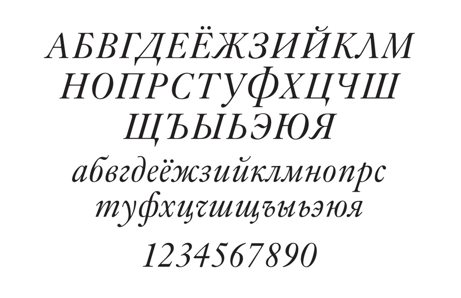
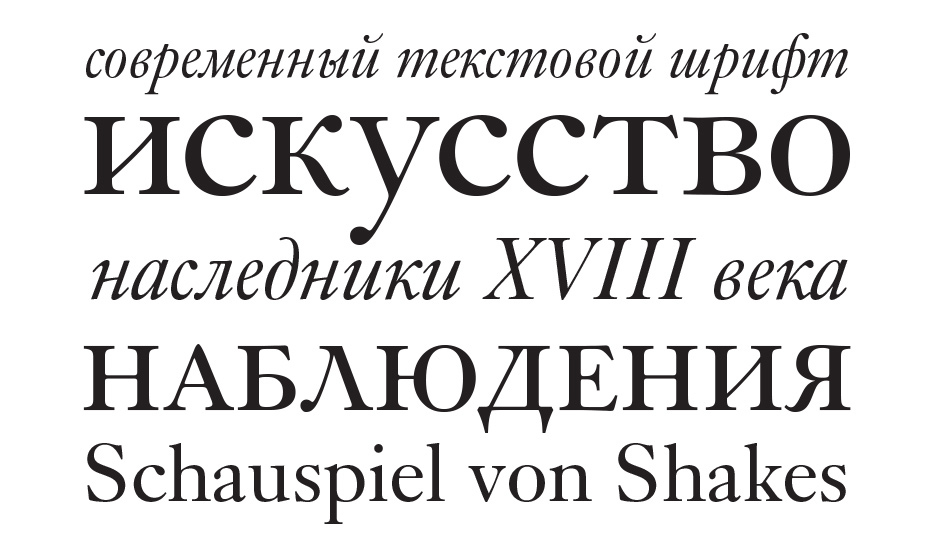
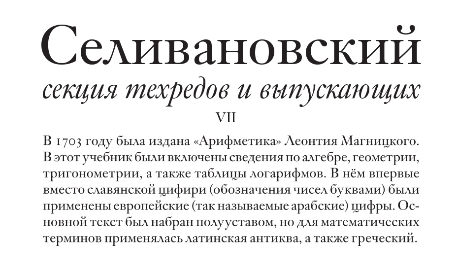
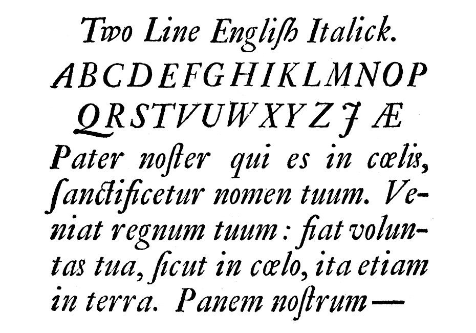
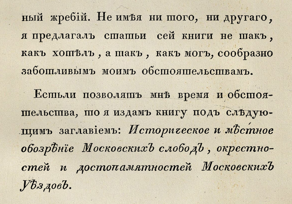
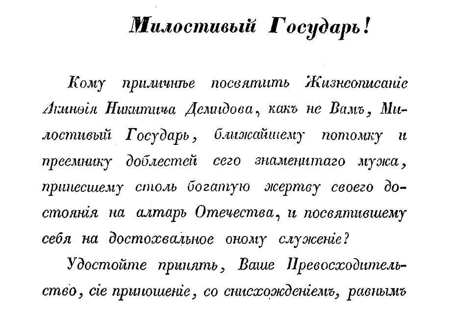
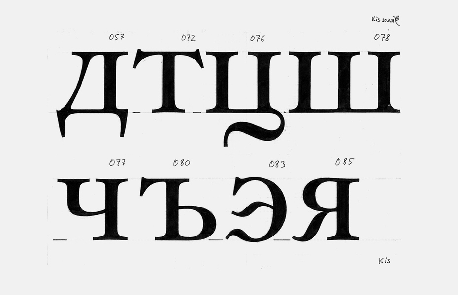
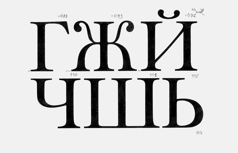
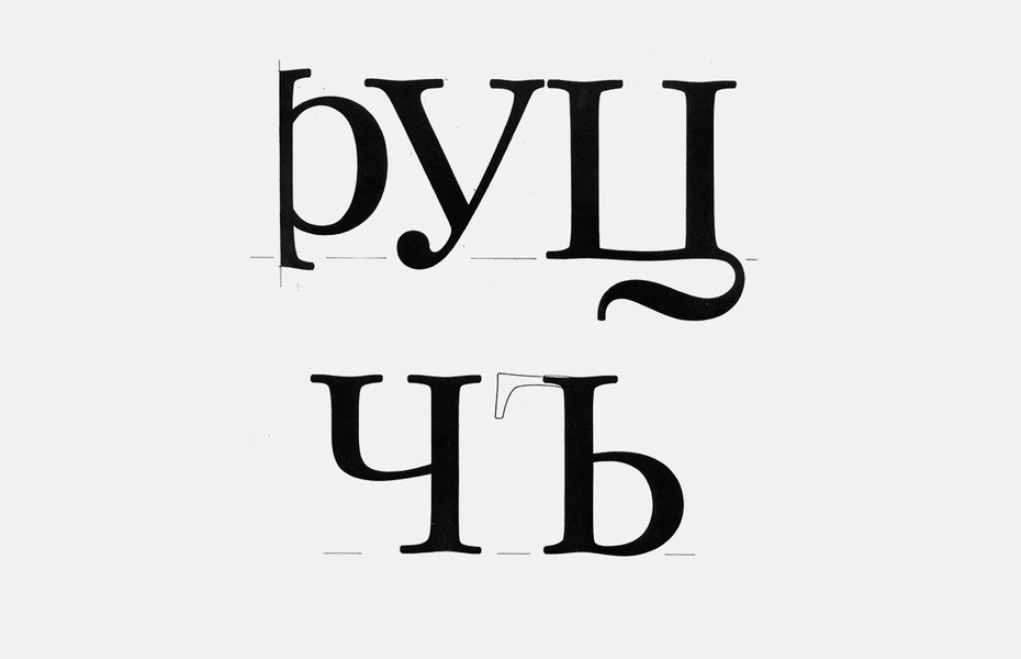
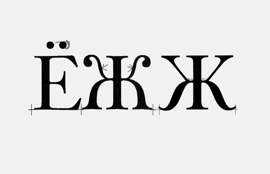
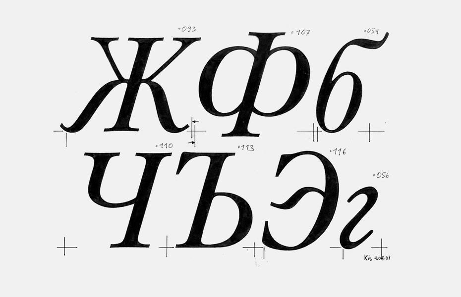
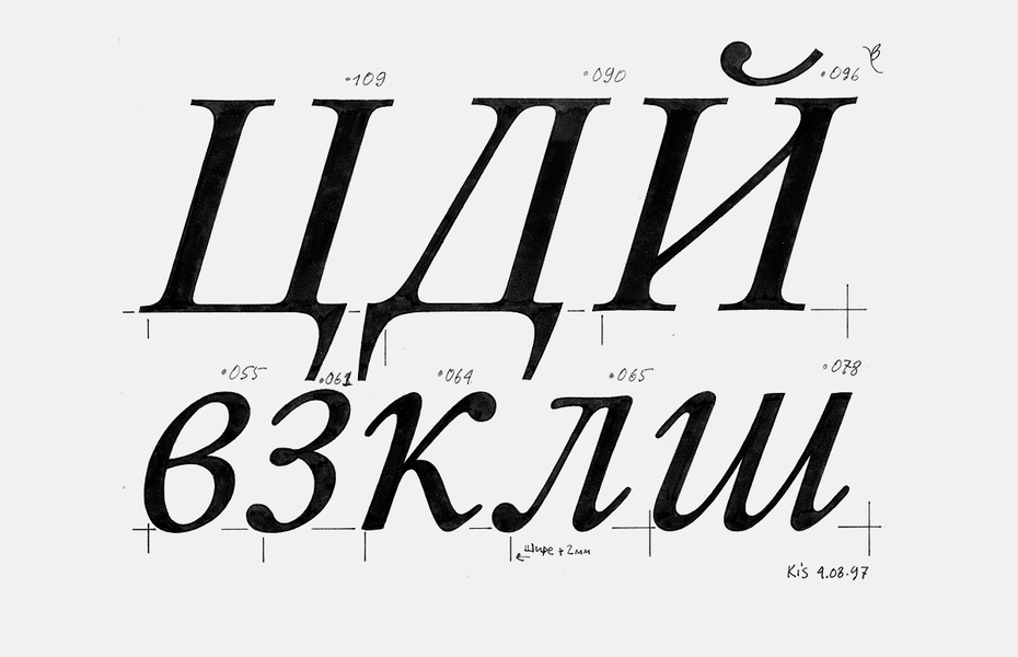
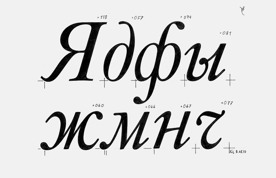
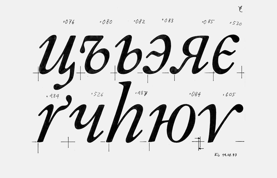

By its nature and genesis, Bitstream Kis falls into a wide category of historical type revivals, which are very common in Western typography—so common that according to Jerry Kelly, an American expert in typographic design, “it may be that there are more revived typefaces in use now than original designs”. Cum grano salis, one may consider Petrovsky and Elizavetinsky typefaces of O.I. Lehmann’s foundry (1902 and 1904–07, respectively), as well as Akademichesky (H. Berthold, c. 1910), Bannikova Roman and Baikonur (VNIIPoligraphmash, 1946–51 and 1960–69) type revivals.
And yet those were precisely the type revivals that provided an aesthetic foundation for a movement in print design known as “typographical revival”, originating with William Morris. The continuing dialogue and endless rivalry between two schools in Western typography of the 20th century—the traditionalist “revivalism” and the innovative neue Typographie— were most beneficial for the development of book and graphic design. The revivalist movement started gaining momentum soon after the Great War; however, Russia—then already communist—was not affected by it.
In fulfilment of its obligations under a contract with American digital foundry Bitstream, ParaType developed Cyrillic “extensions” to a number of classical typefaces initially designed for Latin script. Of all those typefaces, Kis seems to stand closest chronologically to the first Russian “Roman”, the Civil Type of Peter the Great. That made it the prime candidate for a credible reconstruction of a Cyrillic typeface that could have existed in real life, as opposed to the earlier historical typefaces—such as Aldine 401, Original Garamond or Caslon 540—whose stylistic patterns constitute pure and genuine extrapolations.
It is a well-known fact that letterforms evolve over time, both in handwriting, and in print. For example, in the capital Q the long tail is peculiar to the Old-Style typefaces, and the short one is characteristic of the Modern styles; in Cyrillic typefaces of the 18th century the Д and the Л were triangular but by the end of the 19th century they have become trapezoid, almost rectangular. The understanding of those details, and giving them due consideration may impart stylistic integrity and credibility to a type design.
In short, my recommendations to ParaType were to use the forms of early Russian (Petrine) typefaces—wherever possible—as referents for the Cyrillic version of Bitstream Kis.