‘A man of letters’ was the term, in Renaissance times, for individuals engaged in critical thinking, reading, research and human self-reflection about knowledge, life and society. That definition perfectly suits Peter Bilak: he writes, lectures, publishes and, in fact, makes letters. Twenty years ago in the Hague he set up his own type foundry, Typotheque, and since then has launched a series of unique publishing projects: the magazines Dot Dot Dot and Work That Work, co-founded Fontstand, a new way of discovering and licensing fonts, as well as TPTQ Arabic, a company focused on the development of modern and authentic Arabic typefaces, to name a few. Last year Typotheque celebrated its 20th anniversary with a solo exhibition at the Kunstmuseum Den Haag, a fine way to top things off. It has been a pleasure to meet and talk with Peter at his cosy studio at Koningsplein 12, The Hague, Netherlands. — E.Y.
I’d like to start with a question about the last big event in our field—the second Fontstand Conference, which you organized. What do you see as its achievements? What motivated you to organize the event?
It just made sense for us because Fontstand is more than a business, it’s a community project. It brings independent foundries together. Monotype was buying companies and becoming bigger and bigger. And people became disillusioned at the absence of an independent alternative. We started Fontstand the year that Monotype acquired FontShop. Basically, we wondered how small foundries can still be relevant today. We wanted to show that there are other ways to do it – to produce quality work, innovative way to license it, and develop intimate relationships between the makers and clients.
I really admire the work of many colleagues, and thought that maybe we should organize personal meetings to discuss our work and learn from each other. So last year we organized the first meeting, in Zagreb, Croatia. At first, the idea was to make it just a private meeting of type designers, just discussions about what we were working on. And then, once everyone wanted to come, we thought that maybe it would be a shame to keep it so private, and added a public conference to the programme. And it turned out to be a great event. People really enjoyed it. This time in Porto, it was a properly organised public conference on a nice location, with a very packed program. And as before, we also had a private programme for the foundry members, where we discuss lots of statistics and numbers. It was like a kind of very personal annual report, with a chance to hear everyone’s opinion.
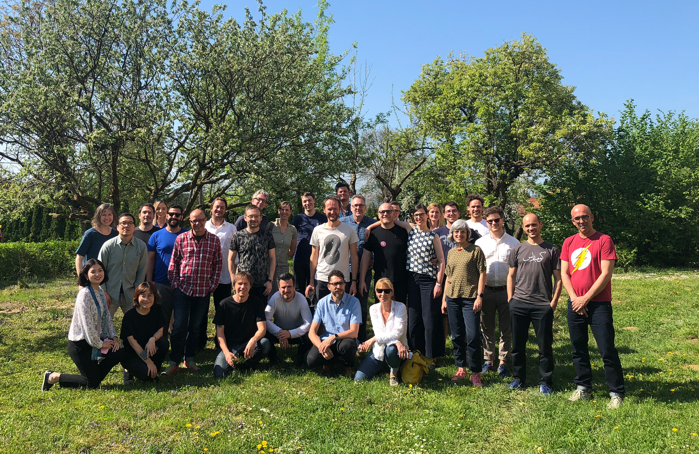
Fontstand Conference participants (Porto, 2019)
First line, sitting: Hyewon Han, Sandol; Yunjung Park, TLAB; Ludwig Übele, Ludwig Type; Dino dos Santos, DS Type; Matteo Bologna, Mucca Type; Susanne Zippel. Standing in order of appearance from left to right: Catherine Dixon; Young Oh Oh, TLAB; Jeremie Hornus, Black Foundry; Barbara Bigosińska; Kristyan Sarkis, TPTQ Arabic; Andreu Balius, Type Republic; Jonas Hecksher, Playtype; Andrej Krátky, Fontstand; Paul van der Laan, Bold Monday; Stefanie Bitzigeio; Quentin Schmerber, (then Production Type, now Swiss Typefaces); Peter Bilak (Fontstand, Typothqeue); Mathias Jespersen, PlayType; Martin Majoor, Questa Project; Nikola Djurek, Typotheque; Paul Barnes, Commercial Type; Indra Kupferschmid; Annemarie Friislund, PlayType; Marko Hrastovec; Laura Meseguer, Type-ø-tones; Ilya Ruderman, CSTM; Michael Hochleitner, Type Jockeys; Rui Abreu, R typography; Mario Feliciano (Feliciano Type Foundry).
You launched Fontstand in 2015. What dynamic do you see during these four years in numbers—fonts, users, incomes? Could you share some numbers with us?
First of all, we don’t really have a strict business plan, such that we know where we want to be in three years or five years, we don’t only think in terms of numbers. We strongly believe in the idea we can use creative ideas not just in drawing typefaces, but also how our work can be available to the public. We also believe in the power of community, so Fontstand feels like a grassroots organization. Of course, we want to be profitable and grow, but very cautiously. We would like to allow type designers getting paid for their work, and we want to also guarantee high quality fonts offered to the clients, which doesn’t always go hand in hand with growth, as you know. We work with foundries and makers by invitation. We carefully curate our library, but we don’t choose typefaces; we invite the designers behind them, and they choose what they want to offer.
Our offer is our platform. We offer these fonts for just 10% of the normal price per month for rental, but the price is controlled by the foundries. They see exactly how it goes, who tests fonts, who rents them , and how much they earn. At this point, there are about 50 foundries and there are always new releases. So Fontstand grows organically as foundries release new typefaces. In terms of users, it’s also growing. We have about 40,000 registered users on Fontstand, which again I don’t know if that’s a lot or not. We never had a target for these numbers, and focus on creating a value for the type foundries involved and for the users, of course.
Right now, the overall conversion rate 5.3, meaning that every fifth free trial converted to a paid rental. But that’s over five years. In the first year, it was one to eight, and now it’s less. So it’s getting better and better, because at the beginning people were just curious and they kept trying. And we are pleased to see that a lot of myths don’t hold up. People think, for example, that “only sans serif sells.” We showed at Porto that we have equal numbers of serifs and sans serifs, equal numbers of display and text fonts that sell. Actually, at the moment, the best-selling fonts are serif fonts.
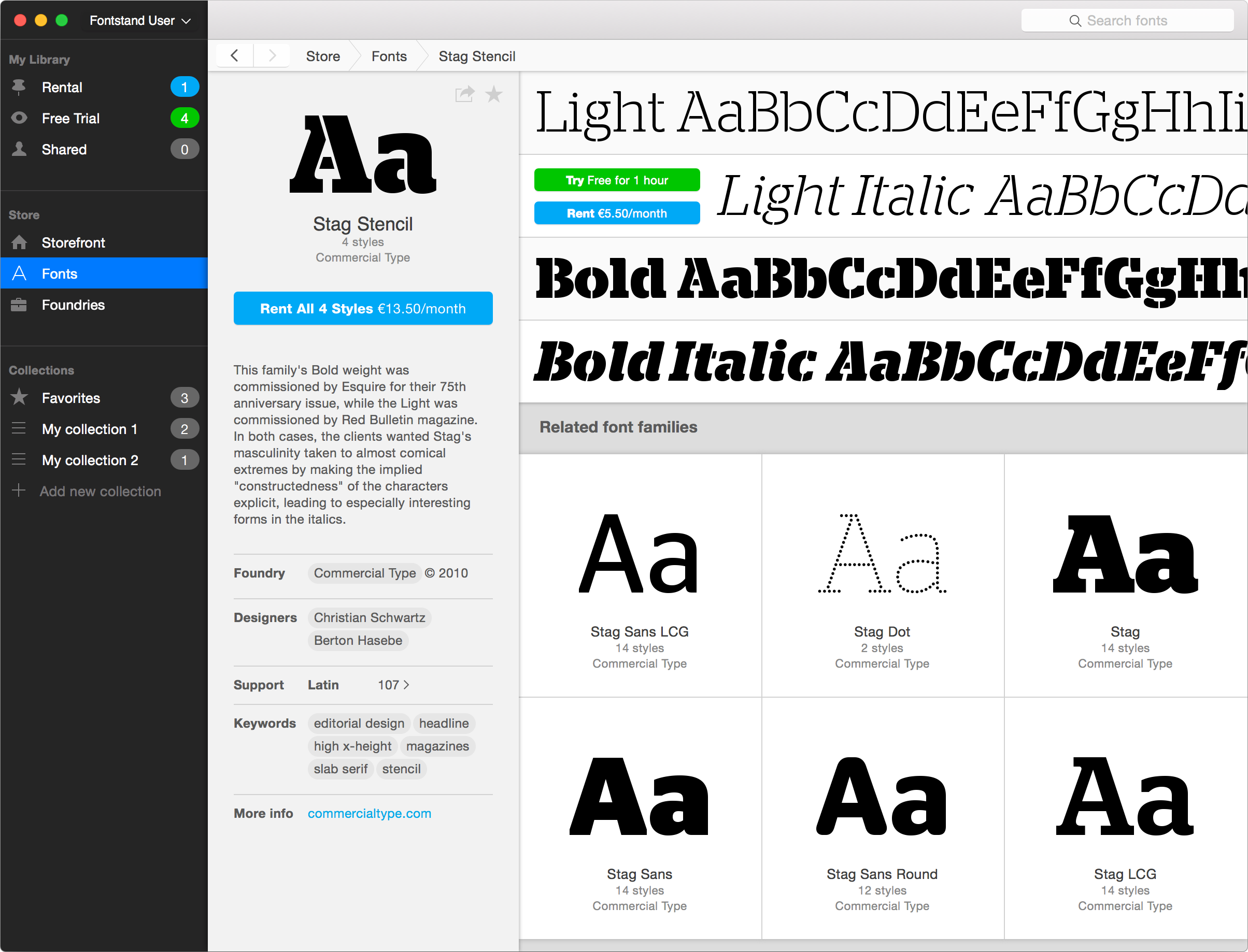
Fontstand’s font view. Fontstand, a simple standalone application for Mac OS X, (downloadable for free at Fontstand.com) marks a revolution in the way fonts are distributed and licensed. Conceived by independent type designers specifically to address the concerns of their industry, it provides customers with a simple way to try fonts for free and rent them by the month for a fraction of their regular price, an ideal solution if you need a font for just one project and don’t plan on using it again. At present, Fontstand features thousands of fonts and font families from more than 20 of the world’s top independent font foundries, including the work of internationally recognized designers.
(From a press-release by Ondrej Jób)
Speaking of the rental model versus subscription model for fonts, what was your main point for going with renting?
It’s a good question. In general, subscription often sounds like a very attractive model. I subscribe to magazines and think that’s a fair model. But the problem with the kind of subscription that Spotify offers, as also do many other digital services, is that there’s a fixed fee, say, $10, for an unlimited number of products. That means that there’s no price really per product. You can consume anything you want for that fixed price, which means that that $10 is divided infinitely by the number of products based on the usage algorithm. Practically speaking, very little gets back to the people who create the work, even those, whose music is very successful. And that’s why artists are disillusioned with Spotify, because on the one hand it became a huge success, with most people now consuming music by streaming, but you need millions of streams to pay just the minimal monthly salary of the content creator. Everyone uses Spotify, but no musician can live from the money that flows back to them.
Say, if we offered five million fonts or songs or books for $10, but what does that $10 represent, how do you get this number? We decided from the beginning to make clear that fonts represent certain value, and it is the makers who set the price.
It looks like the Fontstand is a big project. Obviously, it needed a lot of investment. How many people are working at the moment on Fontstand?
Fontstand is not so big operation. There are: Andrej Krátky, myself and Ondrej Jób, who designed the app and all the online things. But none of us are working full time on it. And then we have a team of developers, with four developers working full time. So there’s a bigger technical team and a smaller creative team, and we don’t have any managers.
To produce software is not cheap. There are no outside investors. We put our money into it, which shows our commitment. We believe that this is a good thing. We could possibly seek external investors, but that would change our priorities, then it becomes only about profits. We wanted to play by our rules. We put our savings into Fontstand. And this, as it happens, is the first year that Fontstand has been profitable, so it took over four years to get here. Again, there was no targeted “when”, there was no pressure to reach profitability by a set time, but, luckily, we’ve come to a good place. And it’s come at a time when we have to make further investments, for example for the upcoming iPad app, but now they can be made by the company itself.
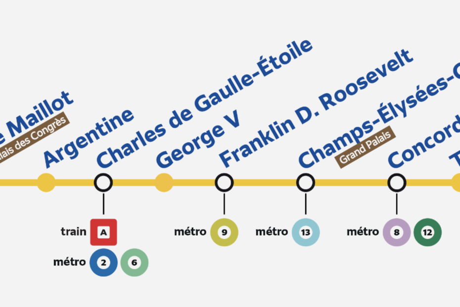
Changing the subject, I’ve always wanted to talk with you about your design projects. I know that you recently worked on typefaces for the Paris transport system. Could you tell us more about the details of the project? Is it finished?
First, it is not yet finished. It’s a fascinating project, mainly in terms of how it’s organized. Typically, a project like this would begin by working on construction first, and a year before launch there would be a call for design and then some design would happen. But not in this case. This is a new transportation system for Paris, called Grand Paris Express, and it will combine railroad and underground and everything, and there will be 80 new stations. It’s a very ambitious, very expensive, huge project, which, if things go well, will be ready in 2035. But projects like this usually don’t go well. They’re too complicated. So it is exceptional that they approached designers in this early phase, before the stations are even built.
There were plenty of questions. For example, how coherent or consistent should the signage be? Should it be identical in every station or different? We had to do a lot of research about the existing signage systems. And especially about what makes signage survive. If you look at the design for the Olympic games, you see how quickly things age. Look at something from 4 years ago, from 8 years ago, 12 years ago, and you see – yes, obviously it ages. So now it’s a question of how to design something that will last quite a long time; we have to design something now that will look fresh in 2035. This is a challenge. And typography plays a very important role in the project because it’s an element which ages the least.
If you look at type, you see that it’s not timeless but it’s more time-resistant than any other medium. If you look at architecture or pictograms or anything else, fashion, often you can identify when they were made. With type, it is a lot of durable. I was just reading a book about Silicon Valley set in a typeface that is 300 years old and it feels fine. It doesn’t feel disconnected because the shapes of type have solidified. They became standardized sometime during the Renaissance. And that’s why working with type became the solution. It’s quite safe to work with type as a key component in signage because it probably will hold up longer than other things.
So back to the project. The signage system will be in five languages: Chinese, Japanese, Arabic, French, of course, English — with three non-Latin scripts, this is quite different.
The typefaces should be durable, but should they be neutral as well?
No. We didn’t think that neutrality was the solution. We wanted to create something which is identifiable and specific to the place. So we are not trying to make something which is not rooted in anything. One decision that we made, for example, is that we are not going to replace existing signage. The new type is going to work next to everything else which has already been made. Paris signage from the 19th century, very Art Nouveau signage, will remain. Then you get postwar signage. And then you get Frutiger signs from the 1970s, and 1990s’ Jean François Porchez signage. These are like layers in archaeology. You see the differences. You don’t try to replace the past, although it sometimes happens that old signage no longer works, and then it is replaced. Only the new stations will use the new system fully.
The question is not how to link the new signage to everything else. It is really about Paris, about the city and about what there is already. I should have mentioned in the beginning that this is a project that was a commission from Integral Ruedi Baur Studio in Paris, who won the pitch. For the project they work with architects and psychologists. It’s about making a location specific, and they are trying to visualize different areas in different ways. There’ll be huge differences at every station. So neutrality was not something that was considered.
Do you think a typeface can be neutral?
I don’t think so. But I do think it’s a really interesting question. I like questions which don’t have a clear answer. I don’t think that’s really possible to make a neutral typeface. I think all typefaces involve a lot of decisions. Decisions about design are not neutral. They are informed by the past, history, your preferences. However, I do think that it’s interesting to consider the possibility — even when I think that’s basically impossible. I think you can’t write a neutral book, you can’t write neutral newspapers because you make your choices about what to talk about, when and how. News is not neutral; nothing is neutral.
The paradox is that we do work with neutrality.
You may have heard that Irina Smirnova is working now on a Cyrillic extension of the Neutral typeface by Kai Bernau. He designed the typeface in 2005 exploring how to make a typeface free of any connotations. Kai is a very serious guy, and he made a longer research into the subject. And since 2017, we work on different language versions of Neutral. We started working on Cyrillic, we tried to think if there was a neutral Russian typeface — what it might look like and what kind of methodology we should use. At first, Irina drew intuitively, relying on her sense of how she felt it should be and then slowly distanced herself and developed analytical methods for how to draw it. I don’t know if you’ve seen her research about this.
Yes, I talked with Irina Smirnova recently. She showed me some examples of her and Max Ilyinov research. It’s a really impressive analytical process, but I’m still wondering if it’s possible.
My conclusion is that it’s not possible. But again a lot of our projects start with a “what if” question. And then you push it, push it all the way you can. You make a commitment. Because if you only work from the methods you already believe in, you’ll always keep doing the same thing. What I really like about my work is that it’s different every time. Every project is very different. It provokes me to design a new workflow, new methods and new tools that allow me to get the most out of them.
Often we try to design things to be different, just slightly different than something else. But here we have a very different approach. Irina finds it really fascinating to draw differently from her usual manner. This really challenges her. And once she is satisfied with her drawing, how it should be, the second one is produced just relying on data, allowing data to structure the work. And then we compare. Sometimes the two results are very similar. Sometimes the process forces you to do completely different things than you feel you should. Sometimes she feels like the result is not really made by her.
For a long time, Kai didn’t feel that it would be possible to do a non-Latin version. I was always telling him, “Yes, it will be different, but maybe even more interesting.” The result will not be a literal translation of the existing typeface; it will be a different typeface, that explore the original concept.
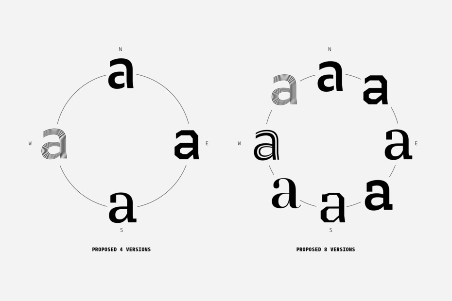
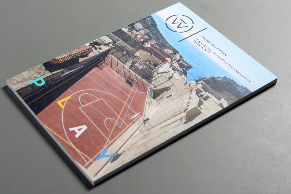
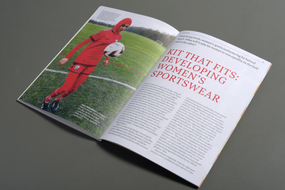
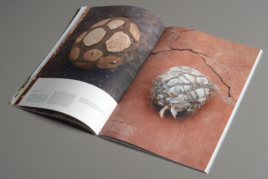
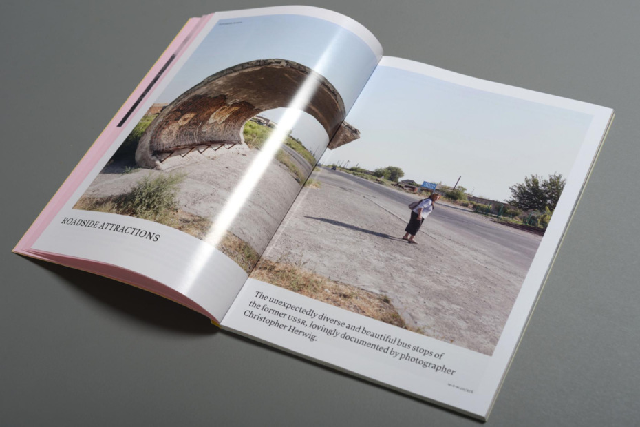
I’d like to talk about a completely opposite kind of situation, about the “tone of voice” of your magazine Works That Work. You designed the typeface Lava exclusively for the project in order to give it its own unique voice. A Russian type designer, Yuri Gordon, refers to this as “the taste of reading.” So what is the “taste of reading” produced by Lava? What was your aim?
Originally, I thought I’d design Works That Work myself. I had a concept of the magazine, and I started playing with layouts using existing typefaces, but I wasn’t satisfied with this because in this small format there’s not much that you can do with design. The type just had to be unique in some way. At the same time, the idea of the magazine was a design magazine for non-designers. And I didn’t want to make it overdesigned. I hoped for just a really normal reading experience. I was always thinking that it would be for my brother, who’s an engineer. And he has this filter. If something looks obviously designed from cover to cover, like Eye magazine, he says, “This is not for me; this is for designers.” So I wanted to see what a magazine might look like to make him feel comfortable as a reader and doesn’t shout out, “This is a design magazine.”
Another big factor in the design was that the magazine was conceived in 2012—the year that the iPad became a big thing. So I was thinking, OK, let’s create something which is about stories. It doesn’t really matter if it will be in print or digital or on phones or Kindles or whatever. But then the problem is that every device is different, and you can’t know what you’ll be read on. Formats are different, colors are different, layouts are different. The only common denominator is the typeface.
Halfway in, I changed my mind and realized I wouldn’t have the time to seriously design the magazine. To really do the job, I would have to spend all my time just running the magazine, being its publisher and editor. So I asked Kai Bernau and Susanna Carvalho to design it. They’re book designers. They had never designed a magazine before, which was the reason I wanted to work with them. I thought it had to feel bookish and very focused. They agreed and were very excited.
Much later, I told them that I wanted to use a typeface which didn’t exist yet. They were, like, “What? What it’s going to be?” You should know that they are very picky. The choice of type is something very personal for them. I knew that they might refuse the project just because of this. So I was a bit careful: “I will give you all possible freedom in using the typeface,” I said. They made a point that type is a tool and they need to know the tool. They can’t design a magazine without knowing the typeface, and they have to become comfortable with it. And they said they never used new fonts. They use fonts which they know very well, trying to get the most out of them.
I gave them a brief which was very open. The brief concerned the weight of the magazine, I told them it had to be under 200 grams, including the envelope. I gave them sample articles. But I didn’t give them the format, but it’s just clear if you know about printing prices in the Netherlands and you’re trying to be very economical that it comes down to very few options. Happily, they came to the same format, which I had in mind, rather bookish size – 17×24 cm. It’s the format in the Netherlands where you don’t waste any paper.
I think that they respect all our fonts, but they wouldn’t use them. They have just a different way of working. I’m not sure if they ever used our fonts before, but I didn’t force them. So finally I showed them sketches of the typeface and I was relieved that they liked it a lot.
How did you describe to yourself the new typeface for WTW? What were you looking for when you made the first sketches?
My closest reference was Plantin. I really like how Plantin looks in books. It has a kind of confidence that you don’t doubt – you see it and there’s no doubt. Any typeface (even Times) – when I see it, I wonder, really? I don’t have immediate, full trust. So you’re looking for something that makes you feel like, “End of questions; it’s fine.”
You can compare typefaces to handshakes. Sometimes you get handshakes that go like “mmm?”… And sometimes a handshake that isn’t forceful is convincing. And you feel, yes, the person knows what he’s doing. The same with voices, and the same with types. I think credibility/authority is an important aspect. Authority means that you don’t doubt what you see; it is not just trying to surprise – “I do it differently.” Lava is completely relaxed, not in your face. It works in a subtle way. Probably, it works more subtly than any of my other fonts. And I’ve become very fond of it. I never thought that it would have such a good afterlife because it was made for the magazine project, but now you can see it in many other projects.
I can confirm that: you can see Lava in Russian fashion magazines and in news media broadcasts, on educational websites and so on. Lava is used, for example, for the brilliant educational project, Arzamas. Very different voices but the same impression. My next question is about the typeface for Dot Dot Dot magazine. It was a completely different story, wasn’t it? You used a very eccentric typeface, Mitim, by a Czech type designer, Radim Peško. And that magazine, in contrast to WTW, was trying to be really unique. How was that?
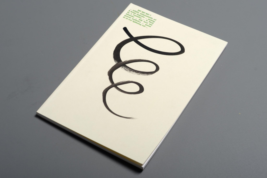
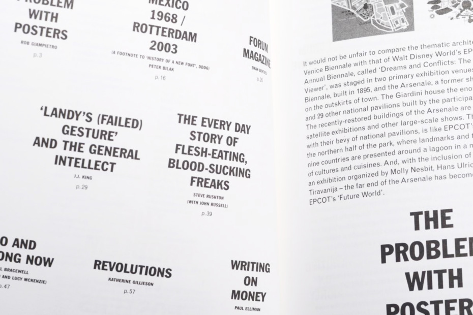
Dot Dot Dot is an older project that started back in 1999. The first issue of DDD used my typeface, Eureka. I think Eureka was used for the first three issues. Then it was Plantin, which we both (Stuart Bailey and I) liked a lot. But, halfway along, on issue nine or ten, we realized that DDD had stopped being a design magazine. It was an art project – about language, music, everything. It became very self-conscious.
First, we didn’t know much about editing and publishing. I think sometimes there were pieces that shouldn’t have been there. Then we slowly began to have different aesthetic preferences: we argued about choices of type, about colors, about things and what they meant to us. Frequently, we couldn’t agree on things. So commissioning Radim was the solution. I had known him for a long time. So we decided to give it a try. We gave him our full trust to make something, and we didn’t know what it was going to be. We gave him a design brief for a typeface, and we showed him what we had used before. But you have to realize that Radim is not a classically trained typographer. We knew that the result was not going to be a book typeface of the kind that we’d get, for example, from my colleagues at Type and Media. Radim’s work is funky, loud, a bit hipster (and was so long before the word became popular).
He worked very quickly. In a week he gave us a font which was something that I would never have used normally, of course. Neither would Stuart, I think. We were just wondering, “What the hell is that?” But we agreed that we’d use it. That was our commitment. I think there was some feedback I gave Radim. We asked him to change a few things, but the deal was that we’d use what we had and would use the updates for the future. I think it is different in every issue. In the beginning it was really rough, but slowly it gets more refined.
Slowly, it gets more weights, more character support, slowly it gets everything. And the deal was that we would pay him per issue; we couldn’t afford serious money. And we accepted the typeface as a person, like someone who comes for a visit, but you didn’t choose this persons personality. But, well, it is a person, and we have to have respect whoever it is. So neither Stuart nor I chose it based on what we normally use, but we had to work with it to find out if we could do something with it.
How did the new typeface affect the magazine?
It changed the magazine very much. It became even more idiosyncratic. It became even weirder. At the time I’d been working on that magazine already for five years. I thought that we had done most of we had wanted to do. But Stuart felt differently, there was still a lot more that he wanted to do with it. We had an exhibition in Tallinn, Estonia, for the 10th issue. And for me it was almost like the end of a project. For Stuart, it was a time to steer it, to make it even more an art magazine. So it became more about art. For me, the criteria for selection were not clear, what should be and what should not be included. Around issue 12, I slowly distanced from the project. And slowly, after having been someone who started the magazine, I became just a reader.
Mitim by Radim Peško (2005–2010) is an ongoing project/typeface designed upon a specific brief* for Dot Dot Dot magazine and characterized by its triangular serifs. The Mitim family of fonts grows and develops with each new issue of the magazine in response to the changing conditions of its production: the context, theme, approach and spirit as well as restrictions in production processes, and the needs of specific contributions.
To me, WTW was very much a kind of reaction to DDD. A matter of trying to learn from that experience, from what I learned about working with text, how to make choices, how to work with authors, how to work with images. And I probably developed a lot more responsibility towards readers. You know, I would often meet readers who said about the DDD magazine: “Oh! I love this so much! It’s really fascinating! I have no idea what it means, but I really like it!” And, I thought, this is terrible because sometimes neither readers nor editors knew what we were really doing. It looked interesting, but no one really knew what it was about. This is something that not many people are willing to admit – but it means you have kind of lost control.
And with WTW I learned that if I didn’t understand even a single word, I wouldn’t publish it. If I don’t understand it as a publisher, there is no way that I am going to offer it to a reader. So it’s a completely different way of working with text. And we were very picky about the texts. We did a lot, actually. For every article we spent 8-10 months working to source everything, to check everything four times. There’s a lot of unique content, and I knew the articles would be strong.
Everyone was so upset when you shut down WTW after the tenth issue. What drove you to close it up?
Well, there were many things involved. First, a project like this requires a certain intensity. It’s like physical exercise – you know you can sprint only as long as you can sprint. If you want to change, then you have to start running marathons, but it’s different then. The rhythm, the tempo, the amount of work - it was a very intense project. And we knew about this. And I was worried. I knew from DDD that at one point I would lose interest, and I wanted to prevent that, so I wanted to end the project before that happened. And from the very beginning, I had said this would be a time-limited project. It was something that had a beginning and would need an end. I think I suggested around issue five for the first time that a logical end seemed to be number 10.
There are many magazines that disappear without even knowing that they have disappeared. For example, we have worked with some writers who had written for Colors magazine before. And someone was always saying, “I’m a former editor of Colors magazine,” and I would ask, “What happened to Colors?” “I don’t know.” Does it still exist?” “I don’t know.” No one knew. It was really weird. There can be this slow running out of energy, of interest. And that seemed to be the least desirable scenario.
The best thing about the project is that I am fully in charge and I can choose when to start, when to end. It’s not very often that you can choose when and how you want to end. Usually you are either forced by finances or by deadlines or by crisis or I don’t know by something else external. This will be an internally made decision that will be on our terms. And the final issue will be about celebrating not only the beginning but also the end because everything has an end cycle.
To put the period on a story is a strong decision — you should be proud of that. Let’s switch to your personal story, if you don’t mind. I am curious about how and when you immigrated from Slovakia. Why did you choose the Netherlands and what motivated your move? How did you put together your multicultural puzzle?
Everyone is born somewhere, and that’s not a choice we make. I happened to be born in the former Czechoslovakia. I never thought about it much. I do think that the place, where we live influences the way we see the world. But I never felt either proud or ashamed. It was just the place I was born. I had a happy childhood. Although if people ask me, “How could you have a happy childhood? You lived in Communism.” My father died when I was young. You don’t think about it as a boy. You find a way to deal with everything. And happiness is not a simple result of good living conditions.
I was born in 1973, and in 1989 the regime changed. It was the end of Communism in Czechoslovakia. I was 16. And it was a good timing. It’s just the time when you start having your opinions about things. Before that, I don’t think kids really think about society much. I remember that growing up under Communism was not streighforward. I was always told what was correct to say at school and which things were not correct, and you find a way to balance the world.
For example, there was the official news on TV, but at homes people listened to Radio Free Europe in the evenings. Slowly, I realized that there are different, parallel realities. And it was very subtle. Then I went to study in the US and realized that my perception was kind of corrupted. I would be with my American classmates, and they’d be telling that something had been on TV, so that meant it was true. But for me the fact that something was on TV didn’t make it true. And suddenly I realized that I was a lot more sensitive to different interpretations of facts. That’s why I never felt strongly about anything. I could see that the same thing can be viewed from many different perspectives.
By the time I was 16, I already spoke two languages – Russian was my second language. We had eight years of Russian in school. I could read Russian books, for example. I don’t speak it very well now but I still understand Russian.
Does it help you to make typefaces supporting the Cyrillic script?
Well, I can read it and can understand, so I think that does change things. I’ve been looking at Cyrillic since I was eight years old. It feels very familiar. It doesn’t feel strange, as it probably does to other people. Russian is the only foreign language I have ever studied. I never studied English. I speak French; I never studied French. I speak Dutch, and I never studied Dutch. Russian is the only language I studied besides Slovak. Probably I speak Russian the least well. But living in a small country means you have to speak other languages. You have to deal with other cultures.
After the change of regime, there was enthusiasm to travel. And for me it just happened at the right time because two years later I went to the university. It was a new situation, new possibilities, and I could do exchange programs. First, I went to England when I was 18 for a semester, and then I went to the US for a year and a half, and then I went to France for another year. So I spent four years abroad in exchange programs. And I think that fact also sped up my development. Because at that age you learn things much faster, like a sponge – absorbing, learning new things.
And when did you develop your interest in typography and want to become a type designer?
Type design kind of happened, just happened. It was never a decision. Because I lived in a small country, I worked with design, with publications. I remember the first time I worked on a book. I was writing it myself and I started looking at fonts. And the font that I chose didn’t have any Czech and Slovak diacritics. “What’s that?” I really wanted to use a German font, but you had to hack the fonts that came up yourself. So we tried to find out how to do that. I had no idea how… software was not available; there were no tutorials or literature to teach type design. Someone showed me the needed tools. So I started playing with them. I was probably messing up things badly. But you kind of do it because there’s nothing else.
Luckily, it was at a time when it wasn’t easy to publish things. I’m very happy about this, because, if it had been, it would be very embarrassing to see. I wrote two books as a student that were published, and I wanted to use my fonts, believing that authorship meant that you designed everything. I used my photography, I wrote the text and did everything, and I felt like I should probably make my own typeface. So finally it was set in my own typefaces. And slowly I realized that I quite like working with this, so I tried to see how I can get better. So looking for ways to learn more, I found Atelier national de création typographique in Paris (now renamed to ANRT), which offered a master’s degree. It was probably the only master’s program at that time in 1994. And I went there. Didn’t speak French, but you learn on the way. And I was working with type, but still there was no decision to be a type designer.
After the studies abroad, I came back to the country, which had become Slovakia already. In 1993 Slovakia became independent. I had a small job in an advertising agency. They really wanted to work with me because I had foreign experience, and I became an art director in the agency, and I ended up doing terrible work and knew it was terrible. I really became disillusioned…. This agency really wanted me to work there, so they offered me money and everything. But I remember the first day, I was going through the archives, and I was saying, “This is shit, this is shit, this is shit, we have to change this, this is really crap.” But eight months later, I was going around the same archive thinking, “This is actually OK, this is OK.” I can’t believe how my standards changed! And it became really scary.
When did you decide to change your location?
I thought that it was time to do something about this. And around the same time it happened that Johanna, my girlfriend, already lived in France, so nothing was holding me there. We had an apartment, and it happened to burn down. I remember Johanna was just visiting, we went out to the movies and then we were going home on Friday evening and saw this fire. We came closer and slowly realized that it was the house we lived in and it was on fire. I went there and saw it burning completely, and it held all my things – my computer, my work, my books. There was nothing left. So next day I quit the job in the agency and within a week I moved to the Netherlands.
It was like a signal. You have a chance to think things over when you lose things – to reconstruct what you had or to use the moment like, “maybe it’s time,” there’s nothing holding you and you have to use it. You have space to do something. I don’t want to sound too spiritual about it, but destruction can give you opportunities. Often when things happen, it’s like a kick in your butt, you can choose to do this or that, make a choice. People are usually too stressed at that time to make the right choices, and they often choose what they know, rather than what they don’t know. But for me it was like I woke up in the morning (I slept at a friend’s house) and thought, “Yes, of course, I’m quitting this job. I don’t really like it. Let’s start over.”
So nothing of my work before 1997 exists because all of it burned in this fire. All my previous life – my books, my posters, my everything – which I think was quite liberating. It was a clean start, because that stuff was also not very good. I am actually quite grateful for this incident. Everything was distroyed, and it was very liberating. Well, one typeface, Eureka, had been published. So that is one thing which hasn’t disappeared.
And there was Jan van Eyck academy in Maastricht, which was into publishing and exploring wider understanding of design. Publishing was something I was very interested in. I was very late applying, but they accepted me into the program. This was like a perfect coincidence and just the thing I needed. Ever since then, I’ve realized that every time we lose something, it’s a chance to go further. It’s always that you don’t know what’s right for you at that time, but the truth reveals itself much later, and the loss often has given you the space to do something.
Sometime ago I was in the Sequoia National Park in California. These trees can be a few thousand years old. They are really impressive. The thing about sequoia trees is that they need forest fires to survive. Without forest fires, they can’t multiply. Most of these big trees have survived hundreds of forest fires. Their cones need to heat up to a certain temperature and only then do they open, and they can replicate. And the fire usually kills everything around them because they need light and space.

Sequoia and Kings Canyon National Park. The fire started from a lightning strike in July 2010. Photo by Hirange
So I moved to the Netherlands two weeks after my home burned to the ground, which of course wasn’t planned. With such decisions you don’t really know what you have decided, what has happened. I had no plans to live here. I was there to do this course. I was in Maastricht for two years. It was a fantastic program and really great teachers.
Karl Martens and Irma Boom were among them, right? Could you tell us a bit more about your teachers? What did you learn from them?
Indeed. Irma Boom and Karl Martens were my teachers. Michael Rock was very important also. Armand Mavis and Jan Van Toorn, a lot of people from Yale University who taught there. From Jan van Toorn I became familiar with social activism, I learned a lot about the role of designer, like thinking not just about form but the meaning behind it and how to operate. So it was really eye-opening. At that time I think my work was extremely formal. When I came there, I learned how to think about what it all means.
They are completely different teachers. First of all, they were less teacher-like than any other teachers that I had. So they are taking you like an equal, and at first it is intimidating. They are more partners in discussions than they are teaching you something. I didn’t even understand that they were trying to teach me something – we were just talking about stuff. It was very personal, very close, very informal. And from everyone I learned different things. Karl Martens is not a big speaker, he doesn’t like speaking publicly but he knows what he’s doing.
I remember one thing – I was trying to learn from him more about grids and technical things. Once we were in a bookshop together, and he opened a book and put it down. “This is a terrible book. It smells really bad,” he said. “Well, it’s not the fault of the book.” “Of course, it is.” Anything that has to do with the book is part of the design, it’s been decided by designers. You chose how to produce it, and you can’t avoid responsibility for that. And to me, at first, I thought, “It’s not fair. Come on.” I thought, for me as a designer, I don’t have any say in this. But maybe you do have say in how the books are bound, how you produce books. He taught me a lot about binding methods. And I realized that I had never thought about it. Before that I thought that my thing was choosing colors and fonts, not even format…, But suddenly there was a discussion about how much a book should cost, and it’s one of the most important decisions in how a book is perceived.
With Irma Boom – the same thing. She told me what makes a book a book – the price, the accessibility. Irma would refuse to work mainly on private books because she felt that it’s being public that makes a book. Although she has a history of making private editions of books, I think right now she really likes to do mass-produced books, although she is recognized for extraordinary materials but she really wants to use accessible techniques to make them.
It was the time of the manifesto, “First Things First,” about the social responsibility of design. All of these designers thought about the responsibility of design. It changed the way I saw it. Suddenly it became less formal. I started thinking about what it means to other people and how to work. I think especially Americans brought this discussion about wider significance, about the cultural significance of your work.
And then I came to the Studio Dumbar, which was like a continuation of my education – more practical, how to operate the business, how to work with databases and things I’d never thought about. It was the first time I heard the term “database” and how we can use it in design. Before that, design for me was intuitive and suddenly it was very systematic. So again I learned different things. And slowly those kind of experiences combined to become a way of working.
And you left Dumbar after two years there? Too much of branding?
No, it was not like that. Dumbar, especially Gert Dumbar, the founder, felt very upset that I left. He didn’t speak to me for a few years. I really enjoyed being there. It was a very good experience. But after two years I felt like I was ready to move on and to work on my own. I don’t operate at my best when I’m given very little responsibility. And I’ve noticed that I’m not the best designer if you only want me to do just a logo or if I do something very limited because my mind goes quite wide. And I’m not really a specialist. I’m a generalist. So I came to the conclusion, somehow, that I have to run my own studio.
Now I think that was quite brave, because I was 28 and I was in this country only two years. I didn’t speak Dutch, I didn’t know any clients, but I felt like, “I’m going to run an office, I’m going to start a studio.” Then I got the project of Fedra Sans, a commission. That is also a dramatic story – my computer was stolen, I lost all my data, I had to redo all over again. And I believe it was better to do it again. When it was ready, the client stopped the project. It was commissioned by a big Swiss insurance company. And it was canceled, and I was really upset about it. But now I think that it was the best thing that could have happened because I could keep the typeface and I could start a type foundry with it. You don’t know sometimes what this kind of thing means.

Fedra type family (sans and serif) designed by Peter Bilak 2001–2009 with Gayaneh Bagdasaryan (Cyrillic). The typeface reflects the original design brief: it humanises the communicated message and adds simple, informal elegance. An important criterion was to create a typeface which works equally well on paper and on the computer screen. The typeface attempts to reconcile two opposing design approaches: rigidity of a typeface designed for the computer screen and flexibility of a handwriting.
If it had been up to me, things would have gone otherwise, but luckily I was somehow forced in a different direction, which was so much better than what I would have chosen. I could keep the rights. I was paid for making it, because they had stopped the project. It was an ideal situation – they pay you to do your own thing which you can keep and can sell later. Fedra supported many of our other projects. It allowed us to do other projects, because it became a quite popular typeface.
When did you start teaching at the KABK Type and Media?
Very quickly, probably too quickly. In 2001, the same year I started my studio, I was asked to do workshops there. I did one of the workshops, and then Type and Media was restructured. It used to be a two-year program with a limited number of teachers, and they changed it to one year – a shorter and more focused program. And I was part of the first generation of teachers there. Most of the students were even older that I was, which at that time was the case quite often. I wasn’t a very good teacher in the very beginning. But slowly things got better. I’ve been doing it long enough now, so I know a little more about what I am doing.
Are you satisfied with the results? How does it feel?
The last year was a very good year, but a good year is also hard for some people because we have a couple of exceptional students, and that puts all the pressure on students who are in the lower half. But it’s a very good year, very hard working, very motivated. And I’m looking forward, which means that we’ll get good results. Every year is different, of course, but usually it’s a joy to work with the students. Because they’re so hard working. They exceed their own expectations. In other schools, you push students to do more. In T&M you have to stop them because they keep going, forget to sleep and eat. I’m also learning a lot. I have to prepare lectures for T&M, and in this way I have a chance to explore my own interests. Usually, whatever I’m working with, I use it to build a more theoretical foundation for the work. So teaching complements my own practice, and hopefully students find it relevant. And slowly you become more articulate about what you’re looking for, what you want to do, and what you want from the class.
I noticed that you quite often mention long-term projects. Long-term can be quite long. Your History typeface took 12 years, for example, and then there is the Fedra type family and so on. A long-term project needs a huge amount of investment – time, money and enthusiasm. What drives you in long-term projects? Is it a psychological thing?
Have you seen this?
Oh, yes. The 100-year calendar.
The thing is that every day I can check if I am up to date. Often in business you think about next year, next quarter. Here you have 100 years. I created it right before 2000. I thought we were lucky to witness the next century. It’s not very often that you start from scratch where there’s three zeros. When we shift the perspective, we get a lot to think about.
For example, we can see here how far we have come in the 21st century, and my daughter will probably die somewhere here (Peter points to the calendar). It gives you a different perspective. Sometimes you become too busy with things, you sit in front of the computer and lose track of what you’re doing. Forgetting why you are here, what you really want to do.
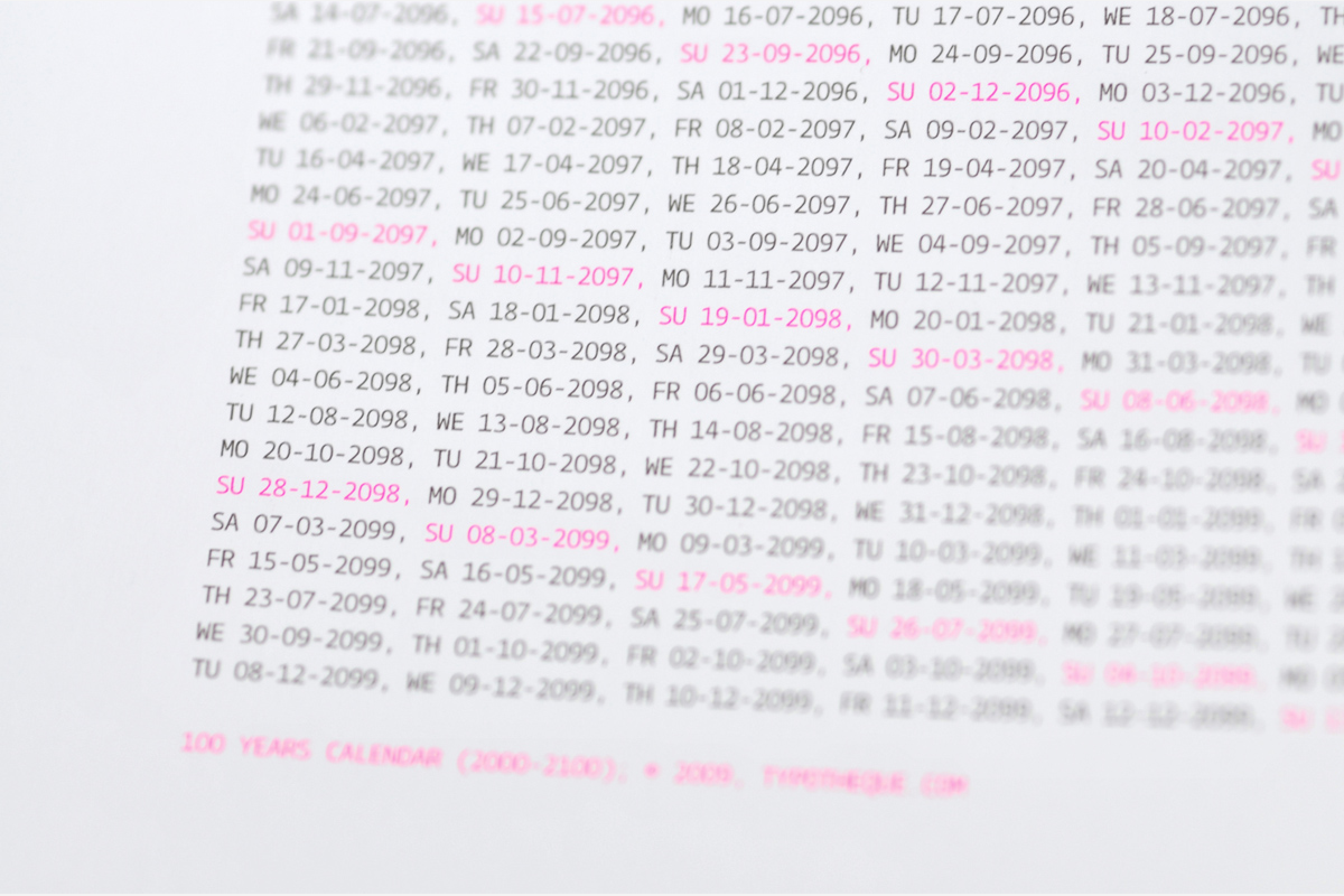
This oversized silkscreened poster (84 × 119 cm) presents all the days of the 21st century, with weekends clearly marked in magenta. The 100-Year Calendar was produced for the Experimenta 2009 exhibition, exhibited as a one-off print, and is now available in a limited edition. You may not know what the future holds, but at least you will know when it will be.
So why not just step back and try to think about your own life like any other project. That’s the question. I do think that we have the ability to design our life, with all our choices. But we often forget about it because we work for clients who need something tomorrow. The calendar allows me to shift perspective. I think a good aim is to see how the world would look for your kids. I think if people would consider it more, there would be different choices, different design, different everything. If you think longer term, you maybe use different inks, maybe you use different amounts of everything and you just choose the right things. And there’s one reason why I like to work with type – because it’s something that has the potential to outlive its makers, if it’s done right.
How do you divide your time between different activities? Making typefaces, publishing books, running business like Fontstand and partnerships in different foundries takes a tremendous amount of time, I think. How do you cope with all of this? Literally, how do you manage things?
It’s simple. You can only do one thing at a time. So I never try to do more than one thing. And at that moment everything else is set aside. The trick is just to find which thing needs to be done. When people try to do more than one thing, things go wrong. They just don’t do it well enough. It’s not properly made. It’s one thing that I’m trying to teach my daughter – the ability to focus. I think this distinguishes great work from less good work. We are too distracted by notifications, phone calls, everything. We lose track of what we want to do. Unfortunately, this means that sometimes I have to deliberately ignore things because I really want to focus on one thing.
And you have to find a way that works for you. I know some things that work for me. In the mornings, I work off-line. I can’t do it the whole day. In the afternoon, I work with the internet. And I create room for creation. If you spend all your time responding to messages and updates and notifications, there’s no space or time to do anything new because you’re only reacting. Unfortunately, we are trained today to react to everything.
Do you practice meditation regularly?
I do. It’s one of the things that keep me from being overwhelmed by things that are temporary. A lot of things that we consider important are temporary things. They come and go. As everything does. So you worry less and less about them. You see that they are temporary, and then it becomes easier to work because you don’t get stressed. Stress is not great for creative work. And I’m also very fast with work, if I know what to do. The hardest thing is to find out what to do. Once I know what to do, it goes very fast.
And another point that I’ve noticed is that I’m privileged for three reasons in terms of productivity. The first, my family, my wife Johanna, allows me to focus on work. The second, I work with great collaborators. I don’t need to commute anywhere. For me commuting is taking a bicycle and going to a place. When I lived in Paris, I spent two hours in transport somewhere. So I can be productive, I can focus, I can do the work. And last but not least, I don’t have to sit in meetings. It’s such a great thing.
And of course I work with very talented, self-driven people whom I can fully trust. I need to mention our partner Nikola, with whom I discuss the big picture but don’t micromanage his work. That also helps to do the work. All the work which is done here is done with the collaboration with other people. So I’m not the sole author. And I don’t remember doing a typeface from beginning until the end alone. We do quite complex projects, so there’s a lot of collaboration. And also I learned how to deal with people, how to give them space. Currently, we work on a large pan-Indian typeface supporting 10 different writing scripts, and we work with 15 different people.
Probably that is why you can cope with the huge multilingual type-design projects. Typotheque is one of the few type foundries which designs an extended Cyrillic set, for example. I am sure it’s not just about markets, it’s not about business, but it would be good to hear from you what motivates you to design such big families for different type systems. We are talking not only about Cyrillic, of course.
I don’t believe that you should make choices based solely on commercial criteria – how much you can sell. Because if you did, then you would only do it for the 26 letters of English because that’s the biggest market. Again, probably coming from a small country which was a bit ignored by major type foundries, I don’t want to make the same mistake that I create typefaces that someone can’t use because I didn’t consider the place to be a market. Often people don’t do a particular glyph because they think it’s too much work. And one glyph can make a difference in the usability of the font.
And every few years we choose to focus on a linguistic program. We did this with Hebrew. Now we are busy with Armenian. Why would we do Armenian, with population of less than 3 million, where no other language is using this script? It’s ridiculous. But I do think that there’s a lot of cultural value, there’s a lot of value that I’m learning for myself. So we choose things not just in terms of commerce.
Some languages are still not encoded, and they need to be encoded. For some, there are no tools, no infrastructure, for some there are no fonts. That’s something we want to do. We are at work on two projects (about which it is too early to talk) for languages for which there are no digital fonts as yet. Is there a market for this? I don’t know, but we still want to do it.
I see you have a copy of The Theory of Type Design by Gerard Unger. We are working on Russian translation of his While You’re Reading. Did you ever work with Gerard?
I knew Gerard for a long time, but I never worked with him. I met him when I was still in Paris in 1994, and we stayed in touch, always in good contact. I admired him greatly. It was sad that he passed away. He was very open when he was diagnosed with cancer. He was very open about everything. He knew his prognosis. And his last 12 months were very productive. He was really trying to make sure that he left something behind. We had discussions about type, about originality… He was someone I admired, who permanently changed how we understand our profession.
Great, thank you for these words, Peter. Thank you so much for your time. I think we are done.
Good luck with the transcription!
Type journal would like to thank: Dmitry Pilikov for his accompanying in the trip to The Hague, and his help with the photo shooting and recording of the interview; and Olga Krivovjaz for her help with transcription.
The First Things First manifesto was written on 29 November 1963 and published in 1964 by Ken Garland. It was backed by over 400 graphic designers and artists and also received the backing of Tony Benn, a radical left-wing MP and activist, who published it in its entirety in The Guardian newspaper.
