 designer’s creative path is determined by the desire to find his or her own voice and style of work when creating type. Typographers are just as familiar with the eternal confrontation between form and content as writers or painters, but new discoveries are being made in our sphere despite the complexity of creative tasks. By Masha from Russia—this playful phrase conceals a great amount of work done by Maria Doreuli over the past few years, including some legitimate success stories: the victory of typeface William at the Grandchamp (2011) and Letter.2 (2011) competitions, a master’s degree in Type & Media from the Royal Academy of Art (KABK) in Holland (2013), and the recent nomination of font Chimera at TDC2 in New York (2014). These achievements have made Maria’s name noticeable even when looking at the modern type design landscape from a distance—especially if it’s typeset in Chimera.
Masha, I would first like to ask you a question about the three spheres that are mentioned on your website: graphic design, type design and writing. Let’s start with writing—it’s a pretty rare professional direction these days in Russia. What topics are you interested in?
Everything’s more or less clear with font and design—it’s my work and I’m genuinely fascinated by it. Before, I wasn’t really attracted to, say, essays at school. I didn’t particularly like analysing things and couldn’t understand why it’s necessary. The desire to write appeared during my studies in Holland on the Type & Media course: I realised that it’s an important aspect of research.
At this point, we can talk a little bit about the blog you recently launched with Krista Radoeva. By the way, what is Cyrillicsly?
“Cyrillicsly” is one of our Type & Media inside jokes. Instead of “Seriously?!”, We used to say “Cyrillicsly?!”, and also substituted other words with type buzzwords: excited—x-heighted, I agree—I a greek. At first, we used #cyrillicsly on Twitter. It was just funny, and we’ve got used to it and decided that it’s not a bad name for a blog either. Cyrillicsly is a place where we share our thoughts. We’re not planning on developing it into an academic resource teaching people how to draw Cyrillic. We still only have one article though, so at the moment it’s more talk than actions.
For a long time in Russia there’s been a vacuum in which there’s little information about the profession. Foreign colleagues don’t know much about us.
I feel the need to write in English, not in Russian, especially on social media like Facebook and Twitter. For me, it’s not only an opportunity to maintain contact with colleagues, but also just a way to pay tribute to foreign friends. Take the Dutch, for example: they often write in English (though they have their own native language too), thereby broadening their professional horizons and engaging in international discussion.
The themes we are going to discuss in the blog are in-between different Cyrillic alphabets, but that isn’t the only focus. We rather wanted to highlight the variety of possibilities and show how different Cyrillic can be. I’m outraged by the way Russian colleagues try to ossify Cyrillic, effectively stopping its further development. I’m also pretty sceptical about many things, but I think that you definitely have to try something new. After all, you can only draw conclusions about the feasibility of an experiment once you’ve carried it out.
Last year at the conferences Serebro Nabora in Moscow and ATypI in Amsterdam you and Krista raised the question of the peculiarities of Cyrillics—Russian and Bulgarian—it was in a certain sense a provocative topic…
After the conferences and after we published some of our material in the blog, Krista and I started to get a angry emails along the lines of “What are you writing about?”, “What do you even know about this?” and “You’re all wrong!” In fact, it was all focused on details. We had to mention key but often controversial historical events when speaking about different Cyrillic alphabets, but it was more of an introduction for those who don’t know. The main theme was how our designers and foreign designers comprehend different Cyrillics. So the next post will be about the different themes that we discussed at the AtypI with Western designers, and the results of discussions at the Serebro Nabora conference. In a word, we’ll post it, then we’ll talk.
Let’s go back to type as a primary occupation. For you, it started with Alexander Tarbeev’s workshop. Five years have already passed since your graduation. What’s changed in the workshop over this time?
I don’t think it’s changed much. There’s always some natural development, of course. When you study, you’re guided by work that’s been done by students before you; you look at the people who were there, and set a standard for yourself. The more strong works there are, the harder you try to reach the same level and do even more.
Did your graduation project William—a historical revival of the Caslon typeface—turn out to be that sort of high-level standard for you?
I studied together with Artem Utkin and always wondered how he managed to get so much done. It seemed that while I was working on one style, he could finish everything: a load of styles and an enormous character set. In many ways I compared myself to him and realised that you really have to find the time and work.
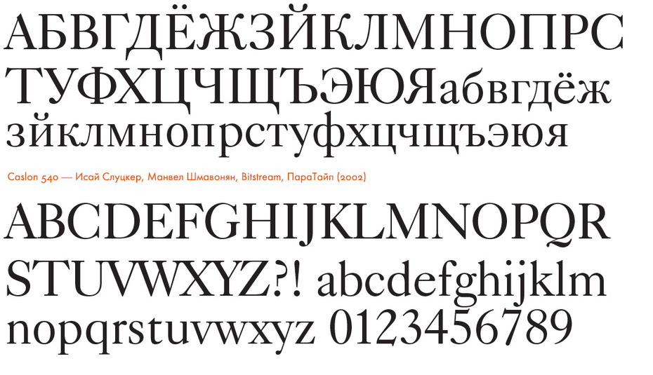
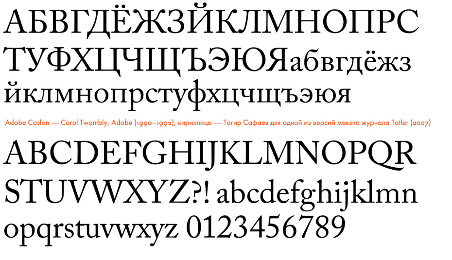
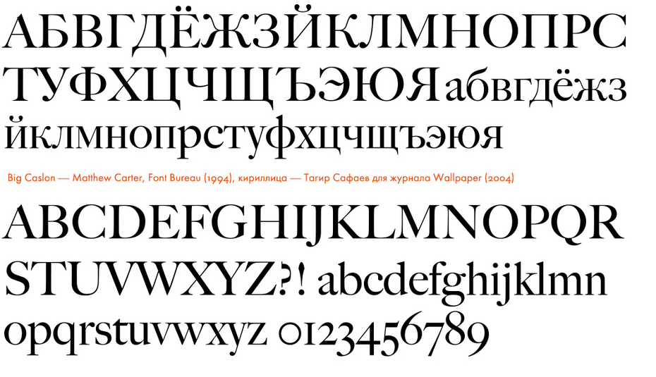
William came a little later. One day, when our group was considering graduation project topics and sketching ideas, Alexander brought in several typeface catalogues, “I found these on the internet, have a look”. That was the time when I got inspired by the idea of creating a superfamily: sans and serif. By that time I’ve already did some drawings, but nothing came out of it—it was really bad! Then he brought me something and said, “You could do a Cyrillic version of one of these typefaces. Maria, you should go and make a Cyrillic Caslon!” I decided to give it a try, seeing as I didn’t have a remarkable topic: I digitised a few letters from one of the smallest point sizes from the catalogue. There was quite a meagre amount of material for historical reconstruction: I enlarged these not very high-quality images and started to work, making my way through the huge pixels.
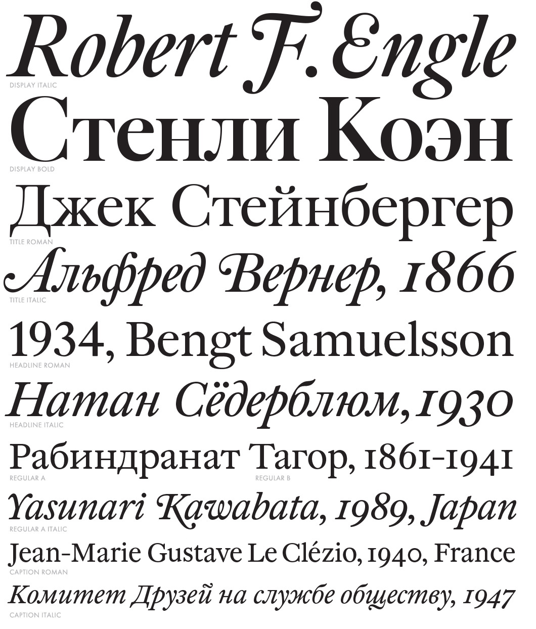
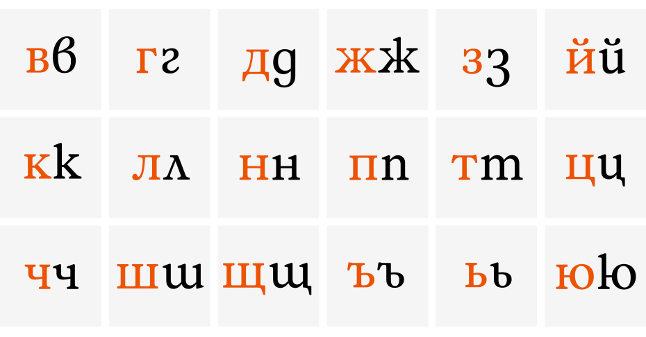
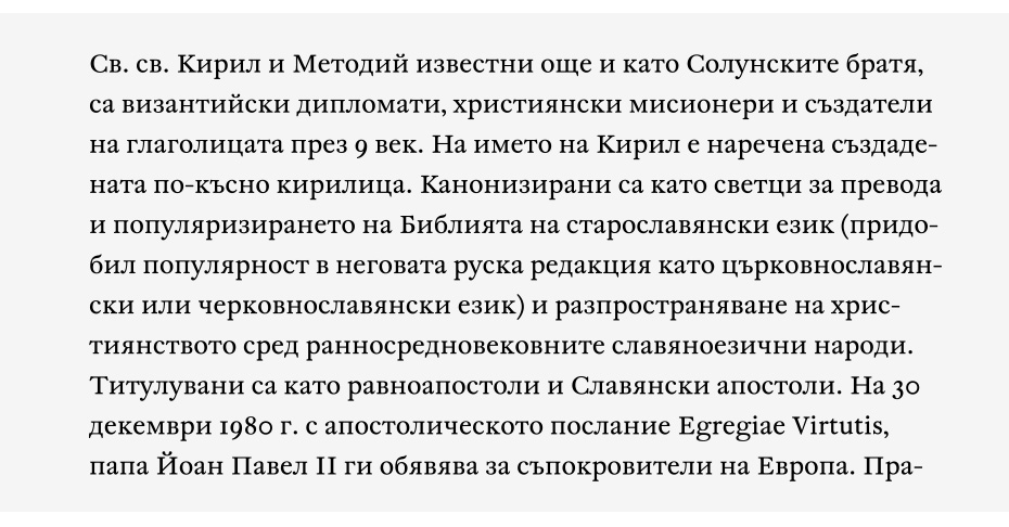
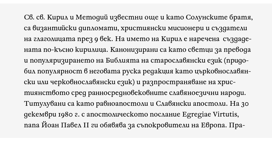
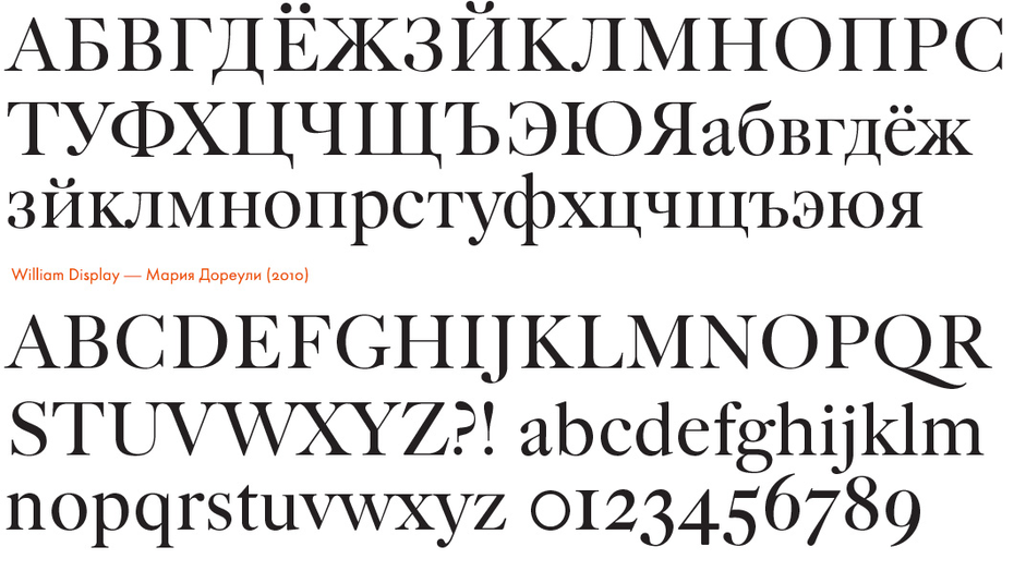
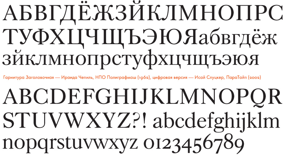
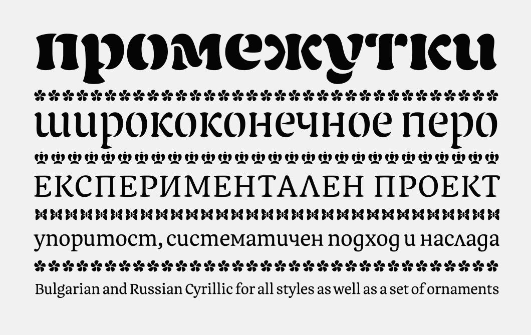
Work on the William type family spanned seven years. It immediately became popular on release. Designers found and appreciated novelty not in the design (form), but in the heart of the family, which was just the thing to require so much time: a wide range of styles (three for large point sizes with finely tuned letter fitting and diverse contrast, two text faces for different types of paper, an italic with swashes and a decorative style, as well as a large number of ligatures and alternatives), multi-language support and, of course, small caps with old style figures.
As a matter of fact, I studied the letters one by one during the process: Latin first, then I proceeded to Cyrillic. I remember, I couldn’t get the letter б (Cyrillic “Be”) right for a long time. It was my first experience of designing type, so I did everything from the very start, and sometimes I had to do things over and over again. It was a long process; I started three years before graduation. Later Alexander would be saying, “I should have done it myself!” I think he found those catalogues around March. By May, I already had some basic characters in the text style. Then in the autumn, during the ATypI Conference in St. Petersburg, Artem and I got to go to a two-day Akira Kobayashi workshop and worked on our projects there.
Which of Akira Kobayashi’s comments do you remember? How did he give you feedback?
We all came with what we had and just continued working in front of him. He went from one table to another, had a thorough look and gave advice. Now I can’t remember exactly what Akira told me, but I was filled with a deep respect for him. Surprisingly, later he recognised me when he came to our KABK course with a lecture. We met once, and he recognised me after quite few years and remembered my name—I was surprised!
Taking into account the fact that William Caslon I created his type in the 18th century, did you think of making, for example, a stylistic set with the form of Cyrillic characters corresponding to that era?
William isn’t a purely historical revival, but rather a modern interpretation. I think that there has to be a strong reason for alternative characters. For example, in the case of the shape of Д and Л—rectangular or triangular—the designer has to decide which form, in his opinion, fits to the idea and character of the typeface the most. I don’t think it’s a place where there can be alternatives. These are some of the key letters, so a decision regarding them should be made. When several constructions are included in a typeface, this makes me feel that the designer wasn’t able to make a decision. With William, I didn’t want to make references to the past. I wanted to make the Cyrillic contemporary.
What was William’s fate after your graduation? Did you have plans to release it at a type foundry?
I started the project in 2007, so it’s been haunting me for nearly seven years now. After graduation, a publishing house (we later fell out) bought it for the first time and printed a series of books. I always wanted to complete William, but I already had a job at the RIA Novosti news agency, so didn’t have any time. Then I was approached by a client from Kiev who wanted to license all the styles of William for the Zhensky Zhurnal magazine (Women’s Magazine). I thought, “Well, now I’ll have to rush and finish all the styles just for him. I’ll better tell him a high price so he says no”. I told him the price, but he didn’t say no… And I had to finish everything within three months! The text style was already more or less done and the main part of the headline character set existed, but the italics were just started and included only few letters.
It was very intense—I worked a full working day, then a “full working night”, with no weekends. I remember the last day when I had to send off these files, I was falling asleep on my feet and afraid of falling over in the metro on my way to work. I didn’t have any energy at all. But in the end I got the type family ready with everything that was originally planned. Some of the styles are in exactly the same condition now.
That’s not to say that I’m happy with how it all worked out. Only later I realised: you can never be fully happy with everything. Nevertheless, it was a certain stage, I finished the typeface in a way that I was able to submit it to the Letter.2 competition. It proved to be important that I still had three months left to prepare well for the competition.
We talked about Artem Utkin setting the bar high, which was an incentive. Continuing the theme of your studies, what was the group like on the Type & Media course? Which reference points did you have there?
As for t]m, things are completely different: the group itself was important there, not just one person. Because everyone comes from different backgrounds, different countries and is really different, so they influence each other. From the start, we set out to socialise: celebrated birthdays, New Year, Easter, made cakes. Studying wasn’t the only important thing for us, the fact that we were together was too—we still do a lot of travelling to different countries and are delighted when we manage to meet up.
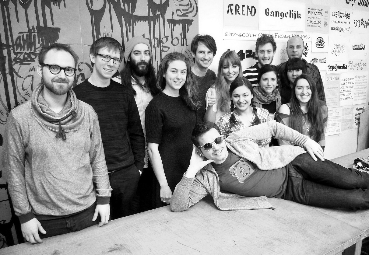
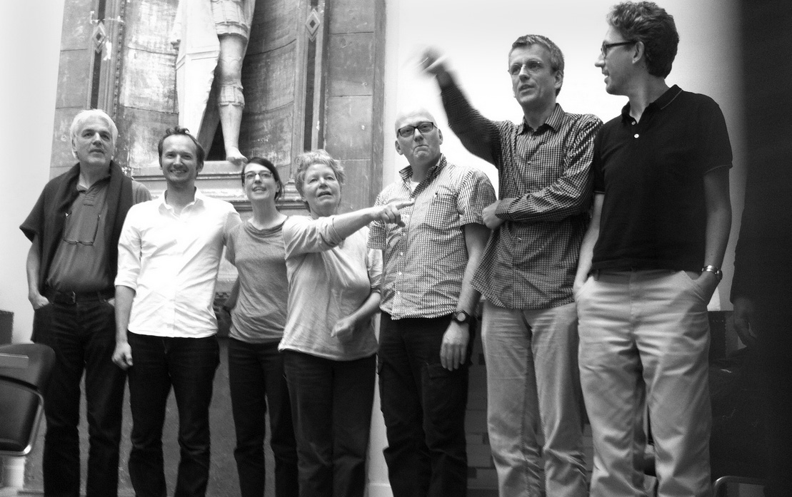
Students of the Type & Media course after Miguel Sousa’s workshop. From left to right: Teo Tuominen, Bernd Volmer, Étienne Aubert Bonn, Maria Doreuli, Troy Leinster, Barbara Bigosińska, Diana Ovezea, Adam Katyi, Tania Alvarez, Lukas Schneider, Sun Helen Isdahl Kalvenes, Krista Radoeva. On the table—Miguel Sousa (Adobe). The Hague, 2013.
I understand that the selection of a harmonious group is one of the important concepts of the Type & Media course and its supervisor Jan Willem Stas—the key to a successful learning process.
It really is. Jan Willem never explained exactly how it’s done, but I guess that the teachers could possibly see a person at the interview and say, “No, this one’s not for us”, even if they have an interesting portfolio. Personality is important. People are different and the work during the course is very intensive, everyone is together all the time, so it’s important to avoid situations that would get in the way of studying.
I didn’t get in the first time. It was probably for the best—at the time that wasn’t my ultimate goal. But it was a blow to my self-esteem when I was turned down, of course. I decided not to apply anymore and continue to progress myself. Later I changed my mind—after all, you shouldn’t miss such an opportunity when you have the chance, while you don’t have kids and there’s nothing to stop you. So I decided to go all out: I went to the open day and took a more considered approach to my portfolio—got rid of the excess and filled it with some new work. I found out afterwards that they weren’t sure whether to take me again, but accepted me after they saw me at the open day and the Roboton conference in The Hague.
When did getting into Type & Media become your goal? Did you already realise that you had to move on after you finished your studies at Tarbeev’s workshop?
During my studies, everyone did nothing but talk about Type & Media, a lot of people studied there. But I thought it would be better to go to Reading—Sophia Safayeva was the only one to study there (that’s one of my characteristics—to refuse something that is too popular). I thought about Reading, but realised that it’s a lot of money and not a the best possibility for me.
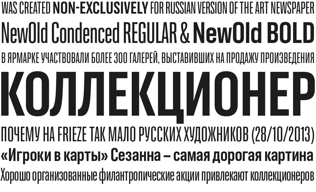
When I was working on the grotesque NewOld for Dima Barbanel, I got hung up on the fact that I can’t do anything new and original, that I work on the things that were already done before and just including Cyrillic there. This made me sad and I was fed up with work too: on the one hand, I learned a lot at RIA Novosti, but after about a year—18 months I had an idea in my mind that I want to quit. I had to finish William, do something independently, practice calligraphy… I wanted to progress, but didn’t have enough time because of my main job. A solution that was comfortable for all sides suggested itself: I sort of didn’t quit, I just left to study.
How did work start on the course? What was the most difficult thing at first?
The first semester lasts until the end of January. Usually, there are two classes a day—in the morning and evening, and students get homework to do for the next day. Classes go on until 5-6 pm, then there’s still a load of homework—and you can’t put it off until the weekend, you have to do it every day. It’s really hard work. Until about October, the pace is a bit calmer and it seems that everything is all right: trips, museums, more theory, but in November you realise that you’ve done nothing and now have to work twice as hard. This is how you learn to make decisions quickly, because there is no time for hesitation. You have to work constantly.
The main advantage of the first part of the course is that you don’t only master new techniques, but also analyse what you’re better at and what you’re worse at—this is the first step to starting your graduate project. You try a variety of things, which gives you a foundation and lets you understand what are you up to and what inspires you. At the same time as studying, you try to find your own path.
How were the theoretical lessons? Which topics did you discuss and what was the most useful thing for you in the programme?
It’s quite flexible—there is a certain programme that’s given to everyone, but the topics of classes depend largely on the students’ initiative. It’s important for the teachers to see what we’re interested in, what it’s worth focusing on and what we already know. For them it’s important that the students ask questions instead of sitting in silence. If the class is quiet, you can conclude that we already know everything and there might not even be a need to tell us all of this. I think this is also an element of education that is required for type designers—to learn to look for problems yourself. The most organised classes were probably Peter Biľak’s: the first part is a lecture, the second—discussion involving analysis of our homework. Everything was clear-cut with him, whereas other teachers’ classes were less predictable. By the way, this kind of style and approach to teaching reminded me of Alexander Tarbeev: everything was exactly the same—he didn’t have many pre-prepared lectures and your knowledge depends largely on the initiative you show.
Overall, the course was set up as follows: at first, with Erik van Blokland we study pointed nib writing, TypeCooker begins sometime in November and we do a new sketch every week. Simultaneously, with Peter Verheul we study broad nib writing and we create a typeface based on it. During Paul van der Laan’s classes we work on a revival. Peter Biľak’s classes start later, from November to February: he does lectures on many subjects including multilingual type design and gives us assignments on Greek and type family planning. He also taught us how to present our work. By January, we’re already thinking about our graduation projects. Christoph Noordzij came once a month to consult us and we discussed our progress on the project with him. Despite the fact that I had such a weird project, he tried his best to grasp it and really helped me especially at the very first stage. He has a very sharp eye.
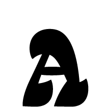
Chimera was born out of a sketch from one of those TypeCooker exercises, right? Did you see it as a potential diploma project right away? When did the sketch turn into Chimera?
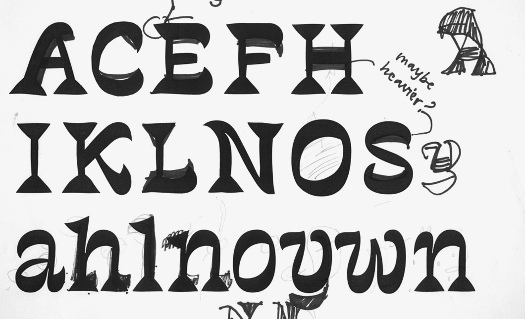
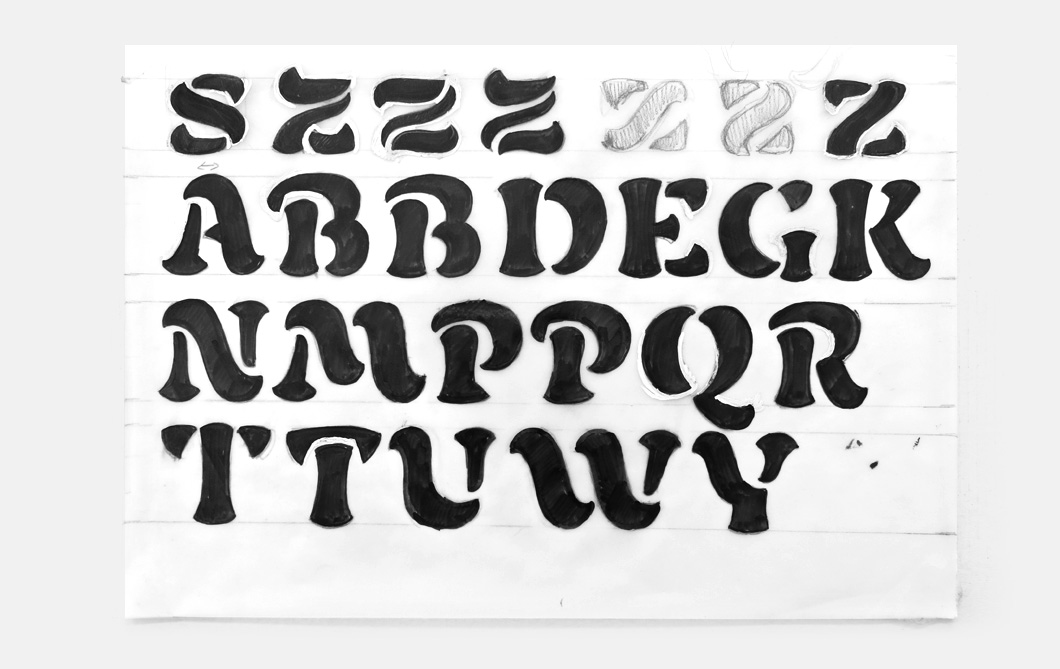
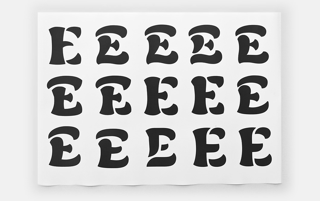
Once I brought the drawing into class, Erik saw it and said, “Make an alphabet out of this!” A week later, I showed him a few more characters, and in the end I drew almost all the lowercase letters, they were narrow and weird. But even when it didn’t work out, I still wanted to continue and see whether it could work, I got excited. I tried to pick a name that would highlight the crazy character of the type and at the same time sound familiar in both Russian and English. A chimera is a monster with the head and neck of a lion, the body of a goat and a tail of a snake. It’s a creature that is, frankly, quite difficult to ignore. It think that the name does a good job of reflecting the mad essence of a project that fits a square peg into a round hole.
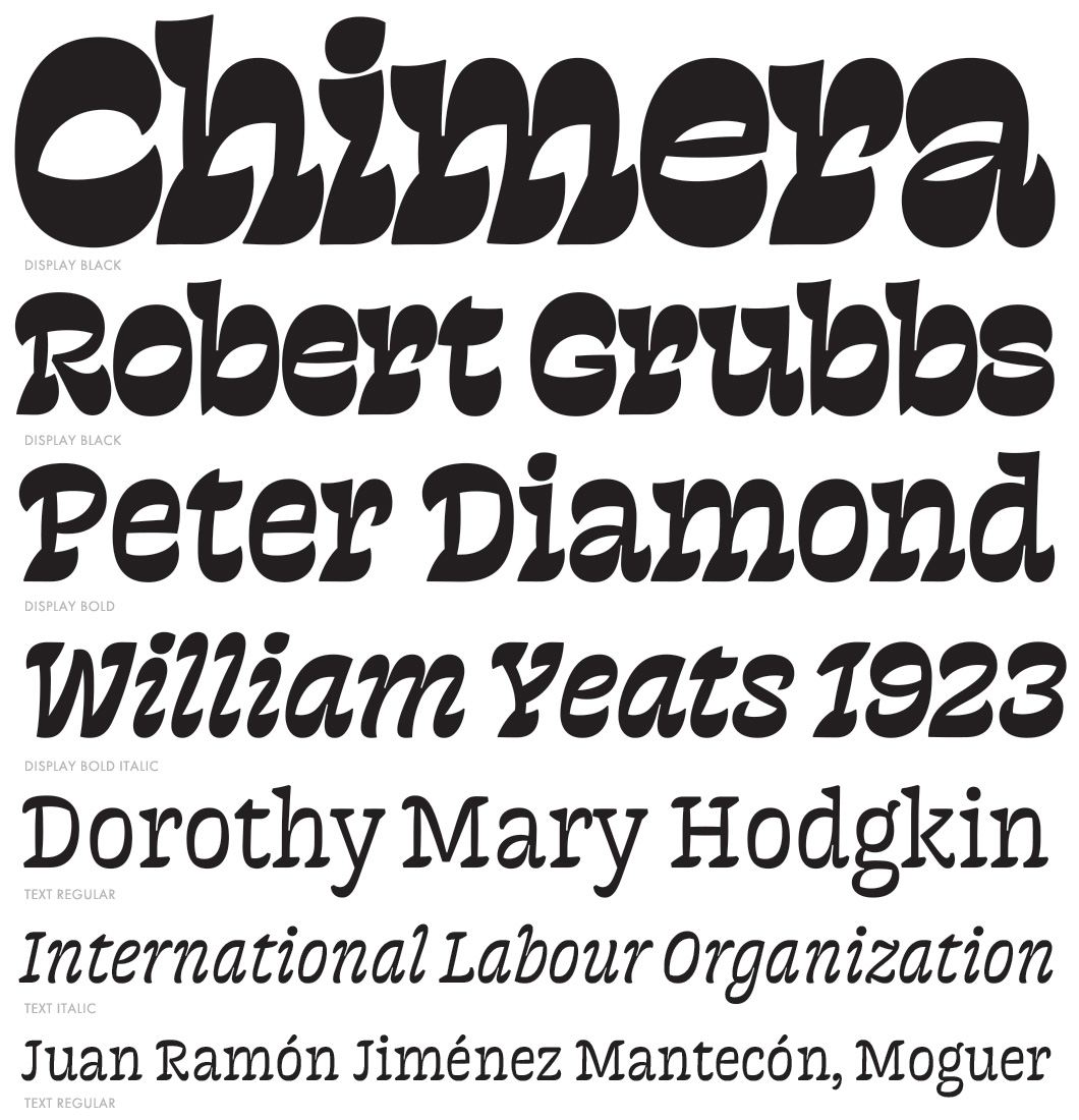
The intensive part of Chimera’s creation took about five months. This is how it was submitted to the TDC2competition in 2014. Work on the Cyrillic part is still in progress.
As a graphic experiment, Chimera could be compared to the typeface Amalta by Vera Evstafieva. The author’s position is clearly marked in both the works: in Amalta—a study of the form halfway between broad brush and printed type, in Chimera—reversed contrast with a distinguished appearance. Vera said to us in an interview that Amalta does not enjoy commercial success. What do you feel about the commercial potential of Chimera?
I understand that Chimera is a typeface that I won’t be able to make money with. Although you never know what will be in demand in the future. You can release a typeface, and only a few years later it will suddenly become popular. The exact opposite can happen too, but it’s impossible to predict. Peter Biľak told me that he worked on History for almost 10 years and the day before release he was tormented by thoughts like, “This will never sell well. Too complex to use, too difficult to understand”, but now History is one of the bestsellers in his library. He told me, “Maria, never think about that. Do what creatively satisfies you”. Of course, there are always people for whom sales are the main criteria, they find a niche, build their own library and gradually fill it. I believe that if you’re truly passionate about something, nothing should be able to stop you.
It would seem that there’s a lot of room for experimentation in this design, but I assume that the precision of the shapes required a lot of effort. Chimera is practically made up of pieces of art, which reminds me somewhat of House Industries objects.
That’s probably not a coincidence. When I was working on Chimera, I felt a great respect for House Industries, because their letters really do become objects. You have to look for compromises and find a smart decision. In this work in particular, I realised how important it is to focus on non-alphabetic characters, such as the section sign, pilcrow, brackets, figures, asterisk, and so on. These are important components of a typeface: if you look at a free font that’s been made quickly, all the non-alphabetic characters are almost certain to be shoddy. Whereas in any decent typeface, all characters, even those that are rarely used, are given as much attention as the alphabets.
Obviously, creating type is a very individual process. Each designer has his or her own relationship with form and a unique look at type. Which designers, foundries or projects earn your admiration?
I really appreciate Erik van Blokland’s Eames, at House Industries, I like how smart particular lettershapes are solved. It’s one thing when you look at the finished work and think, “Oh, everything’s turned out great!” But it’s another thing when you start to look for solutions yourself. Krista (Radoeva—editor’s note ) was in a similar situation when she was working on the bold stencil style for her typeface Аманита. It’s a different story to Eames, but she also had to find look for a clever solution for each character so that everything worked together. For both of us Eames was somewhat of an ideal typeface as to ingenuity and working with form.
I also enjoy what Paul Barnes and Christian Schwartz are doing at Commercial Type and I respect the fact that Peter Biľak orders Cyrillic from Russian designers for his Typotheque foundry. And it pays off well in the end—his typefaces are very popular in Russia.
When we talk about designing type, the search for graphic and typographic expression, creativity and so on, the meticulous technical work is often left out of the equation. What does your workflow look like?
I used to work in Fontlab, but now I’ve switched to Robofont. I like its simplicity, both in the interface and ideologically. It isn’t cluttered and allows you to create an individual workspace for each project. Robofont’s comrades—Metrics Machine, Superpolator and Prepolator—make working on type a real pleasure.
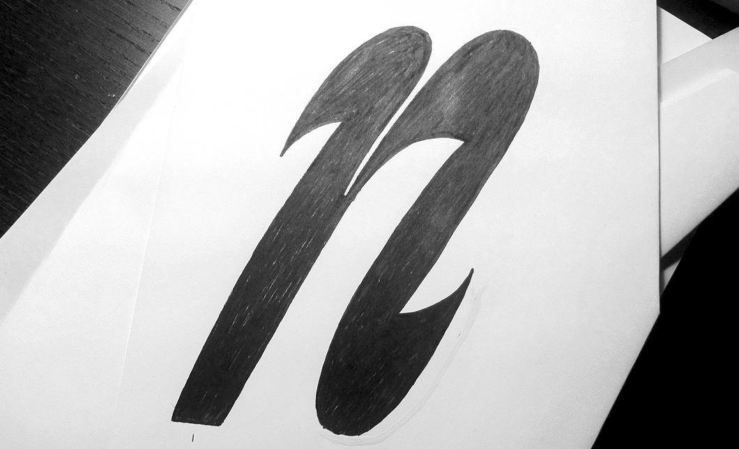
Until t]m I mainly worked digitally, but now I try to incorporate as much sketching in the process as I can not only when starting, but during the whole period of working on the project. This helps me to find something new and to avoid cheap decisions that are imposed by Bezier curves. When I can’t get a certain shape right, I usually make a big print out and on top. Once I’ve found a solution, I scan the sketch and digitize it. Sometimes it’s enough just to look at the drawing and you already know which changes you need to make in the contour, and sometimes (as with Chimera) you have to precisely re-digitise the sketch to get the curve exactly as it has to be.
This drawing to digitising process is very nicely organised in Robofont. Another thing that makes Robofont great is the fact that, even if you really want to, it won’t let you forget about Python. I was always pretty good at technical subjects, but at one point I realised that I don’t enjoy programming that much spend several hours on studying it every day. And it’s impossible to be good in Python, like any other skill—your knowledge goes away if you don’t practice it regularly.
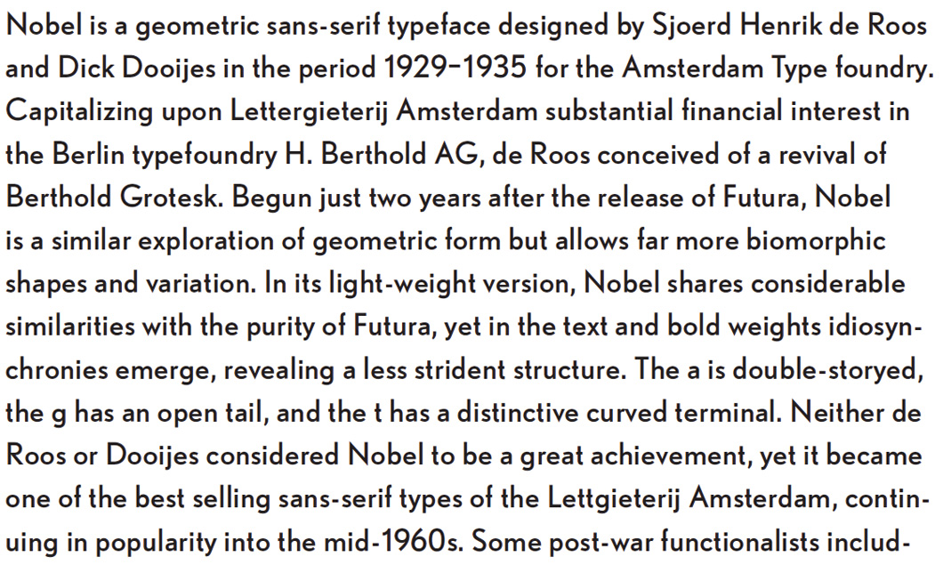
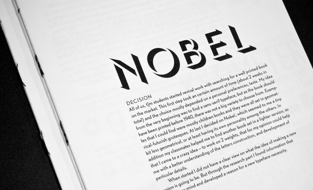
Another aspect of your practice was a historical revival of the Dutch geometrical grotesque Nobel, which was one part of your educational process. What state is the project in now? Do you still find it inspiring?
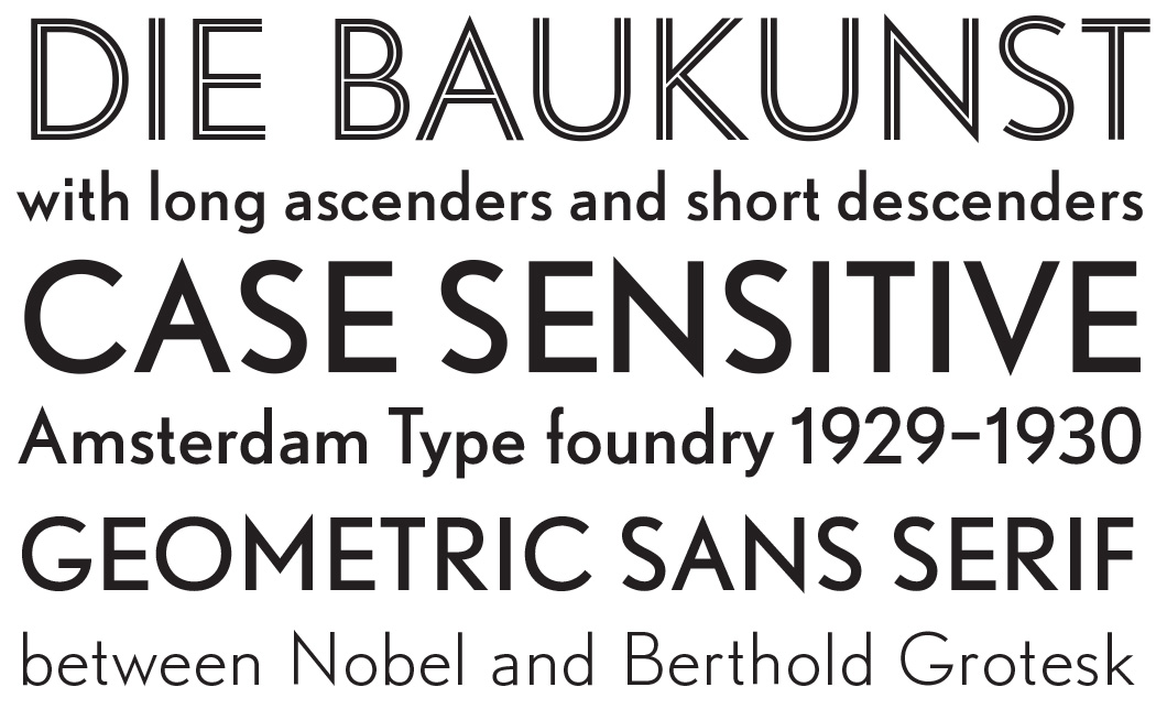
Yeah, I did Nobel as a revival assignment. It’s a geometric sans serif, a Dutch interpretation of the Berthold Grotesque. I didn’t finish it and try not to think about it at the moment—William and Chimera are enough for me now. When I will finish any of those, I’ll start thinking about Nobel.
The last question is for you as for graphic designer: what sort of typefaces are in short supply, in your perspective? What do you think about the range of typefaces that are represented on the Russian market today?
There is often a lack of styles in typefaces with Cyrillic. Among other things, the way the type family and its styles are organized is what makes the work successful. Peter Biľak, for example, pays great attention to this: his projects often contain a wide range of styles and weights. I often hear type designers say that nobody uses Black Italic or that italic small caps are not necessary. But all these things are important and extend the typeface’s range of use.
For me, as a designer working with Cyrillic, Fedra and Brioni have a decent character set and variety of styles. There’s PT Sans for non-commercial projects, and now it’s also possible to buy stuff from Brownfox. I recently bought Geometria, if only it had Greek—I often need it.
A successful text typeface to me is the one in which both the character set and the family structure are well organized. That’s what we started our project in the Netherlands with. Even using just a few letters, you can decide on which exact styles are necessary. After all, even a small detail affects everything else. You have to start with a broad overview: what’s going to be part of the family, and how the styles are going to work with each other. That’s why I’m now reflecting again on what I really need in William and what I can get rid of. It’s time to reconsider a lot of decisions there.
In 2014, Krista Radoeva was awarded a prize by the The Society of Typographic Aficionados, which since 2010 has been given to young people up to 25 years of age for outstanding achievements and promising potential in the field of typography. Krista will present her work and receive the award at the TypeCon2014 conference this summer in Washington.
Vera Evstafieva (2003-2004), Ilya Ruderman (2004-2005), Irina Smirnova (2009-2010)
Revival—a typeface created as a reconstruction of a historical prototype, or a modern interpretation of classic type.
TypeCooker—a simple and effective tool, invented by Dutch designer and lecturer Erik van Blokland, for training the imagination and creating sketches of letters based on randomly generated parameters. TypeCooker uses a large range of parameters—from the basic (style, relationship between lowercase and uppercase, size of ascenders and descenders, proportion and contrast) to the more specific (contrast type, intended application, etc.).
