 This year has proved once again that the demand for typographic knowledge is really hotting up in today’s Russia. The word “craze” would be just a bit of an exaggeration. The Typomania festival and Serebro Nabora conference are growing in scope each year, while existing type schools have no problems filling their groups and new ones are even opening their doors. The result is an increasing number of people both getting an idea about the profession of type designer and giving themselves a shot in this field. Another encouraging fact is that almost every year one more Russian-speaking designer graduates from the Type and Media course and enters the professional world. Nevertheless, there is a flipside to this success – supply on the market is expanding at a barely noticeable rate. Everything that appears in the media and is of interest remains inaccessible to the general user, either due to design exclusivity or authors’ unwillingness to cater for the untamed mass-market demographic.
Let’s try to make a prediction. It is obvious that designers and foundries are going to be more active in offering fonts with high-quality Cyrillic, designed independently or in cooperation with the relevant experts. The technical level of such projects will undoubtedly be very high due to the unfolding battle for screens and users’ attention, which is, no doubt, the most rapidly growing type market around. It is worth noting that Russian indie foundries have gained some momentum in the past year and, what’s more, some new ones have come on to the scene. We are looking forward to new projects from domestic companies and studios such as Brownfox, Letterhead, ParaType, Art. Lebedev Studio, the newly-minted Contrast Type Foundry and CSTM Fonts, alongside works from independent designers and worldwide manufacturers that demonstrated a distinct interest in Cyrillic. Against this backdrop, demand will grow not only for type designers, but also for such rare professionals in the Russian-speaking world as font technicians.
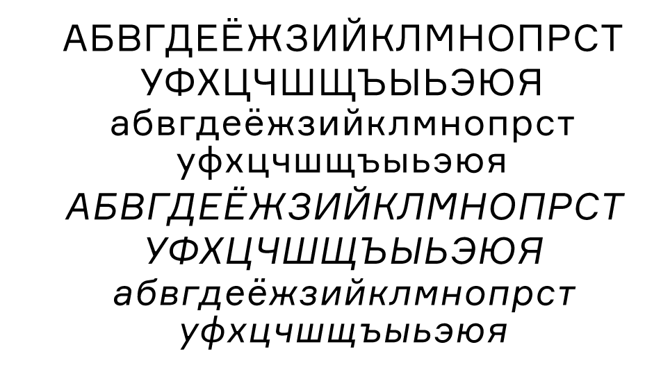
Finally, here are our top 10 favourite typefaces with Cyrillic of 2014. The criteria have not changed since last year: the typeface must be available for purchase by the general public; another requirement is the presence of the Cyrillic alphabet in the character set and, finally, the release date should be between 1st January and 31st December 2014. This time, 37 candidates from 14 countries were included in the longlist (last year there were 36 – such emblematic consistency!). The editorial board and editors picked out ten of the projects by voting, and they are given here in strict alphabetical order.
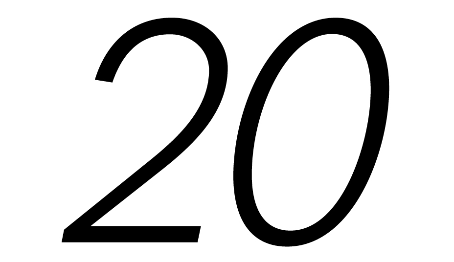
20 kopeek, designed by Yuri Gordon
Foundry: Yuri Gordon, Russian Federation
20 kopeek, designed by Yuri Gordon
Foundry: Yuri Gordon, Russian Federation
20 kopeek, designed by Yuri Gordon
Foundry: Yuri Gordon, Russian Federation

20 kopeek, designed by Yuri Gordon
Foundry: Yuri Gordon, Russian Federation
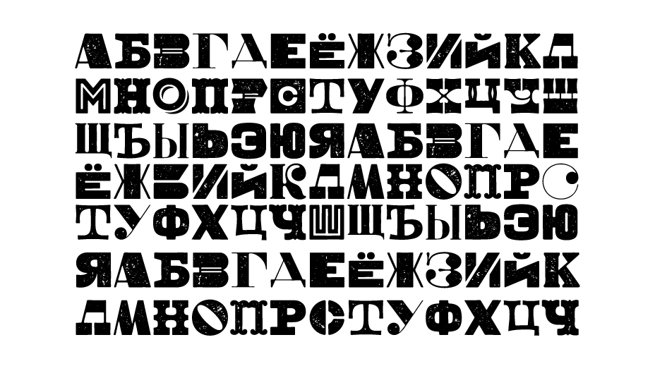
20 kopeek
“20 kopeek” is a diverse typeface. Thanks to the ingenious work with alternative characters it is possible to change the feel of the type with one click of the Stylistic Alternates button. Take a look at the composition of any of the 14 styles (from Thin to Black), and you will find two versions of К, Ж, Я and R—curly like an Akzidenz-Grotesk in the main set and with straight diagonals in the alternative one. A sidestory unfolds in the italics, where oblique versions of the letters are hidden in the additional stylistic set. The type’s image depends on the actions of the designer, who can make it old-fashioned or pragmatic, referring either to the end of the 19th century or the middle of the 20th. For classification lovers, however, it is a bit of a muddle, and any allusions to specific historical grotesques are nothing more than irony (look at the Latin letters f, g, r and y). Readers of Yuri Gordon’s blog will remember the story of how the antiqua 21 Cent was created, inspired by a composite of late 19th–early 20th century typefaces (for example, the Century series and especially Century Schoolbook). The grotesque “20 kopeek” is a perfectly coordinated partner to the aforementioned antiqua, and this union gave birth to a font superfamily. Both the antiqua “cents” and grotesque “kopecks” are coordinated in terms of weight, proportion and size, and, according to the author, were designed to be used together. The font is complemented with small caps, as well as minuscule and majuscule numbers, and support a wide range of languages.
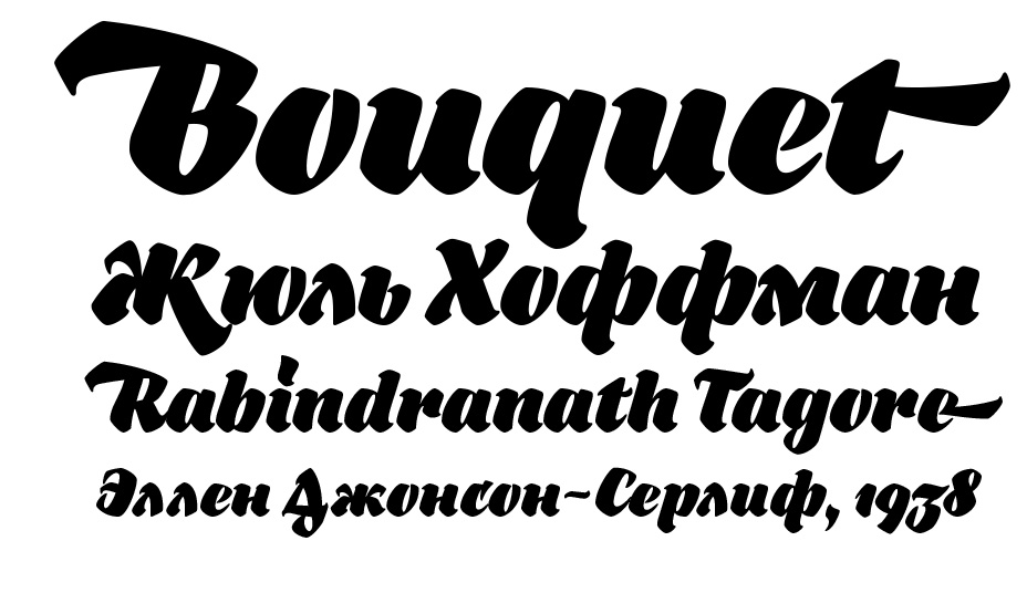
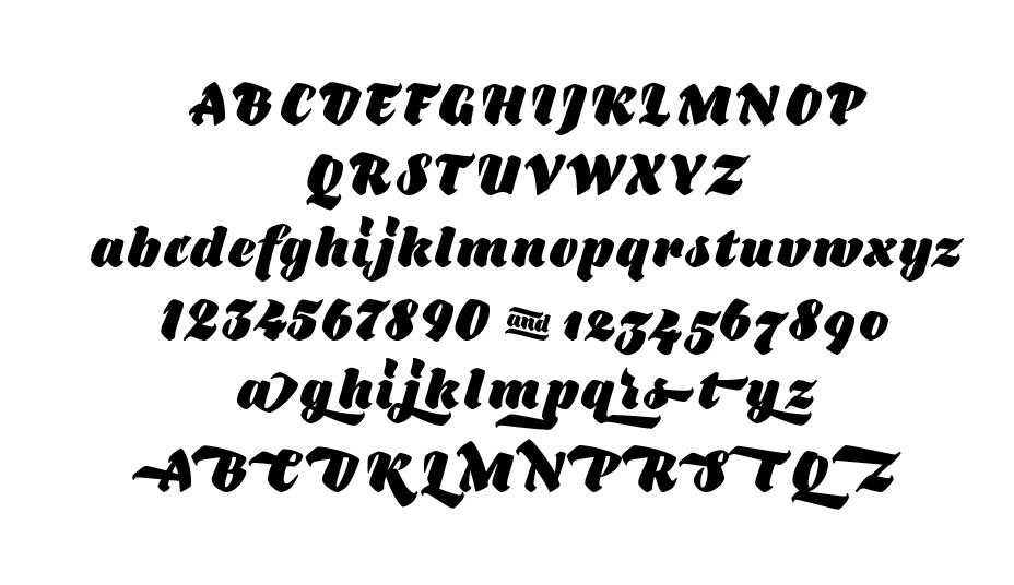
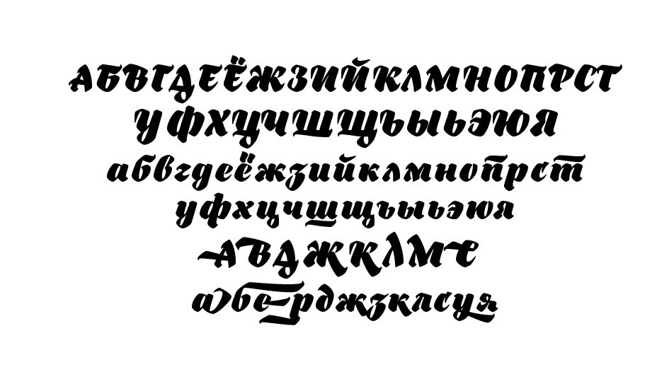
Bouquet, designed by Denis Serebryakov
Foundry: Denis Serebryakov, Belarus
Bouquet, designed by Denis Serebryakov
Foundry: Denis Serebryakov, Belarus
Bouquet, designed by Denis Serebryakov
Foundry: Denis Serebryakov, Belarus
Bouquet, designed by Denis Serebryakov
Foundry: Denis Serebryakov, Belarus
Bouquet
A striking example of a typeface with a gentle reference to antique German handwriting, using a wide brush. An inscription set in this typeface can be taken for lettering—the large number of alternative characters with swashes aids this impression. The designer’s control over black and white, as well as the whole outline, is noteworthy. Bouquet is remarkable for its dense dark colour of type in the middle point sizes and additional decorations such as flourishes if you are typesetting a large title. As a rule, the introduction of such a typeface on the market rapidly turns it into a regular for signage and packaging due to the expressiveness of the names typeset in it, which immediately turns them into logos. It is interesting to compare it with another example of calligraphy rethought as type—the Amalta typeface by Vera Evstafieva. They are similar in the graphical basis, i.e. the wide-brush lettering, while their main difference concerns their potential for text during further development. With Amalta, it would be theoretically possible with a decrease of weight and contrast and additional character adjustment. The lack of this, of course, is not a disadvantage of Bouquet, which is an artistic statement in itself.

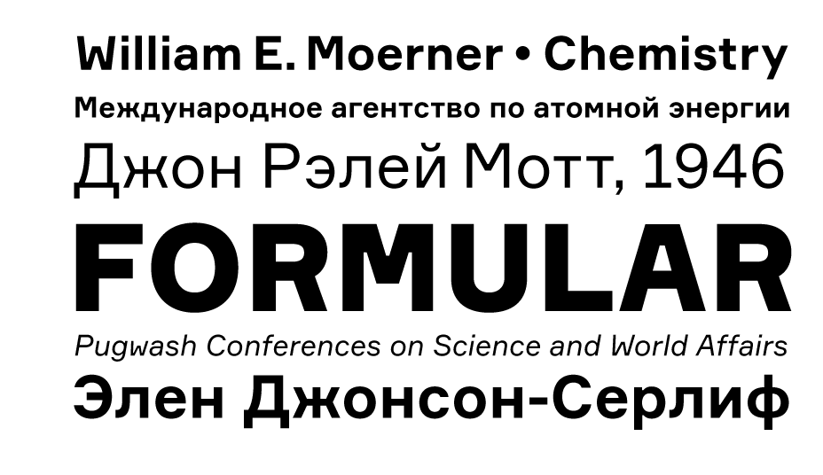
Formular, designed by Gayaneh Bagdasaryan, Vyacheslav Kirilenko
Foundry: Brownfox, Russian Federation and Kazakhstan
Formular, designed by Gayaneh Bagdasaryan, Vyacheslav Kirilenko
Foundry: Brownfox, Russian Federation and Kazakhstan

Formular, designed by Gayaneh Bagdasaryan, Vyacheslav Kirilenko
Foundry: Brownfox, Russian Federation and Kazakhstan
Formular, designed by Gayaneh Bagdasaryan, Vyacheslav Kirilenko
Foundry: Brownfox, Russian Federation and Kazakhstan
Formular
Formular is a neo-grotesque typeface inspired by the utilitarian 19th-century grotesques, where typography exercises the powerful function of defamiliarisation, creating tension between form and content on a graphic level. Actively dividing them, Lorenz Brunner, Simone Koller, Ronny Hunger and many other “Swiss” paradoxically try to bring attention to the content, which is, perhaps, the number one task for a graphic designer in an era that has lived through post-modernism. The typefaces that we see in projects following these aesthetic principles are interesting with regard to the subtle “glitches” in their rhythm – sometimes increased letter spacing, sometimes the shapes of individual letters. This new Brownfox type family is almost flawless—balanced in its outlines, rhythm and optical details. It differs from its counterparts due to the inventive forms of certain letters, such as M and W. (Just one detail makes the rhythm and “sound” quite distinctive.) Another important point in the structure of this typeface is its proportions. Formular is easy to work with in different typographical situations: it can seem light in a left-aligned composition, then become a “wall” in justified text. Its characters, pronouncedly pure in their geometry (tending towards squares and circles), knit the line tightly together, while the extremely short ascenders make it possible to bridge between lines in paragraphs as tightly as possible without losing air and the rhythm inside. This makes it a versatile tool, for example, in interfaces and on web pages (a large advantage of the type family is the availability of a screen version). It meets the challenges of titles, notes, menu items, standfirsts and pull quotes equally convincingly. One of the most notable fresh examples is the educational project Arzamas, where Formular is counterpointed by the Lava typeface. It is worth noting that Formular is equipped with minuscule and tabular figures, case-sensitive punctuation, fractions, superscript and subscript characters, and stylistic alternatives for a number of letters.
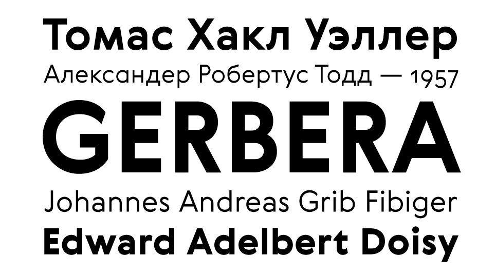
Gerbera, designed by Gayaneh Bagdasaryan, Vyacheslav Kirilenko
Foundry: Brownfox, Russian Federation and Kazakhstan
Gerbera, designed by Gayaneh Bagdasaryan, Vyacheslav Kirilenko
Foundry: Brownfox, Russian Federation and Kazakhstan
Gerbera, designed by Gayaneh Bagdasaryan, Vyacheslav Kirilenko
Foundry: Brownfox, Russian Federation and Kazakhstan

Gerbera, designed by Gayaneh Bagdasaryan, Vyacheslav Kirilenko
Foundry: Brownfox, Russian Federation and Kazakhstan
Gerbera
At first, the new sans-serif Gerbera seems to refer to works by Edward Johnston, Eric Gill, Paul Renner and Arno Drescher, as well as modern typefaces such as Euclid (SwissTypefaces) or Brown (Lineto). It is possible to spend a long time enthusiastically comparing them, but what we see in Gerbera is not only the geometry of Futura and the flexible forms from the Arts and Crafts movement era, but also the shadow of Roger Excoffon and his grotesque Antique Olive (for some reason, not as popular today as the others listed above). However, this may be an optical illusion because of just one subtle detail, namely the small amount of reverse contrast in the characters to which Gerbera owes its specific rhythm. This Brownfox typeface deserves attentive examination: the exaggeratedly variable-width capitals look solemn and bookish, the reverse contrast is implemented with filigree precision, and the optional stylistic replacements (lowercase a, uppercase Q) suddenly change the character of a word when used. Nevertheless, you cannot help but ask why a sans-serif so apparently close to humanistic typefaces is lacking a double-storey g, at least as an alternative form, but, on the other hand, this inconsistency gives Gerbera a certain charm.
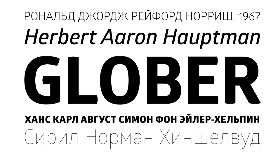
Glober, designed by Svetoslav Simov, Ivan Petrov
Foundry: Fontfabric, Bulgaria
Glober, designed by Svetoslav Simov, Ivan Petrov
Foundry: Fontfabric, Bulgaria
Glober, designed by Svetoslav Simov, Ivan Petrov
Foundry: Fontfabric, Bulgaria

Glober, designed by Svetoslav Simov, Ivan Petrov
Foundry: Fontfabric, Bulgaria
Glober
On the surface, the Glober typeface does not seem exceptional compared to a number of open narrow sans-serifs, and the radiuses of the curves attached to stroke endings look even somewhat forced in places. But then you notice the ovals and half-ovals: made with skill, they shape the character of the typeface, and this is what changes our impression of Glober’s appearance. The ovals are “warm”, not mechanical: the shapes of the letters o and e are precise and force all the other characters to follow their example, creating a range of flexible feeling in a seemingly unsophisticated and static typeface model. This balanced type family is remarkable for its 18 styles—from narrow to ultrabold, including obliques. Importantly, there is an on-screen version of Glober, which makes it a versatile tool for mobile application developers and web designers. This type family was the winner of the Modern Cyrillic 2014 competition in the Text Typefaces category.
Identitet, designed by Nikola Djurek, Arebica designed by Nikola Djurek with Hasan Abu Afash, Russian Cyrillic designed by Ilya Ruderman. Thanks to Robert Čanak for help with Arebica, Amra Zulfikarpašić for help with Bosančica (Croatian Cyrillic).
Foundry: Typonine, Croatia
Identitet, designed by Nikola Djurek, Arebica designed by Nikola Djurek with Hasan Abu Afash, Russian Cyrillic designed by Ilya Ruderman. Thanks to Robert Čanak for help with Arebica, Amra Zulfikarpašić for help with Bosančica (Croatian Cyrillic).
Foundry: Typonine, Croatia

Identitet, designed by Nikola Djurek, Arebica designed by Nikola Djurek with Hasan Abu Afash, Russian Cyrillic designed by Ilya Ruderman. Thanks to Robert Čanak for help with Arebica, Amra Zulfikarpašić for help with Bosančica (Croatian Cyrillic).
Foundry: Typonine, Croatia

Identitet, designed by Nikola Djurek, Arebica designed by Nikola Djurek with Hasan Abu Afash, Russian Cyrillic designed by Ilya Ruderman. Thanks to Robert Čanak for help with Arebica, Amra Zulfikarpašić for help with Bosančica (Croatian Cyrillic).
Foundry: Typonine, Croatia
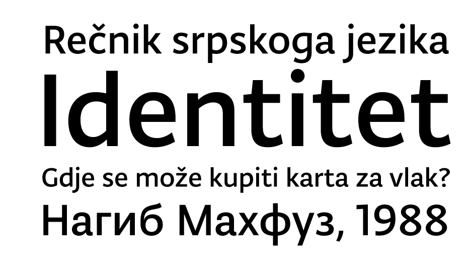
Identitet
Nikola Djurek’s type projects of are often associated with an experiment, be it technological or linguistic. Identitet turned out to be a bold new investigation into incorporating the several scripts that have historically been used (and still are) in the Balkans into one type system. This is a very high bar to reach, as the chosen scripts are drastically different in the graphical image of their characters. Within the Identitet family, Glagolitic script (in three styles—from an accurate historical reconstruction of an ancient “angular” Glagolitic to a more modern rounded one), Bosnian Cyrillic, Russian Cyrillic, Arebica (a variant of the Arabic alphabet for the Bosnian language) and Latin all have a common line thickness, identical x-height and upper case height, etc. This concerns all the details, making it possible to achieve unity within the system. Identitet is a landmark project for a modern world that has embraced globalisation with its instant access to any information, which, in its turn, requires translation and graphic display on billions of mobile devices. Nikola Djurek has done some serious research and art work—suffice to say, for example, that the author has created new graphemes in the “round” Glagolitic script for sounds in the modern Serbian language that did not exist in ancient times.
Input, designed by David Jonathan Ross and Maria Doreuli (Cyrillic consultant)
Foundry: Font Bureau, USA

Input, designed by David Jonathan Ross and Maria Doreuli (Cyrillic consultant)
Foundry: Font Bureau, USA
Input, designed by David Jonathan Ross and Maria Doreuli (Cyrillic consultant)
Foundry: Font Bureau, USA
Input, designed by David Jonathan Ross and Maria Doreuli (Cyrillic consultant)
Foundry: Font Bureau, USA
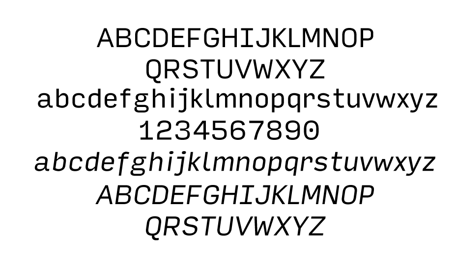
Input
This type family has a huge number of monospaced styles specifically for computer coding. A reasonable question arises whether it is functionally justified, but let it remain a rhetorical one. The aesthetics of monospaced type from the early era of computers and text editors have long been popular among graphic designers. David Jonathan Ross was inspired by the creation process of Verdana by Matthew Carter and originally designed Input as a pixel font. When the basic proportions of the letters were found, David started drawing outlines on top of the 11-pixel grid. As a result, Input can successfully work when typing code and for tabular data, as well as in plain text (technical documentation, for example). Curiously, the author suggests using various styles in code (in addition to syntax highlighting)—from sans to serif. Input is free for personal use, and its site is not only a promotion tool, but also a wonderful ground for testing and generating a font with the given stylistic features and character composition. Input was a winner of the Modern Cyrillic 2014 competition in the Text Typefaces category. This was jury member Gayaneh Bagdasaryan’s comment on the project: “Despite the fact that some of the Cyrillic characters could have been slightly adjusted in accordance with tradition, the overall texture of text composition distinguishes Input from many other Cyrillic fonts due to the fact it has its finger on the pulse of time. The monospaced typeface keeps its charm in Cyrillic as well, which is a rarity in itself.”
Journal Sans New, designed by Maria Selezeneva, Alexandra Korolkova and Olexa Volochay
Foundry: ParaType, Russian Federation
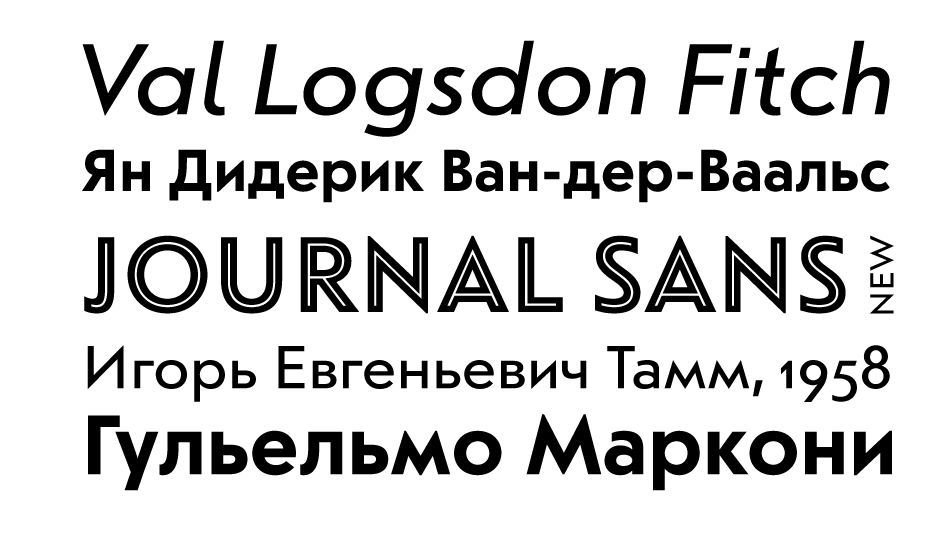
Journal Sans New, designed by Maria Selezeneva, Alexandra Korolkova and Olexa Volochay
Foundry: ParaType, Russian Federation
Journal Sans New, designed by Maria Selezeneva, Alexandra Korolkova and Olexa Volochay
Foundry: ParaType, Russian Federation
Journal Sans New, designed by Maria Selezeneva, Alexandra Korolkova and Olexa Volochay
Foundry: ParaType, Russian Federation
Journal Sans New
Journal Sans (its text version—there was also a style set for large-size composition, see Catalogue of Hand-set and Machine-set Typefaces, Moscow, 1966) was designed by Anatoly Shchukin and his colleagues from the Department of Movable Types at the Polygraphmash Institute in 1940-1956. Examination of the first digital version of Journal Sans, created by ParaGraph in its infancy, identified a number of problems in its outlines, letter spacing and kerning. They all have been eliminated thanks to the efforts of designers Maria Selezeneva, Alexandra Korolkova and Olexa Volochay, but that is not even the most important thing. It is a known fact that the typeface lying at the heart of Journal Sans is Erbar-Grotesk (Jakob Erbar, Ludwig & Mayer, 1929)—its proportions, geometrical structure and range of styles are all similar. This update of Journal Sans includes substantial revision and refinement of characters that existed in metal form during Soviet times: many letterforms have been simplified and their original versions (к and ж, for example) are hidden in the OpenType features set. These very actions have brought Erbar-Grotesk and Journal Sans Serif together again. In addition, the range of styles has been expanded: proper italics (rather than an oblique style) has appeared, as well as two header styles. It would seem that Journal Sans New is no longer reminiscent of Soviet magazines like “Science and Life” filed away behind polished brown cabinet doors, and is a powerful tool for contemporary design work. And yet, if you still want to indulge in a little nostalgia, you can always use the alternative triangular л and д, which will immediately change the type’s “age”.

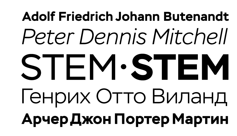
Stem, designed by Aleksandra Korolkova, Maria Selezeneva and Isabella Chaeva
Foundry: ParaType, Russian Federation
Stem, designed by Aleksandra Korolkova, Maria Selezeneva and Isabella Chaeva
Foundry: ParaType, Russian Federation
Stem, designed by Aleksandra Korolkova, Maria Selezeneva and Isabella Chaeva
Foundry: ParaType, Russian Federation
Stem, designed by Aleksandra Korolkova, Maria Selezeneva and Isabella Chaeva
Foundry: ParaType, Russian Federation
Stem
Many designers have envisioned a Cyrillic Gotham, and Stem seems a serious attempt to fulfil this dream. But the feature that really sets this typeface apart, except for its visual features, is the italics. While the upright style tries to maintain a certain rigidity and restraint, the use of italics rather than the expected slanted letterforms noticeably soften its image to become more friendly and accommodating. Twelve styles, from extra-narrow to bold, include italics, small caps, different stylistic sets for numbers, alternative forms of characters (a, к, ж)—and this is only the first part of a project designed for large-size display typesetting. According to the authors, the release of new typefaces for text composition, including caption styles, is on the horizon.

Woodkit, designed by Ondrej Jób
Foundry: Typotheque, the Netherlands

Woodkit, designed by Ondrej Jób
Foundry: Typotheque, the Netherlands
Woodkit, designed by Ondrej Jób
Foundry: Typotheque, the Netherlands
Woodkit, designed by Ondrej Jób
Foundry: Typotheque, the Netherlands
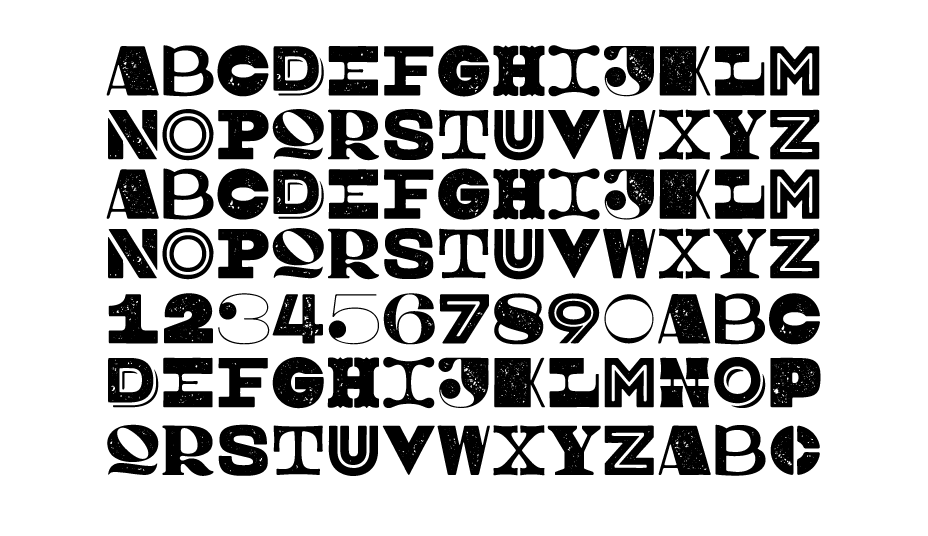
Woodkit
This project by Ondrej has reanimated wooden display type characters as an aesthetic object. As the author says, working with Woodkit resembles playing with building blocks. You have three separate families (Solid, Print and Reprint with varied degrees of print degradation) at your disposal, each containing 6 different styles with ornaments. With OpenType enabled, one can find fun variations and use Woodkit for all it is worth—all 10,000+ glyphs. This impressive display typeface was one of the winners of the Modern Cyrillic 2014 competition. The typeface was highlighted by jury member Yuri Gordon: “Woodkit is a typeface project remarkable in its design and brilliant in its conception. This type system, consisting of extremely varied, but perfectly matched glyph blocks, makes it possible to construct extraordinary houses/inscriptions/pictures, where each letter catches the eye, and a simple composition turns into a finished poster. But it is also easily readable! You can play with Woodkit as if it were a construction toy, building either words or abstract compositions from the ornaments and symbols included in the system. For me, this set is both a blast from the past with its wooden letters, and a tip of the hat to the future with its dynamic typography and intrinsically valuable typographic games, which are not linked to practical purposes, as was previously the case. It is, perhaps, the world’s first kit for The Glass Bead Game.”