 right figures in the history of design often overshadow their equally talented, but less fortunate contemporaries. The bright stars of 1960s–80s Dutch design, such as Wim Crouwel and Jan van Toorn, eclipsed a whole galaxy of prominent designers. The names and work of some of them only came to be known outside the Netherlands at the beginning of this century, in part through the efforts of researchers and the growing wave of interest in Dutch modernism. Nevertheless, the world continues to discover these forgotten names, to the delight and surprise of a new generation of designers.
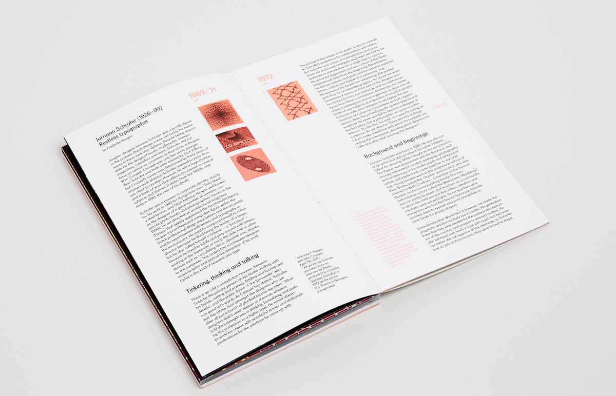
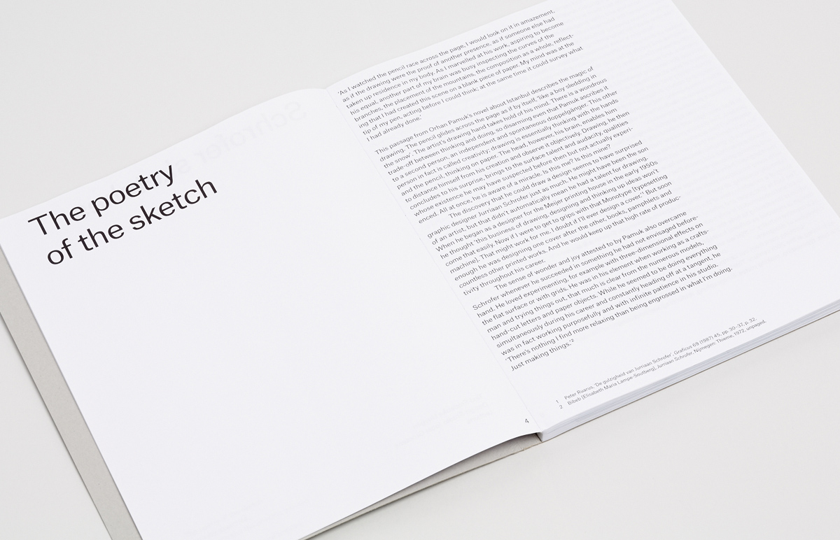
In March 2013, Unit Editions published a small book that shed light on the life and work of Dutchman Jurriaan Schrofer (1926–1990), a versatile designer little known outside his own country. His designs for photobooks and corporate identities were innovative, and he helped to organize the design community and elaborate state policy regarding the creative industries. At the peak of his career in the 70s, his bizarre experimental approach to the construction of typefaces and complex rhythmic compositions based on them set him apart. In November of the same year, an extensive monograph on Schrofer was published, and a year later followed a book of his sketches and drafts. These three publications were the basis for this book review.
To make this piece more complete, we found two more books published during Schrofer’s lifetime, to which he contributed personally—Jurriaan Schrofer (1972) and Zienderogen (1988). In addition, Jurriaan Schrofer’s biographer and researcher of the history of Dutch design, Frederike Huygen, kindly agreed to answer questions about Schrofer’s personality and his work on the aforementioned books. We would like to start our review with this interview.
I checked throughout the reviews of recent publications about Jurriaan Schrofer. Most of the reviewers showed surprise of discovery, being astonished by his works, especially his typographic experiments. Did such multifaceted and prolific designer stays undiscovered for contemporary generation of designers inside the Netherlands as well?
Schrofer was unknown to the world outside the Netherlands, except for the book Dutch Type by Jan Middendorp (2004) and for the general book Dutch Graphic Design, a Century by Kees Broos and Paul Hefting of 1997. In Holland he has always been part of the graphic design scene and he was well known; but maybe the youngest generation was not overly familiar with his work. You have to take into account that histories of graphic design and monographic books on graphic designers are a very recent phenomenon. This only really took off in the 1990s. And making a book, especially in the Netherlands as a small country, is expensive because there aren’t enough buyers.
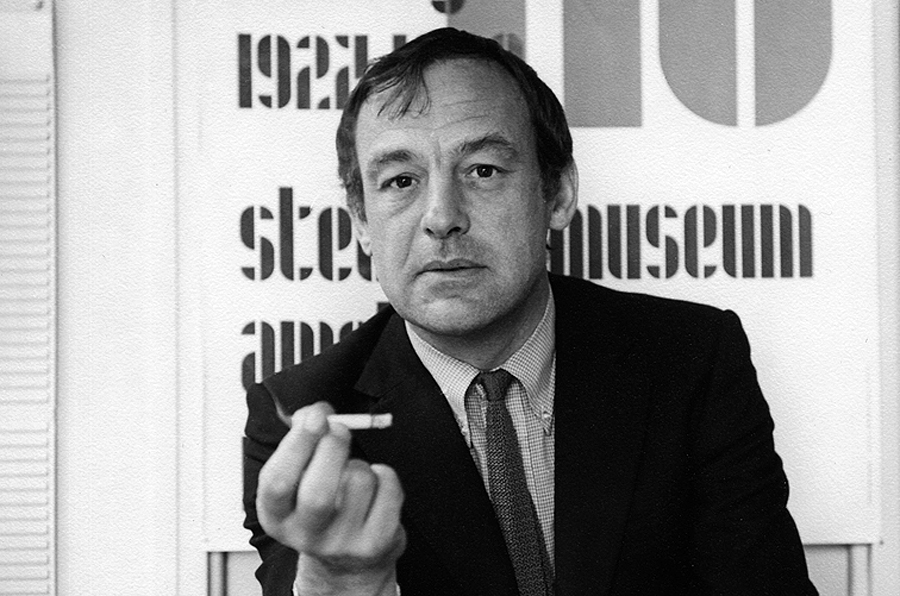
Jurriaan Schrofer in 1969. Photo: typetoken
It seems that many figures of Dutch modernism are still in shadow of world renowned Wim Crouwel. And Schrofer also not seems as exception from that. Why it may happend? Could we compare them two, taking into account their close age, common background of apprenticeship at Dick Ellfers, involvement in design teaching, their influence and impact on industry and policy?
We can compare them, and I did, in the book you will find many instances where both are mentioned. The truth is however also, that Crouwel’s work is visually and theoretically more coherent whereas Schrofer always tried new things and does not have such a specific or individual style. And people, especially designers themselves, like work that shows a highly personal signature. Many works of Schrofer are not as strong as Crouwel’s. And Schrofer had less long-term relationships with clients, he was forever changing and there were periods when de did not design at all.
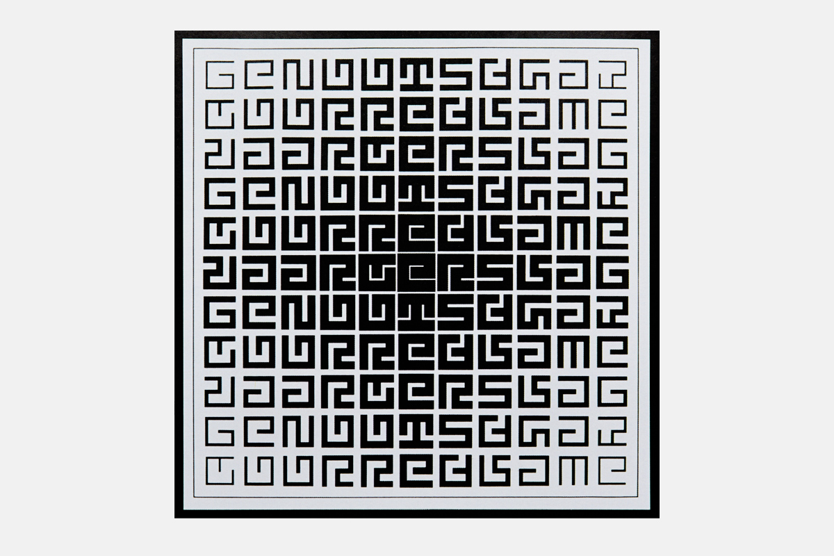
Composition from the inside cover of the GvR advertising association annual report. 1970. Source: Jurriaan Schrofer (1926-1990): Restless typographer. Unit, London, 2013.
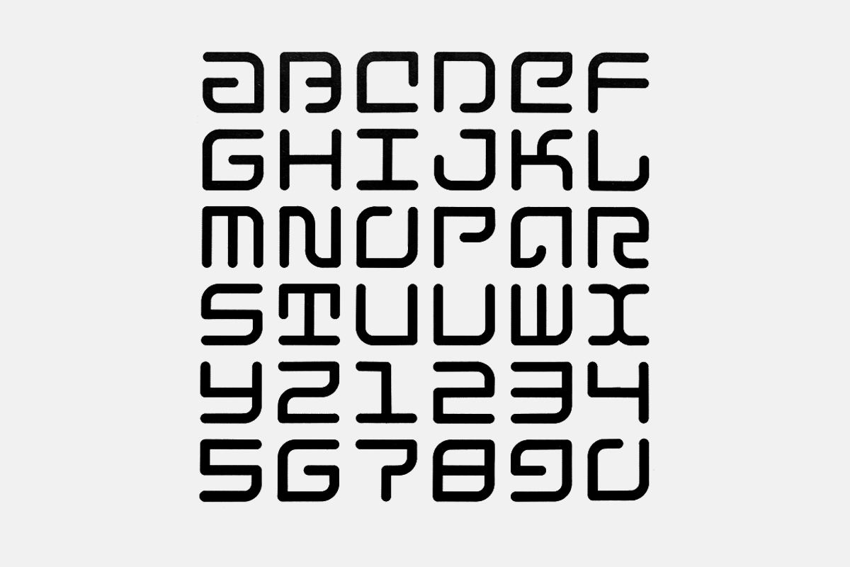
Set of characters with rounded elements, used for Schrofer’s business cards, among other things. 1972. Source: Jurriaan Schrofer (1926-1990): Restless typographer. Unit, London, 2013.
Composition for the cover of the Rijkspostspaarbank annual report. 1970. Source: Jurriaan Schrofer. Koninklijke Drukkerij G.J. Thieme BV, Netherlands, 1972.
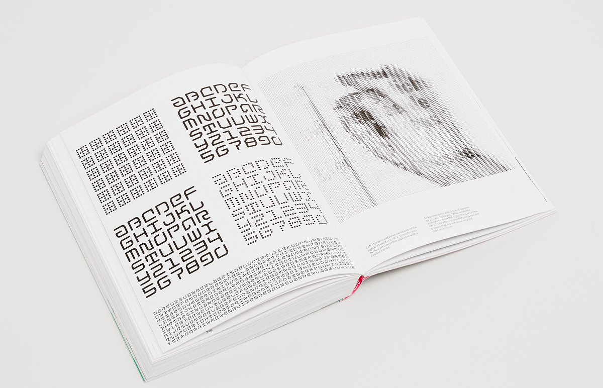
Silk-screen print. 1971. Source: Jurriaan Schrofer. Koninklijke Drukkerij G.J. Thieme BV, Netherlands, 1972.
Schrofer’s legacy and in particular his archive are colossal. There was enough for three substantial publications that followed one after the other and barely overlapped in their themes and reproduced works. How did it happen that the full spectrum of his work was made public only 23 years after his death?
This just has practical reasons. There have been plans to produce a Schrofer monograph since the nineties and some funding was available. But it took a long time (and more money, thus fundraising) before the archive was inventorized, then several authors have been working on the project to no avail, and finally I managed to bring this project to an end. Just around that period, Tony Brook discovered Schrofer too and he wanted to publish a small book, which I then considered as an appetizer for the larger book.
Archetypal Schoefer’s covers for book series published by Mouton. 1970 and 1976. Source: Jurriaan Schrofer: graphic designer, pioneer of photo books, art director, teacher, art manager and environmental artist. Valiz, Netherlands, 2013.
Almost in any field of design work he has been involved, Schrofer shows pioneering approach and remarkable results. In conclusion chapter of your book you have said that “his oeuvre lacks visual consistency and stylistic development“. Do you think that such inconsistency may caused him controversial recognition and influenced his legacy, comparing to his coevals like Crowel, Bos or Wissing?
In fact, he was always one of the leading designers of his time and was also known as a theorist. There was no doubt about his recognition back then. The question of what value Schrofer’s legacy carries has only emerged now. In addition, we have just recently got the opportunity to take a closer and broader look at this man and his work.
Jurriaan Schrofer
Author: Bibeb (Elizabeth Maria Lampe-Sautberg) ¶ Publisher: Koninklijke Drukkerij G.J. Thieme BV, 1972 ¶ Design: Jurriaan Schrofer ¶ Typeface: Univers ¶ Languages: Dutch and English ¶ Size: 24×26,5 cm
48 thread-sewn pages in a soft cover made from one-side coated cardboard. There are two types of paper in the book: uncoated book and matte coated, which alternate. The pages are printed in three colours; the coated paper, as well as the cover, are in full colour.

48 thread-sewn pages in a soft cover made from one-side coated cardboard. There are two types of paper in the book: uncoated book and matte coated, which alternate. The pages are printed in three colours; the coated paper, as well as the cover, are in full colour.
48 thread-sewn pages in a soft cover made from one-side coated cardboard. There are two types of paper in the book: uncoated book and matte coated, which alternate. The pages are printed in three colours; the coated paper, as well as the cover, are in full colour.
48 thread-sewn pages in a soft cover made from one-side coated cardboard. There are two types of paper in the book: uncoated book and matte coated, which alternate. The pages are printed in three colours; the coated paper, as well as the cover, are in full colour.
48 thread-sewn pages in a soft cover made from one-side coated cardboard. There are two types of paper in the book: uncoated book and matte coated, which alternate. The pages are printed in three colours; the coated paper, as well as the cover, are in full colour.
48 thread-sewn pages in a soft cover made from one-side coated cardboard. There are two types of paper in the book: uncoated book and matte coated, which alternate. The pages are printed in three colours; the coated paper, as well as the cover, are in full colour.
48 thread-sewn pages in a soft cover made from one-side coated cardboard. There are two types of paper in the book: uncoated book and matte coated, which alternate. The pages are printed in three colours; the coated paper, as well as the cover, are in full colour.

48 thread-sewn pages in a soft cover made from one-side coated cardboard. There are two types of paper in the book: uncoated book and matte coated, which alternate. The pages are printed in three colours; the coated paper, as well as the cover, are in full colour.
48 thread-sewn pages in a soft cover made from one-side coated cardboard. There are two types of paper in the book: uncoated book and matte coated, which alternate. The pages are printed in three colours; the coated paper, as well as the cover, are in full colour.
From 1969 to 1978, the Thieme printing house organised and financed the publication of four booklets devoted to Dutch designers that were part of the elite and influential design association AGI. At the heart of all four editions were personal interviews with their protagonists—Willem Sandberg, Otto Treumann, Jurriaan Schrofer and Wim Crouwel—conducted by Bibeb (the pen name of Elizabeth Maria Lampe-Sautberg), a famous interviewer and journalist who worked for the weekly Vrij Nederland at the time. The sessions lasted for several hours and were usually held in an informal setting at the interviewee’s home or studio.
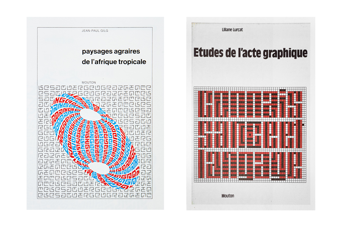
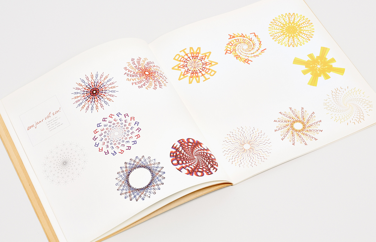
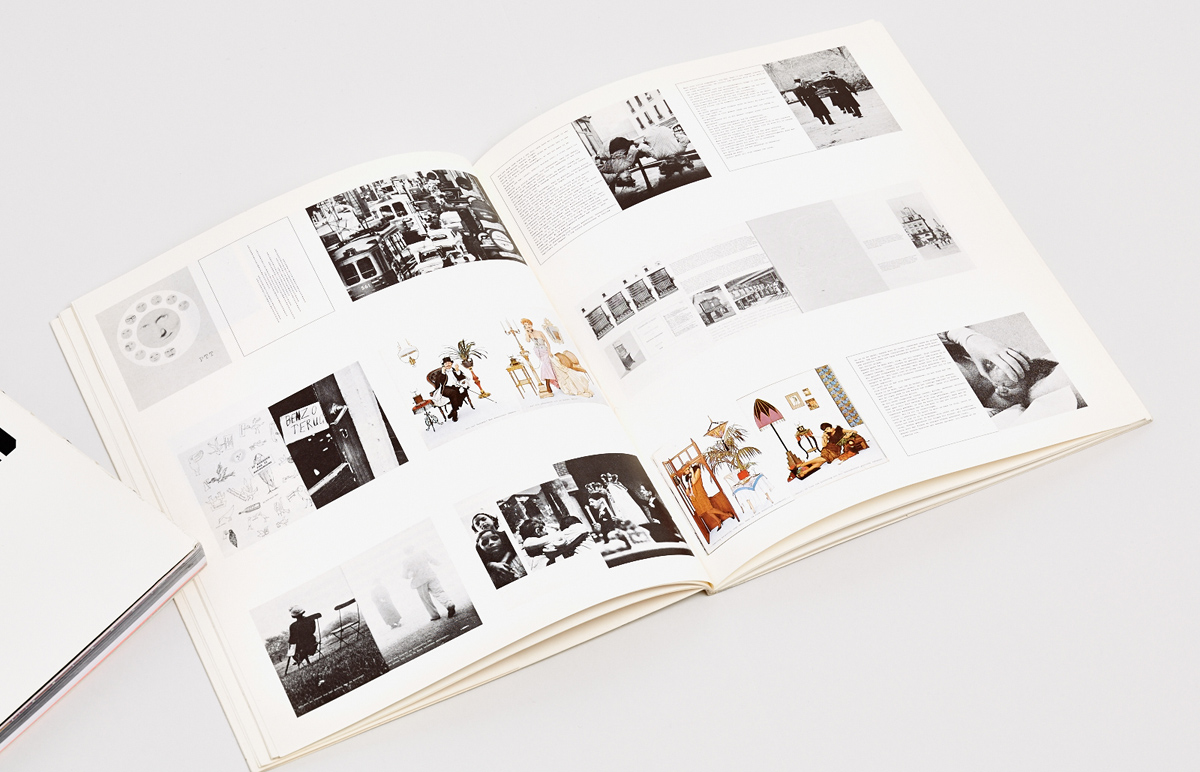
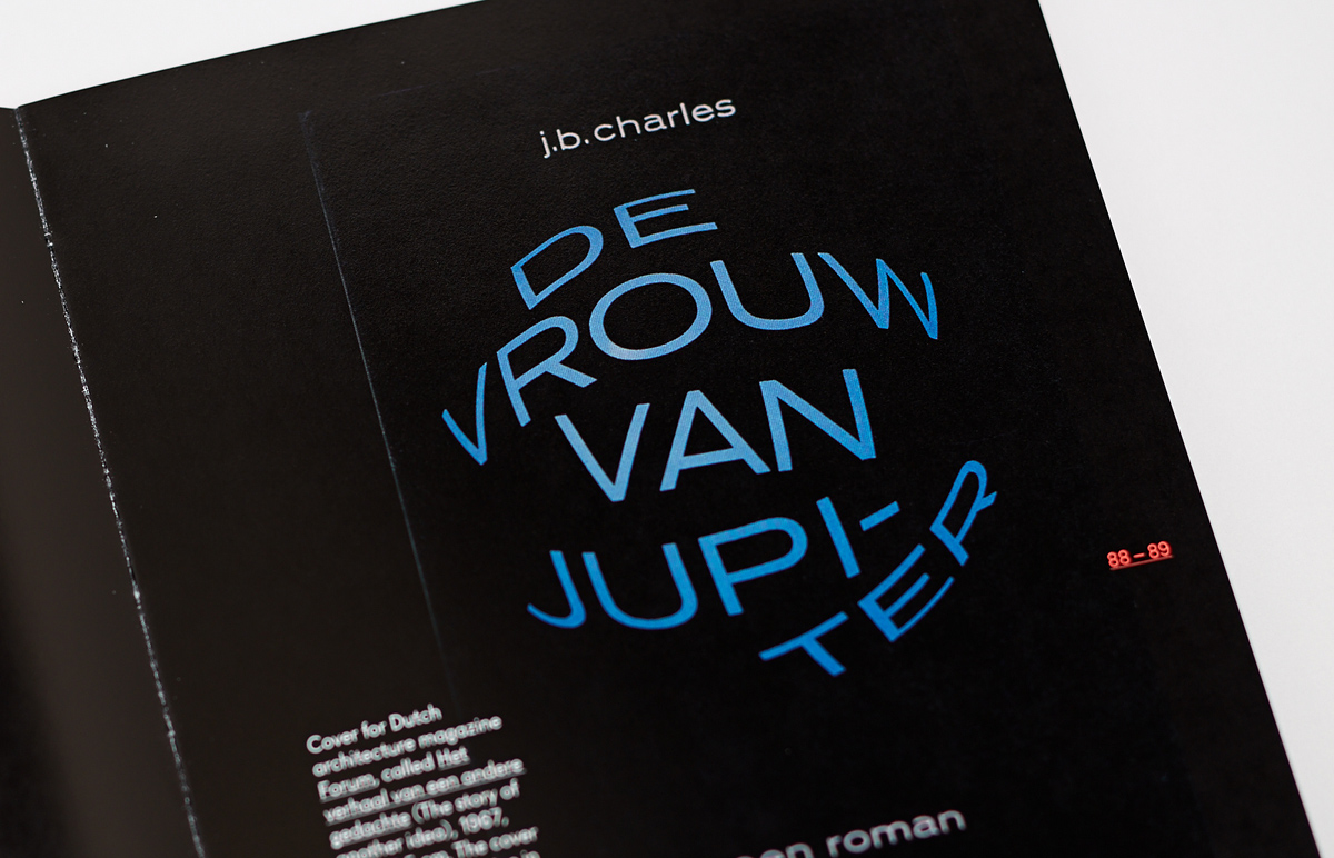
The booklet dedicated to Schrofer was published in 1972. Text in two languages—Dutch in black ink and the English translation in blue—are interspersed with one- and two-colour reproductions of Schrofer’s works, including spreads from photobooks, covers, posters, signs and logos, as well as photographs of 3D models. The full-colour sections on coated paper showcase Schrofer’s typographical experiments that he began to pursue in the second half of the 60s. The most exciting are a series of covers for the publisher Mouton, as well as circular compositions for the Sun All Year Long calendar and the annual report of the Dutch National Post Bank. A typographic composition by Schrofer with the text “Alsjeblieft-dankjewel” (“If you please. Thank you!”) is printed on the cover.

Jurriaan Schrofer. Series of covers for Mouton publishers.
Jurriaan Schrofer. Series of covers for Mouton publishers.
The frank, almost intimate interviews with Schrofer begin with the story of his childhood and of his father. His father was an abstract painter and held communist political views, which foreshadowed problems in pre-war Holland. That is probably why the boys in the neighbourhood from religious families called Schrofer’s father rude names. Being a shy child, he even began to stutter badly. In the pre-war years and early post-war period, Schrofer’s family experienced several dramas: his parents’ divorce, the death of Jurriaan’s younger sister Tina, his brother Fritz’s passing. Schrofer said he was similar to his father in his uncertainty and constant sense of fear. When returning to his room in the boarding-school, he would take a running jump onto the bed, fearing that someone hiding in the dark could grab him by the leg.
Schrofer’s first experiments with printing started at school, in the basement with a small platen press and a letterset of Sjoerd Hendrik de Roos’s typeface Hollandse Mediaeval. At the end of the 30s, thanks to his father, Jurriaan met Helmut Salden, a German typographer and teacher who first moved to Majorca when the Nazis came to power, then to Holland. One time, showing him a Chinese-styled lettering made for a geography lesson, Schrofer received the following feedback: “A letter is a pure thing. If you make something Chinese of it, it becomes kitsch.” “You don’t forget a thing like that,” says Schrofer, adding that with age he has come to the following conclusion: “I’ve thought now and again that art begins with kitsch. And that more emotion often lies in kitsch than in what they call art.”
Jurriaan Schrofer’s alphabet designs.
Jurriaan Schrofer’s alphabet designs.
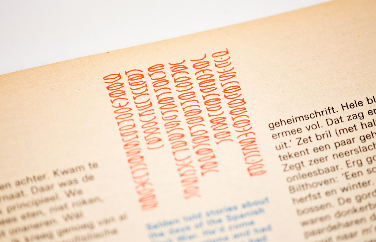
However, when Salden told Schrofer about the bombings of Barcelona during the Spanish Civil War, when he was forced to leave, Jurriaan’s head was occupied with other things. He was thinking, drawing, cutting stencils out of linoleum that he used to make prints on paper and invented a secret alphabet. Bibeb writes that at this point in the interview, he put on his glasses, drew a line of secret characters and said despondently, “Utterly unreadable. Very good”. Seeing the set of characters in the booklet, it can be assumed that his passion for modular fonts and experimental typography came from these youthful games with the secret alphabet that filled pages and pages in his notebooks.
In the interview, Schrofer says that in his youth he most wanted to be a movie director. However, nothing came from this idea, indeed, as from his desire to get a degree in law or philosophy. In Amsterdam, shortly after the war ended, he met Dick Elffers, renowned designer and the owner of a small print shop, who required an assistant. This acquaintance would largely determine the future of Jurriaan’s life. “But I had no illusion at all of becoming a designer,” adds Schrofer, “Because I coudn’t draw for one thing.”
The interview continues with a biographical story about his work with Elffers, his move to the Meijer printing house, the success of his photobook Vuur ann Zee, created for Dutch steel company Hoogovens, and his switch to advertising. In the final part, Schrofer mentions that in recent years he “has been working on various alphabets, or rather on the skeletons of alphabets”. With each new experiment, the letters become less and less legible, but that does not bother him. “At a certain stage of inquiry it doesn’t matter at all if you do things that are useless. It’s a matter of searching for symbols that are flexible, that can easily be distorted,” he adds.
Zienderogen
Author: Jurrian Schrofer ¶ Publisher: G.J. Thiemefonds, 1988 ¶ Design: Jurrian Schrofer ¶ Typeface: Garamond ¶ ISBN 978-90-70896-06-0 ¶ Language: Dutch ¶ Size: 19,2×24 сm
48 thread-sewn pages in a soft cover with flaps made from uncoated paper. Paper: bulk light-coated matte. Monochrome and full-colour printing (for some reproductions).
48 thread-sewn pages in a soft cover with flaps made from uncoated paper. Paper: bulk light-coated matte. Monochrome and full-colour printing (for some reproductions).
48 thread-sewn pages in a soft cover with flaps made from uncoated paper. Paper: bulk light-coated matte. Monochrome and full-colour printing (for some reproductions).
48 thread-sewn pages in a soft cover with flaps made from uncoated paper. Paper: bulk light-coated matte. Monochrome and full-colour printing (for some reproductions).
48 thread-sewn pages in a soft cover with flaps made from uncoated paper. Paper: bulk light-coated matte. Monochrome and full-colour printing (for some reproductions).
48 thread-sewn pages in a soft cover with flaps made from uncoated paper. Paper: bulk light-coated matte. Monochrome and full-colour printing (for some reproductions).
48 thread-sewn pages in a soft cover with flaps made from uncoated paper. Paper: bulk light-coated matte. Monochrome and full-colour printing (for some reproductions).
48 thread-sewn pages in a soft cover with flaps made from uncoated paper. Paper: bulk light-coated matte. Monochrome and full-colour printing (for some reproductions).
48 thread-sewn pages in a soft cover with flaps made from uncoated paper. Paper: bulk light-coated matte. Monochrome and full-colour printing (for some reproductions).
48 thread-sewn pages in a soft cover with flaps made from uncoated paper. Paper: bulk light-coated matte. Monochrome and full-colour printing (for some reproductions).
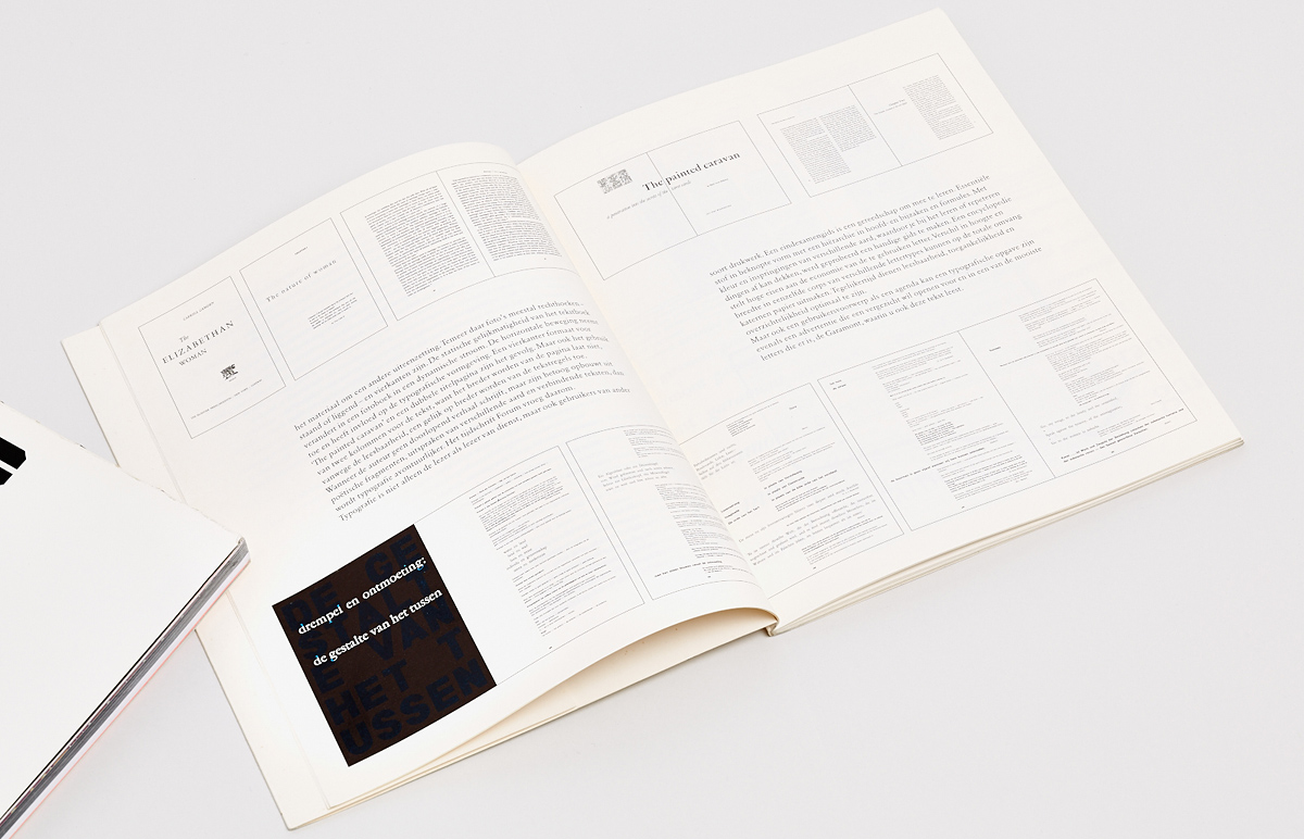
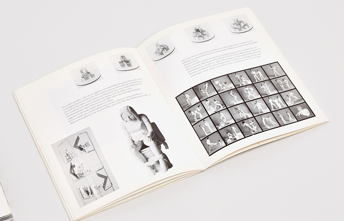
In 1987, Jurriaan Schrofer was given an award for the innovative use of paper by Bührmann-Ubbens, a Dutch distributor of paper and cardboard. The prizewinner was honoured with the opportunity to organise an exhibition of his work and create a long-planned installation—a maze of paper with perforated inscriptions and patterns. A brochure created by the author, published by the Gerrit Jan Thieme Foundation, was to be issued to accompany the exhibition. The foundation financed the release of an entire series, which included publications from Schrofer, Wim Crouwel, Dick Elffers, Piet Schreuders, Gerard Unger and other designers. In his letter to the foundation’s publishing board, Schrofer described his idea of the booklet as a six-part story about typography, design and criteria to evaluate its quality, and relationships with clients and customers, as well as methods and structures to represent time, the differences between two-dimensional and three-dimensional, characters and their semantic meaning. The text was to be accompanied by reproductions of graphic works and photographs of installations created by the author, which in this case would act as a background element to the story.
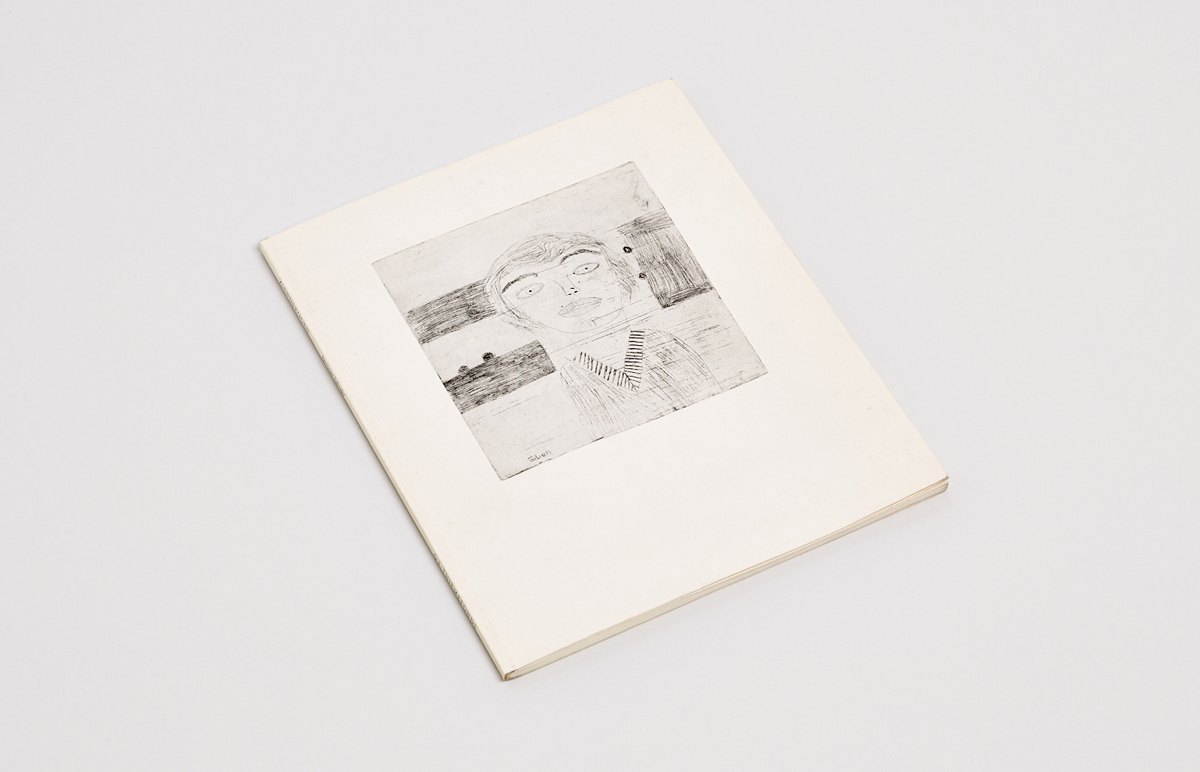
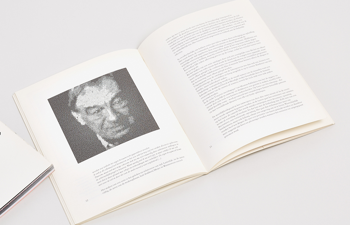
Zienderogen (In Front of Eyes) was published in 1988, two years before Schrofer’s death. A self-portrait of his son Gillian, drawn when he was nine, is printed on the cover. The middle of the publication contains a portrait of Schrofer made of characters from his illegible typeface in four different weights. The back cover is a self-portrait with the silhouette of Willem Schrofer, the author’s father. The book is riddled with biographical references, but its most striking element is the voluminous quotes from a letter to his son, who is now a well-known industrial and interior designer. The letter was written in 1980, when Gillian was 14 and already thinking about his future career. In it, Schrofer recalls moments from his son’s childhood, gives him advice on choosing a profession, reflects on design and its nature, and recollects moments from his personal experience.
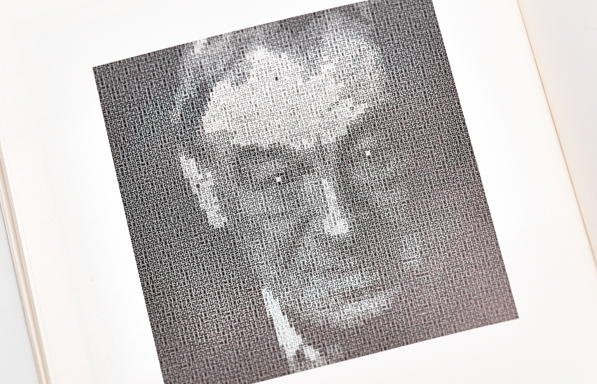
A portrait of Jurriaan Schrofer made of characters from his illegible typeface in four different weights.
From Schrofer’s letter to his son: “You, your grandfather and I are alike: wayward, we do not want to depend on anyone else, and are only happy when we have something to do. However, for your grandfather this ‘something’ is colour, for you—objects, and for me—characters. An artist, like a singer of pure poetry, is autonomous in his art. An industrial designer is the author of tools—a knife and fork, table and chairs, car and satellite, and his art is a secret of a craft. A graphic designer embodies the art of storytelling through the implementation of written communication between people. Do what you do best. It is great to have a certain talent, because then you will automatically become yourself. It is much harder when you do not have one, or when there are several at once.”
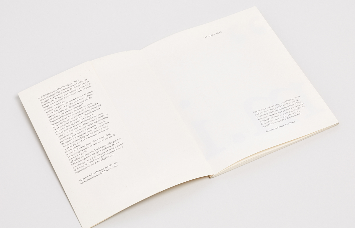
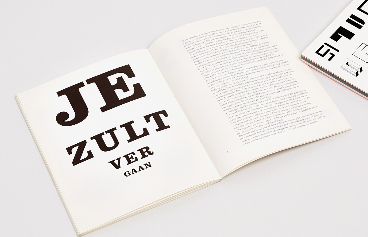
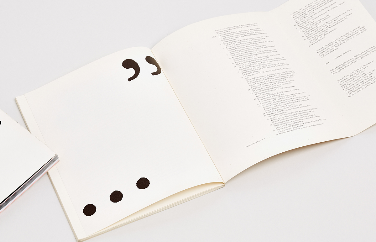
On the title page, there is an epigraph from Nietzsche’s Ecce Homo, which very accurately defines Schrofer’s attitude towards himself and his life, full of wandering and searching, mistakes and achievements. The text in the brochure is enclosed in giant quotation marks, which open on the back of the title page and close on the last page, with the postscript “m.i.”(“in my opinion”). Unlike some of his dogmatic contemporaries, which Schrofer is often compared with, he is full of doubts and his rhetorical style is complex. At the same time, practical remarks are woven between the philosophical constructs:
“It is in the very cases where the author does not write a long sequence of narrative, but constructs it based on poetic fragments, various statements and textual links, that typography becomes bold and original. […] Typography does not only serve readers of literature, but also those who use different types of media in other ways. A final exam preparation guide is a learning tool. Fundamental material in a concise form with a clear hierarchy of primary and secondary descriptions and formulas. Colour and different types of indentation help to create a handy reference aid; thanks to them, it is easier to find certain things when working with the book. An encyclopaedia has exacting demands as to the choice of typeface for economic reasons. A difference in metrics of characters from different typefaces can greatly affect the resulting volume of the text. At the same time, it is necessary to ensure optimal readability and clarity.”
In the book, Schrofer repeatedly returns to the concept and essence of design—its isolation from other kinds of creative activity. From the letter to his son: “The design that I would like to define is associated with a different object than art. Design is about pre-formulation, plan, scheme, strategy, intention, the first sketch, the general idea. The implementation of the following steps is based on many aspects related to art, but their goal is not to create an object of art in the way that we envision it today. And that is why I do not trust designers who call themselves artists.”
The book is also home to several amusing incidents. Schrofer recalls how he made his tax consultant laugh by saying that his trip to Istanbul was not just a holiday, but a scientific expedition that allowed him to study the relationship between the square and the circle through the example of Hagia Sophia and the Blue Mosque, so therefore must be considered as business expenses. The ending of the story is a dialectical statement summarising the philosophy of Jurriaan Schrofer: “In order to reflect the living connection between people in text and illustrations, it is necessary to engage in the endless story about the meaning and meaninglessness of our existence, although that is a difficult task. In front of my eyes is life, entirely consisting of moments of happiness and loss; to live without experiencing any problems is a living death. Solving the obvious contradictions, I did not come to the conclusion that there were less good moments. In fact, it is not about ‘yes’ and ‘no’, nor faith or conscience, nor truth or lies, but the experience of the unity of opposites.”
Jurriaan Schrofer (1926–1990): Restless typographer
Essay: Frederike Huygen ¶ Edited by Tony Brook and Adrian Shaughnessy ¶ Publisher: Unit Editions, 2013 ¶ Design: Tony Brook and Elena Carl (Spin) ¶ Typeface: Fugue, Radim Peško ¶ ISBN 978-0-9562071-8-0 ¶ Language: English ¶ Size: 15×25 cm
144 pages in a thread-sewn binding with an open spine. Paper: matte coated. Full-colour printing with additional scarlet fluorescent spot ink.

144 pages in a thread-sewn binding with an open spine. Paper: matte coated. Full-colour printing with additional scarlet fluorescent spot ink.
144 pages in a thread-sewn binding with an open spine. Paper: matte coated. Full-colour printing with additional scarlet fluorescent spot ink.
144 pages in a thread-sewn binding with an open spine. Paper: matte coated. Full-colour printing with additional scarlet fluorescent spot ink.
144 pages in a thread-sewn binding with an open spine. Paper: matte coated. Full-colour printing with additional scarlet fluorescent spot ink.
144 pages in a thread-sewn binding with an open spine. Paper: matte coated. Full-colour printing with additional scarlet fluorescent spot ink.

144 pages in a thread-sewn binding with an open spine. Paper: matte coated. Full-colour printing with additional scarlet fluorescent spot ink.
144 pages in a thread-sewn binding with an open spine. Paper: matte coated. Full-colour printing with additional scarlet fluorescent spot ink.
144 pages in a thread-sewn binding with an open spine. Paper: matte coated. Full-colour printing with additional scarlet fluorescent spot ink.
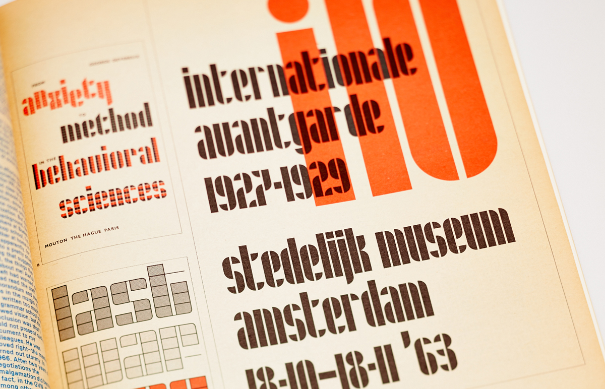
Increased interest in modernist typography naturally spurred demand for books devoted to this topic. British publisher Unit Editions has put a particular emphasis on it, even causing some suspicions of riding the current modernistic trend in graphic design. Indeed, the first editions of their books sold like hot cakes. However, it is much safer to say that the founders of the publishing house, Tony Brook and Adrian Shaughnessy, thanks to their reputation, taste and interesting approach to editing and design, if anything, form trends, rather than following them.
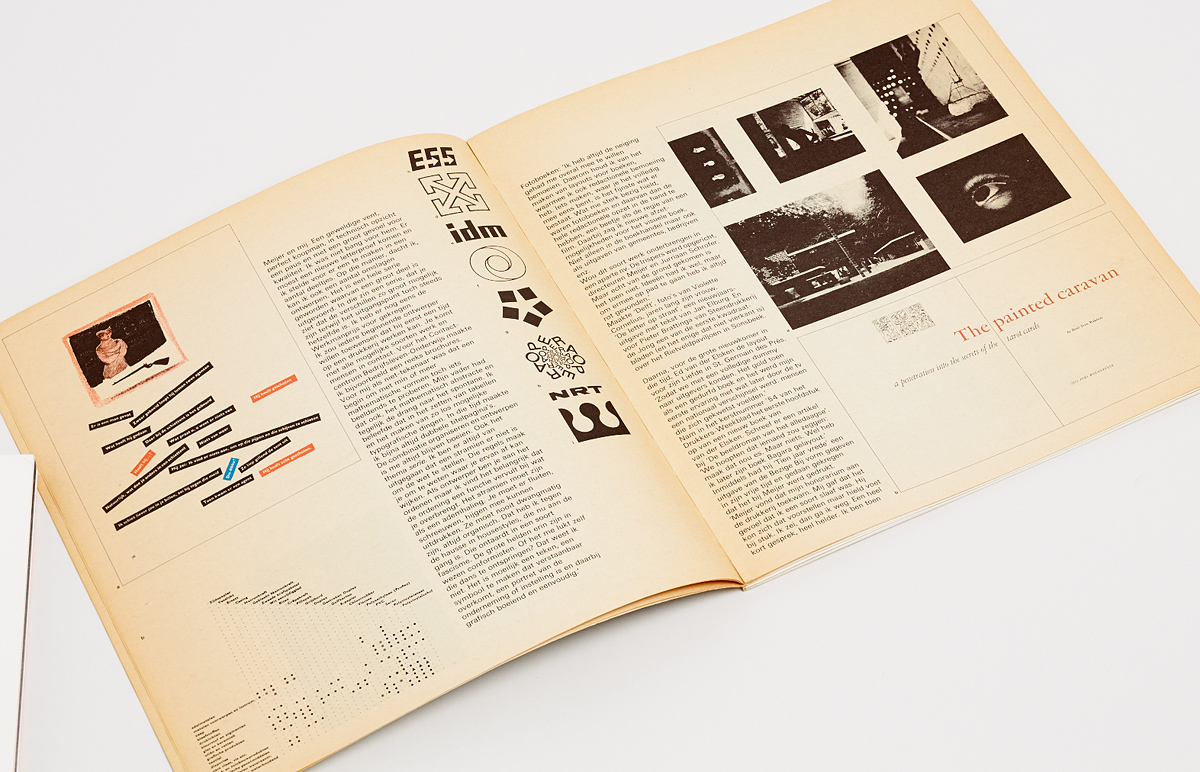
Even before the publication of their book about Jurriaan Schrofer, Unit Editions was drawn to the history of the Dutch graphic design, sequentially releasing Wim Crouwel’s exhibition catalogue A Graphic Odyssey, Ben Bos’s book TD 63-73 on the heyday of studio Total Design and Kwadraat-Bladen, a book dedicated to the eponymous series of experimental publications made under the auspices of Pieter Brattinga and De Jong & Co. By the way, both Total Design and Kwadraat-Bladen have a direct link to Jurriaan Schrofer. In 1974, Schrofer went to TD, becoming a member of the board and getting his own design team in addition to the four that already existed, and worked at the studio until 1979, specialising in corporate identity, wayfinding and spatial design. The story of the Kwadraat-Bladen deserves to be told separately.
By the mid-50s, Dutch printers had begun to produce their own advertising, exhibiting their printing and finishing techniques. De Jong & Co was no exception. However, art director Pieter Brattinga, whose family owned the company, was not fully satisfied with the design and quality of these materials. A meeting with Schrofer allowed Brattinga to formulate the concept of the publications that would later be named Kwadraat-Bladen (Square Pages). In 1956, Schrofer showed Brattinga the mock-up of a booklet about the Rietveld Pavilion in an Arnhem park. The result was embodied in the form of a printed sheet folded into thirds, encircled by a red wrapping, with photos of the pavilion, printed at a then unimaginable 120 lines per inch. It was 25 by 21 centimetres in size; Brattinga, however, had a square in mind and even asked Schrofer to change the proportions, but the latter refused. The publication was distributed to customers of the printing house and was an incredible success: it the first time text, photos and design had been combined by a single idea in this format, all while achieving unsurpassed print quality. However, the discrepancy in shape did not allow it to be considered part of the “square series”, even though it was actually the turning point.
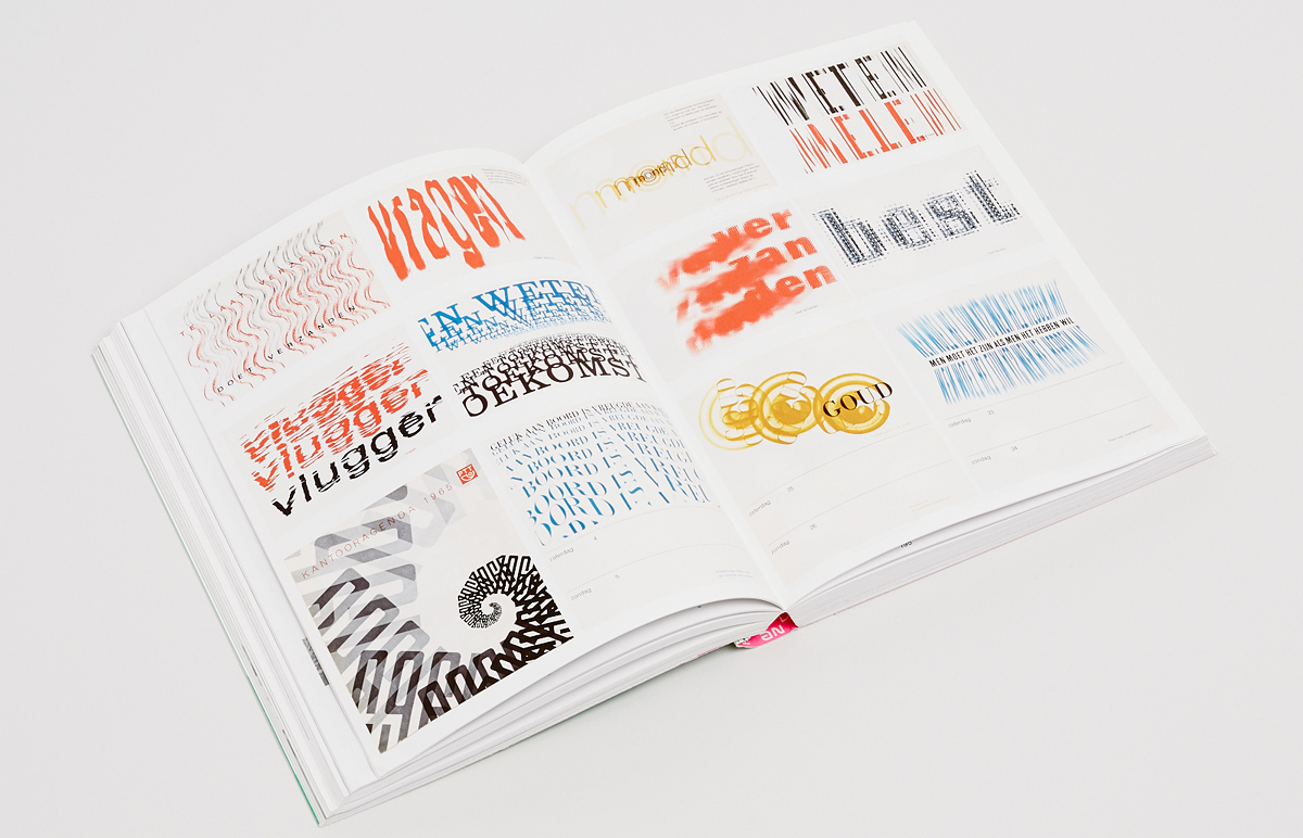
Restless Typographer is focused on Schrofer’s typefaces, lettering and typography. It begins with a selection of his alphabets, including one cleverly named Sans Serious, and continues with a comprehensive retrospective of his type compositions, lettering and book covers. The book’s coda is a short essay about Jurriaan Schrofer by Frederike Huygen. Prior to the Unit Editions publication, Schrofer’s name was little known outside of the Netherlands, despite the vibrancy and innovative nature of his work in various genres. The book was intended to be a prelude to an extensive monograph devoted to Schrofer that Huygen was working on at the time.
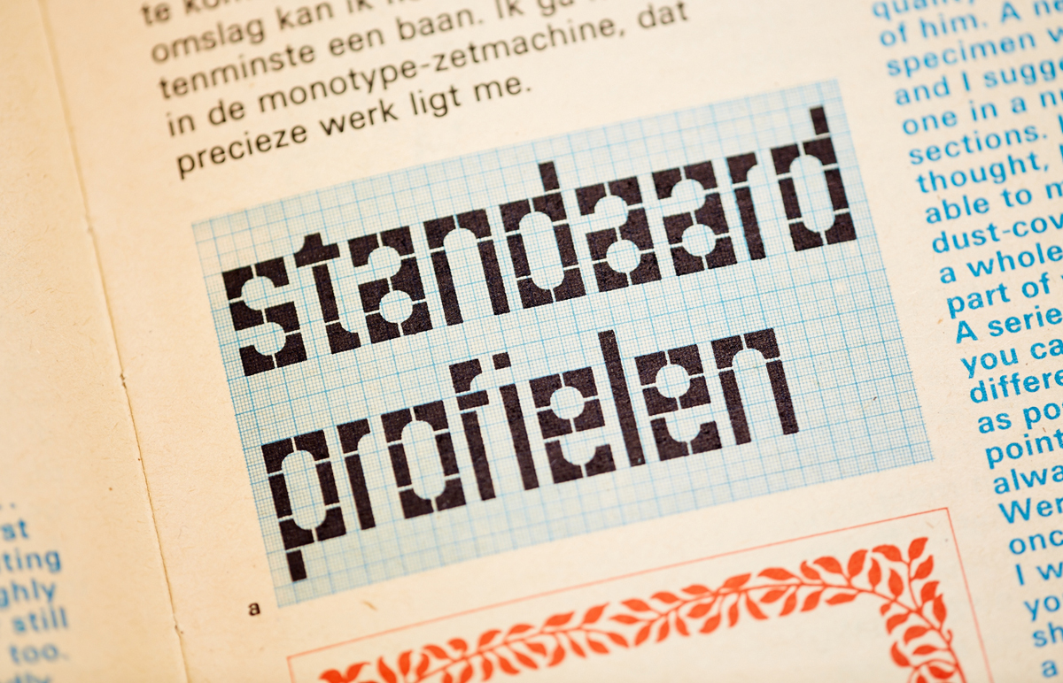
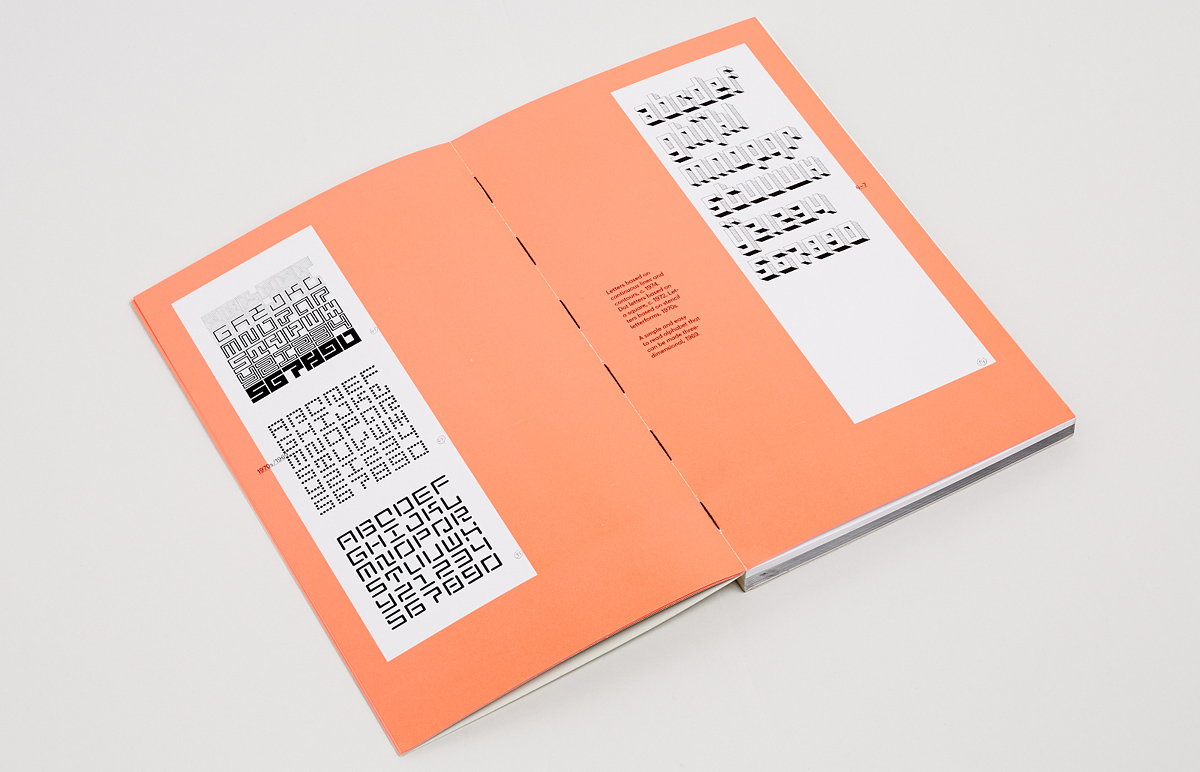
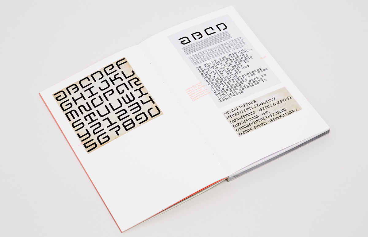
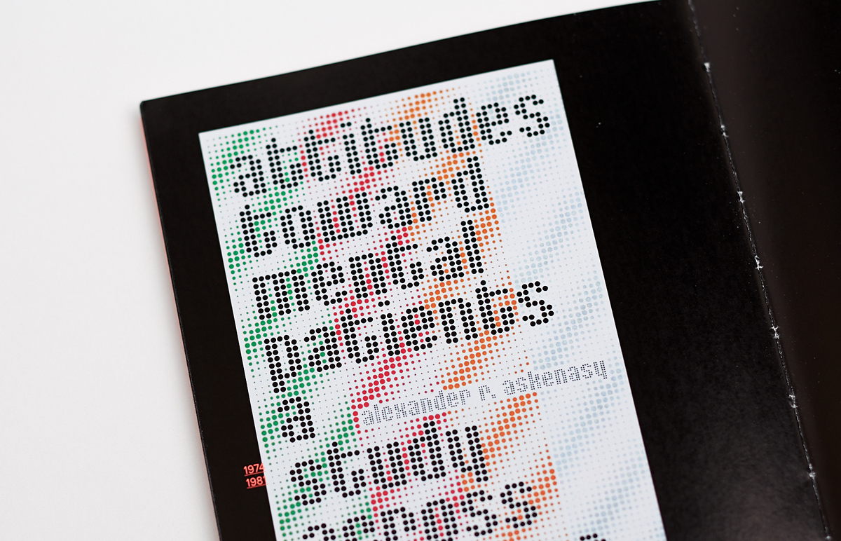
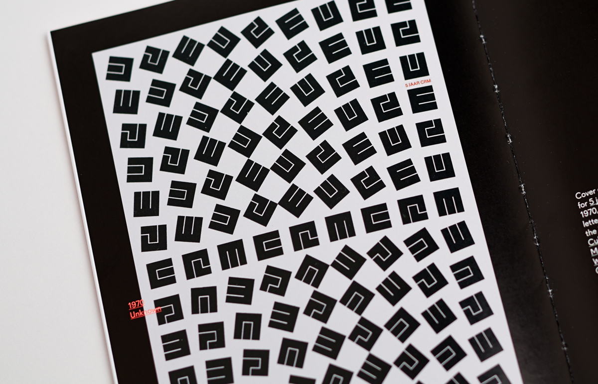
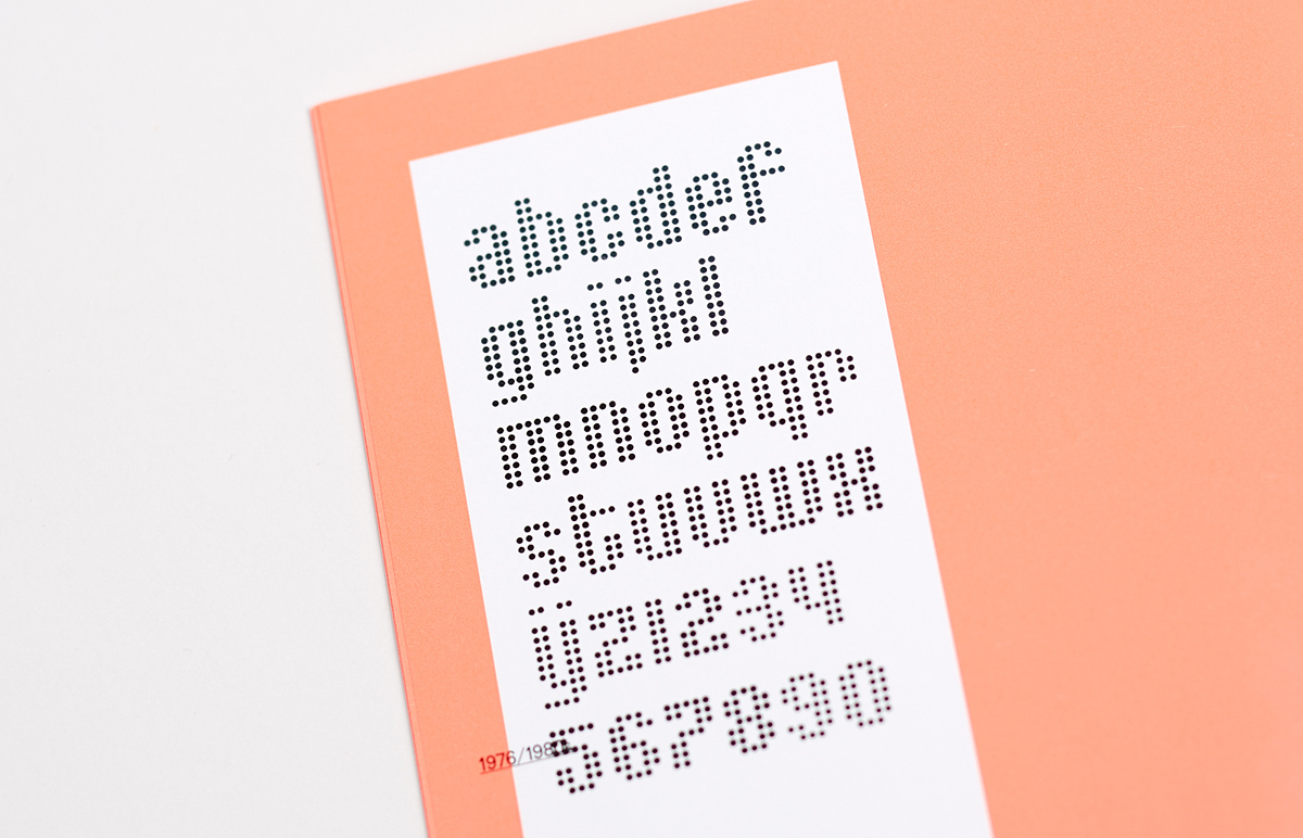
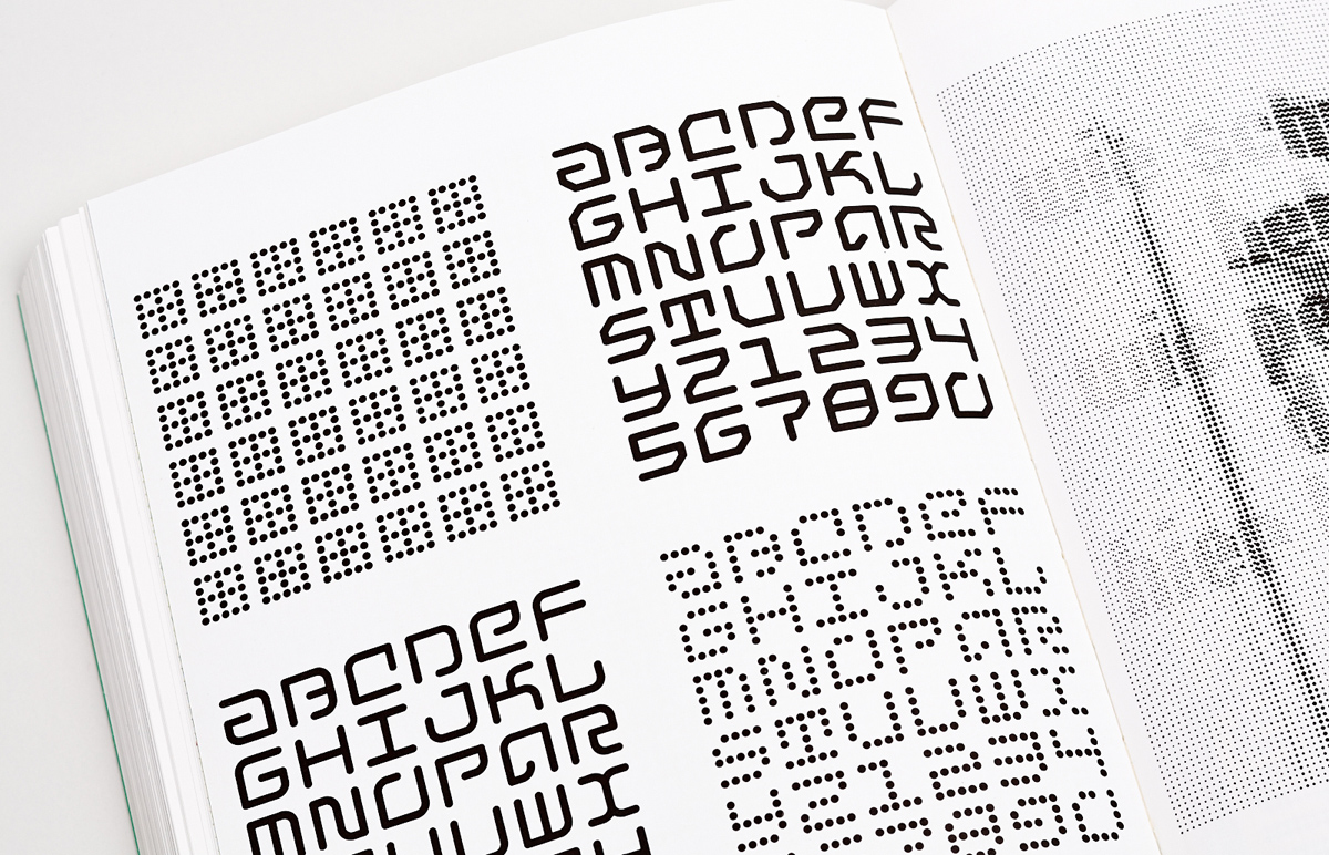
Schrofer’s approach to the design of his typefaces can be described as intentionally geometric, modular and minimalist, although this minimalism is often offset by the boldness and impact of their use. His typefaces do not have a full character set and often even capitals. As a rule, they do not go beyond the set of letters he needed to carry out a specific design task. This makes it possible to say that his letters were tailor made. Letters Made to Measure was even chosen as the title of a publication containing samples of Schrofer’s typefaces that Lecturis released in 1987. On several occasions, Schrofer ordered his own Letraset-like dry transfer sheets to simplify the creation of complex compositions with repeated elements.
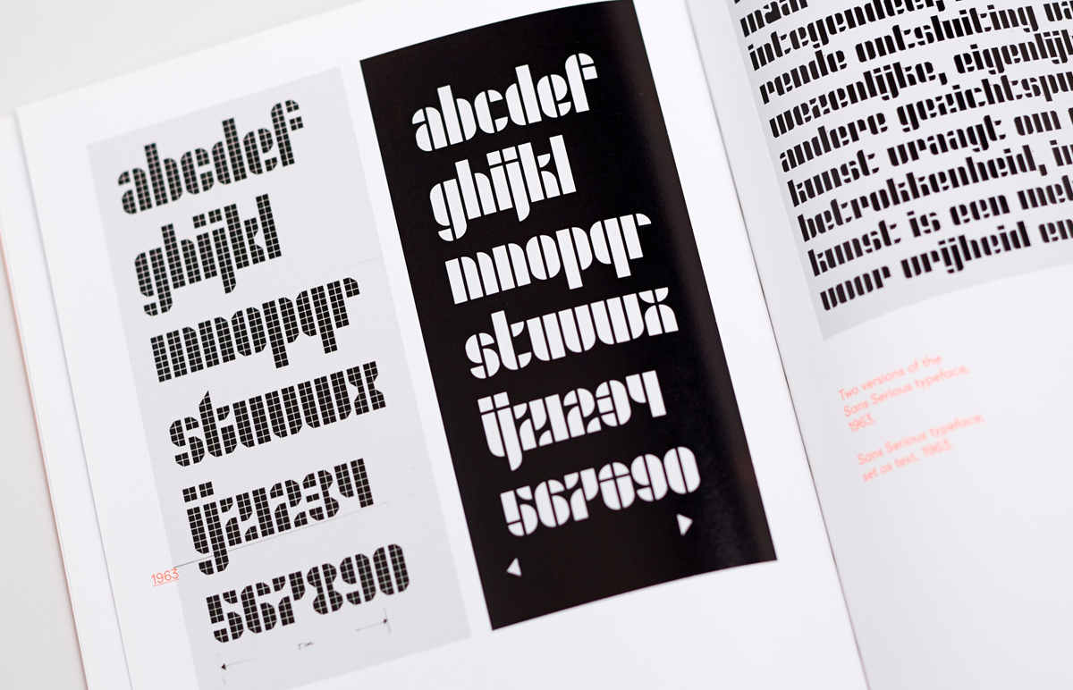
Two versions of Jurriaan Schrofer’s typeface Sans Serious.
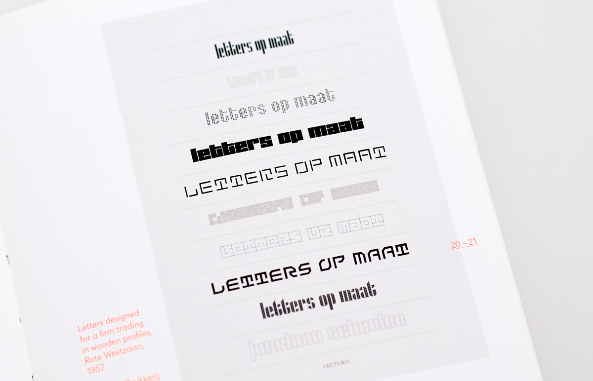
Examples of Schrofer’s type on the cover of the brochure Letters op maat (Letters Made to Measure).
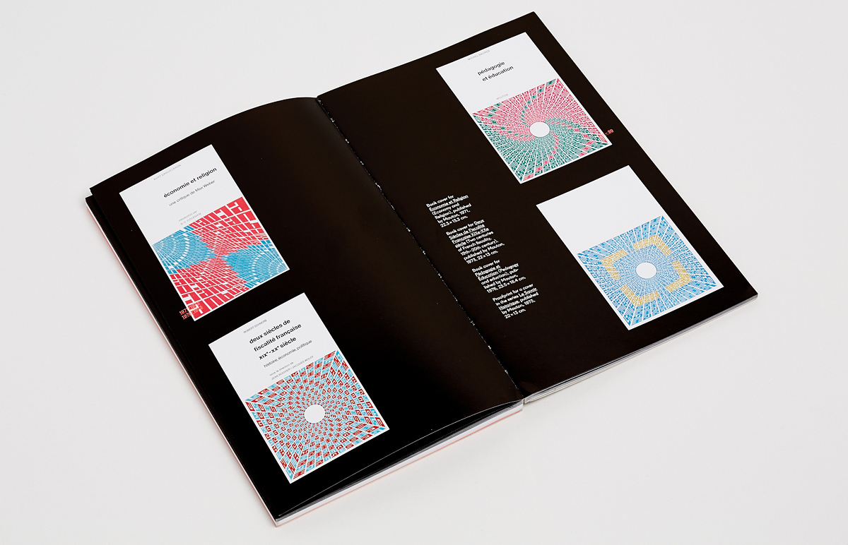
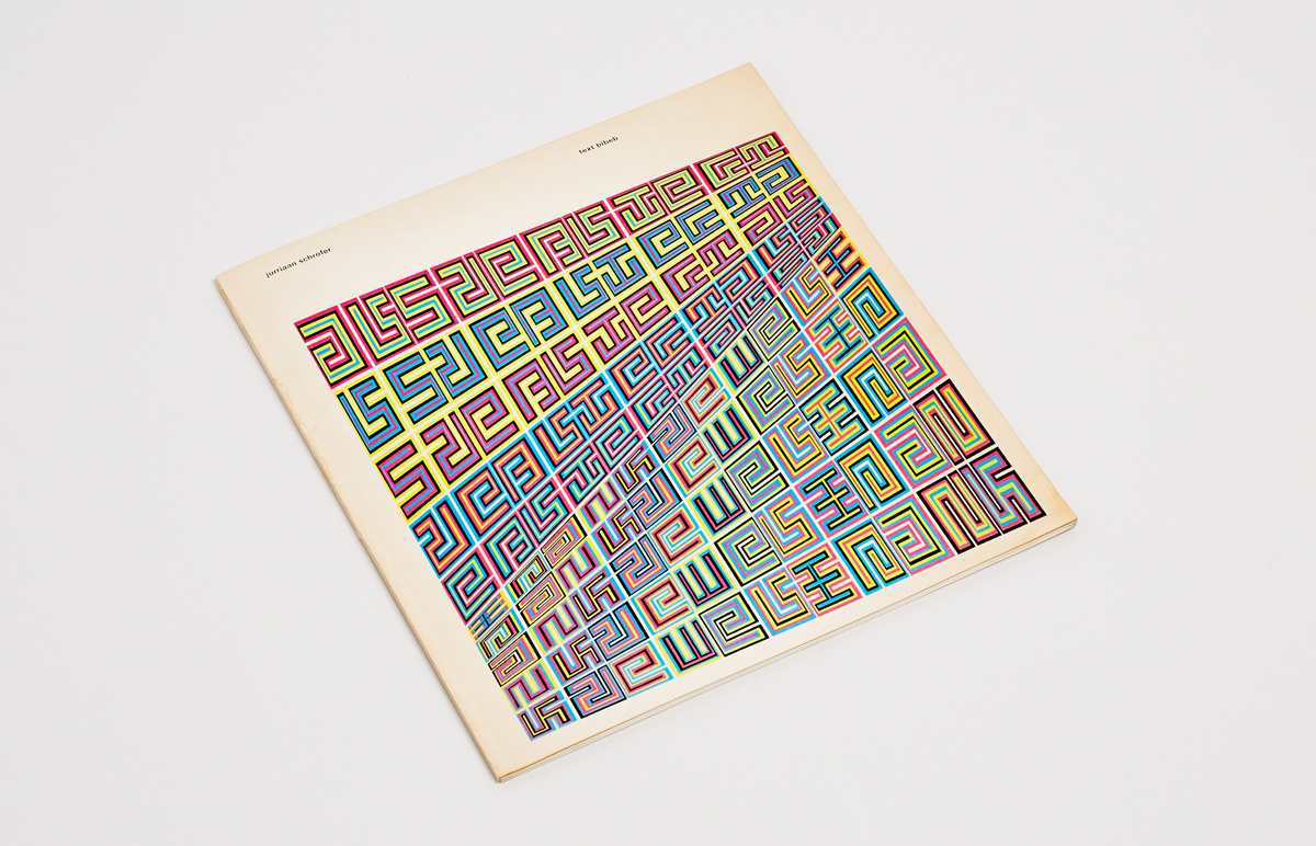
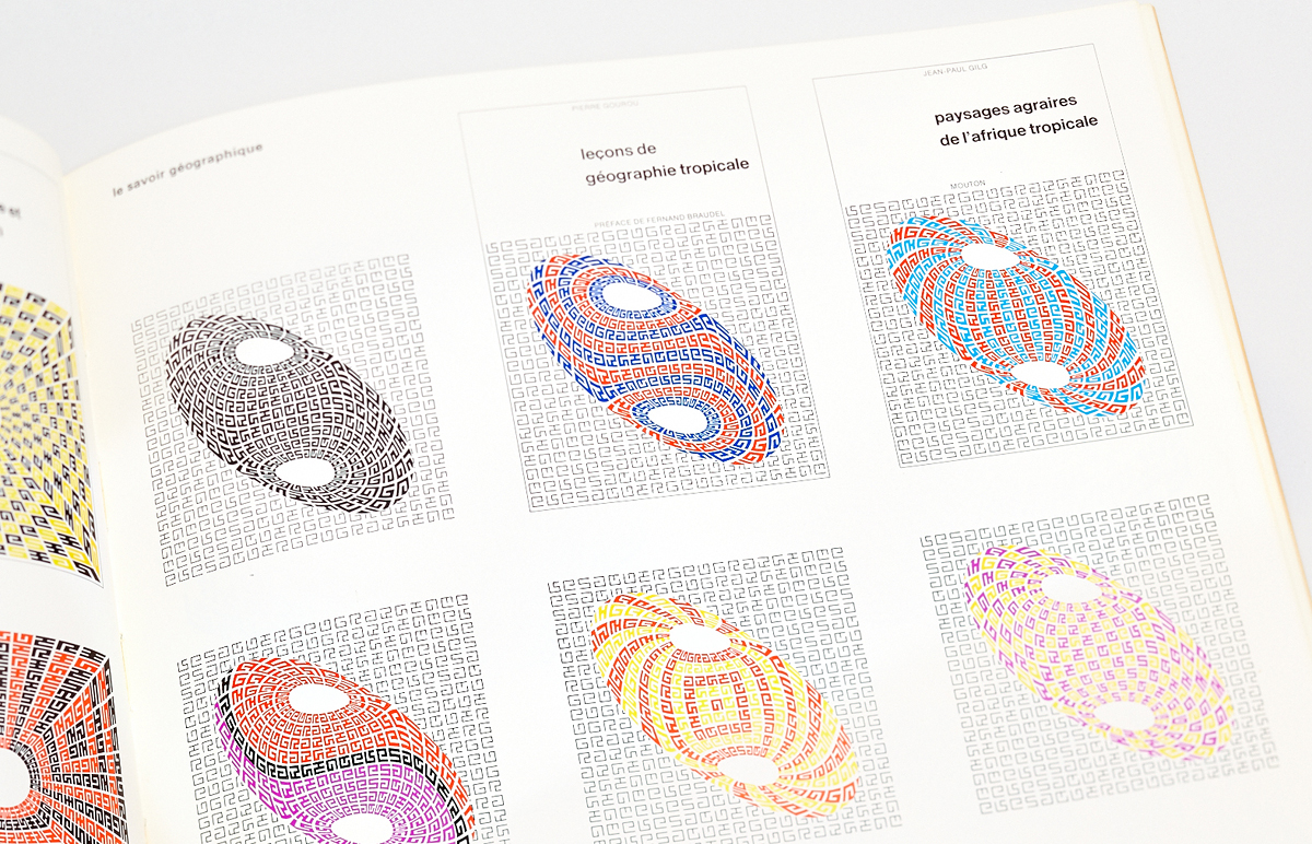
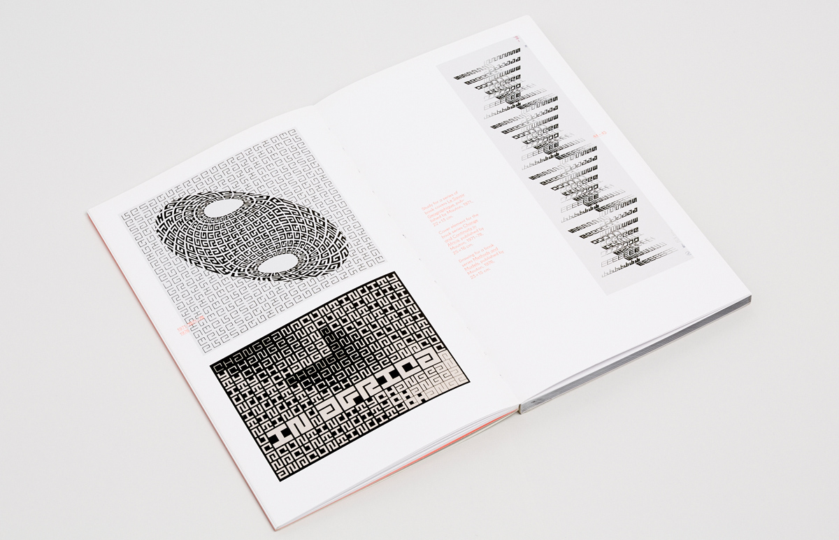
Series of book covers for Mouton.
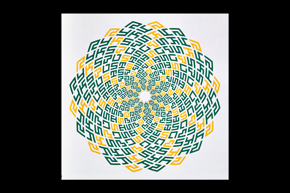
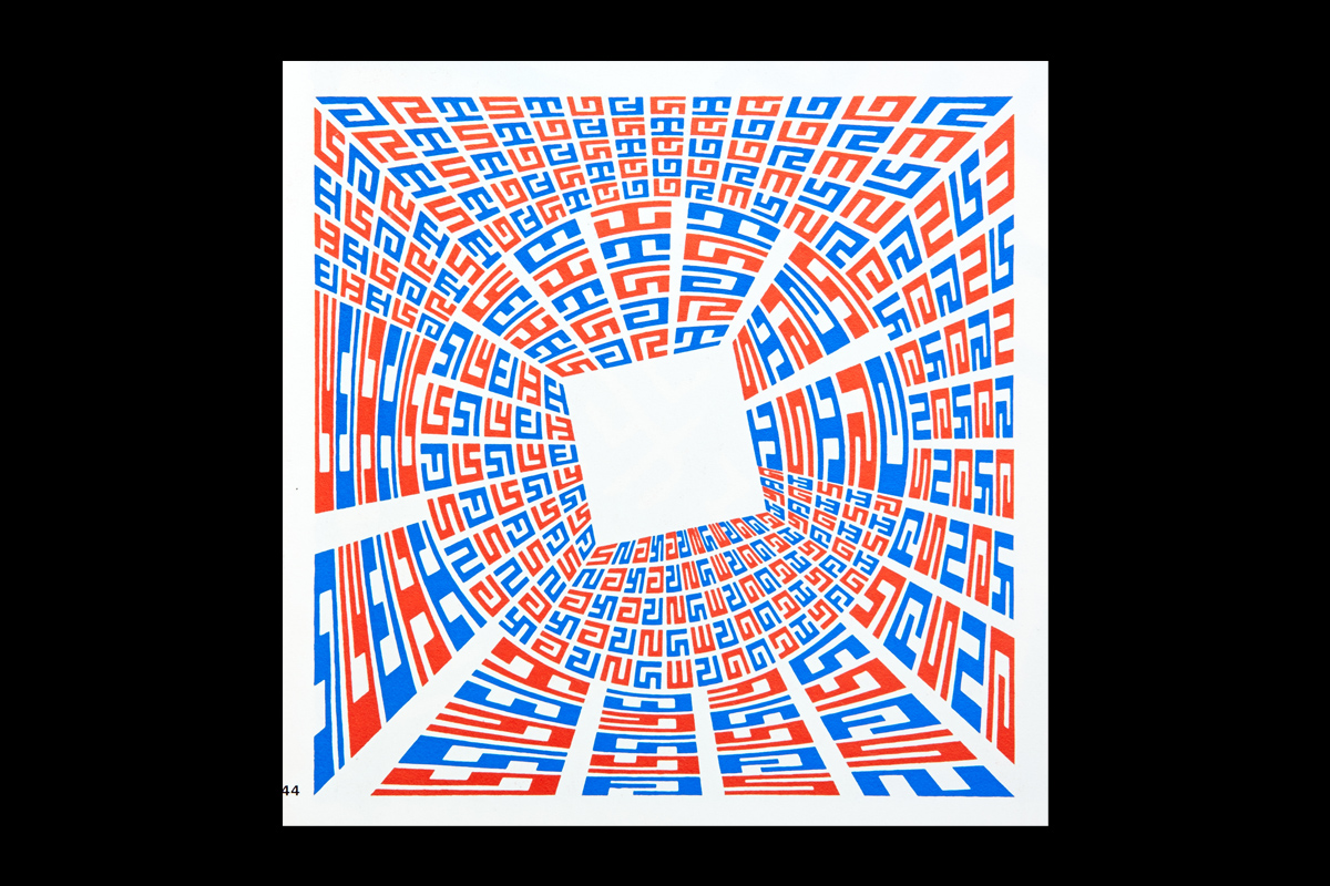
The need to develop serial typographic compositions led Schrofer to a succession of abstract, but typographic in nature experiments, the most striking result of which was a series of book covers for the publisher Mouton. Huygen writes, “He was at the time under the spell of Jacques Bertin’s book Sémiologie Graphique. Bertin was a French cartographer and in this seminal work he analysed signs and symbols and their graphic possibilities. He provided Schrofer with a grammar of signs: distinguishing variations in shape and form, direction, colour, structure, tone or size. Schrofer was in the grip of signs and shapes, but he also was inspired by Op Art, and artists like Maurits Escher and Victor
Vasarely.”
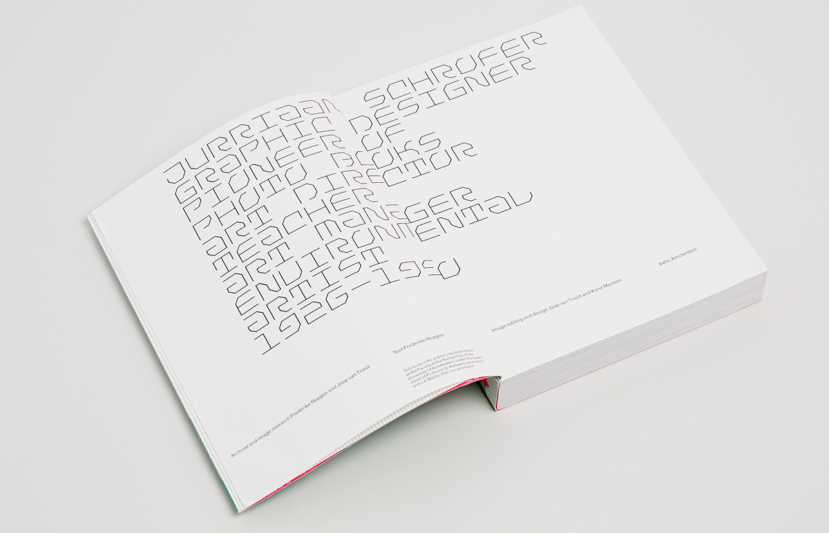
Jurriaan Schrofer: graphic designer, pioneer of photo books,
art director, teacher, art manager and environmental artist
Author: Frederike Huygen ¶ Publisher: Valiz, 2013 ¶ Design: Jaap van Triest, Karel Martens (cover by Karel Martens) ¶ Typeface: F-Grotesk, digital versions of Schrofer’s typefaces by Radim Peško ¶ ISBN: 978-90-78088-70-7 ¶ Language: English (a Dutch version has also been published) ¶ Size: 17×23.2 cm
424 pages bound with Otabind*, soft cover with flaps. Paper: Profibulk (matt coated). Cover printed in three colours, including fluorescent pink, inside pages in full-colour. One of the best books published in the Netherlands in 2013 according to annual contest De Best Verzorgde Boeken (The Best Dutch Book Designs).

424 pages bound with Otabind*, soft cover with flaps. Paper: Profibulk (matt coated). Cover printed in three colours, including fluorescent pink, inside pages in full-colour. One of the best books published in the Netherlands in 2013 according to annual contest De Best Verzorgde Boeken (The Best Dutch Book Designs).
424 pages bound with Otabind*, soft cover with flaps. Paper: Profibulk (matt coated). Cover printed in three colours, including fluorescent pink, inside pages in full-colour. One of the best books published in the Netherlands in 2013 according to annual contest De Best Verzorgde Boeken (The Best Dutch Book Designs).
424 pages bound with Otabind*, soft cover with flaps. Paper: Profibulk (matt coated). Cover printed in three colours, including fluorescent pink, inside pages in full-colour. One of the best books published in the Netherlands in 2013 according to annual contest De Best Verzorgde Boeken (The Best Dutch Book Designs).

424 pages bound with Otabind*, soft cover with flaps. Paper: Profibulk (matt coated). Cover printed in three colours, including fluorescent pink, inside pages in full-colour. One of the best books published in the Netherlands in 2013 according to annual contest De Best Verzorgde Boeken (The Best Dutch Book Designs).

424 pages bound with Otabind*, soft cover with flaps. Paper: Profibulk (matt coated). Cover printed in three colours, including fluorescent pink, inside pages in full-colour. One of the best books published in the Netherlands in 2013 according to annual contest De Best Verzorgde Boeken (The Best Dutch Book Designs).

424 pages bound with Otabind*, soft cover with flaps. Paper: Profibulk (matt coated). Cover printed in three colours, including fluorescent pink, inside pages in full-colour. One of the best books published in the Netherlands in 2013 according to annual contest De Best Verzorgde Boeken (The Best Dutch Book Designs).
424 pages bound with Otabind*, soft cover with flaps. Paper: Profibulk (matt coated). Cover printed in three colours, including fluorescent pink, inside pages in full-colour. One of the best books published in the Netherlands in 2013 according to annual contest De Best Verzorgde Boeken (The Best Dutch Book Designs).
424 pages bound with Otabind*, soft cover with flaps. Paper: Profibulk (matt coated). Cover printed in three colours, including fluorescent pink, inside pages in full-colour. One of the best books published in the Netherlands in 2013 according to annual contest De Best Verzorgde Boeken (The Best Dutch Book Designs).
In 1997, publishing house Uitgeverij 010, which specialises in architecture and urbanism, released the book Mode en Module, exploring the life and work of Wim Crouwel, the famous Dutch graphic designer. Frederike Huygen and Hugues Boekraad authored the monograph, which opened the publisher’s series on graphic designers from the Netherlands, supported by the Prins Bernhard Cultuurfonds. The books in the series, often bilingual, were dedicated to the eminent Willem Sandberg, Otto Treumann, Helmut Salden and Jan van Toorn, as well as some other figures less known outside Holland: Baer Cornet, Ed Annink, Piet Gerards.
Mode en Module has become an important reference point for monographs on Dutch designers—due not only to its originality, but also to its new approach: the authors critically and meticulously analyse the life and work of a living classic, with no archive access restrictions or interference in the editorial process. In fact, a monument to the work of a world-famous designer is not necessarily a heavy volume in a cloth cover, but can be a small paperback with modern cold glue binding. No less interesting and progressive is the design of the book, which Jaap van Triest and Karel Martens worked on in tandem, a year after they had designed Martens’s monograph Printed Matter. The latter was also a milestone among books about designers and was re-printed three times, each of which invariably ended with the print run quickly selling out. The monograph on Schrofer formed a kind of “designer trilogy” by van Triest and Martens: in addition to design similarities, the frighteningly narrow margins and distinctive covers, its format is also the same as the previous two. It is safe to say that the integral form and content of all three books—Printed Matter, Mode en Module and Jurriaan Schrofer—puts them among the most significant publications devoted to Dutch graphic design.
Schrofer’s biographer Frederike Huygen gave many years to the preservation, study and promotion of the history of Dutch design. In addition to Mode en Module, she is the author of numerous publications, including Visies op Vormgeving, The Style of the Stedelijk and Lex Reitsma—196 Posters for De Nederlandse Opera. She currently heads the Dutch Design History Foundation. The book Jurriaan Schrofer, published by Valiz, was the result of work on her doctoral thesis at the University of Amsterdam. Jaap van Triest, who helped the author with archival work, and Karel Martens were involved in the design. Radim Peško—the book is set in his F-Grotesk—digitised Schrofer’s alphabets especially for the project.
The rather detailed title of the book—Jurriaan Schrofer: graphic designer, pioneer of photo books, art director, teacher, art manager and environmental artist—fully reflects Schrofer’s multidisciplinary and broad interests. In the introduction, Huygen explains that it is impossible to apply a traditional chronology to the presentation of his oeuvre, so she split the story into eight chapters on the areas of his work. The eighth chapter, which talks about Schrofer’s experiments with letters and symbols, stands slightly apart from the rest. The main sources for the book were Schrofer’s vast archive and numerous interviews with members of his family, clients, colleagues and former students. Each chapter is based around a thematic axis onto which the author, in addition to facts, biographical details and reproductions of works, threads small comments explaining the discourse and environment, without which it would be difficult to understand what was happening, or basically impossible for readers unfamiliar with the design scene in the Netherlands at the time. Numerous references and notes in the margins remind us of the academic nature of this study. Some of them are very detailed and, alongside the captions describing reproductions, form another layer of narrative.


Out of all the chapters, apart from the one about Schrofer’s typefaces, the most interesting for a mainstream audience are perhaps those dedicated to his apprenticeship under Dick Elffers, his work in the field of photobook design, in advertising and as an employee of Total Design. The book also pays great attention to Schrofer’s contribution as an organiser of the Dutch design community. Thanks to his active participation, the Association of Graphic Designers (GVN) was formed in 1969, which democratised the conditions for professional recognition and participation in craft unions compared to previous years. Prior to this, the rules of authoritative design organisation GKf, which became part of the new union, did not allow designers specialising in advertising, for example, to join—in the opinion of its members, this was a contemptible, low-minded genre.
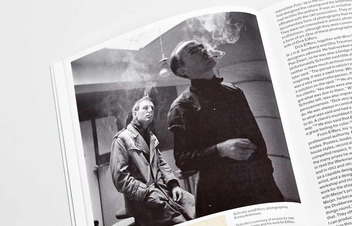
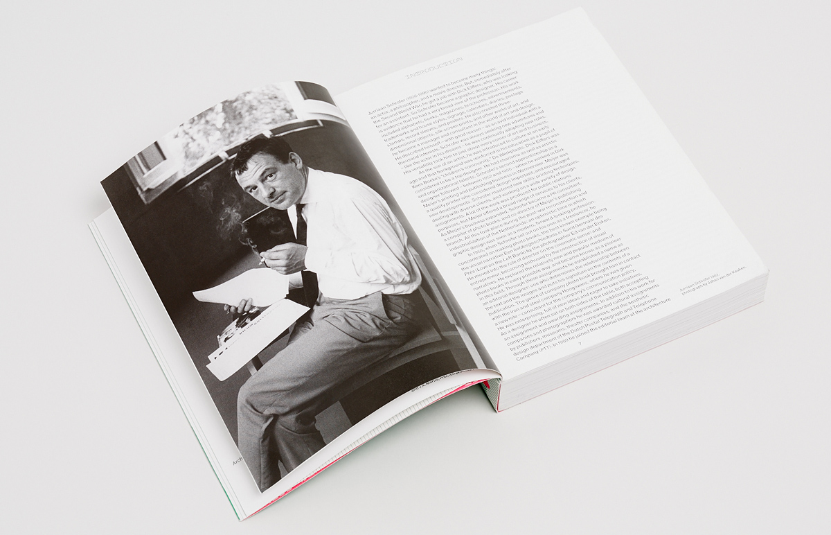
Jurriaan Schrofer (left) and Dick Elffers in the late 1940s. Photo: Emmy Andriesse.
A common thread in the book is Schrofer’s internal contradictions and his opposition to the excessive rationalisation and dogmatisation of design. Huygen writes, “Schrofer’s critique of the modernism of the ‘generals of system’ was a way of distinguishing himself from his contemporary and colleague Wim Crouwel. Crouwel made a big impression, through his work and his appearance. He was a fervent disciple of Swiss modernism, and represented a change of paradigm in the profession: not artistry, but a business-like, systematic aproach; not emotion but information. Schrofer on the other hand emphasized the human dimention and rejected a systems-based approach, dogma, and consistency.” A striking example of this is the story of how Amsterdam’s first metro line, opened in 1977, was designed.
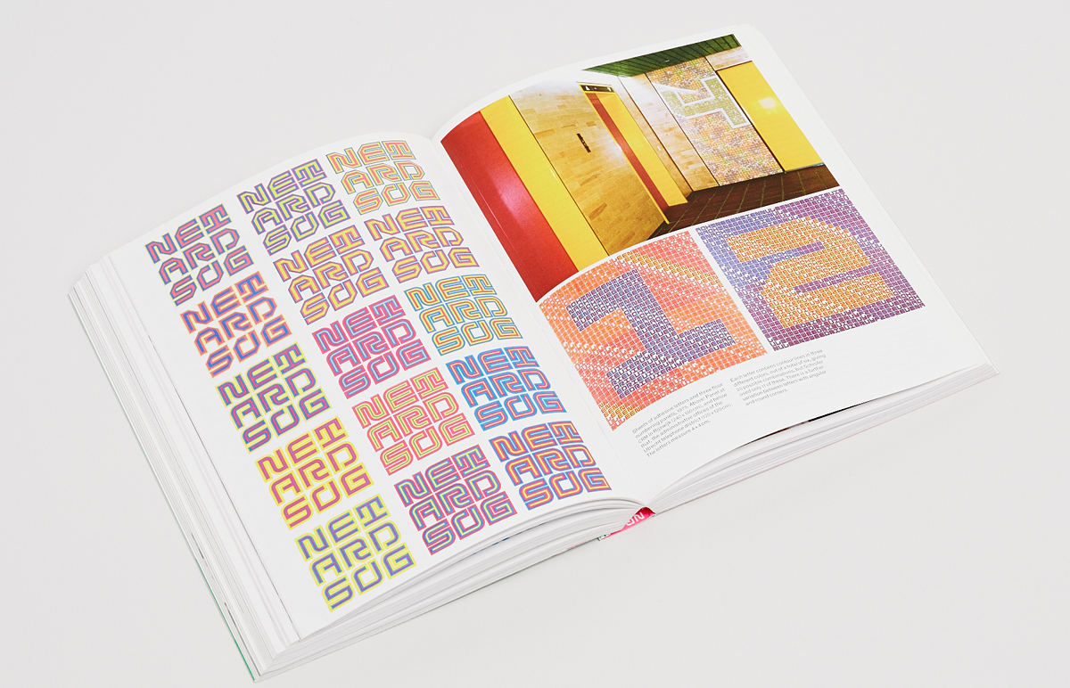
In 1971, the municipality created an art commission to form a design concept for the stations and symbols as part of Amsterdam underground construction project. Schrofer, who was at that time a design consultant for the metro, was part of it. He later headed the project’s graphic design working group and compiled a design guide, the details of which were worked on by Pieter Brattinga and his team of designers. Jurriaan Schrofer saw design as something elevated and expressive, but not detracting from functional qualities. He insisted that the underground system, having its own visual identity, should not restrict the identity of each of the stations. Disagreements began when it turned out that the team was not very interested in developing his ideas and tried to build a consistent identity system. However, despite the obvious nature of the contradictions, work continued. The tug of war between Schrofer’s working group and the designers, as well as the numerous bizarre proposals of the latter, including the comical idea to choose a mole as the symbol of the underground and even make the entrances look like burrows, which did not fit in with the concept or technical constraints, led to the fact that the Metro never got a unified identification system.
At the same time, the book gives numerous contrasting examples, when the non-systemic, expressive approach led to interesting and innovative results. Schrofer’s type experiments were no exception to this. However, perhaps the greatest achievement of his life was overcoming the stereotypical boundaries of the profession and moving into a space of possibilities, when a designer can become a mediator, coordinator or director. You can find plenty of convincing evidence of this in the book. In conclusion, Huygen writes, “Graphic designers build images—in both senses of the word—which create distinctive capital for their clients. Such images manifest aesthetic autonomy and are valued for their visual qualities. But the designer also has another kind of autonomy, as an advisor. Graphic designers coordinate and negotiate. The roles of the intermediary and strategist are part of the profession as well, and in his practice Schrofer played these roles superbly.”
Schrofer Sketches
Author: Frederike Huygen ¶ Publisher: Lecturis, 2014 ¶ Design: Studio Joost Grootens ¶ Typeface: Atlas Grotesk ¶ ISBN: 978-94-6226-077-1 ¶ Language: English ¶ Size: 22×28 cm
176 pages, “Swiss brochure”** binding with a soft kraft-board cover. Paper: Amber Graphic offset. Full-colour printing with fluorescent spot inks. One of the best books published in the Netherlands in 2014 according to annual contest De Best Verzorgde Boeken (The Best Dutch Book Designs).
176 pages, “Swiss brochure”** binding with a soft kraft-board cover. Paper: Amber Graphic offset. Full-colour printing with fluorescent spot inks. One of the best books published in the Netherlands in 2014 according to annual contest De Best Verzorgde Boeken (The Best Dutch Book Designs).
176 pages, “Swiss brochure”** binding with a soft kraft-board cover. Paper: Amber Graphic offset. Full-colour printing with fluorescent spot inks. One of the best books published in the Netherlands in 2014 according to annual contest De Best Verzorgde Boeken (The Best Dutch Book Designs).
176 pages, “Swiss brochure”** binding with a soft kraft-board cover. Paper: Amber Graphic offset. Full-colour printing with fluorescent spot inks. One of the best books published in the Netherlands in 2014 according to annual contest De Best Verzorgde Boeken (The Best Dutch Book Designs).
176 pages, “Swiss brochure”** binding with a soft kraft-board cover. Paper: Amber Graphic offset. Full-colour printing with fluorescent spot inks. One of the best books published in the Netherlands in 2014 according to annual contest De Best Verzorgde Boeken (The Best Dutch Book Designs).
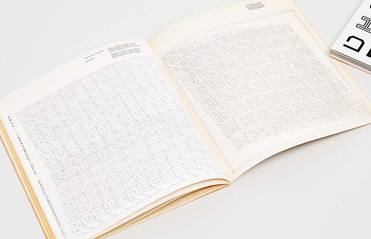
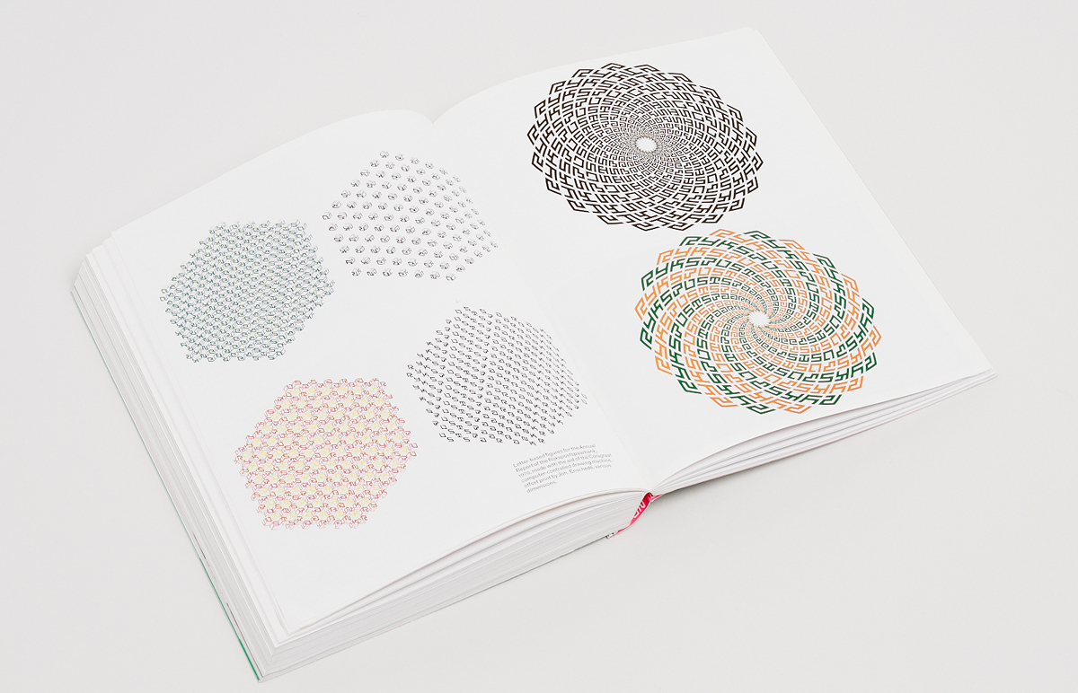
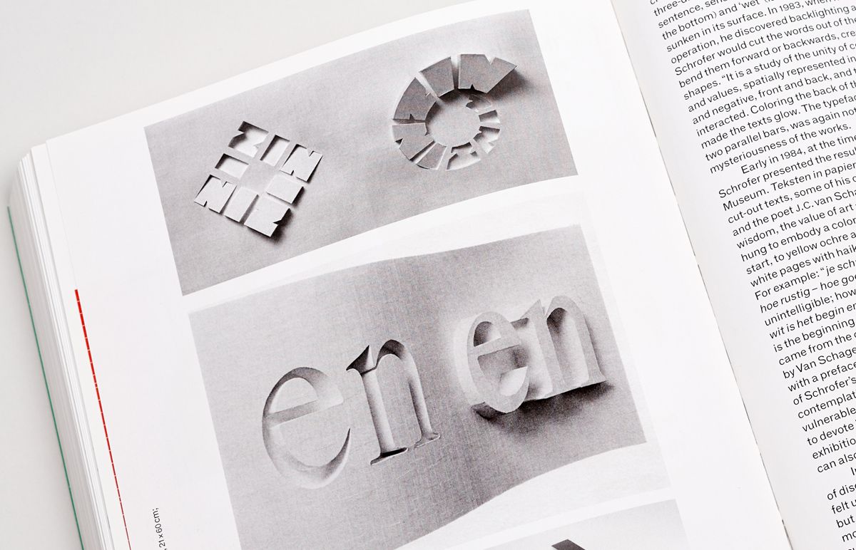
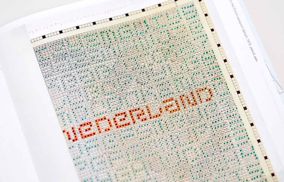
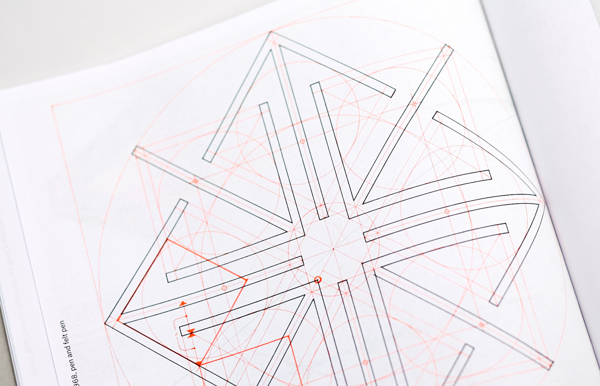
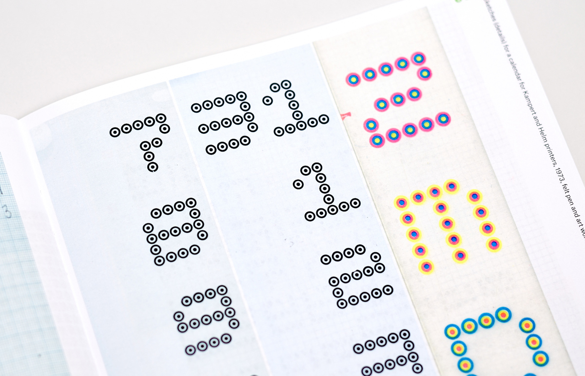
It was a great discovery for researchers of Schrofer’s archive that hundreds of sketches, drawings, proofs and even colour separations from which he printed have been preserved. After completing her extensive monograph on Schrofer, Frederike Huygen decided to devote a separate publication to his drafts and working materials, considering them to have a particularly expressive power and poetic qualities. At a time when more and more designers of the digital age are showing interest in the legacy of designers past and passing, to the traces of handwork in design and to the tangible and printed, this release is no mere coincidence. This is how the author sums up the idea: “More than anything else, this book is a declaration of love for graphic design in its physical presence.”
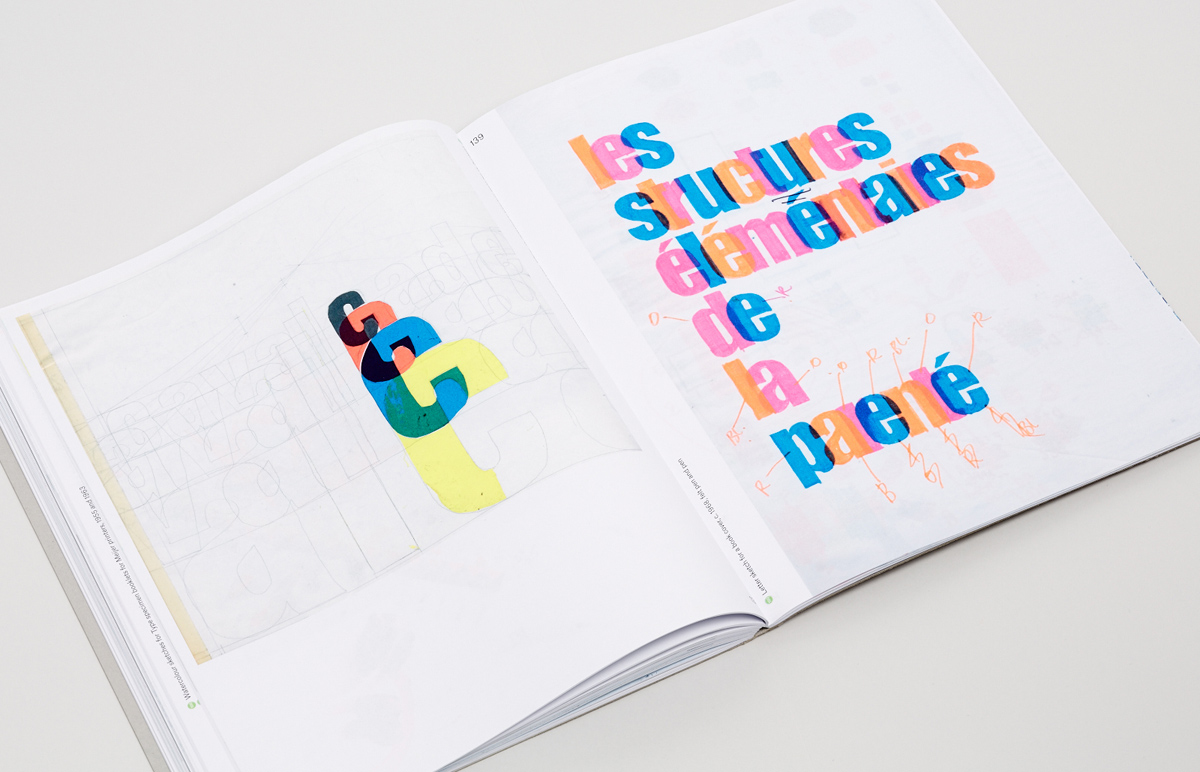
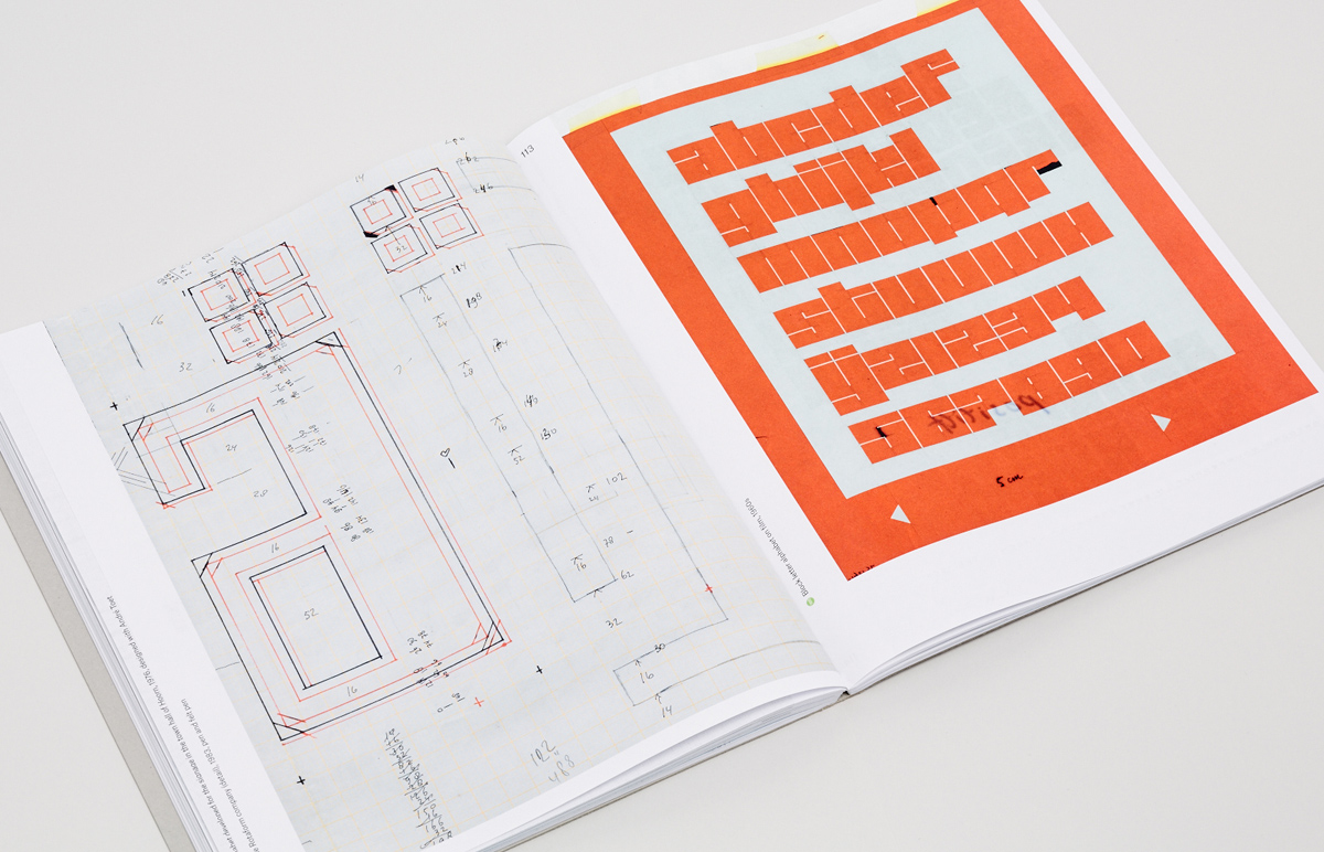
The book, called Schrofer Sketches, was released in November 2014 by Lecturis. It includes an introductory essay by Huygen, an extensive section with reproductions of archive materials, primarily experiments in the field of type, typography and geometric structures, and an especially interesting final part—a chapter revealing the techniques and sequence of steps Schrofer used to produce some of his works, taking into account the circumstances and limited technology of the time. All drafts, drawings and sketches are attributed and dated. Reproductions in the book are provided at four different scales: 25%, 50%, 75% and full size.
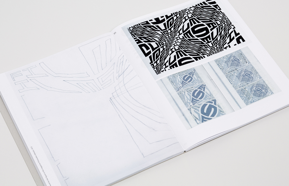
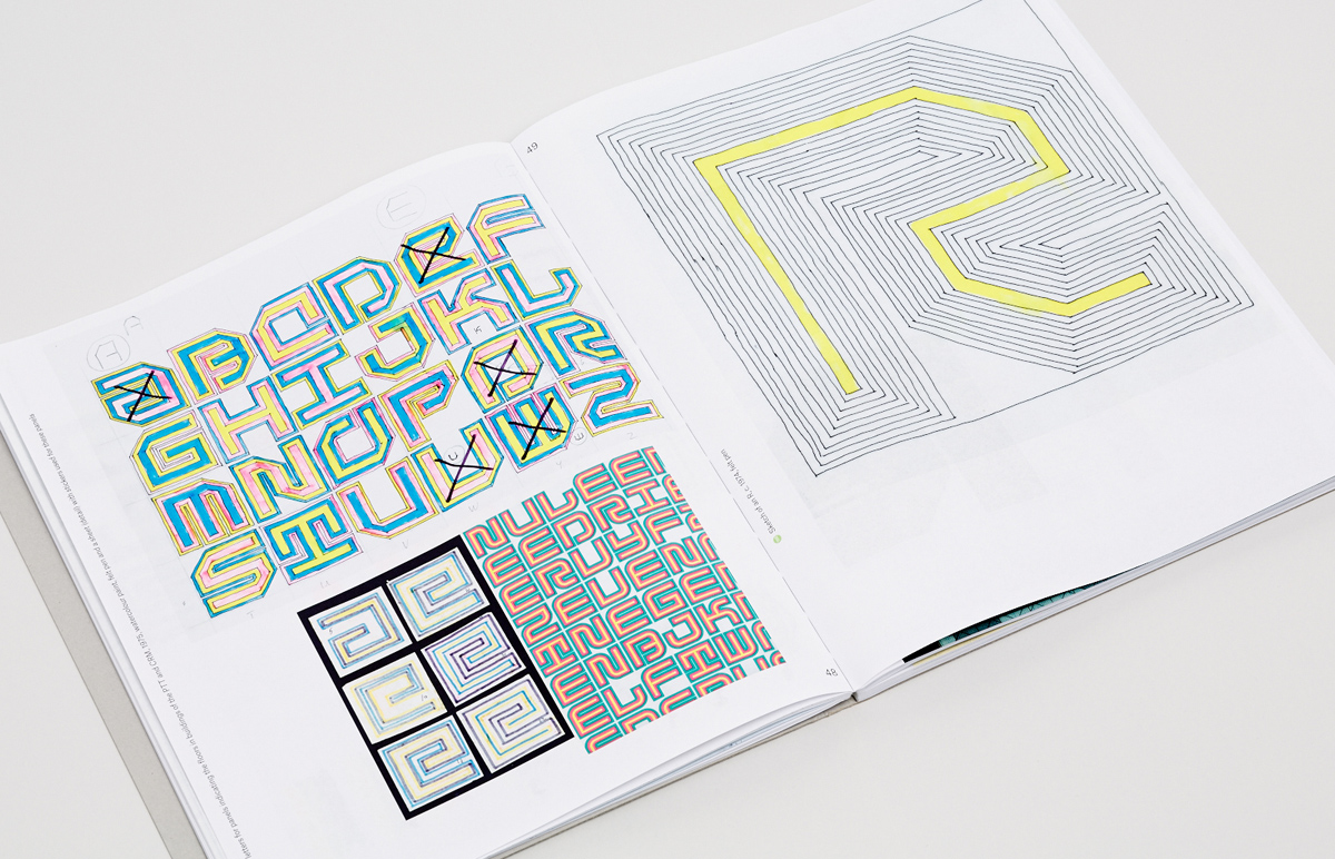
Book designer Joost Grootens, whose studio designed Schrofer Sketches, is known, among other things, for his special approach to illustrating and printing reproductions. This book is no exception. In order to convey more expressively the richness of the markers and felt-tip pens that Schrofer often used when sketching, additional fluorescent inks were utilised alongside the standard process colour ones. Thanks to this solution, many sketches look particularly naturalistic, as if drawn into the book.
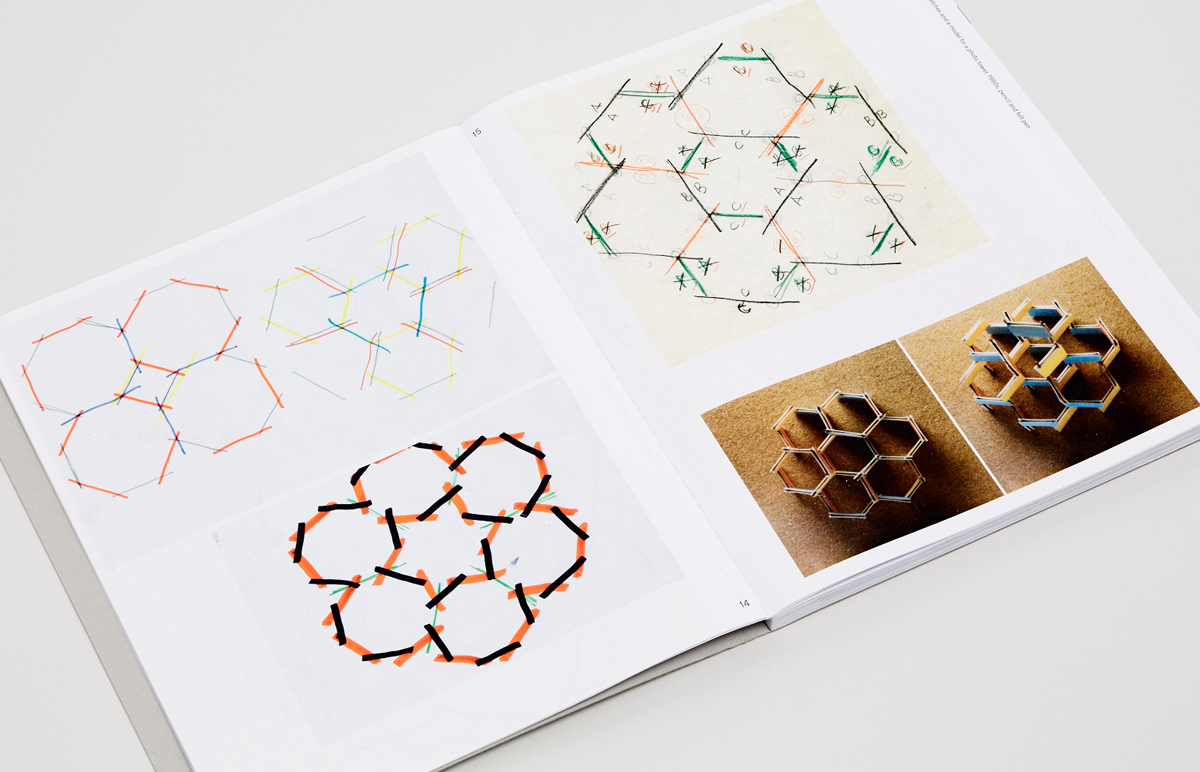
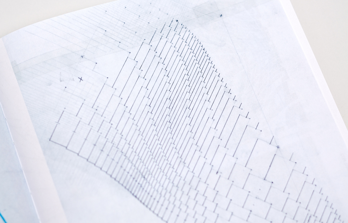
The drawings provided in the book reveal, perhaps, to the fullest extent the mathematical, calculated, almost computer-like nature of Schrofer’s interest in letters, patterns and complex graphic structures. The detailing and meticulousness with which some of the works were created is striking. He often used graph paper or logarithmic paper to draw symbols and patterns, in addition to creating the skeletons of complex geometric deformations of certain inscriptions and entire type compositions, sketching out detailed coordinate grids by hand.
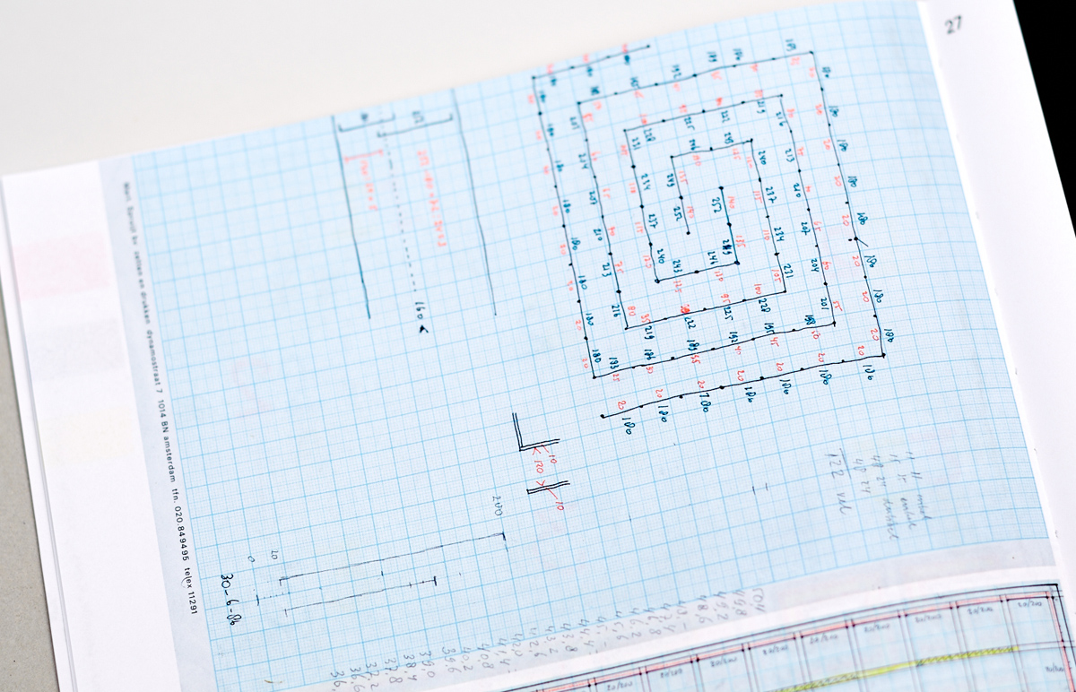

Although Jurriaan Schrofer was around for the advent of computers and even had recourse to them after Ootje Oxenaar showed him the Coragraph electronic drawing machine at the Eindhoven University of Technology, he never really mastered computer skills. Most of his works were created by hand with pen and ink, technical pen, marker, felt-tip, pencil, cutout paper figures, Letraset and Mecanorma dry transfer sheets and custom-made character sets on dry-transfers.
Huygen remarks, “What Schrofer grappled with on paper can now be achieved with a press of a key. Programs and algorithms are in charge now and the toolkit has gone all-digital. Designers do their sketching on screen, but if they don’t save the intervening stages the process is lost from view. The computer’s perfection and precision have precipitated a backlash among designers as manifested in the pursuit of imperfection, deviation from the norm, individualism and uniqueness of character.”